Data Vis Dispatch, May 19: China, maps, and the Eurovision Song Contest

Welcome back to the 245th edition of Data Vis Dispatch! Every week, we’ll be publishing a collection of the best small and large data visualizations we find, especially from news organizations — to celebrate data journalism, data visualization, simple charts, elaborate maps, and their creators.
Recurring topics this week include China, the use of maps, and Eurovision song themes.
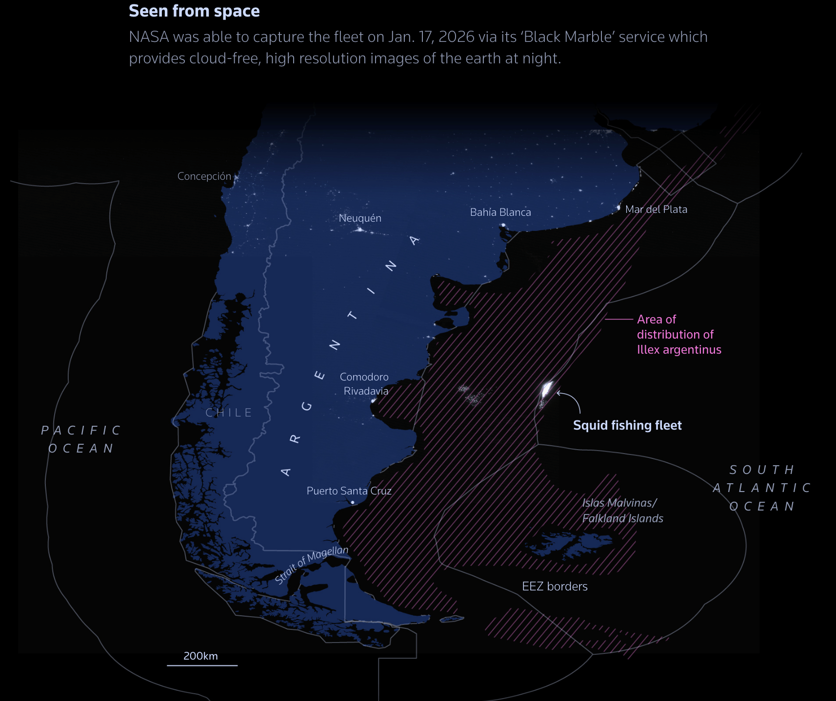
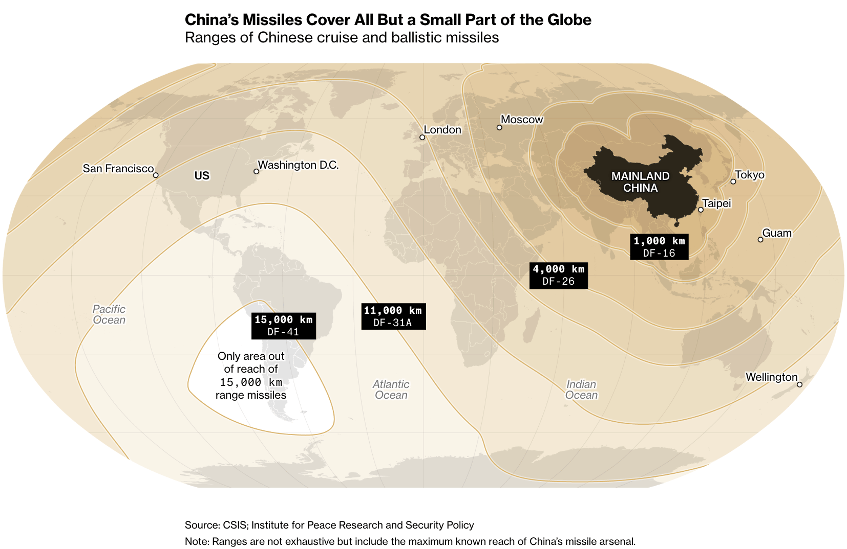
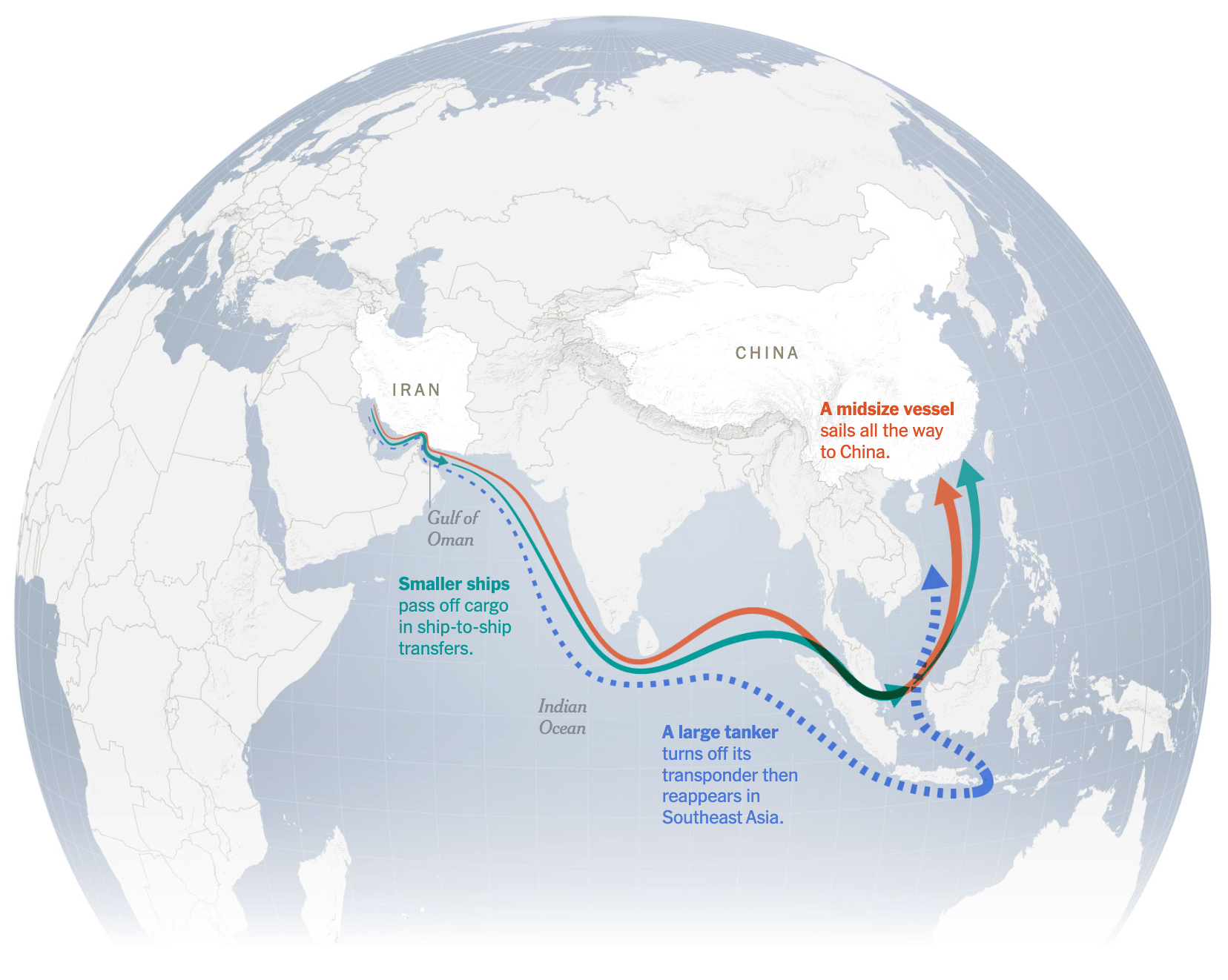
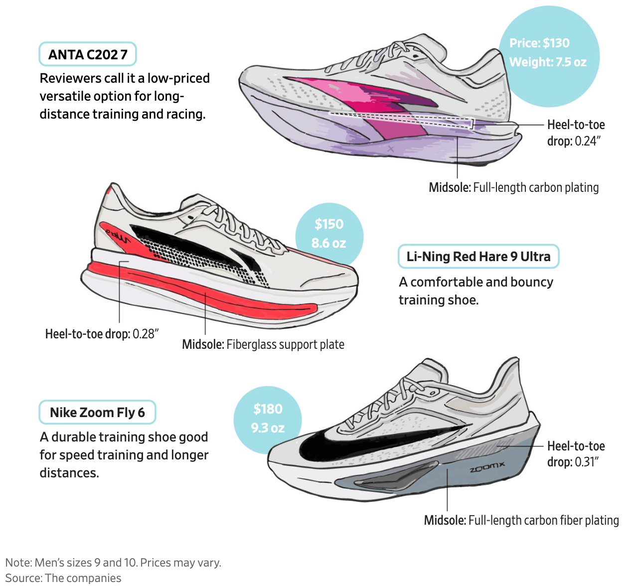
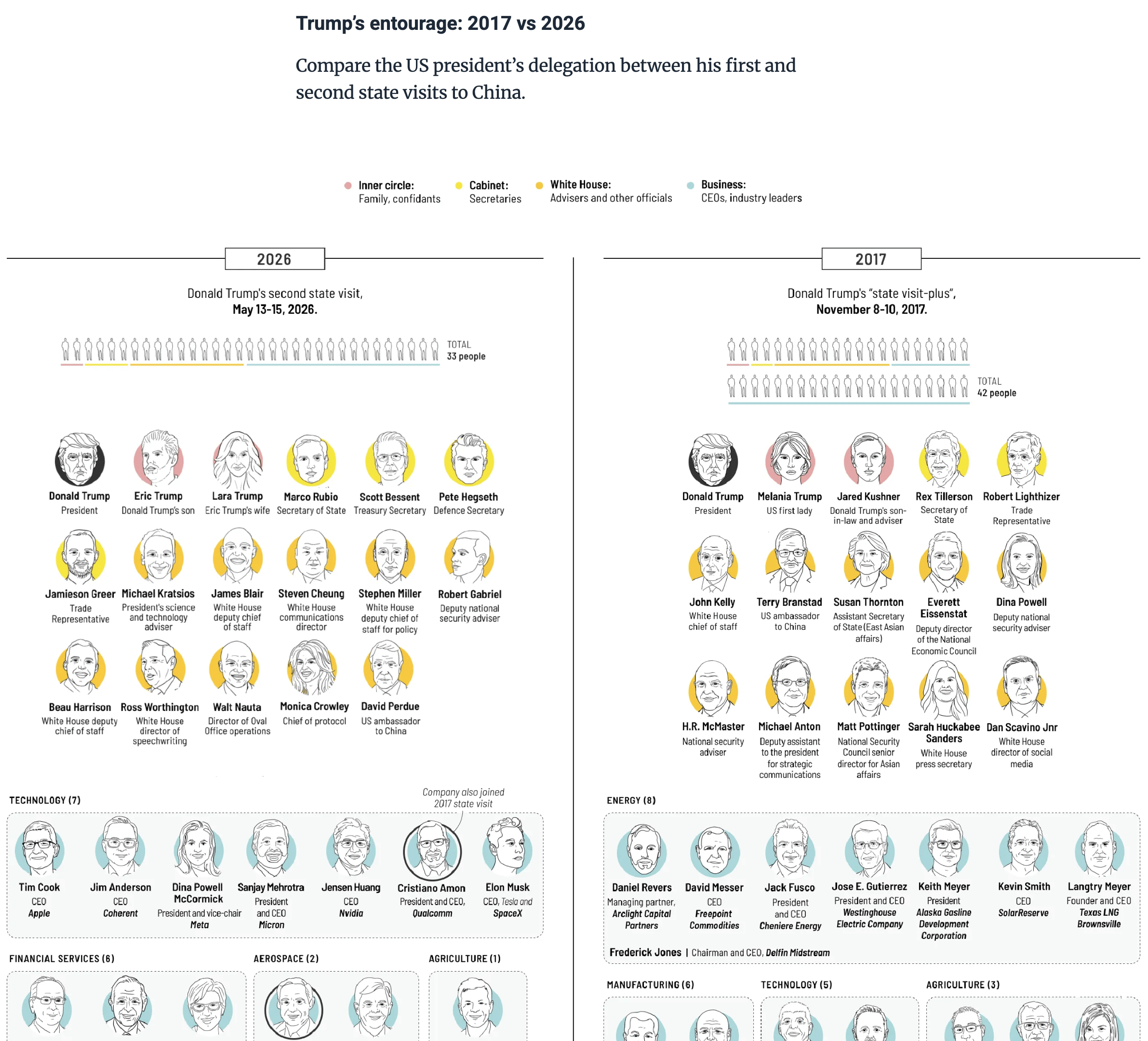
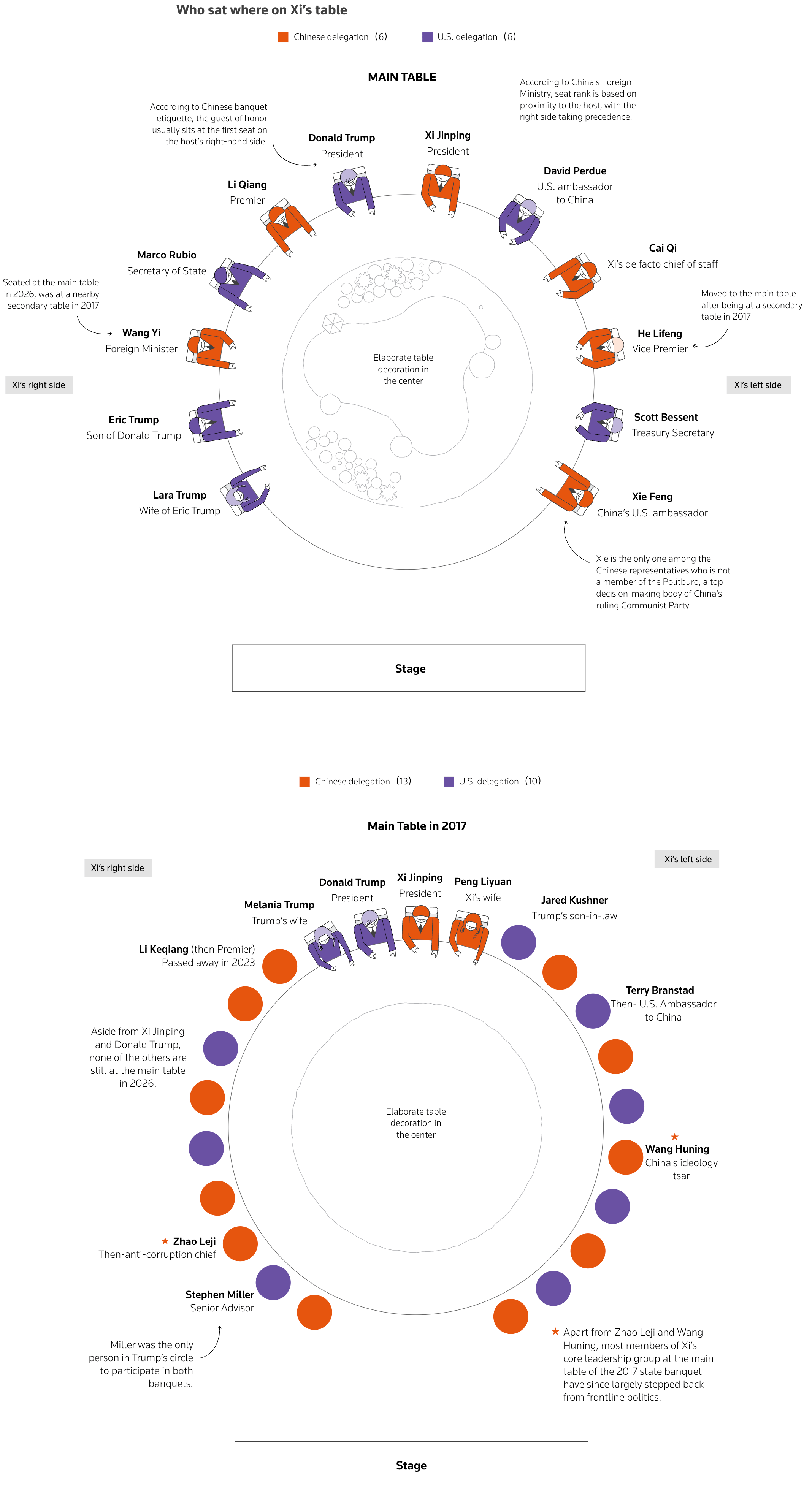
This week, we take a closer look at China, with fishing vessels off the coast of Argentina and military missile ranges causing concern. Furthermore, ships bound for China are bypassing the U.S. blockade, and Chinese shoe models are dominating the domestic market.
While the U.S. is aiming to reduce its reliance on China's supply chain of critical minerals, Trump's state visit to China took place last week, with visualizations covering the event.
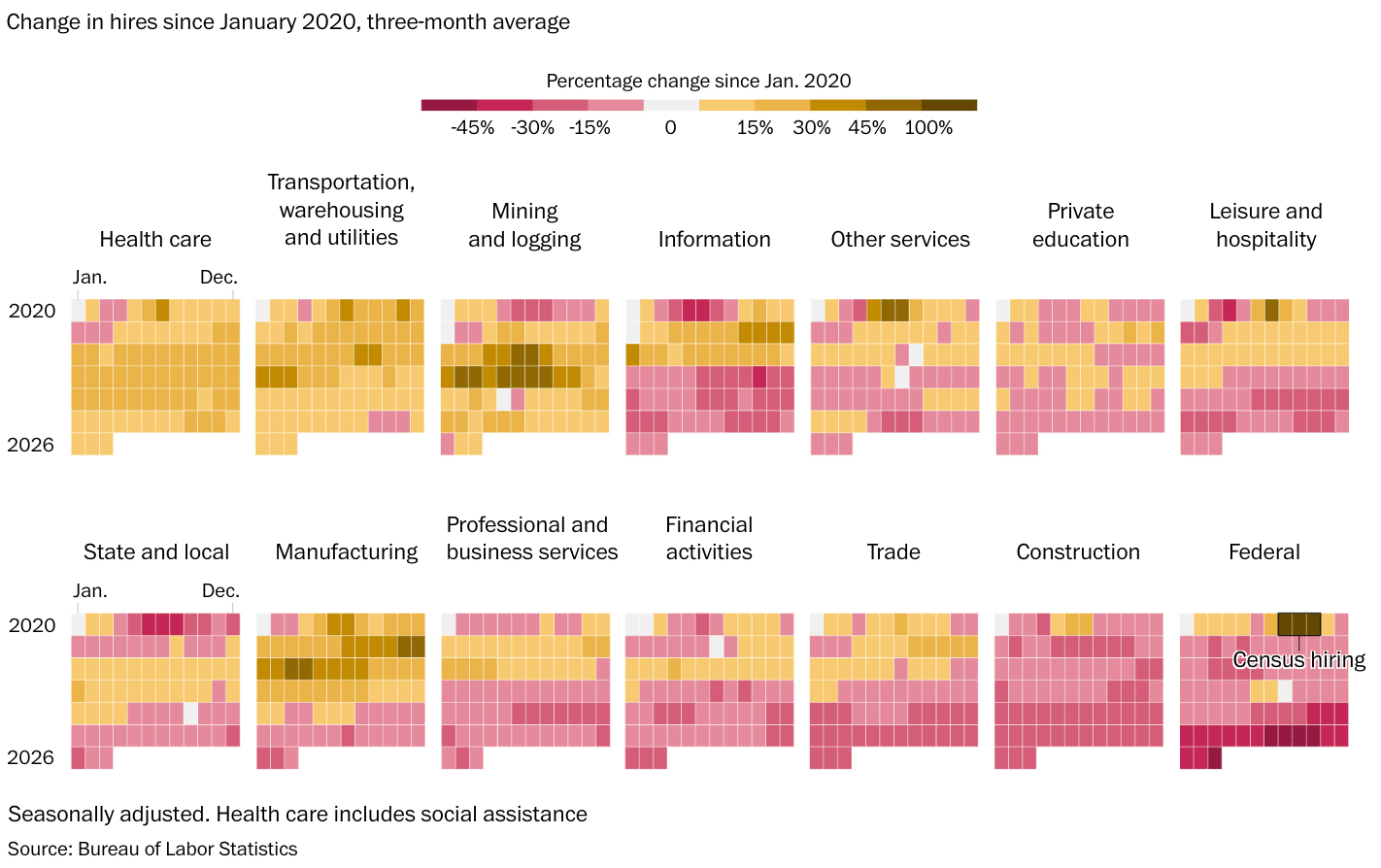
Inequality plays a significant role in education, with differences in students' experiences impacting their educational process. Additionally, while housing prices in the U.S. are exceeding household incomes, changes in hiring and advances in AI are affecting the job market.
![Fernando Becerra: "Feliz de ver el Mapa de Justicia Educacional, la plataforma que diseñamos y desarrollamos desde Dataista SpA para el Centro de Justicia Educacional (CJE), finalmente arriba y funcionando! [<em>Chart title: Percentage of students with a high degree of sense of belonging in total and by socioeconomic group (SEG) of the establishment],"</em> May 14 (<a href="https://www.linkedin.com/posts/becerrafernando_feliz-de-ver-el-mapa-de-justicia-educacional-ugcPost-7460471760971423744-6AhO/"><strong>LinkedIn</strong></a>, <a href="https://www.mapadejusticiaeducacional.cl/"><strong>project website</strong></a>)](https://datawrapper.de/cdn-cgi/image/quality=85,width=1472,f=auto,fit=cover/https://kirby.datawrapper.de/media/pages/blog/data-vis-dispatch-may-19-2026-china-maps-and-the-eurovision-song-contest/f4f569baa4-1779188432/cleanshot-2026-05-19-at-13.00.18@2x.png)
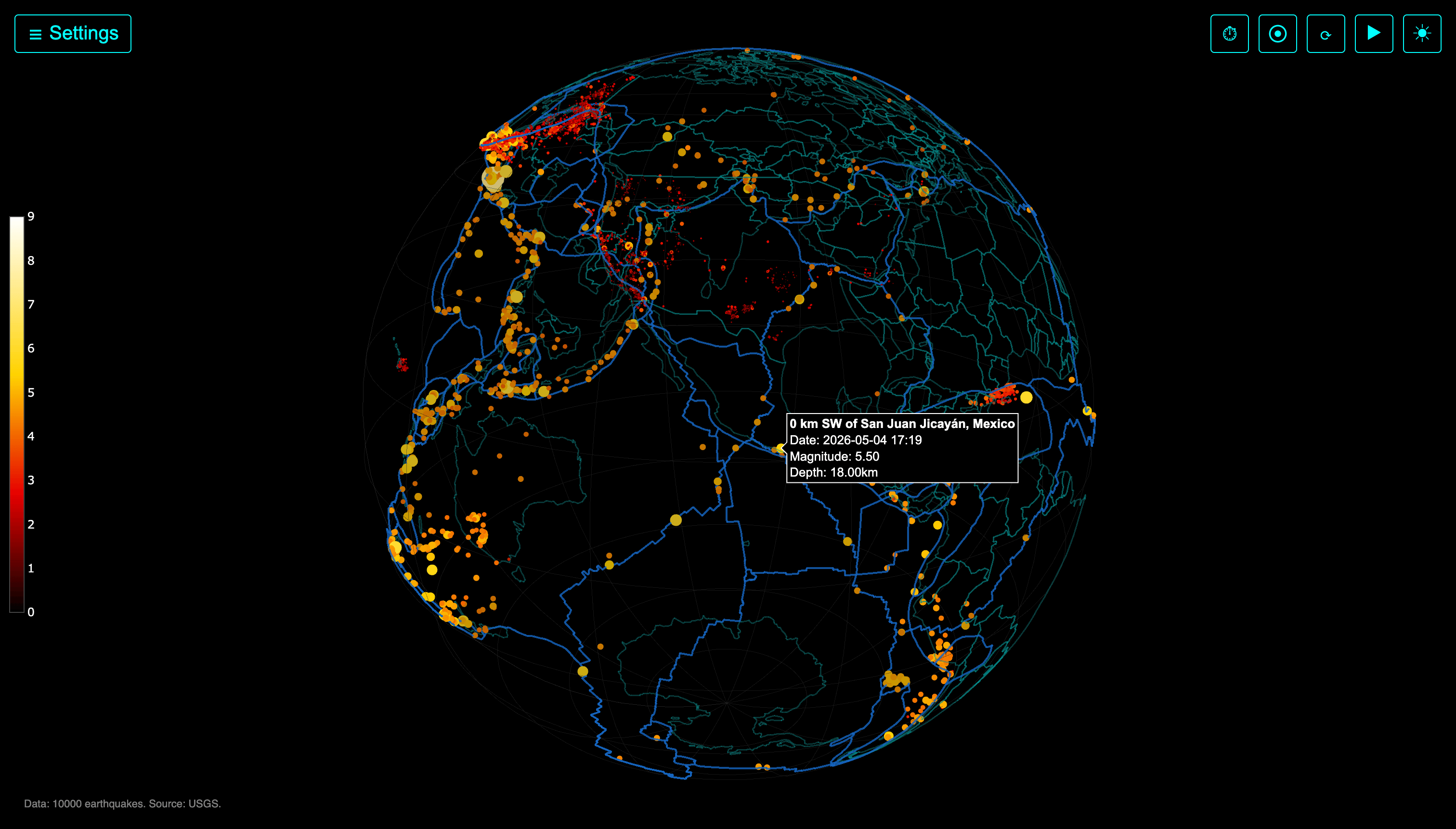
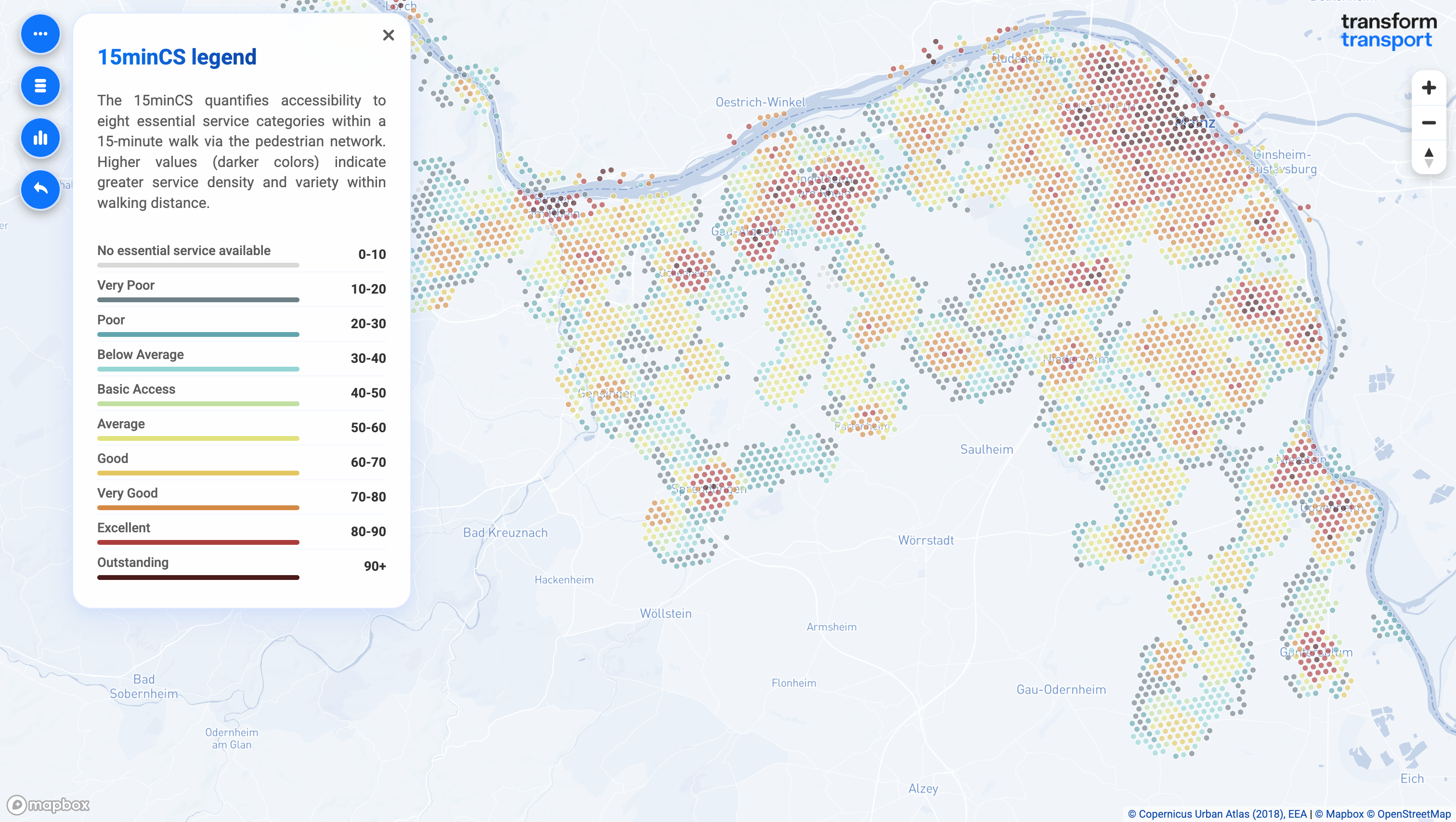
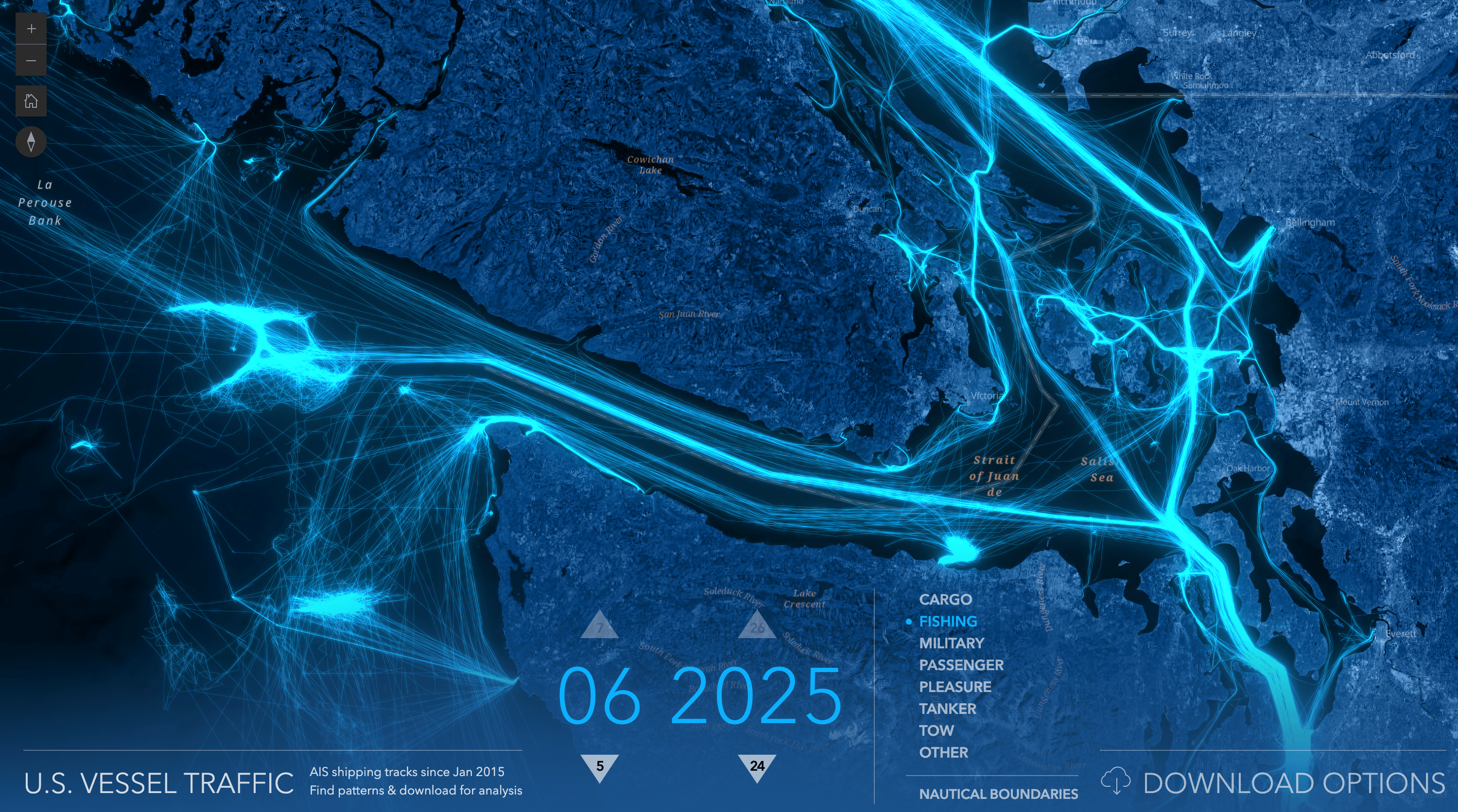
Maps are useful in visualizing current topics - from gold mining permits to global earthquakes, accessibility in European cities, vessel traffic, and even Rio's sister city agreements!
![InfoAmazonia: <a href="https://infoamazonia.org/2026/05/14/anm-mantem-permissoes-de-garimpo-no-tapajos-mesmo-apos-alertas-de-esquentamento-de-ouro/?utm_source=bluesky&utm_medium=InfoAmazonia&utm_campaign=publer"><strong>ANM mantém permissões de garimpo no Tapajós mesmo após alertas de ‘esquentamento’ de ouro</strong></a> [<em>ANM maintains mining permits in Tapajós even after warnings of gold 'laundering'</em>], May 14](https://datawrapper.de/cdn-cgi/image/quality=85,width=1508,f=auto,fit=cover/https://kirby.datawrapper.de/media/pages/blog/data-vis-dispatch-may-19-2026-china-maps-and-the-eurovision-song-contest/f10f5d3e15-1779101992/cleanshot-2026-05-18-at-12.59.38@2x.png)
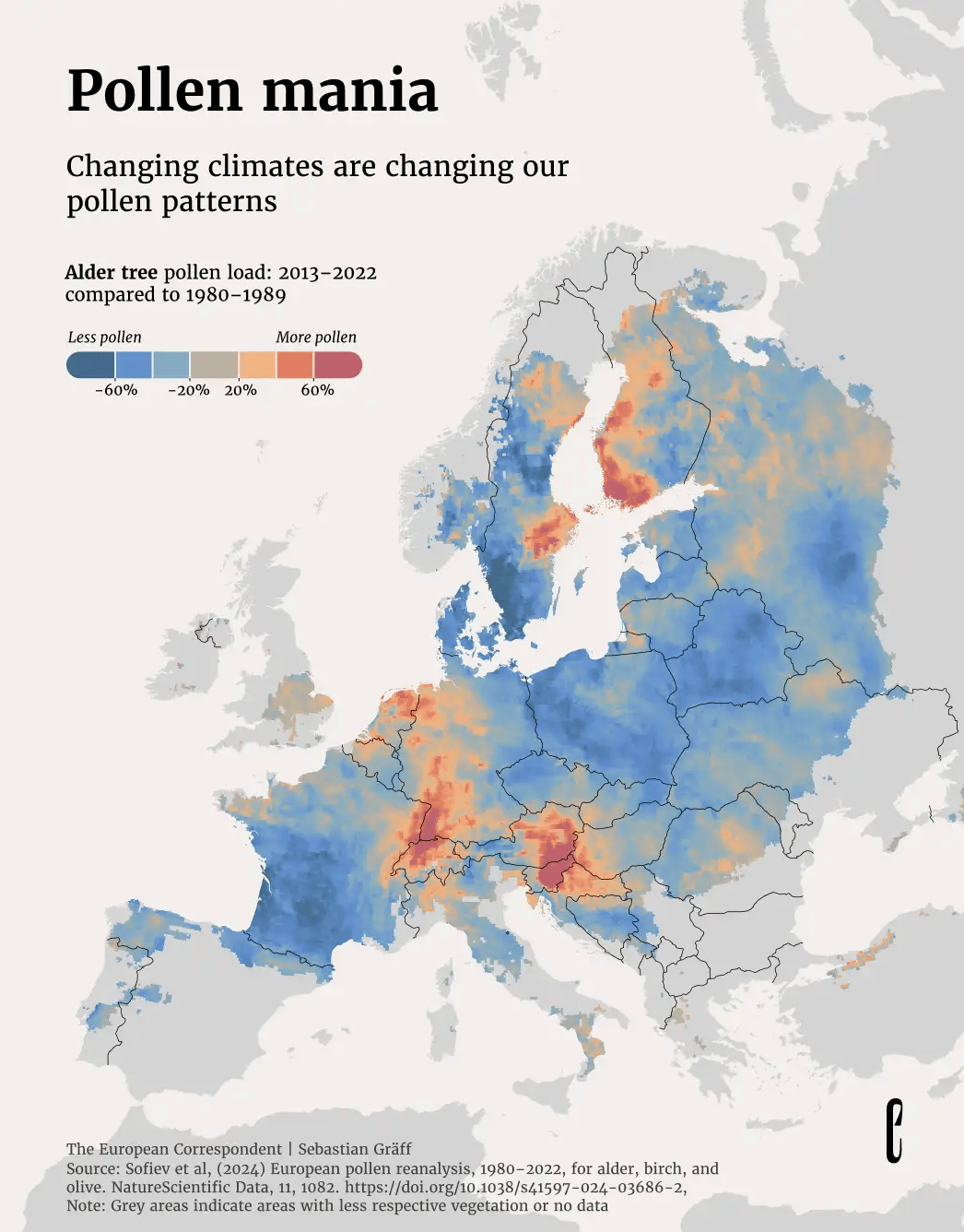
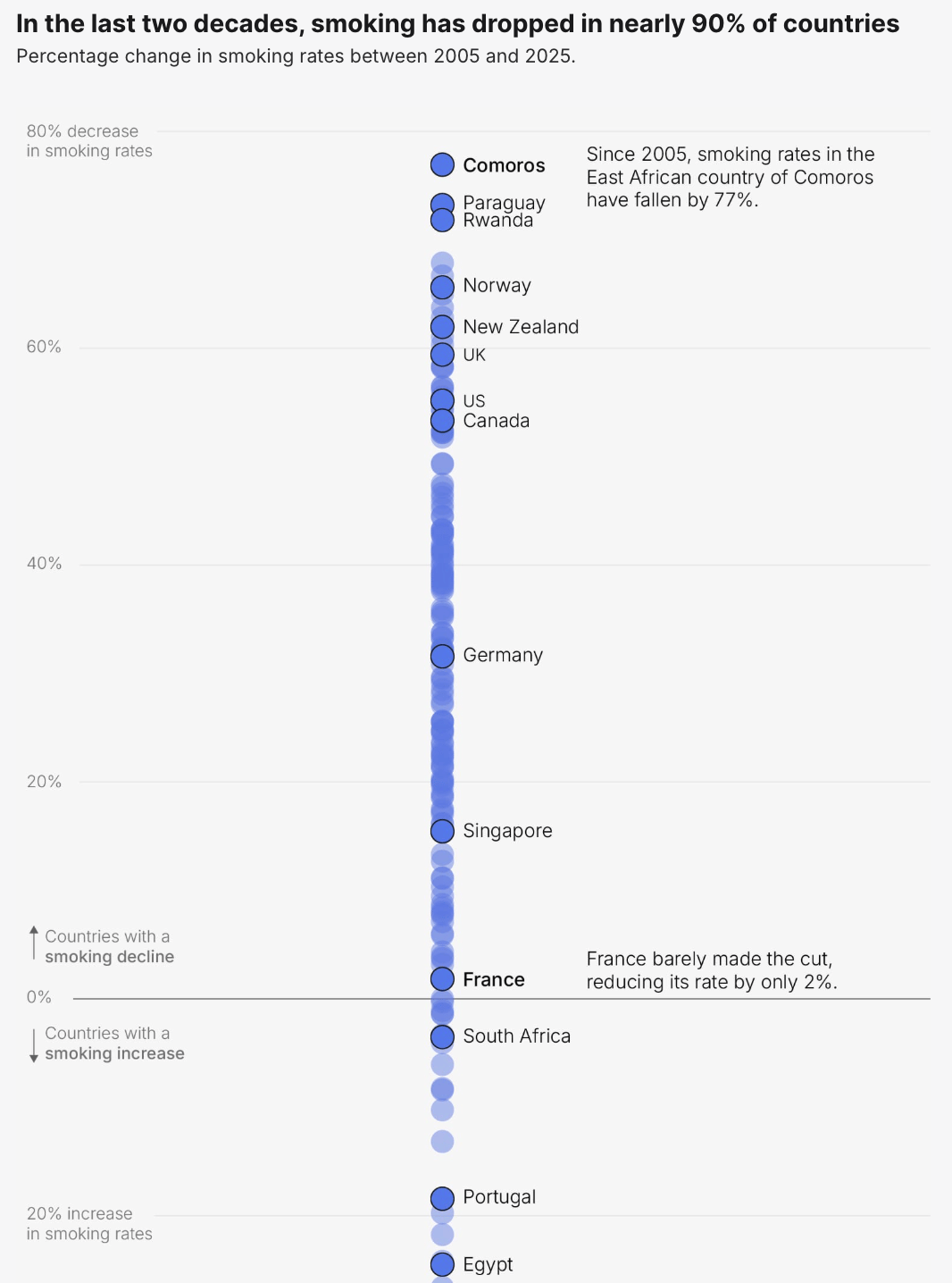
While changes in pollen patterns and declining smoking rates both affect health, changes in smoking habits can significantly reduce cancer risks.
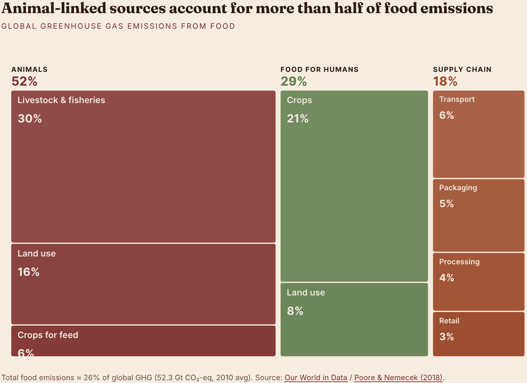
We end this Dispatch with a selection of other interesting topics: costs of popular dog breeds in Germany, food emissions, and Eurovision song themes!
What else we found interesting
Applications are open for…
An interactive visual journalist at The Economist
A principal data journalist at European Correspondent
A data journalist at European Correspondent


