Data Vis Dispatch, May 13: Kashmir, Pope Leo XIV, and climate extremes

Welcome back to the 192nd edition of Data Vis Dispatch! Every week, we’ll be publishing a collection of the best small and large data visualizations we find, especially from news organizations — to celebrate data journalism, data visualization, simple charts, elaborate maps, and their creators.
Recurring topics this week include the Kashmir region, the new Pope, and coming climate extremes.
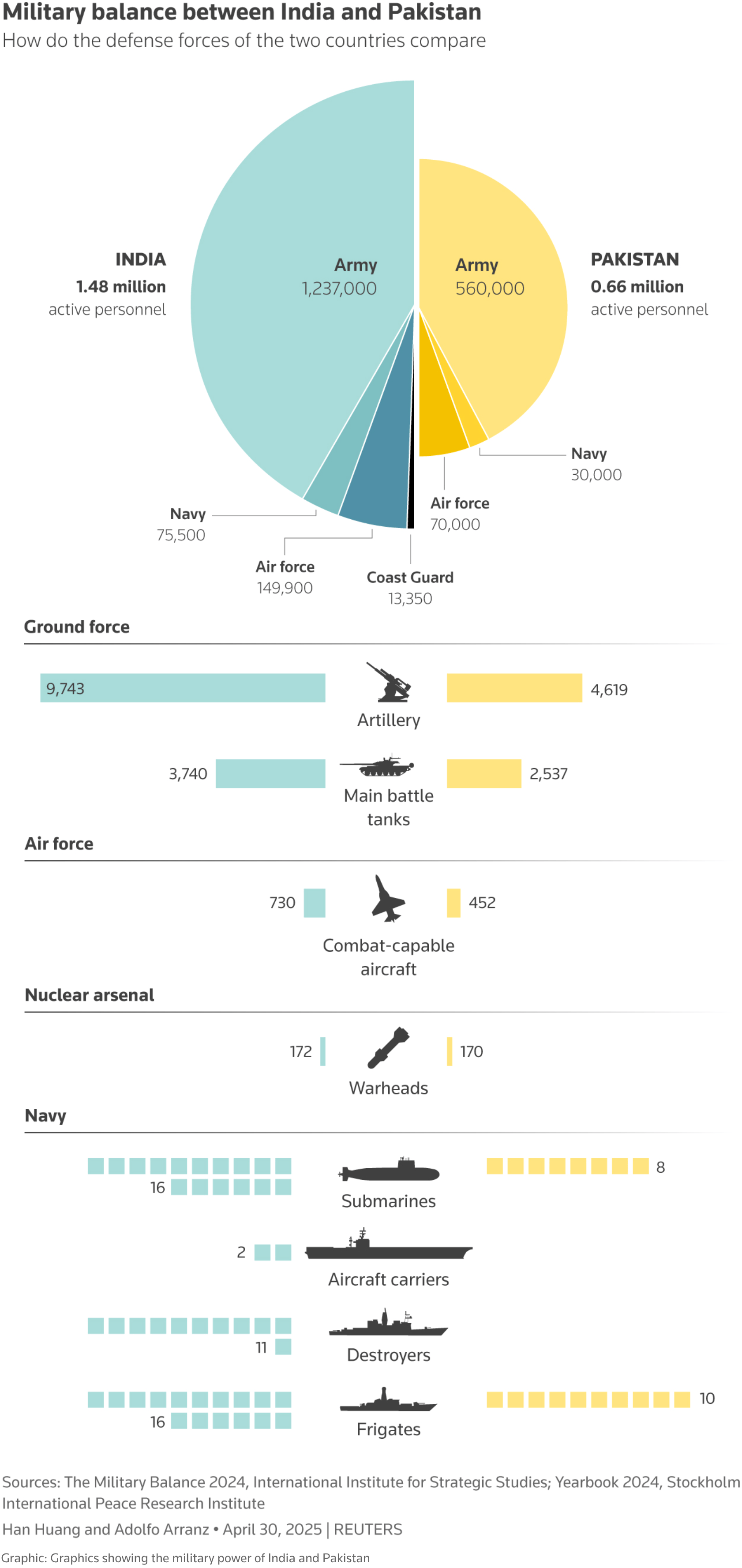
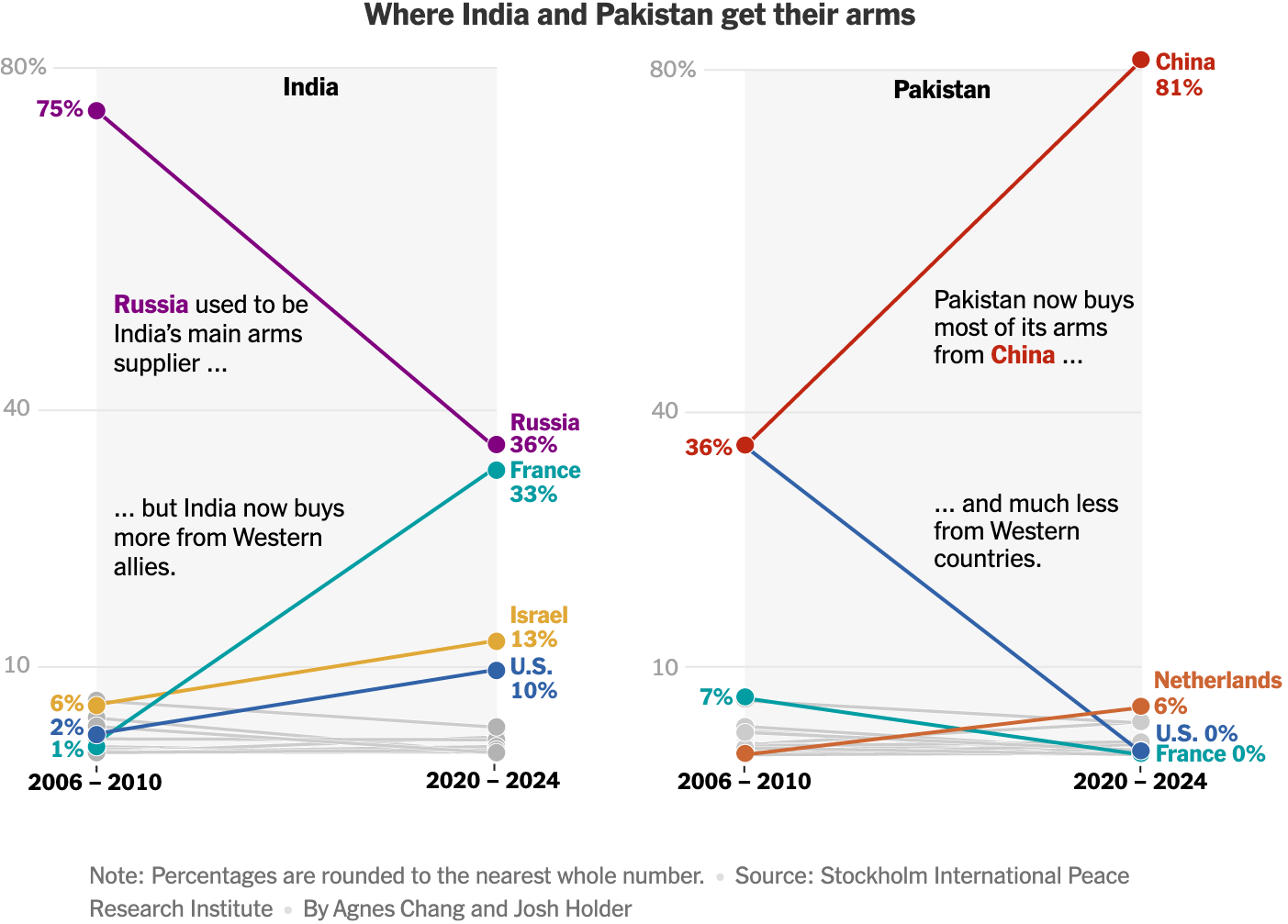
Last week, escalation between India and Pakistan brought global attention to the conflict over Kashmir:
![El Orden Mundial: <a href="https://elordenmundial.com/mapas-y-graficos/mapa-cachemira-disputa-territorial-india-pakistan/"><strong>El mapa de Cachemira, la gran disputa territorial entre India y Pakistán</strong></a><strong> </strong>[<em>The map of Kashmir, the major territorial dispute between India and Pakistan</em>], May 8](https://datawrapper.de/cdn-cgi/image/quality=85,width=1299,f=auto,fit=cover/https://kirby.datawrapper.de/media/pages/blog/data-vis-dispatch-may-13-2025/cdd0ea5d84-1747039289/mapa-cachemira-def.png.webp)
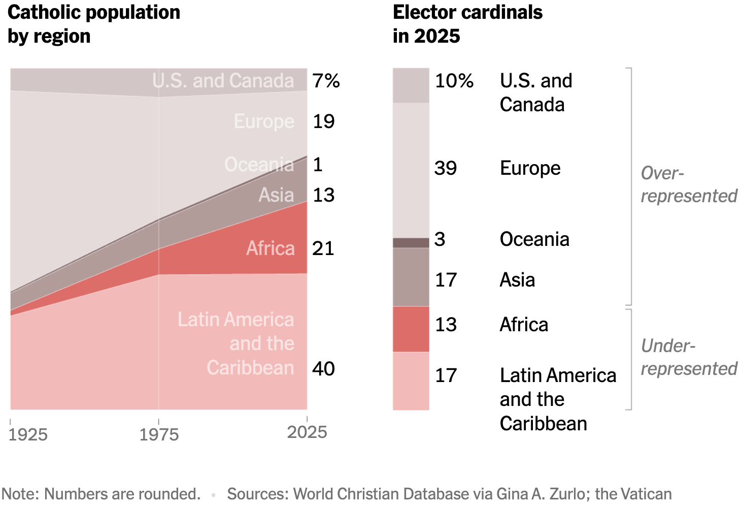
After Pope Francis' death, the Catholic church has a new head in the American Robert Francis Prevost, now Leo XIV:
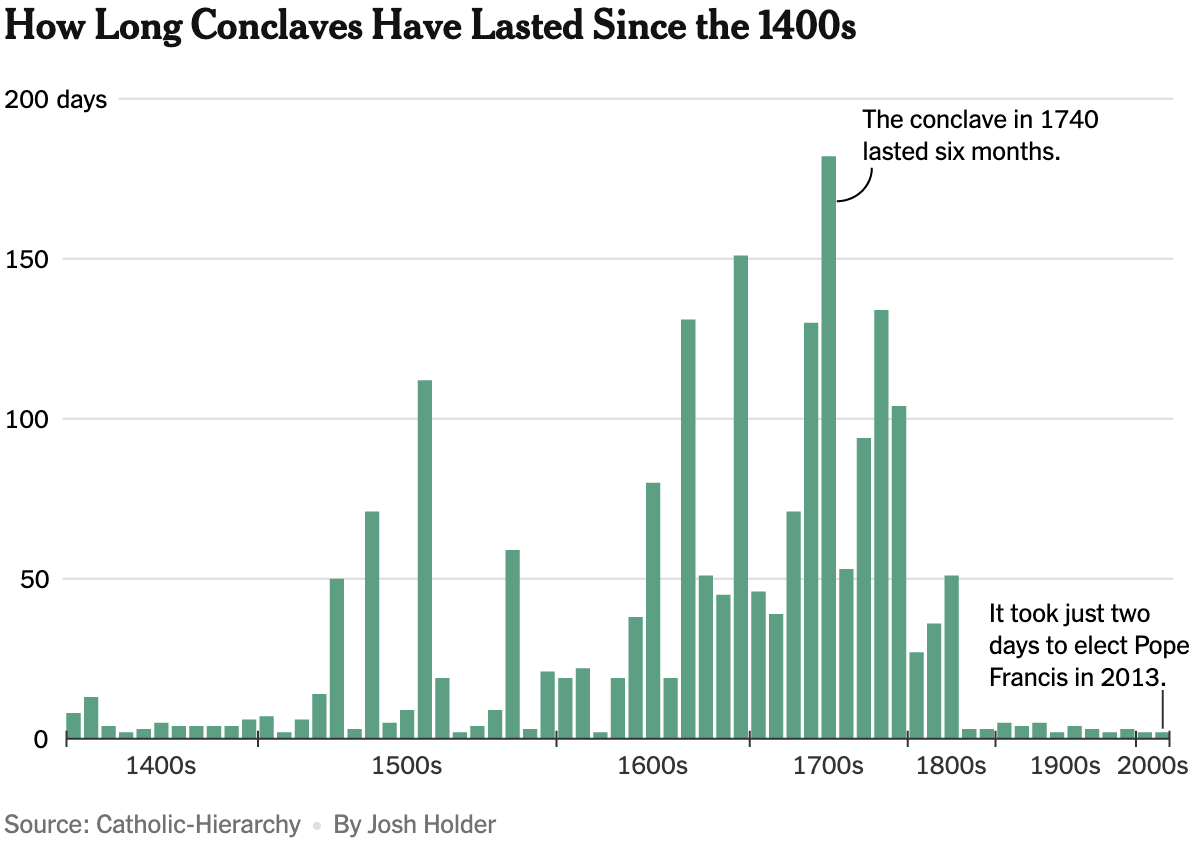
![Nexo: <a href="https://www.nexojornal.com.br/grafico/2025/05/06/eleicao-papa-conclave-quem-faz-parte-cardeais-2"><strong>Como funciona o conclave, que elege o novo papa</strong></a> [<em>Chart title: Frequent names chosen by popes</em>], May 6](https://datawrapper.de/cdn-cgi/image/quality=85,width=1168,f=auto,fit=cover/https://kirby.datawrapper.de/media/pages/blog/data-vis-dispatch-may-13-2025/f4369e3fa1-1747037929/cleanshot-2025-05-12-at-10.18.24@2x.png)
![La Nación: <a href="https://www.lanacion.com.ar/el-mundo/conclave-2025-uno-por-uno-estos-son-los-candidatos-para-ser-nuevo-papa-y-suceder-a-francisco-nid28042025/"><strong>Uno por uno, estos son los candidatos para ser nuevo Papa</strong></a><strong> </strong>[<em>One by one, these are the candidates for the new Pope</em>], May 8 <span class="badge">Deep dive</span>](https://datawrapper.de/cdn-cgi/image/quality=85,width=1960,f=auto,fit=cover/https://kirby.datawrapper.de/media/pages/blog/data-vis-dispatch-may-13-2025/b7c3c6d526-1747039919/cleanshot-2025-05-12-at-10.51.08@2x.png)
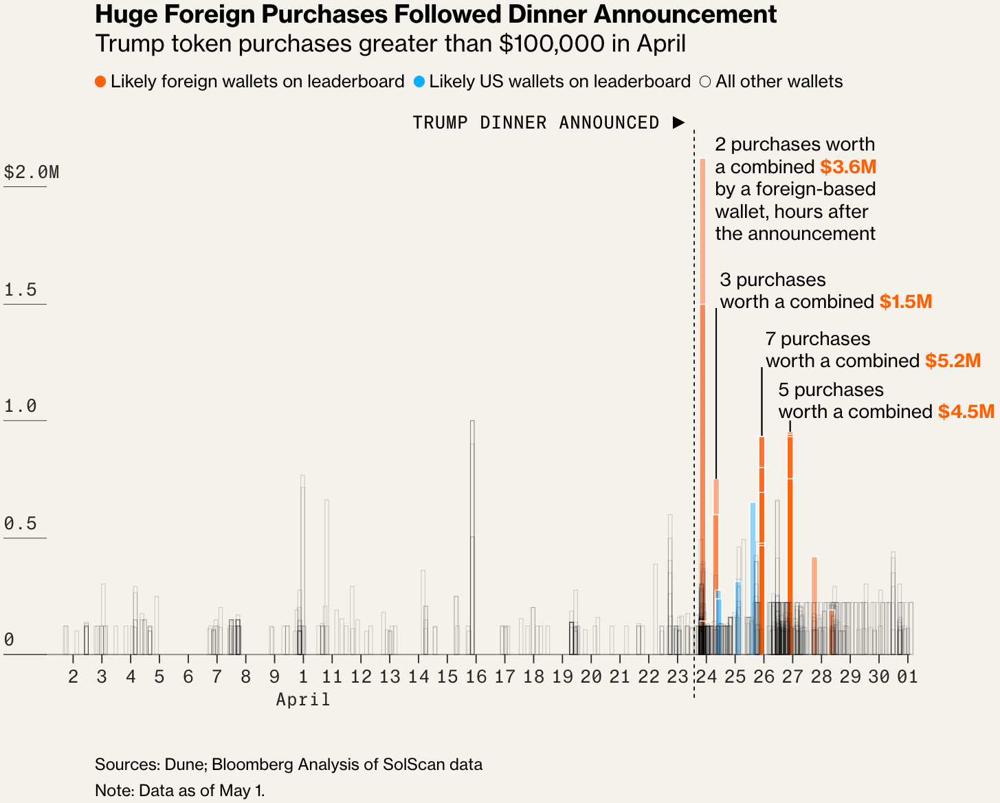
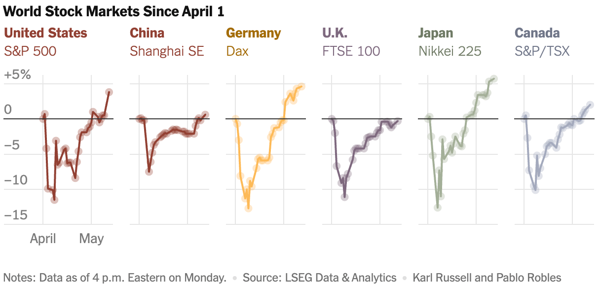
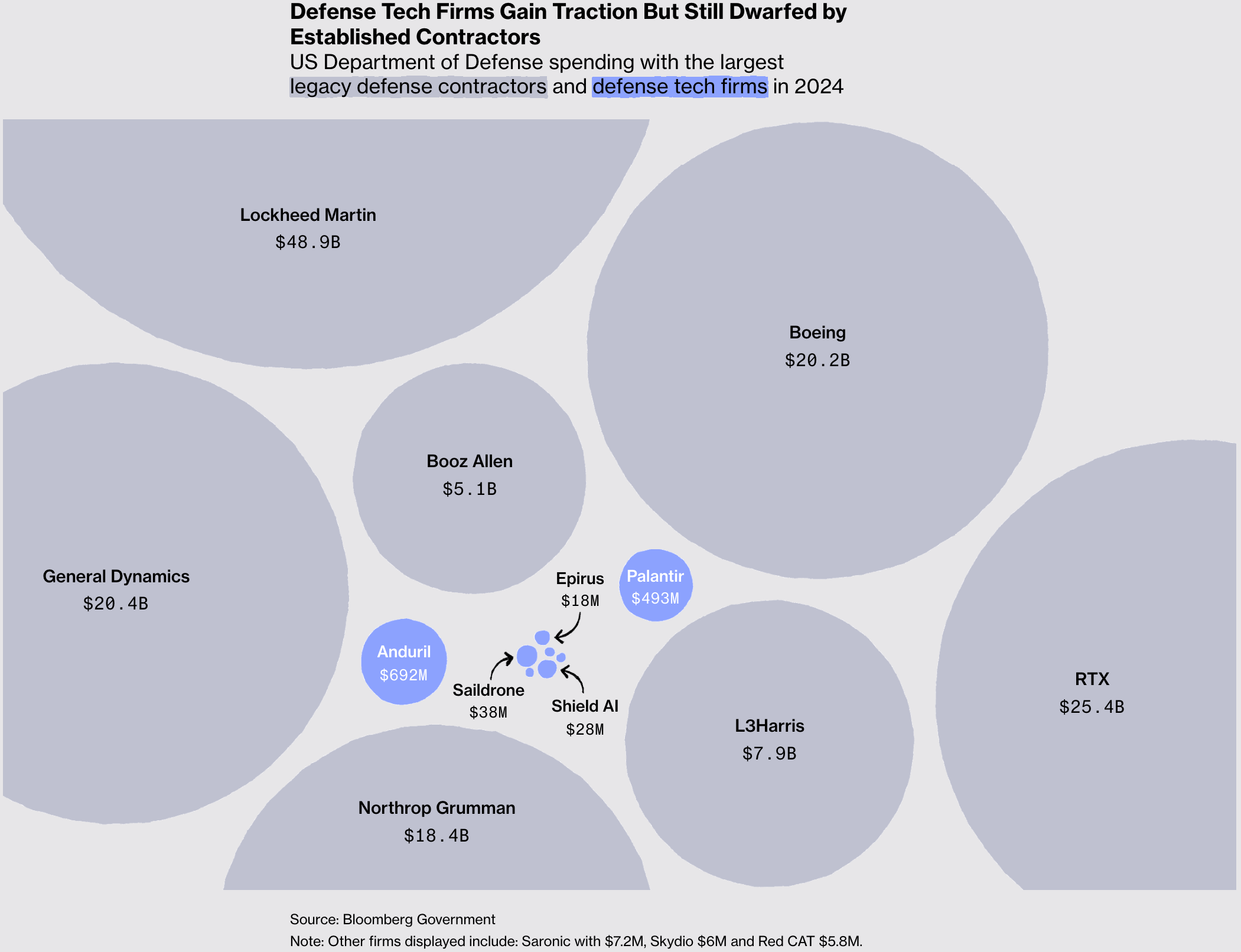
Moving from one powerful American to the next — no look at world news would be complete without a Trump catch-up:
Other political charts centered on choosing new public officials:
![Data Dictionary: "Senatorial elections in the Philippines surprise with some upsets […]," May 12 (<a href="https://x.com/DictionaryData/status/1921959164722503748"><strong>X</strong></a>)](https://datawrapper.de/cdn-cgi/image/quality=85,width=1323,f=auto,fit=cover/https://kirby.datawrapper.de/media/pages/blog/data-vis-dispatch-may-13-2025/e9d85f2cb6-1747118678/cleanshot-2025-05-13-at-08.43.33@2x.png)
![Die Zeit: <a href="https://www.zeit.de/politik/deutschland/2025-05/kanzlerwahlen-ueberblick-mehrheiten-daten-friedrich-merz"><strong>Früher war es auch schon knapp</strong></a><strong> </strong>[<em>It's been close in the past too</em>], May 6](https://datawrapper.de/cdn-cgi/image/quality=85,width=1197,f=auto,fit=cover/https://kirby.datawrapper.de/media/pages/blog/data-vis-dispatch-may-13-2025/c02829a366-1747040087/cleanshot-2025-05-12-at-10.54.18@2x.png)
Let's move on to the economy, which had its fair share of diverse visualizations:

![Diario Sur: <a href="https://www.diariosur.es/culturas/musica/radiografia-musica-directo-datos-explican-entradas-caras-20250512000355-ntrc.html"><strong>Radiografía de la música en directo: los datos que explican por qué las entradas son más caras que nunca</strong></a><strong> </strong>[<em>Live music analysis: the data that explains why tickets are more expensive than ever</em>], May 12](https://datawrapper.de/cdn-cgi/image/quality=85,width=867,f=auto,fit=cover/https://kirby.datawrapper.de/media/pages/blog/data-vis-dispatch-may-13-2025/b9557ee1a4-1747038486/cleanshot-2025-05-12-at-10.27.34@2x.png)
![Koen Van den Eeckhout: "[…] a set of fish icons to compare funds. I use it when I talk about visual variables. This chart uses size as a visual variable in 15 different ways […]," May 8 (<a href="https://bsky.app/profile/vandeneeckhoutkoen.bsky.social/post/3lonpjxllu526"><strong>Bluesky</strong></a>)](https://datawrapper.de/cdn-cgi/image/quality=85,width=1689,f=auto,fit=cover/https://kirby.datawrapper.de/media/pages/blog/data-vis-dispatch-may-13-2025/2bcc12ba26-1747076488/frame-3.jpg)
These graphics looked at the close relationship between technology and the environment — and the consequences for generations to come:
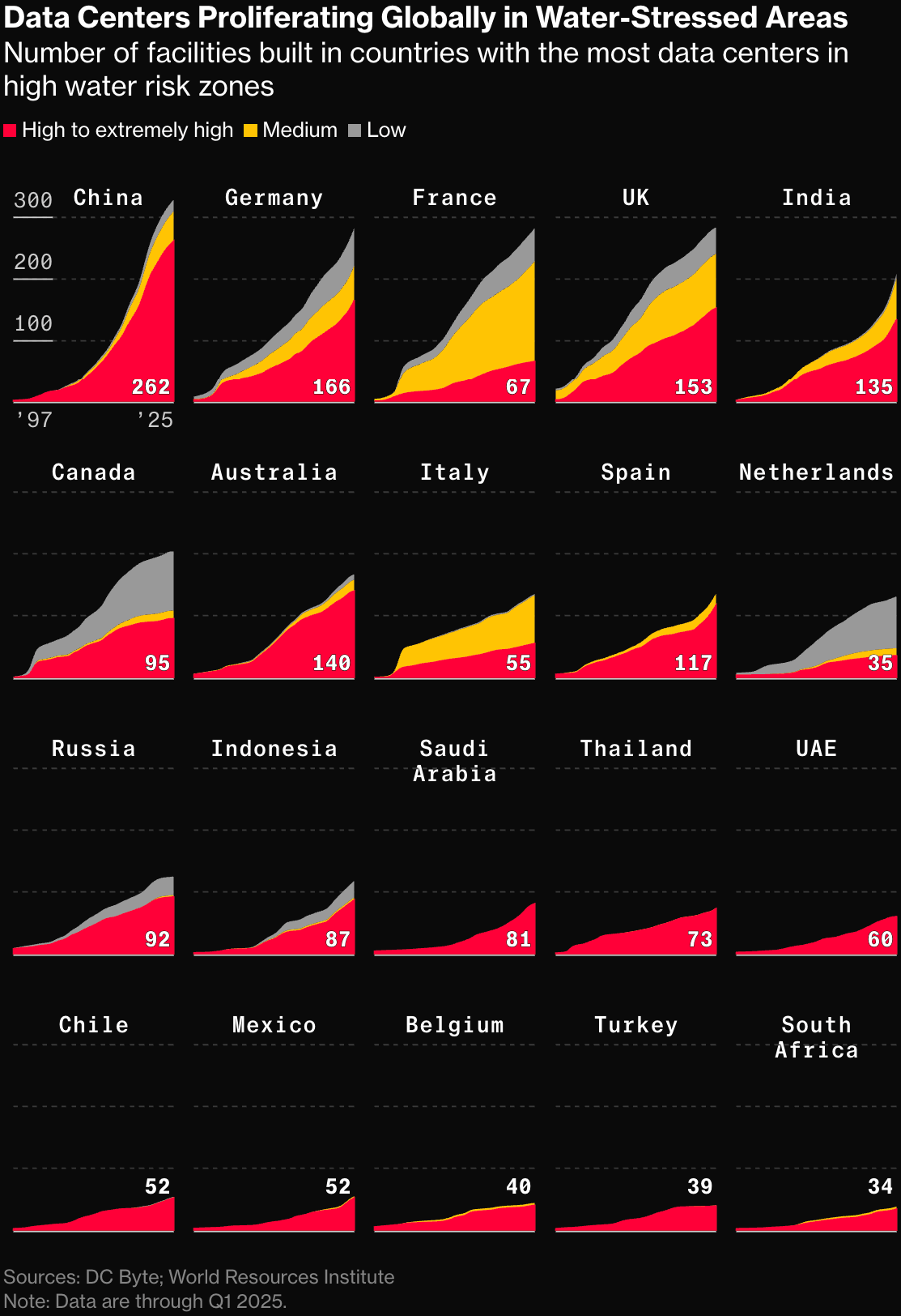
![Neue Zürcher Zeitung: <a href="https://www.nzz.ch/visuals/krise-bei-benzinern-chance-fuer-e-autos-der-wandel-von-europas-autoindustrie-in-grafiken-ld.1847621"><strong>Krise bei Benzinern, Chance für E-Autos? Der Wandel von Europas Autoindustrie in Grafiken</strong></a> [<em>Chart title: The Scandinavian countries are leading the way in e-mobility</em>], May](https://datawrapper.de/cdn-cgi/image/quality=85,width=2260,f=auto,fit=cover/https://kirby.datawrapper.de/media/pages/blog/data-vis-dispatch-may-13-2025/d280457630-1747073778/cleanshot-2025-05-12-at-12.07.15@2x.png)
![Der Spiegel: <a href="https://www.spiegel.de/politik/deutschland/spiegel-klimaradar-so-steht-es-um-die-klimapolitik-von-schwarz-rot-die-bilanz-nach-sektoren-a-ad212b96-4e1b-4456-a616-7fafe4bd94ff"><strong>Wie ernst nimmt Friedrich Merz die Klimapolitik?</strong></a><strong> </strong>[<em>Chart title: Bottom line - Germany's greenhouse gas balance</em>], May 8](https://datawrapper.de/cdn-cgi/image/quality=85,width=1256,f=auto,fit=cover/https://kirby.datawrapper.de/media/pages/blog/data-vis-dispatch-may-13-2025/f57ae8c4ac-1747039489/cleanshot-2025-05-12-at-10.44.28@2x.png)
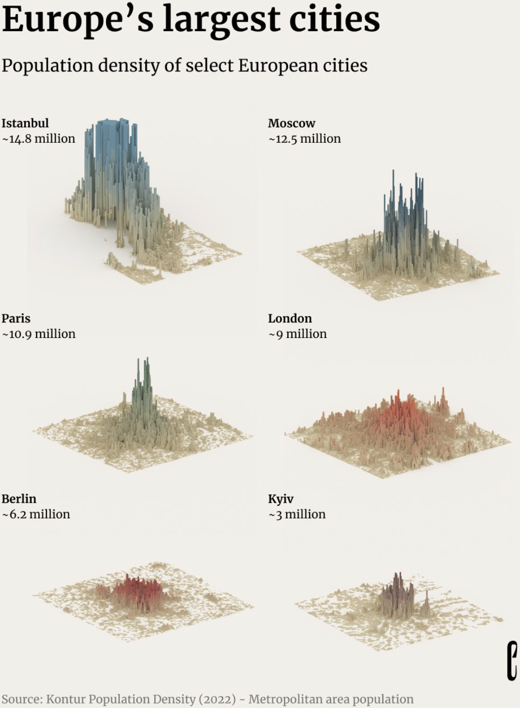
We'll end this edition with some dark but important work on violence against indigenous women, plus militarism, large cities, and supermarkets:
![Gênero e Número: <a href="https://www.generonumero.media/violencia-contra-mulheres-indigenas/"><strong>Violência contra mulheres indígenas</strong></a><strong> </strong>[<em>Violence against indigenous women</em>], May 8](https://datawrapper.de/cdn-cgi/image/quality=85,width=1888,f=auto,fit=cover/https://kirby.datawrapper.de/media/pages/blog/data-vis-dispatch-may-13-2025/35d78e26b2-1747038151/cleanshot-2025-05-12-at-10.20.30@2x.png)
![El Orden Mundial: <a href="https://elordenmundial.com/mapas-y-graficos/supermercados-espana-lucha-territorio-grandes-cadenas/"><strong>El mapa de los supermercados en España: así es la lucha por el territorio de las grandes cadenas</strong></a><strong> </strong>[<em>The map of supermarkets in Spain: this is how the big chains fight for territory</em>], May 6](https://datawrapper.de/cdn-cgi/image/quality=85,width=2880,f=auto,fit=cover/https://kirby.datawrapper.de/media/pages/blog/data-vis-dispatch-may-13-2025/8fec2d9b74-1747039377/cleanshot-2025-05-12-at-10.42.33@2x.png)
What else we found interesting
Applications are still open for…
A senior graphics reporter at NPR
A junior lecturer in data analysis at the University of Tartu
A PhD in data physicalization at Institut Mines-Télécom
A working student on the data journalism team at Handelsblatt
Help us make this dispatch better! We’d love to hear which newsletters, blogs, or social media accounts we need to follow to learn about interesting projects, especially from less-covered parts of the world (Asia, South America, Africa). Write us at hello@datawrapper.de or leave a comment below. Want the Dispatch in your inbox every Tuesday? Sign up for our Blog Update newsletter!


