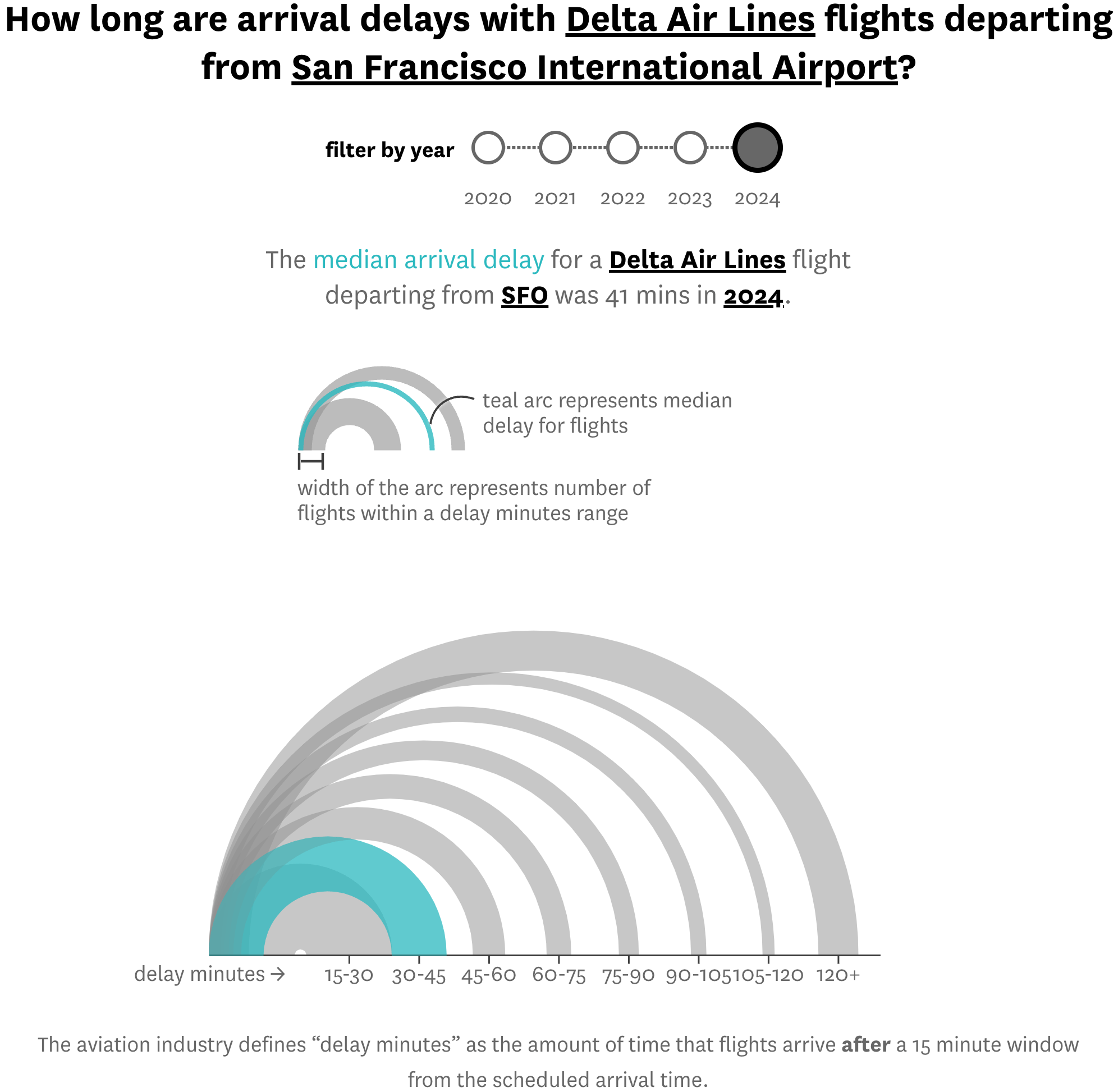
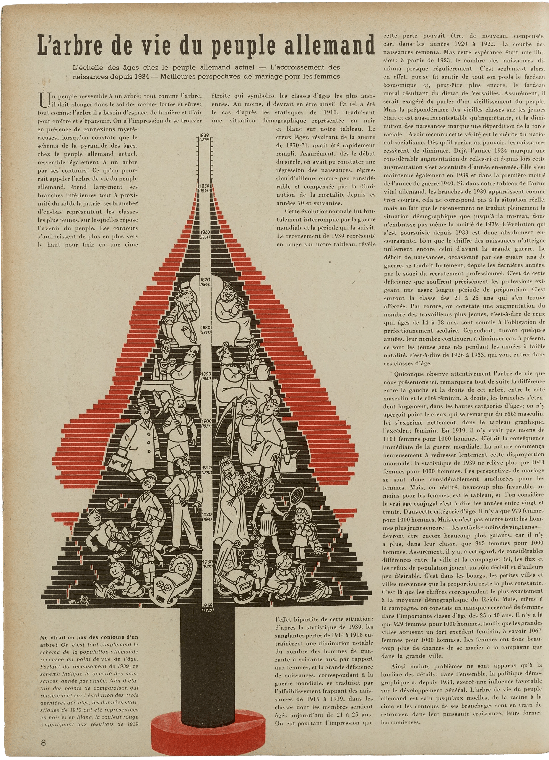
Data Vis Dispatch, June 3: Education, politics, and Germany

Welcome back to the 195th edition of Data Vis Dispatch! Every week, we’ll be publishing a collection of the best small and large data visualizations we find, especially from news organizations — to celebrate data journalism, data visualization, simple charts, elaborate maps, and their creators.
Recurring topics this week include education and politics around the world, as well as a closer look at life in Germany.
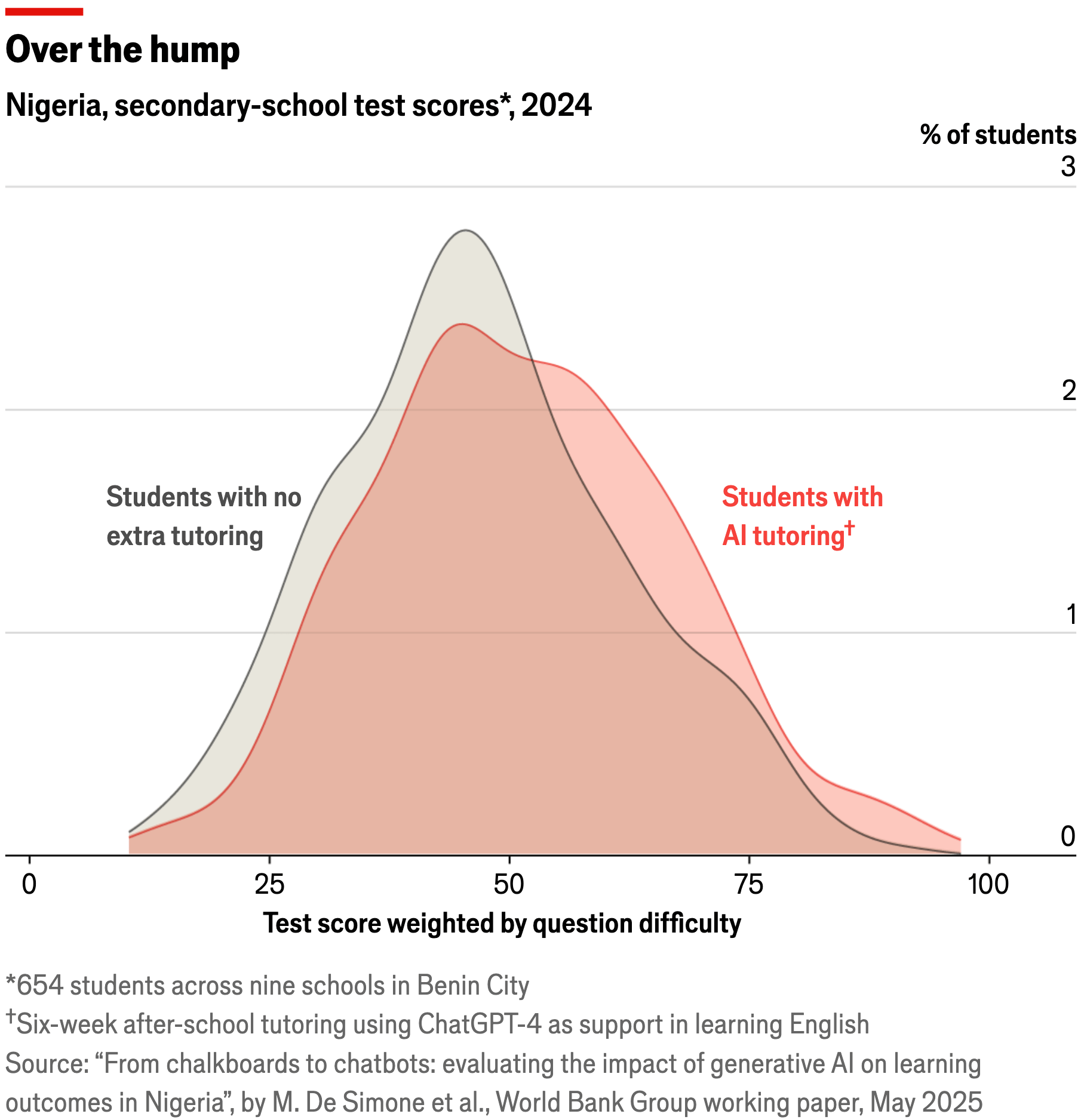
In our reader survey, some of you said they'd like to see more data vis on education. We've been keeping our eyes open and are happy to report that we found some!

As usual, several newsrooms covered current and past elections:
![Gazeta Wyborcza: <a href="https://biqdata.wyborcza.pl/biqdata/7,159116,31990762,wyniki-wyborow-na-mapie-zobacz-jak-glosowali-twoi-sasiedzi.html"><strong>Wyniki wyborów na mapie. Zobacz, jak głosowali twoi sąsiedzi</strong></a> [<em>Chart tile: Presidential election. Winner in the second round</em>], June 2](https://datawrapper.de/cdn-cgi/image/quality=85,width=1794,f=auto,fit=cover/https://kirby.datawrapper.de/media/pages/blog/data-vis-dispatch-june-3-2025/4d76c4d27e-1748963944/cleanshot-2025-06-03-at-13.16.06@2x.png)
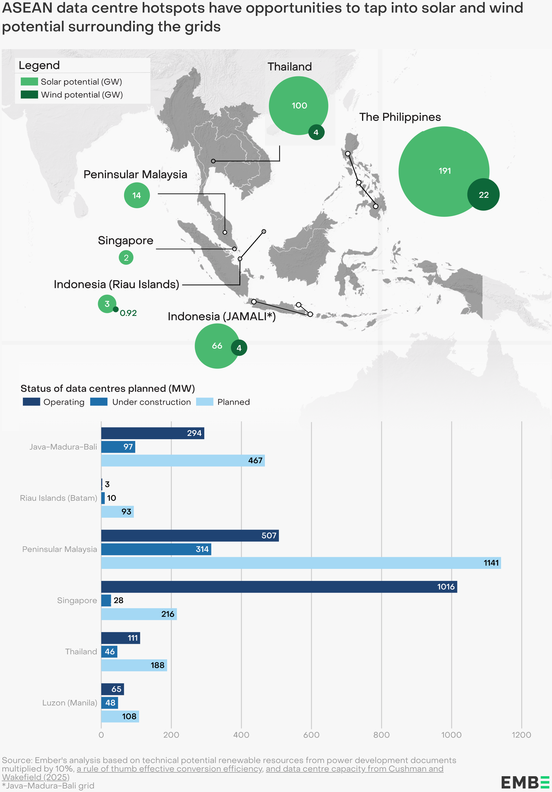
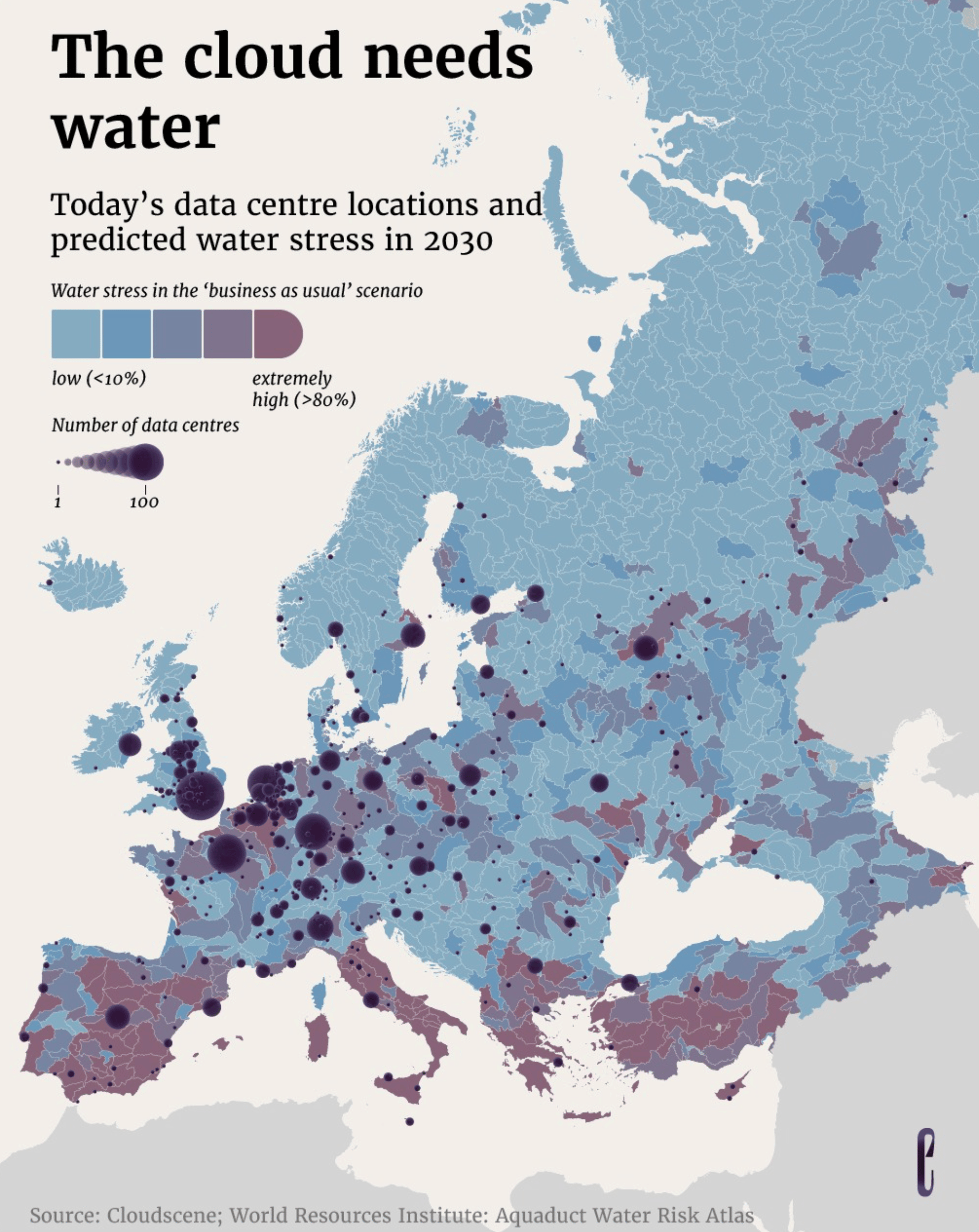
We collected two graphics about the relationship of data centres and their resource needs:
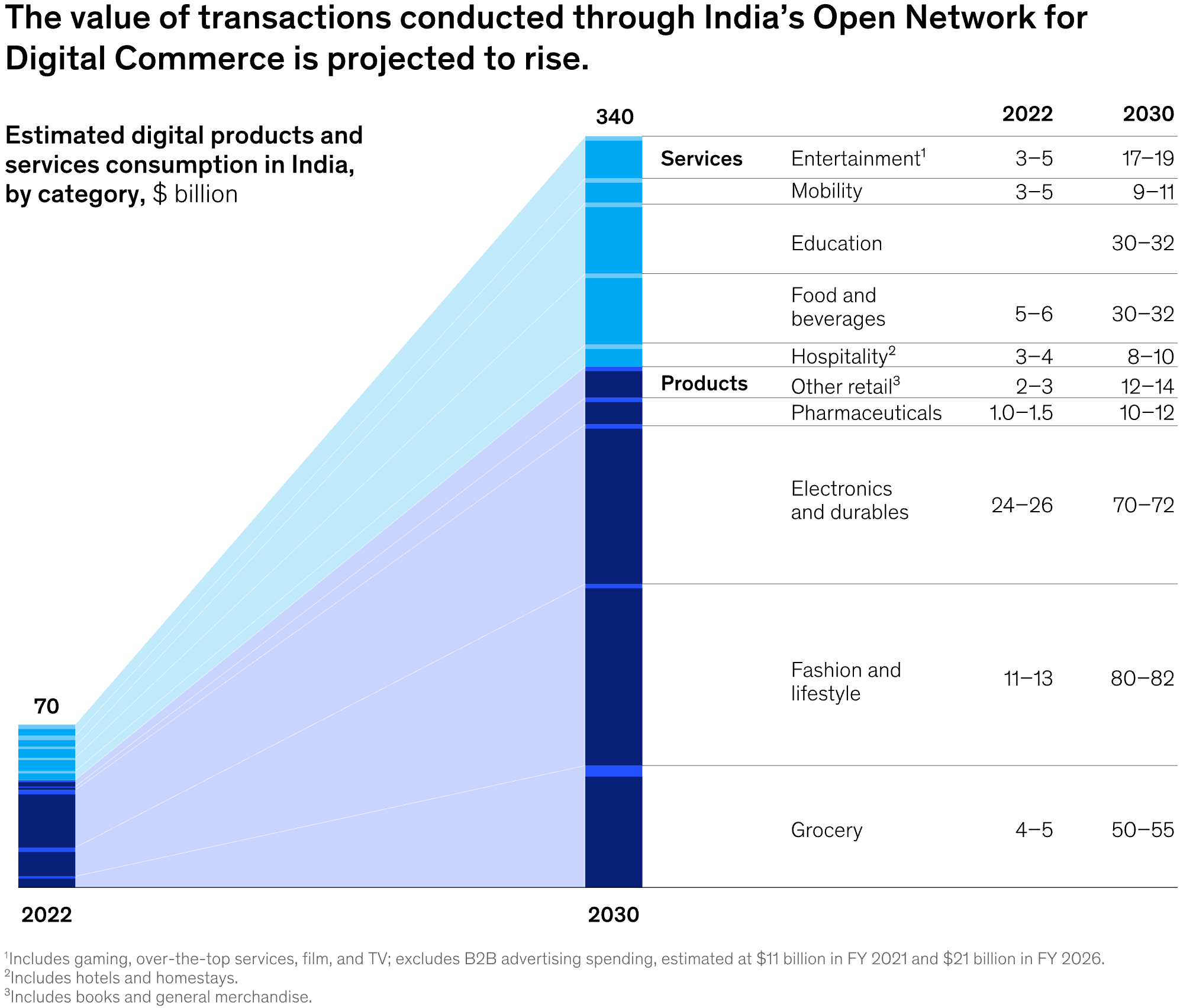
And here's a pair of visualizations about changes in India's economy:
![Data for India: "Over time, India’s economy has steadily moved away from its dependence on agriculture […]," May 30 (<a href="https://bsky.app/profile/dataforindia.bsky.social/post/3lqec5yrgfc2y"><strong>Bluesky</strong></a>)](https://datawrapper.de/cdn-cgi/image/quality=85,width=1776,f=auto,fit=cover/https://kirby.datawrapper.de/media/pages/blog/data-vis-dispatch-june-3-2025/6230651048-1748873877/cleanshot-2025-06-02-at-16.16.27@2x.png)
Our friends at Die Zeit took a close look at housing, employment, and car preferences in Germany:
![Die Zeit: <a href="https://www.zeit.de/wirtschaft/2025-05/mietpreise-immobilien-deutschland-staedte-stadtteile"><strong>Das sind die teuersten und günstigsten Stadtteile Deutschlands</strong></a><strong> </strong>[<em>Chart description: German neighborhood rent prices (Y) plotted against average monthly income of respective renters (X)</em>], May 28](https://datawrapper.de/cdn-cgi/image/quality=85,width=2064,f=auto,fit=cover/https://kirby.datawrapper.de/media/pages/blog/data-vis-dispatch-june-3-2025/dff6ce3c72-1748871432/cleanshot-2025-06-02-at-15.36.28@2x.png)
![Die Zeit: <a href="https://www.zeit.de/arbeit/2025-06/fachkraeftemangel-berufe-nachwuchs-arbeitnehmer-daten"><strong>In diesen Branchen werden dringend Mitarbeiter gesucht</strong></a><strong> </strong>[<em>Employees are urgently needed in these sectors</em>], June 3](https://datawrapper.de/cdn-cgi/image/quality=85,width=2352,f=auto,fit=cover/https://kirby.datawrapper.de/media/pages/blog/data-vis-dispatch-june-3-2025/49be01ffee-1748947891/cleanshot-2025-06-03-at-12.51.02@2x.png)
![Die Zeit: <a href="https://www.zeit.de/mobilitaet/2025-05/zugelassene-autos-modelle-marken-karte-deutschland-statistik"><strong>Diese Autos fahren in Ihrer Gegend</strong></a> [<em>These cars drive around your area</em>], May 30](https://datawrapper.de/cdn-cgi/image/quality=85,width=1700,f=auto,fit=cover/https://kirby.datawrapper.de/media/pages/blog/data-vis-dispatch-june-3-2025/1fa8b22785-1748964426/cleanshot-2025-06-02-at-15.33.49@2x.png)
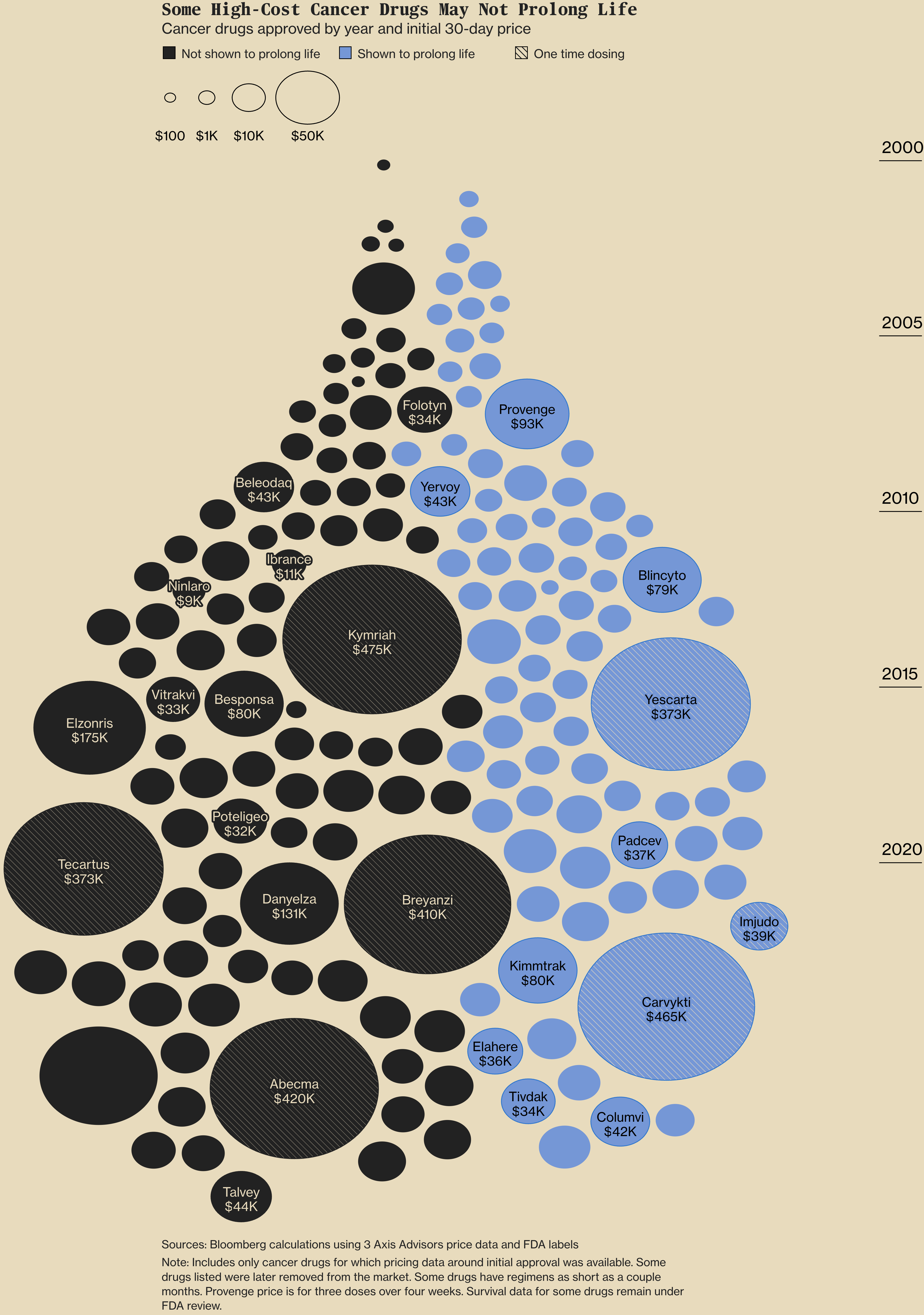
Here's a mixed-topic selection of different ways to scatter circles on a plot — or ovals, in Bloomberg's case:
![Le Monde: <a href="https://www.lemonde.fr/les-decodeurs/article/2025/05/29/comment-le-service-est-devenu-decisif-dans-le-tennis-moderne_6609081_4355770.html"><strong>Comment le service est devenu décisif dans le tennis moderne</strong></a> [<em>How the serve has become decisive in modern tennis</em>], May 29](https://datawrapper.de/cdn-cgi/image/quality=85,width=1170,f=auto,fit=cover/https://kirby.datawrapper.de/media/pages/blog/data-vis-dispatch-june-3-2025/200e0ae813-1748873319/cleanshot-2025-06-02-at-16.08.22@2x.png)
And we're wrapping up this week with a batch of maps, charts, and dashboards we found beautiful or interesting:

![Neue Zürcher Zeitung: <a href="https://www.nzz.ch/visuals/operation-spinnennetz-so-verlief-der-ukrainische-angriff-aus-dem-drohnen-container-ld.1887155"><strong>So verlief der ukrainische Angriff aus dem Drohnen-Container</strong></a> [<em>How the Ukrainian attack from the drone container unfolded</em>], June 3](https://datawrapper.de/cdn-cgi/image/quality=85,width=2750,f=auto,fit=cover/https://kirby.datawrapper.de/media/pages/blog/data-vis-dispatch-june-3-2025/11545e045c-1748966462/cleanshot-2025-06-03-at-18.00.29@2x.png)
![Beyond Words Studio: "Pain is a universal human experience. Yet one that’s too often dismissed, stigmatised or misunderstood […]," May 29 (<a href="https://www.linkedin.com/company/beyond-words-studio/posts/?feedView=all"><strong>LinkedIn</strong></a>, <a href="https://www.haleon.com/our-impact/pain-index/personal-impact"><strong>Tool</strong></a>) <span class="badge">Nice interactions</span>](https://datawrapper.de/cdn-cgi/image/quality=85,width=2012,f=auto,fit=cover/https://kirby.datawrapper.de/media/pages/blog/data-vis-dispatch-june-3-2025/f4e2501501-1748946960/cleanshot-2025-06-03-at-12.35.30@2x.png)
What else we found interesting
![Die Zeit: <a href="https://www.zeit.de/wissen/2025-05/protein-bedarf-ernaehrung-lebensmittel-alltag-sport"><strong>Wie viel Protein Sie wirklich brauchen</strong></a><strong> </strong>[<em>How much protein you really need</em>], May 27](https://datawrapper.de/cdn-cgi/image/quality=85,width=1335,f=auto,fit=cover/https://kirby.datawrapper.de/media/pages/blog/data-vis-dispatch-june-3-2025/6d7dcc5a8d-1748871187/cleanshot-2025-06-02-at-15.32.31@2x.png)
![Der Spiegel: <a href="https://www.spiegel.de/wissenschaft/technik/ukraine-russlands-drohnenangriff-auf-tschernobyl-grafikanalyse-zu-schaeden-und-reparaturen-a-c3b7fcef-fee9-4b48-92e6-8479b3ccf0e2"><strong>Warum es so schwierig ist, die Schutzhülle von Tschernobyl zu reparieren</strong></a><strong> </strong>[<em>Why it is so difficult to repair the Chernobyl protective shell</em>], May 29](https://datawrapper.de/cdn-cgi/image/quality=85,width=3090,f=auto,fit=cover/https://kirby.datawrapper.de/media/pages/blog/data-vis-dispatch-june-3-2025/17c7f02a05-1748947537/cleanshot-2025-06-03-at-12.45.14@2x.png)
Applications are open for…
A multimedia editor and database developer at The New York Times
A DC data reporter at The New York Times
A senior lecturer in computer science at giCentre, London
Help us make this dispatch better! We’d love to hear which newsletters, blogs, or social media accounts we need to follow to learn about interesting projects, especially from less-covered parts of the world (Asia, South America, Africa). Write us at hello@datawrapper.de or leave a comment below. Want the Dispatch in your inbox every Tuesday? Sign up for our Blog Update newsletter!


