Data Vis Dispatch, June 10: Wildfires, ocean health, and solar energy

Welcome back to the 196th edition of Data Vis Dispatch! Every week, we’ll be publishing a collection of the best small and large data visualizations we find, especially from news organizations — to celebrate data journalism, data visualization, simple charts, elaborate maps, and their creators.
Recurring topics this week include Canadian wildfires, the health of our oceans, and the ongoing rise of solar energy.
Wildfires in Canada have left their mark in the air and on the web, with many visualizations of air quality in the Northern Hemisphere:
![Nael Shiab: "Just updated our Climate Dashboard this morning to add air quality warnings […]," June 3 (<a href="https://bsky.app/profile/naelshiab.bsky.social/post/3lqpixxqcm22a"><strong>Bluesky</strong></a>, <a href="https://newsinteractives.cbc.ca/features/2023/climate-dashboard/"><strong>Tool</strong></a>)<strong> </strong><span class="badge">Outstanding tool</span>](https://datawrapper.de/cdn-cgi/image/quality=85,width=1634,f=auto,fit=cover/https://kirby.datawrapper.de/media/pages/blog/data-vis-dispatch-june-10-2025/d01d1c45eb-1749543086/cleanshot-2025-06-10-at-10.06.08@2x.png)
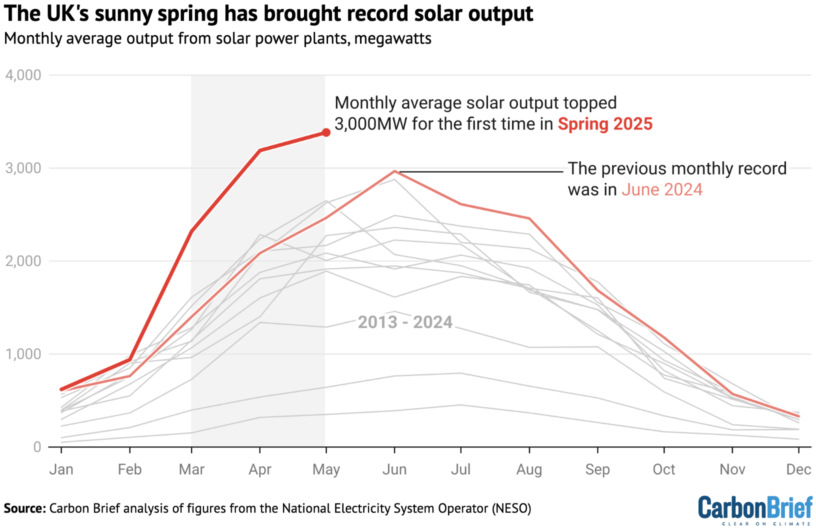
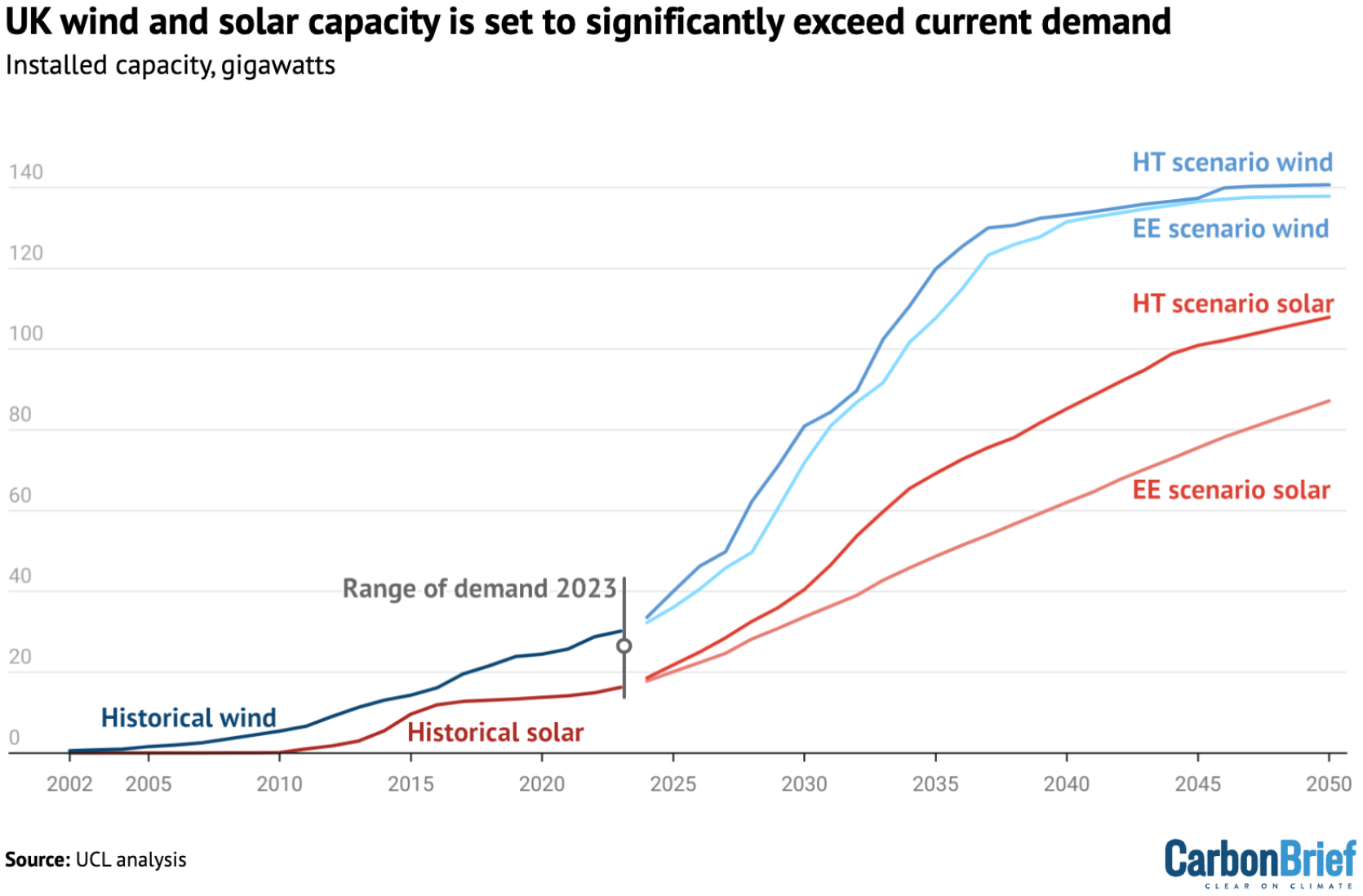
Where the skies weren't hazy, solar energy continued its rise:
![edDiario.es: <a href="https://www.eldiario.es/economia/cambiaria-sistema-electrico-espana-baterias-cubrir-28-demanda-nocturna_1_12360562.html"><strong>¿Cómo cambiaría el sistema eléctrico en España con baterías? Así podrían cubrir hasta un 28% de la demanda nocturna</strong></a> [<em>Chart title: How electricity generation has changed in California versus Spain</em>], June 8](https://datawrapper.de/cdn-cgi/image/quality=85,width=1970,f=auto,fit=cover/https://kirby.datawrapper.de/media/pages/blog/data-vis-dispatch-june-10-2025/702fec4cea-1749543486/cleanshot-2025-06-10-at-10.17.22@2x.png)
![Frankfurter Allgemeine Zeitung: <a href="https://www.faz.net/aktuell/wirtschaft/schneller-schlau/kreislaufwirtschaft-kommt-in-deutschland-nicht-voran-diese-laender-liegen-vorn-110504856.html"><strong>Die Kreislaufwirtschaft kommt in Deutschland nicht voran</strong></a> [<em>The circular economy is not making progress in Germany</em>], June 2](https://datawrapper.de/cdn-cgi/image/quality=85,width=1378,f=auto,fit=cover/https://kirby.datawrapper.de/media/pages/blog/data-vis-dispatch-june-10-2025/9d65ecf6bb-1749547290/cleanshot-2025-06-10-at-11.19.41@2x.png)
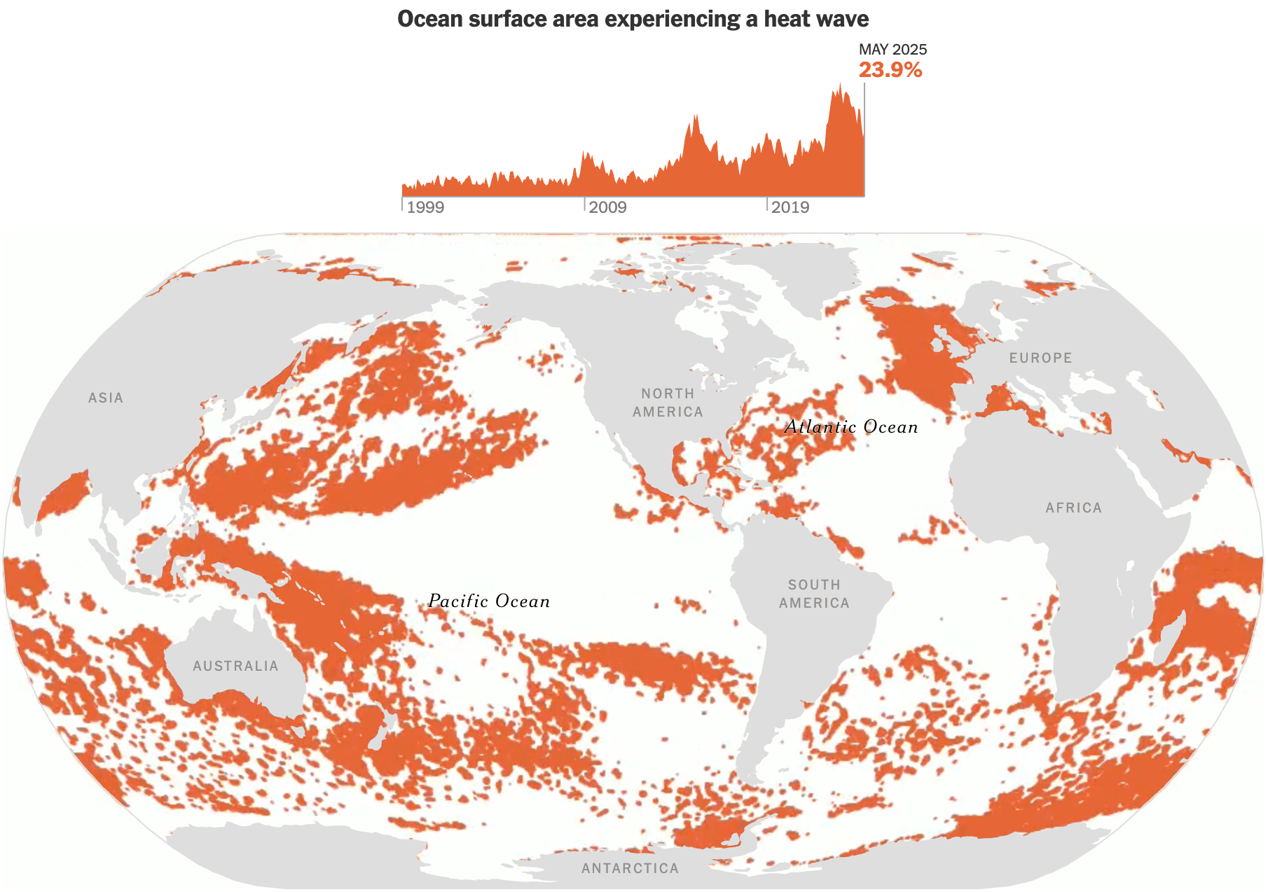
While warm and sunny weather might be nice for solar energy, ocean ecosystems are suffering under the changing climate:
![Der Spiegel: <a href="https://www.spiegel.de/wissenschaft/natur/ozeane-diese-fuenf-grafiken-zeigen-wie-meer-und-bewohner-leiden-a-5de96758-8701-4be3-97ba-734c8040403a?giftToken=61c8363d-c3c0-44d5-8cb1-9595b52ec808"><strong>So leiden die Meere und ihre Bewohner</strong></a> [<em>How the oceans and their inhabitants are suffering</em>], June 9](https://datawrapper.de/cdn-cgi/image/quality=85,width=2008,f=auto,fit=cover/https://kirby.datawrapper.de/media/pages/blog/data-vis-dispatch-june-10-2025/b944898fed-1749548887/cleanshot-2025-06-10-at-11.47.36@2x.png)
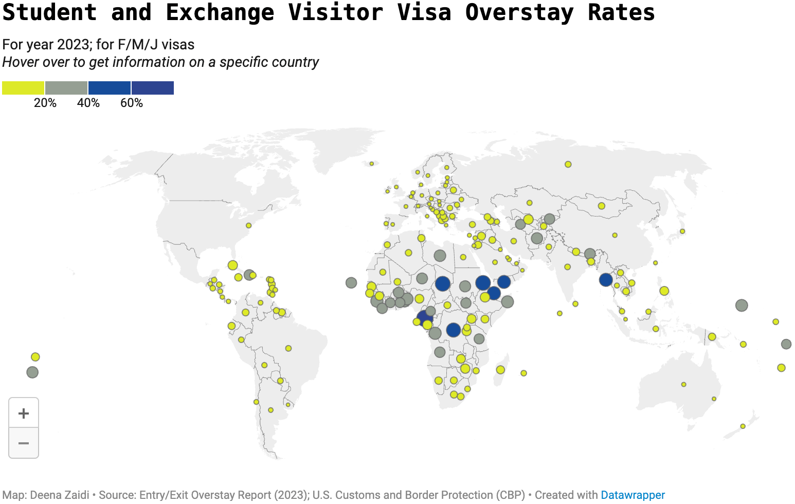
Last week, many news graphics revolved around developments in U.S. travel, thanks to the Trump effect and a new list of banned countries:
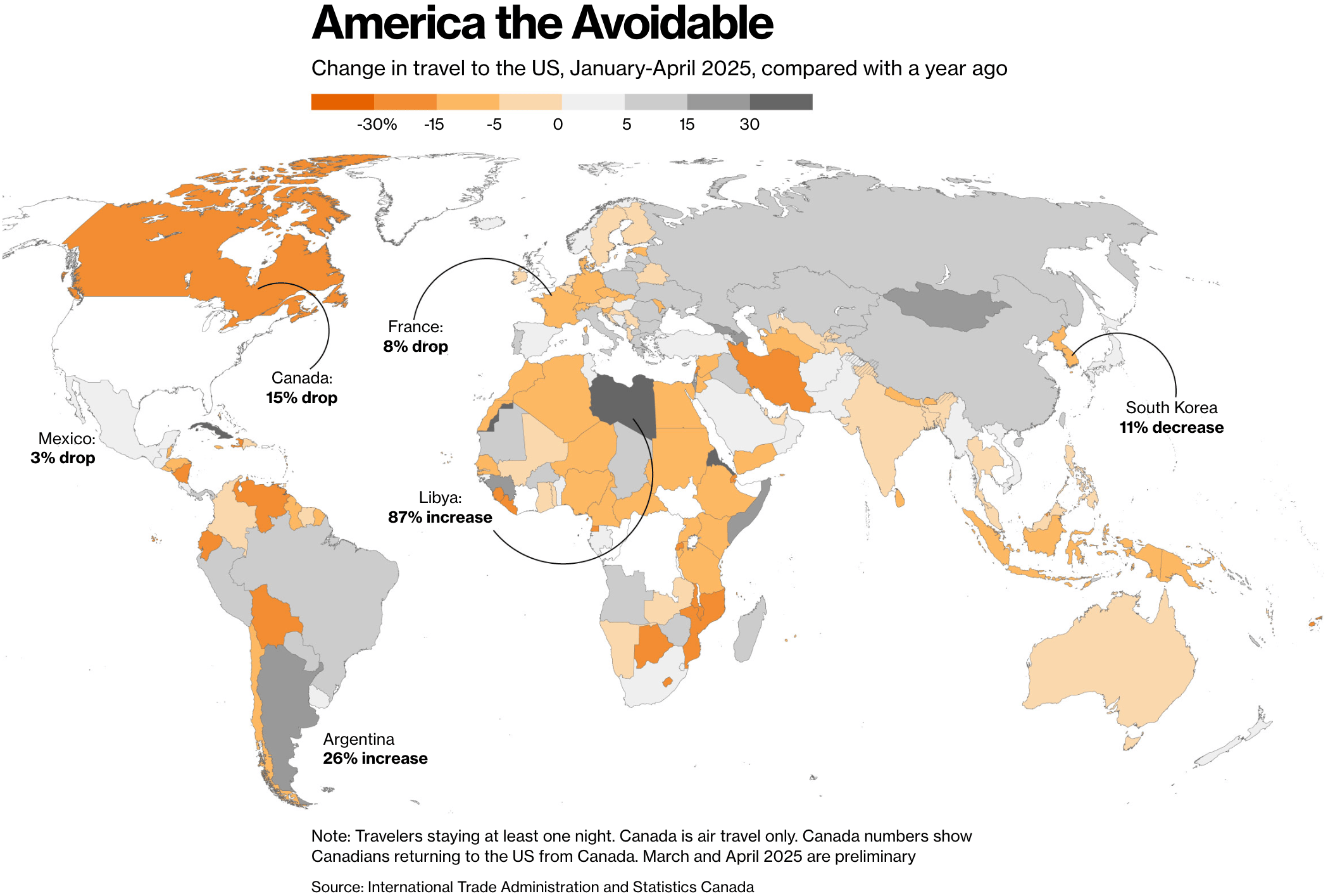
![Neue Zürcher Zeitung: <a href="https://www.nzz.ch/visuals/wegen-trump-bleiben-schweizer-und-deutsche-den-usa-fern-neue-zahlen-zeigen-ein-anderes-bild-ld.1887243"><strong>Wegen Trump bleiben Schweizer und Deutsche den USA fern? Neue Zahlen zeigen ein anderes Bild</strong></a> [<em>Are Swiss and Germans staying away from the USA because of Trump? New figures show a different picture</em>], June 7](https://datawrapper.de/cdn-cgi/image/quality=85,width=1292,f=auto,fit=cover/https://kirby.datawrapper.de/media/pages/blog/data-vis-dispatch-june-10-2025/823a15078b-1749544207/cleanshot-2025-06-10-at-10.29.41@2x.png)
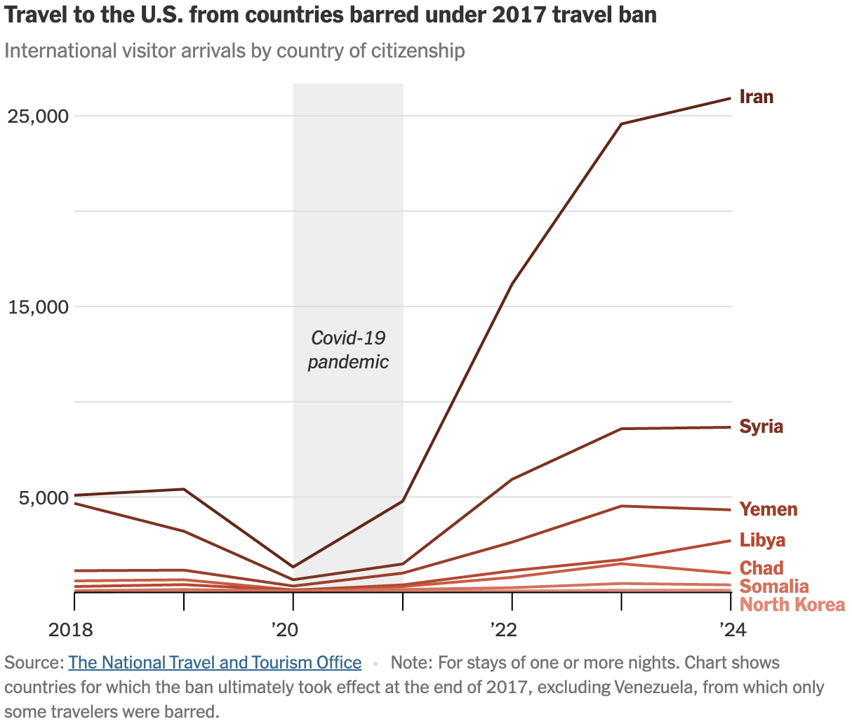
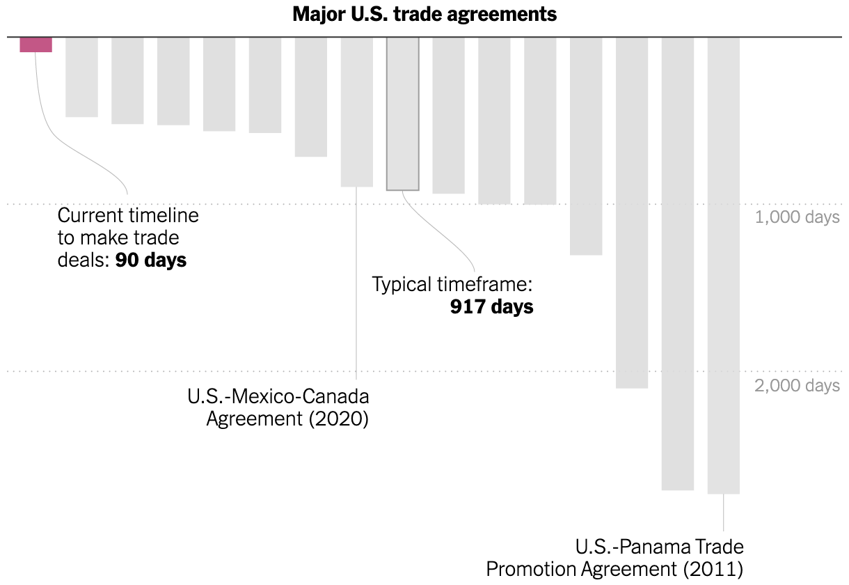
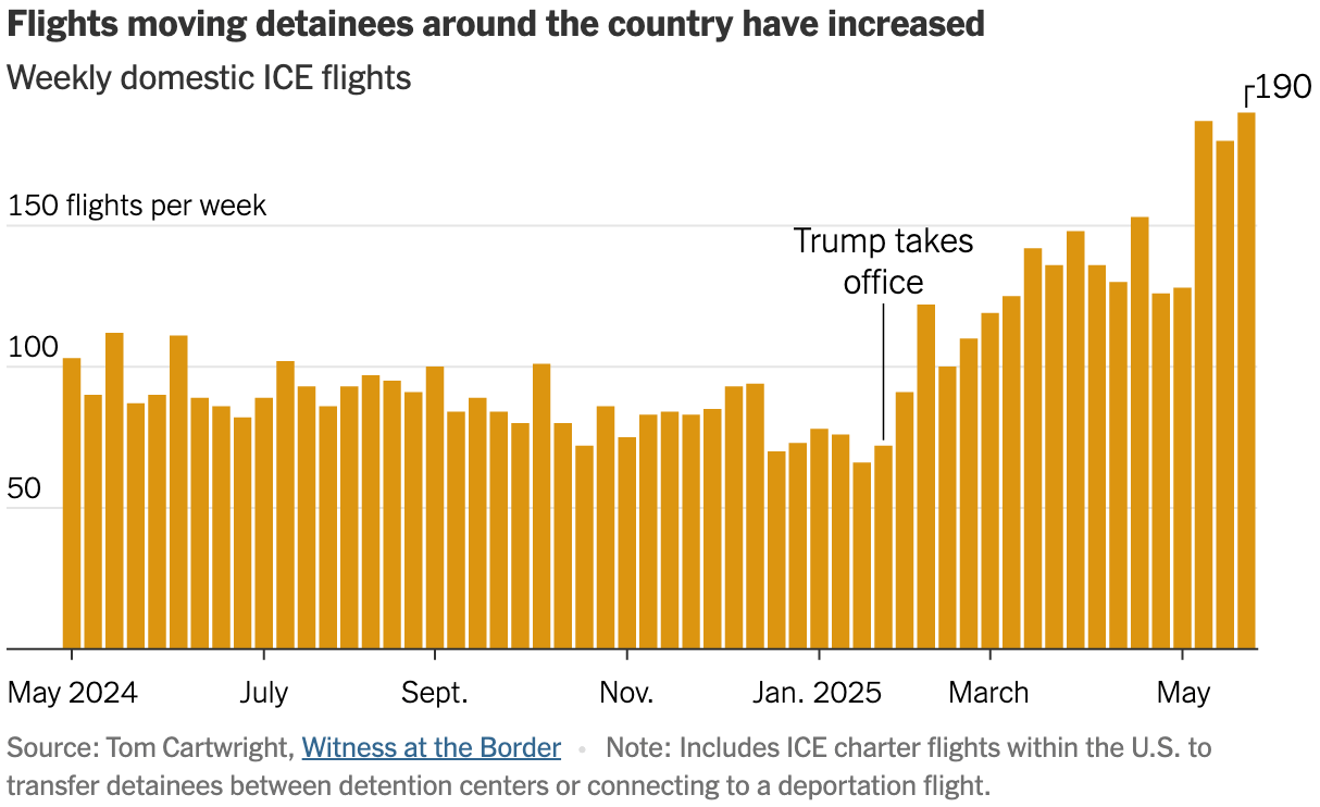
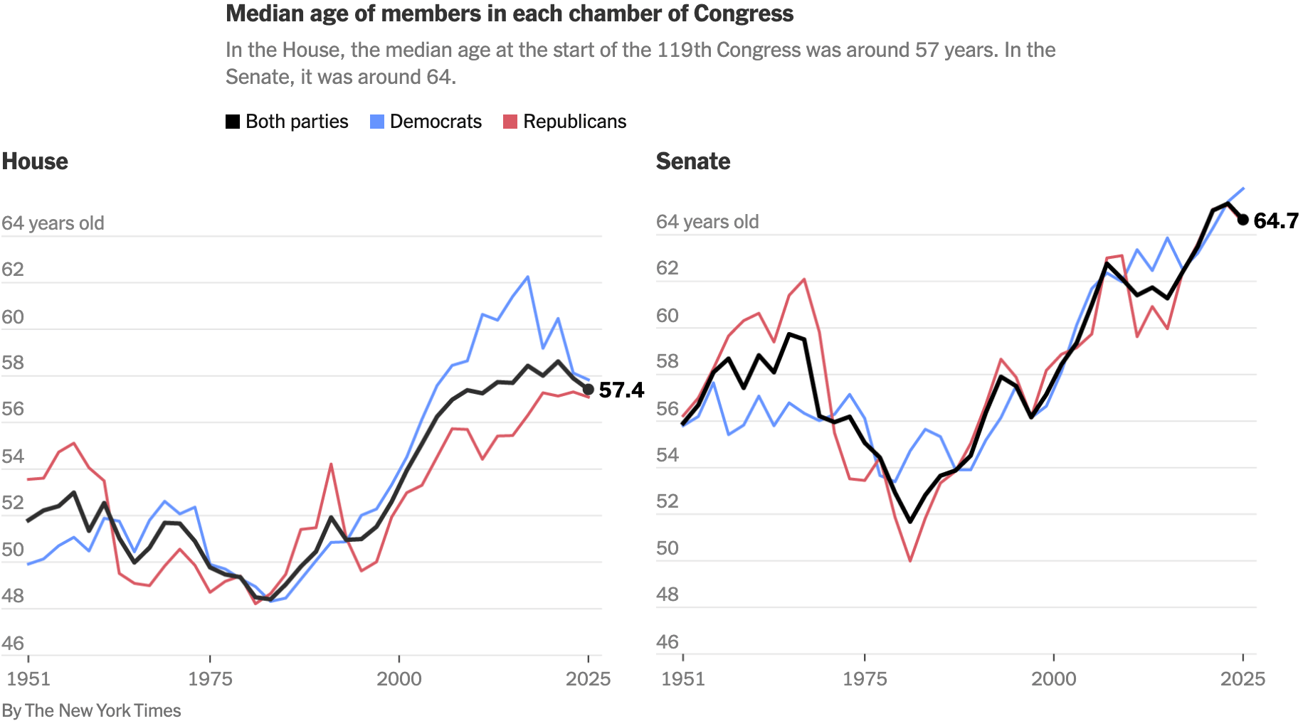
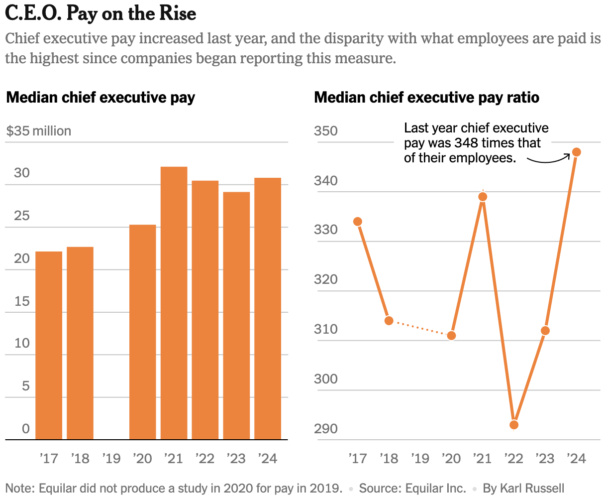
A range of visualizations from the New York Times covered deportations, trade, and cuts to science funding in the U.S.:

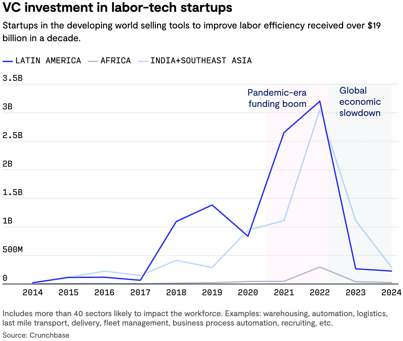
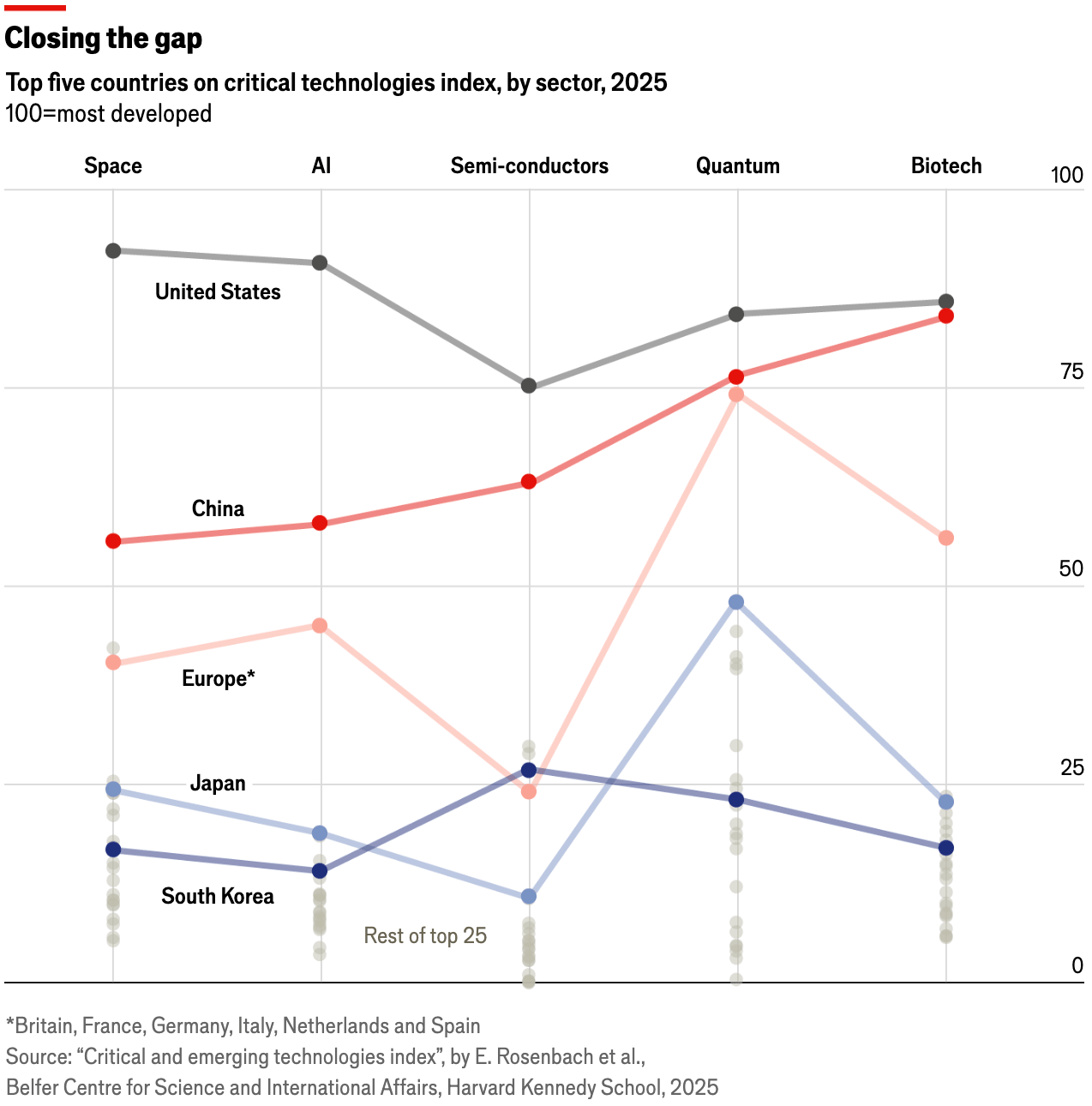
These line charts covered the intersection of technology and the economy:
![Atlatszo: <a href="https://atlatszo.hu/adat/2025/06/07/150-milliardot-esett-a-tesla-piaci-erteke-miutan-elon-musk-es-donald-trump-nyilvanosan-osszeveszett/"><strong>150 milliárdot esett a Tesla piaci értéke, miután Elon Musk és Donald Trump nyilvánosan összeveszett</strong></a> [<em>Tesla's market value fell by $150 billion after Elon Musk and Donald Trump publicly clashed</em>], June 7](https://datawrapper.de/cdn-cgi/image/quality=85,width=1498,f=auto,fit=cover/https://kirby.datawrapper.de/media/pages/blog/data-vis-dispatch-june-10-2025/9a1c7eab79-1749552746/cleanshot-2025-06-10-at-12.52.13@2x.png)
We happened to notice two great maps using data from Brazil's 2022 census:
![Folha de S.Paulo: <a href="https://www1.folha.uol.com.br/cotidiano/2025/06/veja-o-perfil-de-cada-religiao-e-todos-os-dados-que-importam-do-censo-2022-em-graficos.shtml"><strong>Veja o perfil de cada religião e todos os dados que importam do Censo 2022 em gráficos</strong></a> [<em>See the profile of each religion and all the data that matters from the 2022 Census in graphs</em>], June 6](https://datawrapper.de/cdn-cgi/image/quality=85,width=1260,f=auto,fit=cover/https://kirby.datawrapper.de/media/pages/blog/data-vis-dispatch-june-10-2025/5e5252bf19-1749545300/cleanshot-2025-06-10-at-10.47.58@2x.png)
![Nexo: <a href="https://www.nexojornal.com.br/grafico/2025/06/06/brasil-religiao-populacao-religiosa-dados-censo-2022"><strong>A religião da população brasileira no Censo de 2022</strong></a> [<em>The religion of the Brazilian population in the 2022 Census</em>] June 6](https://datawrapper.de/cdn-cgi/image/quality=85,width=1176,f=auto,fit=cover/https://kirby.datawrapper.de/media/pages/blog/data-vis-dispatch-june-10-2025/424a89f842-1749545740/cleanshot-2025-06-10-at-10.54.37@2x.png)
And at the end of this edition comes data vis on health, wealth, sports, and birds:
![Neue Zürcher Zeitung: <a href="https://www.nzz.ch/visuals/aktuell/ein-dorf-verschwindet-der-bergsturz-von-blatten-in-3-d-ld.1888058"><strong>Ein Dorf verschwindet: Der Bergsturz von Blatten in 3-D</strong></a> [<em>A village disappears: The Blatten landslide in 3-D</em>], June 9](https://datawrapper.de/cdn-cgi/image/quality=85,width=1290,f=auto,fit=cover/https://kirby.datawrapper.de/media/pages/blog/data-vis-dispatch-june-10-2025/626e195579-1749544100/cleanshot-2025-06-10-at-10.27.54@2x.png)
![Beyond Words Studio: "[…] We created a series of creative yet easy-to-read data visualizations that show how people buy train tickets at 428 stations across England […]," June 6 (<a href="https://www.linkedin.com/company/beyond-words-studio/posts/"><strong>LinkedIn</strong></a>)](https://datawrapper.de/cdn-cgi/image/quality=85,width=1921,f=auto,fit=cover/https://kirby.datawrapper.de/media/pages/blog/data-vis-dispatch-june-10-2025/76f261180d-1749546905/1749200737276.jpeg)
![Maps Mania: "The ADS-B Massive Visualizer now maps 1.5 billion eBird observations […]," June 6 (<a href="https://googlemapsmania.blogspot.com/2025/06/mapping-billion-birds.html"><strong>Blog</strong></a>, <a href="https://adsb.exposed/?dataset=Birds"><strong>Tool</strong></a>) <span class="badge">Huge database</span>](https://datawrapper.de/cdn-cgi/image/quality=85,width=2972,f=auto,fit=cover/https://kirby.datawrapper.de/media/pages/blog/data-vis-dispatch-june-10-2025/bcd2cc3477-1749544606/cleanshot-2025-06-10-at-10.36.29@2x.png)
What else we found interesting
Applications are open for…
A design principal at Clever Franke
A graphics/multimedia editor at The New York Times
A DC data reporter at The New York Times
Help us make this dispatch better! We’d love to hear which newsletters, blogs, or social media accounts we need to follow to learn about interesting projects, especially from less-covered parts of the world (Asia, South America, Africa). Write us at hello@datawrapper.de or leave a comment below. Want the Dispatch in your inbox every Tuesday? Sign up for our Blog Update newsletter!


