Data Vis Dispatch, July 29: U.S. tariffs, humanitarian crisis in Gaza, and more

Welcome back to the 203rd edition of Data Vis Dispatch! Every week, we’ll be publishing a collection of the best small and large data visualizations we find, especially from news organizations — to celebrate data journalism, data visualization, simple charts, elaborate maps, and their creators.
Recurring topics this week include U.S. tariffs, the humanitarian crisis in Gaza, and more.
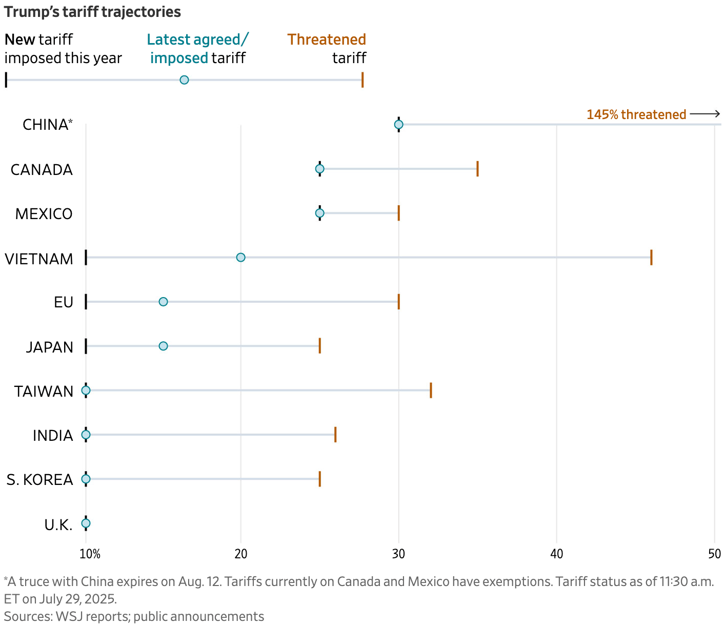
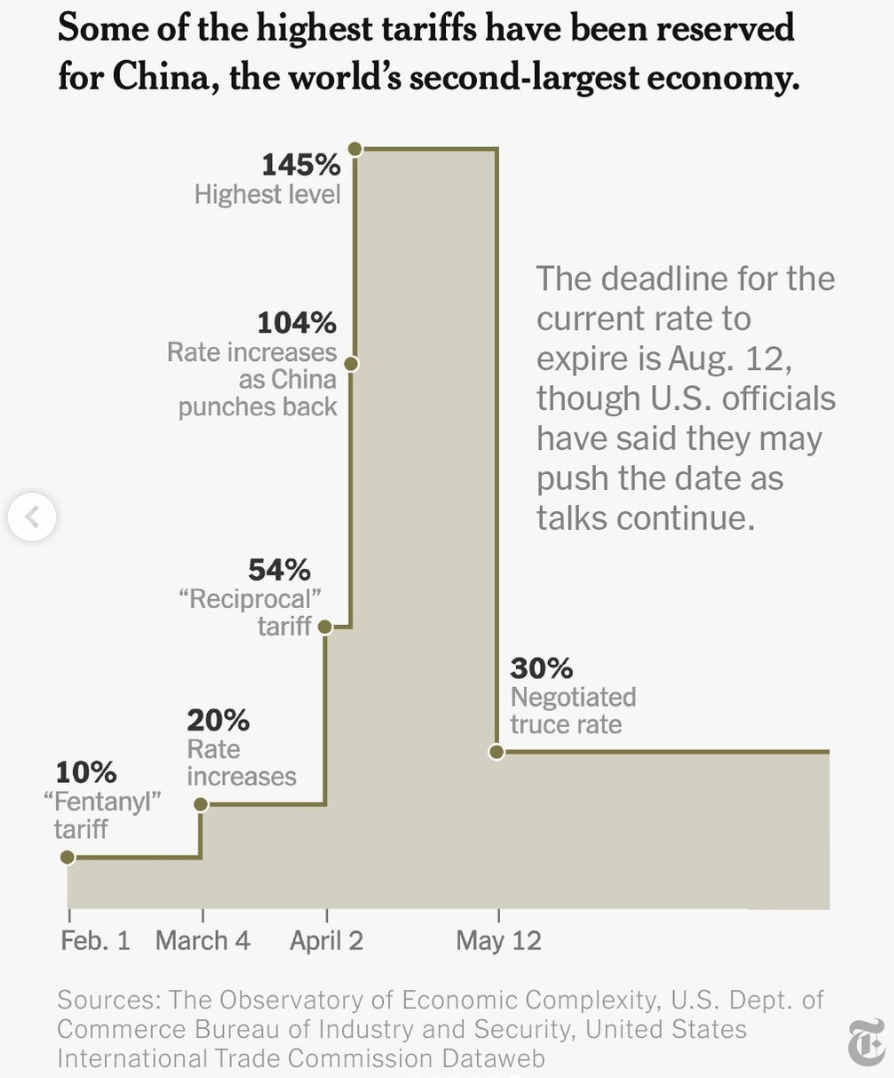
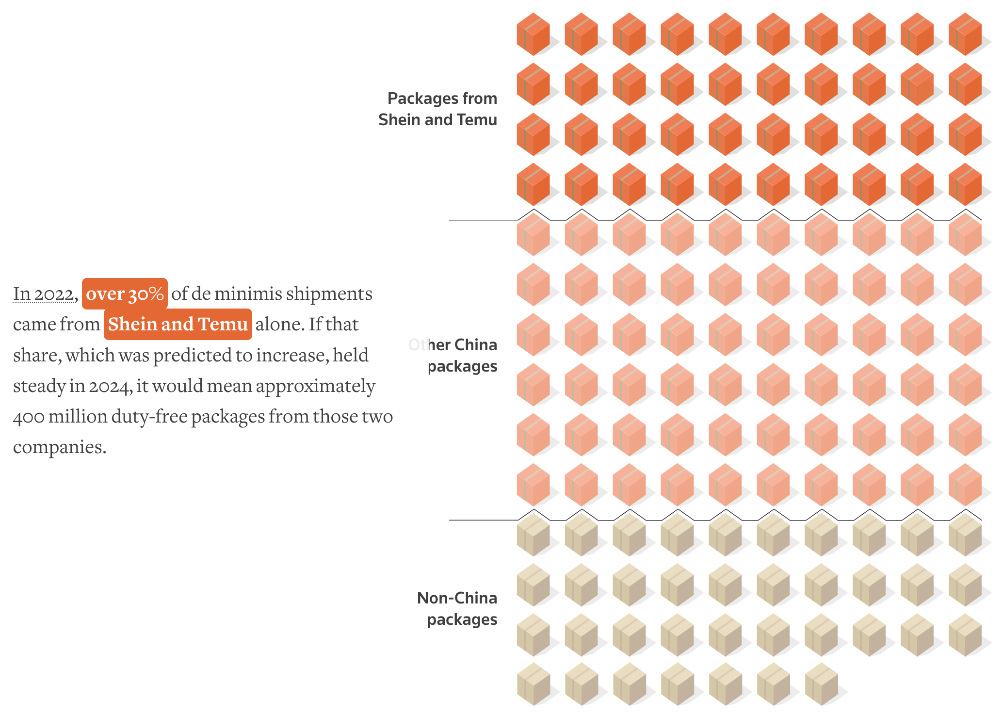
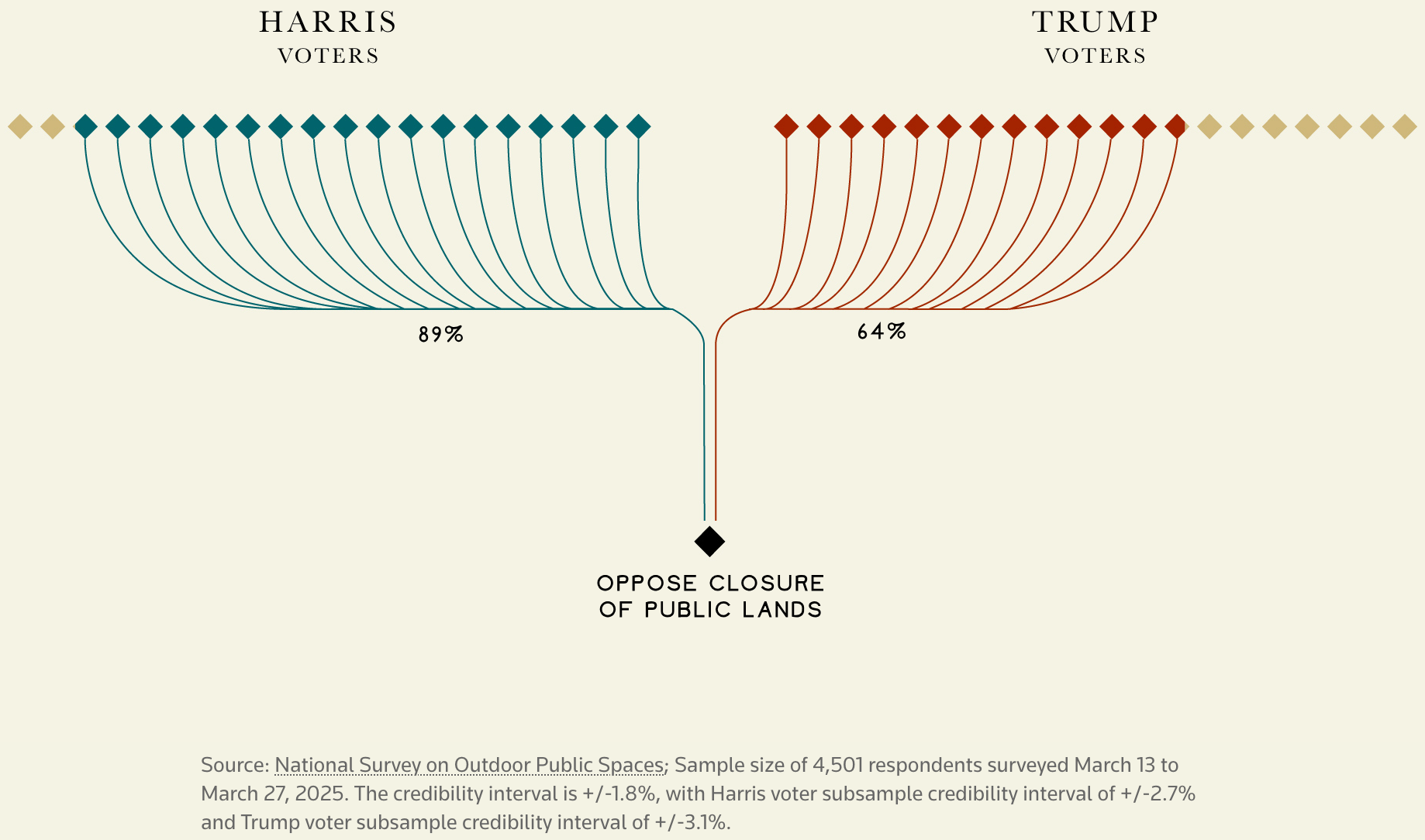
This week, international tariffs, both threatened and imposed, lead the U.S. coverage, followed by protection of public lands, and words on the streets of New York City.
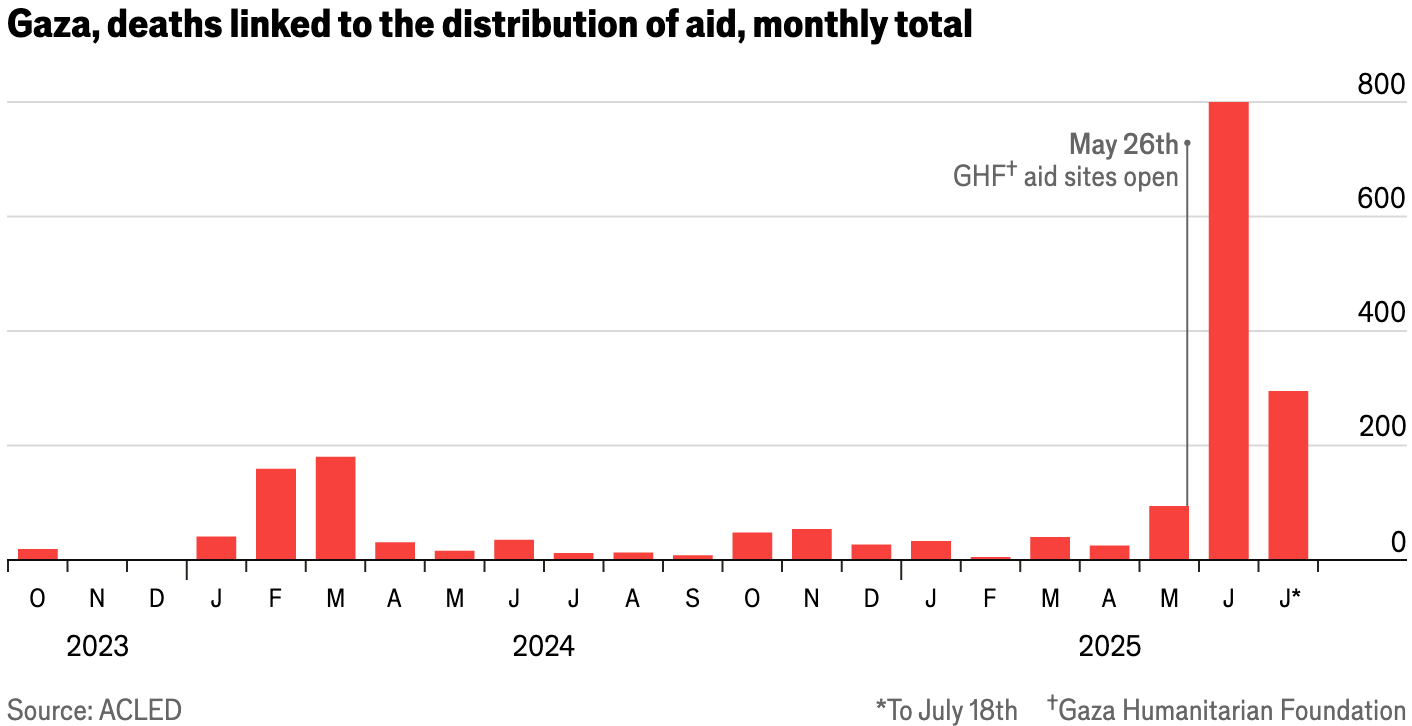
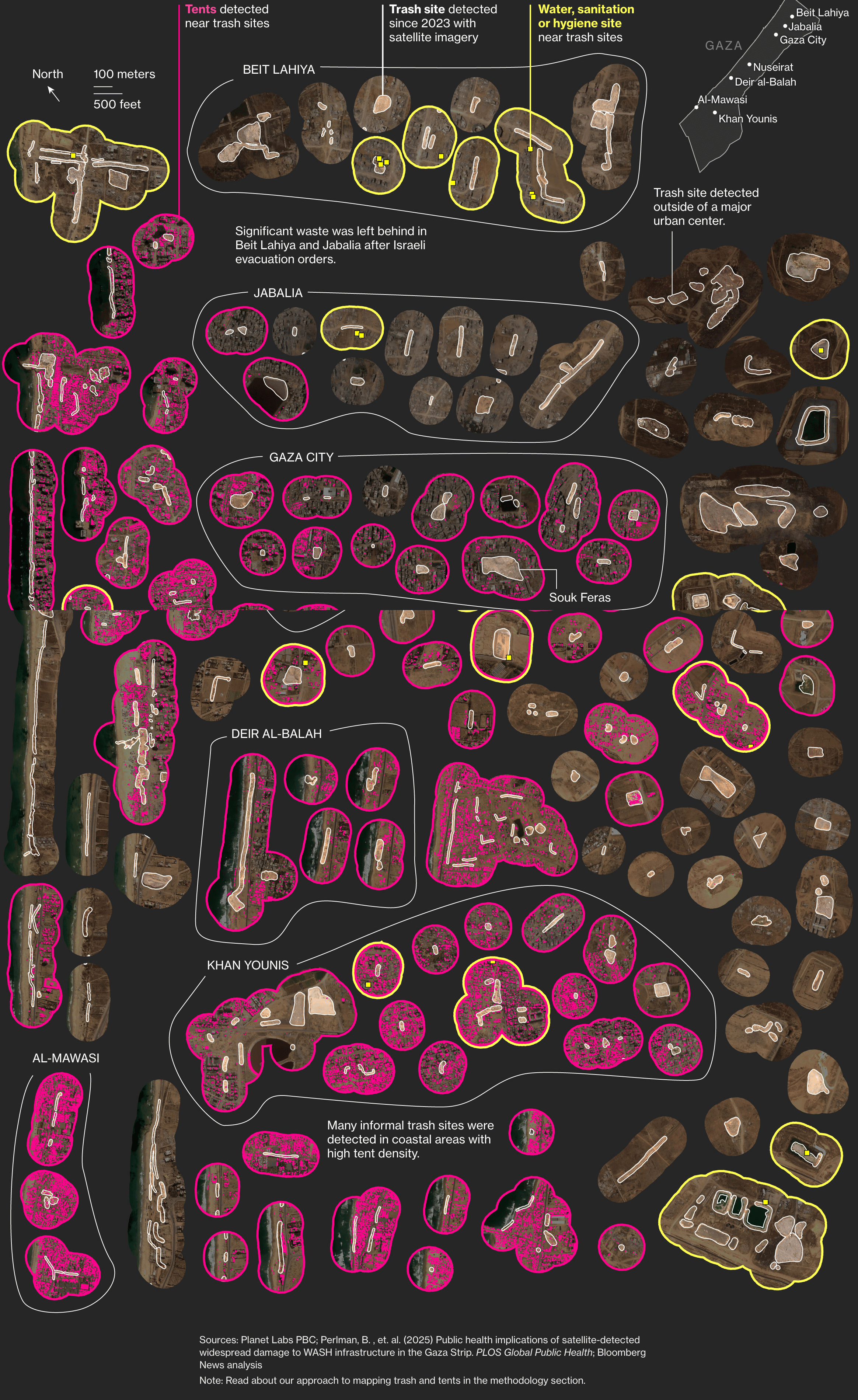
The humanitarian crisis in Gaza keeps worsening on different fronts, from insufficient food supplies, to closed hospitals, and environmental concerns.
![The Wall Street Journal: "Palestinians across the Gaza Strip are facing a daily struggle to find food as supplies entering the besieged enclave have diminished since Israel overhauled the aid-distribution system in May. [...]," July 28 (<a href="https://www.instagram.com/p/DMqSaI4PPM1/"><strong>Instagram</strong></a>)](https://datawrapper.de/cdn-cgi/image/quality=85,width=946,f=auto,fit=cover/https://kirby.datawrapper.de/media/pages/blog/data-vis-dispatch-july-29-2025/11efe18869-1753806446/cleanshot-2025-07-29-at-18.27.07@2x.png)
![Die Zeit: <a href="https://www.zeit.de/politik/ausland/2025-07/israelische-angriffe-gaza-kriegsverbrechen-krankenhaus-satellitenbilder"><strong>Wo Krankenhäuser den Tod bedeuten</strong></a><strong> </strong>[<em>Where hospitals mean death</em>], July 24](https://datawrapper.de/cdn-cgi/image/quality=85,width=2850,f=auto,fit=cover/https://kirby.datawrapper.de/media/pages/blog/data-vis-dispatch-july-29-2025/d69a3743f9-1753805847/cleanshot-2025-07-29-at-18.16.41@2x.png)
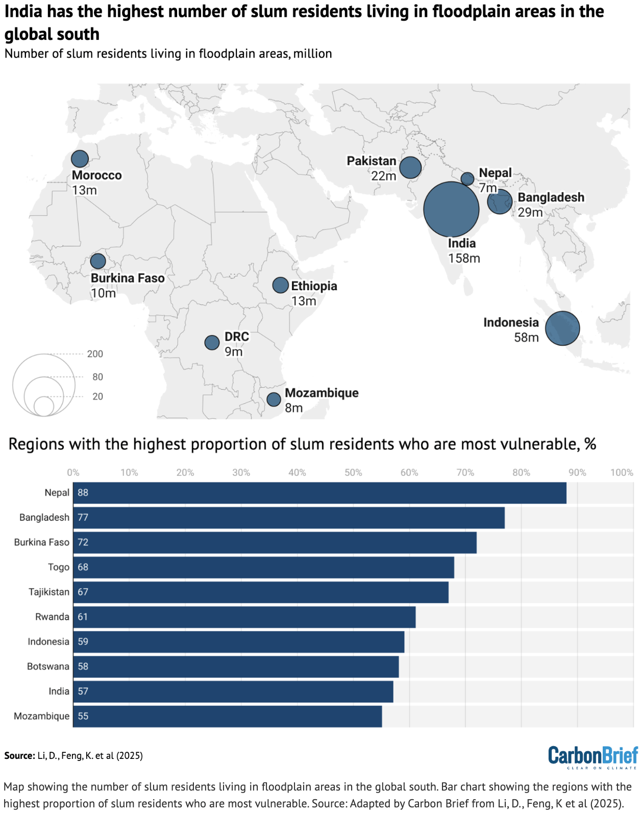
Visualizations covering the Global South explore environmental risks and illegal mining, but also improving travel prospects.
![InSight Crime: <a href="https://insightcrime.org/es/noticias/ofensiva-antiminera-desplaza-operaciones-otras-zonas-venezuela/"><strong>La ofensiva antiminera desplaza las operaciones a otras zonas de Venezuela</strong></a><strong> </strong>[<em>Anti-mining offensive shifts operations to other areas of Venezuela</em>], July 25](https://datawrapper.de/cdn-cgi/image/quality=85,width=1322,f=auto,fit=cover/https://kirby.datawrapper.de/media/pages/blog/data-vis-dispatch-july-29-2025/b05bc2097d-1753802558/cleanshot-2025-07-29-at-17.20.09@2x.png)
![Newsgraphy: <a href="https://newsgraphy.my/malaysia-passport-index-2025/"><strong>我国护照能带我们畅行无阻地走多 远?来看最新数据</strong></a> [<em>How far can our passport take us? Let's look at the latest data</em>], July 25](https://datawrapper.de/cdn-cgi/image/quality=85,width=1080,f=auto,fit=cover/https://kirby.datawrapper.de/media/pages/blog/data-vis-dispatch-july-29-2025/f61b2c52f6-1753800270/521967765_1117376497115086_2725225341098435143_n.jpg)
Other notable charts (and map) cover the Tour de France downtimes, the richest Germans, and more.
![Le Monde: <a href="https://www.lemonde.fr/les-decodeurs/article/2025/07/26/guide-de-la-sieste-du-tour-de-france-femmes-2025-piquez-un-petit-somme-au-bon-moment_6624381_4355770.html"><strong>Guide de la sieste du Tour de France Femmes 2025 : piquez un petit somme au bon moment</strong></a><strong> </strong>[<em>Guide to napping during the 2025 Tour de France Femmes: take a quick nap at the right time</em>]<strong>,</strong> July 26](https://datawrapper.de/cdn-cgi/image/quality=85,width=1584,f=auto,fit=cover/https://kirby.datawrapper.de/media/pages/blog/data-vis-dispatch-july-29-2025/bae77819f0-1753781470/cleanshot-2025-07-29-at-11.30.43@2x.png)
![Frankfurter Allgemeine Zeitung: <a href="https://www.faz.net/aktuell/wirtschaft/schneller-schlau/schwarz-gruppe-das-weit-verzweigte-imperium-des-lidl-milliardaers-110602269.html"><strong>Das weitverzweigte Imperium des Lidl-Milliardärs</strong></a><strong> </strong>[<em>The sprawling empire of the Lidl billionaire</em>], July 29](https://datawrapper.de/cdn-cgi/image/quality=85,width=2006,f=auto,fit=cover/https://kirby.datawrapper.de/media/pages/blog/data-vis-dispatch-july-29-2025/dab7296128-1753802884/cleanshot-2025-07-29-at-17.27.29@2x.png)


What else we found interesting


Help us make this dispatch better! We’d love to hear which newsletters, blogs, or social media accounts we need to follow to learn about interesting projects, especially from less-covered parts of the world (Asia, South America, Africa). Write us at hello@datawrapper.de or leave a comment below. Want the Dispatch in your inbox every Tuesday? Sign up for our Blog Update newsletter!


