Data Vis Dispatch, December 16: New website special

Welcome back to the 223rd edition of Data Vis Dispatch! Every week, we’ll be publishing a collection of the best small and large data visualizations we find, especially from news organizations — to celebrate data journalism, data visualization, simple charts, elaborate maps, and their creators.
This week, we celebrate the launch of our new website with a special edition of the Dispatch. It features many incredible charts, maps, and tables created with Datawrapper by our talented users. We're thrilled that we can show these examples of best practice on our new website, as inspiration for new and returning users.
Recurring topics this week? Lots of inspiring visualizations covering a wide range of issues and themes. Enjoy!
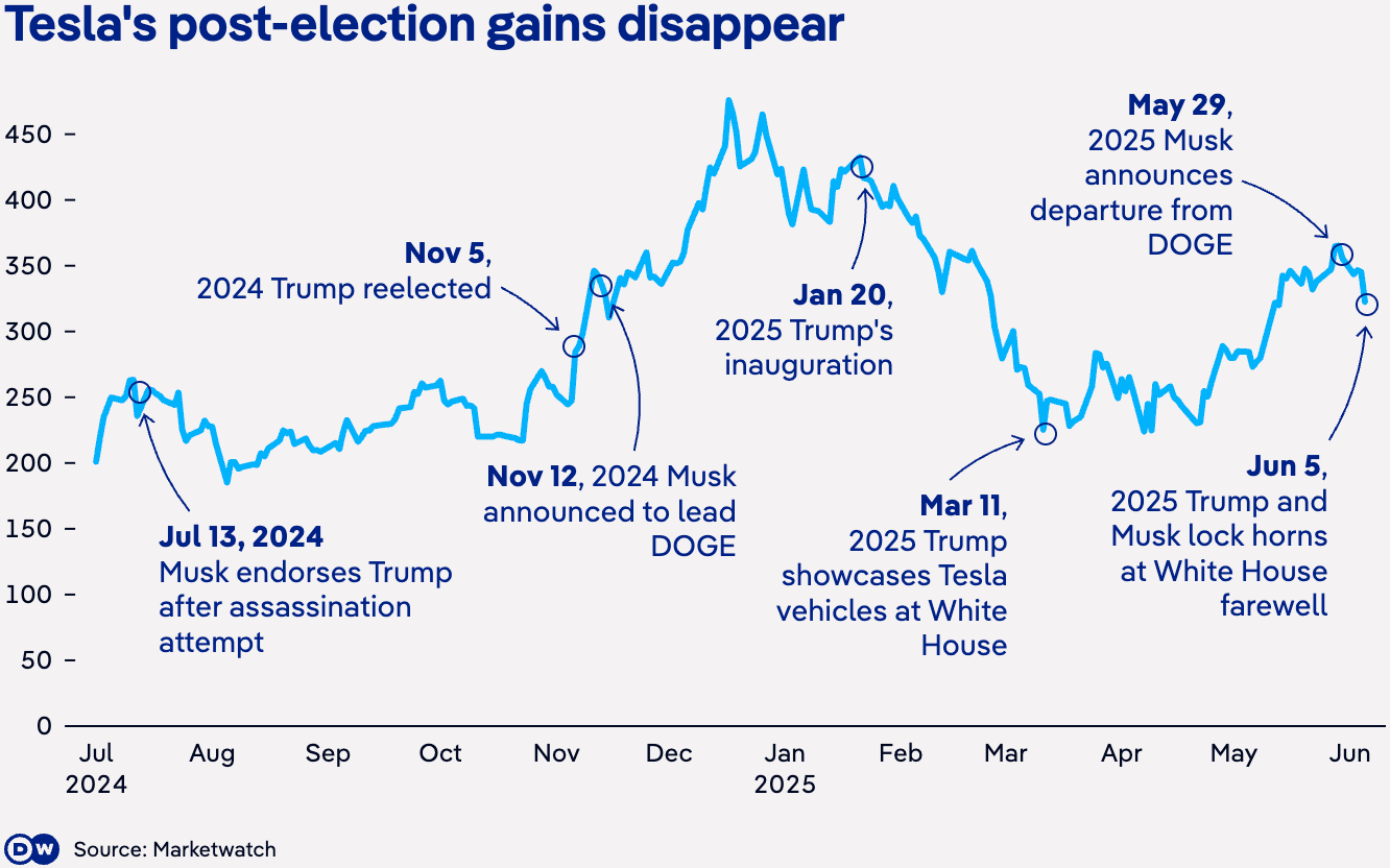
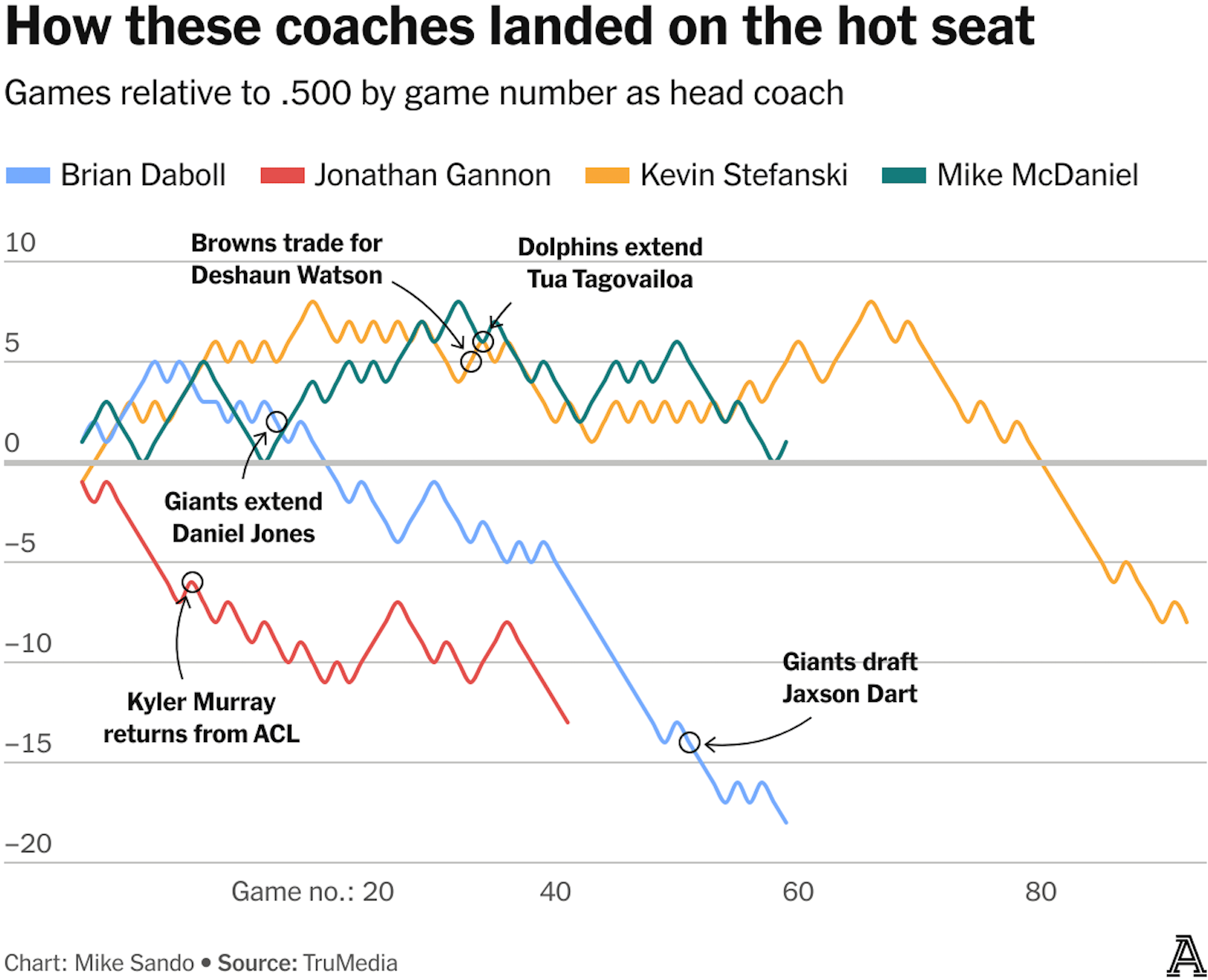
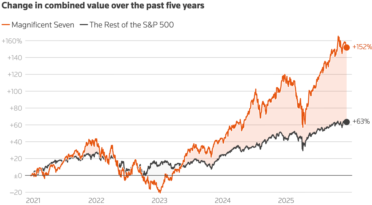
First up, line charts! Trusty companions for anyone looking to show change over time. Adding features like annotations, colors, range highlights, or adjusting the style of the lines is an effective way to guide attention, highlight the key message, or bring in more details.
![ZEIT: <a href="https://www.zeit.de/wissen/2025-07/waldbrandgefahr-deutschland-hitze-statistik-daten"><strong>Warum es in Deutschland jetzt schon so viel brennt</strong></a> [Chart description: <em>Above-average risk of forest fires</em>]](https://datawrapper.de/cdn-cgi/image/quality=85,width=1324,f=auto,fit=cover/https://kirby.datawrapper.de/media/pages/blog/data-vis-dispatch-december-16-2025/242db4c52e-1765914921/cleanshot-2025-12-16-at-20.53.54@2x.png)
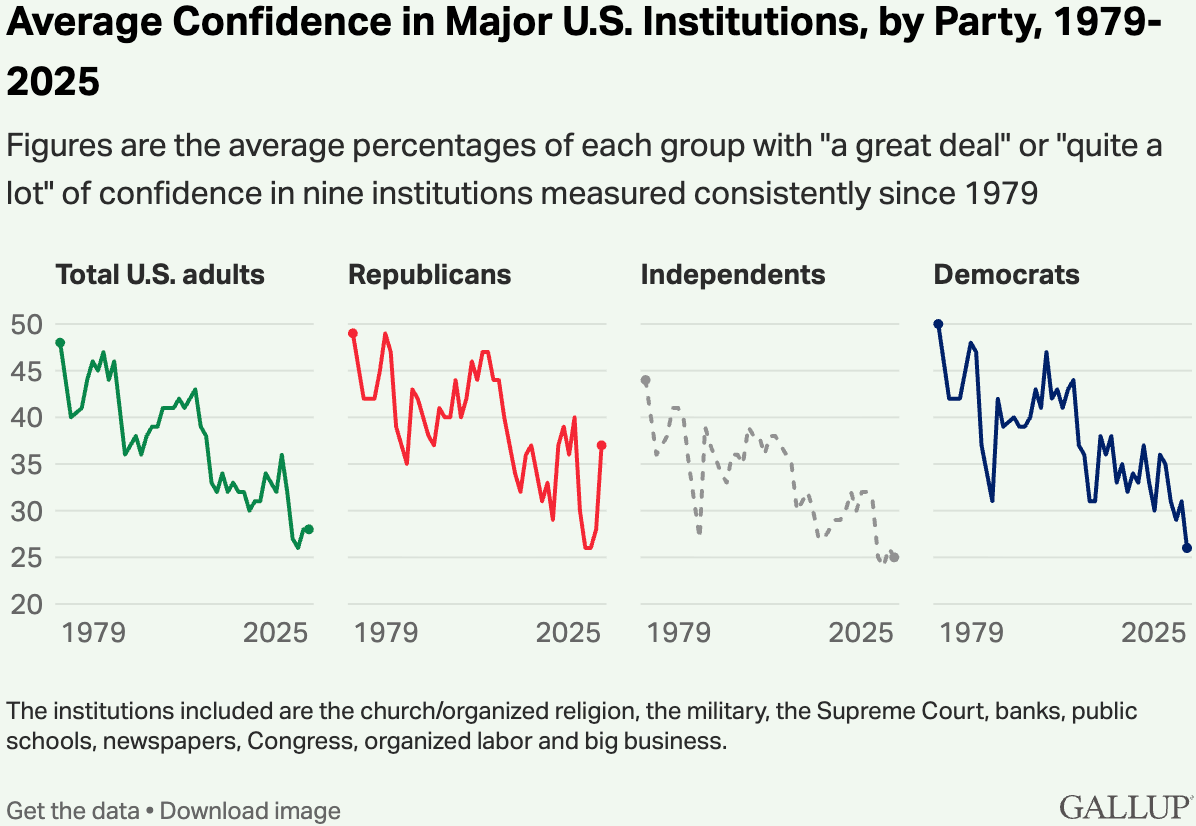
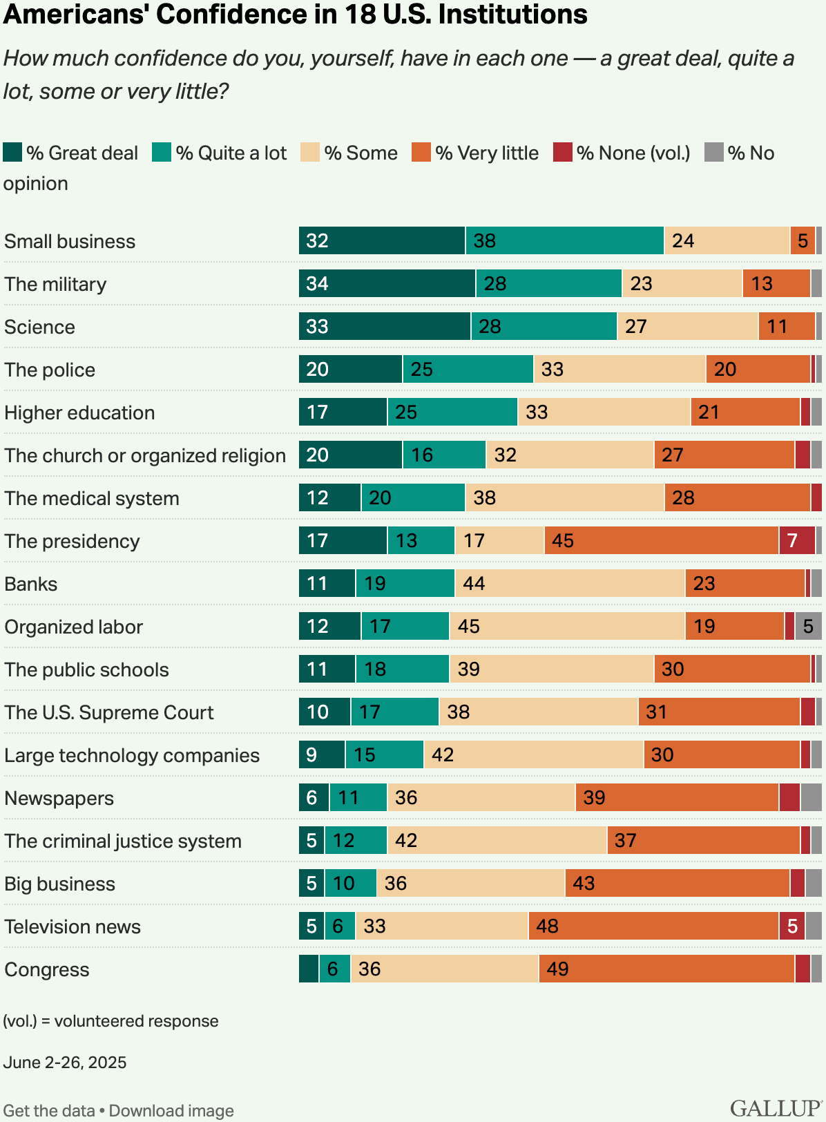
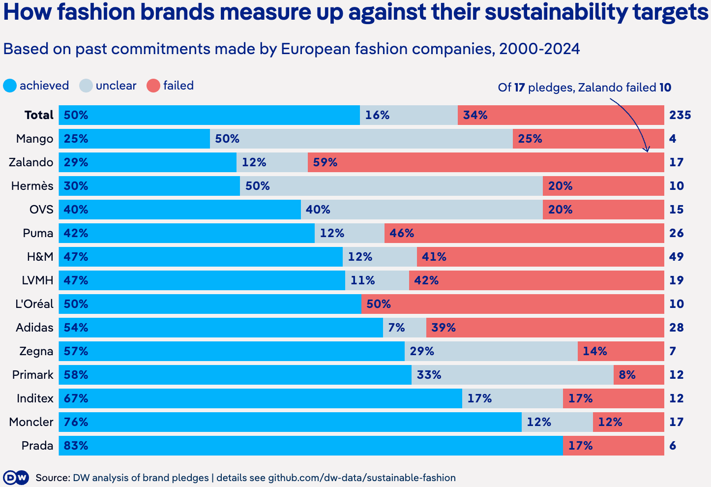
Stacked bar charts are perfect for visualizing survey results, but they work just as well for showing (particularly ordered) categorical data.
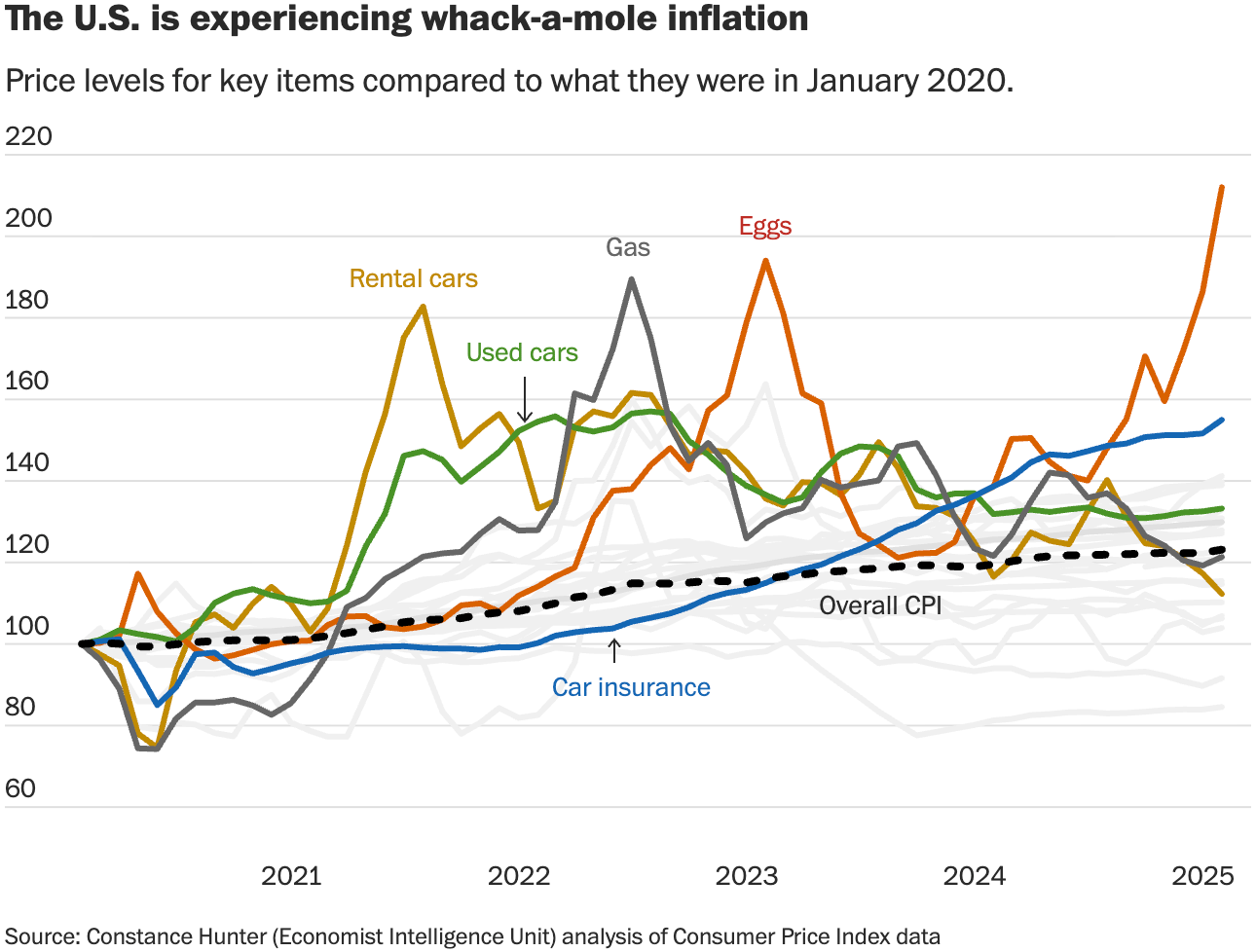
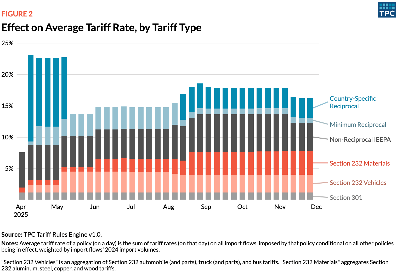
While they are close relatives of bar charts, column charts are often used to compare amounts over time. Stacked column charts with a carefully selected color palette can communicate layered information in an easy-to-digest way.
![ZEIT: <a href="https://www.zeit.de/wissen/2025-07/waldbrandgefahr-deutschland-hitze-statistik-daten"><strong>Warum es in Deutschland jetzt schon so viel brennt</strong></a> [Chart description: <em>The cause of forest fires often remains unknown</em>]](https://datawrapper.de/cdn-cgi/image/quality=85,width=1328,f=auto,fit=cover/https://kirby.datawrapper.de/media/pages/blog/data-vis-dispatch-december-16-2025/d52d91fe33-1765914557/cleanshot-2025-12-16-at-20.49.11@2x.png)
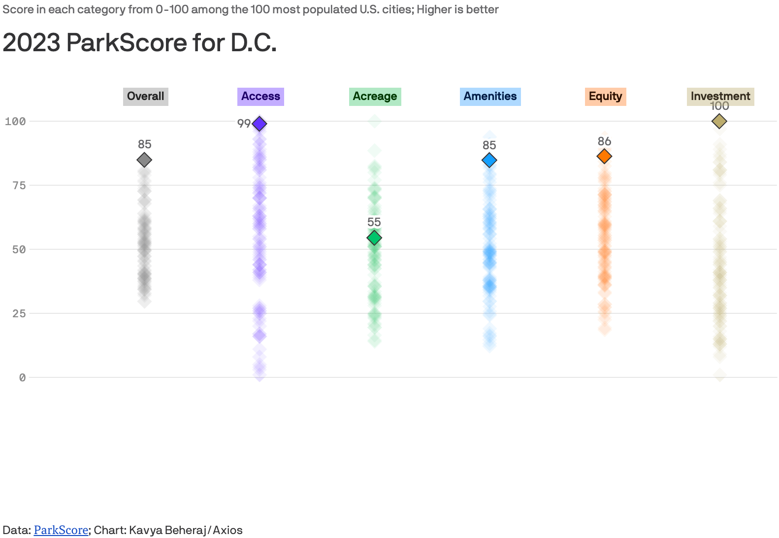
Scatterplots, the most versatile chart type of them all. Ideal for showing data with multiple dimensions thanks to its two axes, adjustable symbol sizes, shapes, and colors, and plenty of space for detail in the interactive tooltips.
Want to show regions, locations, paths, or other geographical data? A choropleth, symbol, or locator map is the way to go.
![ZEIT: <a href="https://www.zeit.de/wirtschaft/energiemonitor-strompreis-gaspreis-erneuerbare-energien-ausbau"><strong>Die wichtigsten Daten zur Energieversorgung – täglich aktualisiert</strong></a> [Chart description: <em>Since the beginning of the year, 848 wind turbines have been connected to the grid</em>]](https://datawrapper.de/cdn-cgi/image/quality=85,width=1218,f=auto,fit=cover/https://kirby.datawrapper.de/media/pages/blog/data-vis-dispatch-december-16-2025/a13e0474d2-1765915285/cleanshot-2025-12-16-at-20.59.03@2x.png)
![SPIEGEL: <a href="https://www.spiegel.de/wissenschaft/technik/nordostpassage-china-laesst-frachtschiffe-in-nur-18-tagen-nach-europa-fahren-a-5e6aa224-7a76-4747-bf21-9374ee72d1b3"><strong>In nur 18 statt 50 Tagen mit dem Frachter von China nach Europa</strong></a><strong> </strong>[<em>From China to Europe by freighter in just 18 days instead of 50</em>]](https://datawrapper.de/cdn-cgi/image/quality=85,width=1252,f=auto,fit=cover/https://kirby.datawrapper.de/media/pages/blog/data-vis-dispatch-december-16-2025/c24054628f-1765912745/cleanshot-2025-12-16-at-20.04.23@2x.png)
![SPIEGEL: <a href="https://www.spiegel.de/panorama/jeff-bezos-und-lauren-sanchez-sind-fuer-ihre-hochzeit-in-venedig-angekommen-a-2d9f295b-eacf-44cd-8f85-8051c6d935f2"><strong>Jeff Bezos und seine Bald-Ehefrau sind in Venedig angekommen</strong></a><strong> </strong>[<em>Jeff Bezos and his soon-to-be wife have arrived in Venice</em>]](https://datawrapper.de/cdn-cgi/image/quality=85,width=1258,f=auto,fit=cover/https://kirby.datawrapper.de/media/pages/blog/data-vis-dispatch-december-16-2025/a25c0af0fe-1765911644/cleanshot-2025-12-16-at-19.59.06@2x.png)
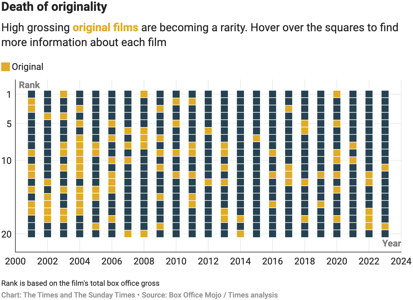
Among other popular chart types, we have the understated table (with heatmap capability), a dot plot to show the difference between two data points, and a donut chart, a sleek alternative to the well-known pie.
![SPIEGEL: <a href="https://www.spiegel.de/wissenschaft/mensch/uno-klimakonferenz-so-steht-es-um-die-globale-erwaermung-a-659a6694-9b46-4559-a08e-7aa0dd5cb658"><strong>Plus 1,2 Grad und kein Ende in Sicht</strong></a> [Chart description: <em>Development of the global average temperature since 1850</em>]](https://datawrapper.de/cdn-cgi/image/quality=85,width=1226,f=auto,fit=cover/https://kirby.datawrapper.de/media/pages/blog/data-vis-dispatch-december-16-2025/2d3f4804f7-1765913017/cleanshot-2025-12-16-at-20.23.02@2x.png)
What else we found interesting
Applications are open for…
A cartographic design intern at Esri Creative Lab
A graphics reporter (deleted data project) at The Guardian


