Data Vis Dispatch, August 26: Africa map, nations' energy, and more

Welcome back to the 207th edition of Data Vis Dispatch! Every week, we’ll be publishing a collection of the best small and large data visualizations we find, especially from news organizations — to celebrate data journalism, data visualization, simple charts, elaborate maps, and their creators.
Recurring topics this week include a campaign questioning the Mercator map, nations' energy supply and demand, and more.
A campaign backed by the African Union has been making the cartographic rounds, aiming to abolish the popular Mercator projection in favor of alternatives that better represent the continent's true size:
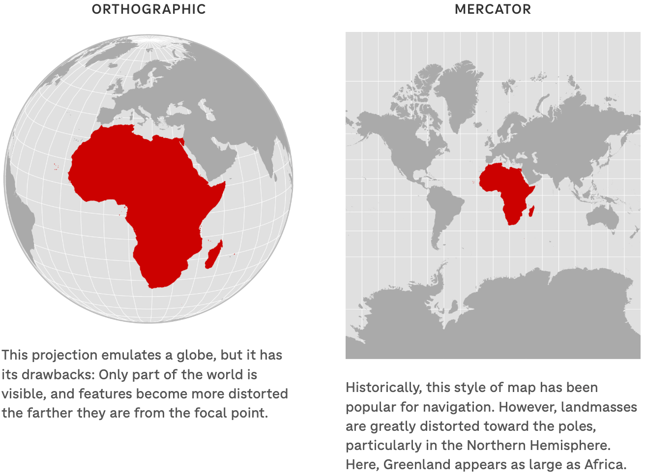
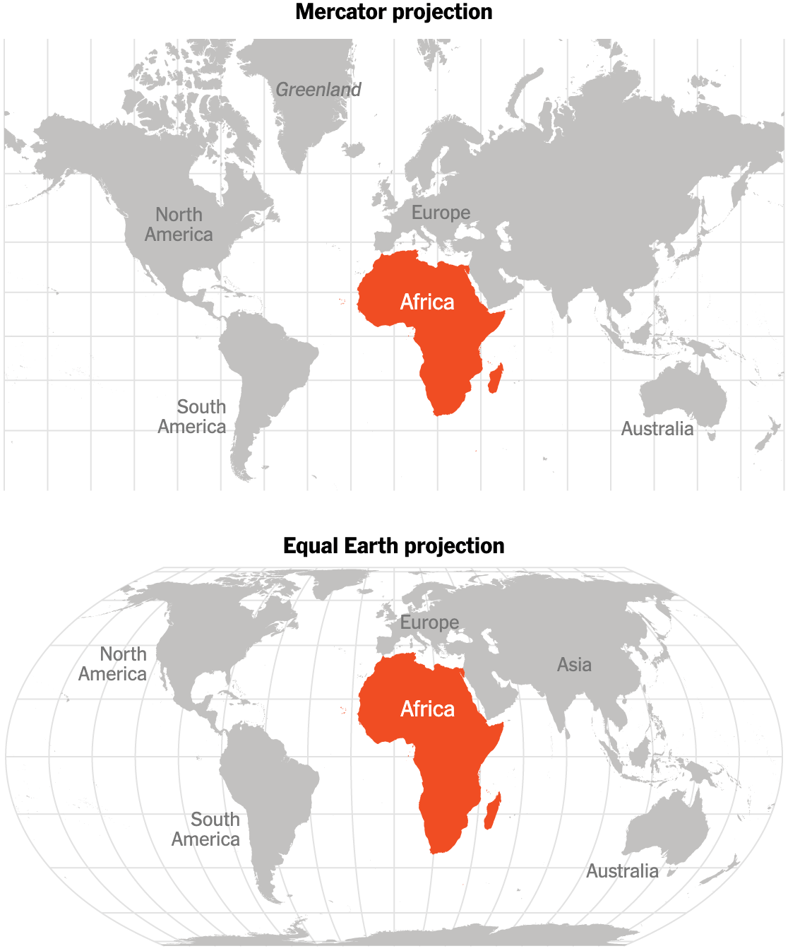
![Diario Sur: <a href="https://www.diariosur.es/sociedad/africa-discriminada-mapas-20250824165653-ntrc.html"><strong>¿Está África discriminada (también) en los mapas?</strong></a><strong> </strong>[<em>Is Africa discriminated against (also) on maps?</em>], August 24 <span class="badge">Visual demonstration</span>](https://datawrapper.de/cdn-cgi/image/quality=85,width=686,f=auto,fit=cover/https://kirby.datawrapper.de/media/pages/blog/data-vis-dispatch-august-26-2025/3d0d345453-1756193970/cleanshot-2025-08-26-at-09.39.03@2x.png)
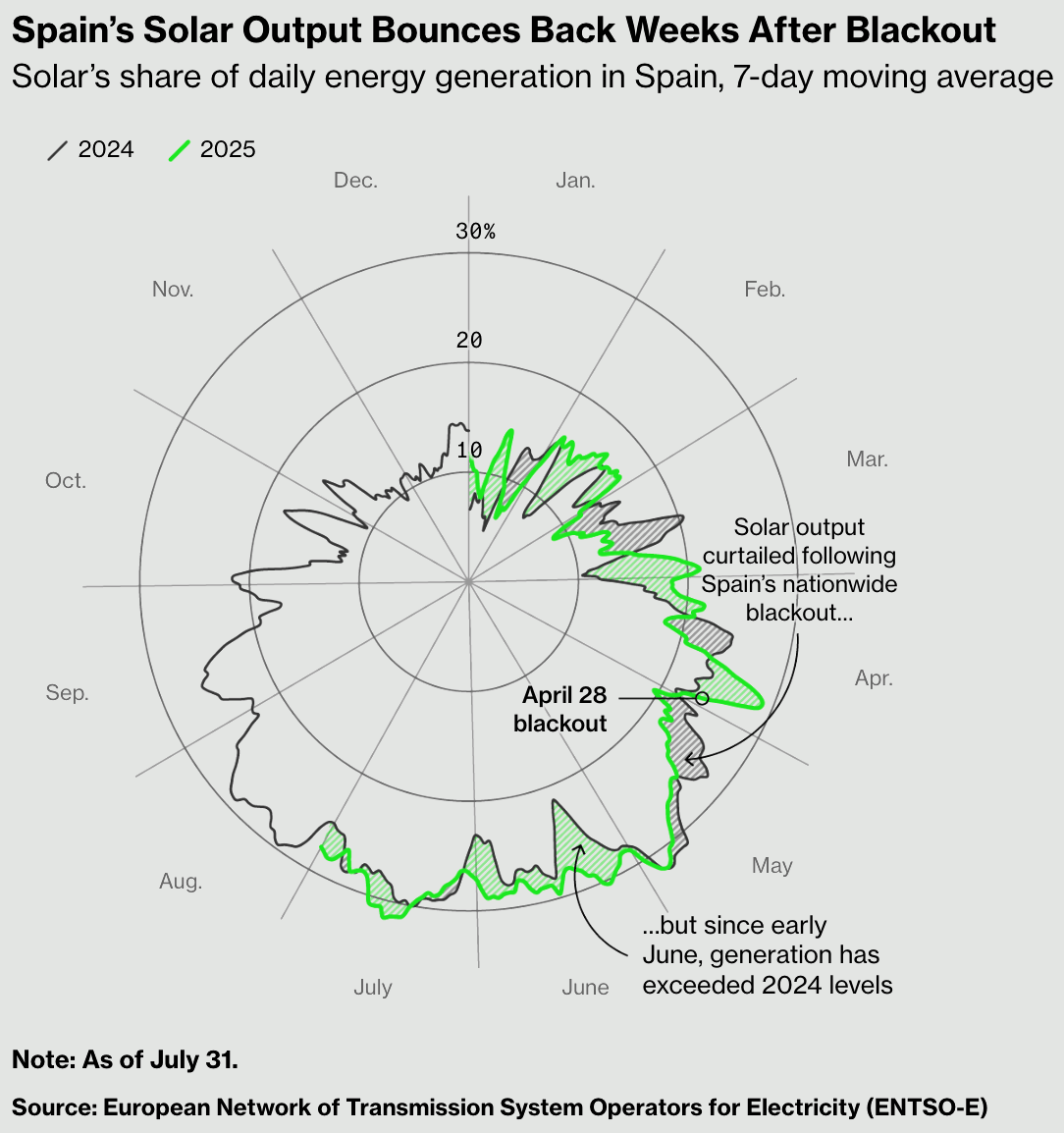
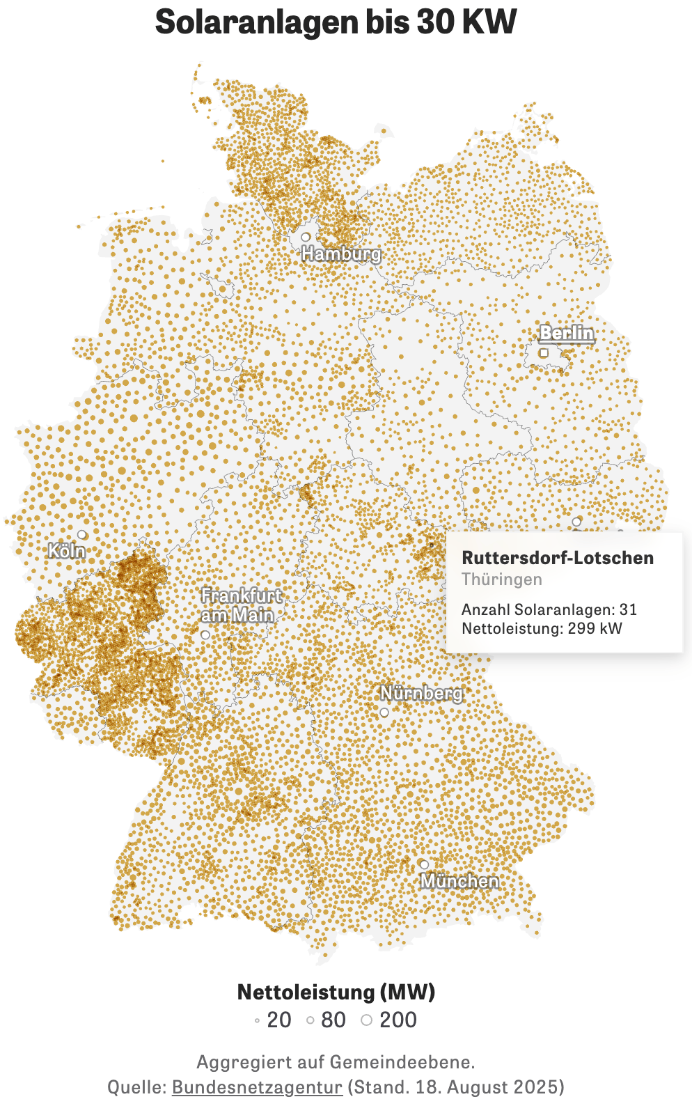
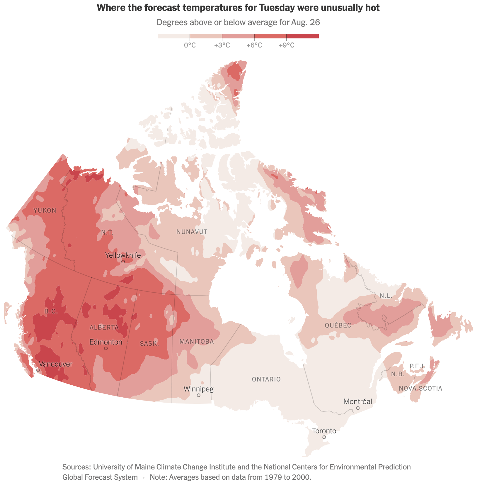
Solar energy can play a vital role in energy supply and demand:
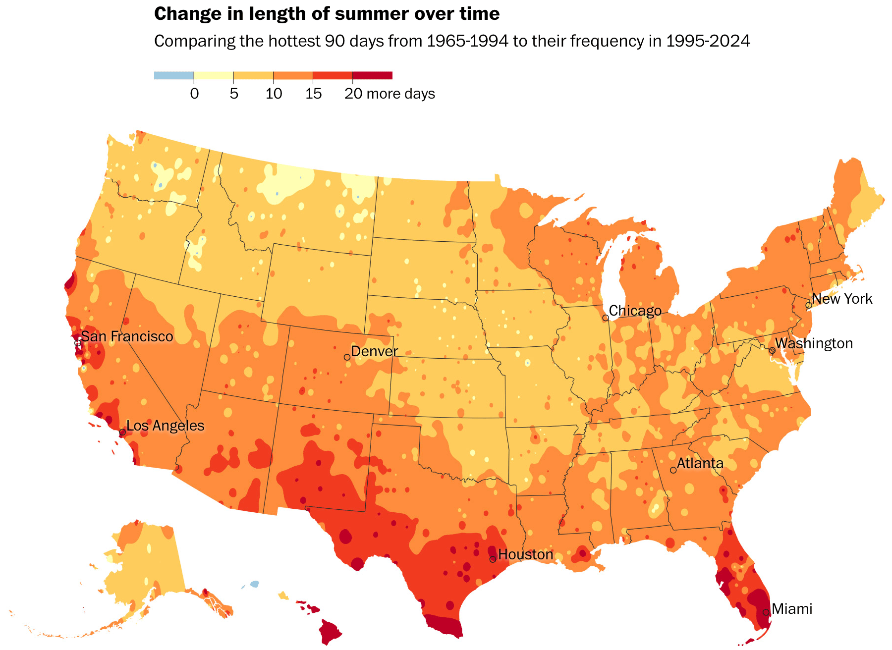
Meanwhile the summers get hotter and longer:
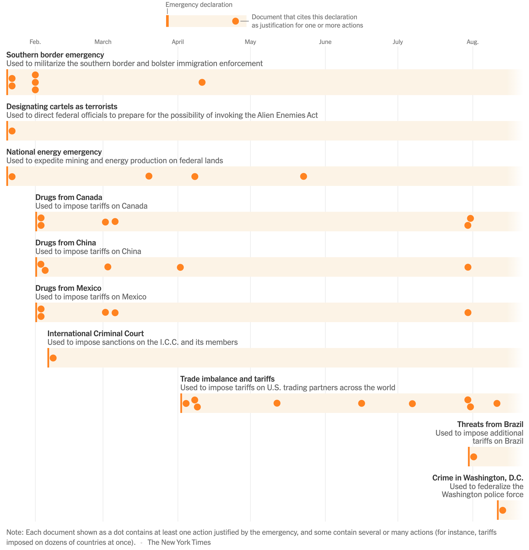
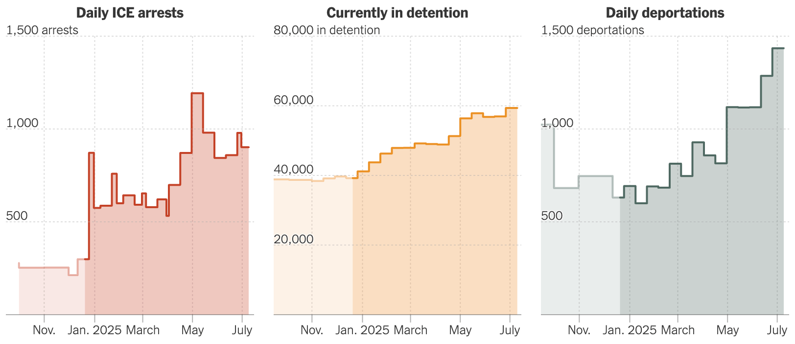
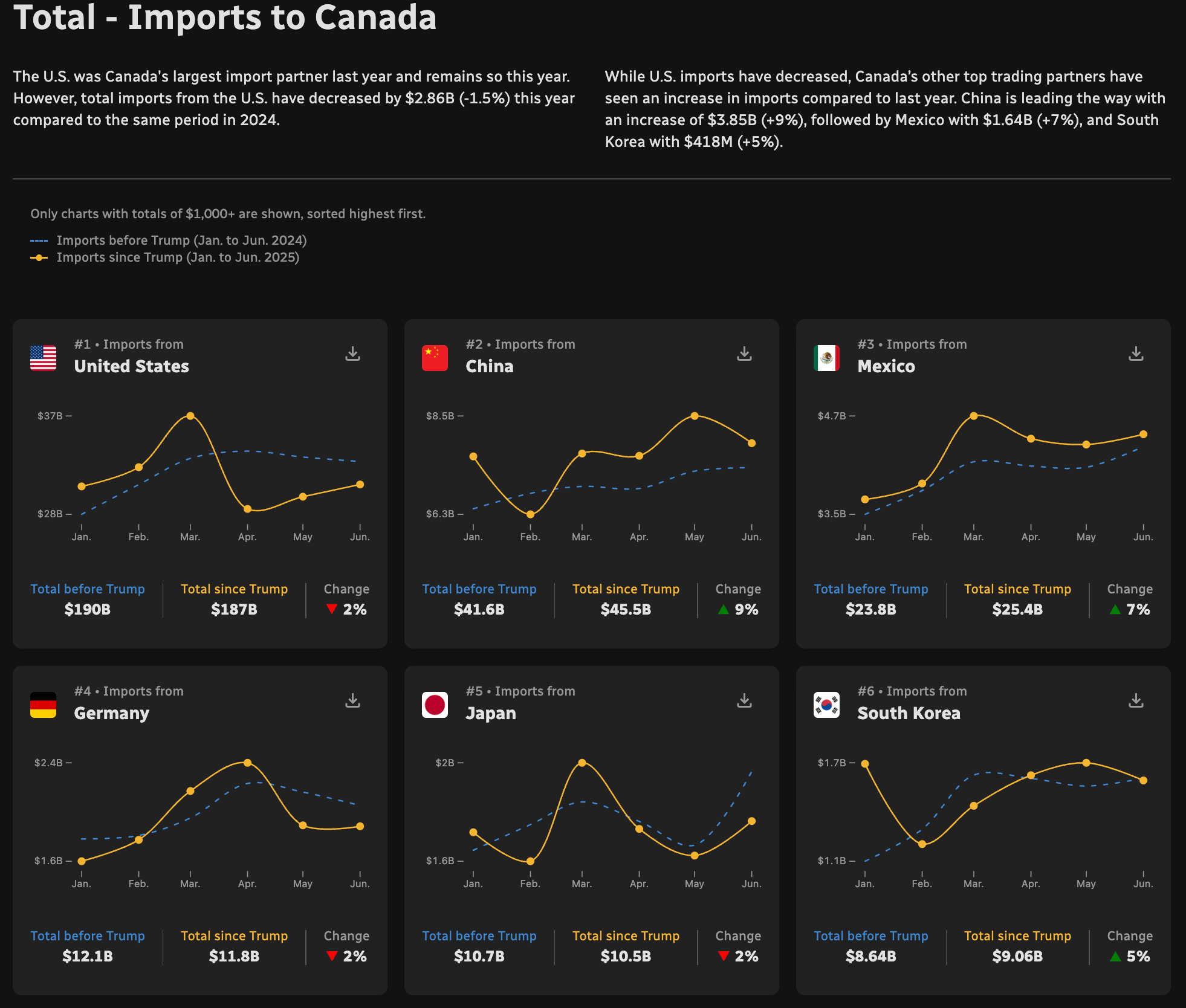
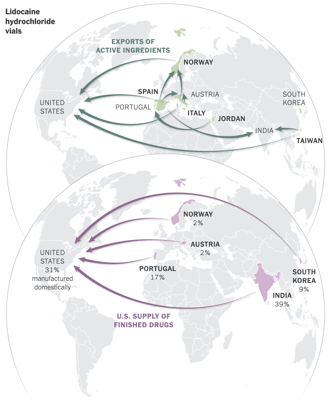
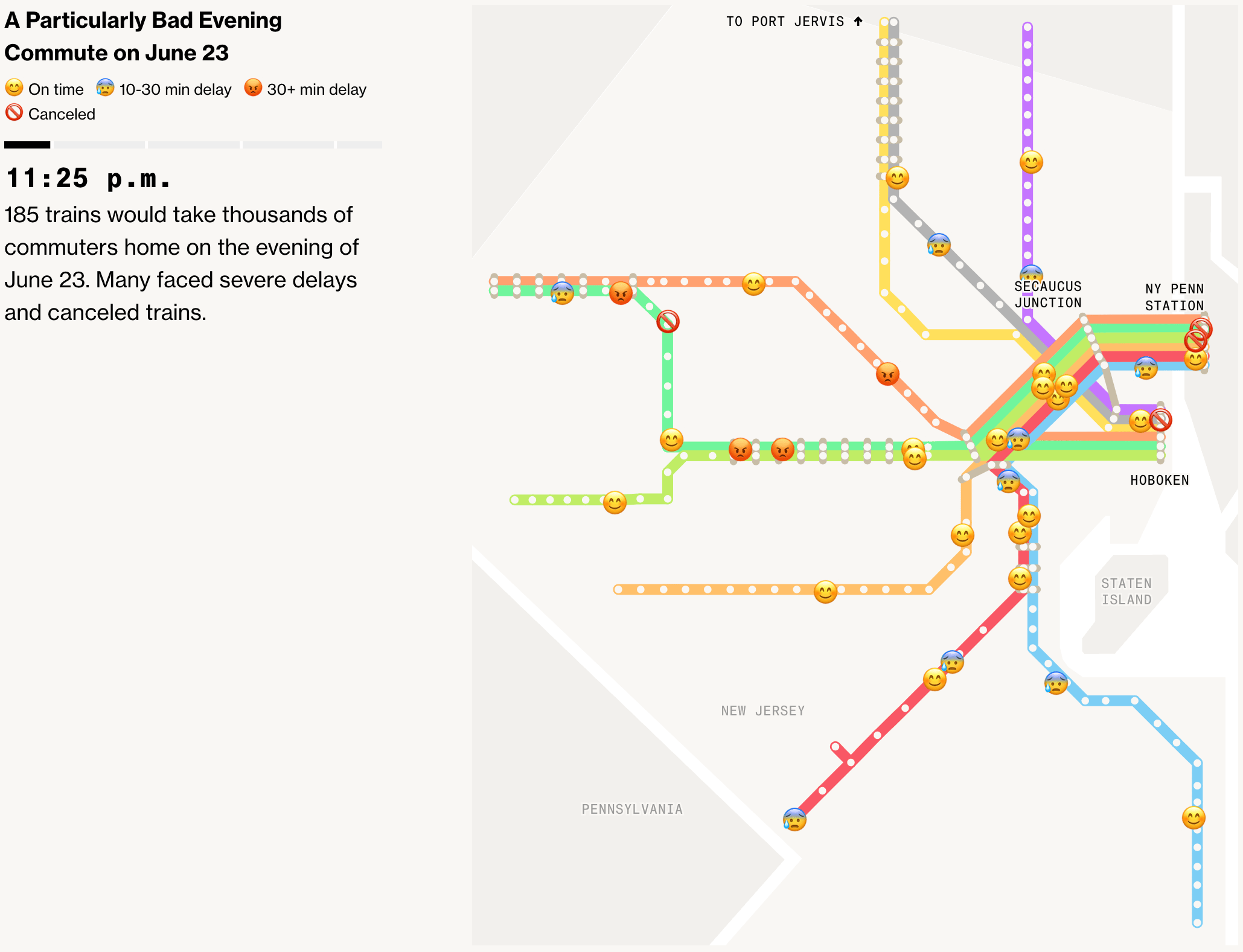
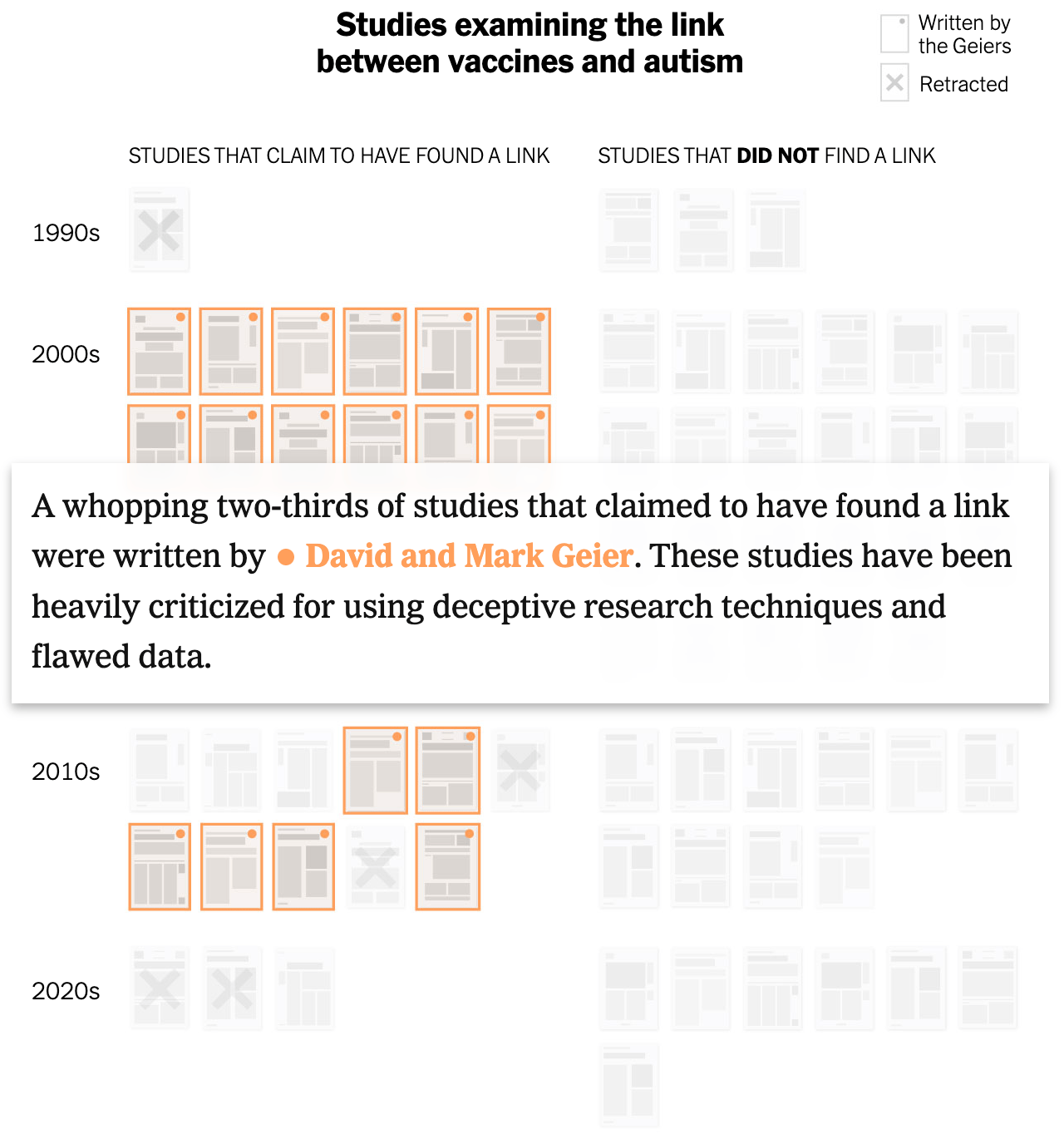
We saw charts dealing with the U.S. political situation both directly and indirectly:
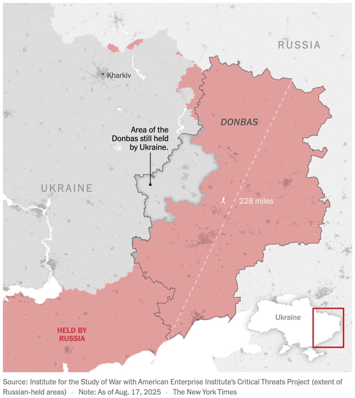
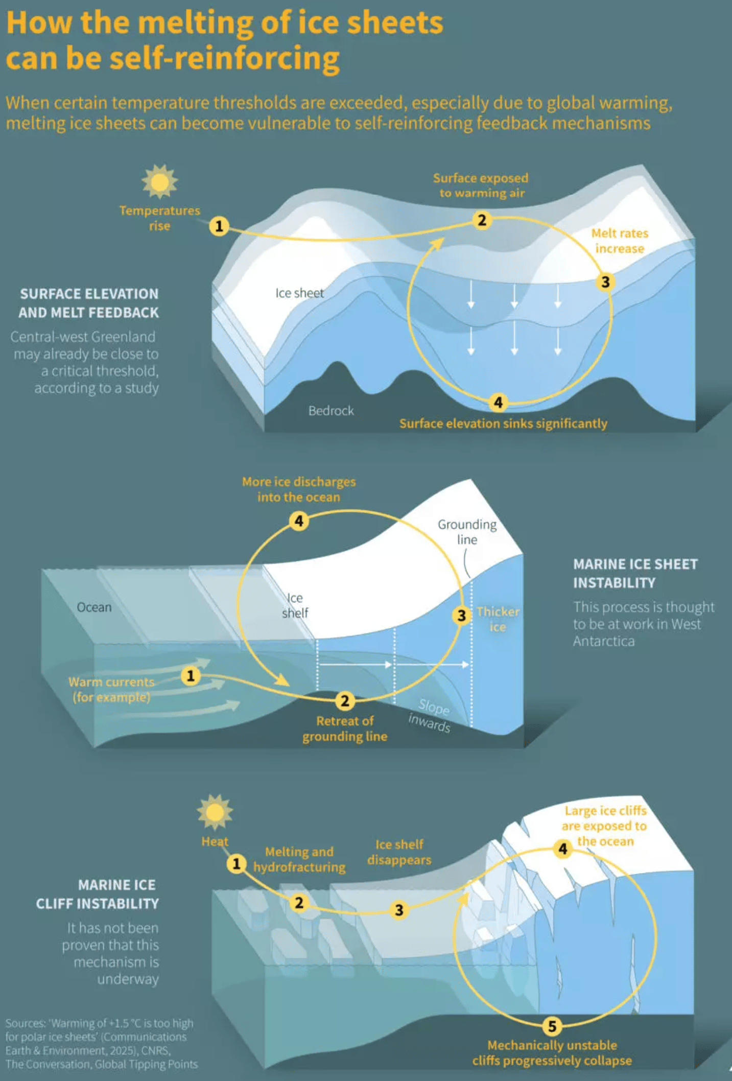
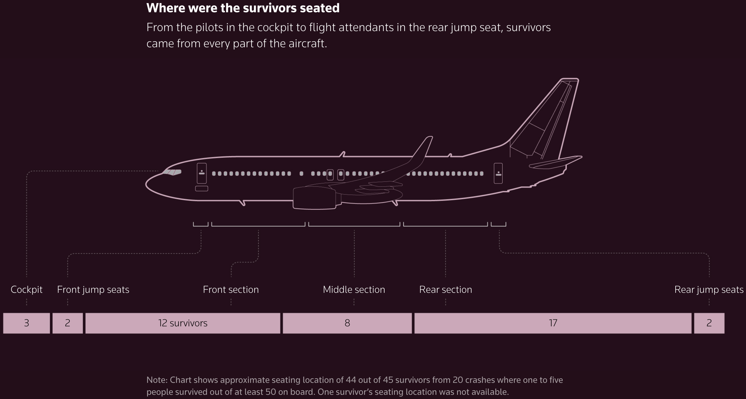
And on the ongoing brutality for civilians in Gaza and Ukraine:

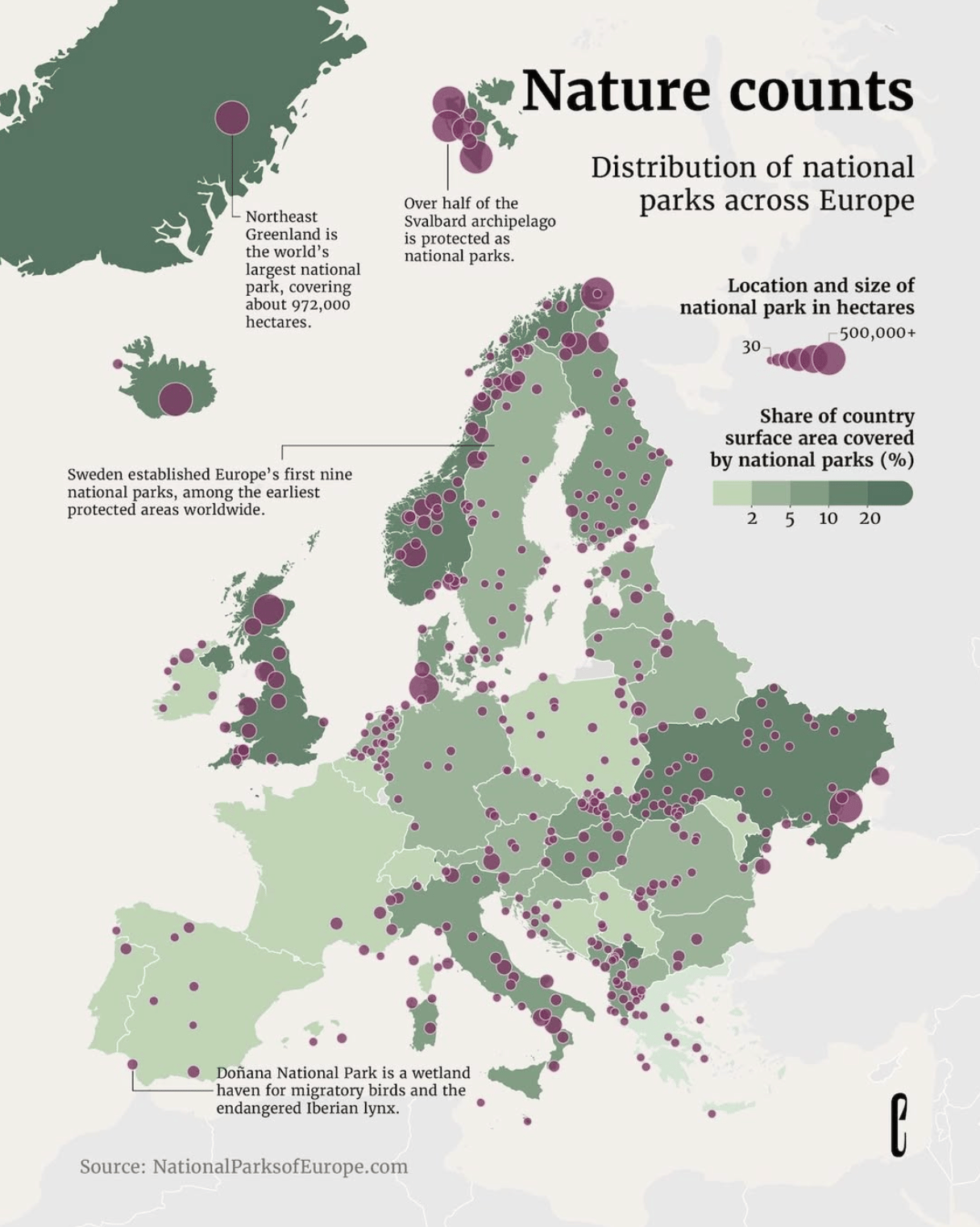
We'll end on a lighter note with national parks and commuter rail:
![Jer Thorp: "[…] In 2009 I made this series, called 360/365, which each visualize a year of people and orgs featured in NYT stories," August 20 (<a href="https://bsky.app/profile/jerthorp.bsky.social/post/3lwtt7dhkz22t"><strong>Bluesky</strong></a>, <a href="https://www.jerthorp.me/365"><strong>Portfolio</strong></a>)](https://datawrapper.de/cdn-cgi/image/quality=85,width=1030,f=auto,fit=cover/https://kirby.datawrapper.de/media/pages/blog/data-vis-dispatch-august-26-2025/b574584342-1756135785/bafkreihg22qswiobd7jmhfaaw2insipuu2fehh6ppbfihi6xcyzmlnczou.jpg)
What else we found interesting
Applications are open for…
A senior data reporter at RADAR
Help us make this dispatch better! We’d love to hear which newsletters, blogs, or social media accounts we need to follow to learn about interesting projects, especially from less-covered parts of the world (Asia, South America, Africa). Write us at hello@datawrapper.de or leave a comment below. Want the Dispatch in your inbox every Tuesday? Sign up for our Blog Update newsletter!


