Lucy Block, ANHD, about shifting public narratives with data visualization


Lucy Block from the Association for Neighborhood and Housing Development (ANHD) spoke at our Unwrapped conference about "Charting Change: How can data visualization help us win progressive policies?"
Lucy has been developing ANHD's data analysis and storytelling work for six years. She uses many tools, but her favorite is Datawrapper. In addition, she manages ANHD's Displacement Alert Project that includes the DAP Portal data tool. She also teaches NYU urban planning students how Datawrapper can help them tell powerful stories with data.
Watch her talk here:
04:51 – Datwrapper demo
09:21 – A map adapted by the New York Times
11:23 – Stand-alone infographics
13:14 – Datawrapper for exploring data
14:29 – Lessons learned
16:51 – Q: Encouraging institutions to open data?
20:55 – Q: Defining an audience?
Full transcript
Introduction
[00:00:04] Lucy Block: Hi everybody. I'm really excited to be here. My name is Lucy Block and I'm a senior research and data associate at the Association for Neighborhood and Housing Development, which is also known as ANHD. ANHD is a 50-year-old community development organization in New York City, and we're an umbrella for over 80 other neighborhood-based and citywide nonprofit groups.
Our mission is to build community power across our members to achieve affordable housing and thriving, equitable neighborhoods in New York City. And we do that through many different approaches. They include organizing coalitions, developing and advocating for policies on behalf of our communities, producing research and data to support our work, and building capacity. Our work areas encompass many different issues: affordable housing, economic development, land use, banking, and more. So today, I want to talk to you about an example of how we’ve merged those different approaches together—including how Datawrapper is a part of that.
First, before I get into that, I wanted to share this Post-it note with you that I have on my desk. I stole this from my boss, who is a data and research nerd like me. It says: “Don't put policy before power.” What I've learned from her over the years, and what this Post-it reminds me of, is that our best research and data analysis and policy development really accomplish nothing if we haven't built up the power as an organization—along with our members and our partners—to actually change the things that we care about, such as passing laws and implementing laws.
So no matter how cool and pretty and sleek my data visualizations are, they don't actually get us anywhere unless they're part of a larger strategy and vision. Which I personally find really motivating, and I wanted to show you an example of how I try to make that a part of our larger work.
This is a photo of us with one of our member organizations and a small business owner—the owner of a plant shop who's been on a large commercial corridor in the Bronx for several decades. As part of what we call our equitable economic development work, we want to protect and get resources to the kinds of small businesses that we see as making up the cultural backbone of New York City. For those of you who live in or have visited New York City, I think you might have a picture in your mind of what types of small storefront businesses I'm talking about.
And so our member organization pictured here is working with this business and others along that commercial strip to try to make sure they don't get pushed out because they don't have leases or legal protections. In the meantime, there are major development plans for a very large armory right across the street.
Also on this slide is a statement of ours about how we do this work: we’re fighting for affordable commercial space and an end to commercial tenant harassment, and we see commercial displacement as cultural displacement.
So through our many member organizations, as well as a coalition that we run to protect and get resources to small businesses, we hear about all the different kinds of issues they face. Many of them can't get leases from their landlords even if they want them. Or the lease terms are very short. The terms of the lease might be very poor, putting the tenant at a disadvantage. Some face active threats and harassment by their landlords, which can take many different forms—but are sometimes really egregious. And many others still haven't recuperated financially from COVID and were excluded from financial help from the government.
Back when we started this small business organizing and advocacy work, our coalition would go to the city council and try to advocate for new laws and protections for small businesses. And those council members would respond like: “Where is your data? How do we know that this is actually a real problem?” And at the time, the data did not exist because our government didn't collect it. So as a first step, that coalition developed a campaign and passed a law to require landlords to report information on how much rent they were charging their first- and second-floor commercial tenants, how long the spaces were vacant, and more information.
And then a couple years later, that resulted in several really valuable datasets that are on New York City’s Open Data Portal. So this one—which I'll be showing you my analysis of—aggregates statistics about median rents, vacancies, total numbers of storefronts, and more data points at different geographies around the city, including council districts.
Datawrapper demo
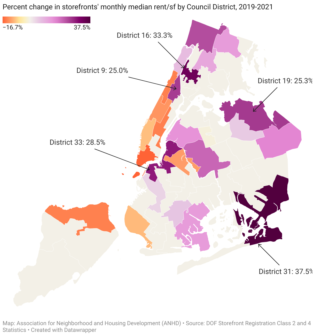
[00:04:51] Lucy Block: So with that data, we've been able to create maps showing those council members—showing the public—what the state of affairs is across these storefront businesses in these different districts and geographies. The data goes back to 2019, which allows us to see how things like median rents have changed across council districts in New York City since before COVID and during COVID. This map is from a report we published last year showing changes in median rents from 2019 to 2021.
So you might be familiar with the shape of New York City. You may not be. This long island in the middle is Manhattan. And you can see that in most of Manhattan, the storefront rents typically decreased from 2019 to 2021—as much as a 16.7 percent decrease at the very bottom of Manhattan. Whereas in Upper Manhattan, in the Bronx, in Queens, in most of Brooklyn, in a lot of districts, rents increased significantly—even though businesses had lost major revenue because of the pandemic.
As you might imagine, Datawrapper is an incredible tool to be able to tell this story with.
Bear with me one moment while I switch over to the Datawrapper backend. Okay, looks like you can see that now. One thing that's great off the bat is that New York City has all kinds of administrative districts prepopulated in there. So city council districts is already a geography. I don't have to upload any shapefiles. Then I just copy and paste this very simple table that is essentially just a reshaped version of the data from that dataset—already available based on the advocacy we started a few years ago—showing the council district by number, total storefronts, median rents each of the years that we had at the time that we produced this, percent change in rent, and net change in rent.
I used a really simple visualization with a diverging gradient to show decreases and increases, added some annotations for the districts with the largest increases in rent—which we wanted to highlight in our report—and then my absolute top favorite part of Datawrapper is the tooltips.
The major difference between this and a map that I would have created in GIS and Illustrator is that this is essentially all I would have gotten—and probably just bucketed values. So somebody looking at this would be able to compare and see where there were decreases, where there were increases, but they wouldn't be able to dive in and see the actual values. The fact that median rent started at $2 per square foot per month in 2019 in this part of Southeast Queens (including the Rockaways), whereas in Manhattan it started at $9 per square foot, as well as looking at the net number of storefronts.
So people who really want to understand this data in more granular detail can hover with the tooltips, and I think just get such valuable additional pieces of the puzzle. So that you can get that overall simple version of the data story as well as the detailed version.
This is what the Datawrapper map looks like embedded on our website. This is the web version of the report that we did. I’ll drop the link in the chat after my talk. I guess I don’t have to convince this audience that Datawrapper is really valuable. But this is one of those examples that I just absolutely love—both the simplicity and the level of detail it can offer with a bit of interactivity, in a way that I just would not be able to build without Datawrapper.
And I teach urban planning students data analysis, visualization, and mapping and data storytelling. And we actually have to just hide the fact that Datawrapper exists—and that you can make maps in Datawrapper—until the end of the class, because we need them to learn spatial analysis. And being able to just pop a CSV into Datawrapper and put together a map like this is way too easy. We need them to learn more GIS than that.
A map adapted by the New York Times
[00:09:21] Lucy Block: Let me switch back over to my presentation. This is another Datawrapper chart from that same report with some of the major findings that we found really important to get across. We compared some demographics of districts where median rents increased versus decreased or stayed the same during that time period.
What we found is that in council districts where rents decreased, 47 percent of the population is people of color. And in council districts where rents increased, 72 percent of the population is people of color. Those findings verified what we and our members hear and experience on the ground—and have for a long time—which is that displacement pressure on small businesses has been hitting communities of color the hardest. That’s also illustrated by the map showing where the decreases and where the increases have happened.
This work was also covered by the New York Times, who did their own version of the map that I showed you and their own reporting on these data findings. And my data visualization skills definitely do not hold a candle to the New York Times, but in this particular case, I think there's really a lot of value in the Datawrapper chart with the interactivity that it offers.
The static chart gives that bucketing of values and the comparison, but overall is definitely a much more simplified picture. I really like that we were able to offer more detail and context in the map we put in our online report.
As a side note, the business that was featured on the cover of this article—this is the woman who owns a business called Nepali Banchagar. It’s a Nepali restaurant in my neighborhood and they make my absolute favorite food, which is called Jhol Mono. I highly recommend visiting that restaurant and trying that food if you're ever in Queens.
Stand-alone infographics
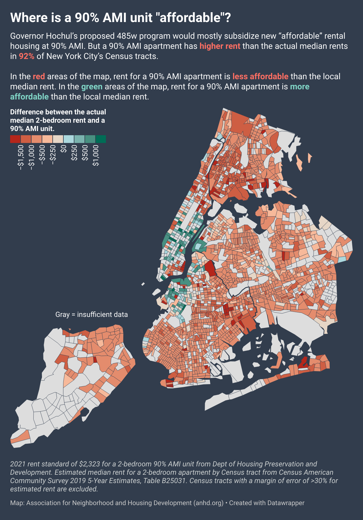
[00:11:23] Lucy Block: This is another example of how my organization has used Datawrapper in what I think is a really valuable way. So the purpose of this map... This is from a couple years ago, and the reason we made it was to take something that's a very obscure and confusing topic. It's AMIs, or area medien income, which, if you're diving into housing policy in New York, you can't avoid affordable housing policy in the United States generally. It's basically a proxy for income limited housing, with a bunch of benchmarks, which are pretty hard to wrap your mind around. And we wanted to show what it meant. This policy was being proposed by our governor, which would have offered a tax incentive largely for the production of apartments that would have rented at 2,300 per month at the time for a two bedroom. It's a couple years ago, now it would be more. And so the map shows that rent would have been higher than the median rent in 92 percent of census tracts around the city. And so our position was that it's not worth the large tax breaks that the developers would get in exchange.
And we embedded this map into a blog on our website, but I really like that it has enough text and information within it to serve as its own kind of self contained infographic. And I think this one stands alone really well. Whereas the other map was embedded in a report that had information surrounding it, this one I think is really nice to be able to share on its own. And we also often do things like make a static version of this by exporting the map, putting it in Canva, and really simplifying the text. And then putting that on social media, along with a link that would take you to the full interactive version.
Datawrapper for exploring data
[00:13:14] Lucy Block: And finally, I wanted to show you a very kind of simple and less splashy use of Datawrapper. I've heard folks talking about how Datawrapper is primarily an exploratory tool, but can also be useful for exploratory purposes. And this is just an internal Slack message where my boss had asked for a breakdown of this income metric for different race and ethnic groups in New York City across recent years. And so I made a couple of different Datawrapper charts to try to illustrate it for her. Actually, the speaker just before me was talking about how they use a few different Datawrapper charts and send it over to their team to see what lands better, what's more helpful.
And this is something that we use just when we have internal questions we want to answer in the process of developing our strategy and figuring out what our public messaging might be and what the data story is to start with. So I just find that popping some simple data into Datawrapper, spending less than an hour putting together these charts and sending them over is an extremely useful and efficient way to be able to get my colleagues some answers that they need in order to do their larger work.
Lessons learned
[00:14:29] Lucy Block: And I want to wrap up with some of my lessons and takeaways. So this applies to Datawrapper and all data visualization and all work generally. Purpose first, always ground your data visualization in its purpose. You'd want to think about, are you trying to just quickly answer a colleague's question? Are you trying to demonstrate the scale of a problem? Is it part of a large report? Like, where is your data visualization fitting and what is it moving forward? And with those answers, that can help you know whether you need to just throw together something that's really quick and dirty and just simply visualizes the data, gets it into a visual format so that you can hand it over to someone who already has lots of context on the issue, or do you need to go through the full explanatory process of carefully choosing each element of your visualization based on what your audience does or doesn't know. So going from those quick charts that I sent over to my boss, to the map which is a bit simpler, to the first map, to the second map, which has a full paragraph, if not more, of information about what the map is demonstrating.
And where are you going to put it? Is it going to be on a website with surrounding text to explain what's happening? Does it need to stand on its own? Will it be circulated on social media? Are you going to just send it to somebody in Slack or an email?
And then finally my favorite, which is to make use of the tooltips to add complexity and additional information to your very simple and beautiful visualization. Currently, tooltips are only available in maps and scatter plots, but I'm hoping that by having a little bit of a platform at this conference, I can push my agenda of having Datawrapper add tooltips to more of their charts and options. I think they offer an incredible functionality. And to me, it's really the largest value add over what I can produce with a static chart. So I absolutely love that feature. So that's it for my talk. You're welcome to contact me. It's my email address lucy. b at anhd. org and you can follow all of our work at anhd.org. Thank you.
Q: Encouraging institutions to open data?
[00:16:51] Michi (host): Thanks so much, Lucy. That was a really fascinating talk. I think that was echoed within the comments, gaining insight into the data that you were sharing, but also everyone was very impressed by your maps. Thank you for that. Also for preaching the gospel of tooltips. I think it's a massively useful tool that we will hopefully then expand also to other chart types. We have quite a few questions here for you. We'll start off with this one from Nils.
It says, Hey Lucy, thanks for the great contribution. Maybe you can give a little bit more insight into the importance of open data for your work. Do you have, by any chance, any experience in encouraging official institutions to collect specific data for public use?
[00:17:36] Lucy Block: Yes, this is one of my favorite topics. We are so lucky in New York City to have really strong open data laws. There's an organization named BetaNYC and others who are advocating for open data, definitely as early as 2011. I think their efforts went farther back than that. But under Mayor Bloomberg in 2012, there was a series of laws put into place that would require our agencies to publish open data.
And so if I'm remembering the law right, I believe that any administrative data set that doesn't have personally identifying or otherwise confidential information is supposed to be published on our open data portal. And there's just been so much work done over the years to try to make that data useful and reliable.
And it can be overwhelming. We have thousands of datasets on the New York City Open Data Portal. And so there's additional work to try to make sure that the administrative data is useful for analysts and advocates and folks who want to use it. So I know that many places have great open data resources, but lots of places don't.
And so I don't necessarily have an easy way for someone to get the same kind of robust open data infrastructure quickly. It requires advocacy from the civic sector, I think, to make sure that the government is both legally required to publish that data. And in New York City, we've had some real mayors actually prioritize it and put resources into agencies that were going to follow up and make it happen.
But that being said, I think probably all governments are maintaining data in some sort of format. In the US, basically all counties maintain property data. And there's always something that you can do to try to get a higher level of access. Sometimes that's, in the US Freedom of Information requests, and then advocates will publish the data on their own. I'm part of a group that has worked to obtain housing court cases from our State Office of Court Administration. So that's in our judicial system and they're not bound by the same open data requirements. And so we get our own feed and we set up an ETL process, which I'm not going to remember what that stands for, extract transfer load.
But we set up our own processes to handle the data which comes in XML format and then put that into CSVs on a GitHub page and be able to open that up. So there are formal legal processes that you can advocate for to make open data a real core part of the way that your government functions.
And then there are other kind of workarounds and external ways that you can advocate for and try to get that data into your hands. I feel like that was quite long answer to the question. But I do care about this, and I like talking about this. So I'm happy to talk to folks if they want to talk more about open data after today.
[00:20:47] Michi (host): I think on such a specific topic like Open Data, it does help to get a very specific answer as well. So thank you for that. We have three questions. I'm going to limit it to one.
Q: Defining an audience?
[00:20:55] Michi (host): I'll close on this question from Val, which is, Do you define audience first before generating charts, or do you use your data in EDA to inform your audience?
[00:21:07] Lucy Block: I really see this as an iterative process because I think you can generally separate your data visualization process into the exploratory phase and the explanatory phase. So in the exploratory phase, your audience might be your internal team. It could be yourself. And you need to define your audience, basically to just know what you're doing and what's the question, who cares about it, and what's it part of. But then there's some more to do in terms of figuring out how much information to include and exclude, even for that more internal behind the scenes audience. And then I really always think that defining the purpose of what you're working on is the absolute first step.
So you might have gone through your exploratory process and latched on to something that you think is interesting and important. But there, in my mind, is another step of going through and figuring out why does this matter and what are we trying to do with it? What are we trying to communicate with it? Who cares? Why do we want them to care? And I work for an advocacy organization, and so we have an agenda. We want to get certain laws passed in the interest of the communities that we work with and on behalf of. And so our data questions fit into that larger process. So the map that I showed is part of illustrating the kinds of pressures that these small businesses. That I think many people would say, oh, yeah, I understand the importance of small businesses in New York City. And we want to make it really clear. People might say, oh, I understand why it would be hard to run a plant shop in the Bronx for 30 years. But they might, unless we do this kind of work, they don't know what the actual changes in median rents are in that specific place over the years and how that compares to Manhattan rents. The fact that Manhattan rents have decreased while rents in the Bronx have increased. And we're trying to highlight those issues, illustrate them with really concrete data, and that's our longer term agenda, and so that's where it fits in. There's a lot to defining the audience, but I really think that purpose comes first, and then audience isn't too hard to determine once you have that.
[00:23:30] Michi (host): Lucy, thank you so much for the talk, for the insights. I hope you stick around in the comments. There's still a few more questions to answer. Thank you also for your advocacy work, for the education that you share, and I'll move on to our next speaker at this point. So thank you very much, Lucy.
[00:23:47] Lucy Block: Thanks.
We asked Lucy some additional questions before her talk:
Lucy, what did you talk about?
How can charts help you win progressive policies for social justice? My talk demonstrated one New York City nonprofit organization's approach to using Datawrapper to tell data stories that shift public narratives, convince elected officials, and fuel organizing campaigns with the goal of winning affordable housing and thriving, equitable neighborhoods for all New Yorkers.
The Association for Neighborhood and Housing Development, or ANHD, has a unique approach to incorporating charts and maps into our campaign messaging and policy work. We are not shy about having a point of view and policy objectives, and we use data analysis and visualization as a key tool in our storytelling to convey what New Yorkers need.
I walked through my organization's internal uses of Datawrapper to quickly gain insights and iterate and our external uses to move local campaigns and policies.
How do you use Datawrapper?
One important way I use Datawrapper is to answer incoming data questions quickly and to give my teammates a sense of whether there's something worth pursuing. They might ask: How have New Yorker's incomes changed over the last few decades? How does that vary by race? I'll pull together the numbers in R or Excel, and then pop the results into Datawrapper for an easily understandable chart and send my coworker the URL along with the summary table. When they get that quick, first result, they can ask me to dive deeper, to go in a different direction, or stop there having enough of an answer for what they needed.
Sometimes, the result might be meaningful enough that we'll want to further develop it into a graphic for social media, a blog post, or a report. There are lots of options for where things can go, but the speedy Datawrapper chart is a very important first step.
I teach urban planning students data analysis, visualization, and mapping and data storytelling. And we have to hide the fact that Datawrapper exists and that you can make maps in Datawrapper until the end of the class, because we need students to learn spatial analysis. Being able to just pop a CSV into Datawrapper and put together a map like this is way too easy. Lucy Block, ANHD, in minute 8:52 of her talk at Unwrapped 2024
What's your guiding principle when working on data visualizations?
Understand the context for the question! Why is it being asked, why is it important? What is the question behind the question?
Is what I'm working on exploratory or explanatory? If it's a quick(ish) answer to an internal question, it's often more exploratory. My teammate might want a fuller picture and to look at a couple dimensions of what they're asking. But if it's moved to the stage of publishing a data viz externally, we're in the explanatory realm. We need to think about simplifying, clarifying, annotations and takeaways. How will we either use the title to make our point clear, or situate the chart/map in a context that makes it clear? I believe that in most cases, our audience is going to spend just a few seconds looking at a data visualization before moving on, unless it makes something click very quickly for them. So we need to get our point across very quickly and clearly.
One thing I love about Datawrapper is that I can use tooltips to provide additional data points for the users who want to dig in more than that initial glance. I also use the notes to add any critical methodology information for the minority of users who want that level of detail about how we did our analysis, while deprioritizing it in the visual hierarchy so that most users can focus on the story.
What's your favorite Datawrapper feature?
Tooltips. It's what makes Datawrapper so much more valuable than the kinds of static charts and maps that I can pull together pretty easily. Datawrapper will output a clean and beautiful chart or map but offer a level of interactivity that provides so much additional helpful information without cluttering things up or requiring hours and hours of coding beyond my technical abilities.
We're looking forward to Lucy's talk at Unwrapped! Until then, you can find more of her work on her ANHD page. To sign up for Unwrapped and hear Lucy and other great speakers, visit our conference website.


