A chart’s worth of hope

Hi! This is David with Datawrapper. For the second to last installment of the Weekly Chart series this year, we have another Covid chart in store for you - this time though, a hopeful one.
After looking at almost a year of exponential growth charts, ever-shortening doubling times and choropleth maps running out of shades of red, I wanted to take a look at the most hopeful Covid chart I could find.
On December 10, Pfizer and BioNTech published a study about the trial results of their newly-developed Covid vaccine. Unless you’re a medical professional, it probably makes for somewhat dry reading. However, one piece of data visualization caught my eye that was striking enough to even make an effect on me as a layperson:
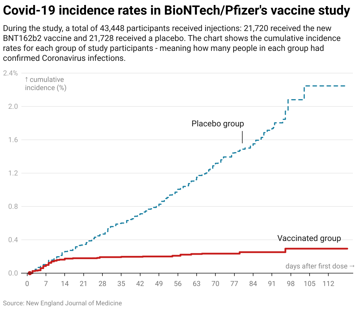
You can find the original chart as Figure 3 in the study published in the New England Journal of Medicine.
Following the study publication, the new vaccine has received official authorization in the United Kingdom, the US and the European Union, among others. Hundreds of thousands have already received it, with millions more to follow.
If you're looking for more inspirational data visualization on humanity's progress in fighting diseases, I recommend heading to the Vaccination page of the excellent Our World in Data.
That's it from Datawrapper for this week! We wish you all happy holidays, and stay tuned next week for Lisa delivering a classic of the Weekly Chart series.