Untangling the underground

Hi! I’m Alicia from the design team, and welcome to another Weekly Chart! Today, we’re looking at public transport maps of Berlin.
I’m sure everyone who’s ever visited a city with a subway is familiar with these network maps that show where different train lines go and where you can transfer to another line. Obviously, those transit diagrams are massively simplified and don’t reflect the real paths of the rail — but how much do they actually differ from a realistic map of the city?
When we take a look at Berlin’s U-Bahn (short for Untergrundbahn, or “underground railway”) network, we can see that the lines curve, cross neighborhoods, and follow the messy logic of a city that grew organically over time. And while I decided only to show the U-Bahn lines on the map below, you can imagine how busy it would be if I had included S-Bahn (short for Stadtschnellbahn, or “city rapid railway”) and tram lines as well.

The transit map of Berlin tells a different story. It is stripped of all geographical elements like lakes, rivers, and forests, the U-Bahn lines are straightened, changes in direction are reduced to 45° and 90° angles, and the spacing of the stations is adjusted. All of these details and more are intentionally and meticulously designed to reduce complexity, improve legibility, and prioritize clarity over topographical accuracy.
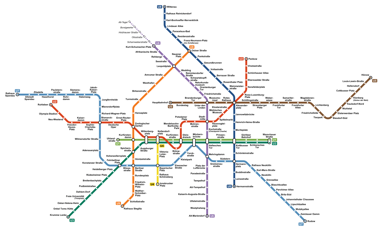
Berlin’s official transit map (that also includes the S-Bahn and tram lines) is based on the design from 1992 by Brigitte Hartwig, well-known German typographer and designer Erik Spiekermann, and his team at MetaDesign. It was inspired by a former Berlin transit map design from 1931 that depicted the S-Bahn – including the famous S-Bahn ring – for the first time as a schematic representation, as well as Harry Beck’s iconic London Underground map of 1933 (which was supposedly inspired by a circuit diagram).
Maps vs. transit diagrams
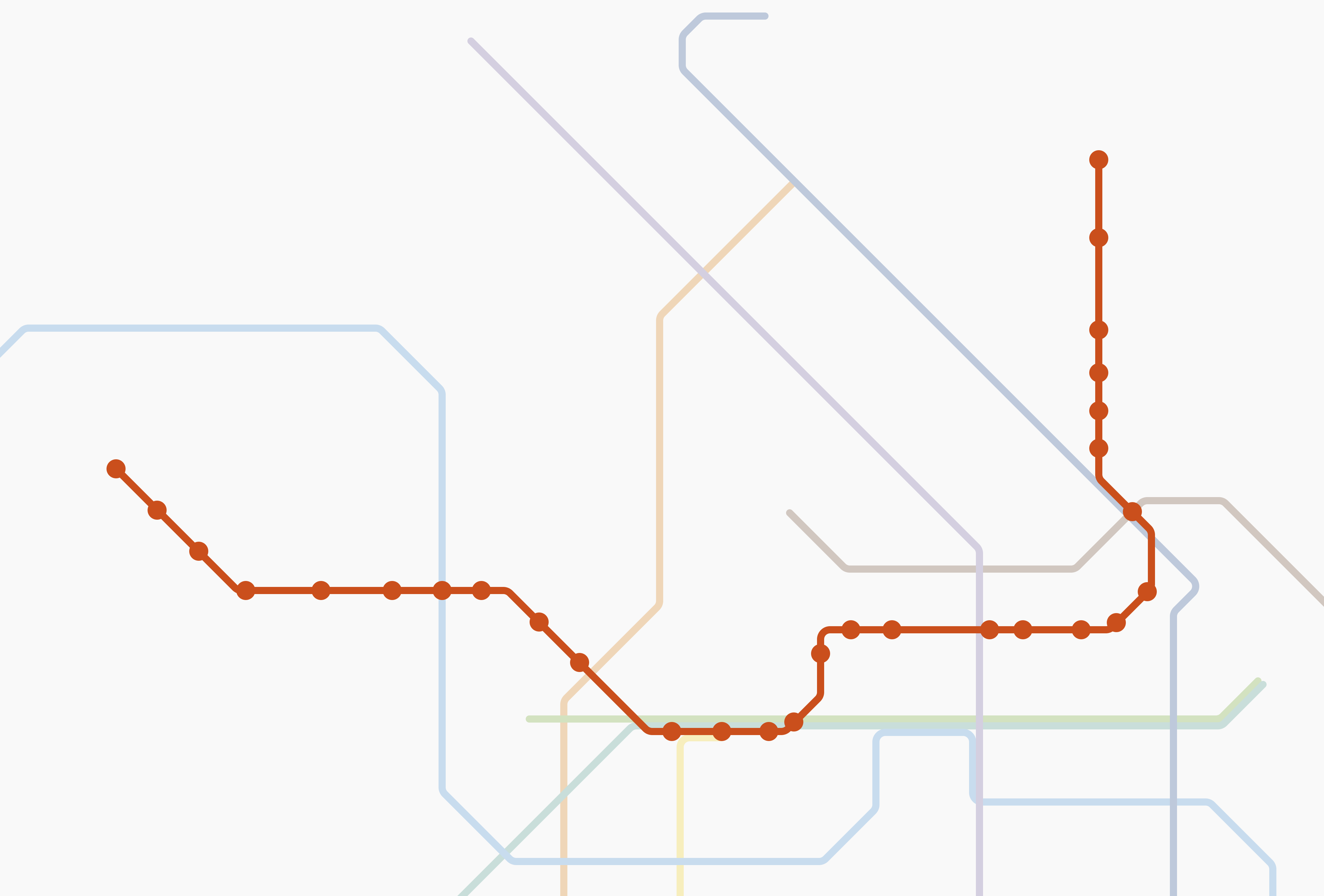
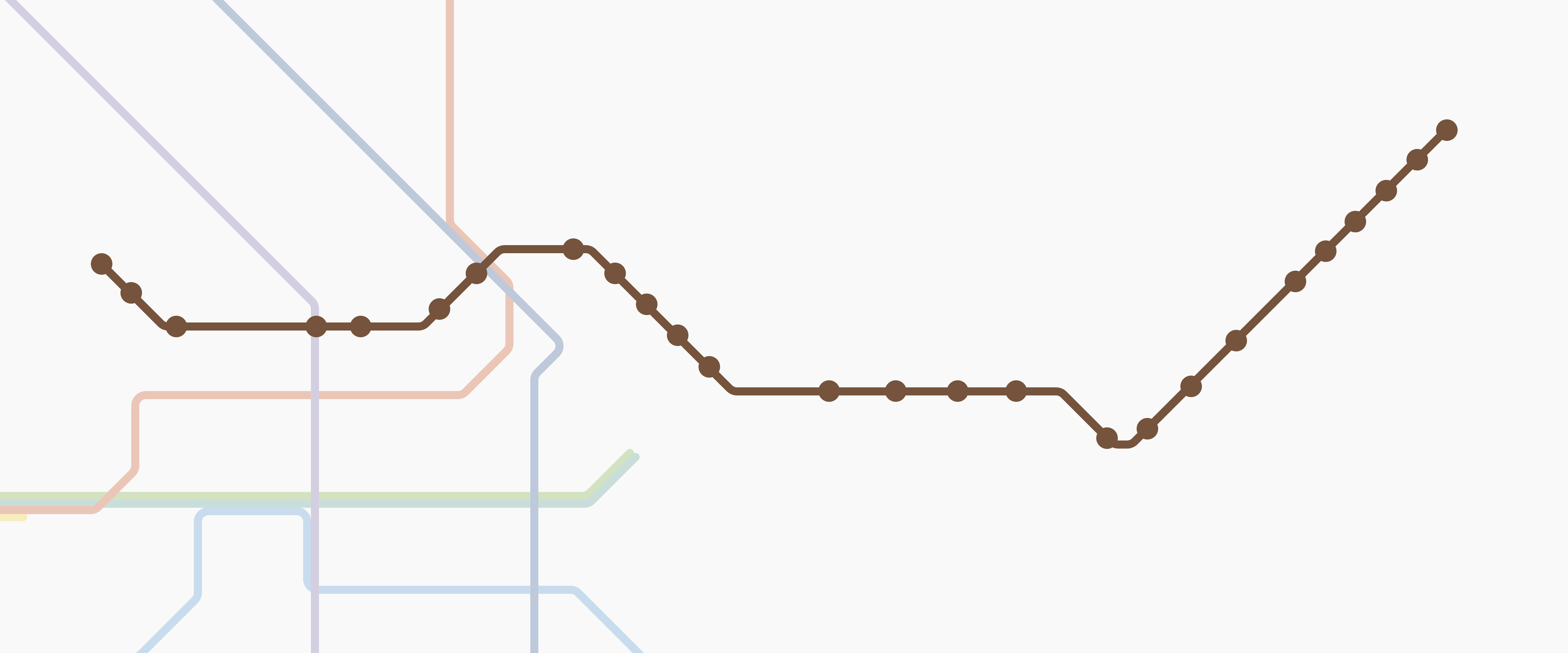
Now, let’s take a look at individual U-Bahn lines side by side. I picked the U2 and U5 because those are the ones I regularly take when commuting to our Datawrapper office.
The U2 is interesting because it basically runs across the entire city center. When comparing the actual route to the transit diagram line, you can see that it’s pretty similar – you can even see the diagonal line at Alexanderplatz in both versions. The lines are generally smoothed out, though, and distances are compressed, especially around the “city center” (Stadtmitte).

When looking at the U5, you can immediately see that the stations towards the west (closer to the center of Berlin) are quite stretched in the transit diagram. What’s interesting here is that the “squiggliness” of the diagram line is much more pronounced than that in the actual map. Both of those adjustments stem from accommodating the available space and crossings with other U-Bahn lines.


But I think it’s not entirely fair to compare these U-Bahn lines individually, as the transit diagram has to work as a whole. As Spiekermann puts it, “Wenn man sich dafür die Geografie etwas zurechtbiegen muss, nur zu! Schließlich sind es ja Diagramme und keine Karten!”¹ (or “If you have to bend the geography a bit to make it fit, go ahead! After all, these are diagrams, not maps!”).
And with that, I leave you for today. I hope you had fun exploring these maps and diagrams, and that you’ve gained a bit of appreciation for just how much work goes into making the tangle of lines look simple.
Wanna dive deeper into the topic? (I definitely fell into a rabbit hole while researching!)
¹“Transit Maps – Ikonische Designs von Berlin bis Tokio” by Mark Ovenden
“Berlin ist Gelb. Das Corporate Design der Berliner Verkehrsbetriebe: Entstehung und Gegenwart” by Lars Krüger, Bodo Baumgardt, Erik Spiekermann & Axel Mauruszat
Berliner U-Bahn-Archiv by Axel Mauruszat