A history of the HIV epidemic

Hi, this is Luc, building charts with the visualization team. Today, I am using one of my favorite chart types to visualize the evolution of a major health crisis of the last 50 years: the HIV epidemic.
Research in the treatment of HIV (the virus)/AIDS (the chronic condition) has recently seen several major breakthroughs. Prevention and prophylactic treatments have reduced the incidence to its lowest point since the beginning of the epidemic, especially in countries that have access to prophylactic treatments (PrEP), that is preventive use of antiviral drugs. Seropositive persons can now live long, healthy lives thanks to effective treatments. Some patients have even been cured from HIV through high-risk stem-cell transplants (though no scalable cures have been found yet).
But it has been a long journey.

This is not a line chart! The chart above is a connected scatterplot showing the global incidence of HIV on the horizontal axis, and the number of deaths related to HIV/AIDS on the vertical axis. The links between dots indicate time, and the colors highlight the main phases of the epidemics:
Phase 0: In the 1980s, contracting AIDS was a death sentence. HIV/AIDS had been a mysterious disease, stigmatized as a gay cancer, until the virus was identified in 1983.
Phase 1: In the 1990s, both the incidence and the number of people dying from HIV/AIDS had been increasing dramatically, until the end of the 1990s, when medical research finally made a breakthrough with combination therapies.
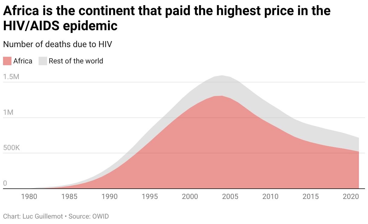
Phase 2: Incidence peaked in the late 1990s, while deaths kept rising into the mid 2000s — mainly because people infected years earlier were progressing to AIDS before treatment became widely available. Even if fewer people were newly infected after the late 1990s, millions infected earlier were still dying, especially in Sub-Saharan populations with the weakest treatment access. That is why incidence, prevalence, and mortality were out of sync.
Phase 3: Since then, mortality rate has been catching up with decreasing incidence, thanks to efforts made on prevention in the 1990s and 2000s, better access to treatment worldwide, and even more since the introduction of prophylactic treatments in the 2010s (PrEP).
Phase 4: The epidemic is now in a late control phase. Incidence continues to fall, and the number of deaths decreases, but progress is slower because remaining hotspots are concentrated in hard-to-reach populations and places with weaker health systems.
Nowadays: The long-term trend suggests that HIV could be controlled to very low levels globally, though eliminating transmission entirely remains uncertain and depends on available funding for research. The hope that the circle drawn in the chart above would eventually close with null incidence and zero deaths remains only a hope for now.
HIV history was shaped by the intertwined stories of biomedical science, structural inequalities (most deaths occurred in Sub-Saharan Africa), and discrimination towards marginalized communities (specific amendments in the USA prevented federal funds from being used for HIV/AIDS prevention, as it was associated with the gay community).
It is also a story of resilience and community-driven public health innovation — the stigma against AIDS was heavily fought by organizations like ACT UP or Deutsche Aidshilfe, which also advocated for evidence-based policies. Nowadays, in many countries, high PrEP uptake among gay and bisexual men has contributed significantly to declining transmission.
Growing up as a gay teenager in Western Europe, I often wonder how different it would have been if great artists who died of AIDS when I was a kid had survived to become my role models. If Keith Haring had finished his painting, if Freddie Mercury or Klaus Nomi had continued singing, if Hervé Guibert or Guillaume Dustan had continued writing, if the stigma around AIDS had not led politicians to frame AIDS as a moral issue and delayed research funding, would it have changed the face of the LGBTQ+ community?
Thanks for reading! Let me know if you like connected scatterplots as much as I do. Next week, you’ll hear from Alex!


