Data Vis Dispatch, October 7: German unity, U.S. government shutdown, and housing shortages

Welcome back to the 213th edition of Data Vis Dispatch! Every week, we’ll be publishing a collection of the best small and large data visualizations we find, especially from news organizations — to celebrate data journalism, data visualization, simple charts, elaborate maps, and their creators.
Recurring topics this week include the 30th anniversary of German reunification, the U.S. government shutdown, and housing shortages.
The 30th anniversary of German reunification on October 3 was an occasion for journalists to take a look at each federal state's sympathies towards the others and the ongoing differences between east and west.
![Der Tagesspiegel: <a href="https://interaktiv.tagesspiegel.de/lab/alle-gegen-berlin-das-grosse-sympathie-ranking-der-bundeslaender-wer-mag-wen-wen-moegen-wir-interaktiv/"><strong>Das große Sympathie-Ranking der Bundesländer</strong></a><strong> </strong>[<em>The big sympathy ranking of the federal state</em>s], October 3](https://datawrapper.de/cdn-cgi/image/quality=85,width=1126,f=auto,fit=cover/https://kirby.datawrapper.de/media/pages/blog/data-vis-dispatch-october-7-2025/bac848e39d-1759853716/cleanshot-2025-10-07-at-18.14.59@2x.png)
![Der Spiegel: <a href="https://www.spiegel.de/wirtschaft/35-jahre-deutsche-einheit-wo-deutschland-weiterhin-geteilt-ist-a-fb150164-e553-4e9f-b6f5-262a49351ab6"><strong>Hier ist Deutschland immer noch geteilt</strong></a> [Chart description: <em>Median gross salary in 2024, in euros</em>], October 3](https://datawrapper.de/cdn-cgi/image/quality=85,width=1112,f=auto,fit=cover/https://kirby.datawrapper.de/media/pages/blog/data-vis-dispatch-october-7-2025/1e57974729-1759742761/cleanshot-2025-10-06-at-11.23.25@2x.png)
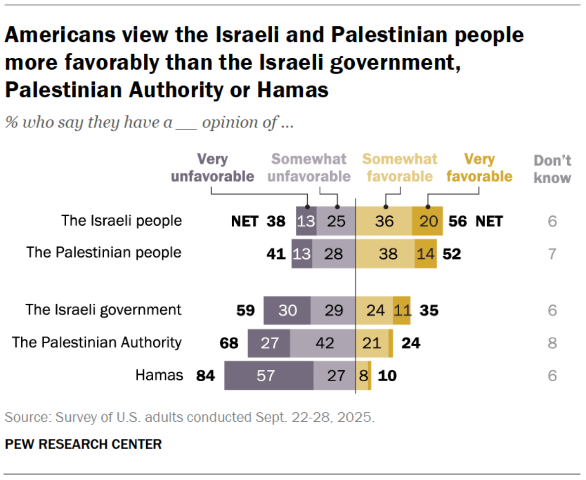
This week also marks two years since the Hamas attack on Israel on October 7, 2023. These days, we see widespread destruction in the Gaza Strip and tens of thousands of lives lost.
![Valentina D'Efilippo: "This weekend to mark two years since Israel’s military response to the Hamas attack on October 7 2023, I spent sixteen hours painting data, one dot for every life lost. t was my way to protest in silence. A way to witness. To connect. To grieve. I only managed to represent half of the reported deaths: 34,624 children, women, journalists and medical workers [...]," October 7 (<a href="https://www.linkedin.com/feed/update/urn:li:activity:7380637494247174144/"><strong>LinkedIn post</strong></a>)](https://datawrapper.de/cdn-cgi/image/quality=85,width=809,f=auto,fit=cover/https://kirby.datawrapper.de/media/pages/blog/data-vis-dispatch-october-7-2025/b5dc74a75a-1759739166/1759681093233.jpeg)
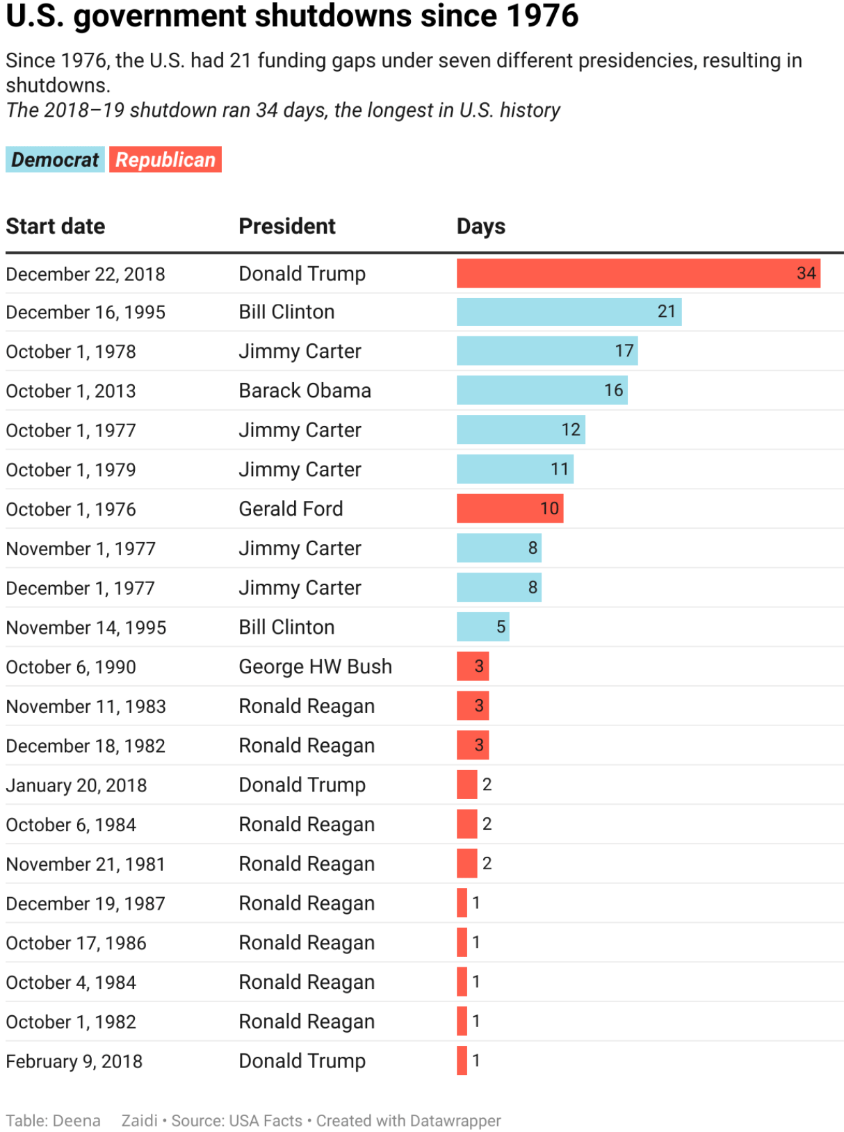
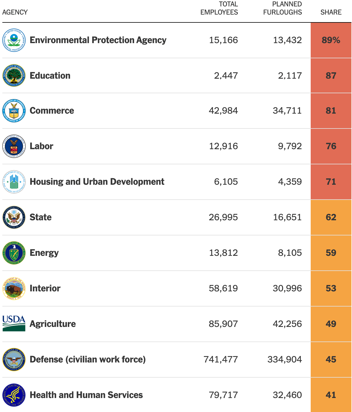
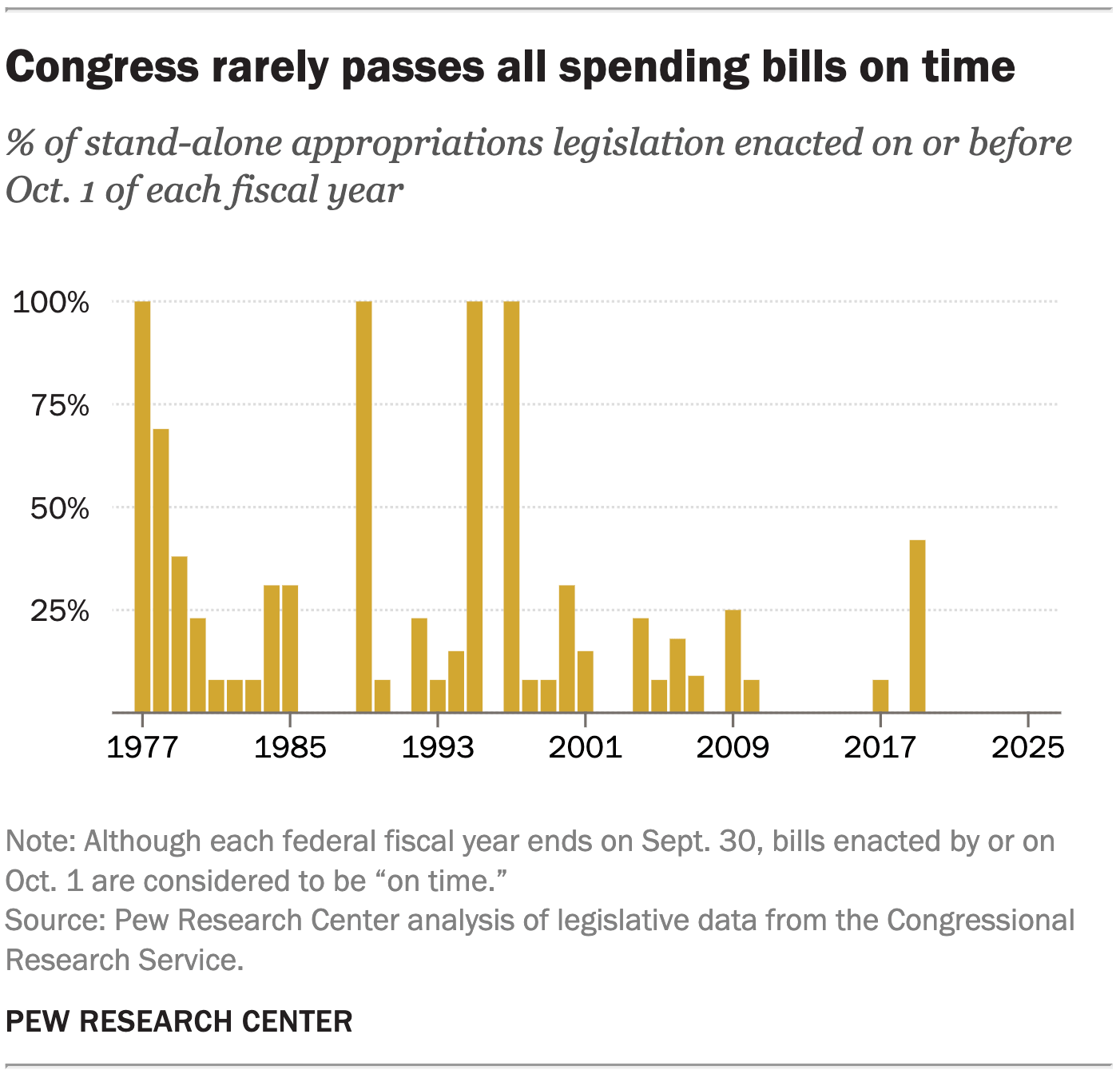
The U.S. government has been in shutdown since Wednesday, October 1, after lawmakers failed to pass a funding bill. A variety of historical reviews of shutdown duration and occurrence were produced, which come in a range of colors and visualization formats.
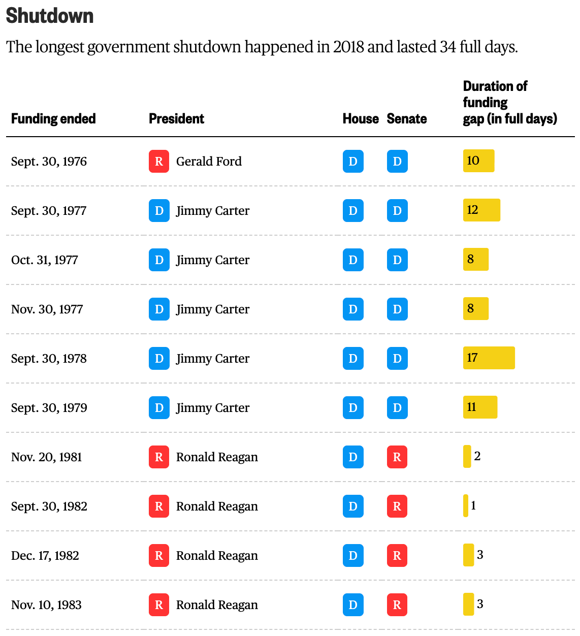
![Der Spiegel: <a href="https://www.spiegel.de/wirtschaft/shutdown-usa-haushaltsstreit-in-der-vergangenheit-a-7e2f9917-ca7c-40d7-8d67-9e88af500c57"><strong>Wenn der Haushaltsstreit den Staat lahmlegt</strong></a> [Chart description: <em>Duration of shutdowns in the U.S. since 1981 in days and the respective majorities in the Congress</em>], October 1](https://datawrapper.de/cdn-cgi/image/quality=85,width=1258,f=auto,fit=cover/https://kirby.datawrapper.de/media/pages/blog/data-vis-dispatch-october-7-2025/89c96f6ea3-1759753570/cleanshot-2025-10-06-at-14.24.30@2x.png)
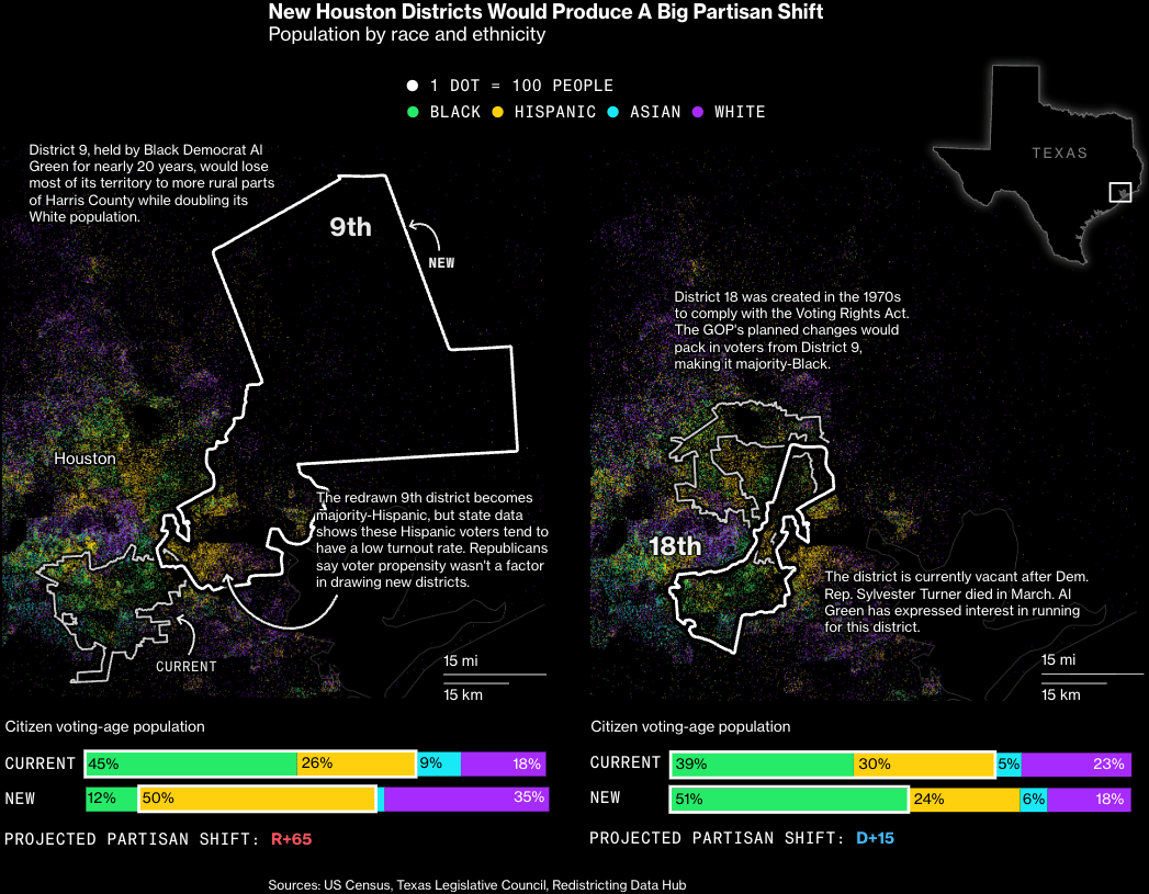
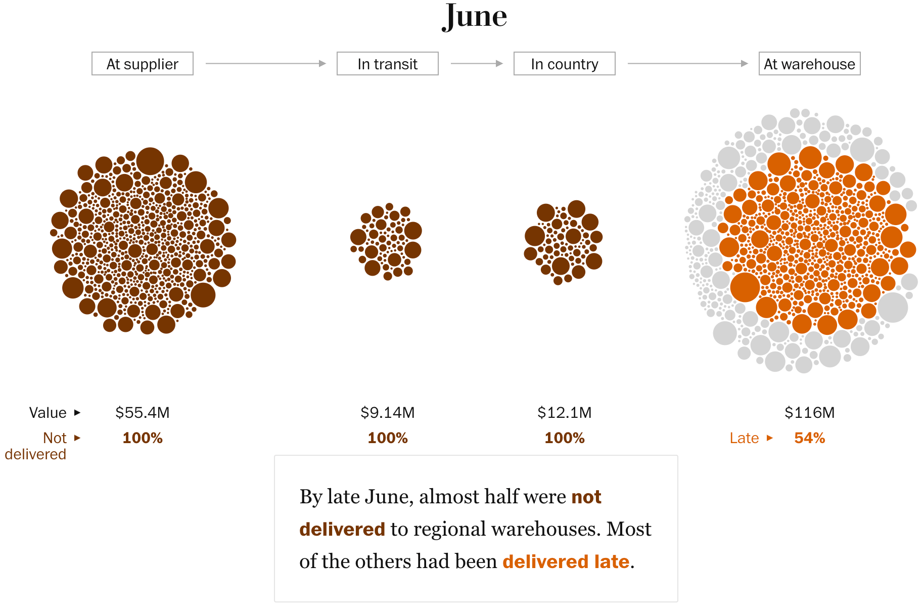
Other U.S. visualizations address the aftermath of the shutdown and its impact on government employees, as well as the rare occurrence of passing spending bills on time. Additional topics include new election districts in Texas and their effect on the political landscape, and delayed HIV aid deliveries.
Czechs voted in elections this past weekend, in unusually high numbers. The occasion also inspired a look back at the history of speeches and reactions in the Chamber of Deputies.
![Seznam Zprávy: <a href="https://www.seznamzpravy.cz/p/vysledky-voleb/2025/parlamentni-volby"><strong>Volby do Poslanecké sněmovny 2025</strong></a> [Chart title: <em>Final election results</em>], October 4](https://datawrapper.de/cdn-cgi/image/quality=85,width=1822,f=auto,fit=cover/https://kirby.datawrapper.de/media/pages/blog/data-vis-dispatch-october-7-2025/b681e2cde7-1759840366/cleanshot-2025-10-07-at-14.31.47@2x.png)
![ČT24: <a href="https://ct24.ceskatelevize.cz/tema/volby-do-poslanecke-snemovny-2025-97721?volebni-tab=snemovna"><strong>Průběžné výsledky složení sněmovny</strong></a><strong> </strong>[<em>Preliminary results of the composition of the Chamber of Deputies</em>], October 4](https://datawrapper.de/cdn-cgi/image/quality=85,width=2206,f=auto,fit=cover/https://kirby.datawrapper.de/media/pages/blog/data-vis-dispatch-october-7-2025/d705debedf-1759854855/cleanshot-2025-10-07-at-18.34.01@2x.png)
![Deník N: <a href="https://denikn.cz/1858543/jaky-byl-recept-na-historicky-uspech-hnuti-ano-vysvetlujeme-v-mapach-a-grafech/?cst=ead7e875db9662ee11c1a6413fdf6acca3630cfdc1d12ac6050bca88d84f4fe6"><strong>Jaký byl recept na historický úspěch hnutí ANO? Vysvětlujeme v mapách a grafech</strong></a> [Chart description:<em> Change in participation in the 2025 elections</em>], October 5](https://datawrapper.de/cdn-cgi/image/quality=85,width=1820,f=auto,fit=cover/https://kirby.datawrapper.de/media/pages/blog/data-vis-dispatch-october-7-2025/b967cf651b-1759840842/cleanshot-2025-10-07-at-14.40.02@2x.png)
![iROZHLAS: <a href="https://www.irozhlas.cz/zpravy-domov/jedenact-roku-bez-legrace-i-164-vykriku-za-jediny-den-107-let-recneni-a-hluceni_2510020630_ksp"><strong>Data ze Sněmovny za 107 let: Hanba křičeli poslanci ve 230 případech. Nejvíckrát se tleskalo Kalouskovi</strong></a> [Chart description:<em> The appropriate number of words spoken necessary to elicit a loud response from the chamber</em>], October 2](https://datawrapper.de/cdn-cgi/image/quality=85,width=1214,f=auto,fit=cover/https://kirby.datawrapper.de/media/pages/blog/data-vis-dispatch-october-7-2025/00499eae0f-1759845014/cleanshot-2025-10-07-at-15.49.19@2x.png)
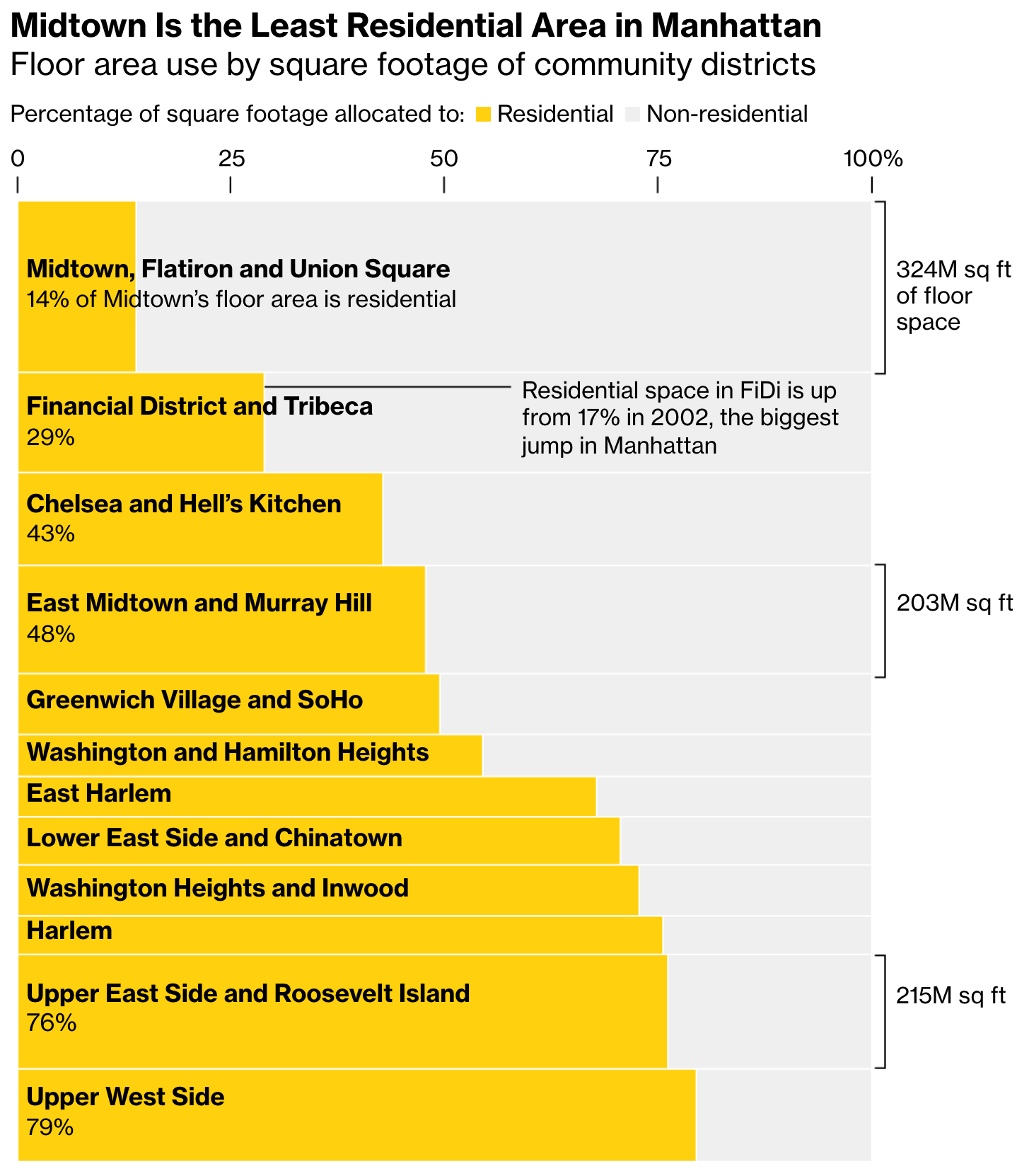
Housing is currently associated with one word: shortage. Cities in Portugal are experiencing an unprecedented housing shortage, largely due to short-term rentals. Meanwhile, on the other side of the Atlantic, Manhattan is attempting to counteract this crisis with large-scale construction projects.
![João Bernardo Narciso: <a href="https://www.desalojamento.pt/?language=en"><strong>desALojamento</strong></a> [<em>Dislodgement</em>], October 1](https://datawrapper.de/cdn-cgi/image/quality=85,width=964,f=auto,fit=cover/https://kirby.datawrapper.de/media/pages/blog/data-vis-dispatch-october-7-2025/2436f7ef03-1759737789/cleanshot-2025-10-06-at-09.58.54.png)
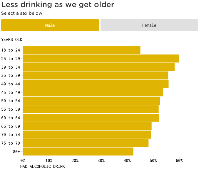
How does your alcohol consumption impact your health risks? And how do you compare to others in your age group? These visualizations may give you the answers.
![Die Zeit: <a href="https://www.zeit.de/gesundheit/2025-09/alkoholkonsum-rechner-vergleich-gesundheitsrisiko-studie"><strong>Wie riskant ist Ihr Alkoholkonsum?</strong></a><strong> </strong>[<em>How risky is your alcohol consumption?</em>], September 30](https://datawrapper.de/cdn-cgi/image/quality=85,width=1128,f=auto,fit=cover/https://kirby.datawrapper.de/media/pages/blog/data-vis-dispatch-october-7-2025/25a88c7300-1759743389/cleanshot-2025-10-06-at-11.34.18@2x.png)
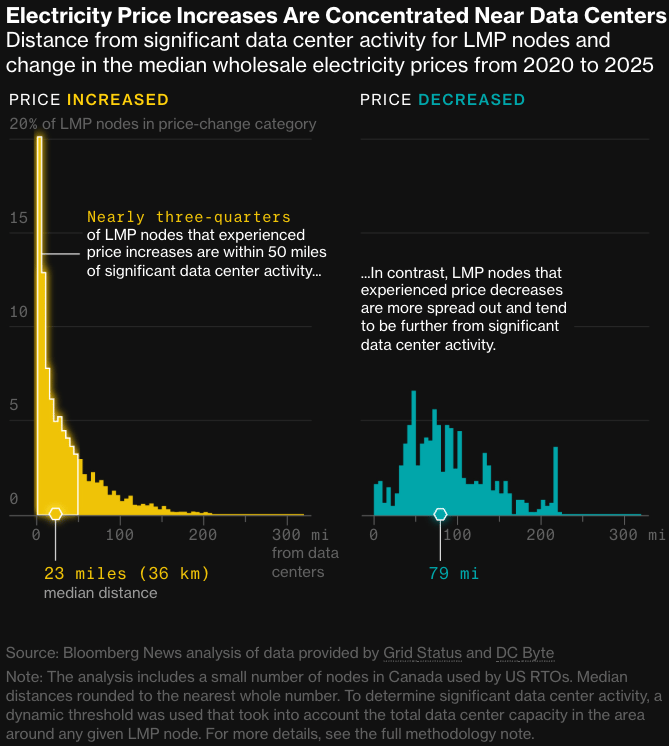
In the realm of energy, newsrooms covered rising electricity costs near data centers, government subsidies in Malaysia that keep oil prices low, and the distinct energy politics of China and the U.S.
![碧懂天下:<a href="https://newsgraphy.my/budi95-petrol-subsidy/"> <strong>1.99令吉油价: 你和政府节省多少钱?</strong></a> [<em>Chart description: International oil price vs. domestic price The gray area represents the price difference that the government covers for the population.The larger this area, the greater the financial burden on the government</em>], October 1](https://datawrapper.de/cdn-cgi/image/quality=85,width=1446,f=auto,fit=cover/https://kirby.datawrapper.de/media/pages/blog/data-vis-dispatch-october-7-2025/02b2a9590b-1759829773/cleanshot-2025-10-07-at-11.34.06@2x.png)
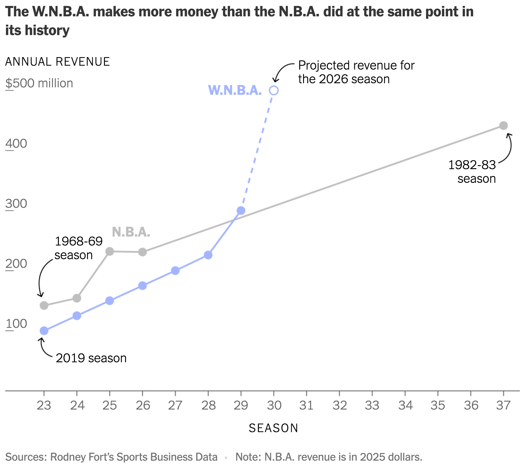
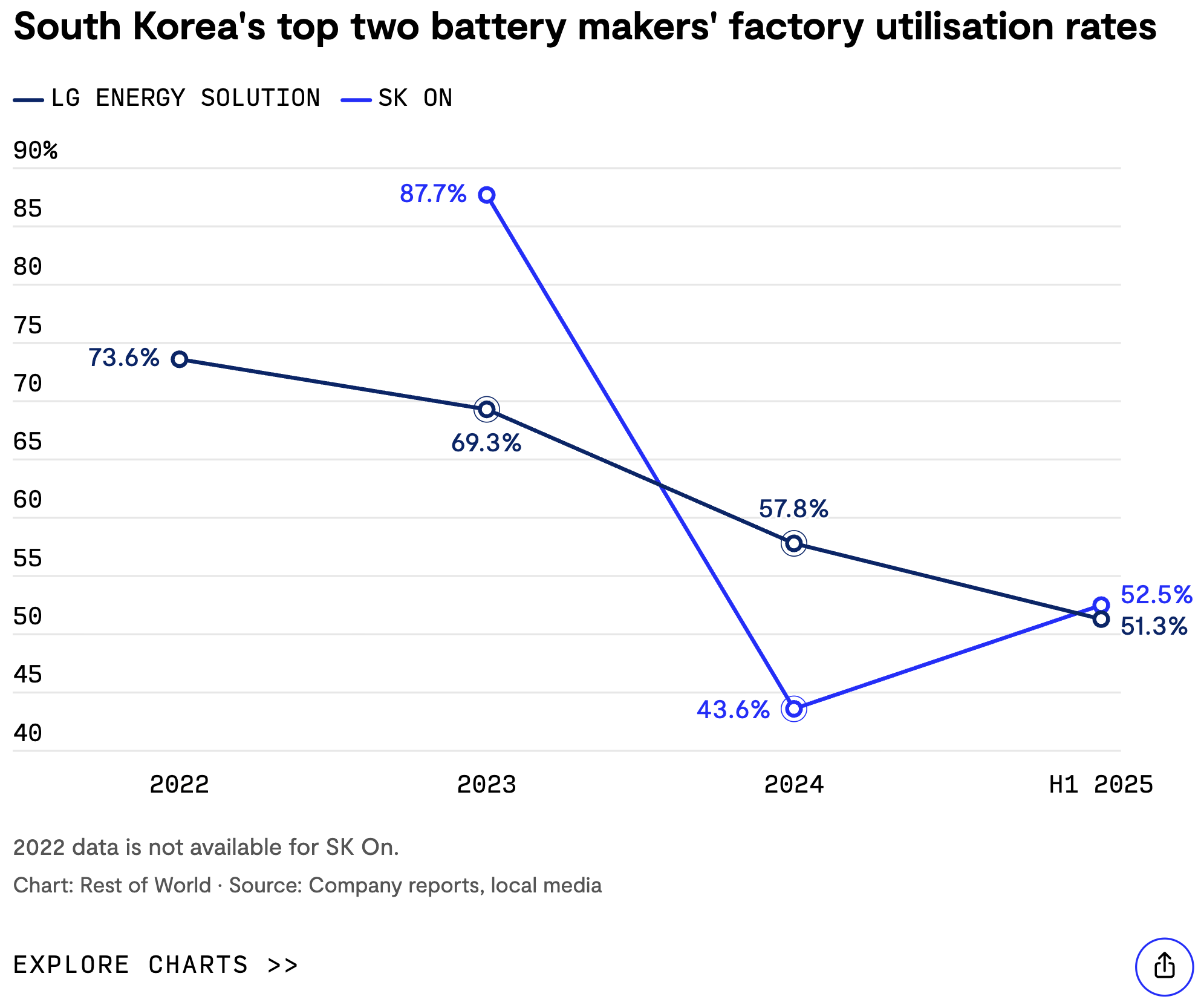
A comparison of women's and men's U.S. basketball revenues, as well as the decline in the use of battery factories in Korea, demonstrates how effective line charts can be with the help of data points and annotations.
Other visualizations this week covered love and religion, and the war in Ukraine.
What else we found interesting
![El Mundo: <a href="https://www.elmundo.es/internacional/2025/10/01/68dd477efc6c83d37e8b45b2.html"><strong>El muro antidrones de Ucrania, el modelo a seguir para Europa</strong></a><strong> </strong>[<em>Ukraine's anti-drone wall, a model for Europe</em>], October 5](https://datawrapper.de/cdn-cgi/image/quality=85,width=2393,f=auto,fit=cover/https://kirby.datawrapper.de/media/pages/blog/data-vis-dispatch-october-7-2025/763ae18720-1759752681/muro_antidron_1200_1.jpg)
![WeVIS: <a href="https://wevis.info/6oct19/"><strong>รำลึก 6 ตุลาฯ 2519 แด่ปัจเจกชนผู้สูญเสีย</strong></a><strong> </strong>[<em>Remembering October 6, 1976 and the individuals who lost their lives</em>], October 6](https://datawrapper.de/cdn-cgi/image/quality=85,width=1920,f=auto,fit=cover/https://kirby.datawrapper.de/media/pages/blog/data-vis-dispatch-october-7-2025/21a2150c81-1759752808/ig_post_4-scaled.jpg)
Applications are open for…
An operations director at Data Visualization Society


