The best of last week’s big and small data visualizations
Rose Mintzer-Sweeney
Welcome back to the 16th edition of Data Vis Dispatch! Every week, we’ll be publishing a collection of the best small and large data visualizations we find, especially from news organizations — to celebrate data journalism, data visualization, simple charts, elaborate maps, and their creators.
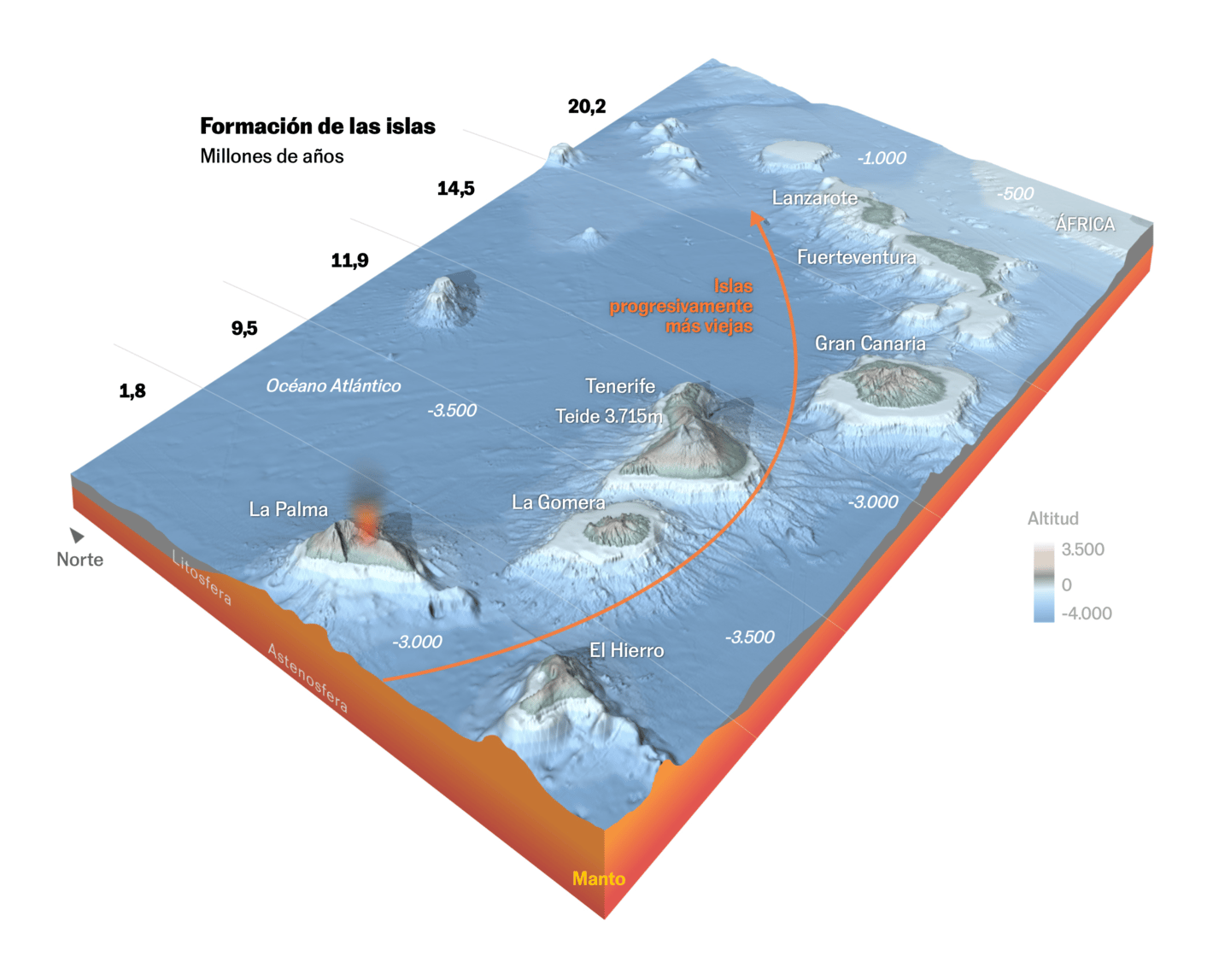
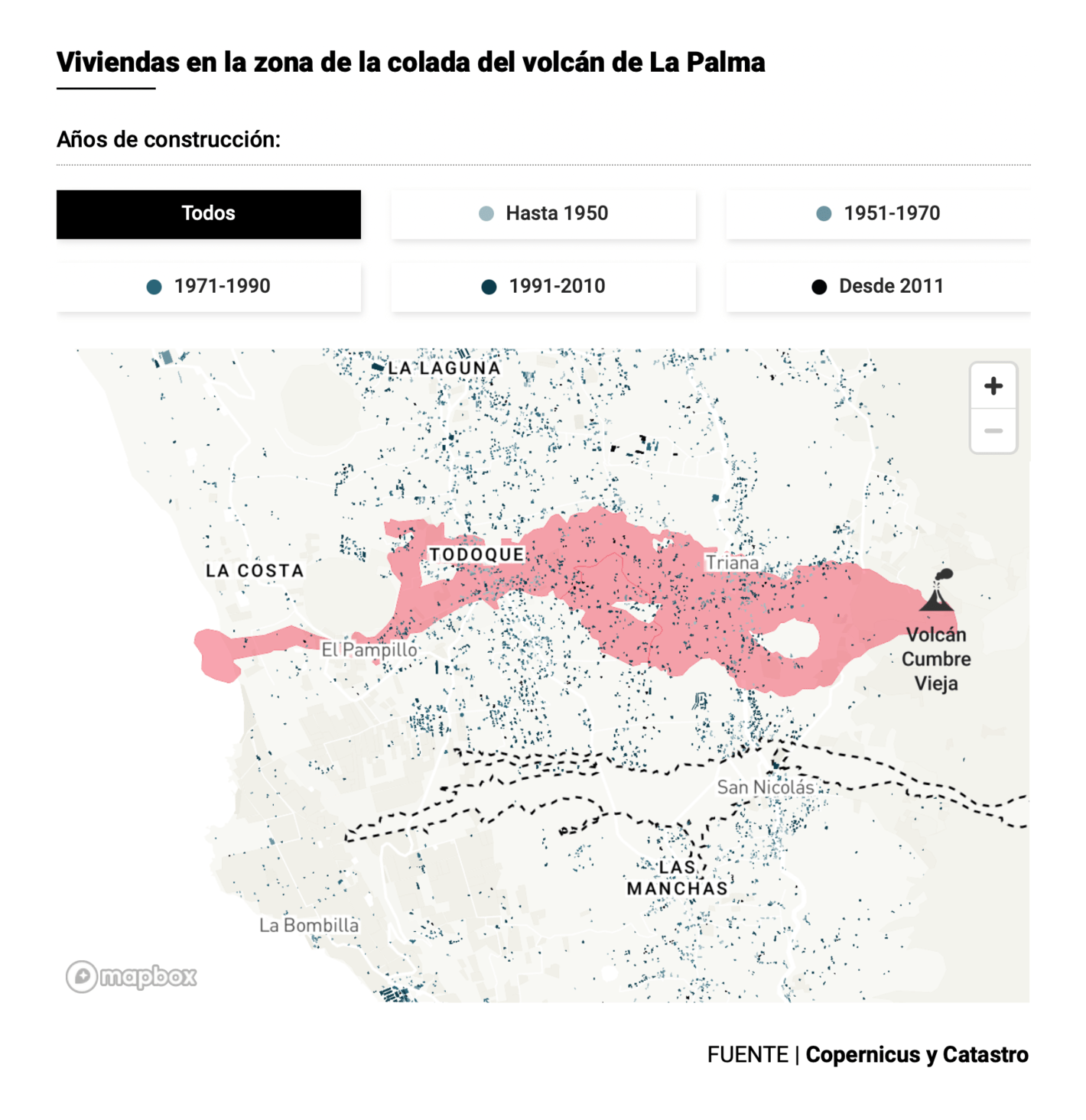
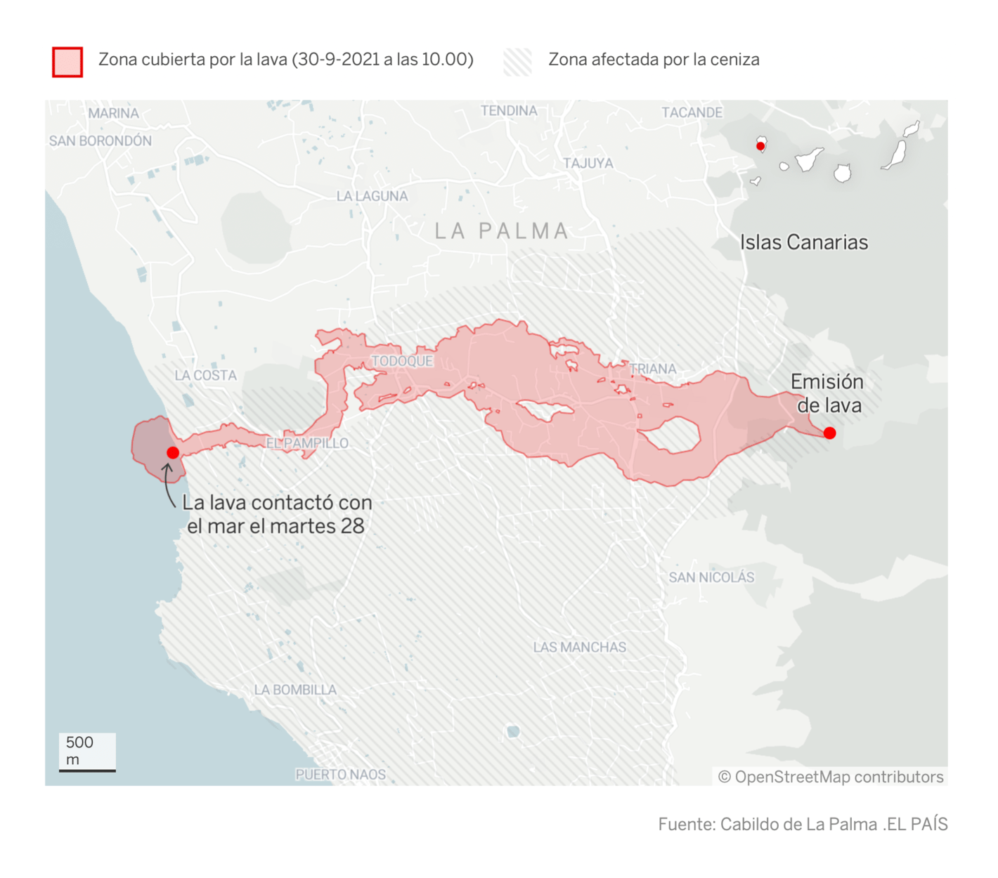
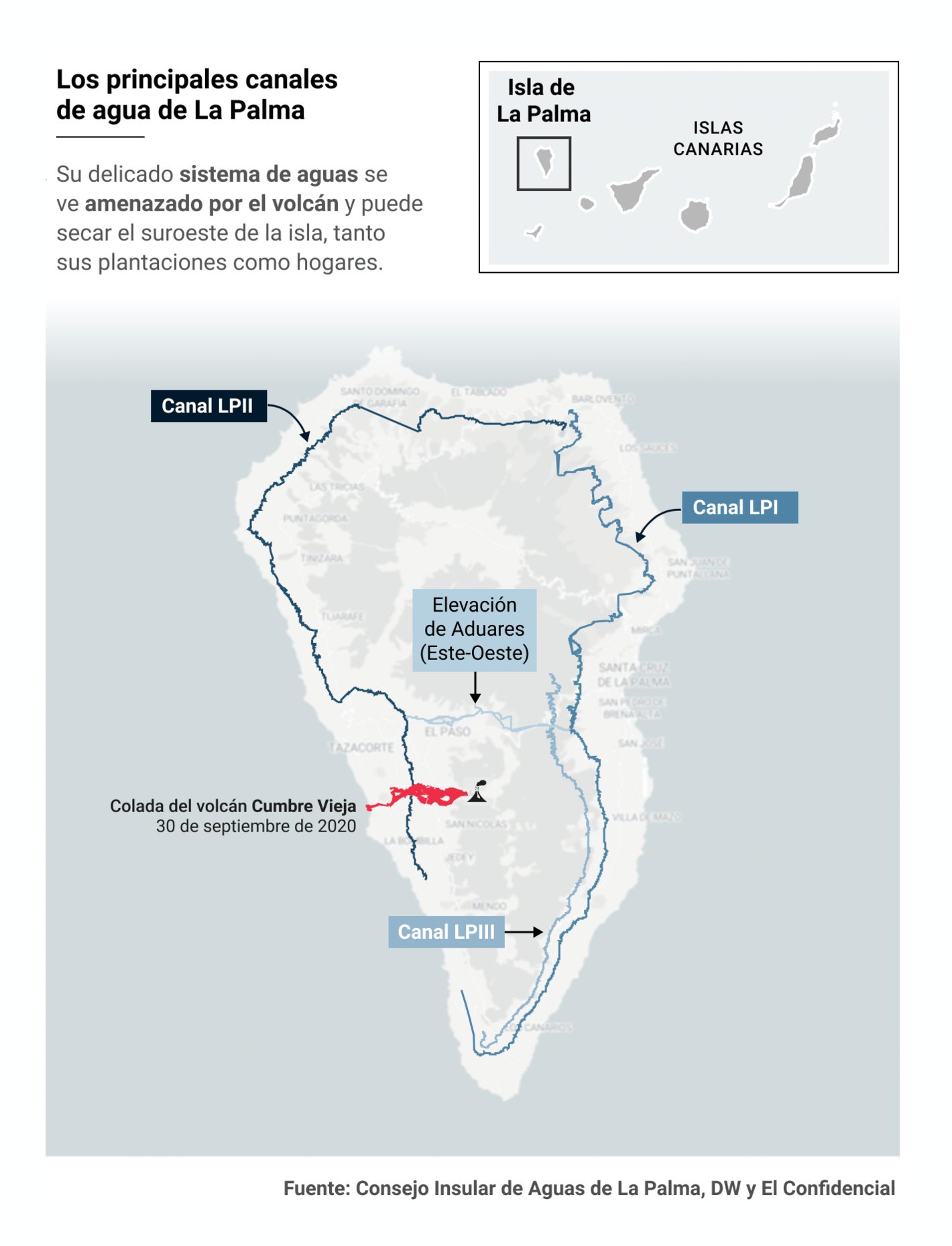
Recurring topics this week include the pandemic, La Palma, and the Pandora papers.
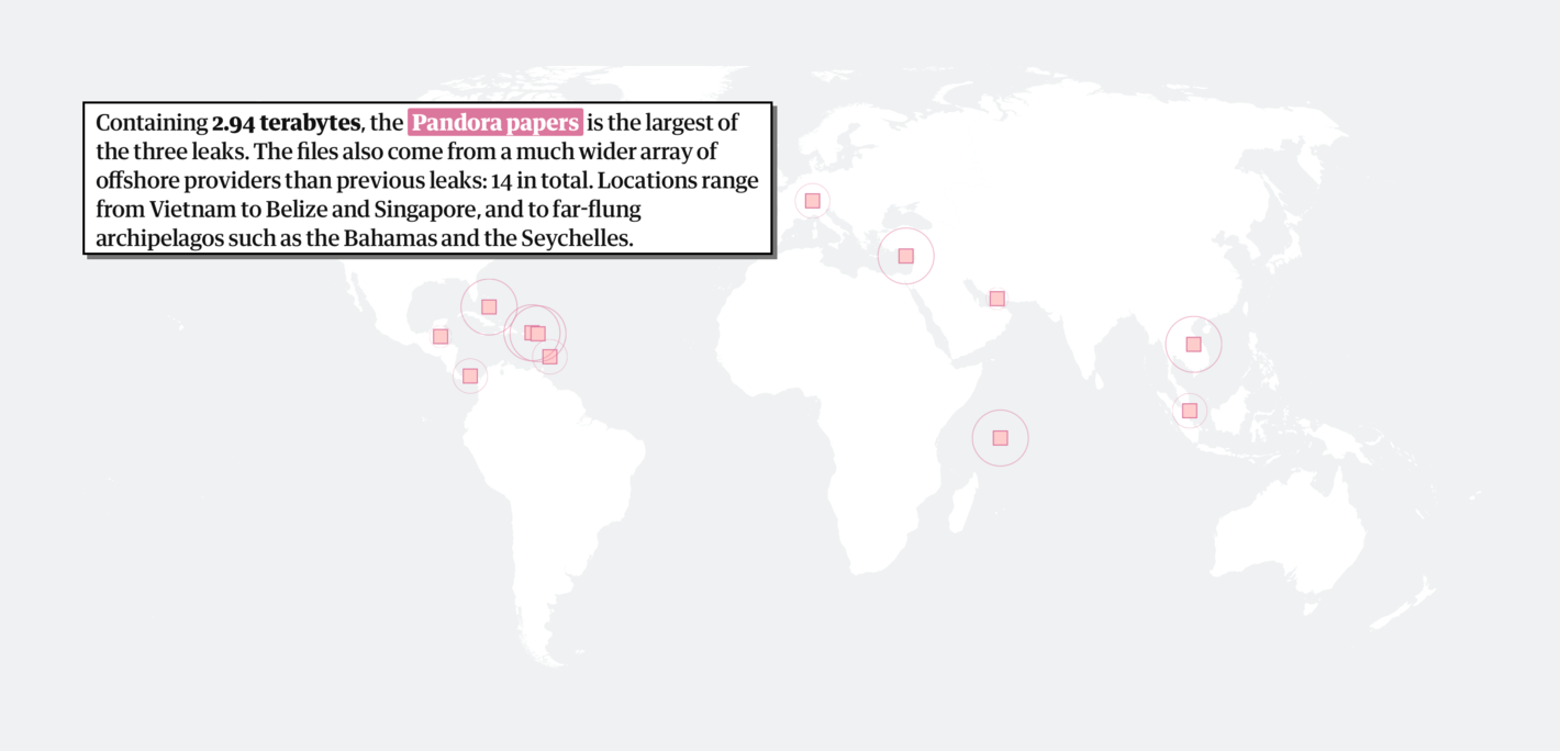
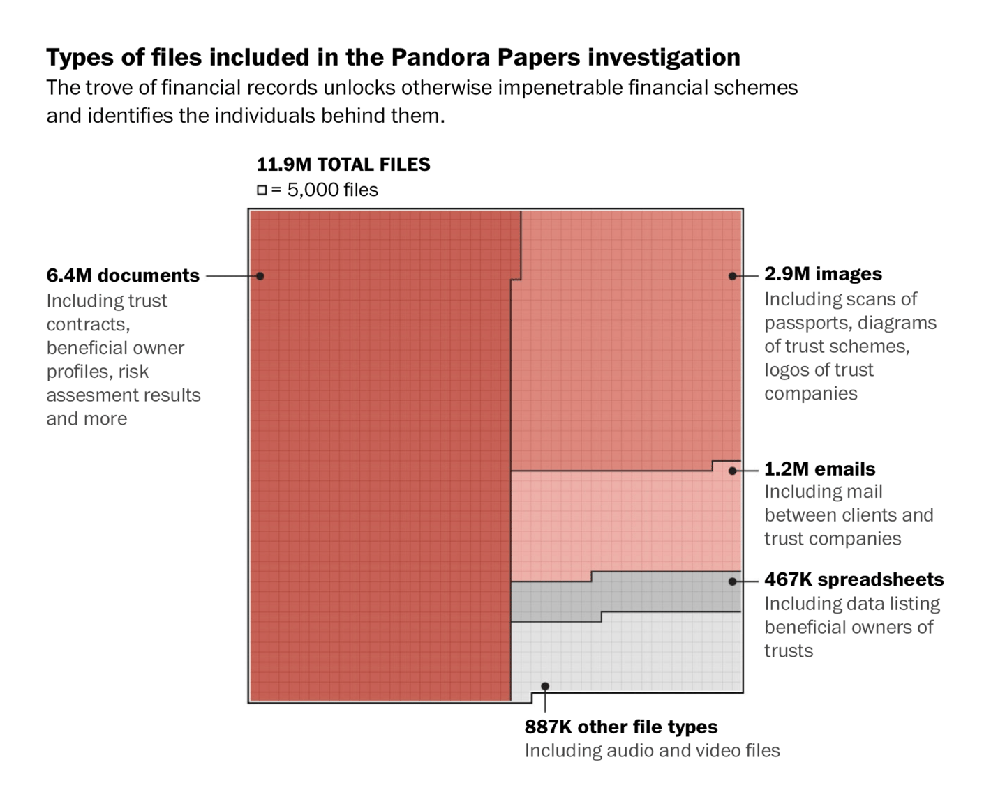
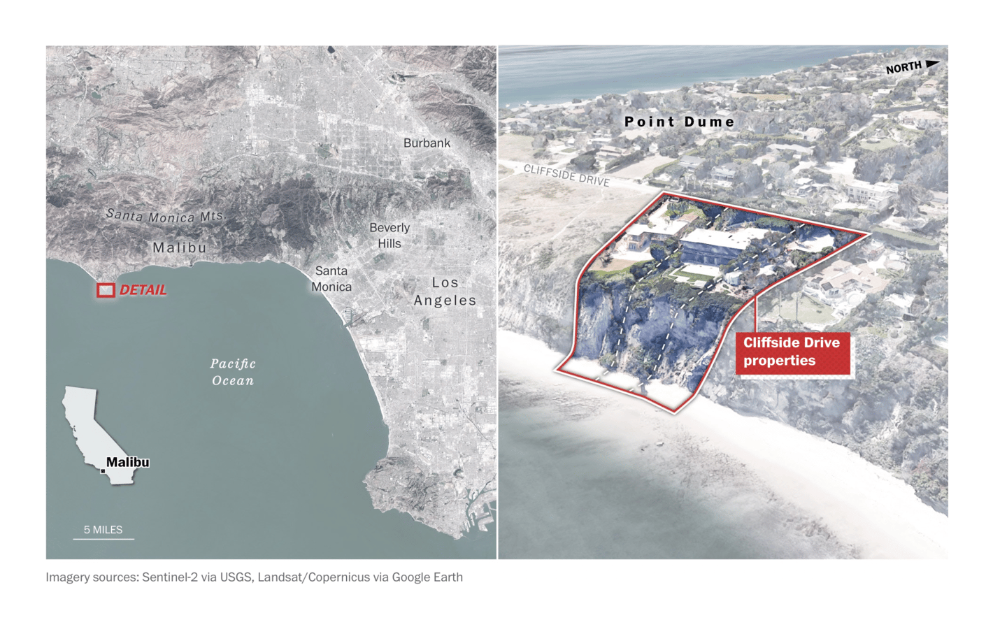
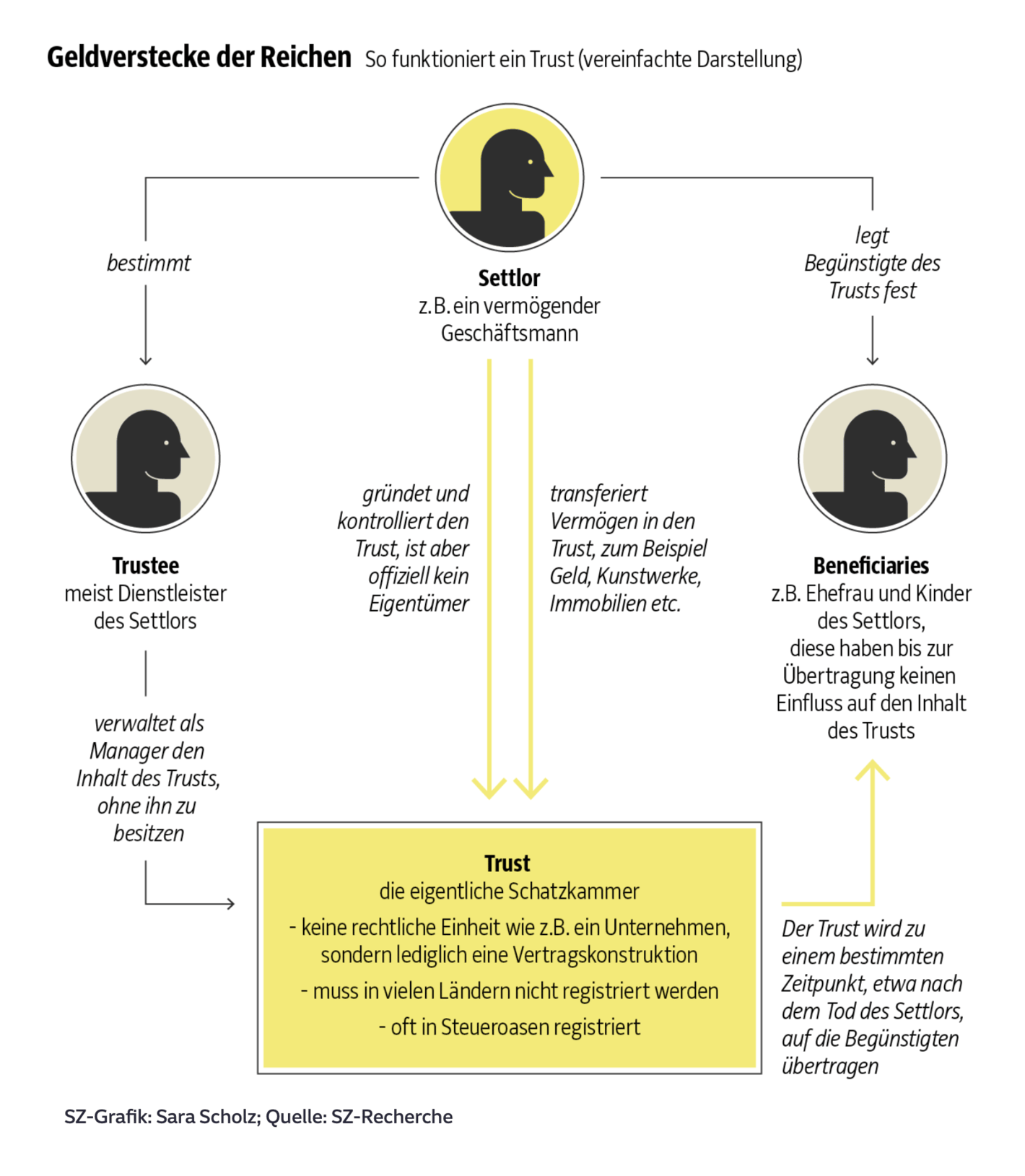
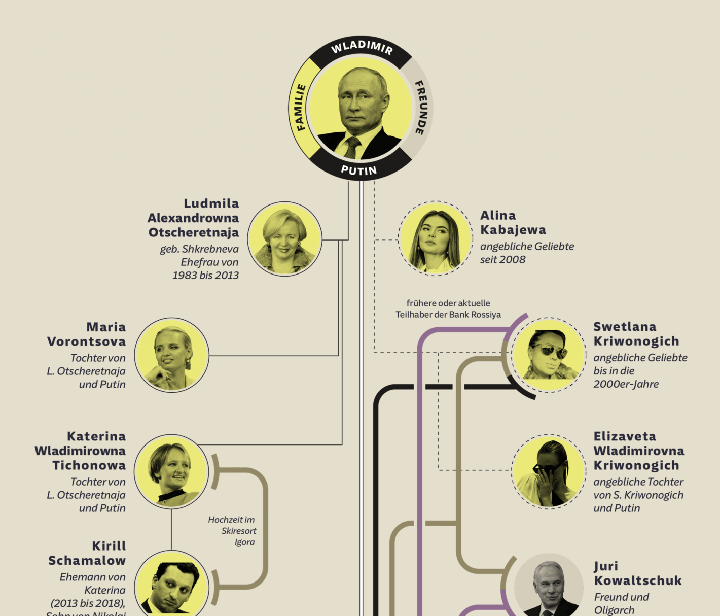
The breaking news of this week was the release of the Pandora papers — a huge leak of compromising documents from 14 offshore financial services firms:
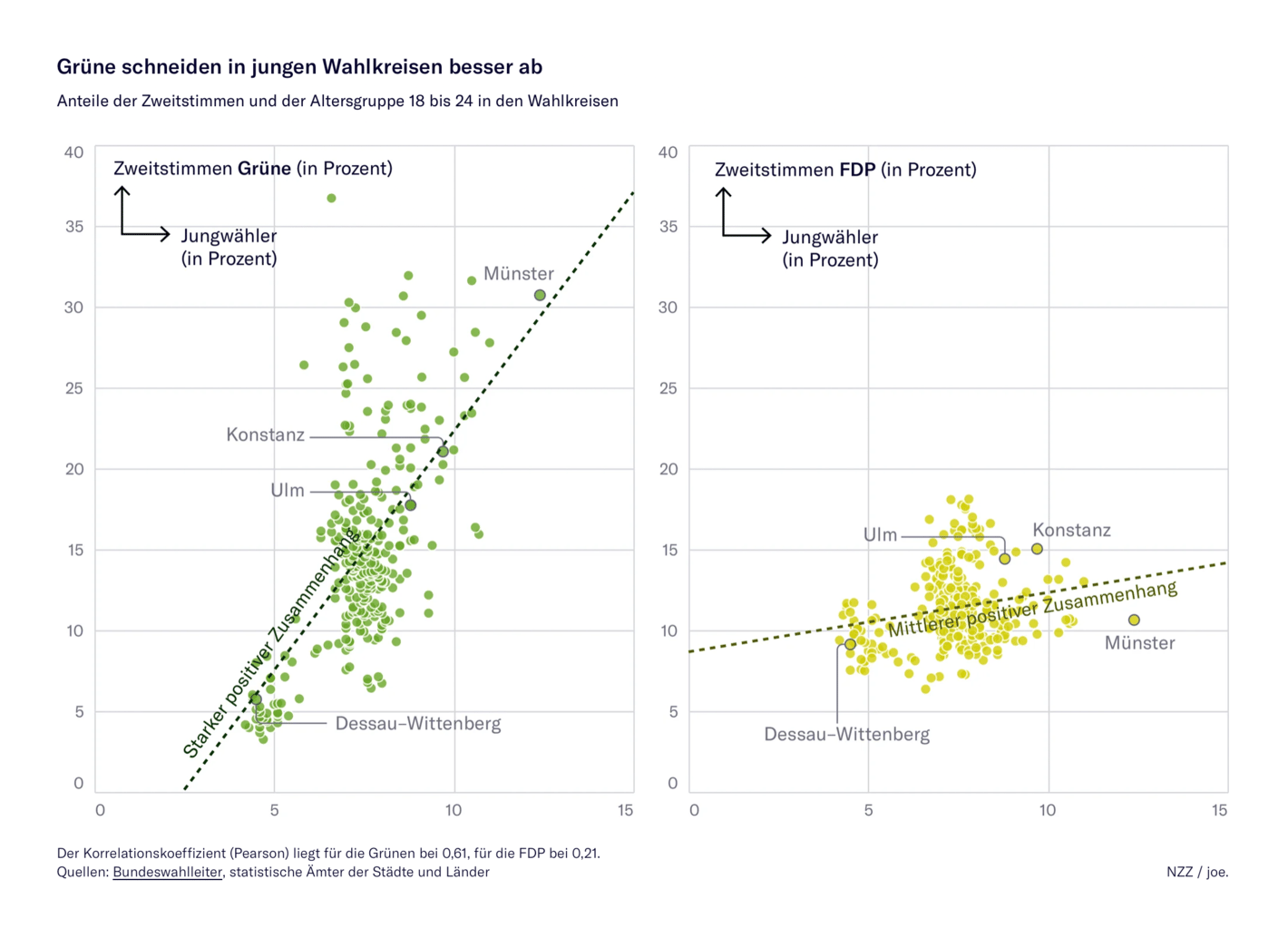
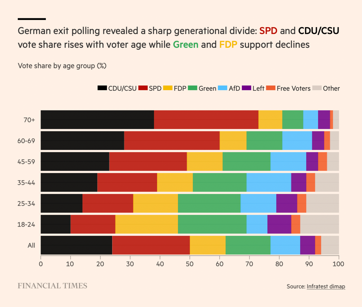
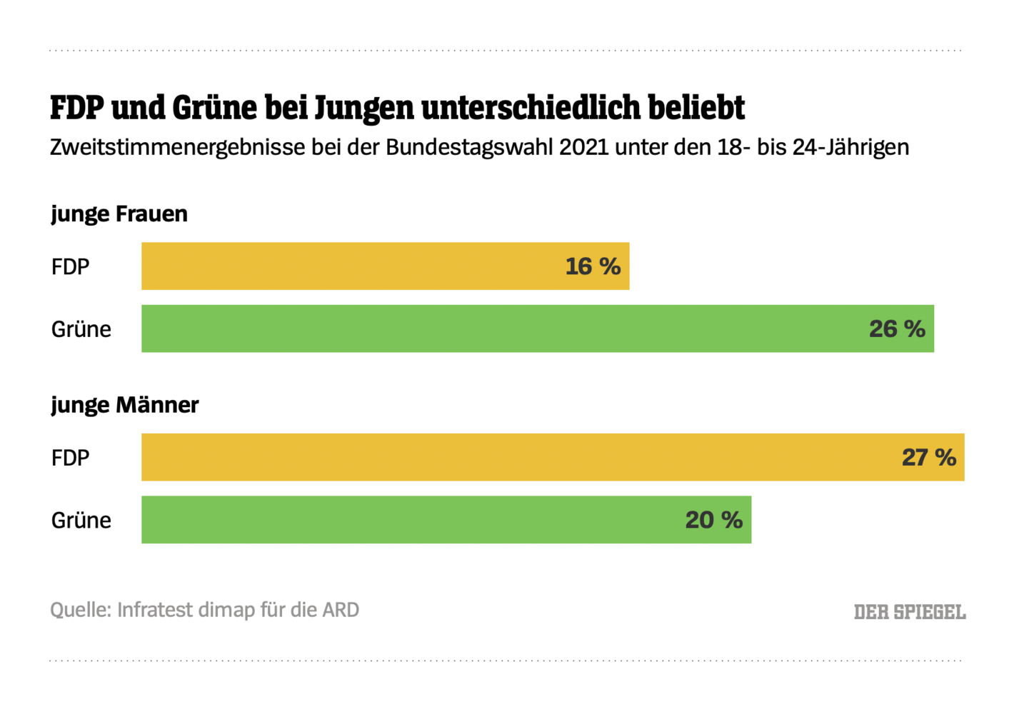
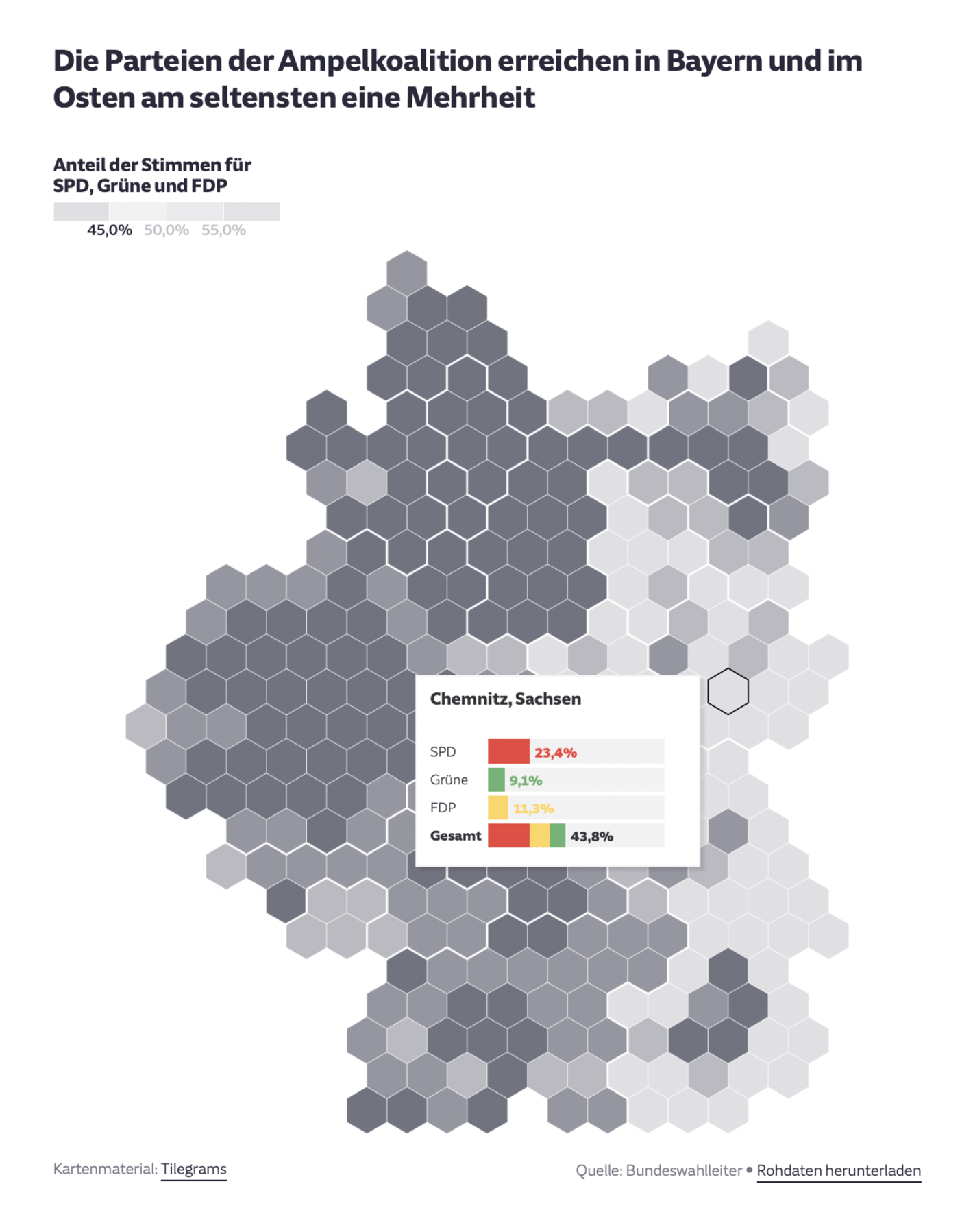
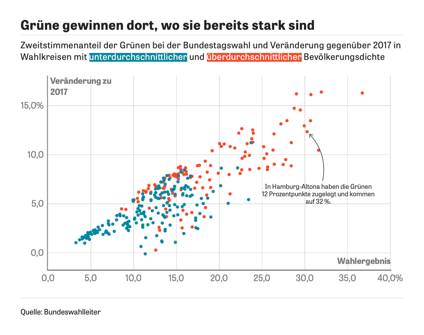
If not for that surprise, elections would have once again made the top story. Several newsrooms dug deeper into Germany's recent results to see which voters — by age, gender, and geography — were responsible for the gains of the Greens and FDP:
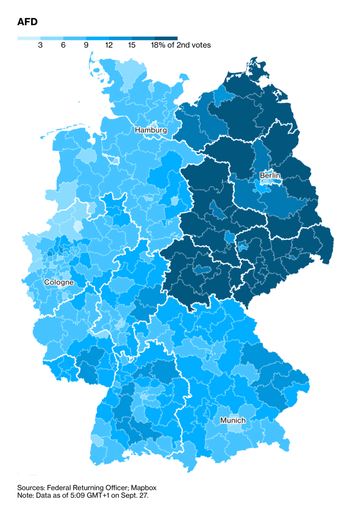
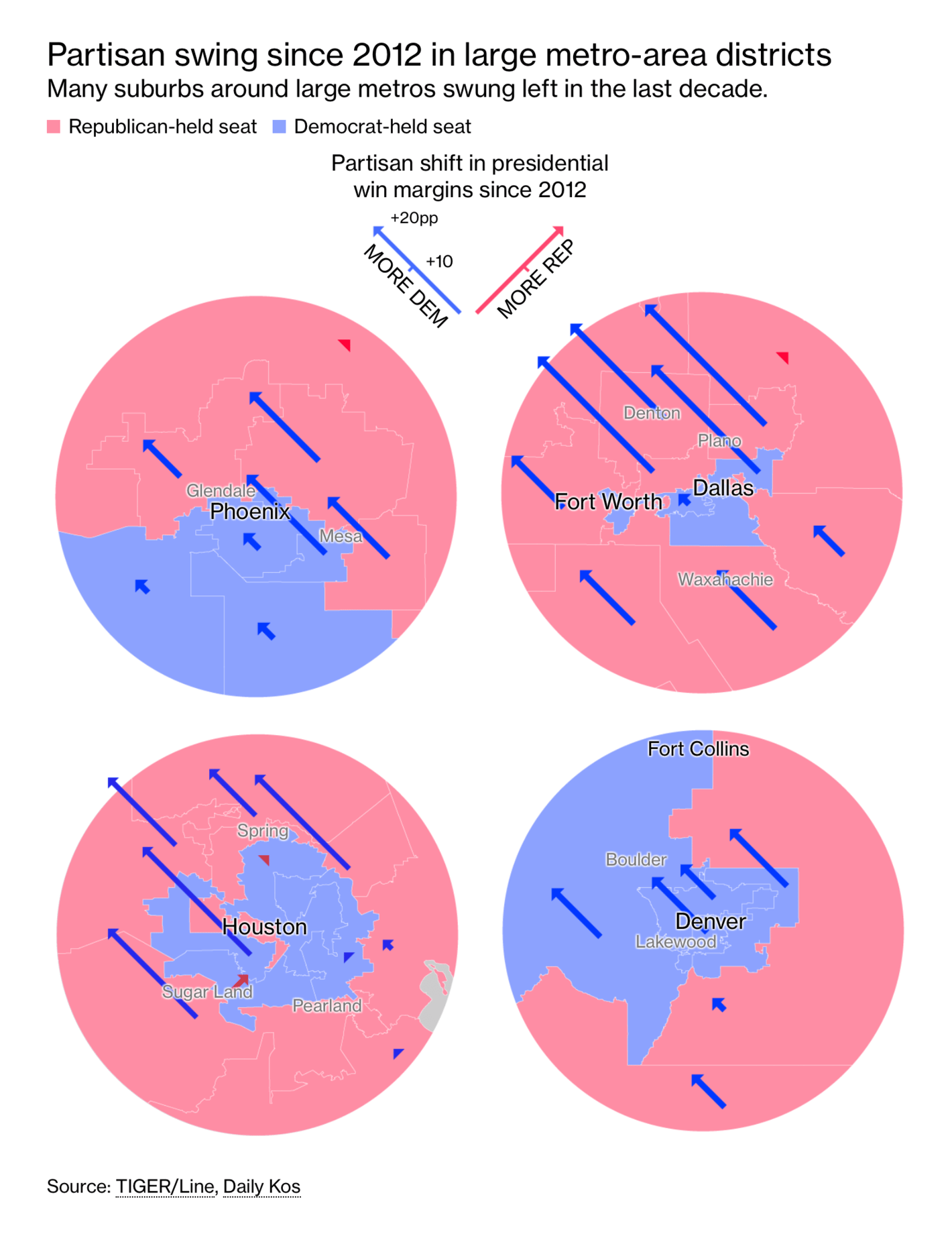
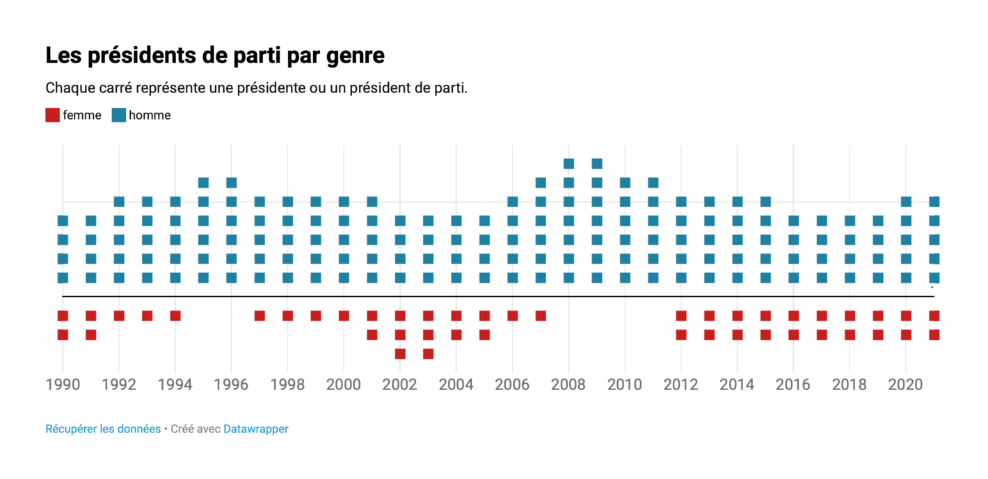
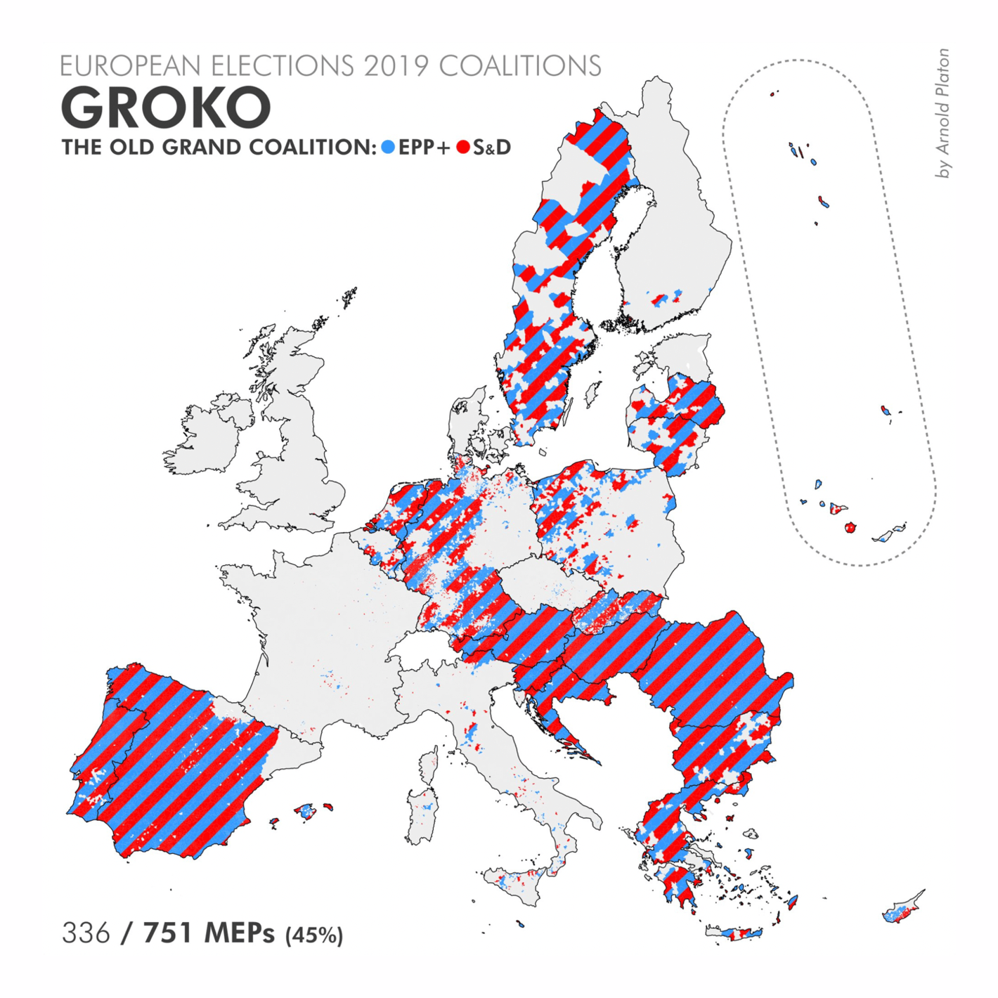
Other electoral maps looked even farther back in time — to 2012 U.S. partisan geography, 30 years of Swiss party leaders by gender, and the 2019 European elections (inspired bylast week's coalition stripes in Der Spiegel):
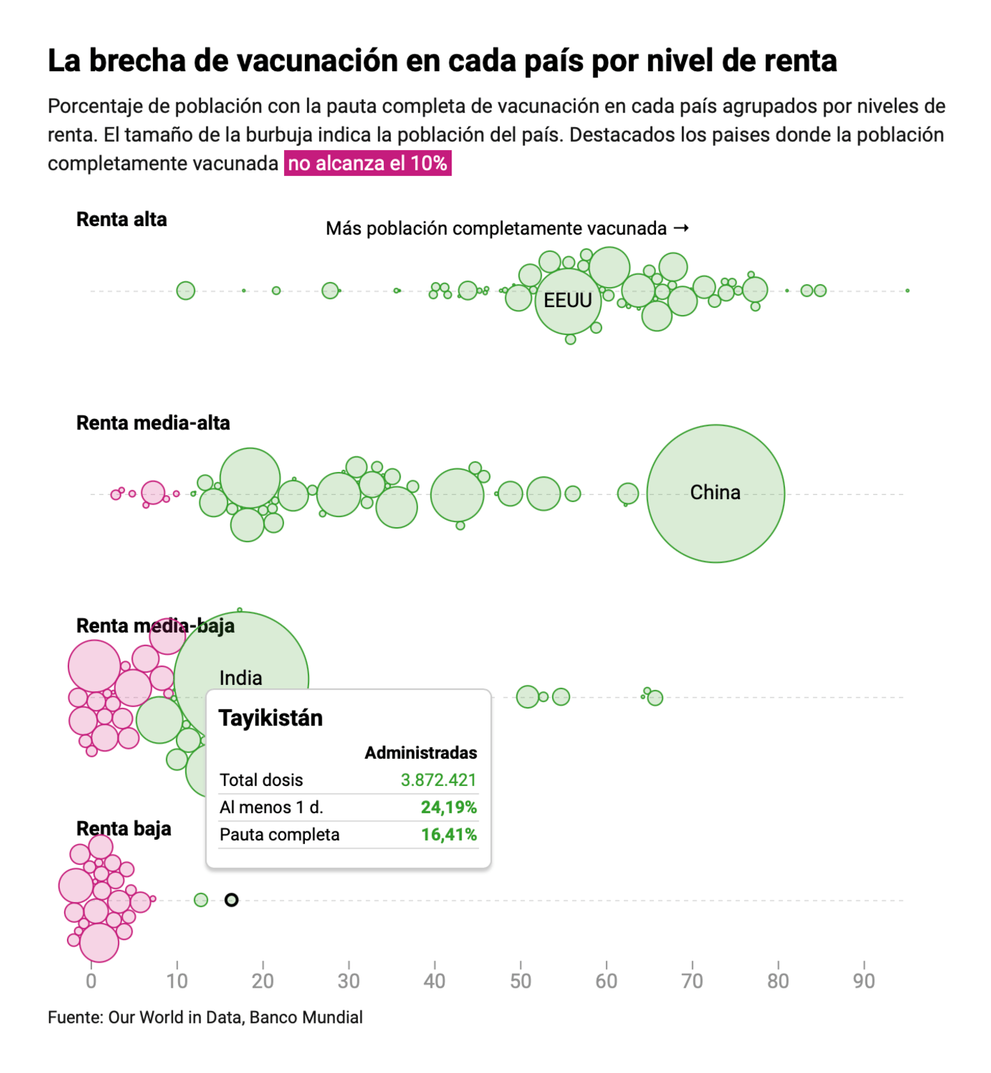
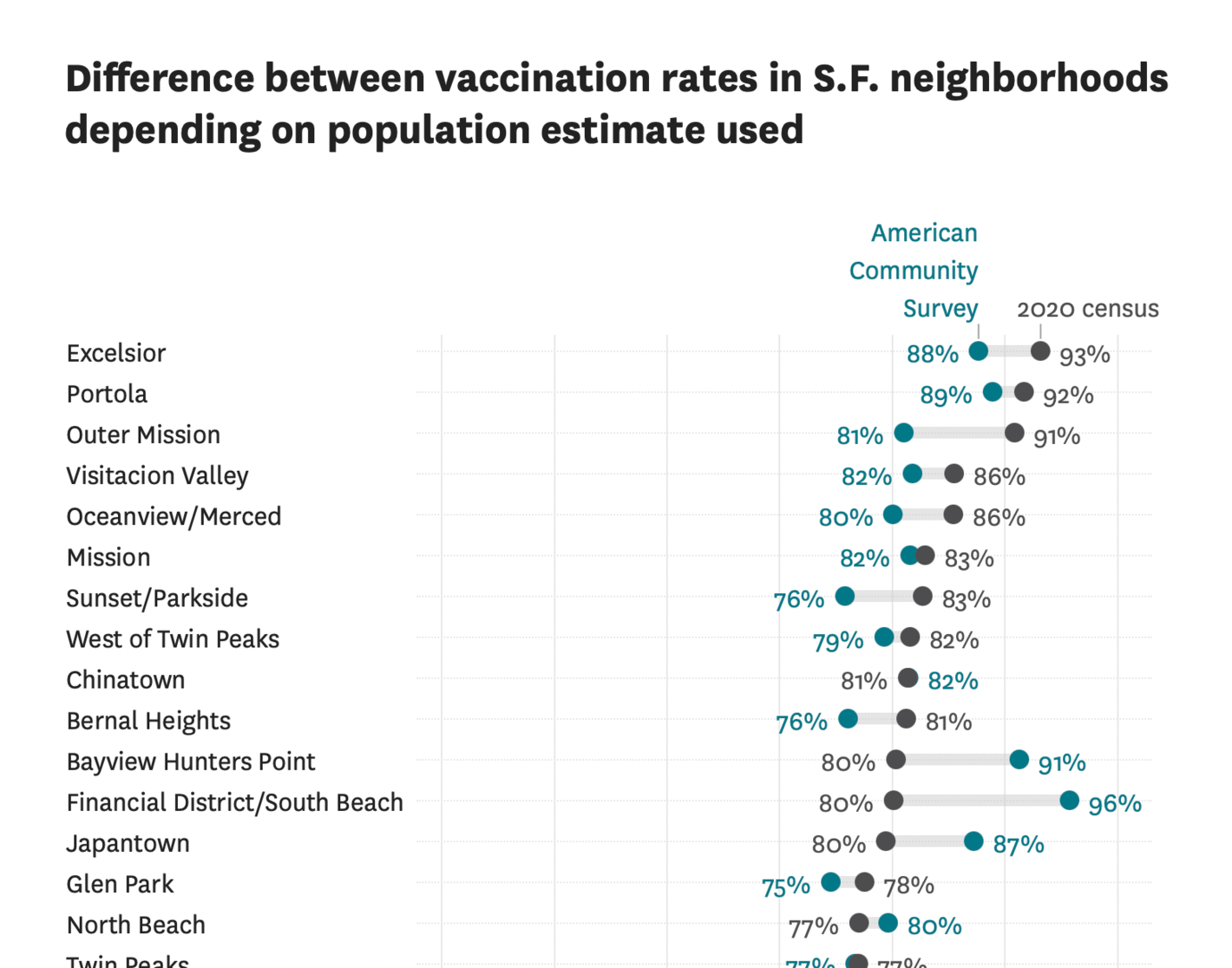
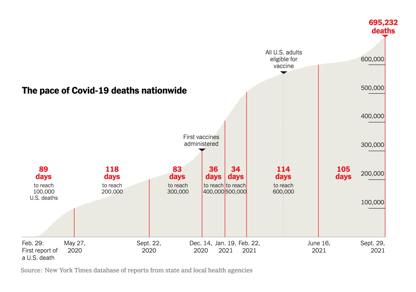
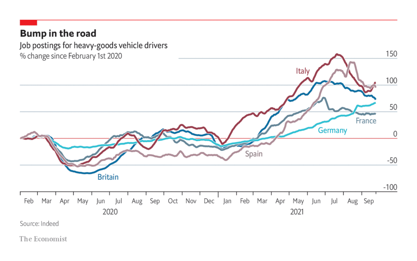
COVID news this week focused on the uneven pace of vaccination. The likelihood that you've already gotten a vaccine depends a lot on your continent, country, and even neighborhood:
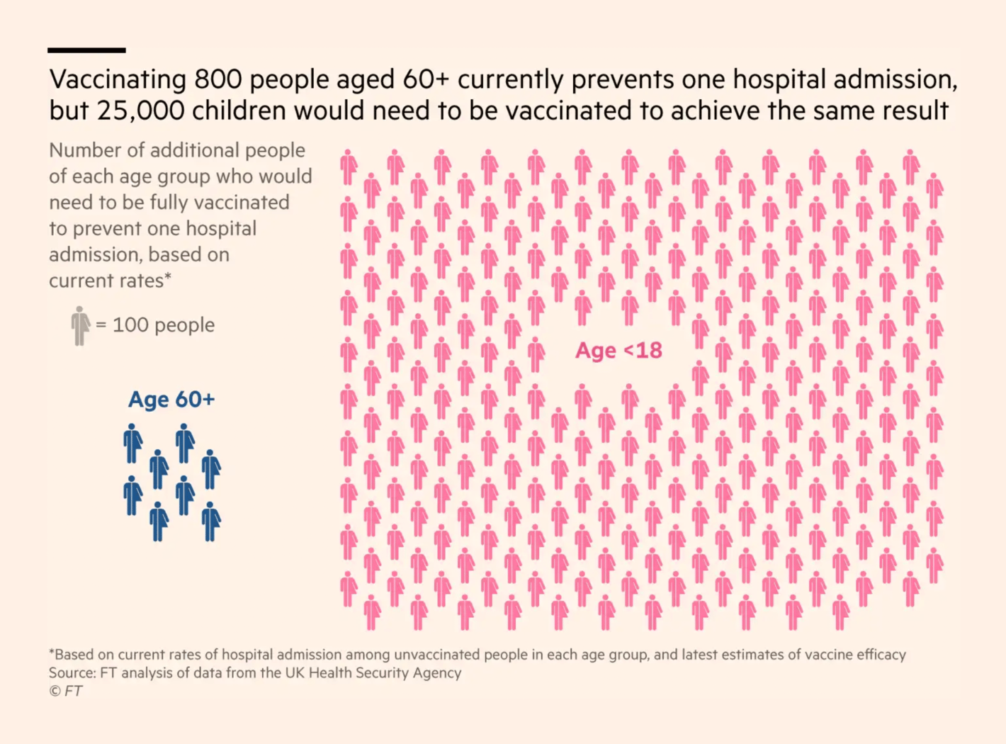
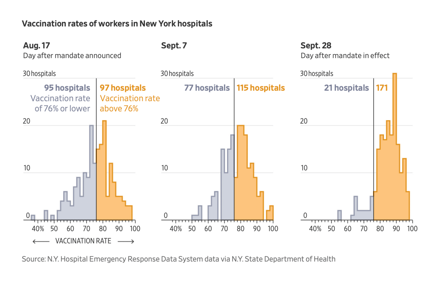
The good news: we can save a lot of lives by directing vaccines towards the most vulnerable and adopting policies that encourage reluctant people to take them.
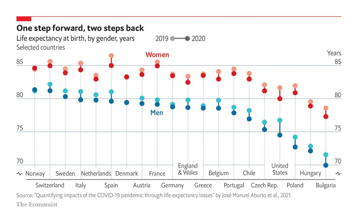
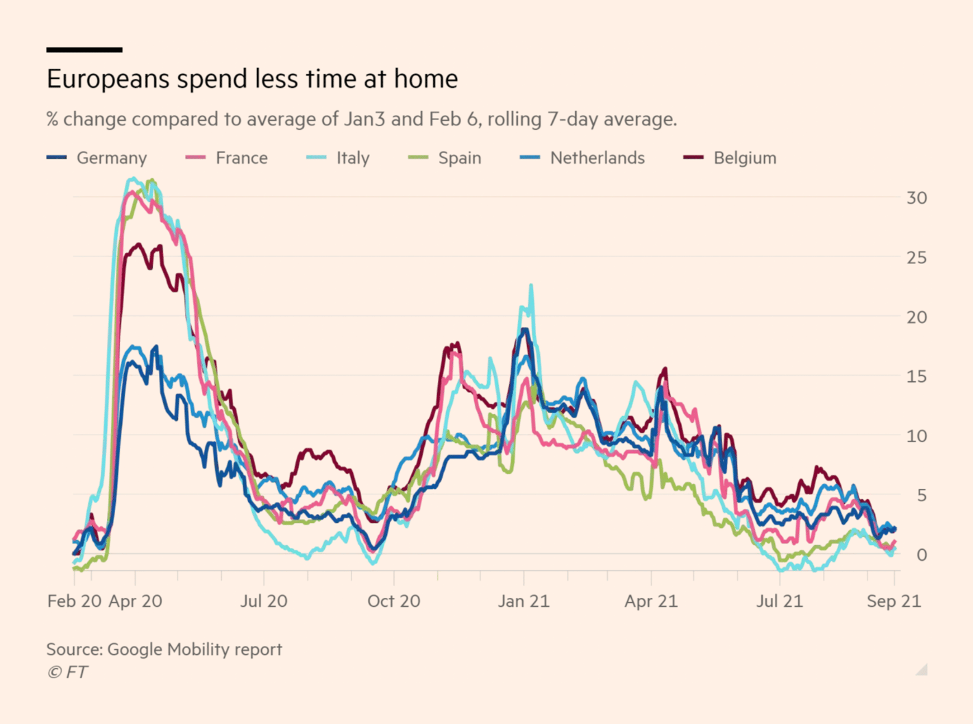
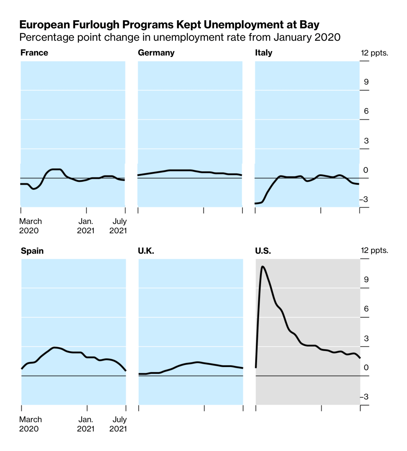
As many countries try to get back to normal, we're seeing more assessments of the policy choices of the pandemic era — and of its ongoing economic disruptions:
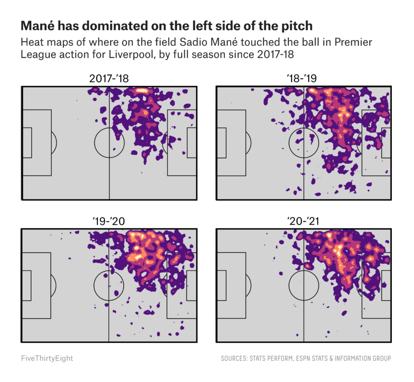
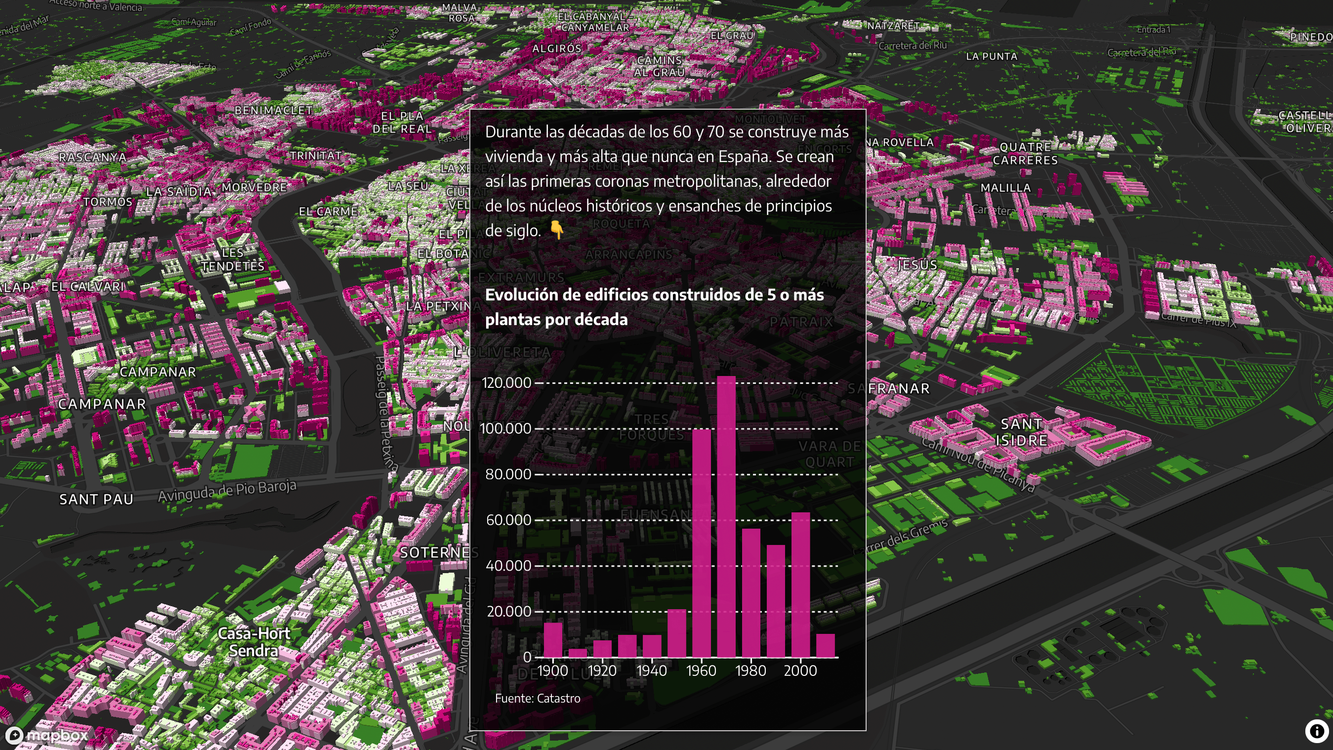
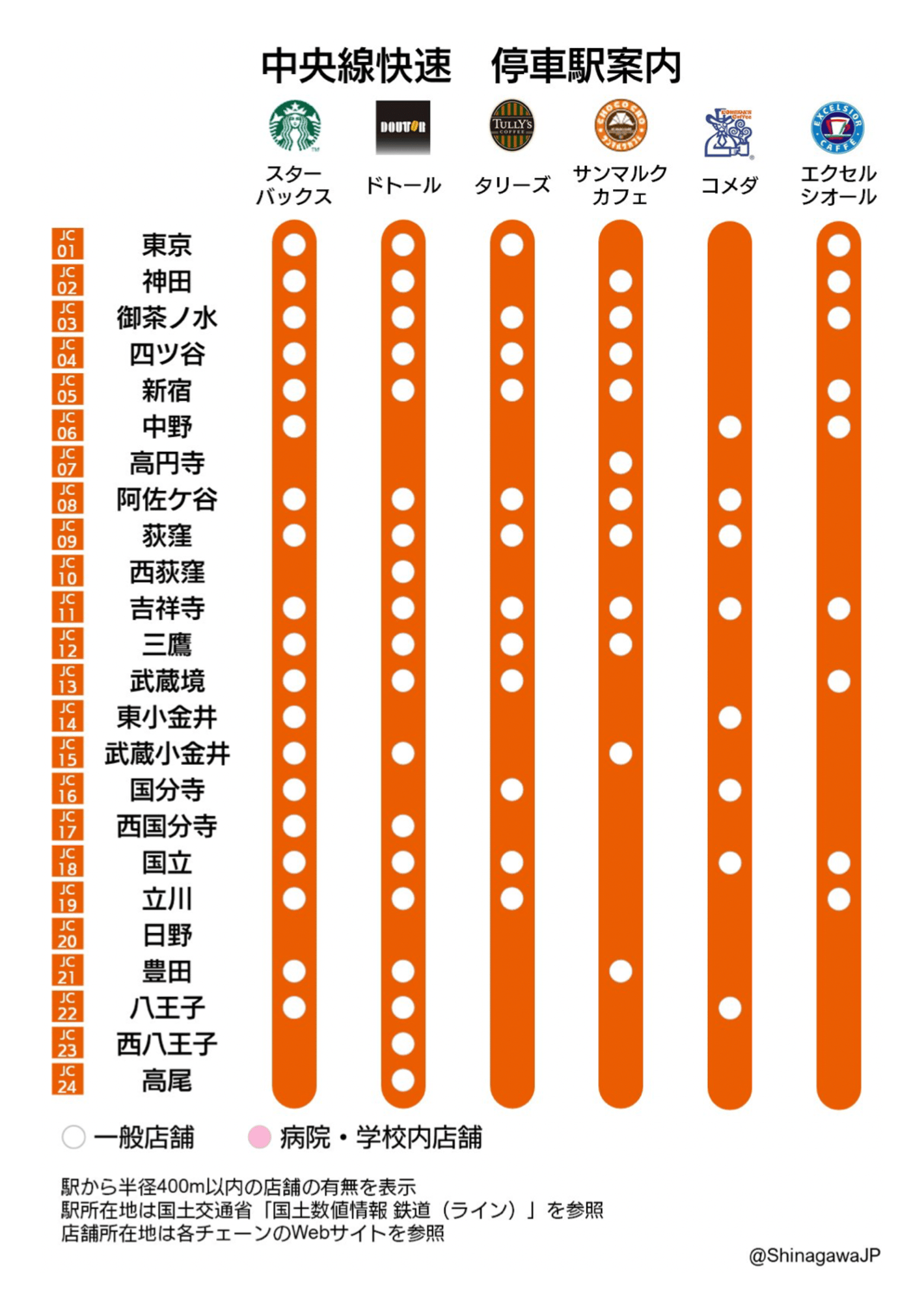
Now we'll rest for a bit in the "lighter note" section — where we keep vis of sports, urban density, and where to get off the train for coffee in Japan:
Help us make this dispatch better! We'd love to hear which newsletters, blogs, or social media accounts we need to follow to learn about interesting projects, especially from less-covered parts of the world (Asia, South America, Africa). Write us at hello@datawrapper.de or leave a comment below.


![Josh Holder: "Our global vaccination tracker has been revamped [...] My favourite addition is that our regional breakdown of vaccination rates is now a Marimekko chart, so you can see how much each region contributes to global vaccination coverage," September 29 (<a href="https://twitter.com/Josh_H/status/1443150599462309897/photo/1"><strong>Tweet</strong></a>, <a href="https://www.nytimes.com/interactive/2021/world/covid-vaccinations-tracker.html?smtyp=cur&smid=tw-nytimes"><strong>Article</strong></a>)](https://datawrapper.de/cdn-cgi/image/quality=85,width=1420,f=auto,fit=cover/https://kirby.datawrapper.de/media/pages/blog/data-vis-dispatch-october-5-2021/59e47ac4c3-1740123132/image22.png)