Data Vis Dispatch, November 18: Lunar missions, butterflies, and the #30DayMapChallenge

Welcome back to the 219th edition of Data Vis Dispatch! Every week, we’ll be publishing a collection of the best small and large data visualizations we find, especially from news organizations — to celebrate data journalism, data visualization, simple charts, elaborate maps, and their creators.
Recurring topics this week include recent lunar missions, the journeys of monarch butterflies, and the #30DayMapChallenge.
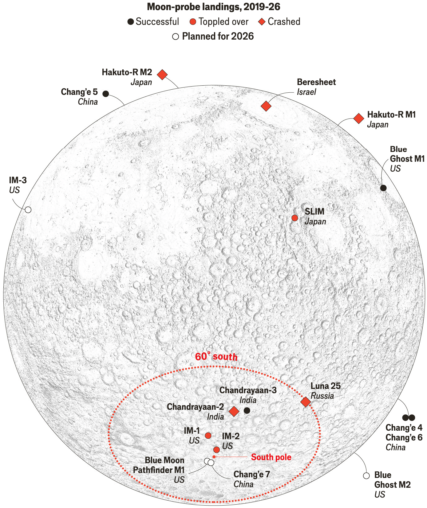
This Dispatch does not begin on Earth, but rather on the Moon, whose southern hemisphere has been particularly busy lately.
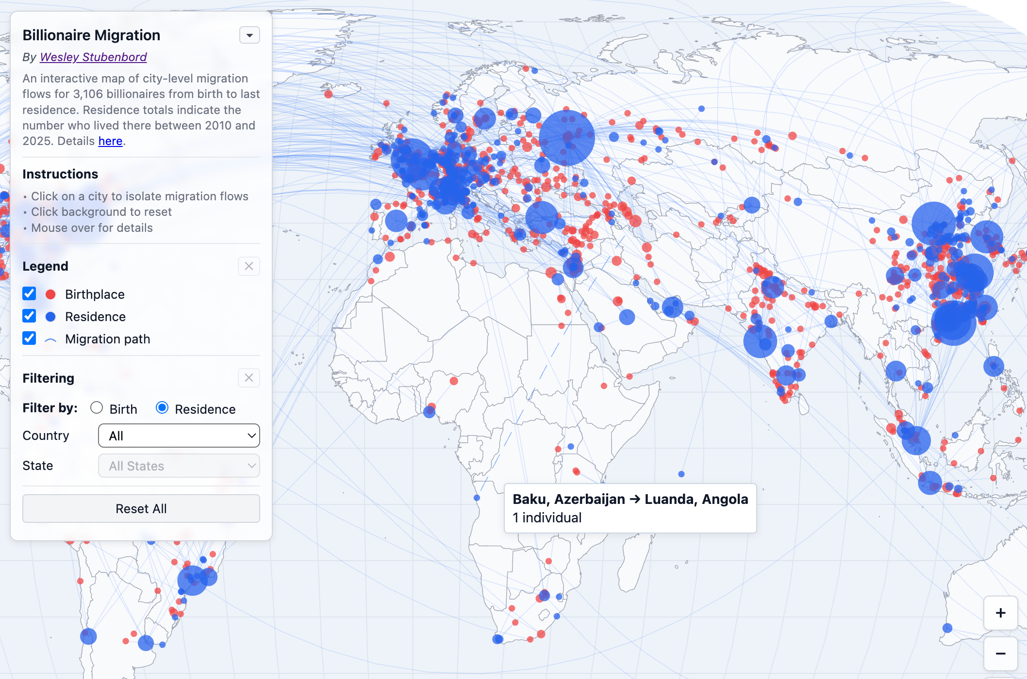
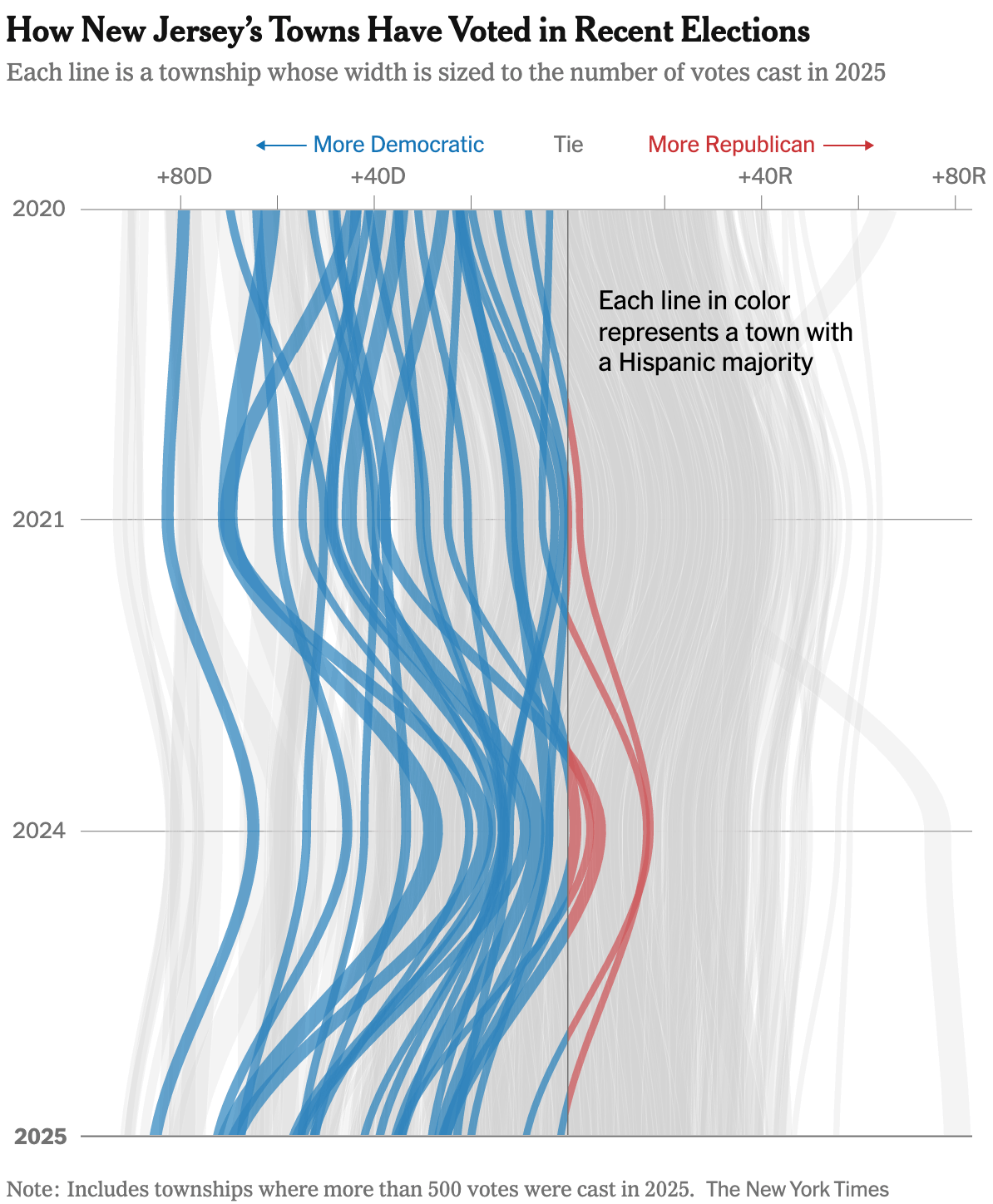
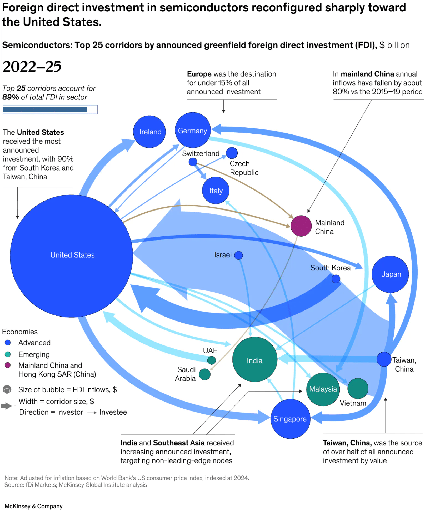
Back on Earth, many things are in flux. Billionaires are migrating, U.S. voter groups are shifting, and investments in semiconductors are being reorganized. Some of these flows are visualized in a particularly flowy way.
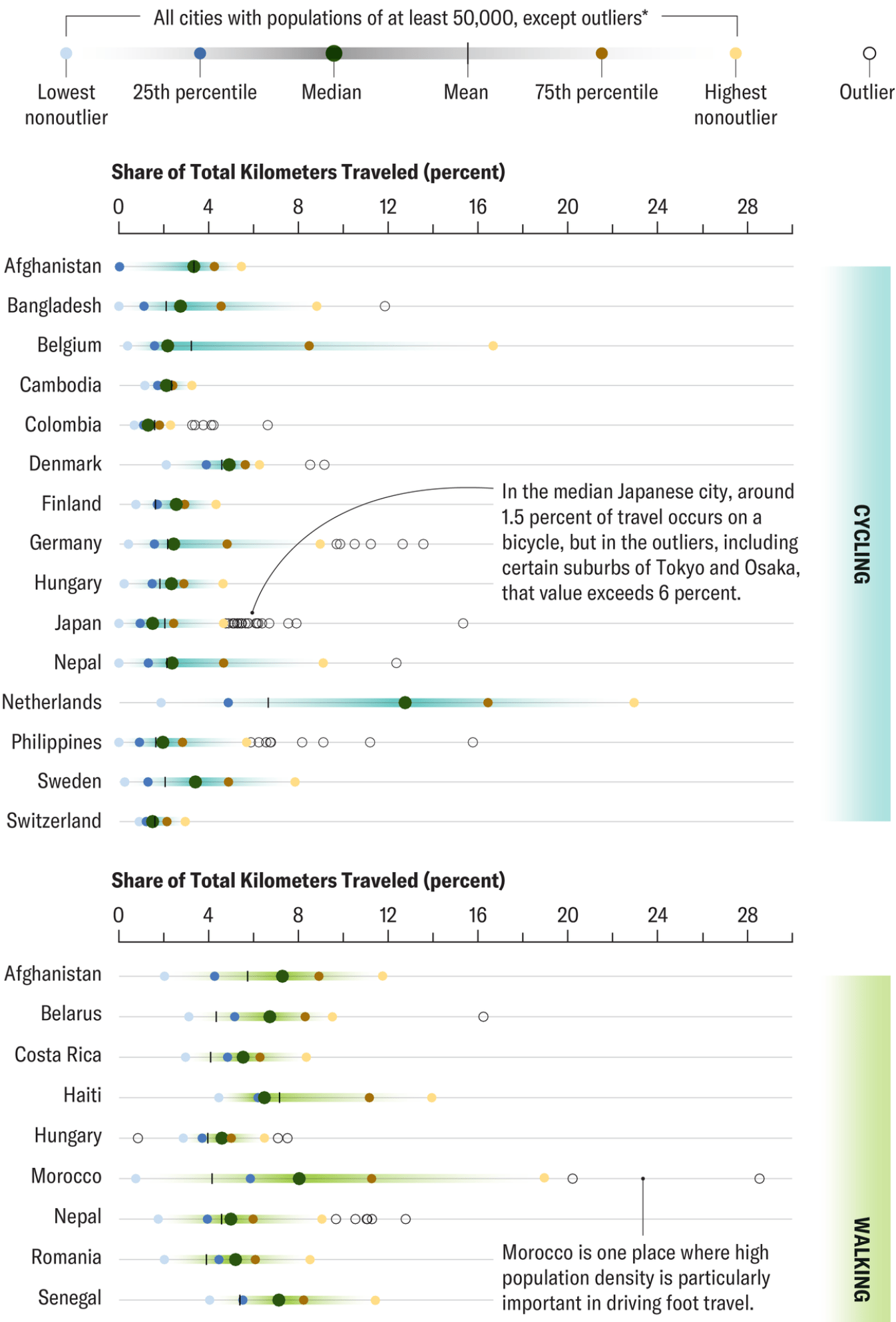
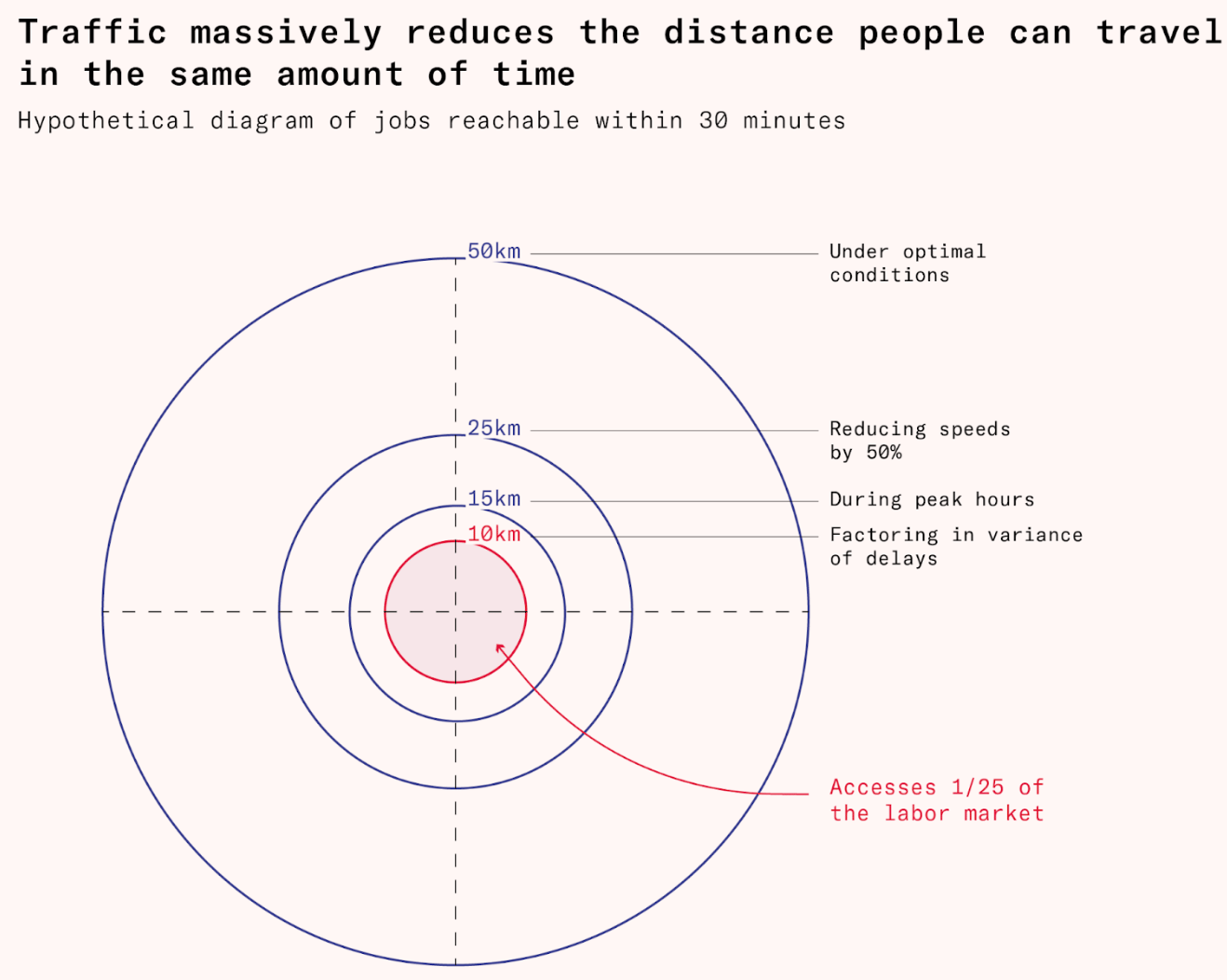
Another topic on the move: mobility. In some cities, it is easier to get around by bike or on foot than in others, as traffic has a major impact on how far you can travel. However, not all mobility projects are designed with civilians in mind; some are designed for the military.
![Le Monde: <a href="https://www.lemonde.fr/international/article/2025/11/16/le-defi-de-l-otan-face-a-la-russie-deployer-les-armees-europeennes-en-quelques-jours_6653614_3210.html"><strong>Déployer les armées européennes en quelques jours : le défi de l’OTAN face à la Russie</strong></a><strong> </strong>[<em>Deploying European armies in a matter of days: NATO's challenge in the face of Russia</em>], November 16](https://datawrapper.de/cdn-cgi/image/quality=85,width=1462,f=auto,fit=cover/https://kirby.datawrapper.de/media/pages/blog/data-vis-dispatch-november-18-2025/5ccda5ed00-1763461162/cleanshot-2025-11-18-at-11.17.54@2x.png)
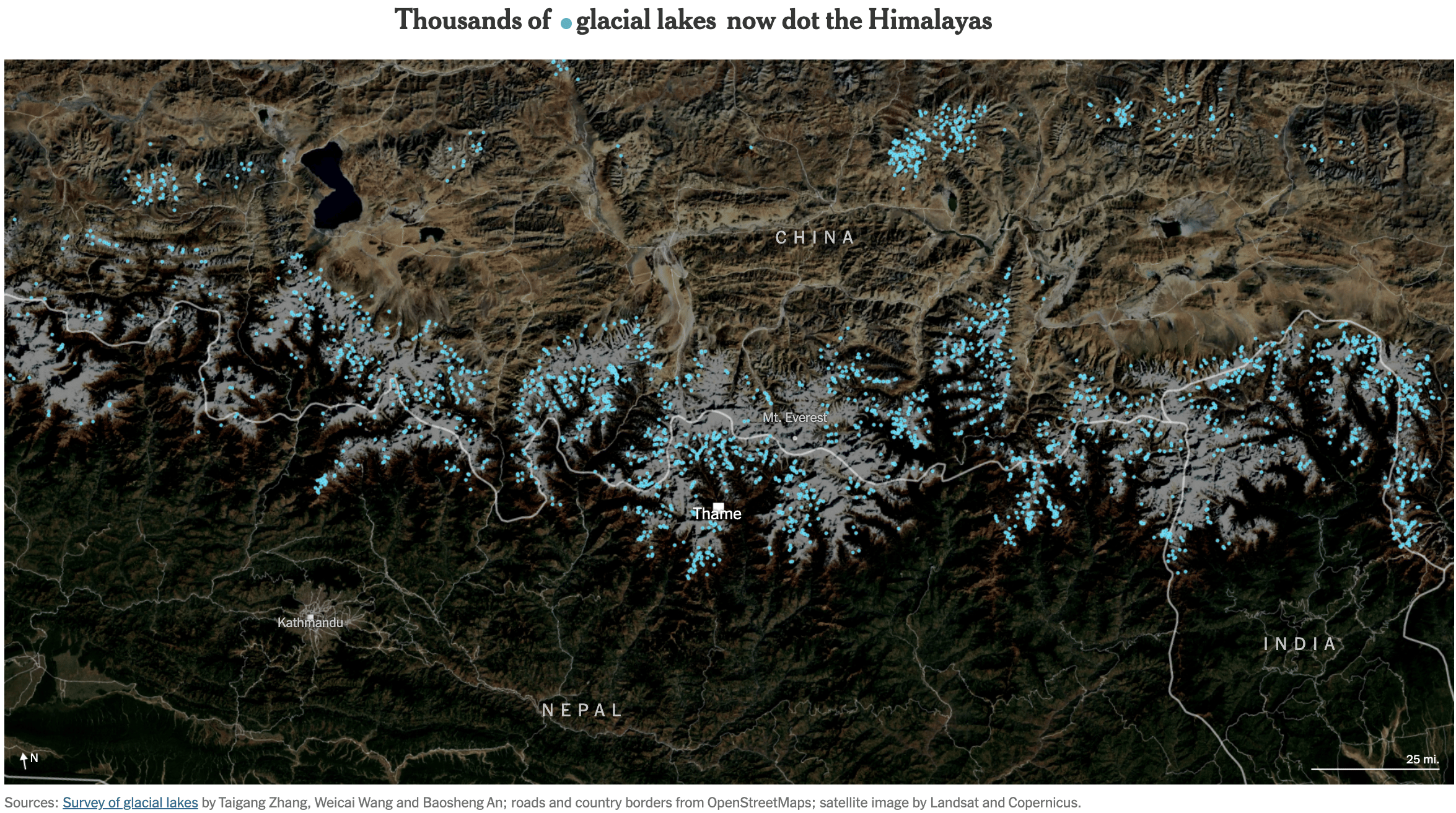
The 2025 United Nations Climate Change Conference (COP 30) is still ongoing, as is engagement with climate issues. Of particular interest: how climate change is transforming the world, from opening new trade routes for China in the Arctic Ocean to creating dangerous glacial lakes in the Himalayas, and what climate investments are being made in green energy and on the African continent.
![El Orden Mondial: <a href="https://elordenmundial.com/mapas-y-graficos/china-ruta-artico/"><strong>China y su camino hacia la nueva ruta del Ártico</strong></a><strong> </strong>[<em>China and its path towards the new Arctic route</em>], November 14](https://datawrapper.de/cdn-cgi/image/quality=85,width=1492,f=auto,fit=cover/https://kirby.datawrapper.de/media/pages/blog/data-vis-dispatch-november-18-2025/16fc32c61a-1763460475/cleanshot-2025-11-18-at-11.07.03@2x.png)
![Perrin Remonté: "[...] Ma carte propose de prendre un peu d'avance et d'envisager le pire : nous sommes en 2100, et après avoir suivi une trajectoire socio-climatique mondiale pessimiste (scénario SSP 8.5) la région a pris entre 4°C et 6°C supplémentaires. Les climats ont changé, et avec eux, tout le reste. Où est le Monde "méditerranéen" actuel? [...]" [<em>My map suggests taking a step forward and considering the worst-case scenario: it is the year 2100, and after following a pessimistic global socio-climatic trajectory (SSP 8.5 scenario), the region has warmed by between 4°C and 6°C. Climates have changed, and with them, everything else. Where is the current “Mediterranean” world?</em>], November 17 (<a href="https://www.linkedin.com/in/perrin-remont%C3%A9-b782a792/recent-activity/all/"><strong>LinkedIn</strong></a>)](https://datawrapper.de/cdn-cgi/image/quality=85,width=2048,f=auto,fit=cover/https://kirby.datawrapper.de/media/pages/blog/data-vis-dispatch-november-18-2025/12942a84aa-1763462256/1763367780233.jpeg)
![Le Temps: <a href="https://www.letemps.ch/data/tableau-de-bord-du-climat-les-indicateurs-cles-en-temps-reel-en-suisse-et-dans-le-monde"><strong>Tableau de bord du climat: les indicateurs clés en temps réel en Suisse et dans le monde</strong></a> [<em>Chart title: Where was it warmer or colder last month?</em>], November 12](https://datawrapper.de/cdn-cgi/image/quality=85,width=1924,f=auto,fit=cover/https://kirby.datawrapper.de/media/pages/blog/data-vis-dispatch-november-18-2025/f90188f3d2-1763389245/cleanshot-2025-11-17-at-15.19.53@2x.png)
![Folha de S.Paulo: <a href="https://www1.folha.uol.com.br/mercado/2025/11/60-da-energia-eletrica-do-mundo-vem-de-combustiveis-fosseis-veja-dados-de-90-paises.shtml"><strong>60% da energia elétrica do mundo vem de combustíveis fósseis; veja dados de 90 países</strong></a> [<em>Chart title: Evolution of the use of renewable sources for electricity generation</em>], November 11](https://datawrapper.de/cdn-cgi/image/quality=85,width=1282,f=auto,fit=cover/https://kirby.datawrapper.de/media/pages/blog/data-vis-dispatch-november-18-2025/7c1d20fdaf-1763461772/cleanshot-2025-11-18-at-11.28.43@2x.png)
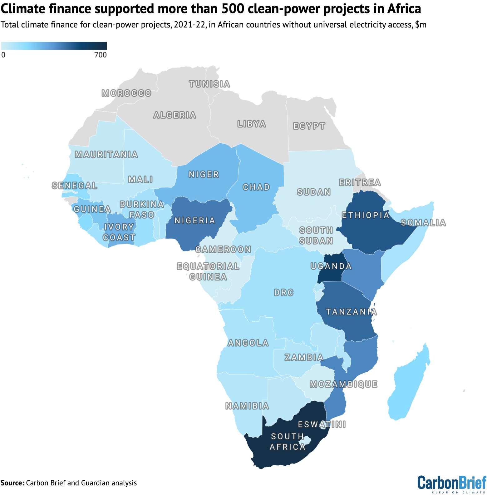
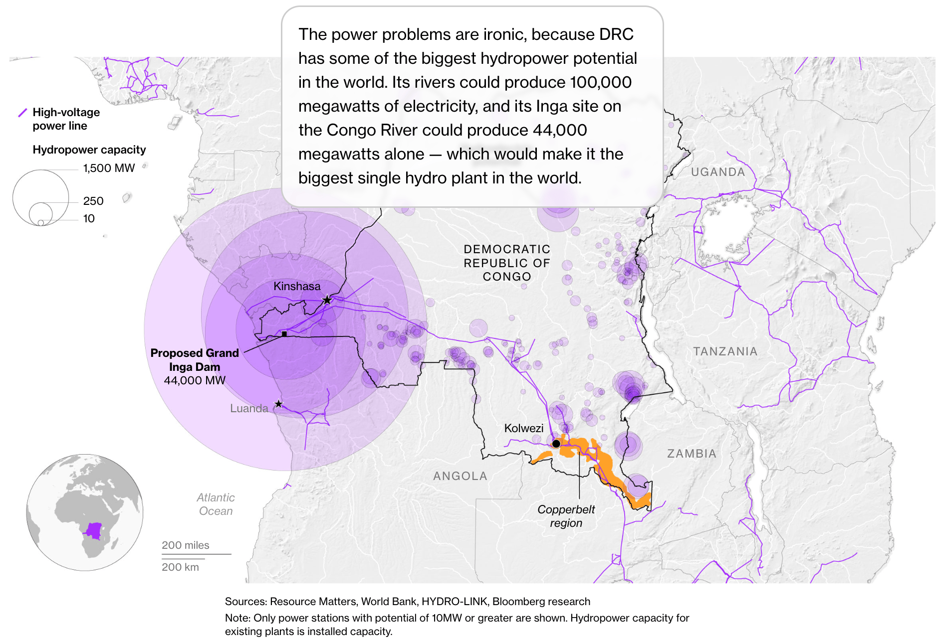
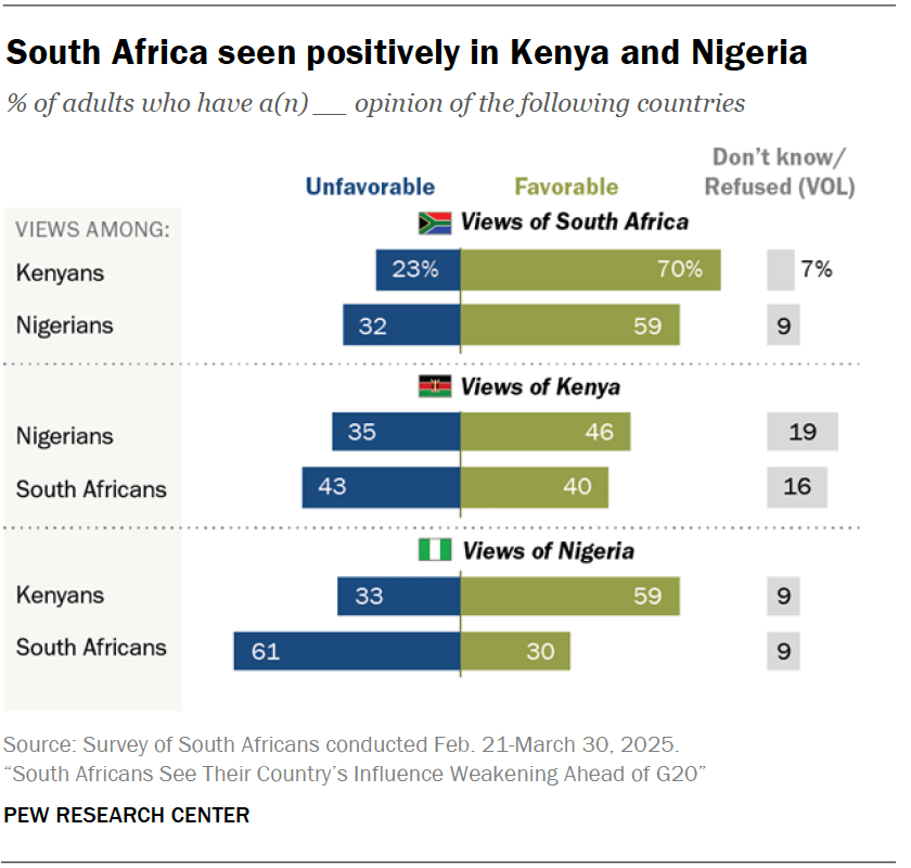
Other issues beyond climate investments have turned the spotlight on the African continent. These include its significant hydropower potential and different countries' opinions of each other.
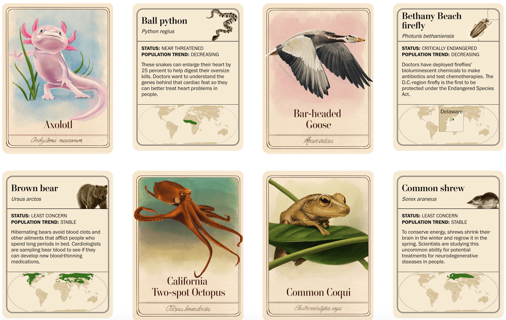
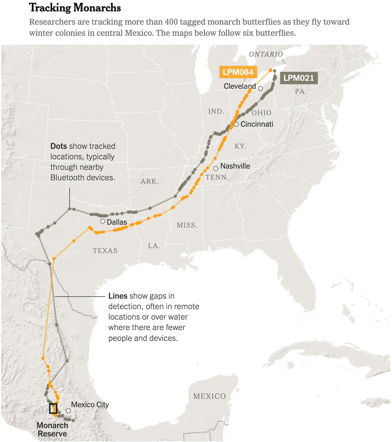
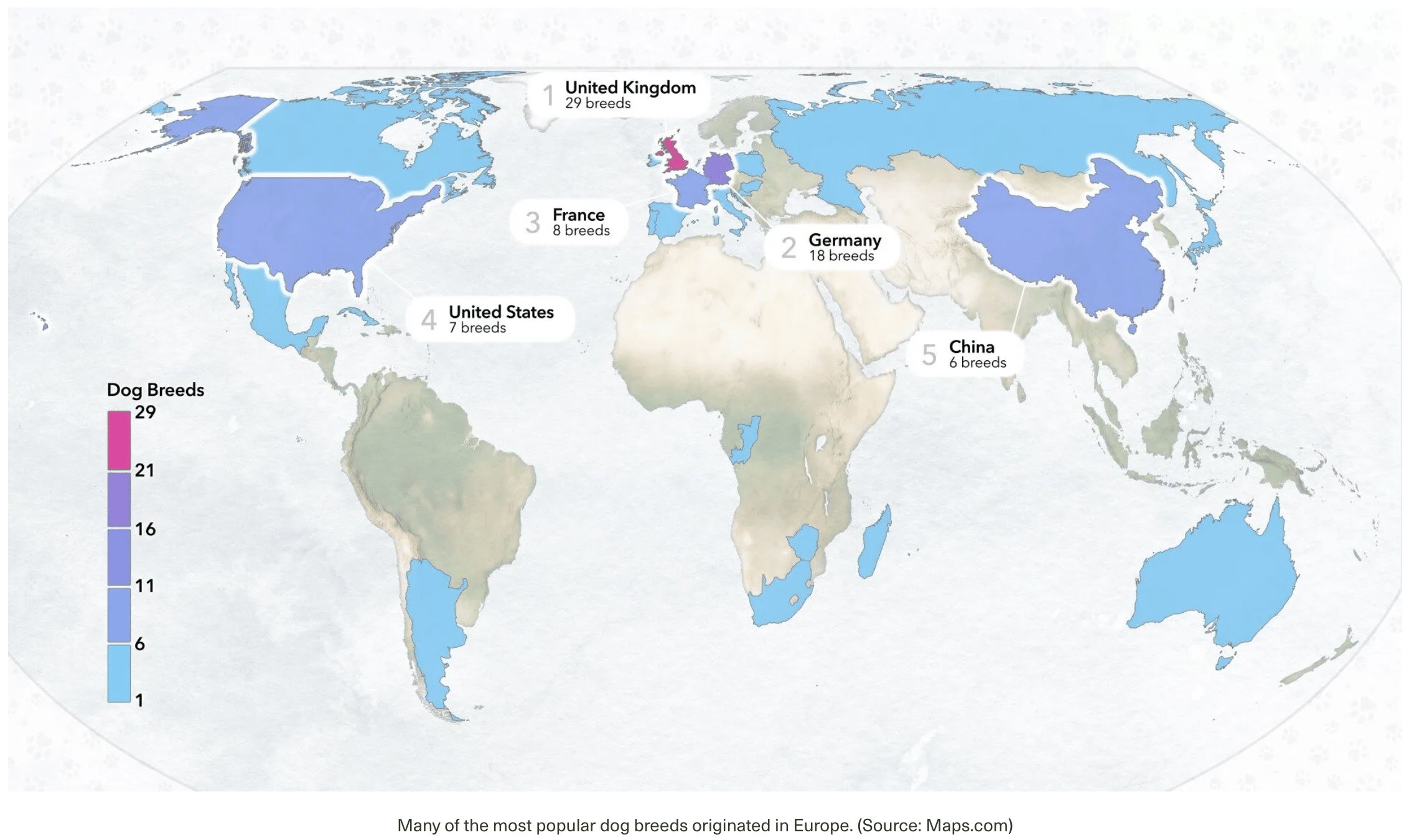
Animals have been mapped and tracked: ball pythons from the southern Sahara have the potential to treat cardiac problems, chips attached to monarch butterflies reveal their incredible journeys to winter colonies in Mexico, and the United Kingdom is leading the race for the most popular dog breeds.
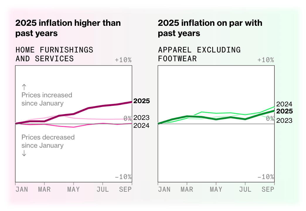
Whether we're buying furniture or breakfast, we may notice that prices are rising. The reason for this: inflation. One possible reason behind that reason: tariffs.
![Der Spiegel: <a href="https://www.spiegel.de/wirtschaft/service/inflation-so-haben-sich-fruehstueck-und-lebensmittel-verteuert-ein-interaktiver-vergleich-a-309665d7-2606-4d33-b785-b7e4635d27da"><strong>So hat die Inflation Ihr Frühstück verteuert</strong></a><strong> </strong>[<em>How inflation has made your breakfast more expensive</em>], November 11](https://datawrapper.de/cdn-cgi/image/quality=85,width=1134,f=auto,fit=cover/https://kirby.datawrapper.de/media/pages/blog/data-vis-dispatch-november-18-2025/ab48fb7e81-1763464558/cleanshot-2025-11-18-at-12.13.49@2x.png)
![Neue Zürcher Zeitung: <a href="https://www.nzz.ch/visuals/die-schweiz-musste-lange-warten-die-wichtigsten-grafiken-zum-zoll-deal-mit-trump-ld.1911726"><strong>Die Schweiz musste lange warten – die wichtigsten Grafiken zum Zoll-Deal mit Trump</strong></a> [<em>Switzerland had to wait a long time – the most important charts on the tariff deal with Trump</em>], November 14](https://datawrapper.de/cdn-cgi/image/quality=85,width=810,f=auto,fit=cover/https://kirby.datawrapper.de/media/pages/blog/data-vis-dispatch-november-18-2025/dd2e9cbfb8-1763389881/cleanshot-2025-11-17-at-15.30.15@2x.png)
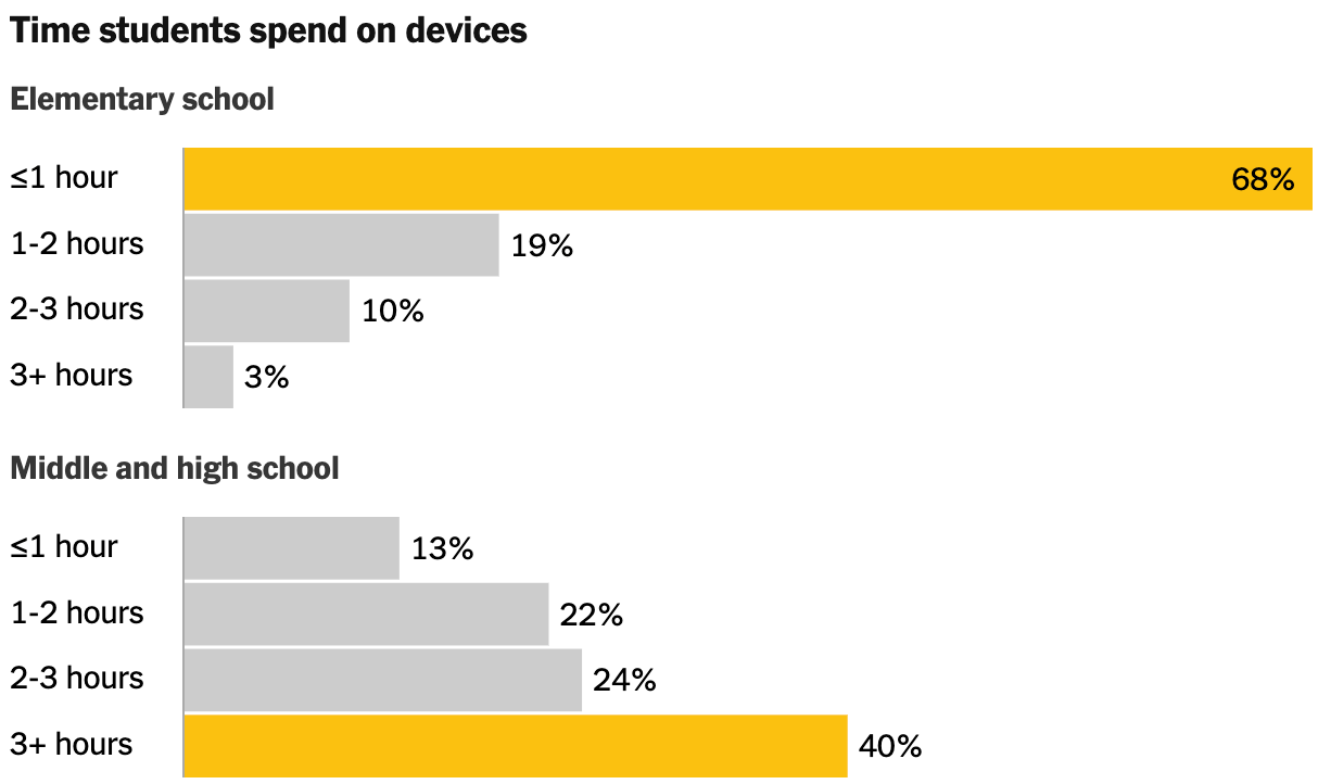
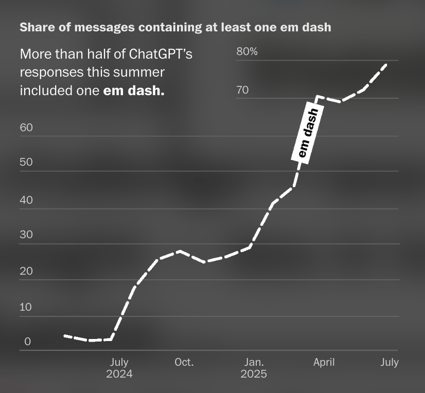
The older children get, the more time they spend on their mobile devices at school, using tools like ChatGPT, known for its prolific use of the em dash.
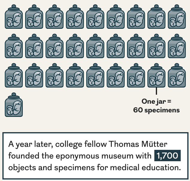
Shuffle, click, highlight, scroll — the following visualizations are full of entertaining interactions, even though their topics couldn't be more different: the ambiguous gender of Chinese names in the form of trees, trends in neuroscience publications as a heat map, and human remains in specimen jars.
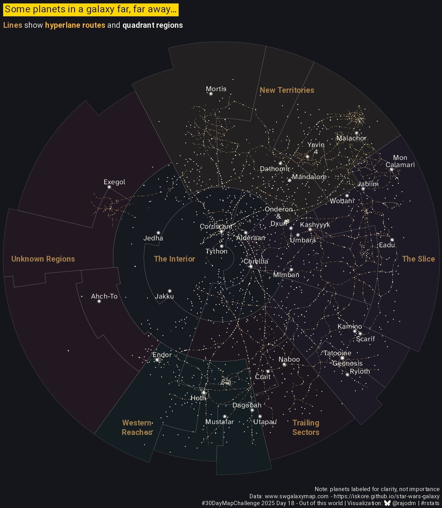
Last but not least, our weekly highlights from the #30DayMapChallenge, in the following categories: 10-minute map, fire, cells, a new tool, and out of this world.
![stevefaeembra: "Day 16 Cells, One day late! Surface water area distribution in Great Britain, done as water droplet plot. Used a coarse hex grid (25km) to sum the area of surface water in each cell [...] Scotland's rocks tend to more volcanic/less porous than England's," November 17 (<a href="https://mapstodon.space/@stevefaeembra/115565996658694737"><strong>Mapstodon</strong></a>)](https://datawrapper.de/cdn-cgi/image/quality=85,width=883,f=auto,fit=cover/https://kirby.datawrapper.de/media/pages/blog/data-vis-dispatch-november-18-2025/ff0697296e-1763471815/water_neu.jpg)
![IGN: "Et si on jouait à reconstruire le monde ! Le tracé des courbes de la Corse été simplifié, pour recréer la carte en relief, bloc par bloc, avec le plus de minutie possible. Alors, plutôt bien fait ?" [<em>Let's play at rebuilding the world! The contours of Corsica have been simplified to recreate the relief map, block by block, as accurately as possible. So, pretty good, right?</em>], November 17 (<a href="https://bsky.app/profile/ignfrance.bsky.social/post/3m5tk6evwss26"><strong>Bluesky</strong></a>)](https://datawrapper.de/cdn-cgi/image/quality=85,width=1080,f=auto,fit=cover/https://kirby.datawrapper.de/media/pages/blog/data-vis-dispatch-november-18-2025/3e7454752a-1763471878/bafkreieh7osstm7vzf6wtqsbdkxbwsi5uj4olmuttzgxrgjnckxki5o7me.jpg)
![Lucas Destrem: "Jour 15 : Feu ! L'astroblème de Rochechouart-Chassenon. Souvenir de l'impact d'un astéroïde d'1,5 km de diamètre, tombé il y a plus de 200 millions d'années entre Charente et Limousin. 20 km/s : imaginez la puissance !" [<em>Day 15: Fire! The Rochechouart-Chassenon astrobleme. Remains of the impact of an asteroid 1.5 km in diameter, which fell more than 200 million years ago between the Charente and Limousin regions. 20 km/s: imagine the power!</em>], November 15 (<a href="https://bsky.app/profile/lucasdestrem.bsky.social/post/3m5nrdcdmd22m"><strong>Bluesky</strong></a>)](https://datawrapper.de/cdn-cgi/image/quality=85,width=1852,f=auto,fit=cover/https://kirby.datawrapper.de/media/pages/blog/data-vis-dispatch-november-18-2025/693a69b634-1763472029/bafkreif6kkwkfldy2sckq4xhz5oqi5ie4hmuj5smxjhosy5v425r4if5ia.jpg)
What else we found interesting
![Rare Volume: "Data can be both functional and expressive. This visual system was created for Symphonologie, an AI-generated orchestral performance at The Louvre. Live audio feeds shaping visual expression in real time [...]," November 18 (<a href="https://www.linkedin.com/company/rare-volume/posts/"><strong>LinkedIn</strong></a>)](https://datawrapper.de/cdn-cgi/image/quality=85,width=960,f=auto,fit=cover/https://kirby.datawrapper.de/media/pages/blog/data-vis-dispatch-november-18-2025/2c57a7da53-1763465473/1763053218062.jpeg)
![Tom Vaillant: "Just released Infoviz.design! Finding inspiration for visual journalism usually means digging through archives or searching across many different sources. This tool uses our old database of visual stories with an LLM to let you semantically search for inspiration using the editorial themes [...]," November 18 (<a href="https://www.linkedin.com/feed/update/urn:li:activity:7396202416465084416/"><strong>LinkedIn</strong></a>, <a href="https://www.infoviz.design/"><strong>Infoviz.design</strong></a>)](https://datawrapper.de/cdn-cgi/image/quality=85,width=1986,f=auto,fit=cover/https://kirby.datawrapper.de/media/pages/blog/data-vis-dispatch-november-18-2025/49f647eebf-1763457543/cleanshot-2025-11-18-at-10.17.59@2x.png)
Applications are open for…
A cartographic design intern at Esri Creative Lab
A data projects editor at The Guardian
A graphics reporter (deleted data project) at The Guardian
Multiple roles on the board of the Data Visualization Society


