Data Vis Dispatch, July 14: FIFA World Cup, heat in Europe, and Middle East alliances

Welcome back to the 253rd edition of the Data Vis Dispatch! Every week, we’re publishing a collection of the best small and large data visualizations we find, especially from news organizations — to celebrate data journalism, data visualization, simple charts, elaborate maps, and their creators.
Recurring topics this week include the FIFA World Cup, the heat in Europe, and Middle East alliances.
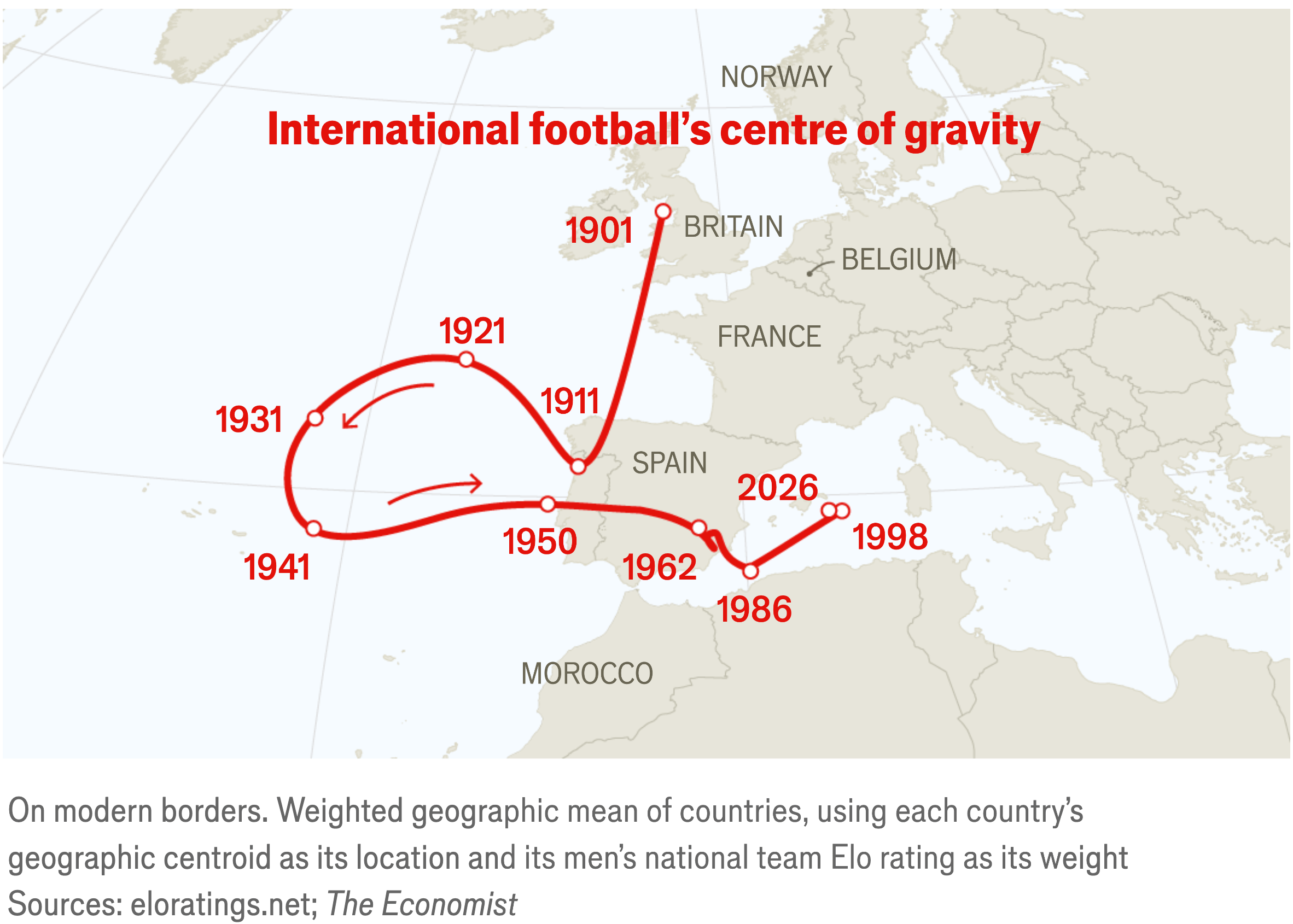
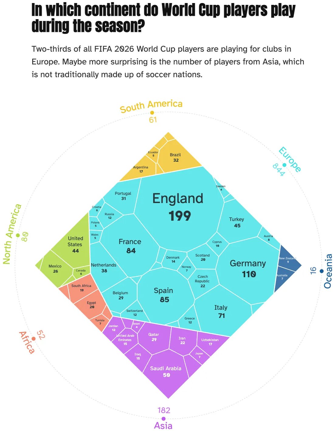
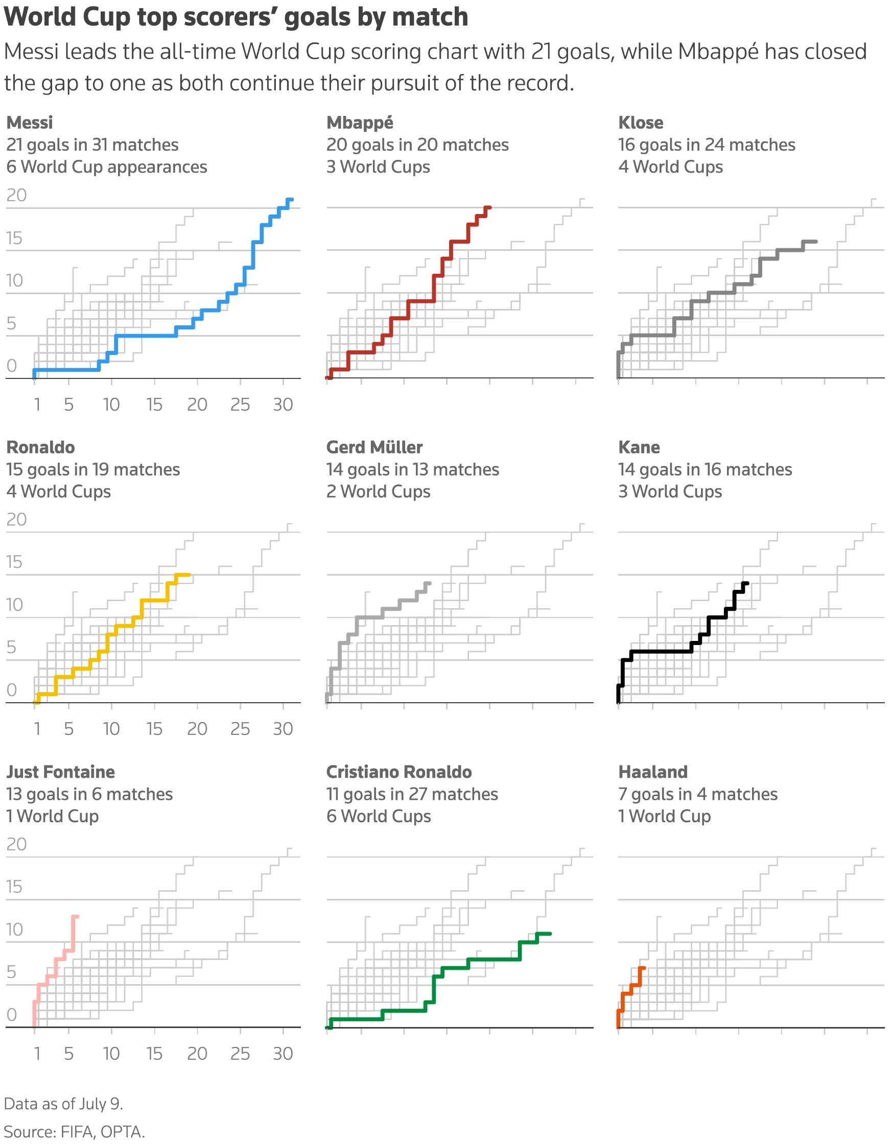
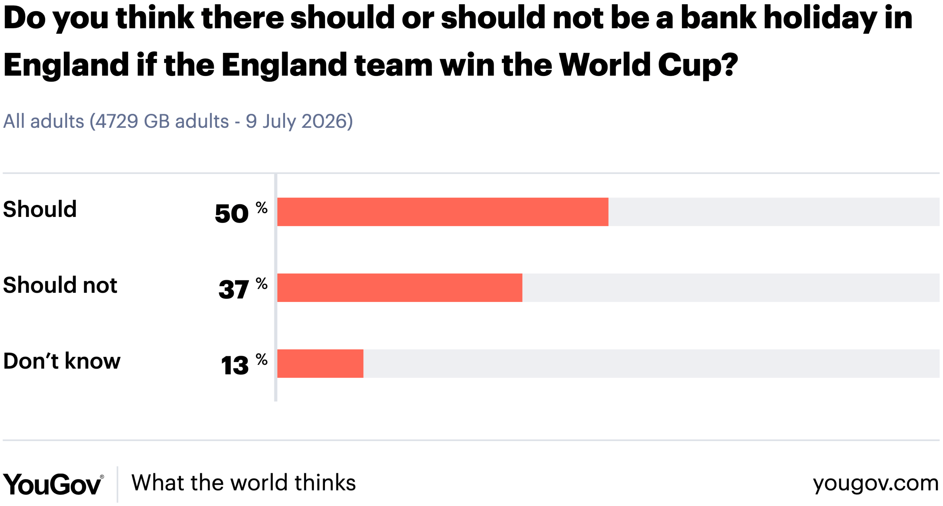
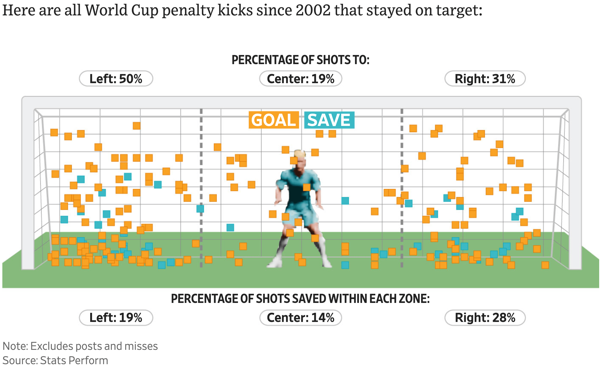
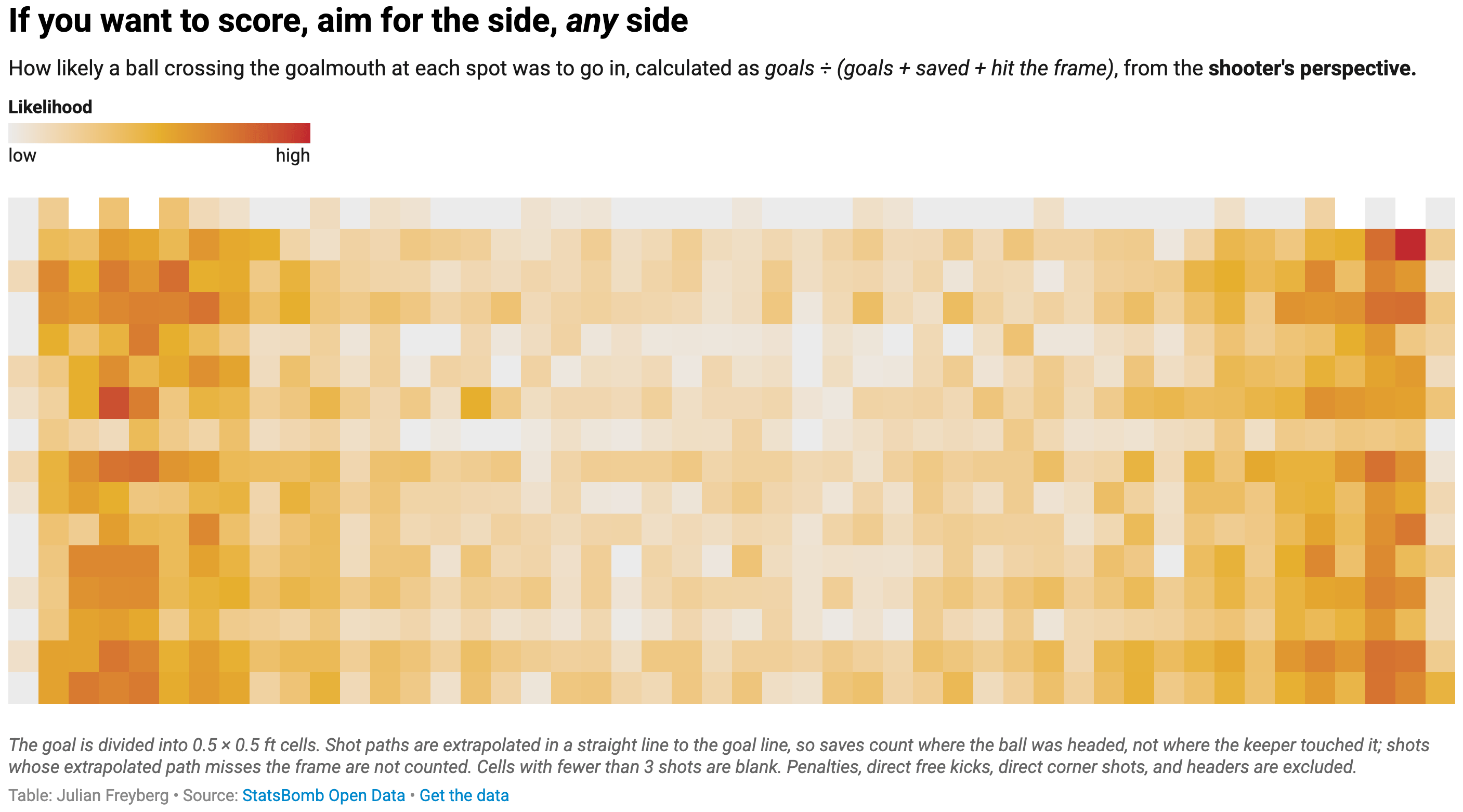
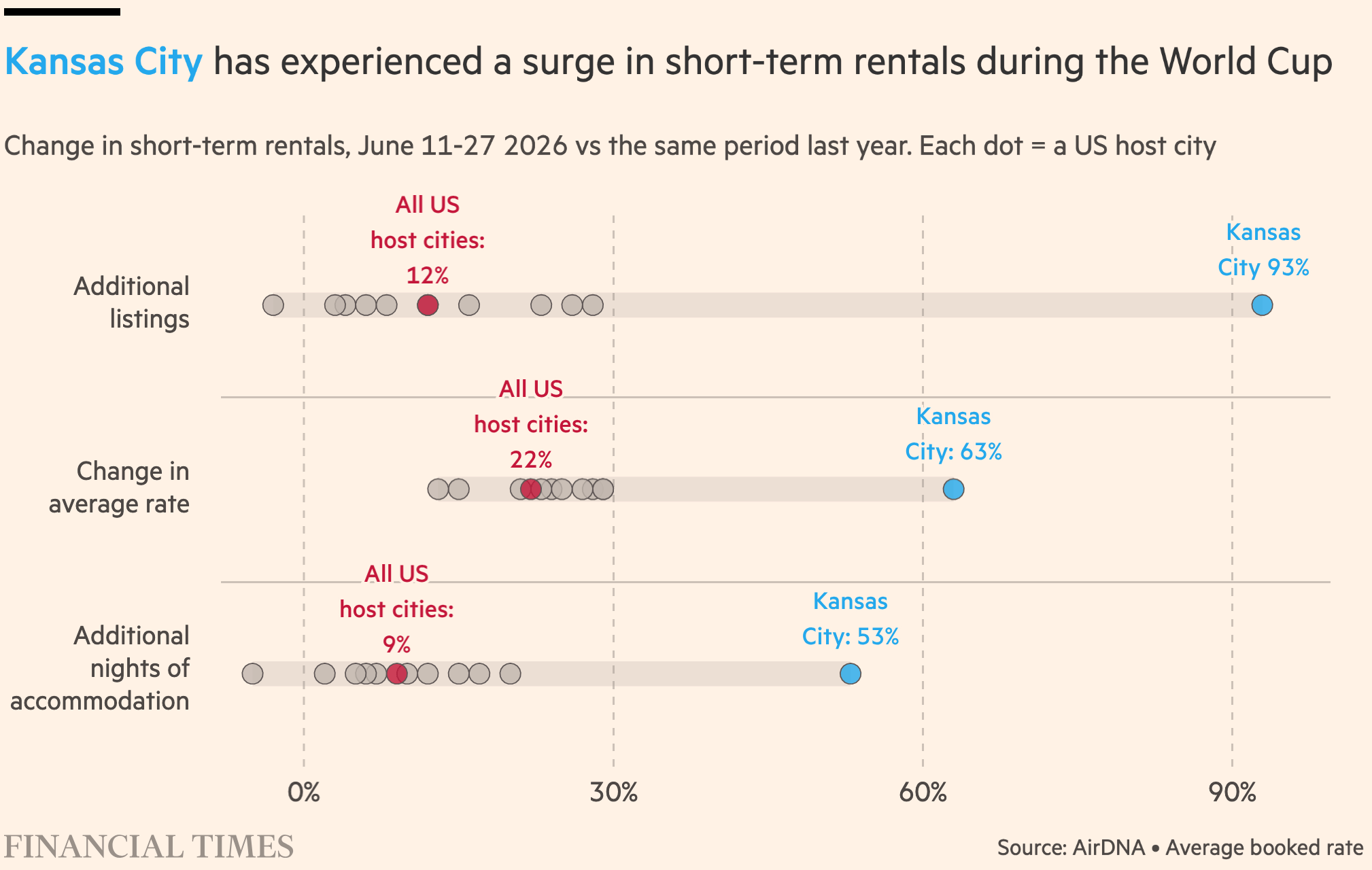
The FIFA World Cup is still in full swing. (For those of you who really aren't interested: it's only five more days!) This week, people visualized the Europe-centeredness of football, where to aim if you find yourself in the (un?)fortunate position of taking a penalty kick, and how Airbnbs, not hotels, made the most money in US host cities.
![Micah McCurdy: "I made viz from one million sims that shows the chances and the pathways for each team through the tournament [...] Update after the quarterfinals," July 12, (<a href="https://bsky.app/profile/hockeyviz.com/post/3mqhdfpglok2x"><strong>Bluesky</strong></a>)](https://datawrapper.de/cdn-cgi/image/quality=85,width=2452,f=auto,fit=cover/https://kirby.datawrapper.de/media/pages/blog/data-vis-dispatch-july-14-2026/34a5a3cf83-1783933235/screenshot-2026-07-13-at-11.00.30.png)
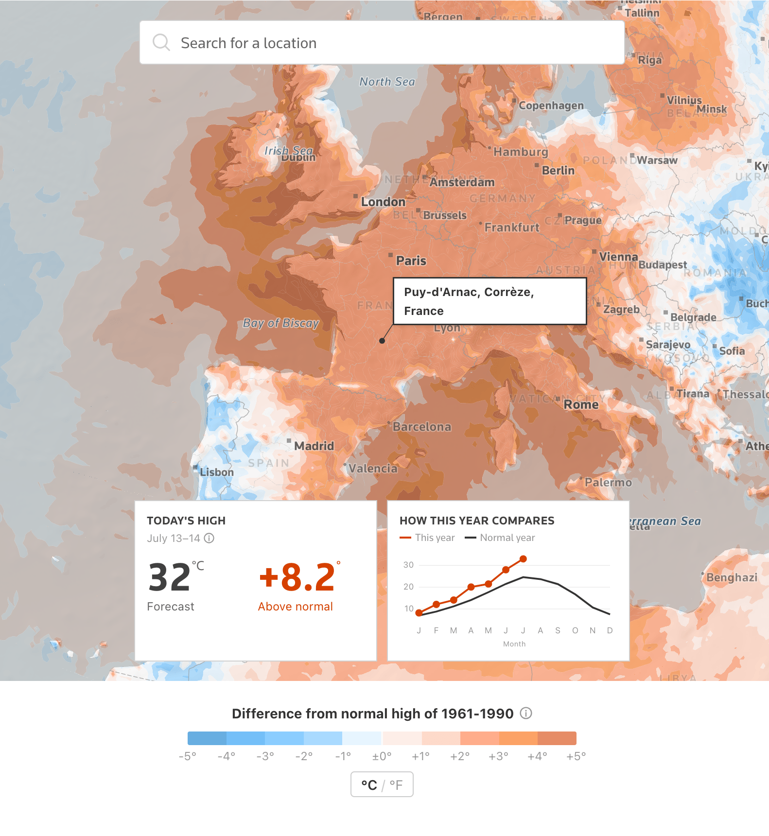
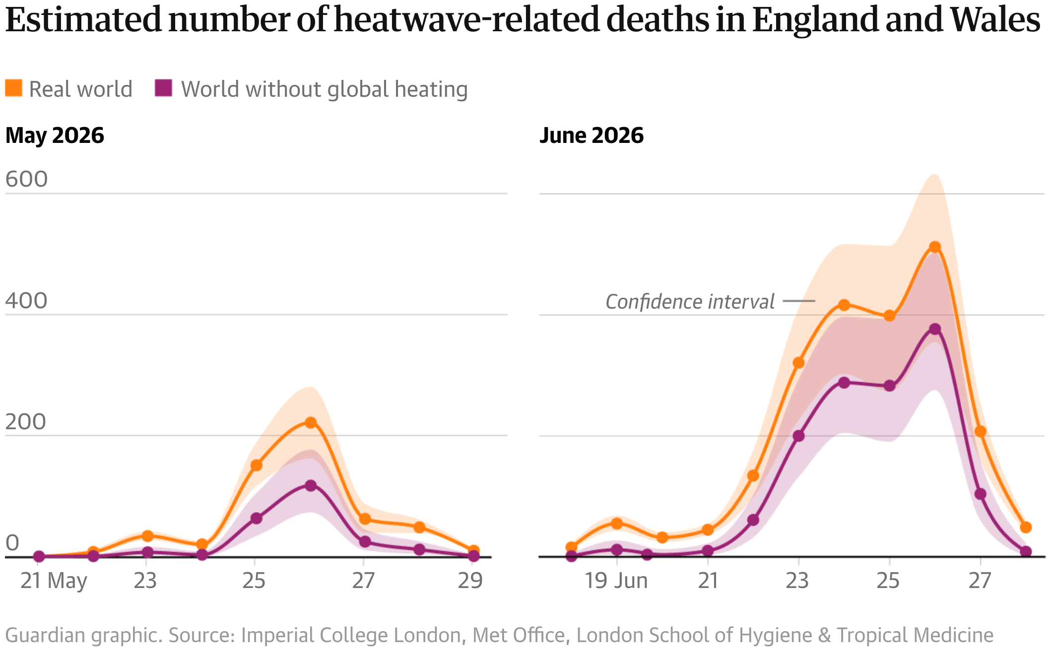
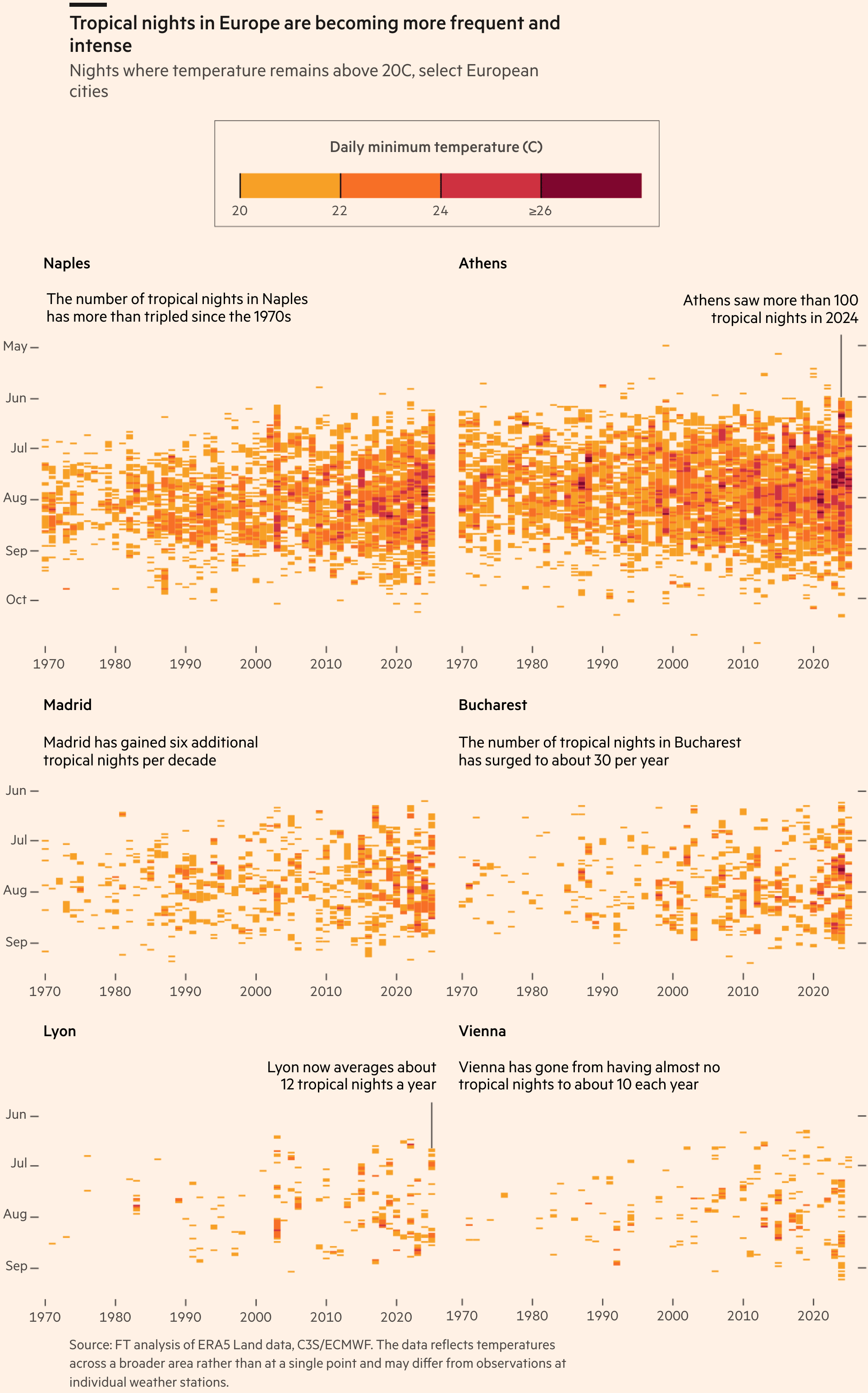
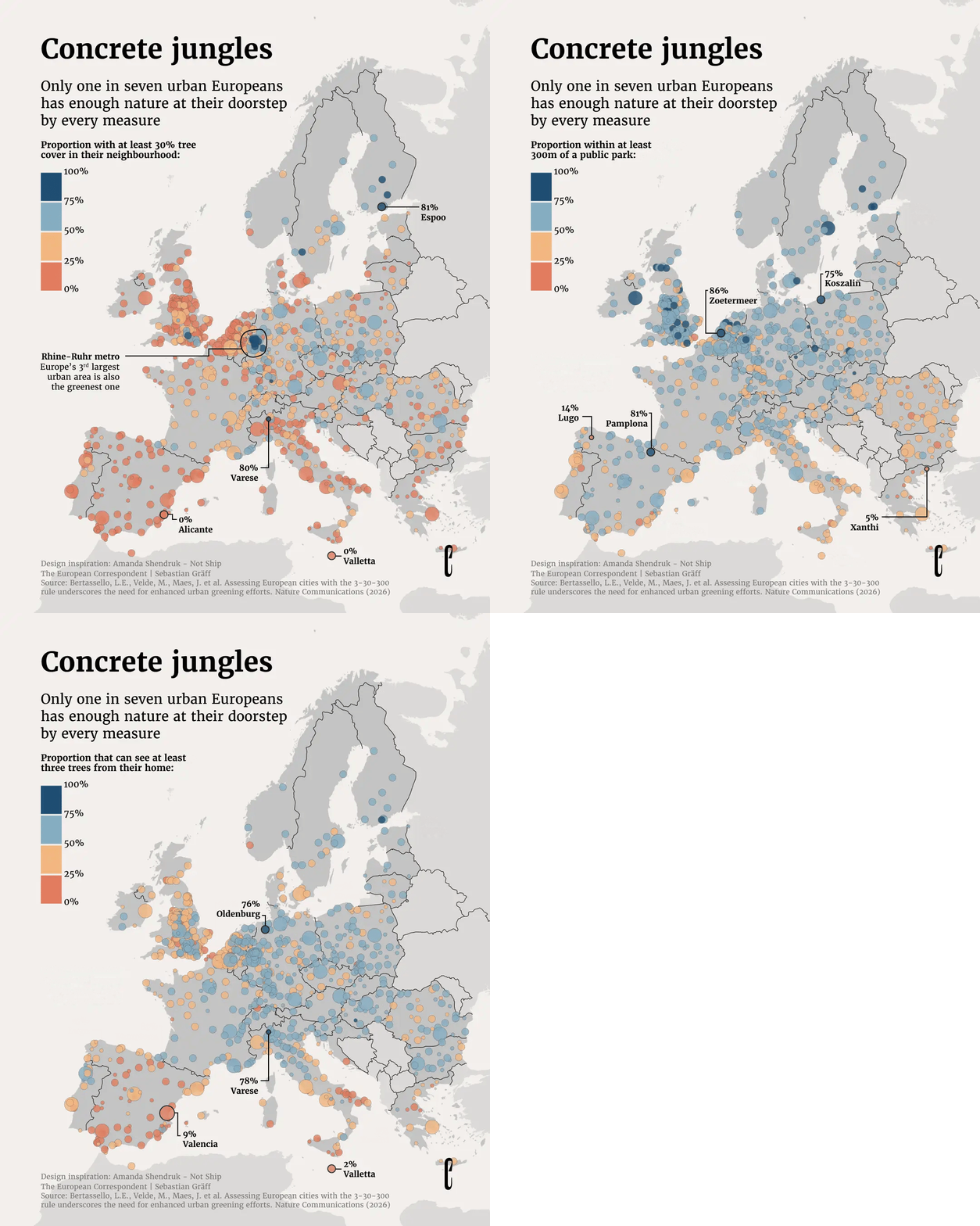
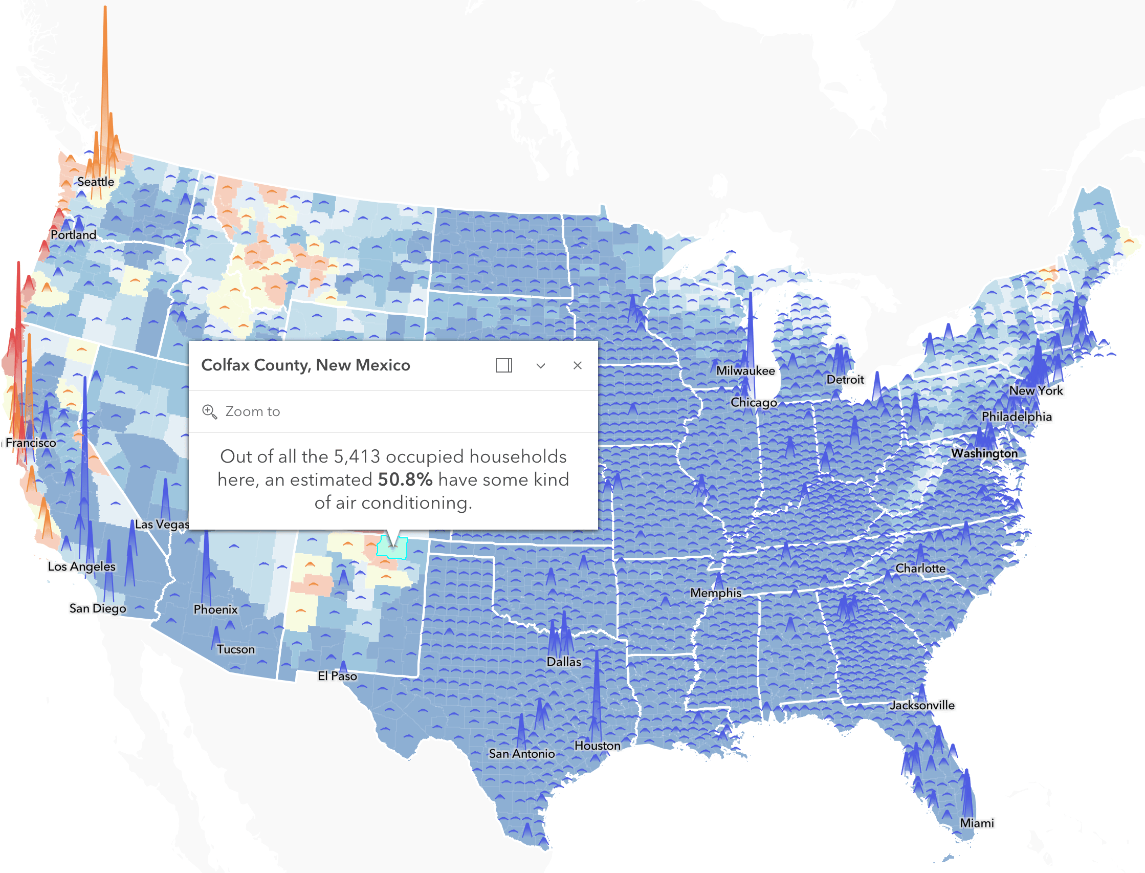
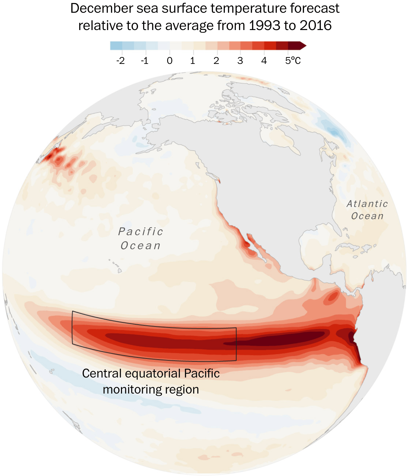
Speaking of Europe: it's been hot here. Reuters created a heatwave tracker just for the continent, and the Financial Times plotted the increase in tropical nights. Trees would help with the heat, but they're often missing – as are the air conditioners so common in the US.
![Giulia Mezzadri: "Silvia Romanelli and I created a data visualization exploring the 37 marine heatwaves recorded in the waters surrounding Italy between 2008 and 2025. The visualization transforms nearly two decades of sea surface temperature data into a visual timeline, revealing how these events have become more frequent and longer-lasting, and how they are not confined to the summer months. [...]," July 8 (<a href="https://www.linkedin.com/posts/giulia-mezzadri_datavisualization-dataviz-climatechange-activity-7480519255873101824-9VZ9?utm_source=share&utm_medium=member_desktop&rcm=ACoAAAifR8QB0orFVxfCEd0a_19fPLQbH5RBpuA"><strong>LinkedIn</strong></a>, <a href="https://www.behance.net/gallery/251579853/Italys-Warming-Waters"><strong>Behance</strong></a>)](https://datawrapper.de/cdn-cgi/image/quality=85,width=2546,f=auto,fit=cover/https://kirby.datawrapper.de/media/pages/blog/data-vis-dispatch-july-14-2026/8a53febe69-1783937059/screenshot-2026-07-13-at-12.03.19.png)
![El País: <a href="https://elpais.com/clima-y-medio-ambiente/2026-07-08/como-de-extremo-es-este-calor-los-datos-de-una-anomalia-historica-en-europa.html"><strong>¿Cómo de extremo es este calor? Los datos de una anomalía histórica en Europa</strong></a> <em>[Map title: Anomaly Forecast for Saturday, July 11; difference from the average in degrees Celsius]</em>, July 8](https://datawrapper.de/cdn-cgi/image/quality=85,width=2432,f=auto,fit=cover/https://kirby.datawrapper.de/media/pages/blog/data-vis-dispatch-july-14-2026/568985b298-1783943307/screenshot-2026-07-13-at-13.47.36.png)
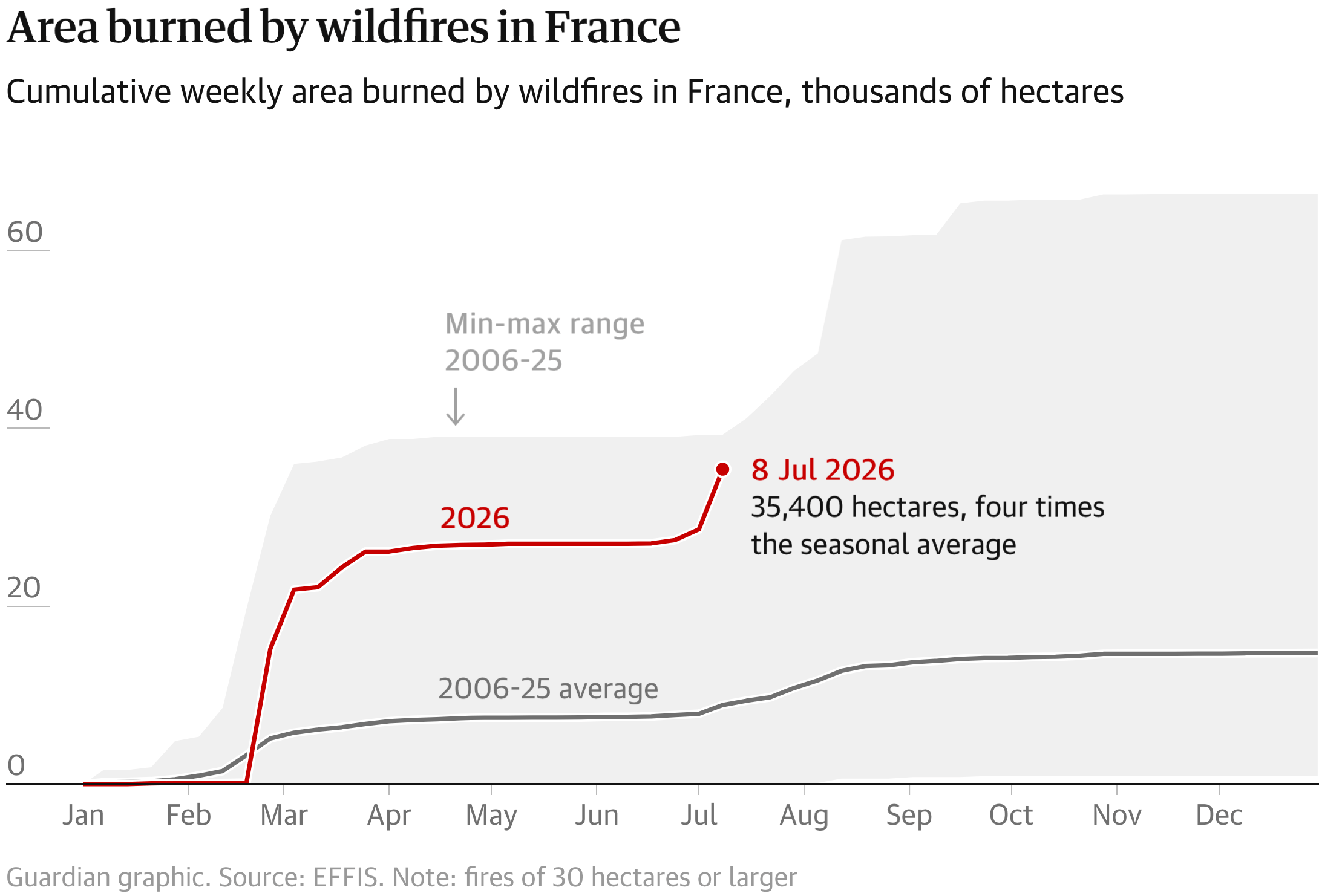
In very related news: wildfires have spread more than usual in Spain and France, as both Le Monde and The Guardian show with a scary-looking line chart.
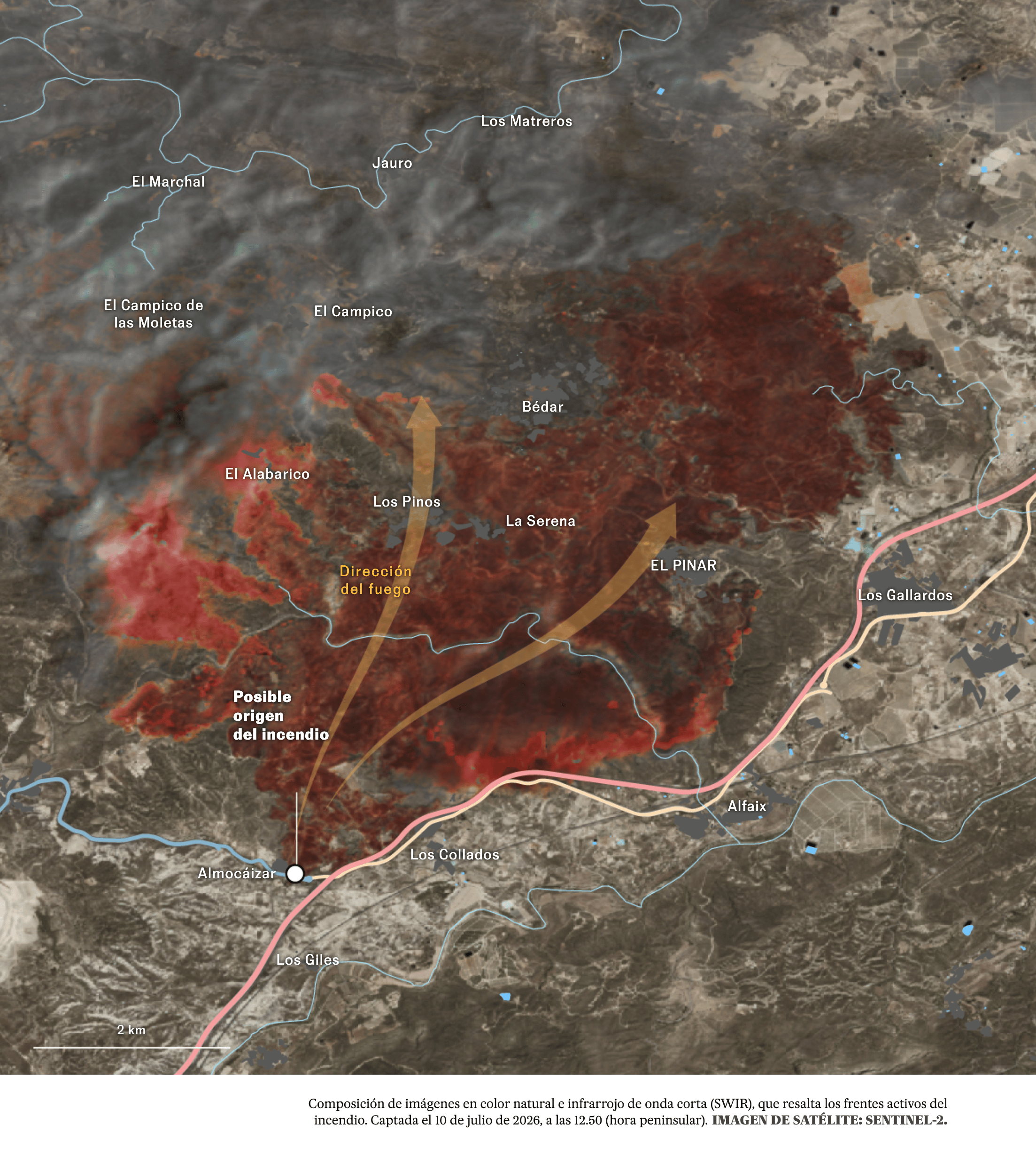
![Le Monde: <a href="https://www.lemonde.fr/les-decodeurs/article/2026/07/11/visualisez-l-etendue-des-incendies-en-france-en-carte-et-graphique_6722679_4355770.html"><strong>Visualisez l’étendue des incendies en France, en carte et graphique</strong></a><strong> </strong><em>[View the extent of wildfires in France on maps and charts]</em>, July 11](https://datawrapper.de/cdn-cgi/image/quality=85,width=1384,f=auto,fit=cover/https://kirby.datawrapper.de/media/pages/blog/data-vis-dispatch-july-14-2026/2c90a3843a-1783939338/screenshot-2026-07-13-at-12.41.16.png)
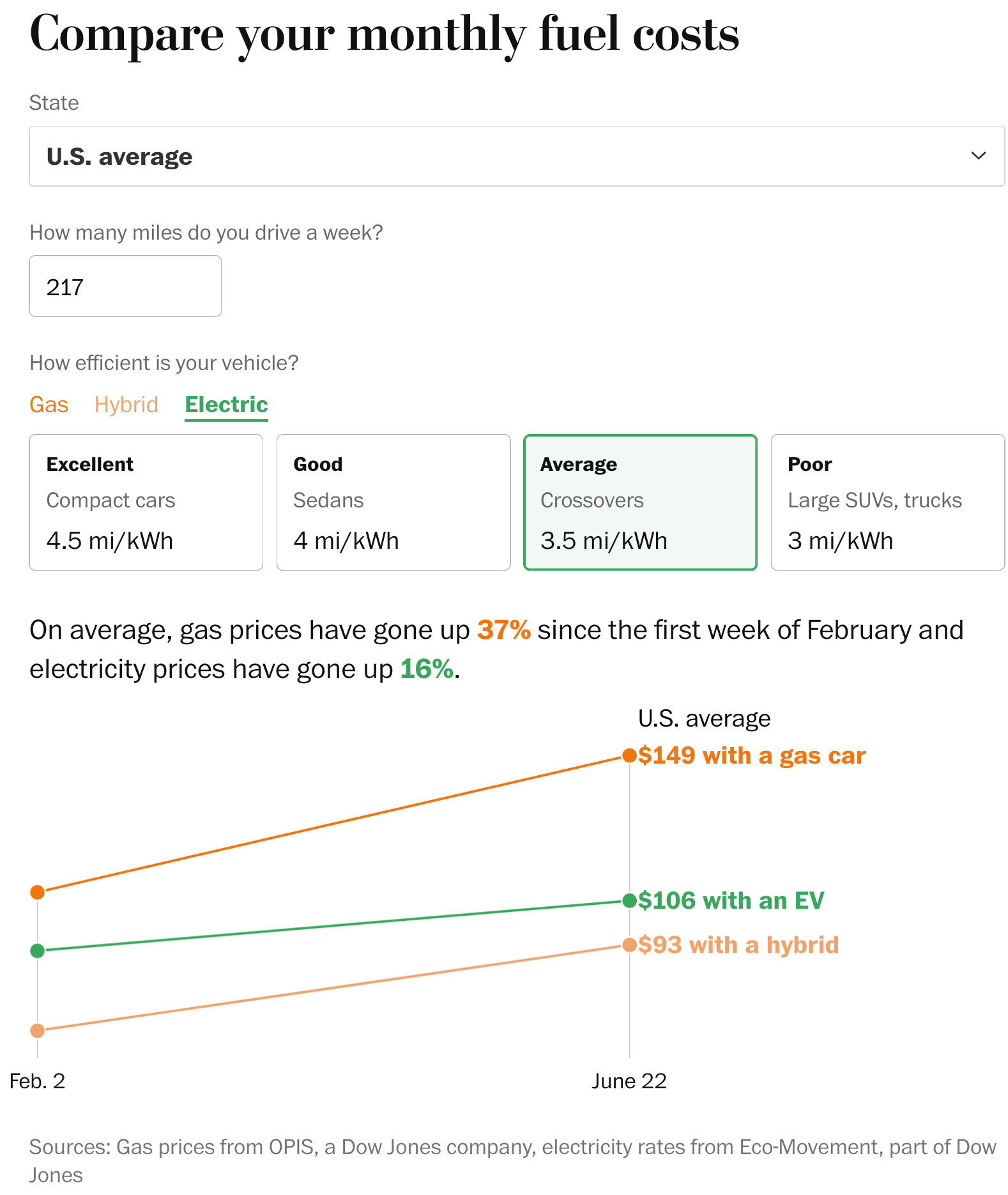
How much cheaper is it to drive an EV than a gas car? How fossil-fuel-based is Germany's electricity mix? And how quickly is the country moving away from those fossil fuels? This week's energy charts have the answers.
![NZZ: <a href="https://www.nzz.ch/visuals/stromtracker-strommix-deutschland-live-ld.10011948"><strong>Strommix in Deutschland live</strong></a> <em>[Germany's Electricity Mix in Real Time]</em>, July 10](https://datawrapper.de/cdn-cgi/image/quality=85,width=2116,f=auto,fit=cover/https://kirby.datawrapper.de/media/pages/blog/data-vis-dispatch-july-14-2026/aa424b97e7-1783928316/screenshot-2026-07-13-at-09.37.57.png)
![ZEIT: <a href="https://www.zeit.de/wirtschaft/2026-07/erneuerbare-energie-wind-solar-strom-eeg"><strong>Ist das jetzt die Reiche-Delle?</strong></a><strong> </strong><em>[Chart title: How Solar Energy Expansion Is Progressing]</em>, July 14](https://datawrapper.de/cdn-cgi/image/quality=85,width=1834,f=auto,fit=cover/https://kirby.datawrapper.de/media/pages/blog/data-vis-dispatch-july-14-2026/f122a7a548-1784014137/screenshot-2026-07-14-at-09.28.36.png)
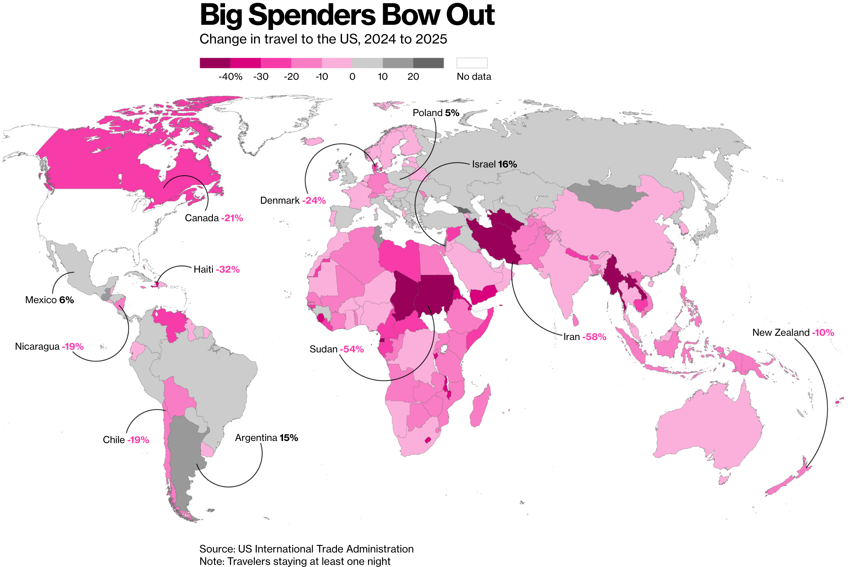
There were quite a few charts about US politics this week: how the Democrats hope to regain control of both the House and the Senate in the midterms this November, the Supreme Court, Trump's sons, and the drop in the number of people traveling to the US.
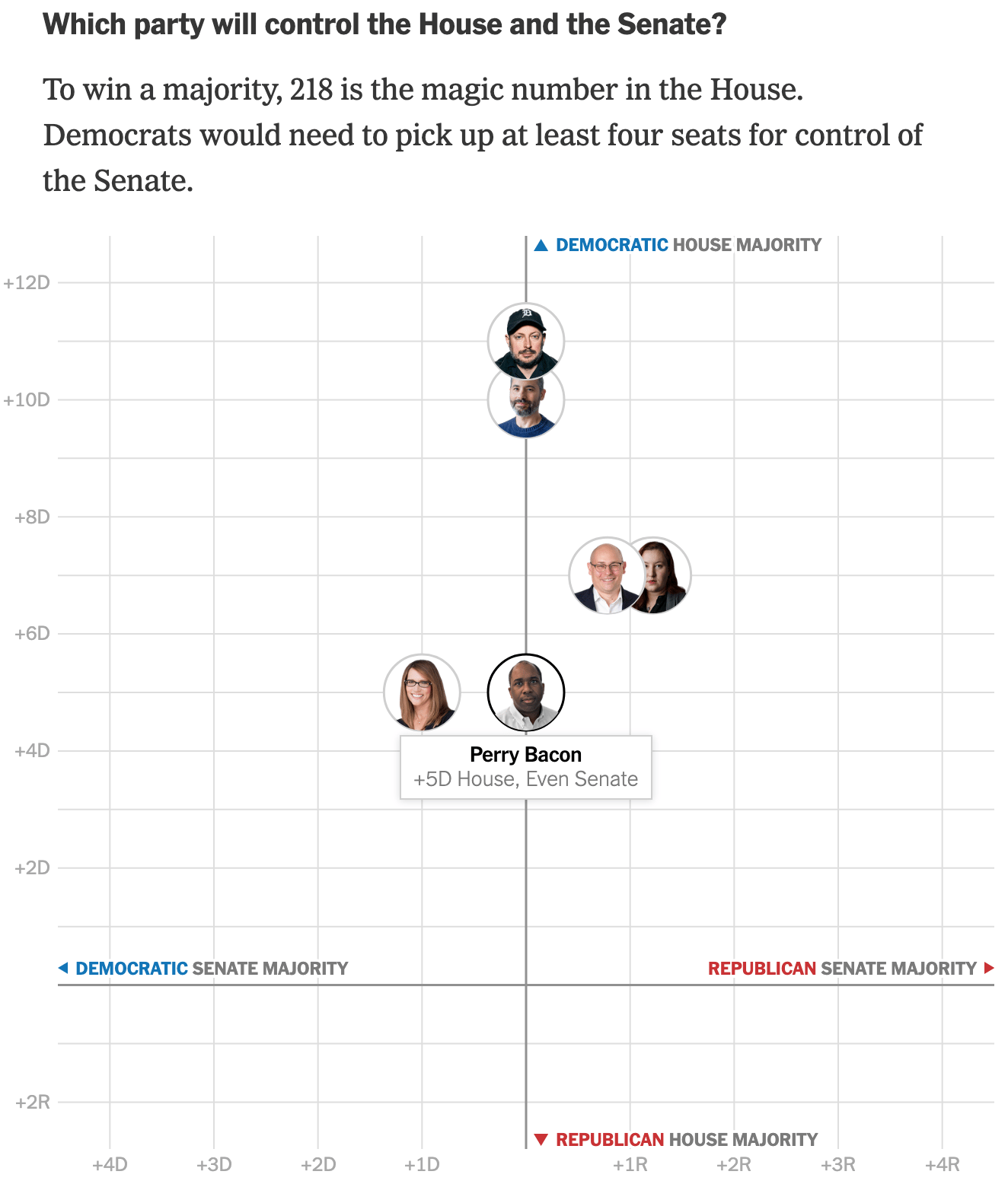
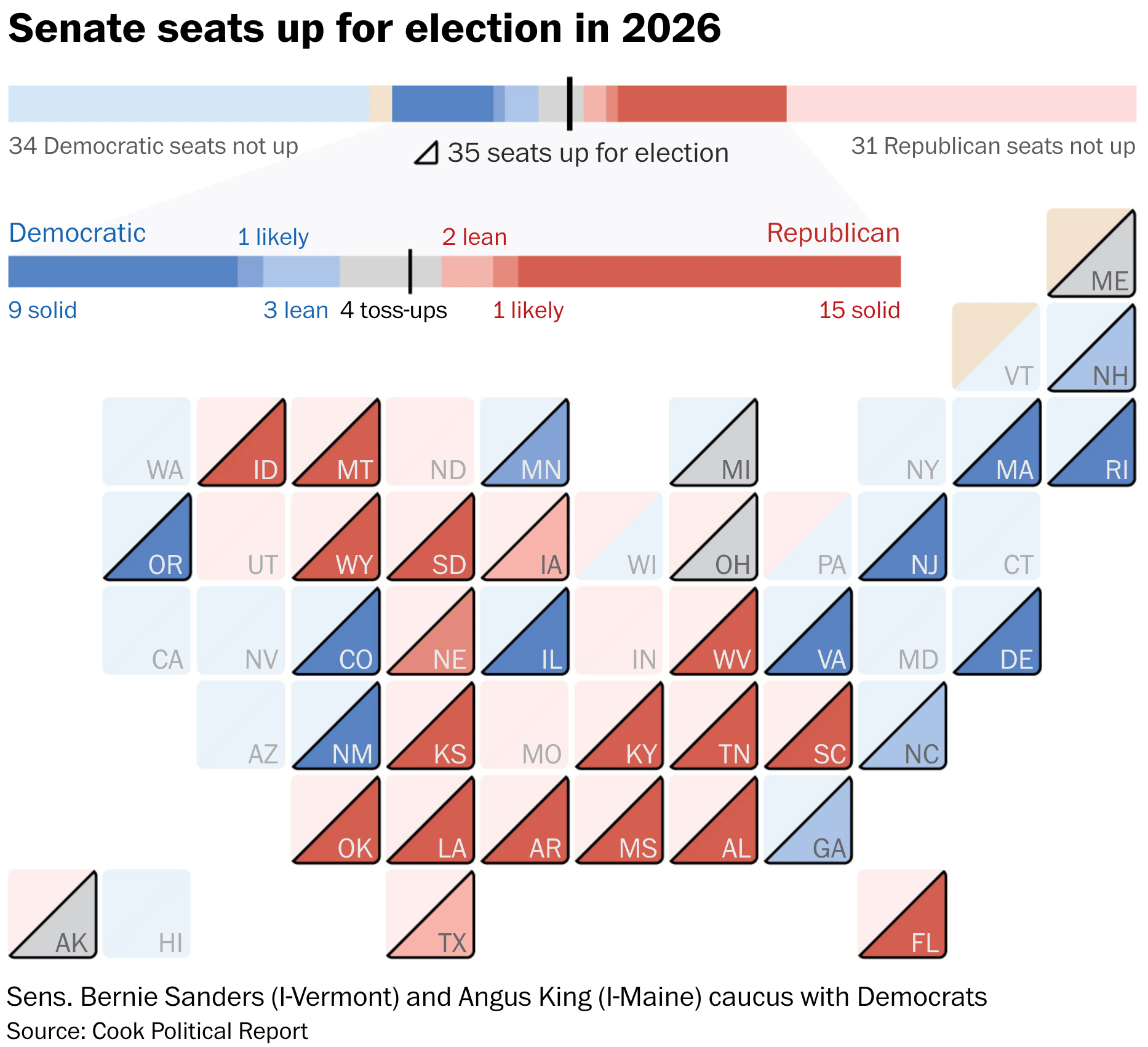

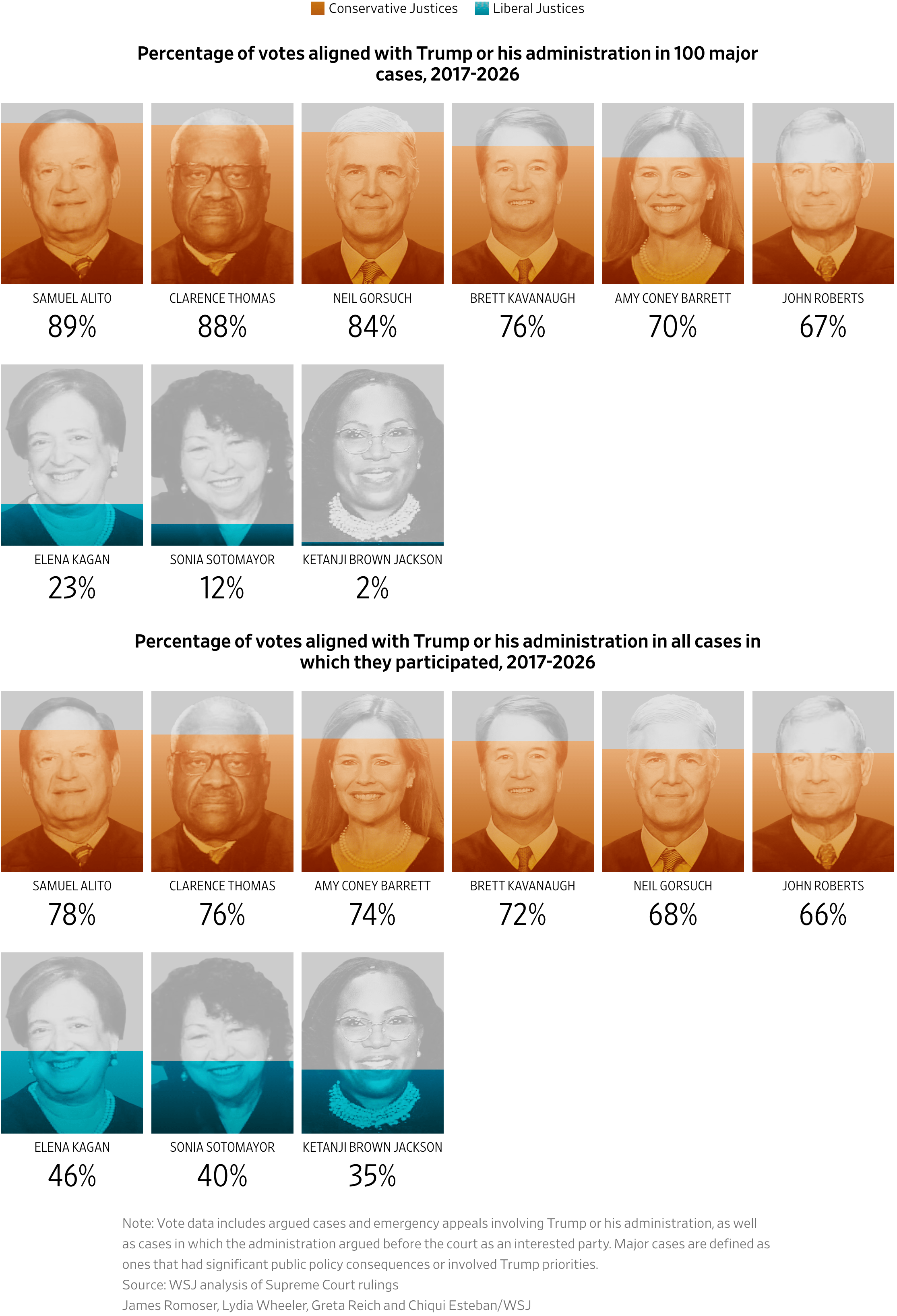
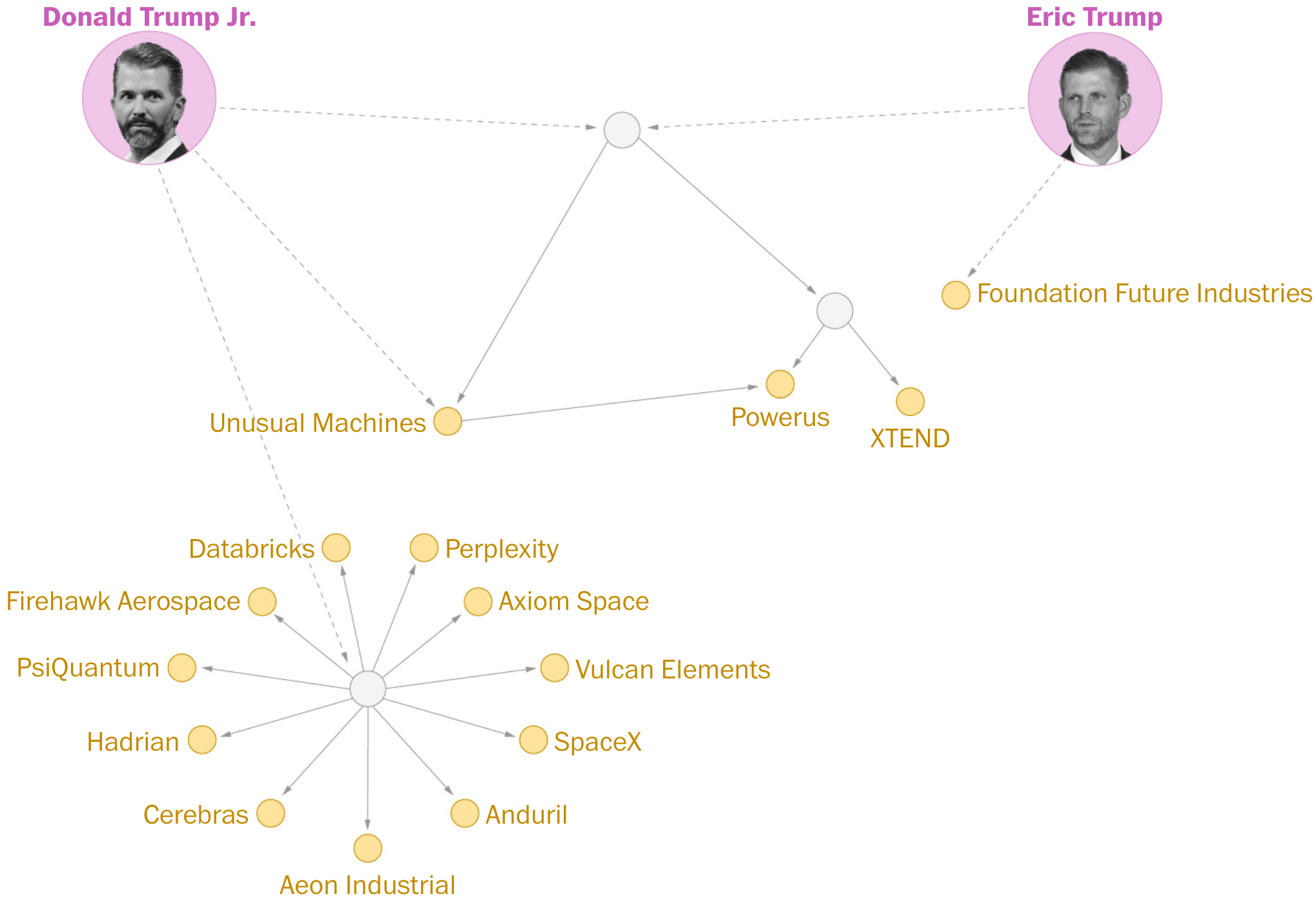
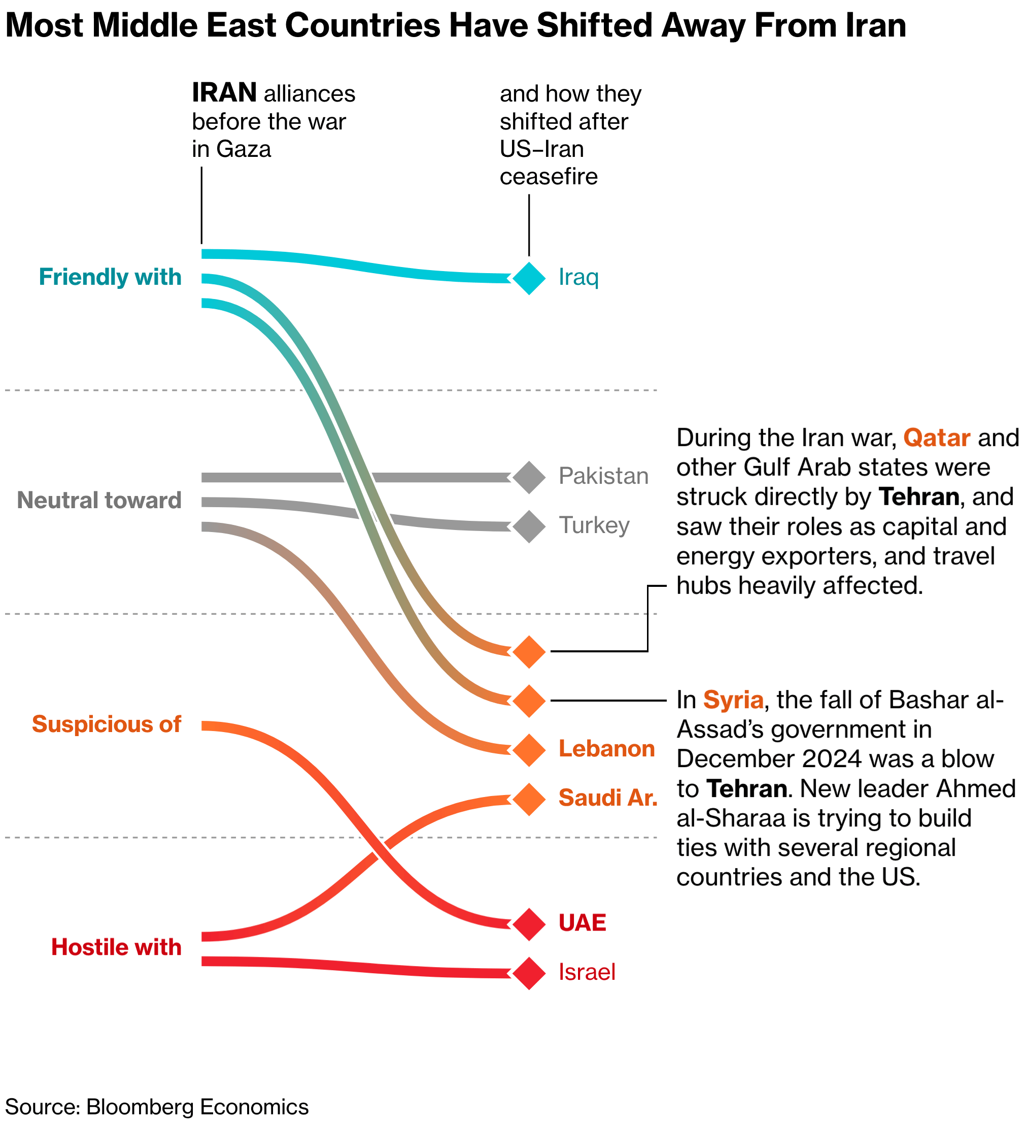
The Iran war continues. Bloomberg charted how alliances in the Middle East have changed over the past 1,000 days, and Reuters put together a visual story on how the war drove up fertilizer prices.
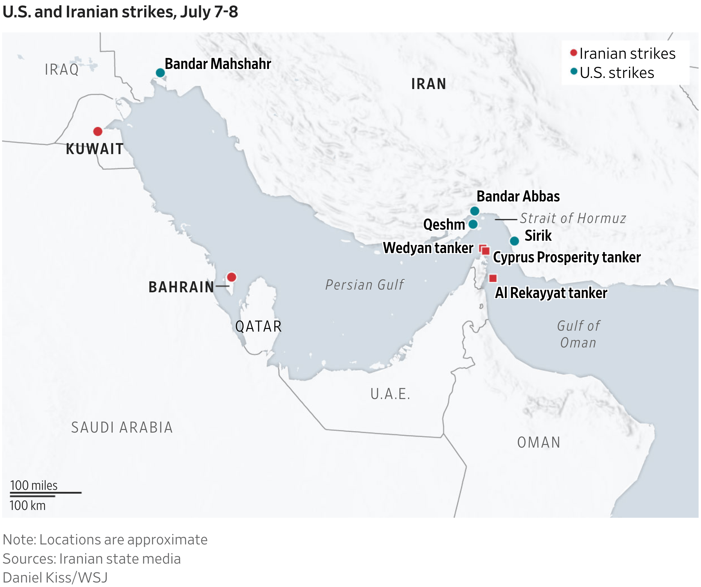
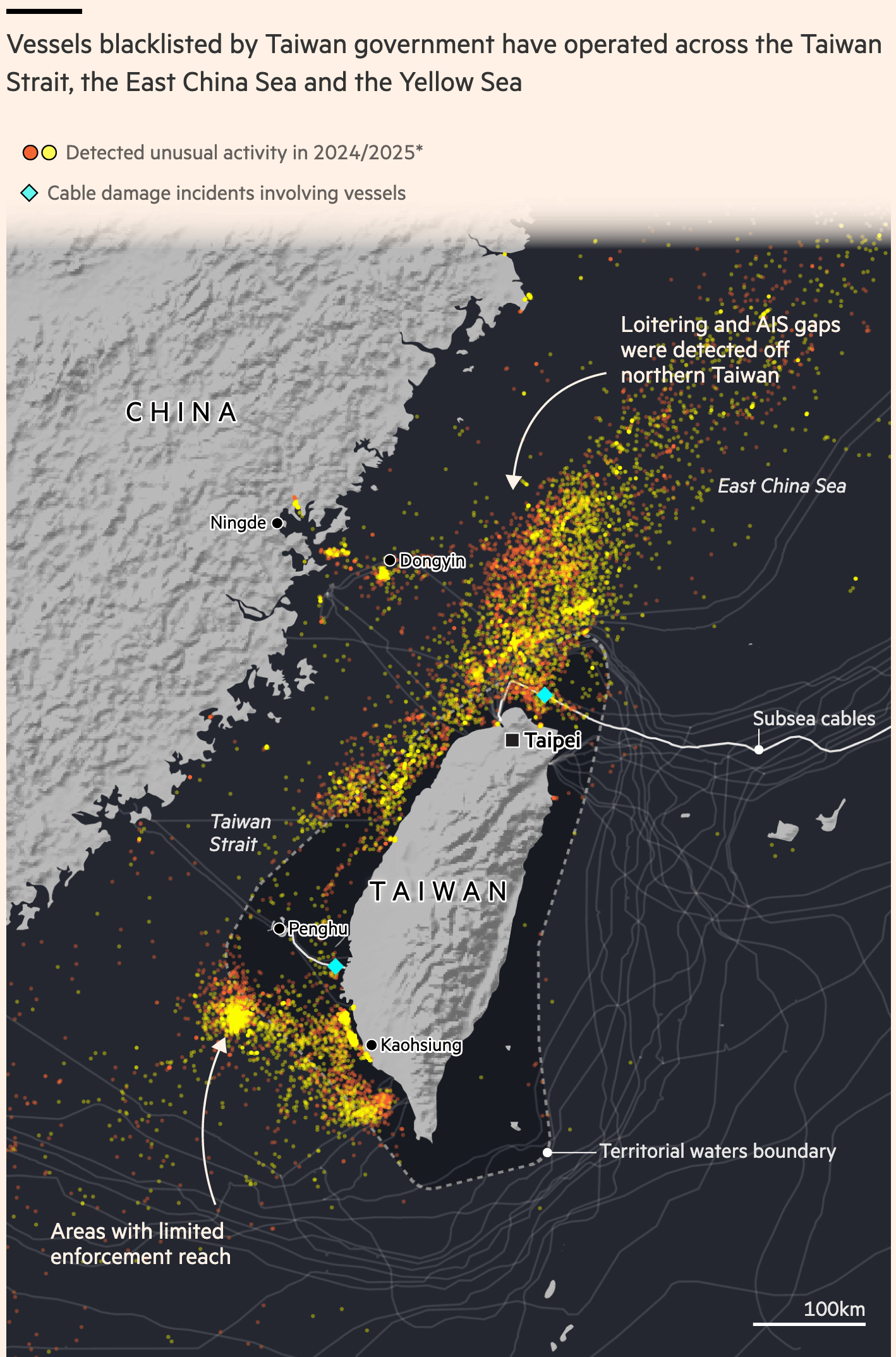
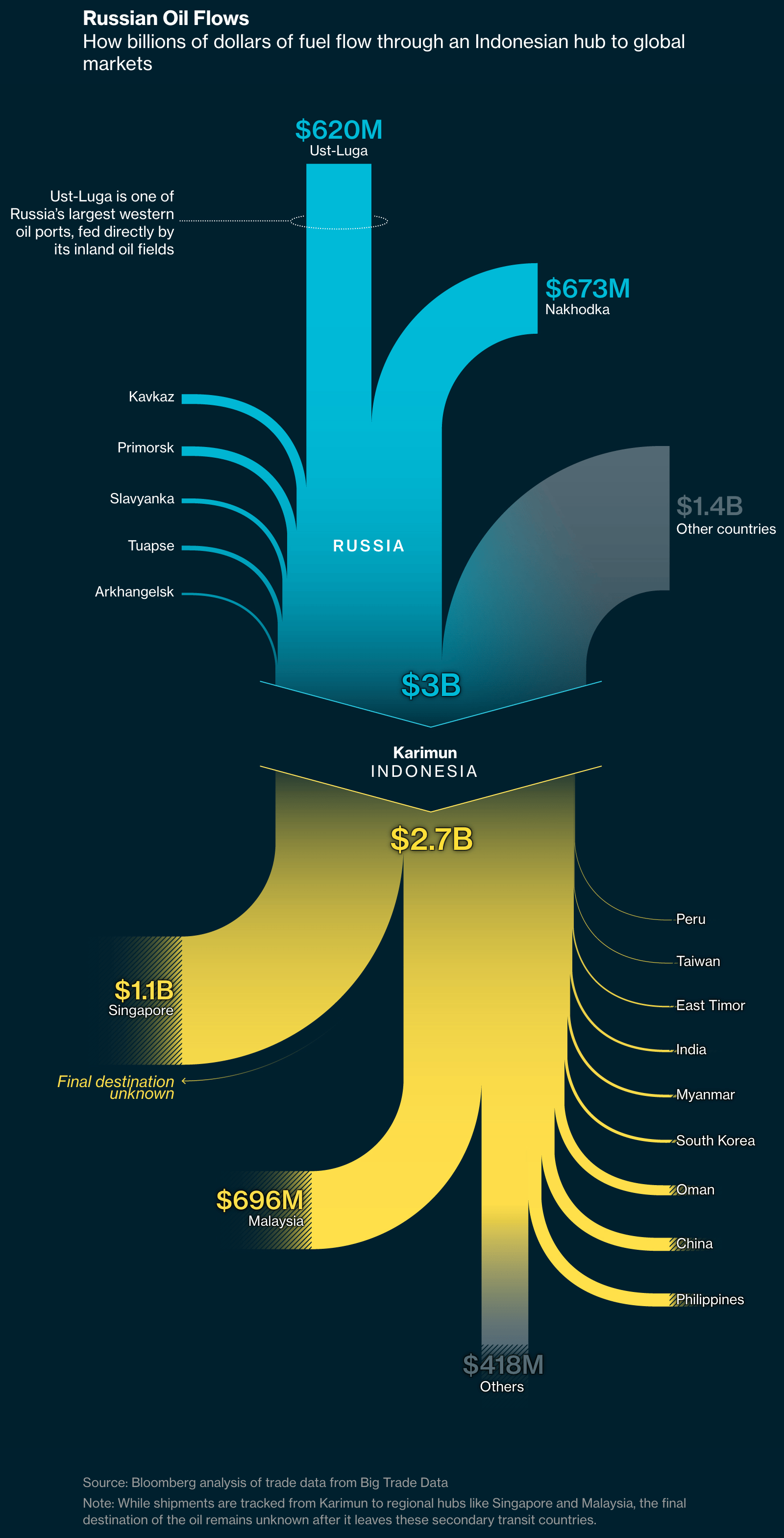
They were also two (yes, two) big stories on ships in Asia trying not to be seen:
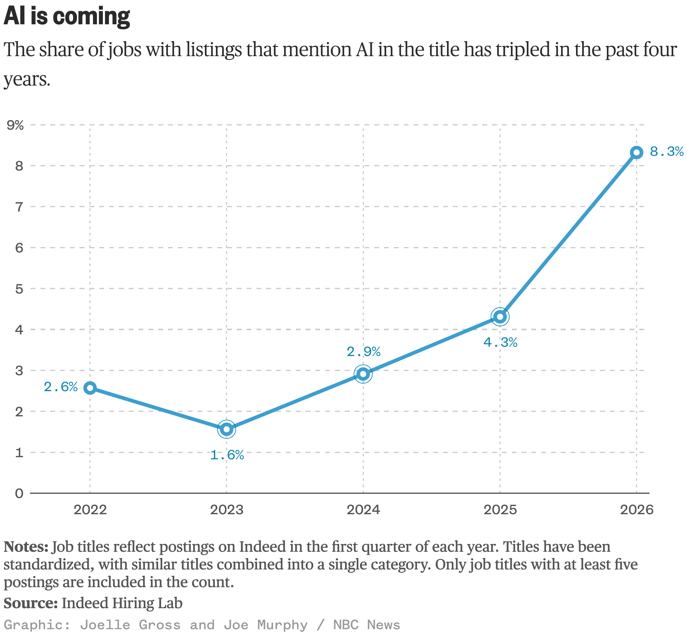
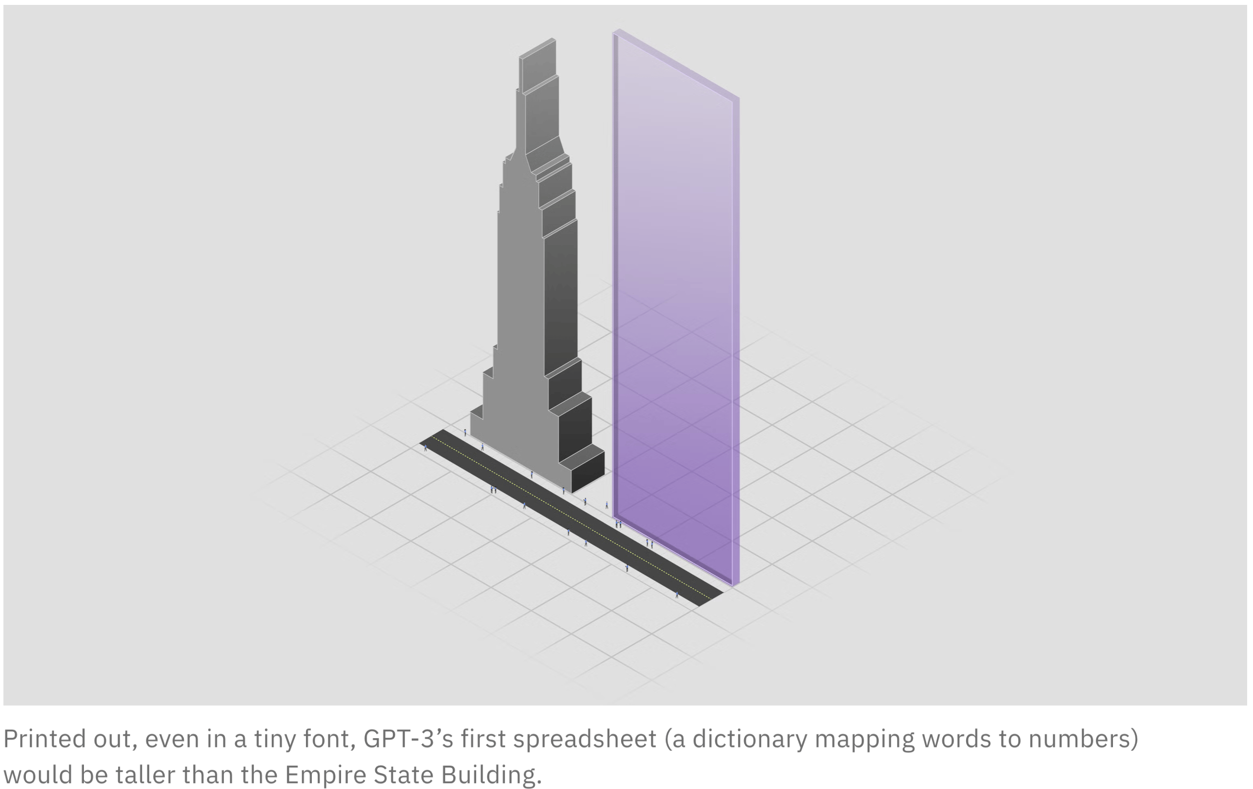
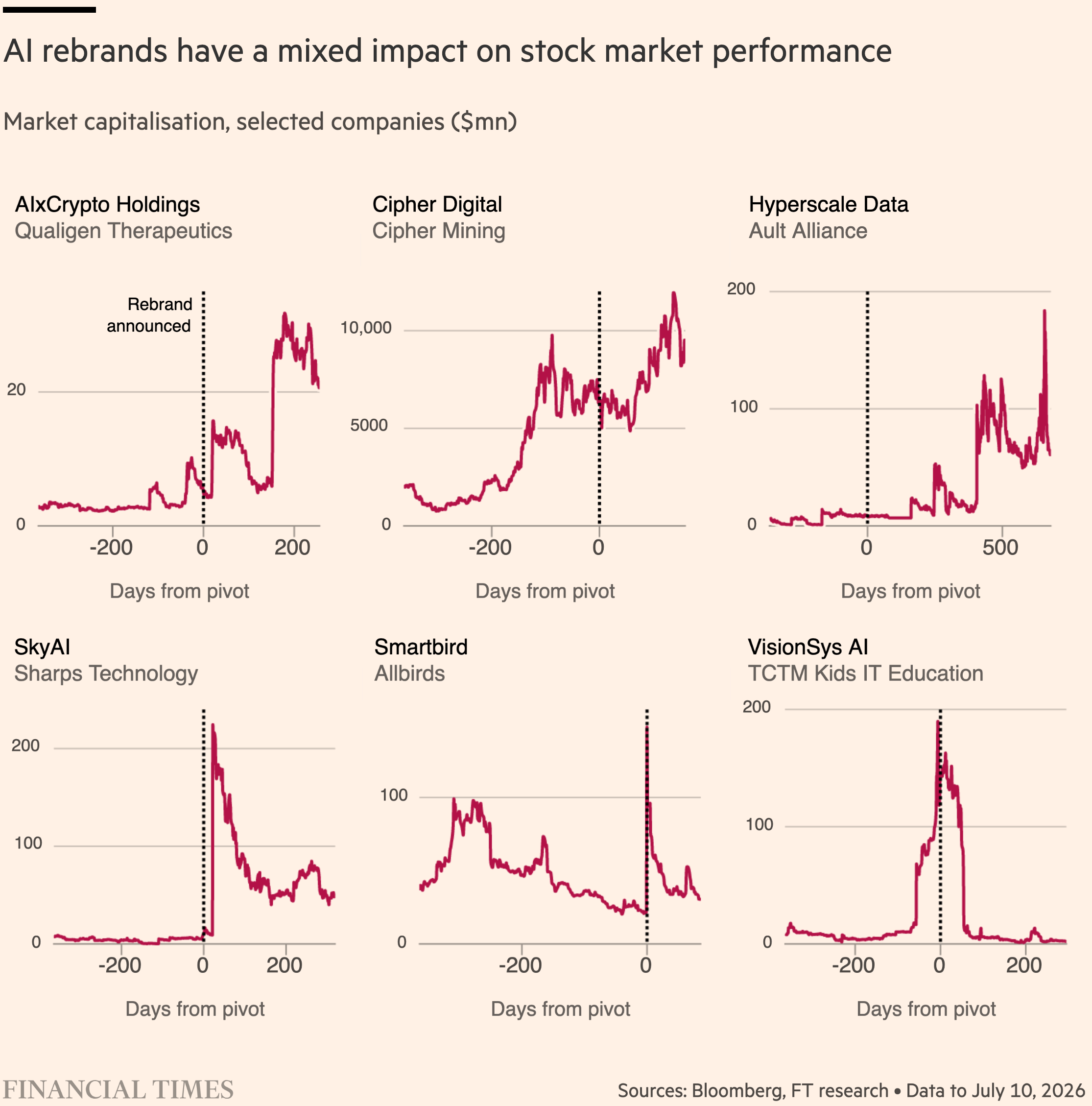
"AI is coming," NBC News states. But is it coming for you and your skills? This week's charts tell you — and they explain how AI (and the tech behind it) works. Also, do these AI rebrands actually help companies make more money? The Financial Times takes a look.
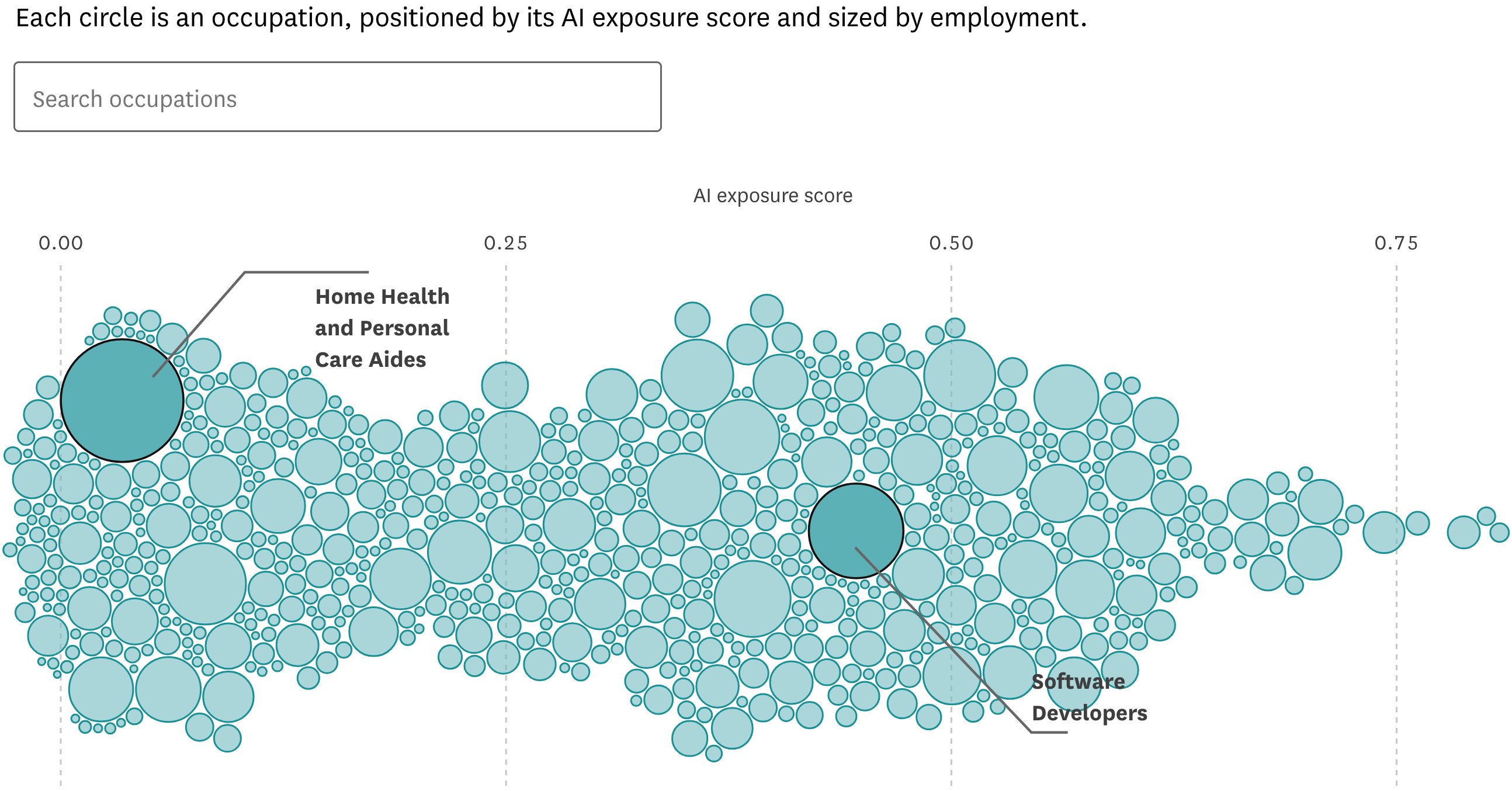
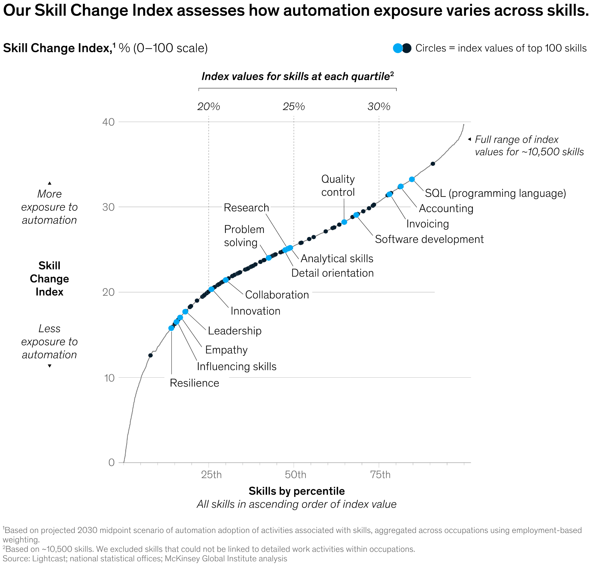
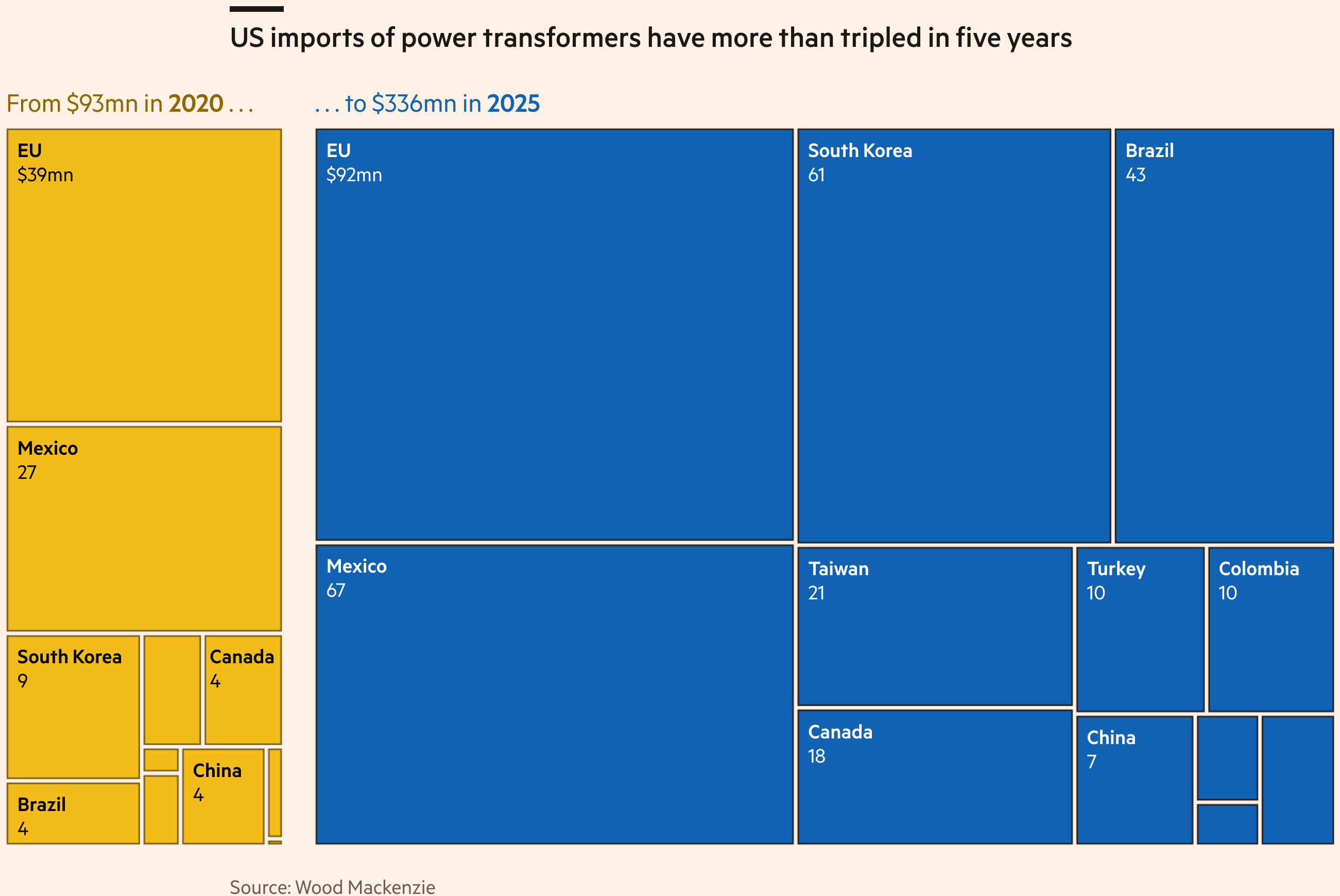
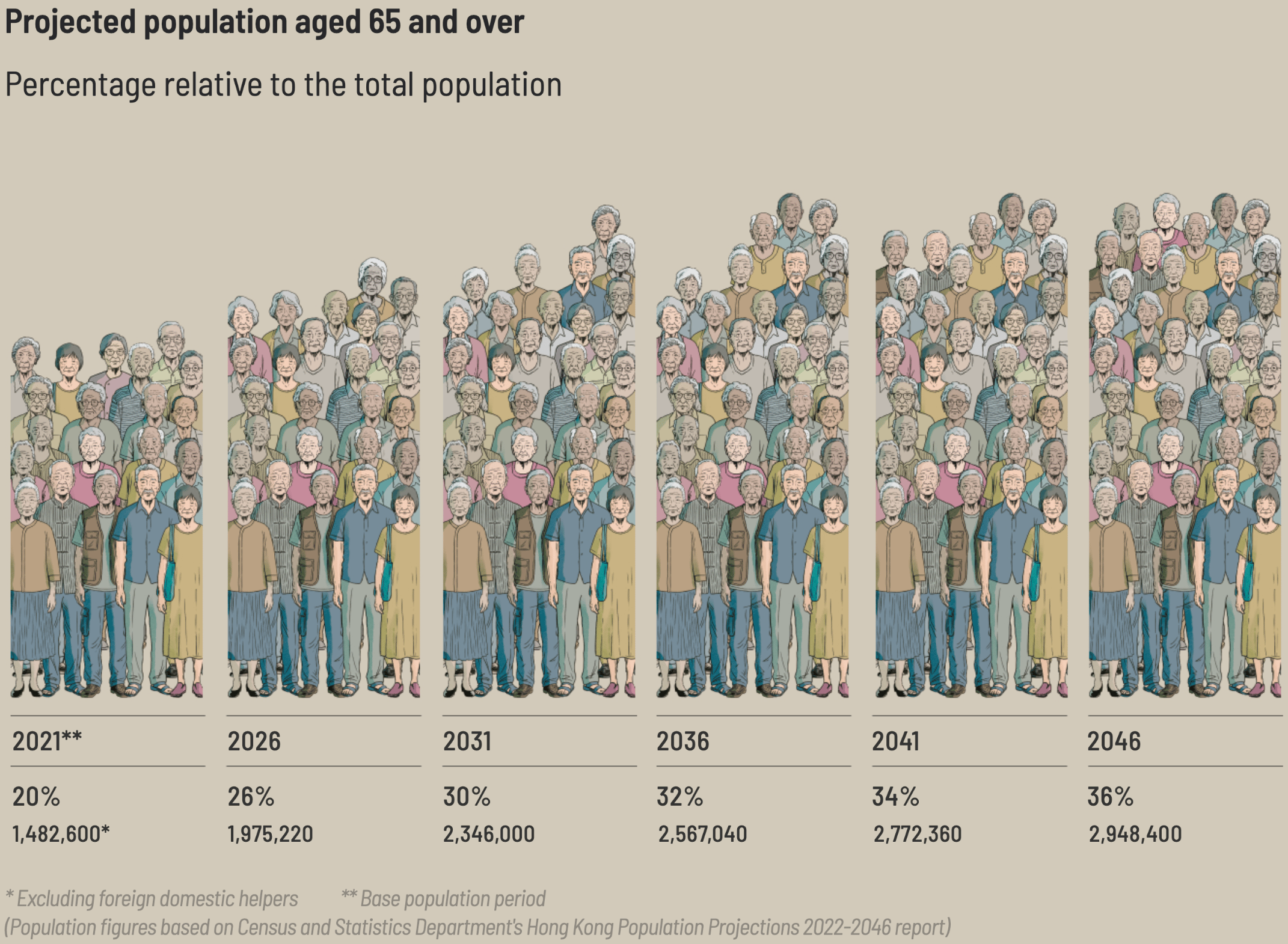
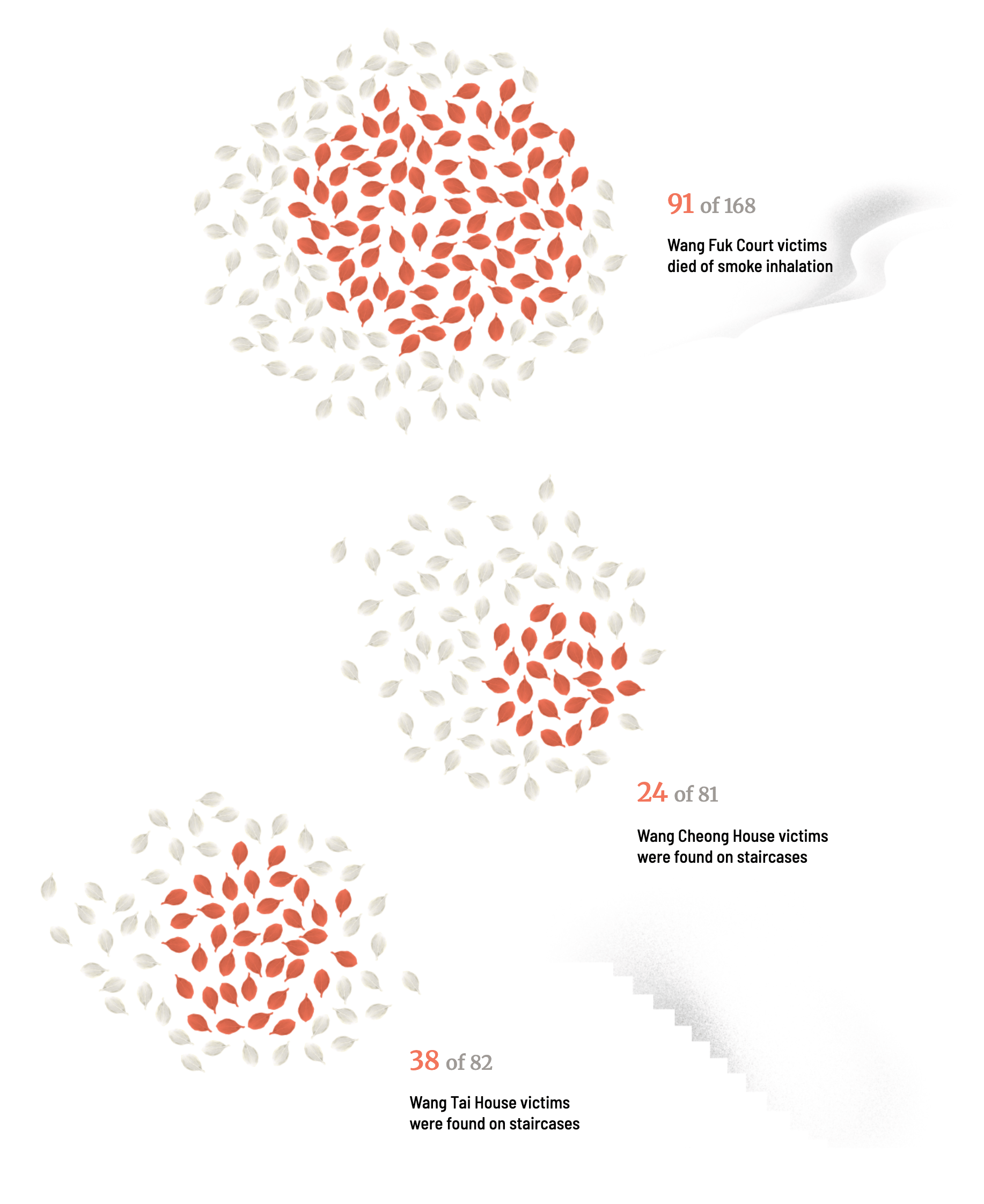
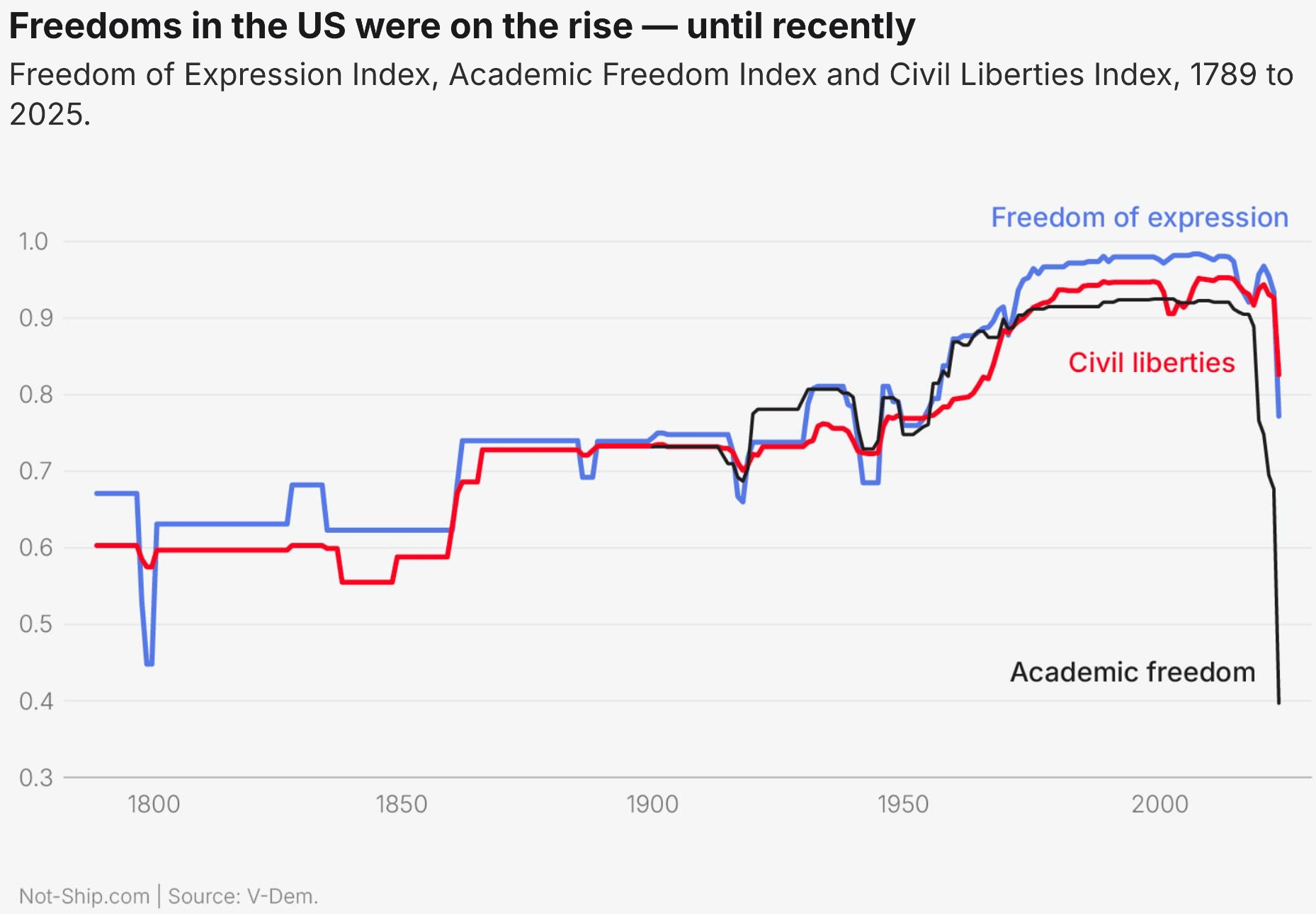
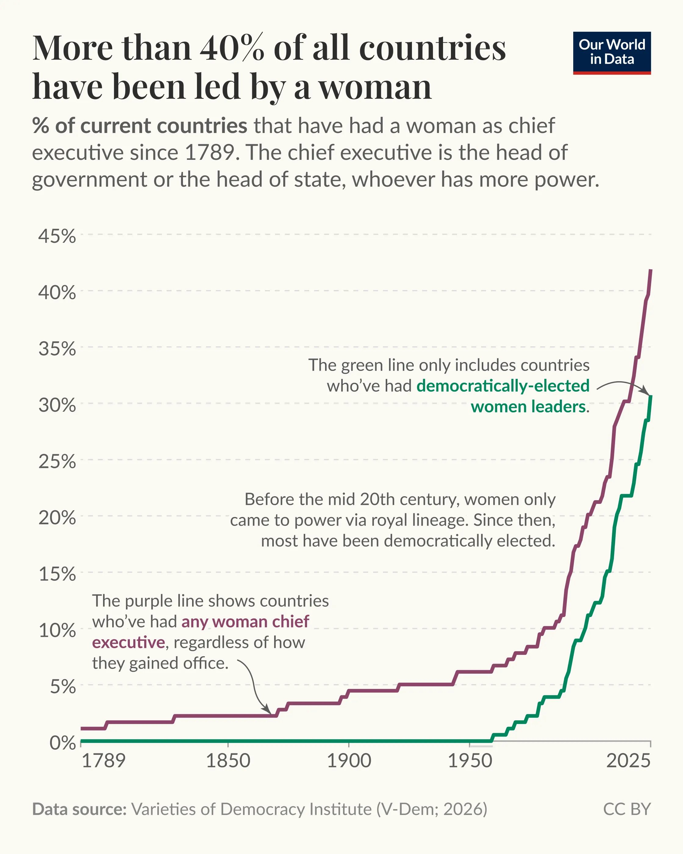
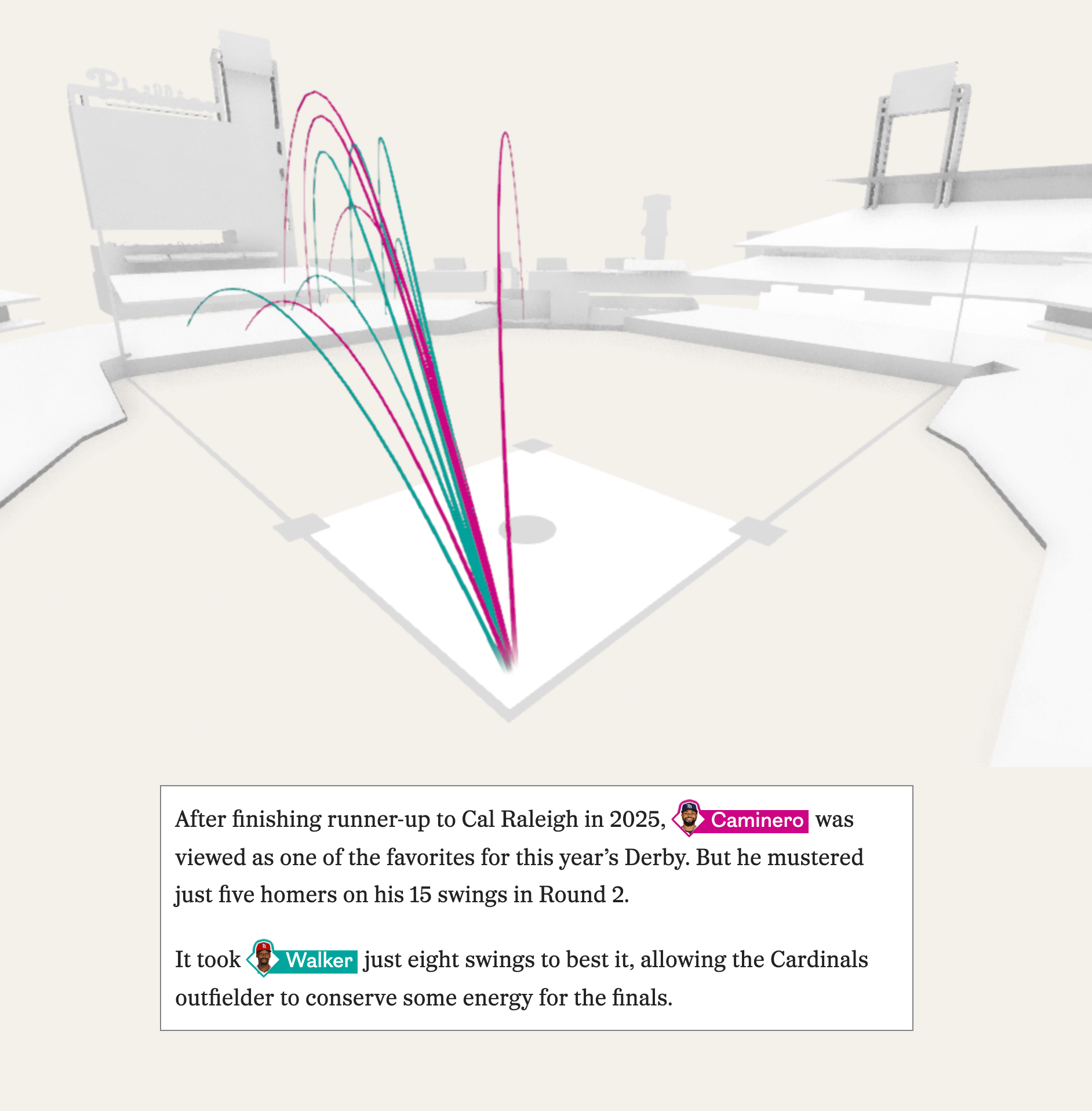
And in this week's "Other great visualizations we couldn't fit neatly in one of the other sections" section: aging and deaths in Hong Kong, academic freedom, female heads of state, baseball, and public transit in Switzerland.
What else we found interesting
Applications are open for…
A data journalist at The Guardian, Sydney
A graphics journalist at the Financial Times, London


