Data Vis Dispatch, August 12: Burning Europe, interactive maps, and tariff analyses

Welcome back to the 205th edition of Data Vis Dispatch! Every week, we’ll be publishing a collection of the best small and large data visualizations we find, especially from news organizations — to celebrate data journalism, data visualization, simple charts, elaborate maps, and their creators.
Recurring topics this week include wildfires in southern Europe, interactive map tools, and different angles on the U.S. tariff situation.
Severe wildfires have been plaguing parts of southern Europe, and there's data to prove that their extent is far beyond normal:
![Der Spiegel: <a href="https://www.spiegel.de/wissenschaft/natur/frankreich-warum-sich-die-waldbraende-nur-schwer-beherrschen-lassen-a-b619d38d-fcef-4138-8efd-14342bd40c0d"><strong>Ein Feuer, das sich schwer beherrschen lässt</strong></a> [<em>A fire that is difficult to control</em>], August 7](https://datawrapper.de/cdn-cgi/image/quality=85,width=1264,f=auto,fit=cover/https://kirby.datawrapper.de/media/pages/blog/data-vis-dispatch-august-12/2a725f91e2-1754919708/cleanshot-2025-08-11-at-15.41.22@2x.png)
![Diario Sur: <a href="https://www.diariosur.es/sociedad/fuegos-indomables-mejor-control-contradiccion-tiempo-extincion-20250808174757-ntrc.html"><strong>¿Fuegos indomables o mejor control? La contradicción en el tiempo de extinción de los grandes incendios</strong></a> [<em>Untamed fires or better control? The contradiction in the time it takes to extinguish large fires</em>], August 8](https://datawrapper.de/cdn-cgi/image/quality=85,width=1179,f=auto,fit=cover/https://kirby.datawrapper.de/media/pages/blog/data-vis-dispatch-august-12/c7819fcb00-1754919211/cleanshot-2025-08-11-at-15.33.00@2x.png)
The destruction of Gaza's physical infrastructure and starvation of its people continue:
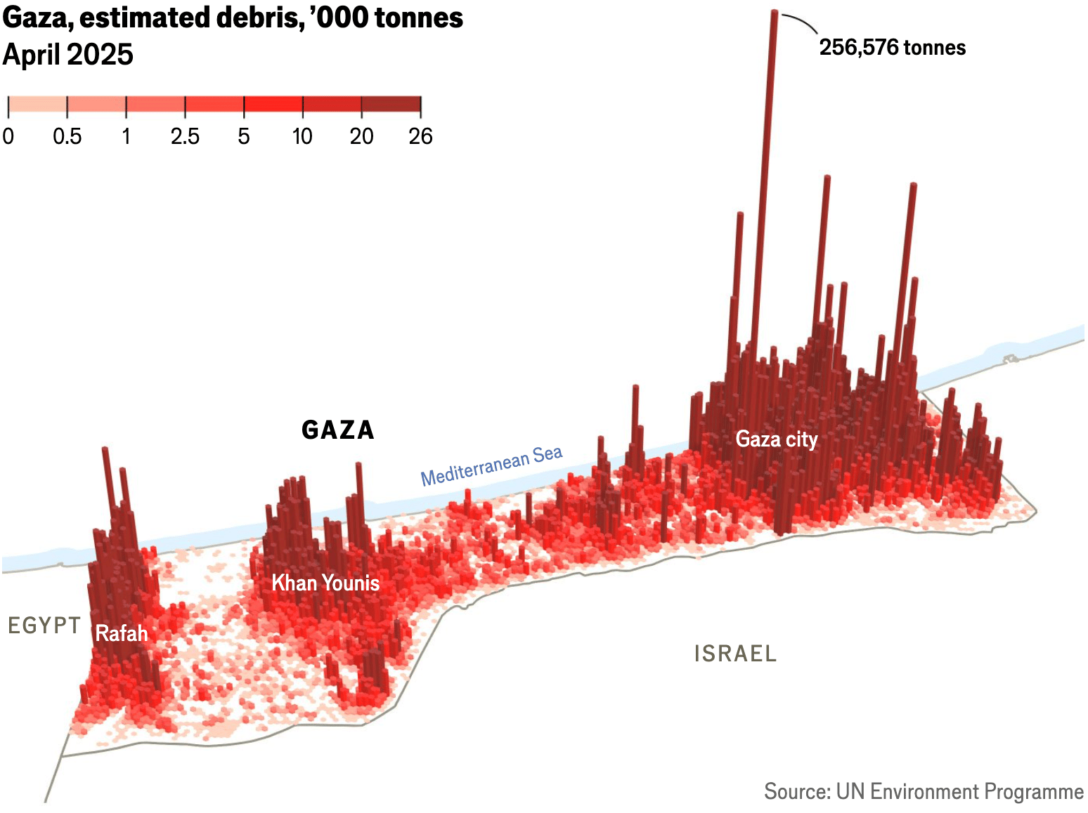
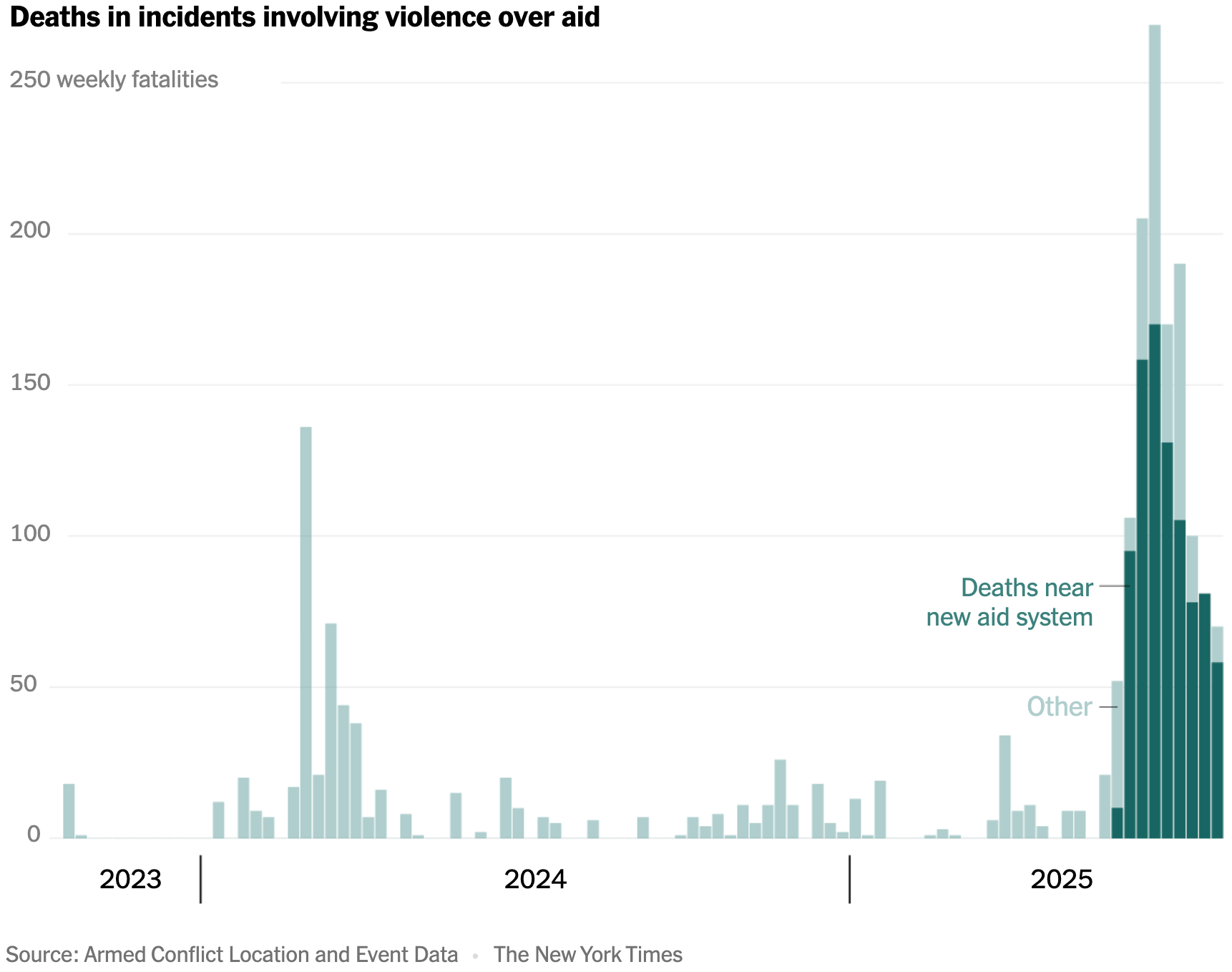
![Die Zeit: <a href="https://www.zeit.de/politik/ausland/2025-08/luftbruecke-gazastreifen-bundeswehr-lebensmittel-nahostkonflikt"><strong>Warum die Luftbrücke den Hunger nicht beenden kann</strong></a> [<em>Why the airdrops cannot end hunger</em>], August 8](https://datawrapper.de/cdn-cgi/image/quality=85,width=1328,f=auto,fit=cover/https://kirby.datawrapper.de/media/pages/blog/data-vis-dispatch-august-12/317d45cffb-1754917775/cleanshot-2025-08-11-at-15.08.43@2x.png)
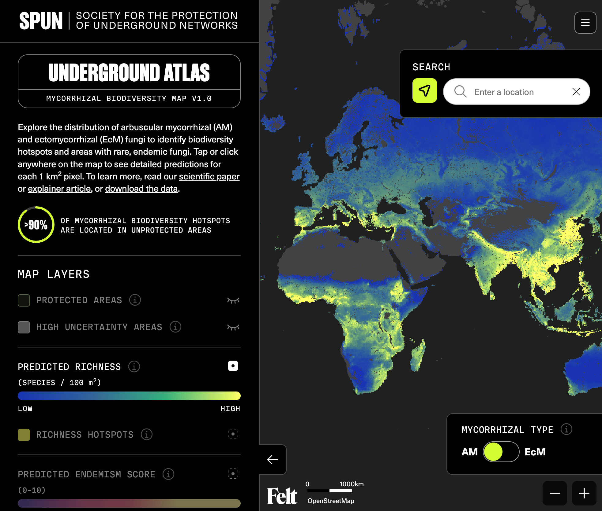
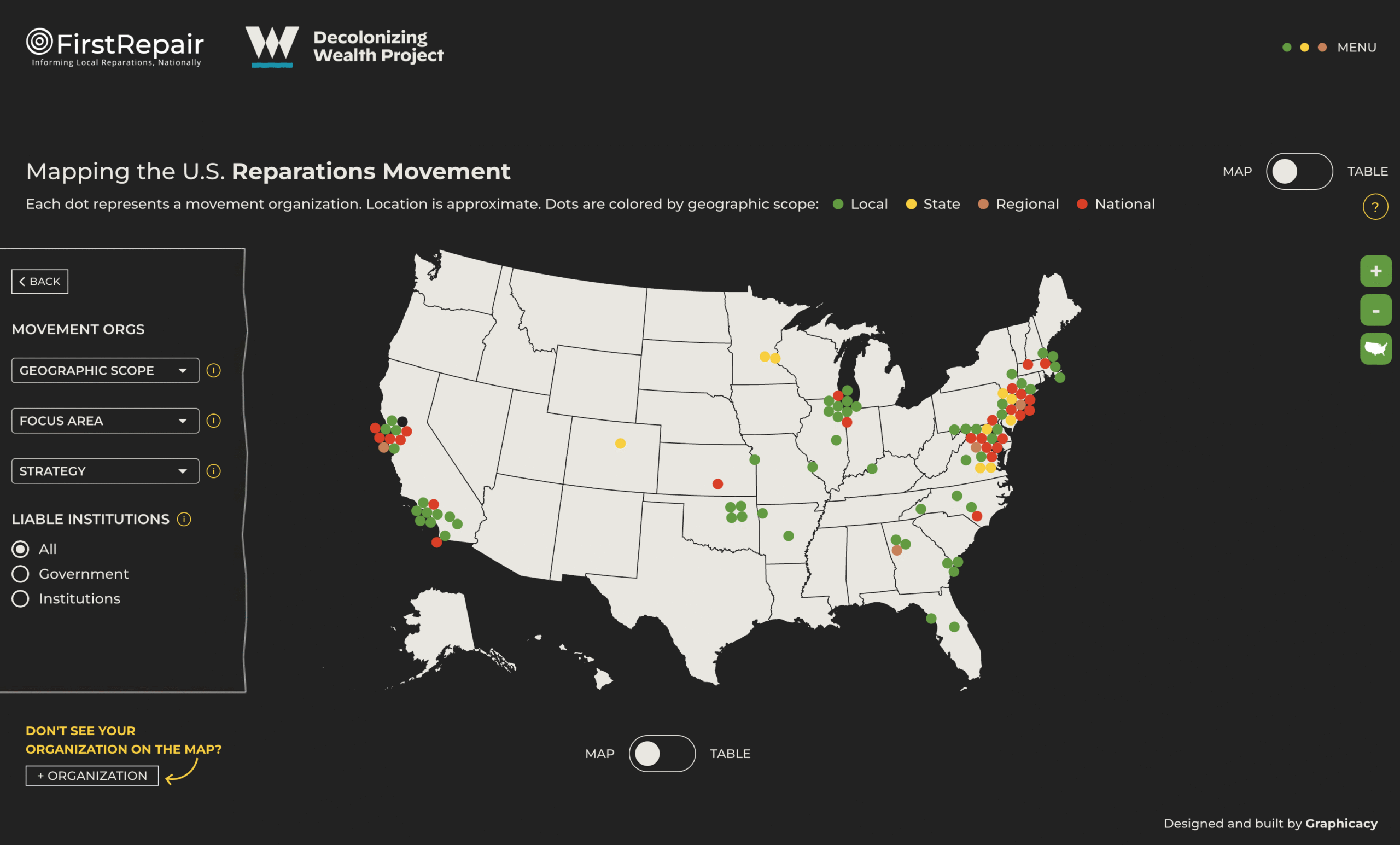
These interactive maps explore worldwide fungal networks and the U.S. movement for slavery reparations:
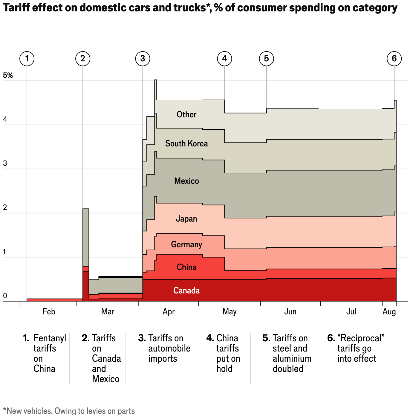
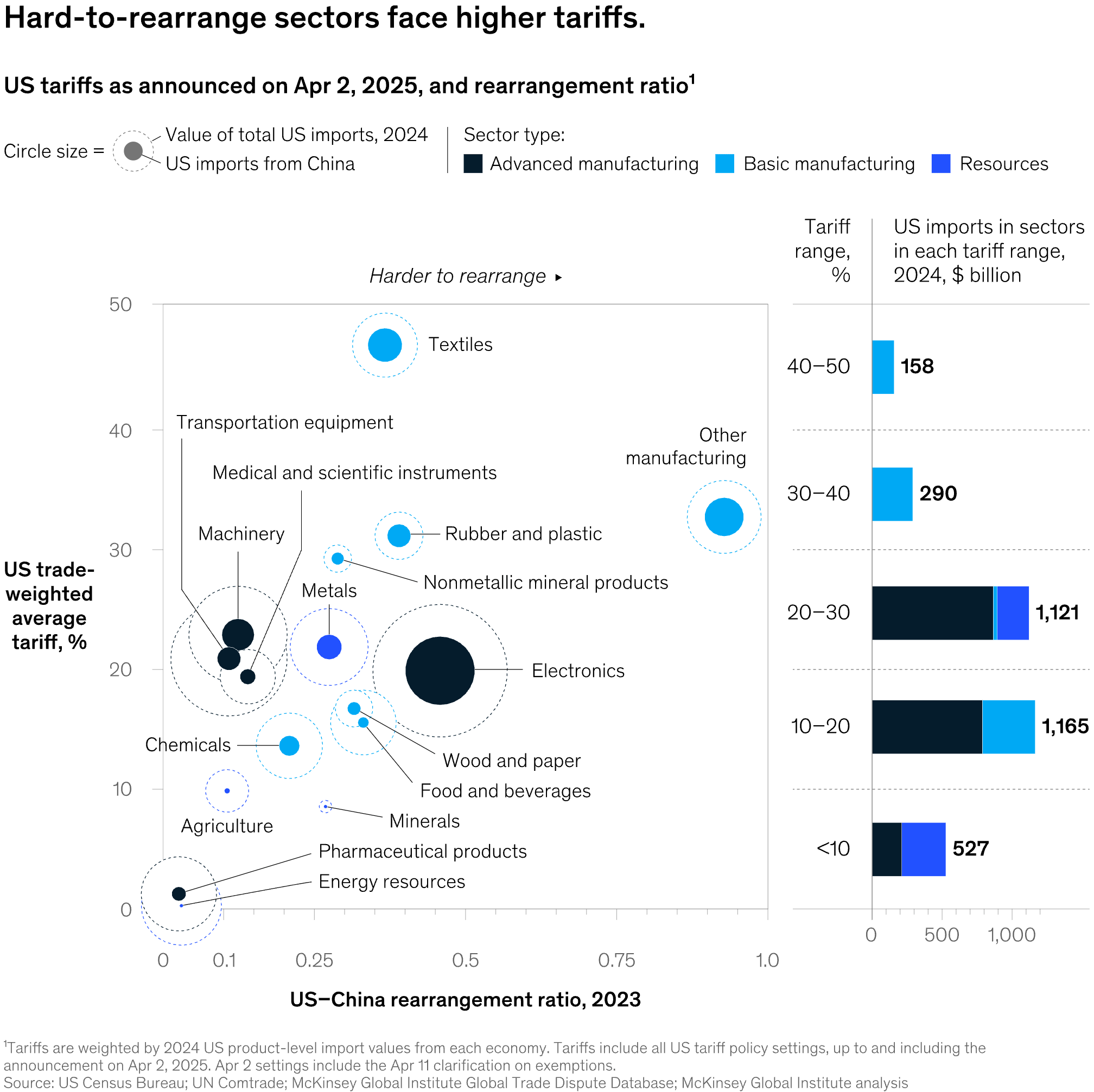
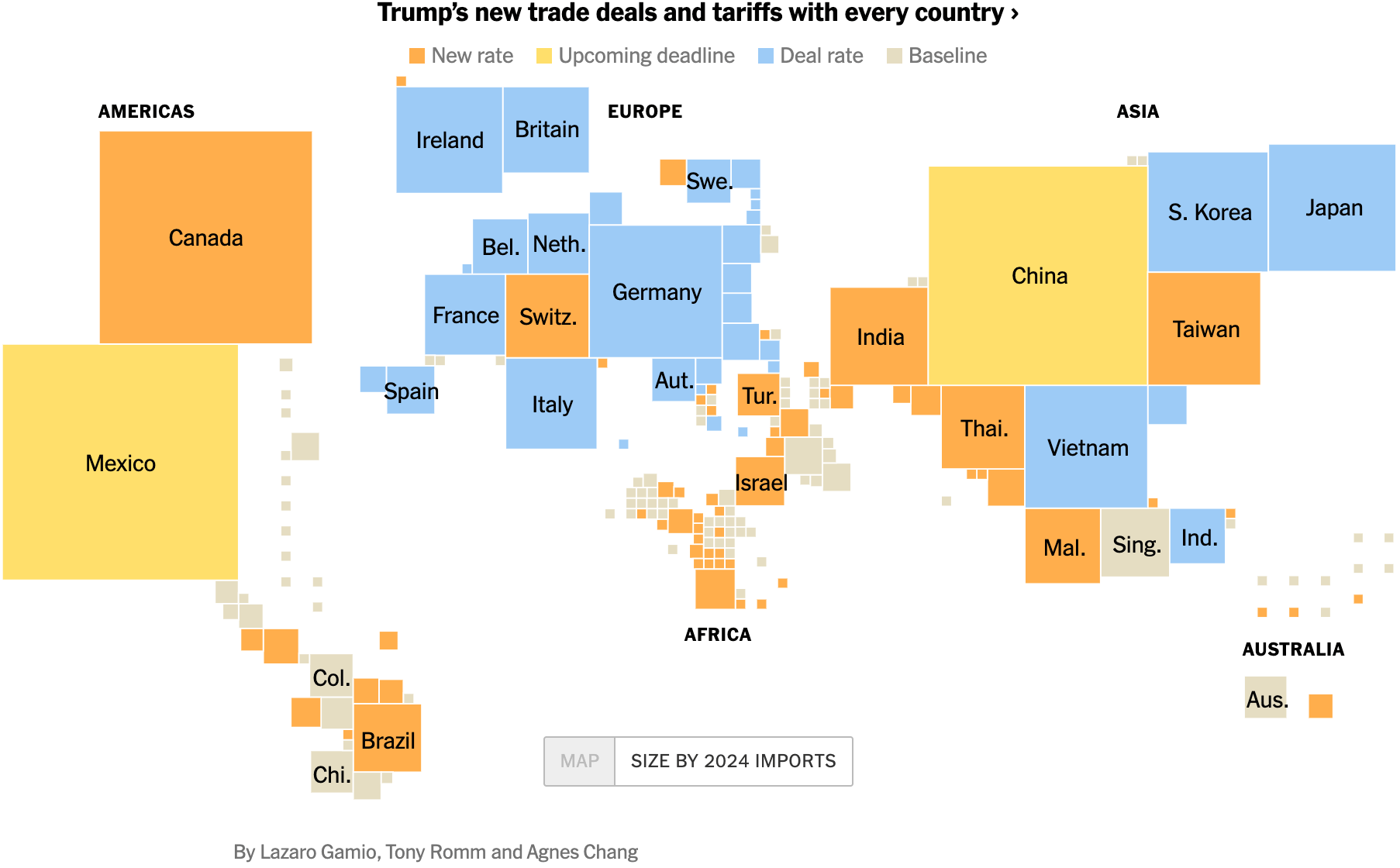
Here are a couple of economic charts — mostly on tariffs — each with their own qualities:
This edition comes to an end with charts about refugees in Germany, tourism in France, Filipino movie trends, and Italian food habits:
![Der Spiegel: <a href="https://www.spiegel.de/panorama/10-jahre-wir-schaffen-das-zehn-jahre-zehn-probleme-und-ein-lichtblick-a-2a5d330c-6777-4696-a0b3-0e016523205e"><strong>Zehn Jahre, zehn Herausforderungen – und ein Lichtblick</strong></a> [<em>Ten years, ten challenges – and a glimmer of hope</em>], August 9](https://datawrapper.de/cdn-cgi/image/quality=85,width=2402,f=auto,fit=cover/https://kirby.datawrapper.de/media/pages/blog/data-vis-dispatch-august-12/da642d9f9b-1754919609/cleanshot-2025-08-11-at-15.39.28@2x.png)
![YouGov: "[…] our poll previously found the rest of the world is committing a great deal of Italian food crimes," August 8 (<a href="https://bsky.app/profile/yougov.co.uk/post/3lvv25v4hoc2w"><strong>Bluesky</strong></a><strong>, </strong><a href="https://yougov.co.uk/international/articles/40810-italian-food-crimes?utm_source=website_article&utm_medium=bluesky&utm_campaign=40810"><strong>Article</strong></a>)](https://datawrapper.de/cdn-cgi/image/quality=85,width=1753,f=auto,fit=cover/https://kirby.datawrapper.de/media/pages/blog/data-vis-dispatch-august-12/780c6f5427-1754918125/cleanshot-2025-08-11-at-15.15.03@2x.png)
What else we found interesting
![Die Zeit: <a href="https://www.zeit.de/wissen/2025-08/klimawandel-staedte-klimazwillinge-zukunft-erderwaermung"><strong>So könnte das Wetter im Jahr 2100 bei Ihnen aussehen</strong></a> [<em>What the weather near you could be like in 2100</em>], August 6](https://datawrapper.de/cdn-cgi/image/quality=85,width=1402,f=auto,fit=cover/https://kirby.datawrapper.de/media/pages/blog/data-vis-dispatch-august-12/f0f9b07549-1754920005/cleanshot-2025-08-11-at-15.46.17@2x.png)
Help us make this dispatch better! We’d love to hear which newsletters, blogs, or social media accounts we need to follow to learn about interesting projects, especially from less-covered parts of the world (Asia, South America, Africa). Write us at hello@datawrapper.de or leave a comment below. Want the Dispatch in your inbox every Tuesday? Sign up for our Blog Update newsletter!


