Data Vis Dispatch, April 7: #30DayChartChallenge, spring, and Easter toast

Welcome back to the 239th edition of Data Vis Dispatch! Every week, we’ll be publishing a collection of the best small and large data visualizations we find, especially from news organizations — to celebrate data journalism, data visualization, simple charts, elaborate maps, and their creators.
Recurring topics this week include the #30DayChartChallenge, the arrival of spring, and Easter traditions.
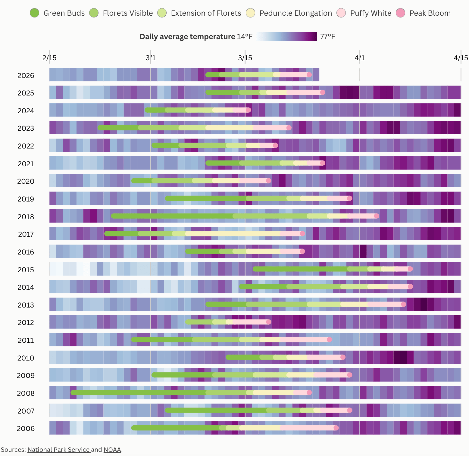
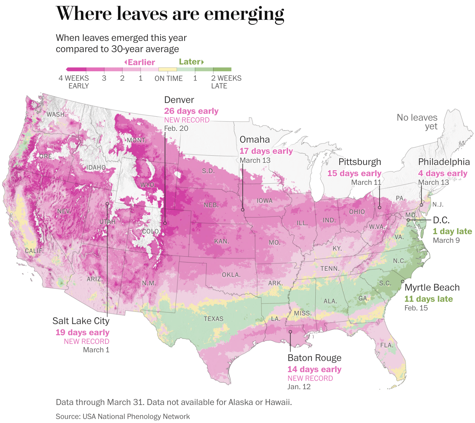
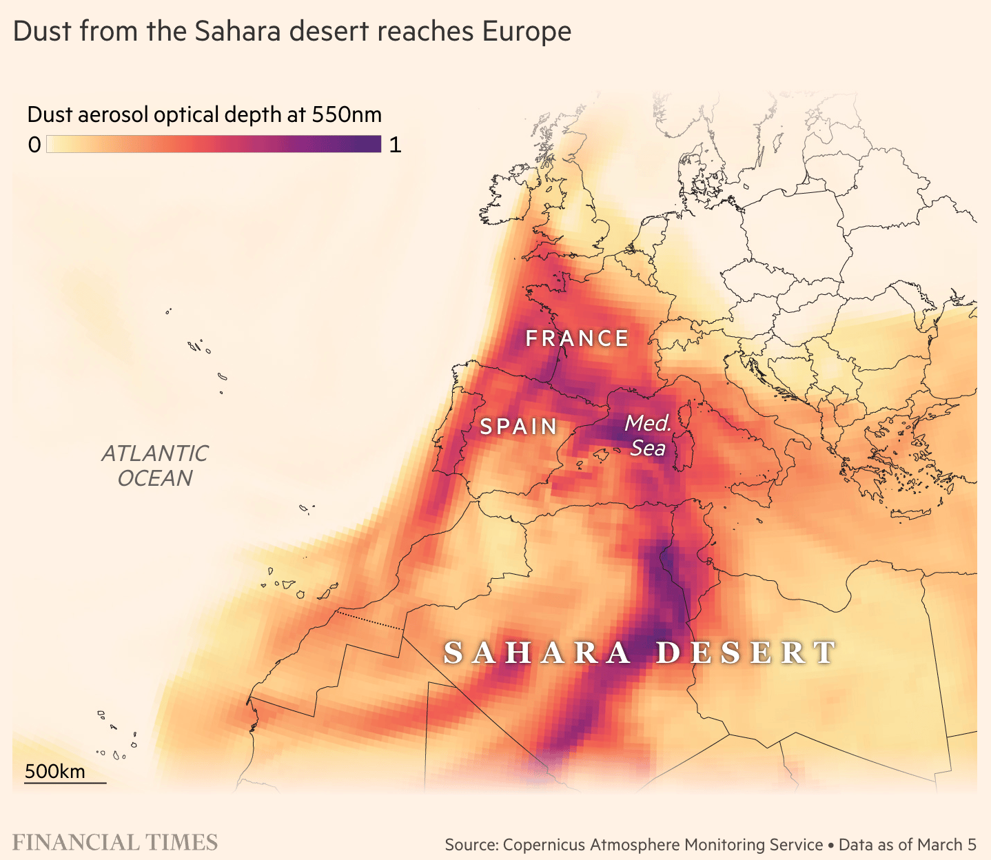
To mark the arrival of April, we start this week with some spring-themed visualizations. The bloom patterns of cherry blossoms in Washington, D.C., and of leaves across the United States are shifting due to warmer temperatures. The arrival of spring has also brought clouds of dust from the Sahara Desert to Europe.
Along with spring, Easter has also arrived, and with it, infographics portraying various Easter traditions!
![Frankfurter Allgemeine:<a href="https://www.faz.net/aktuell/wirtschaft/schneller-schlau/von-der-cholesterinbombe-zum-proteinlieferanten-warum-die-nachfrage-nach-eiern-so-steigt-200690269.html"> <strong>„Eier sind wieder trendy“</strong></a><strong> </strong>[“Eggs Are Back in Style”], April 4](https://datawrapper.de/cdn-cgi/image/quality=85,width=1040,f=auto,fit=cover/https://kirby.datawrapper.de/media/pages/blog/data-vis-dispatch-april-7-2026-30daychartchallenge-spring-and-easter-toast/9dda0e473d-1775457408/cleanshot-2026-04-06-at-07.57.12@2x.png)
![El País: <a href="https://elpais.com/gastronomia/2026-04-01/claves-para-preparar-la-torrija-perfecta-y-por-que-es-mas-que-una-receta.html"><strong>Claves para preparar la torrija perfecta (y por qué es más que una receta)</strong> </a>[<em>Tips for Making the Perfect Torrija (and Why It's More Than Just a Recipe)</em>], April 1](https://datawrapper.de/cdn-cgi/image/quality=85,width=1280,f=auto,fit=cover/https://kirby.datawrapper.de/media/pages/blog/data-vis-dispatch-april-7-2026-30daychartchallenge-spring-and-easter-toast/0544ad58e1-1775469654/tumblr_4d53e94a02328dc100327f567164b28b_34acc007_1280.png)
And on top of spring and Easter, April has also brought the #30DayChartChallenge! We've collected a few from the first batch of visualizations.


![Ansgar Wolsing: "The share of female astronauts among the crew members on space missions has risen slowly over the past few decades. Nevertheless, the crew remains predominantly male [...]," April 3 (<a href="https://bsky.app/profile/ansgarw.bsky.social/post/3mimfty64oc2k"><strong>Bluesky</strong></a>)](https://datawrapper.de/cdn-cgi/image/quality=85,width=2000,f=auto,fit=cover/https://kirby.datawrapper.de/media/pages/blog/data-vis-dispatch-april-7-2026-30daychartchallenge-spring-and-easter-toast/db10ee40bc-1775558473/bafkreiahcrc2ep5tkclxeorfr34ffid2ooxrq3iqs2ijrne4ghocu7uqwe.png)
![Asjad Naqvi: "#30DayChartChallenge 2026 Day4: Slope The figure shows the change in electricity prices in selected EU countries between Feb 2019 (pre-COVID) and Feb 2026 (post geoeconomic shocks) [...]," April 5 (<a href="https://bsky.app/profile/asjadnaqvi.bsky.social/post/3mipiimgbis2p"><strong>Bluesky</strong></a>)](https://datawrapper.de/cdn-cgi/image/quality=85,width=1466,f=auto,fit=cover/https://kirby.datawrapper.de/media/pages/blog/data-vis-dispatch-april-7-2026-30daychartchallenge-spring-and-easter-toast/1cbd676f4b-1775558377/bafkreicgrwlmnytyqa63mgqka5aflpzbedini2u57kdza2c6a7djcrghwe.png)

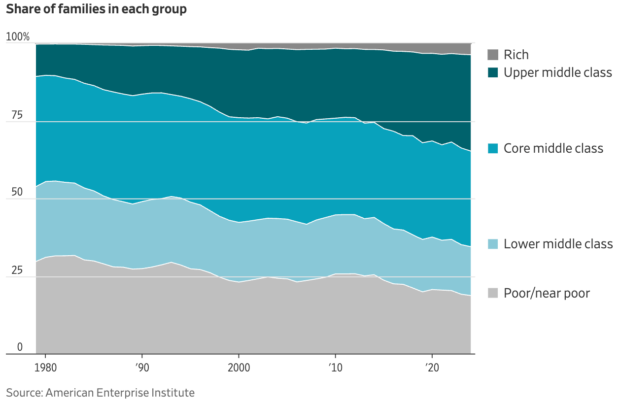
Moving on to the topic of money, higher-income groups are growing in America.
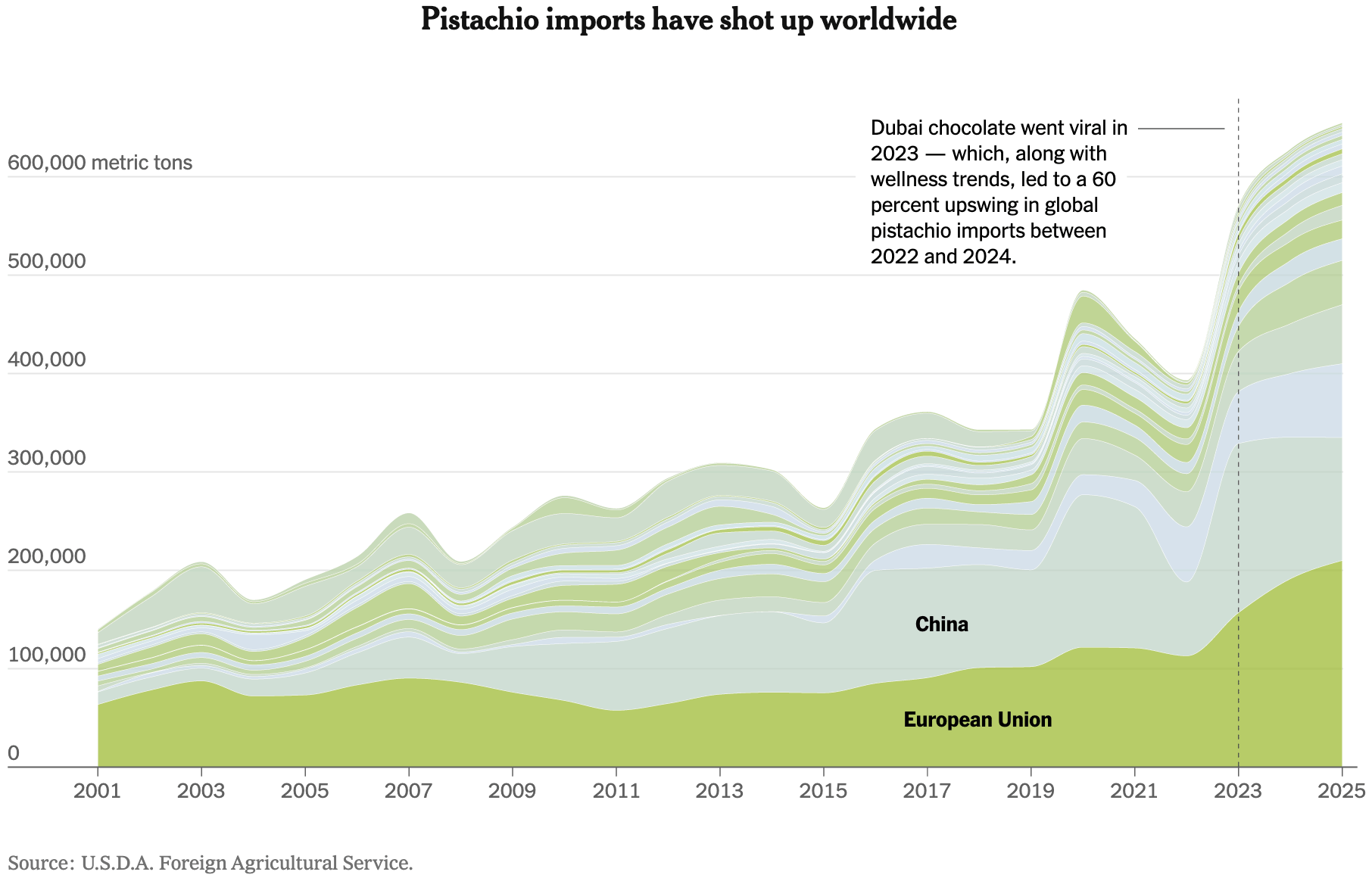
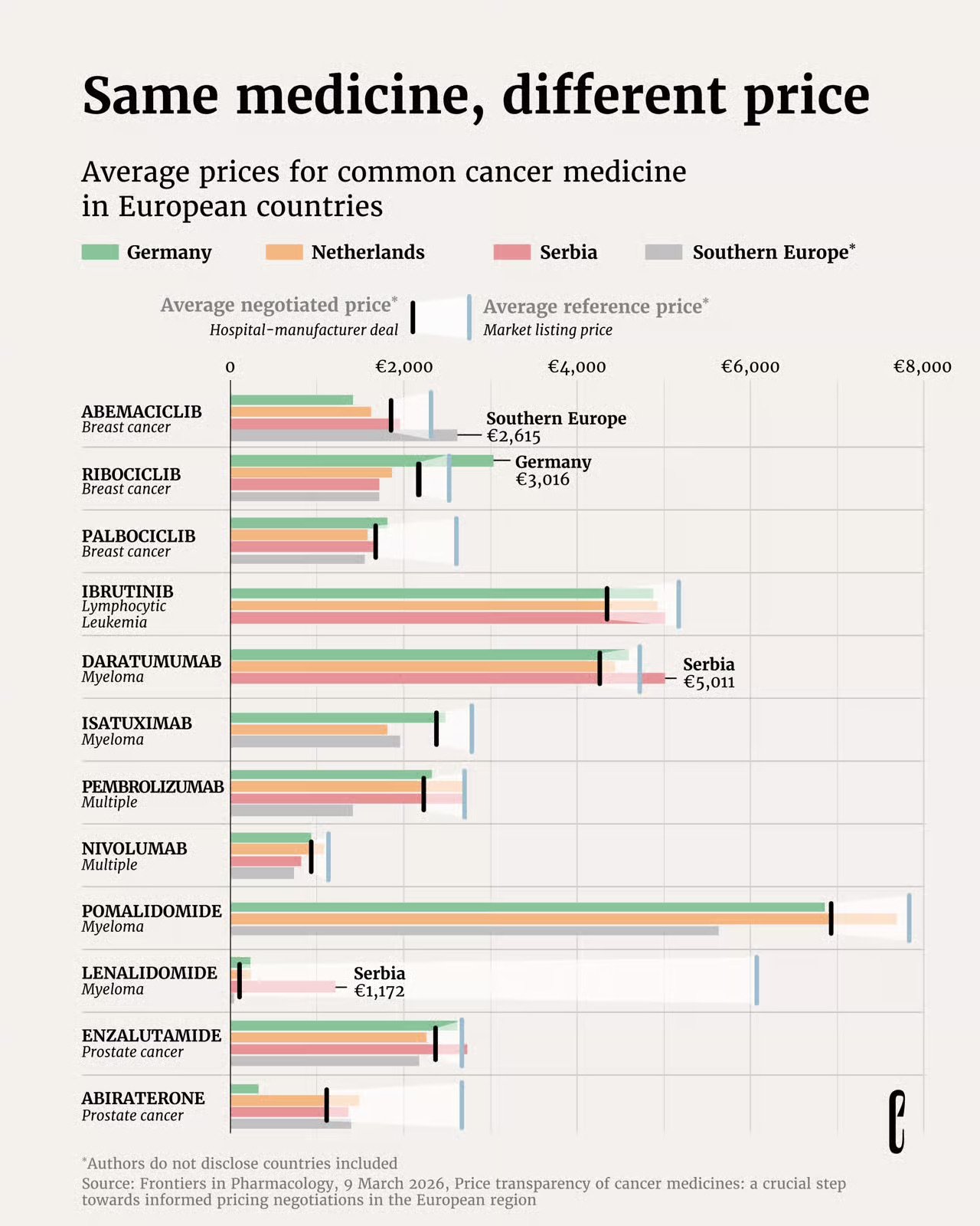
Costs are still rising, affecting everything from pistachio imports to the price of cancer medicine in the European Union. The U.S. healthcare sector has also faced high costs due to administrative expenses.

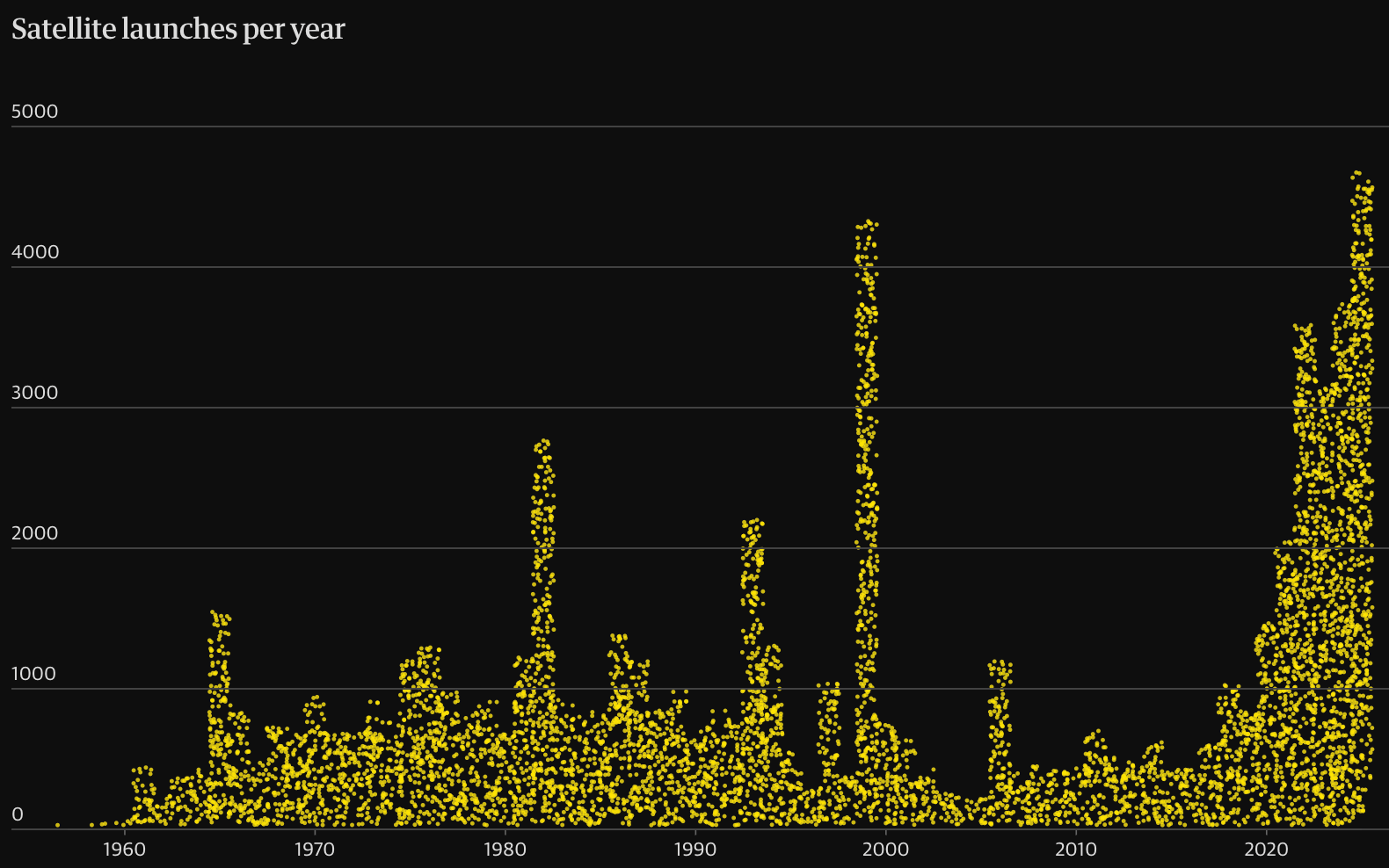
The technology sector is booming, with the chip market projected to more than double in size. We've seen an increase in satellites in space, plus a proposal is underway to install a lunar telescope on the far side of the moon.


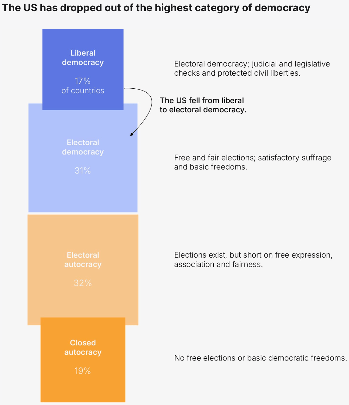
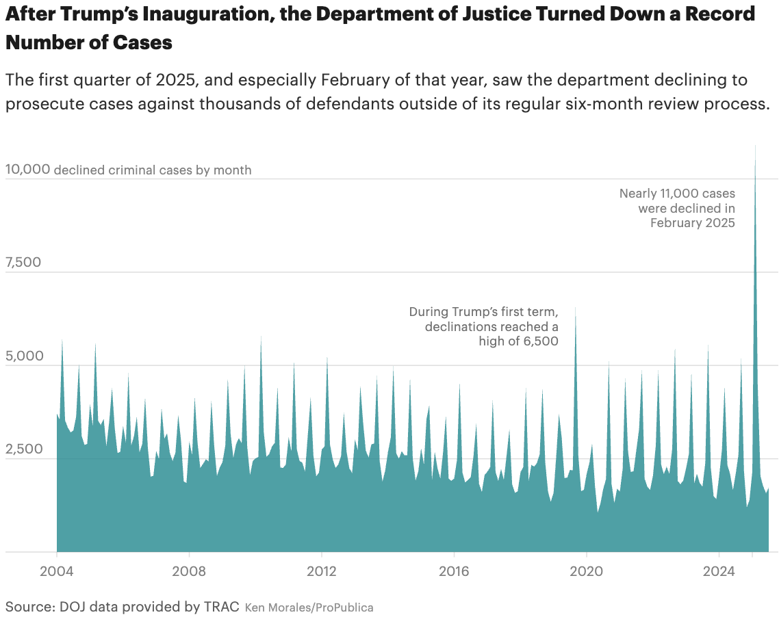
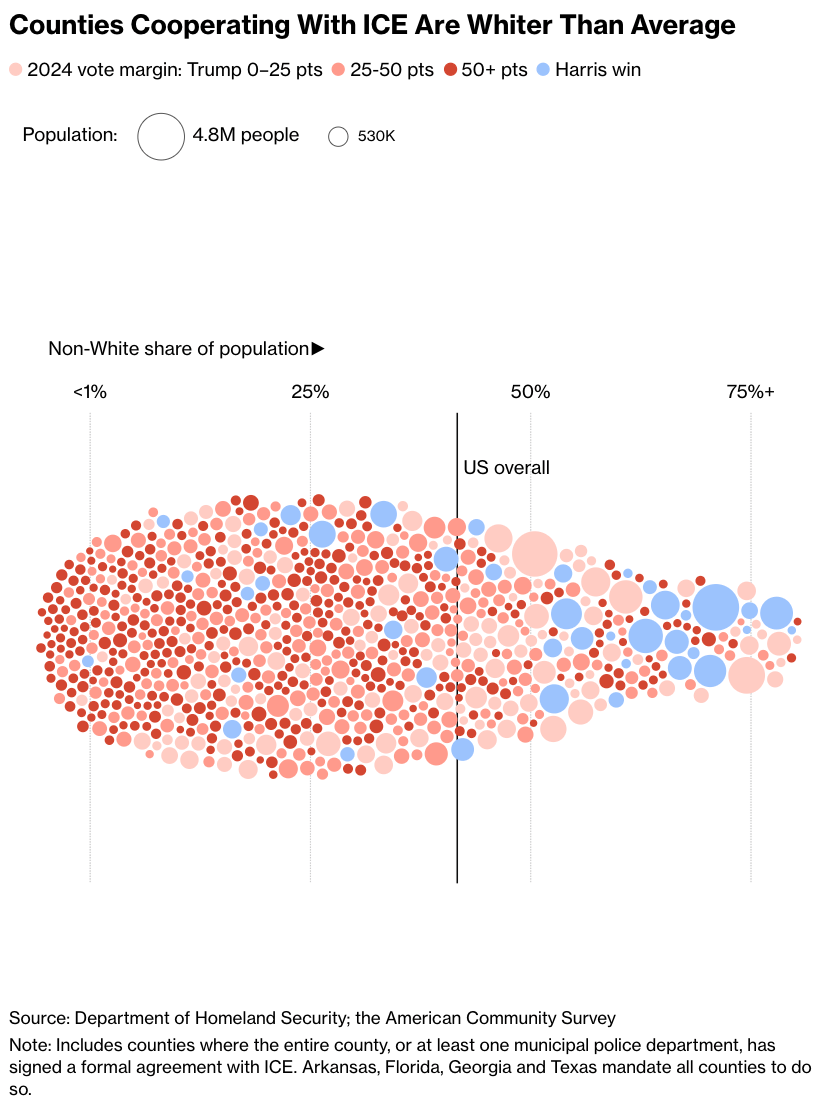
The U.S. is experiencing a decline in democracy. On the topic of immigration, the Department of Justice has rejected thousands of pending criminal cases at a record pace. Furthermore, counties cooperating with ICE tend to be whiter than average.
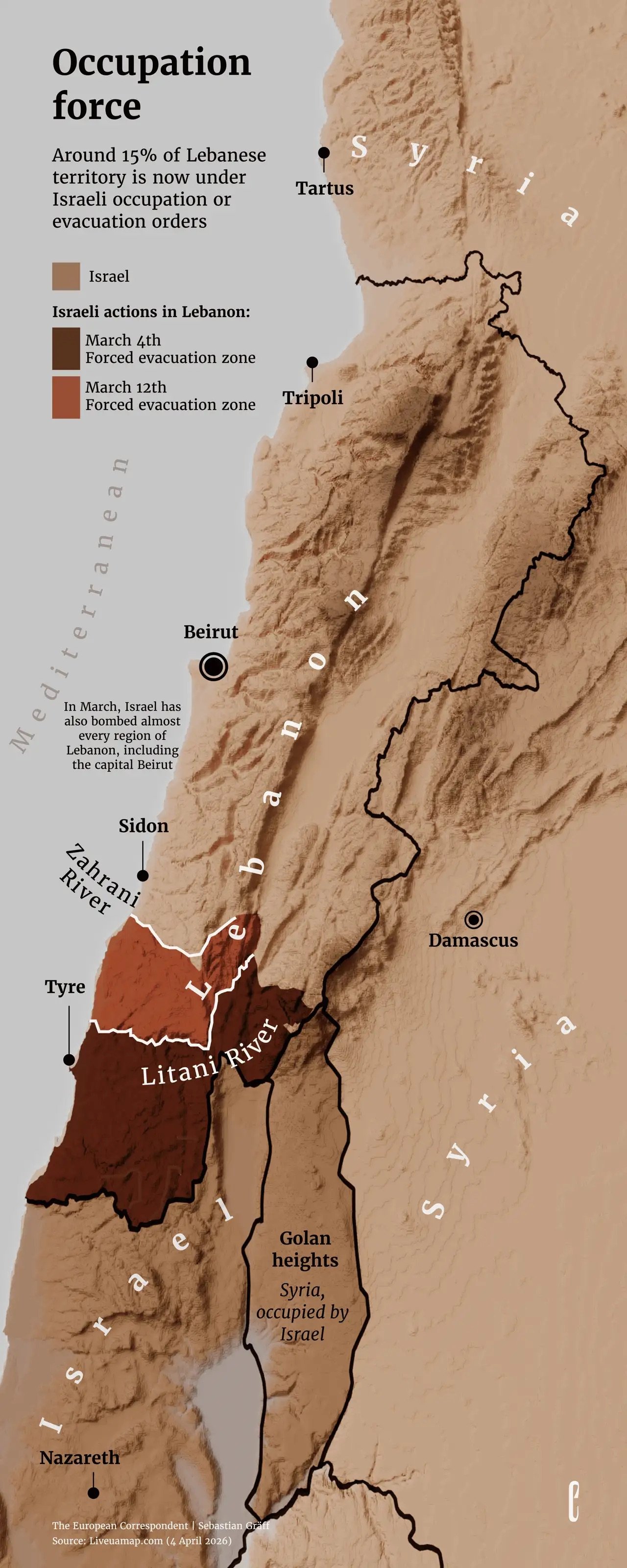
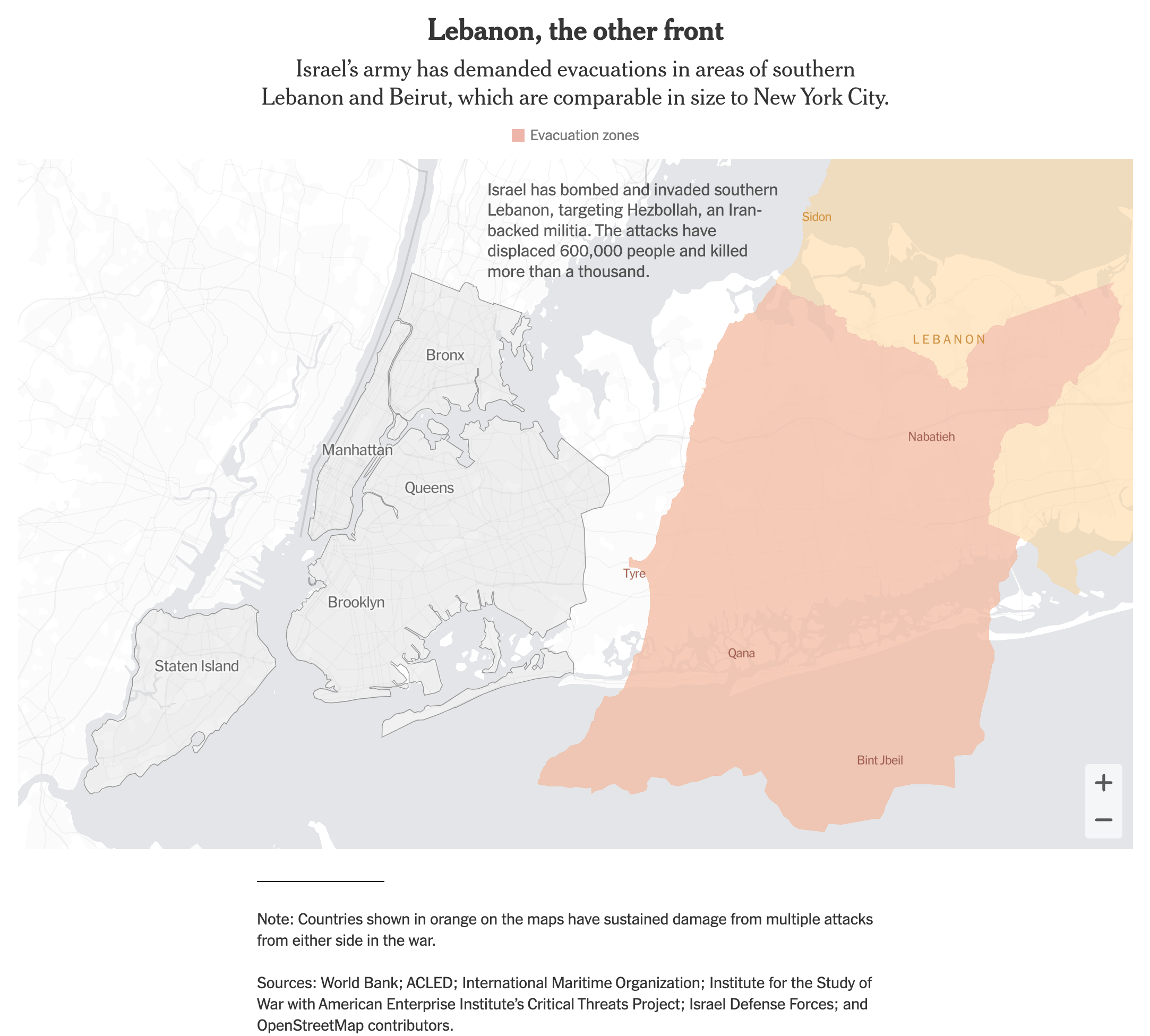
As the conflict in the Middle East intensifies, Lebanon is under Israeli occupation and facing evacuation orders. Iran has recorded the highest number of deaths and disappearances on migrant routes. Meanwhile, in China, safety measures appear to be taking place as a potential military base is being built in the South China Sea.
![Folha de S.Paulo: <a href="https://www1.folha.uol.com.br/mundo/2026/04/ira-lidera-registros-de-mortes-e-desaparecimentos-em-rotas-migratorias-desde-2023-veja.shtml"><strong>Irã lidera registros de mortes e desaparecimentos em rotas migratórias desde 2023; veja</strong></a> [<em>Iran has led in recorded deaths and disappearances on migration routes since 2023; see details</em>], April 5](https://datawrapper.de/cdn-cgi/image/quality=85,width=650,f=auto,fit=cover/https://kirby.datawrapper.de/media/pages/blog/data-vis-dispatch-april-7-2026-30daychartchallenge-spring-and-easter-toast/1058a28c11-1775465719/cleanshot-2026-04-06-at-10.54.17@2x.png)

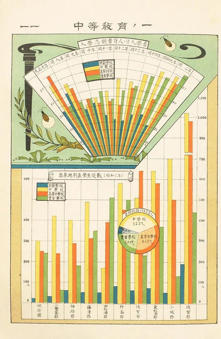
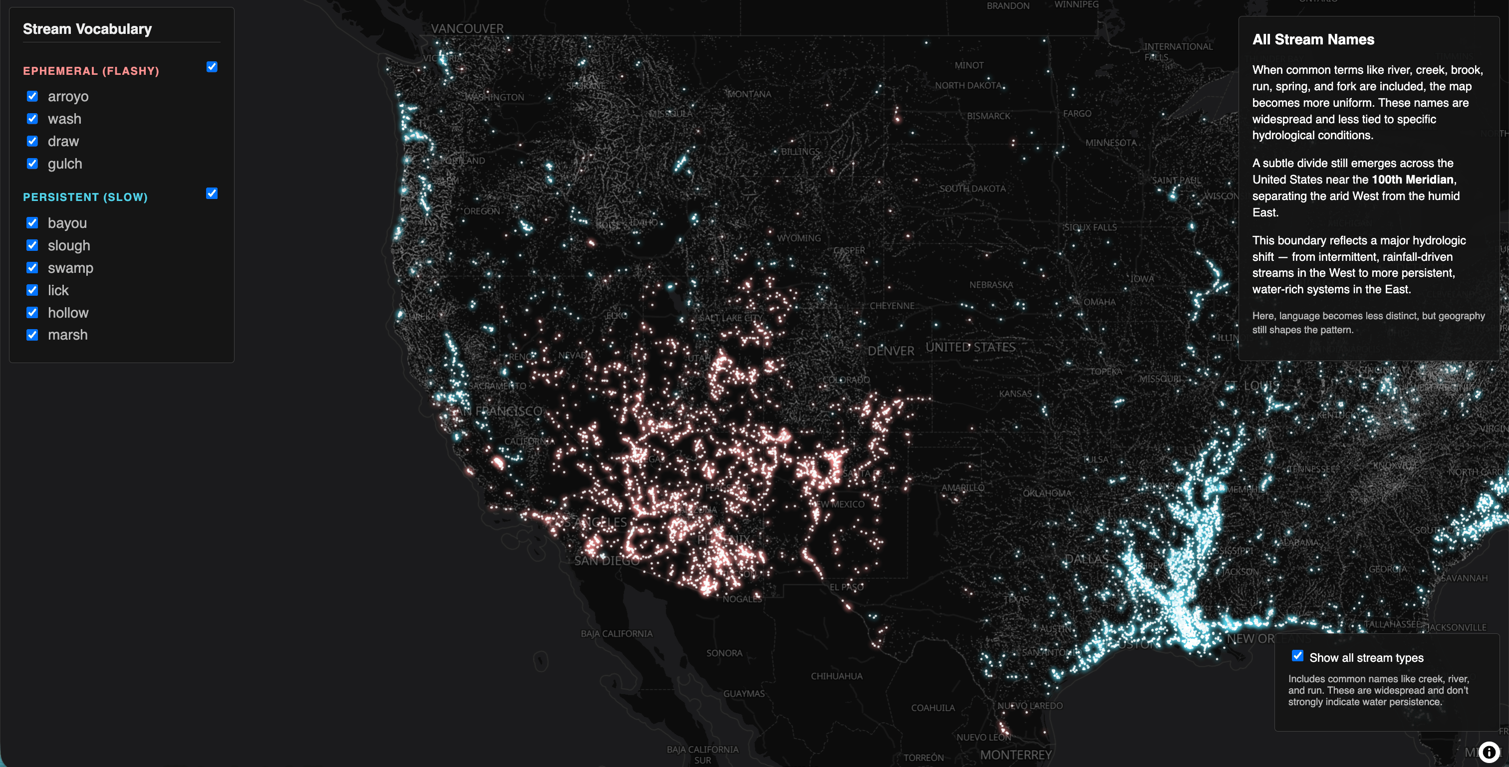
We end this Dispatch with two fascinating visualizations: a scan of an old Japanese chart and a map showing waterways categorized by the words we use to describe them.
What else we found interesting

Applications are open for…
A research assistant in data visualization and -interaction at Deutsches Zentrum für Astrophysik
A data graphics/multimedia editor at The New York Times
A data analyst at Centre for British Progress
A graphics multimedia editor at The New York Times


