How to create a range plot
- Free
- Pro
- Business
- Enterprise
Range plots are a relatively new chart type. They're an extension of the dot plot, which American computer scientist William Cleveland created in the 1980s. Dot plots show one or multiple dots on one line. Range plots show exactly two dots on a line and connect them with an extra bold line. They are great if you want to draw attention to the distance between the values more than to the values themselves. You could also call this chart type the gap chart because it’s great for situations where the gap is important.
This article explains how to create a range plot, using this gender pay gap chart:

Preparing your data
Formatting your data
If you want to try to create this chart type, your data needs to be in a certain format. You'll need:
- One header row containing labels
- A text column containing the main categories
- Two numeric columns for the values of each category
That's what the data looks like for the chart you can see above:
| Highest degree | Women | Men |
| Less Than 9th Grade | 29100 | 43350 |
| 9th to 12th (no degree) | 32950 | 49470 |
| High School | 41760 | 63070 |
| Some college, no degree | 47550 | 70920 |
| Associate Degree | 51320 | 76050 |
| Bachelor's Degree | 77940 | 111800 |
| Master's Degree | 91090 | 144400 |
| Doctorate Degree | 128700 | 163500 |
In this case, we have eight different categories, – our different education levels. Each quantitative value will be shown with a dot and the difference of the two values in one row will be automatically turned into the length of the connecting line.
Uploading your data
Once you have prepared your data, create a new chart in Datawrapper. You can do so by going to our homepage and clicking on Start creating. In step 1: Upload, you can copy & paste your dataset, upload it as a .csv or Excel file, or connect to a Google Sheet. It will look like this:
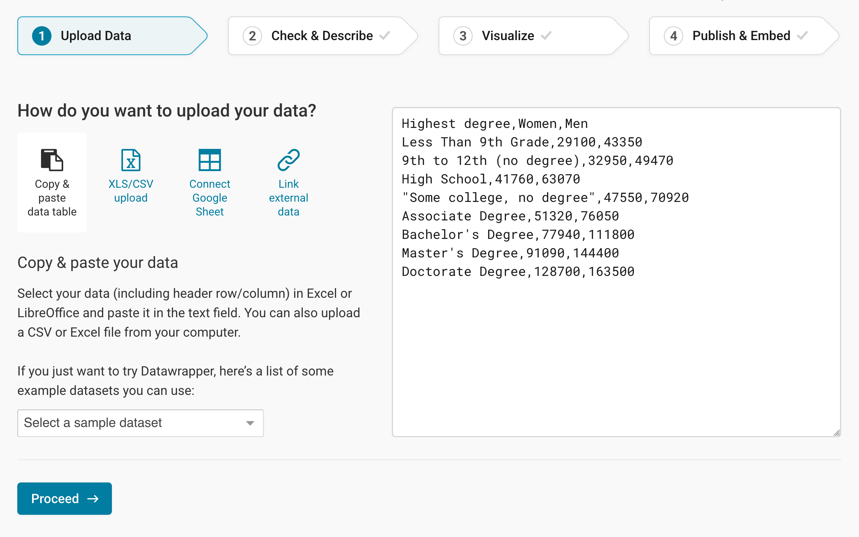
Click on Proceed in the lower left to go to step 2: Check & Describe.
Checking data and units
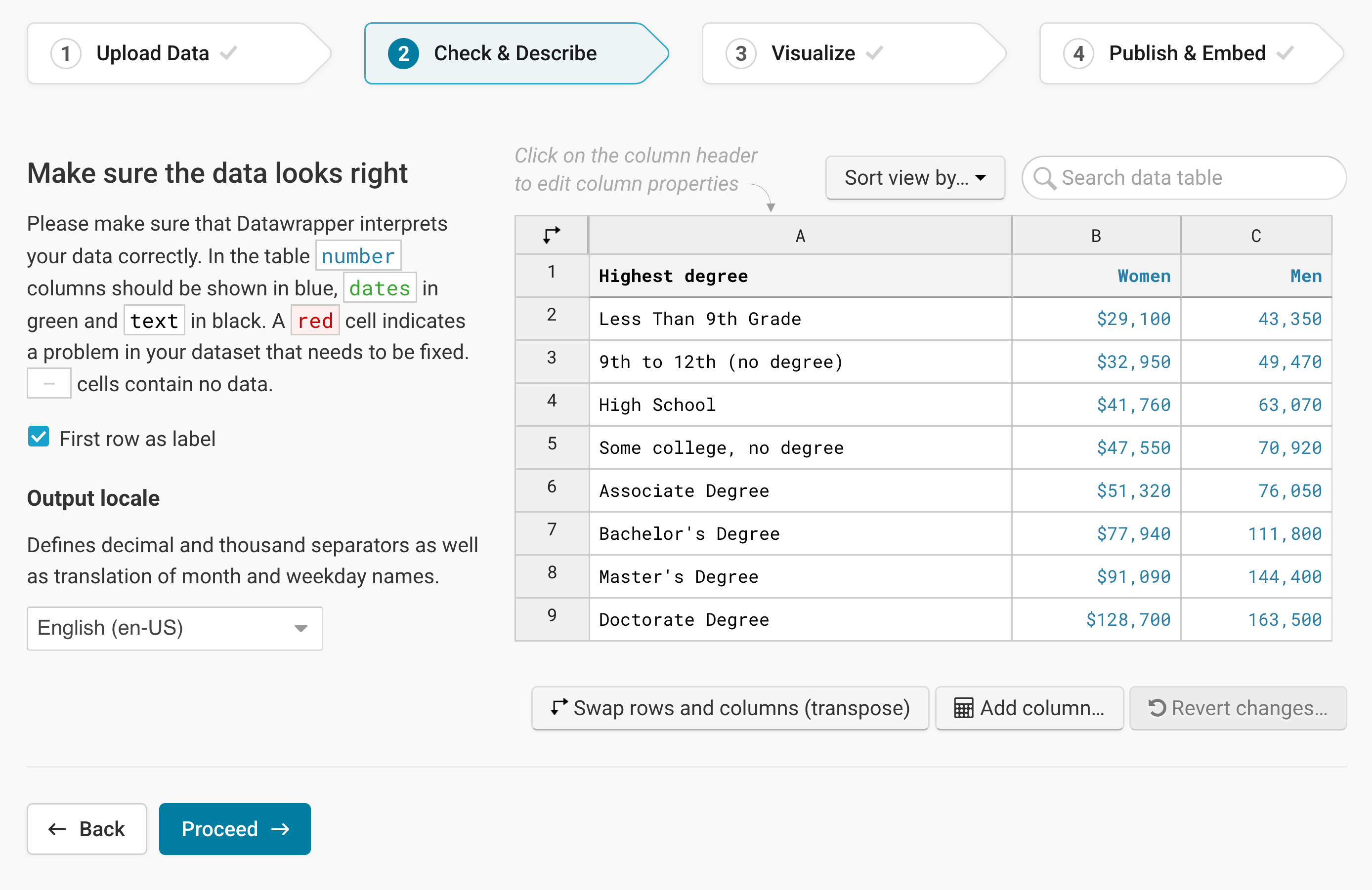
In step 2: Check & Describe, your data will automatically be arranged in columns and rows. You can see that Datawrapper correctly recognized your numbers as numbers (and not as text or dates) because they are colored in blue and are right-aligned. Learn more about Datawrapper's automatic recognition of data formats.
Make sure that the box First row as label is checked so that Datawrapper correctly assigns the values to the labels.
To add a unit (like km/h, kg, inch, $, etc.) to your numbers, click on a column header and then add the unit of your choice to the Prepend/append options on the left. You can learn more about adding units to numbers here.
Click on Proceed and Datawrapper will take you to step 3: Visualize.
Choosing a range plot
Once you're in step 3: Visualize, choose Range Plot and Datawrapper will create the first iteration of your data:
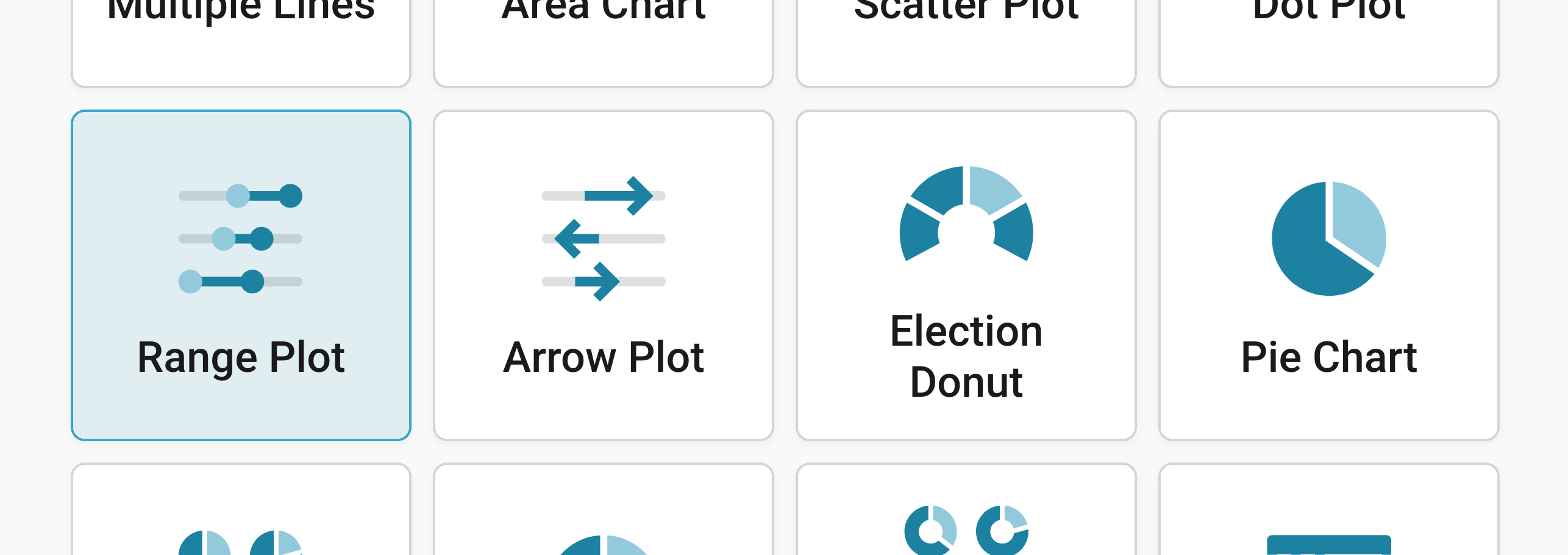
Besides Chart type, you'll notice three more tabs in this step: Refine, Annotate, and Layout.
Resizing
In any tab of step 3: Visualize, you can click, hold, and drag the arrow in the lower right corner to scale the chart window or manually determine the dimensions of the chart by entering values in the boxes below the chart (Size).
We recommend checking what the chart looks like on different screen sizes multiple times while designing it, by clicking on the little icons (mobile, tablet, and computer) below the chart.
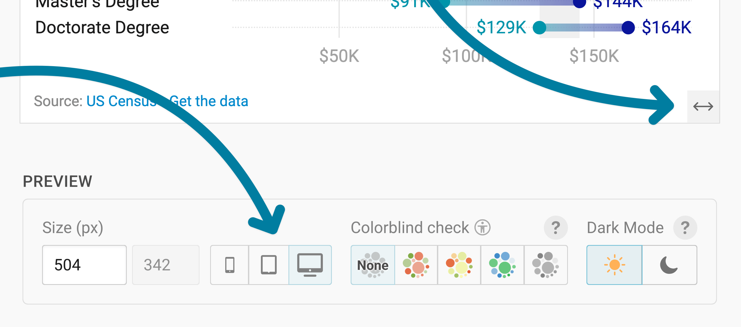
Learn more about changing the width and height of your chart in this article.
Refining your chart
Let's continue with the Refine tab. Here, we see five panels: Range, Labels, Horizontal axis, Appearance, and Sorting & grouping.
Choosing the range
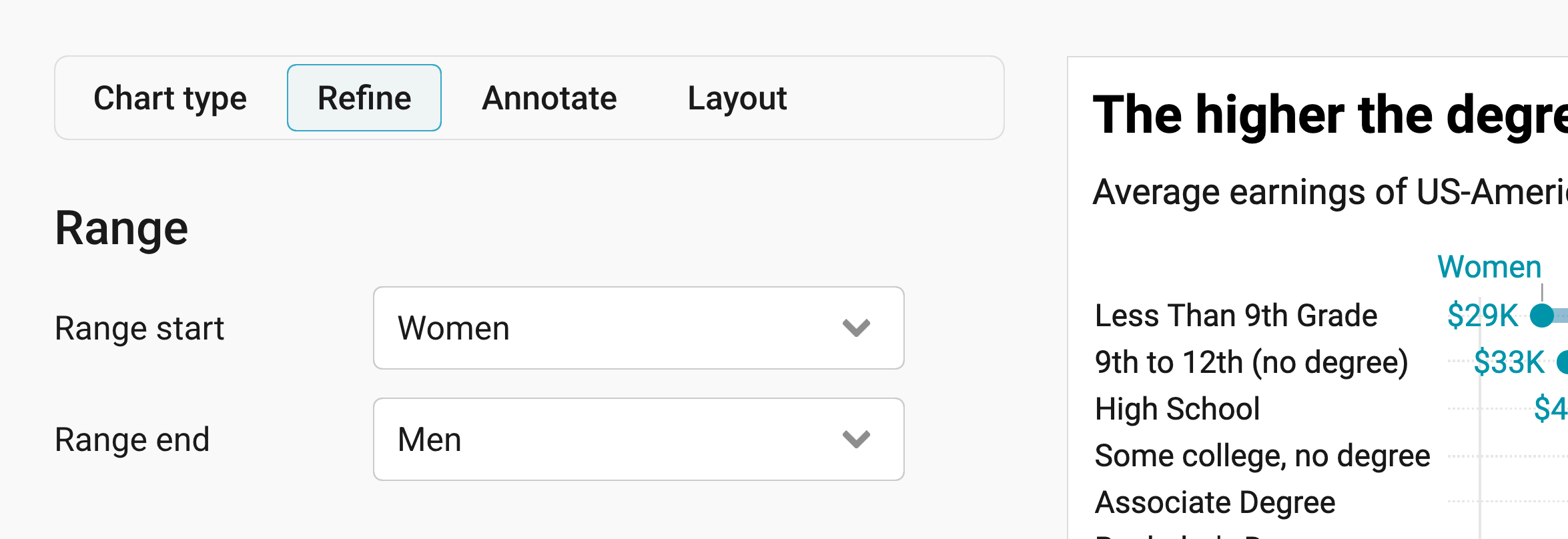
The Range panel lets you decide which two columns your range plot compares.
- Range start: lets you choose the column for the dot at the start of each range. By default, Datawrapper picks the first column with numbers.
- Range end: lets you choose the column for the dot at the end of each range. In our chart, we compare the earnings of women and men, so we use "Women" for the start and "Men" for the end. It doesn't matter much which column you pick for which, but you'll need to remember it when you choose the colors in the Appearance panel.
Formatting labels
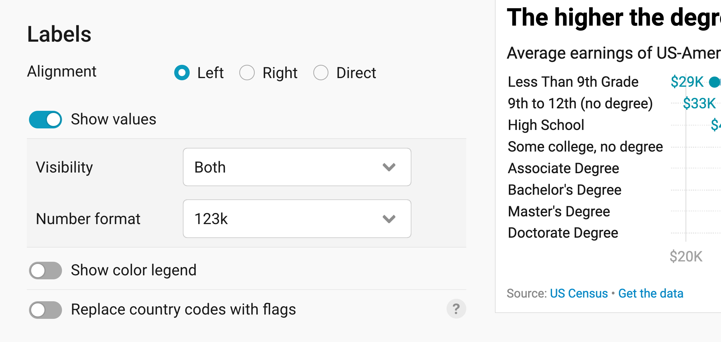
The Labels panel lets you decide where your row labels appear and which values your readers see.
- Alignment: shows the row labels on the Left (the default), on the Right, or Direct, right next to each range.
- Show values: shows the values next to the dots. Under Visibility, you can choose where they appear, for example only at the Start (the default) or at Both ends, like in our chart. Under Number format, you can decide how they look. We chose 123k, which turns 128,700 into 129k. Learn more about all available number formats here.
- Show color legend: adds a legend above your chart that explains which color stands for which column.
- Replace country codes with flags: shows flag when you add country codes to text in a column. Learn more here.
Changing the axis range
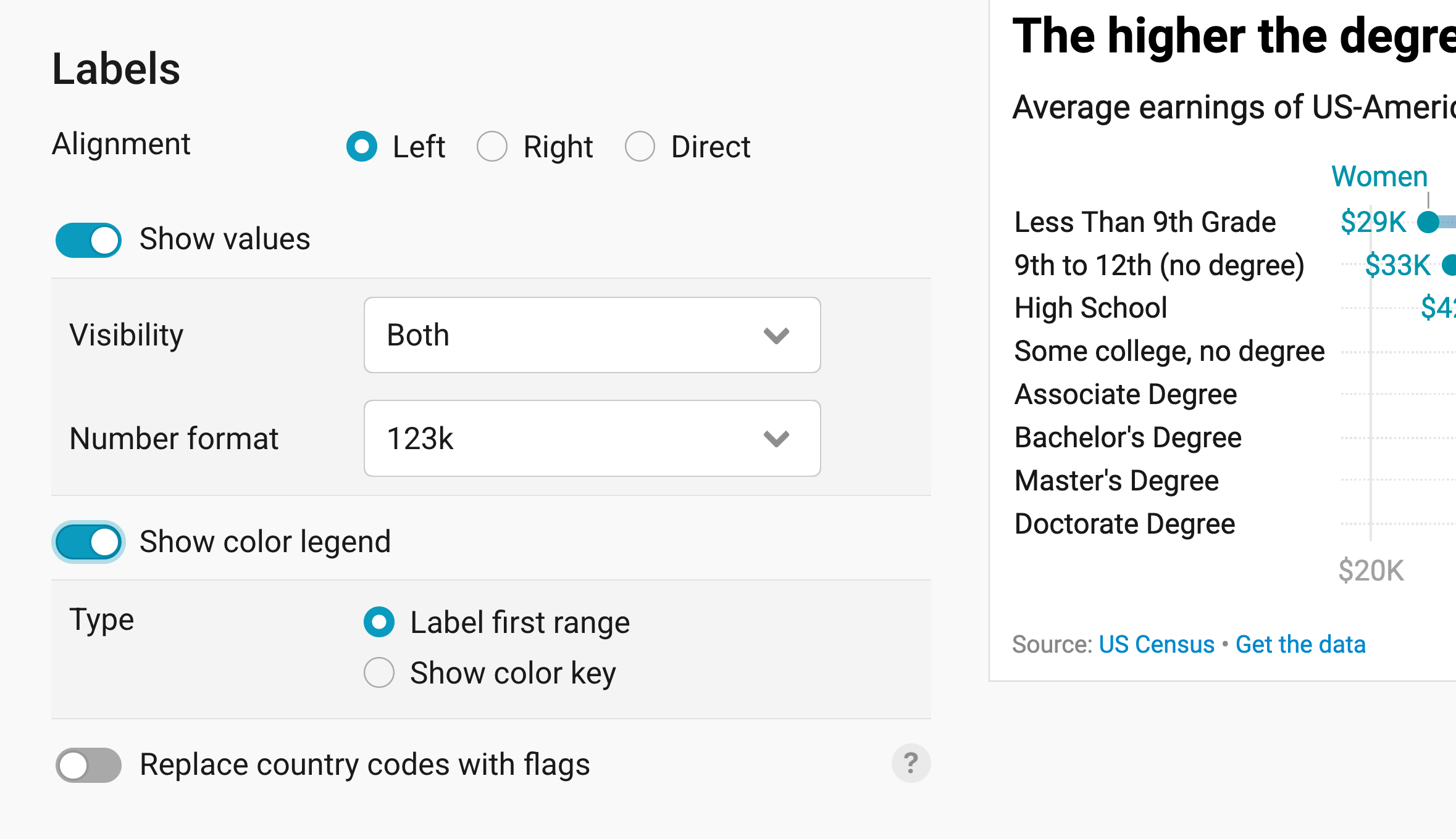
The Horizontal axis panel lets you change the range and look of the axis below your chart.
- Axis range: Round (the default) extends the axis to the next grid line, Exact ends it at your smallest and largest value, and Custom lets you type in your own range. In our chart, we use a custom range from 20,000 to 180,000.
- Number format: decides how the numbers on the axis look. By default, they look the same as your values (Same as values).
- Custom grid lines: sets where your grid lines go. Type in the values, separated by commas, like "20000, 40000, 60000". By default, Datawrapper decides where they go.
- Tick position: shows the axis labels Above or Below (the default) the chart.
Changing colors and appearance
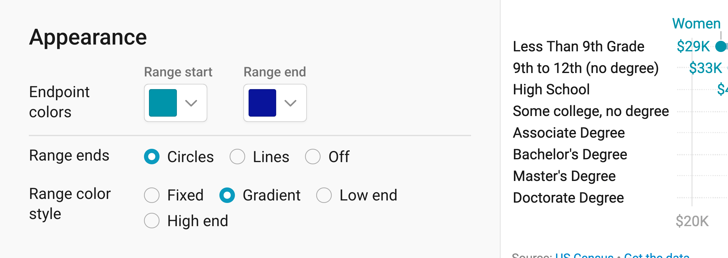
The Appearance panel lets you choose the colors of your dots and the lines between them.
- Endpoint colors: sets the color of the dot at the Range start and of the dot at the Range end.
- Range ends: shows the ends of each range as Circles (the default) or Lines, or turns them Off.
- Range color style: decides the color of the line between the dots. With Fixed (the default), you pick one color under Select color. Gradient blends from the start color to the end color, like in our chart, and Low end and High end use the color of the lower or the higher value.
Sorting and grouping rows
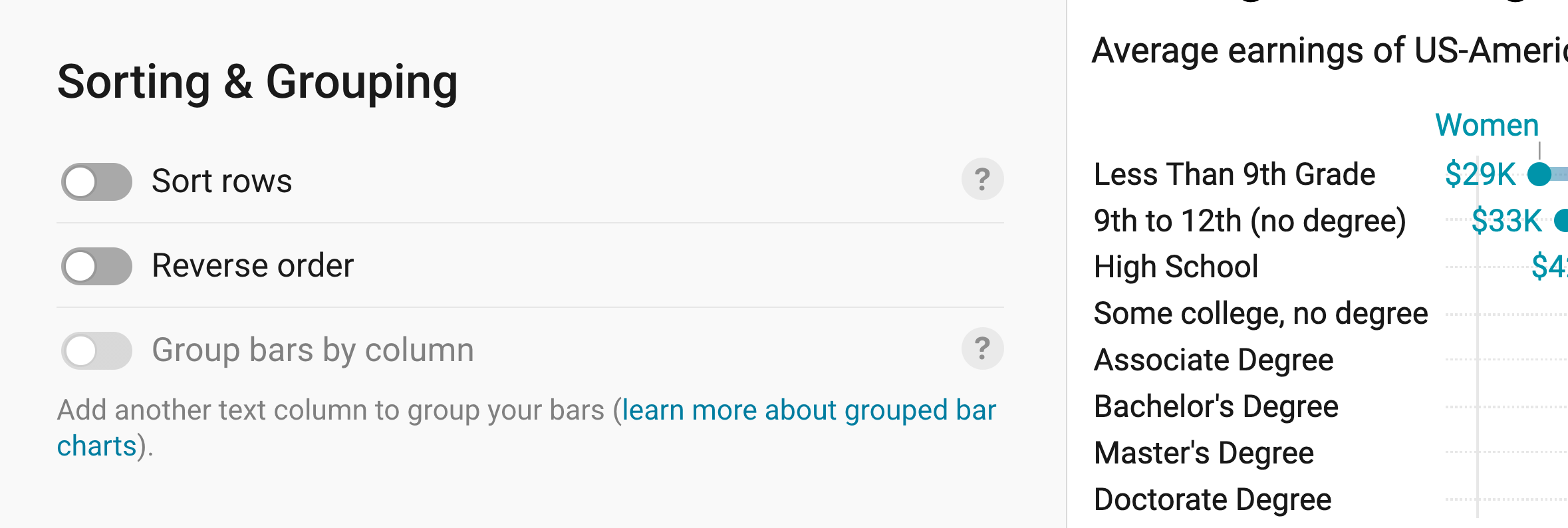
The Sorting & Grouping panel lets you decide in which order your rows appear.
- Sort rows: sorts your rows instead of showing them in the order of your dataset (the default). You can sort them by the values at the range start or end, by the difference between them, or by the percentage change.
- Reverse order: flips the order of your rows.
- Group bars by column: puts your rows into groups. For that, you need an extra text column in your data. In our case, it could say for each degree whether it's below or above high school. Learn more about grouping here.
Annotating your chart
Adding a title and source
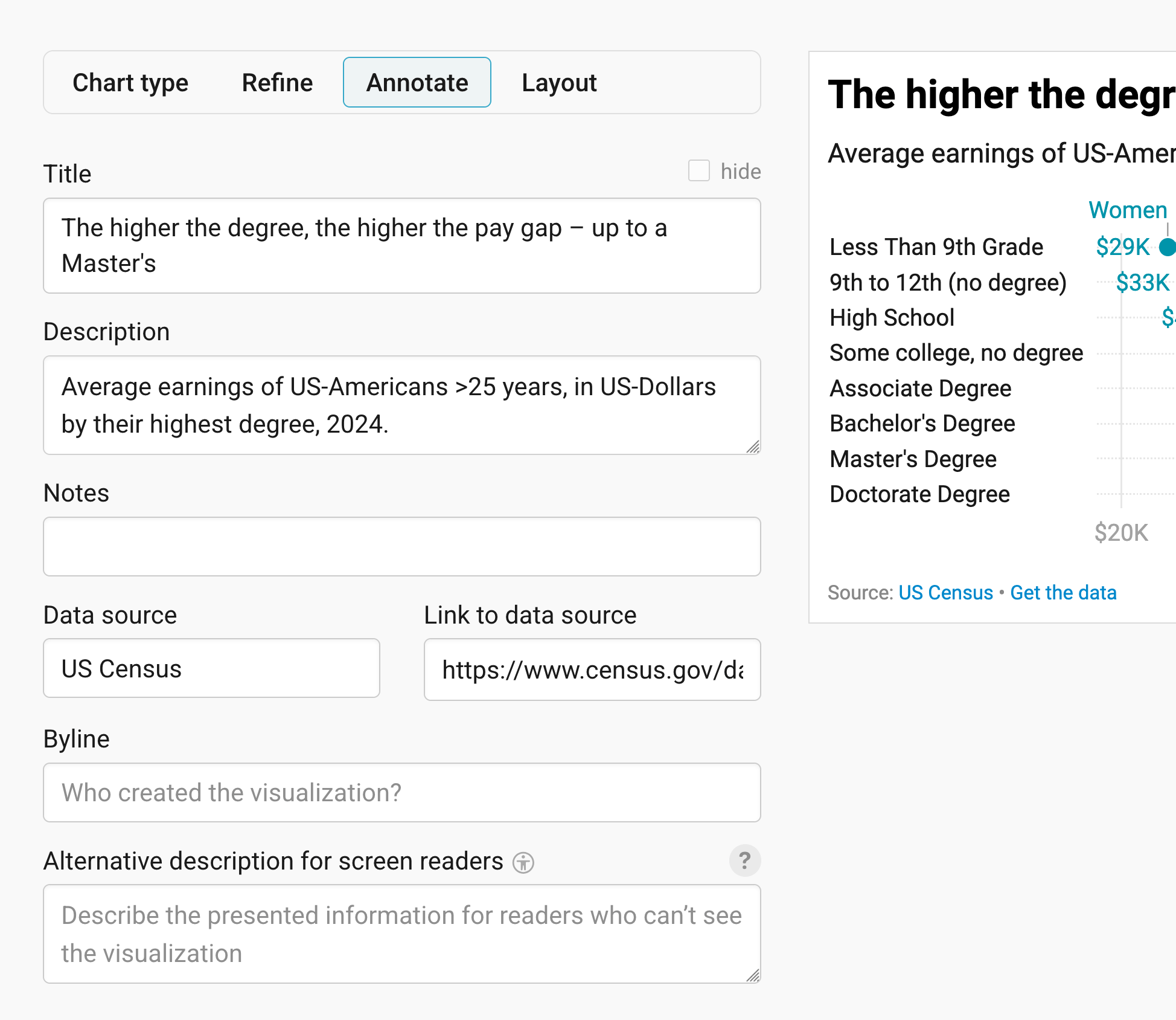
In the Annotate tab, you're first asked to give your visualization a title, description, notes, source, byline, and an alternative description for screen readers. You can find a detailed explanation of all these Annotate options here.
Highlighting rows
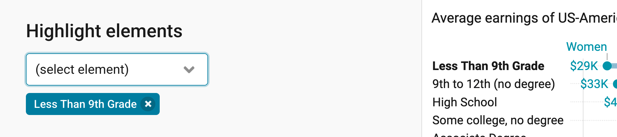
In the 2nd panel in the Annotate tab, you can emphasize certain rows (meaning, making labels bold). To do so, select the row(s) you want to highlight.
Adding text annotations
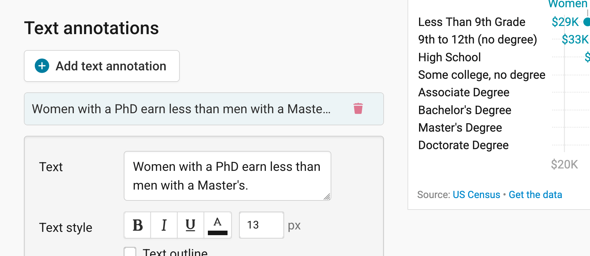
You can add annotations to your range plot by clicking on Add text annotation. You can then style and move the text, add an arrow and circle to it, and adjust how it will appear on mobile. Here's an in-depth explanation of all the options.
Highlighting ranges
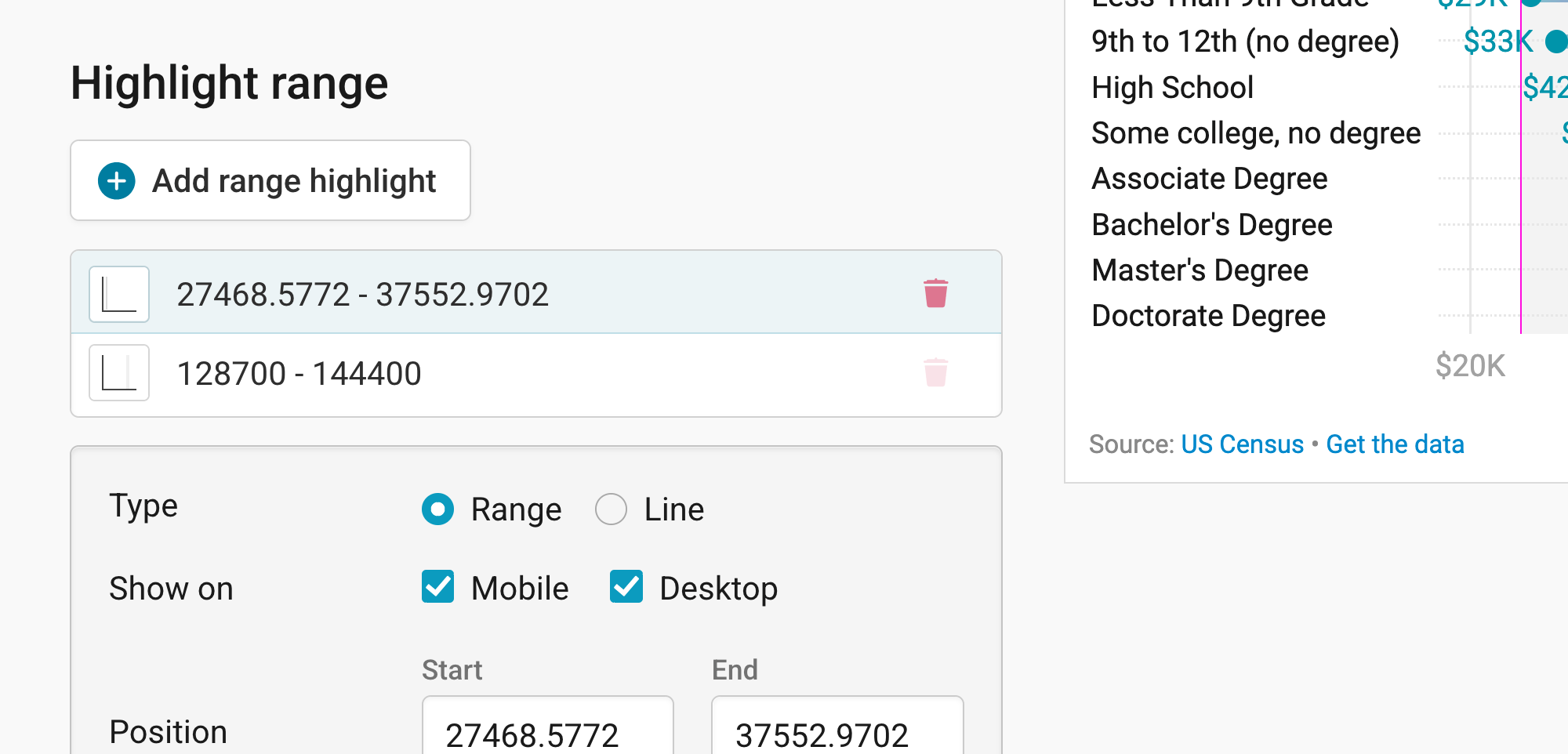
You can add range or line highlights to your chart by clicking on Add range highlight and then dragging on the chart where you want the highlight to be. You can then change its position, color, opacity, and line width and style, or delete it again. Here's an in-depth explanation of all the options.
Publishing your chart
In the Layout tab, you can select an output locale, change the design theme and footer options, and enable social sharing. Find a detailed explanation of all the Layout options here.
In step 4: Publish & Embed, you can first publish your chart and then decide how it gets to your readers. We recommend pasting the embed code into your website or CMS, but you can also share the chart's URL. Learn more about both options here. To use your chart somewhere else, download it as a PNG (on any plan) or as an SVG or PDF (on paid plans). See what each plan includes on our pricing page.
And that's it! You've successfully created and customized a range plot.