How to create a multiple donuts chart
- Free
- Pro
- Business
- Enterprise
What's better than one donut? Multiple donuts! A multiple donuts chart is useful when you want to show proportional parts of multiple wholes and want to give the reader an extra data point in the middle (or just prefer donuts over pies). The individual donut charts should not have too many slices, as the chart otherwise gets cluttered and becomes hard to read – if you want to show more than five parts per donut, consider grouping them.
Below is an example of a multiple donuts chart that makes good use of the part-to-whole concept. We can see the shares of three countries' wealth that the bottom 50%, the next 40% and the top 10% of citizens own:

Preparing your data
Formatting your data
If you want to create this chart type, your data needs to be in a certain format. You'll need:
- One header row containing descriptive labels.
- One column containing at least two categories. This will determine the labels of the donut slices. In our case, that's "bottom 50%", "next 40%" and "top 10%".
- At least two columns containing numeric values. The values in these second, third, etc. columns will define the size of the donut slices. In your final chart, one numerical column will result in one extra donut. The more numerical columns you upload, the more donuts your chart will have.
The most important thing you have to keep in mind is that a donut chart always represents a whole, i.e. 100%. Making a (multiple) donut chart of a survey that allows multiple answers will lead to a misleading chart. In that case, it is better to use a stacked bar chart.
Below is the data we used to create the chart at the top of the page:
| Group | China | Denmark | USA |
| bottom 50% | 6.32 | 4.05 | 0.96 |
| next 40% | 25.63 | 45.69 | 29.50 |
| top 10% | 68.05 | 50.26 | 69.54 |
Uploading your data
Once you have prepared your data, create a new chart in Datawrapper. You can do so by going to our homepage and clicking on Start creating. In step 1: Upload, you can copy & paste your dataset, upload it as a .csv or Excel file, or connect to a Google Sheet. After pasting the data, the text field on the right will look something like this:
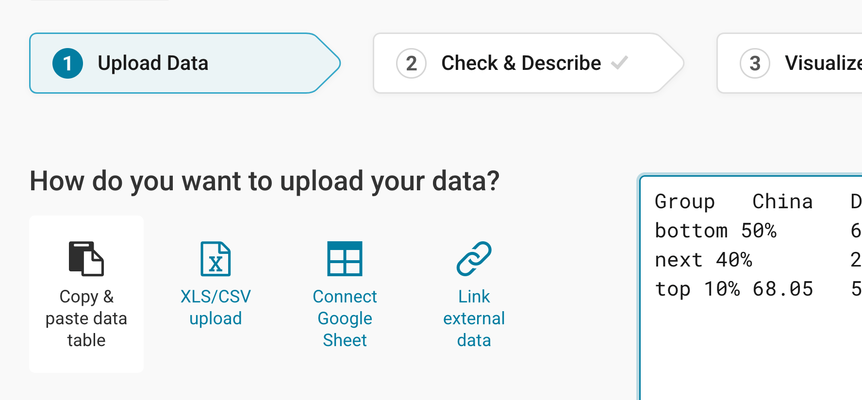
Click Proceed at the bottom right to go to the next step.
Checking data and units
In step 2: Check & Describe, your data will automatically be arranged in columns and rows. You can see that Datawrapper correctly recognized your numbers as numbers (and not as text or dates) because they are colored in blue and are right-aligned. To learn more about Datawrapper's automatic recognition of data formats, visit this article.
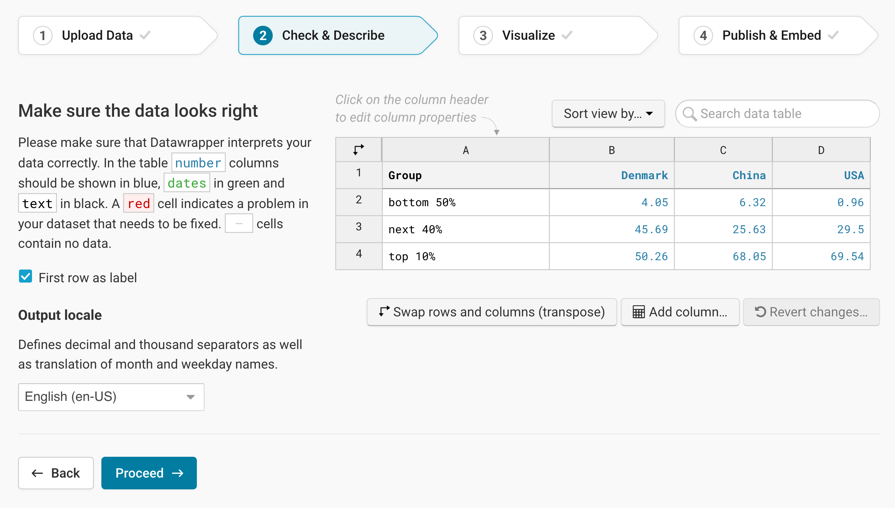
In this second step, you can also make changes to the data. To add a unit (like km/h, kg, inch, $, etc.) to your numbers, click on a column header and then add the unit of your choice to the Prepend/append options on the left. You can learn more about adding units to numbers here.
Click on Proceed at the bottom left to go to step 3: Visualize.
Choosing a multiple donuts chart
Now comes the fun part: You'll see a grid of different chart types under the tab Chart type. Your data was probably automatically shown as a line chart. To change that, click on the Multiple Donuts symbol in the grid of available chart types:
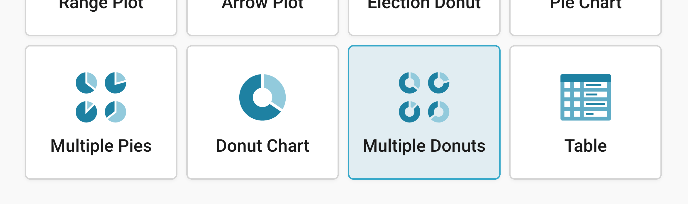
You will now see a multiple donuts chart, without a title, descriptions or customized colors. The next step would be to further refine this chart. Besides Chart type, you'll notice three more tabs in this step: Refine, Annotate, and Layout.
Refining your chart
Resizing
In any tab of step 3: Visualize, you can click, hold, and drag the arrow in the lower right corner to scale the chart window or manually determine the dimensions of the chart by entering values in the boxes below the chart (Size).
We recommend checking what the chart looks like on different screen sizes multiple times while designing it, by clicking on the little icons (mobile, tablet, and computer) below the chart.
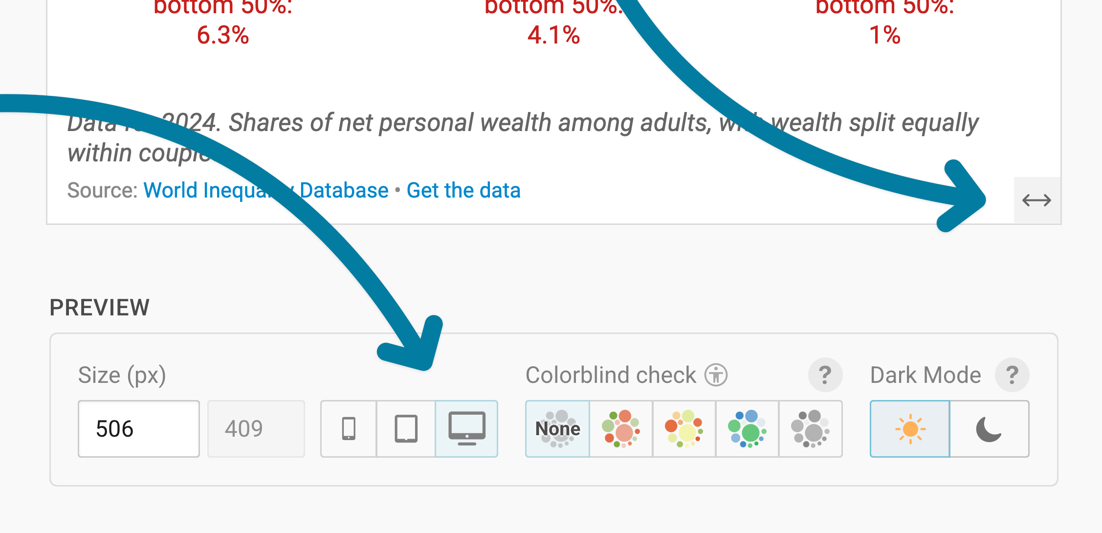
Learn more about changing the width and height of your chart in this article.
Let's continue with the Refine tab. Here, we see four panels: Donut slices, Labels, Color legend, and Grouping.
Changing the donut slices
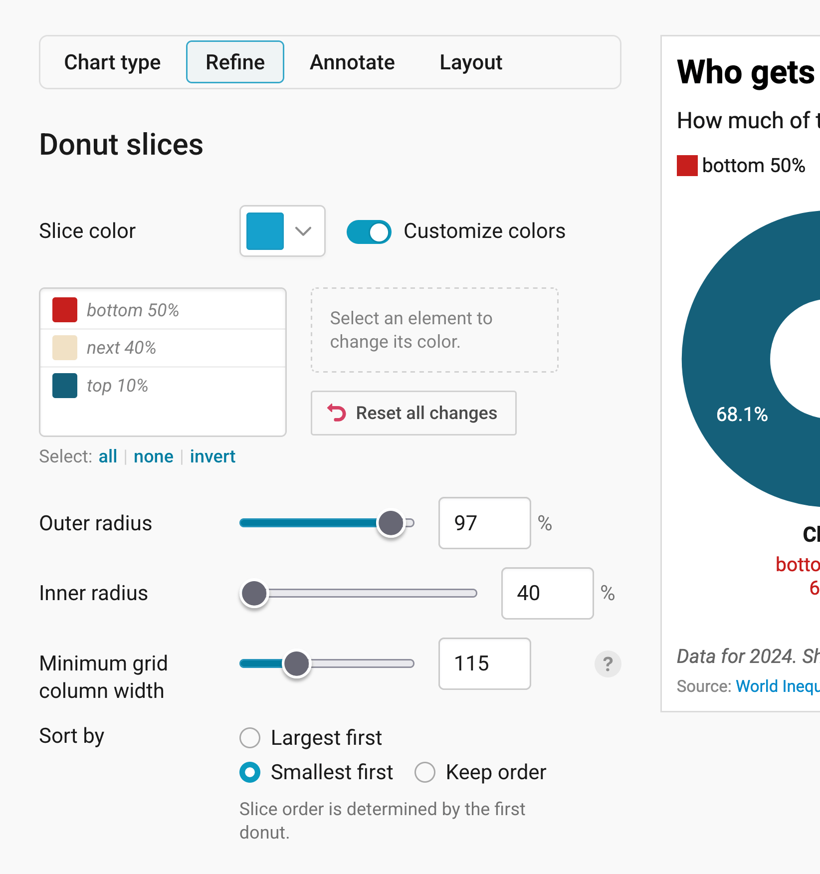
The Donut slices panel lets you decide which colors your slices have, how big and thick your donuts are, and in which order the slices appear.
- Slice color: sets one color for all slices. To give single slices their own colors, turn on Customize colors, click on one or several slices in the list, and pick a new color. Note that the same slices in different donuts must have the same color. All, none, and invert below the list help you select many slices at once, and Reset all changes undoes all your colors. In our chart, the bottom 50% get a strong red, so they stand out next to the much bigger slices.
- Outer radius: sets how much of the available space each donut takes up. Smaller donuts leave more room around them. The default is 75%.
- Inner radius: sets how big the hole in the middle is. The smaller the number, the thicker your donuts (yummy). The default is 50%.
- Minimum grid column width: sets how wide each donut's column has to be at least. The wider the columns, the fewer donuts fit next to each other, and the more of them move to a new row. The default is 120. Make sure to check what your donuts look like on mobile, too.
- Sort by: shows the slices with the Largest first (the default) or the Smallest first. Choose Keep order to show them in the order of your dataset instead. The first donut decides the order for all donuts, so each slice stays in the same place in every donut.
Formatting labels
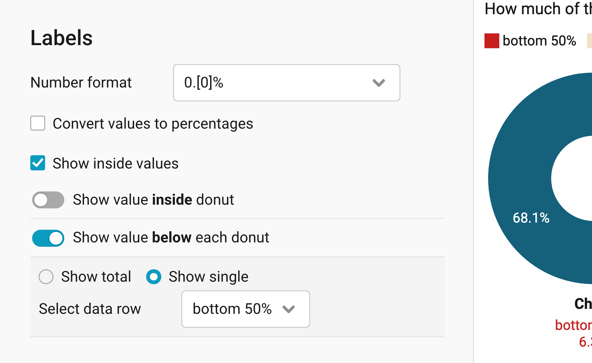
The Labels panel lets you decide which numbers appear inside and below your donuts.
- Number format: decides how the numbers appear, for example "1,992,394" or "1.9m". In our chart, we use "0.[0]%", which adds a percent sign to our numbers. Learn more about all available number formats here.
- Convert values to percentages: turns your numbers into shares of the whole. That's handy if you uploaded absolute numbers but want to show percentages.
- Show inside values: shows the value of each slice inside the slice (on by default).
- Show value inside donut: shows a number in the hole of each donut (on by default). Choose Show total for the sum of all slices (the default), or Show single to emphasize the value of one slice. Under Label text, you can change the label for the number. If you leave it empty, Datawrapper calls it "Total".
- Show value below each donut: shows a number below each donut (on by default), with the same options. In our chart, we chose Show single and selected the "bottom 50%" under Select data row, so readers can compare how much the poorer half owns in each country.
Adding a color legend
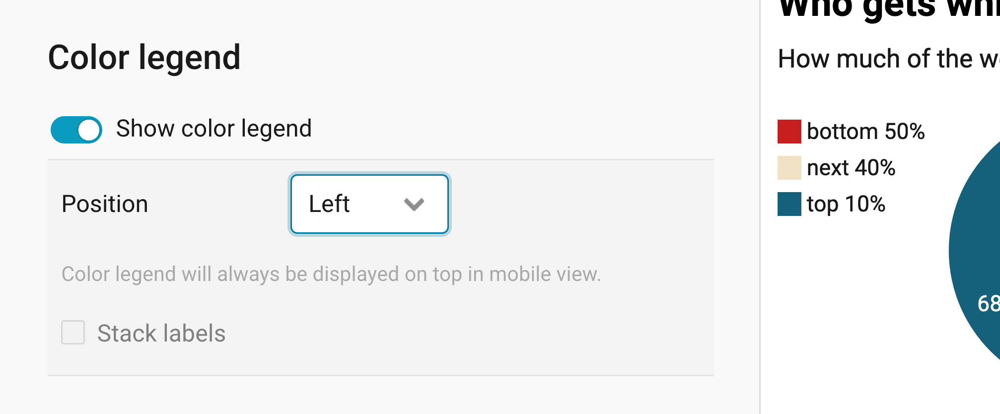
The Color legend panel lets you add a list of your slice names to the chart.
- Show color legend: lists the names of your slices next to the donuts. Under Position, you can choose whether it appears at the top (the default), at the bottom, on the left, or on the right of the donuts. On mobile, the color legend always appears at the top, no matter what you choose.
- Stack labels: lists the names below each other instead of next to each other (off by default). You can only select to stack labels if the color legend is at the top or at the bottom – if the color legend is on the left or right, labels are stacked automatically.
Grouping small slices
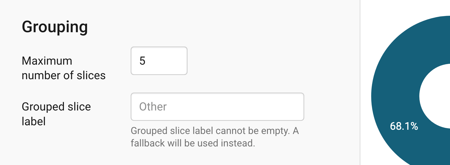
The Grouping panel lets you combine small slices, so your donuts don't get too cluttered.
- Maximum number of slices: groups the smallest slices into one if your data has more slices than this number (5 by default). Donuts with many slices quickly get hard to read, so it's best to keep this number small.
- Grouped slice label: names the slice that combines the smallest ones. If you leave it empty, Datawrapper calls it "Other".
Annotating your chart
Adding a title and source
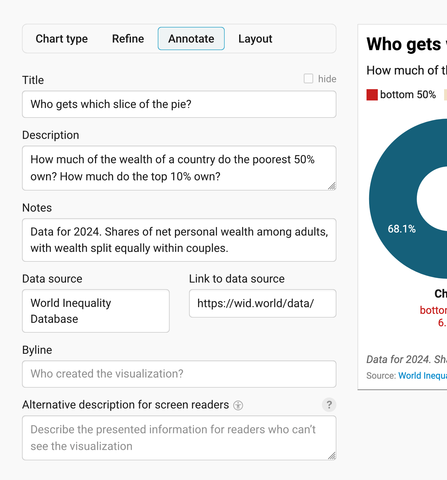
In the Annotate tab, you're first asked to give your visualization a title, description, notes, source, byline, and an alternative description for screen readers. You can find a detailed explanation of all these Annotate options here.
Highlighting slices
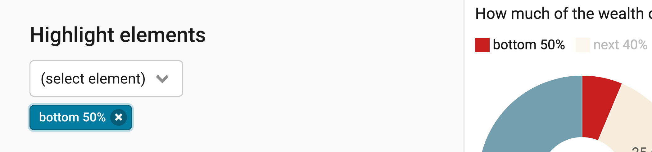
In the 2nd panel in the Annotate tab, you can emphasize certain donut slices. All the other donut slices will then tone down in their color. To remove added elements, click on the little "x" on the left of the text in the blue button.
Publishing your chart
In the Layout tab, you can select an output locale, change the design theme and footer options, and enable social sharing. Find a detailed explanation of all the Layout options here.
In step 4: Publish & Embed, you can first publish your chart and then decide how it gets to your readers. We recommend pasting the embed code into your website or CMS, but you can also share the chart's URL. Learn more about both options here. To use your chart somewhere else, download it as a PNG (on any plan) or as an SVG or PDF (on paid plans). See what each plan includes on our pricing page.
And that's it! You've successfully created and customized a multiple donuts chart.