How to create a column chart
- Free
- Pro
- Business
- Enterprise
The column chart is a vertical variation of the bar chart. It works especially well for time series with only a few dates and for information typically shown with a column chart, e.g. election results in some countries.
A limitation of the column chart is the space for labels on the horizontal axis. If you have a lot of values, Datawrapper will rotate them automatically, but this makes reading the chart much harder. When you have many values and longer names (e.g. all US states), switch to a bar chart in Datawrapper.
In this tutorial, you'll be guided through the steps to prepare and then upload your dataset into Datawrapper in order to create and customize a column chart like the one below.

Preparing your data
Formatting your data
You can copy & paste data from Excel or the web, or upload your own CSV files. For example, here is the dataset for the election results chart above. Your dataset should be formatted as follows:
Tip: You can copy the data from this table & paste it directly into Datawrapper. Make sure that you copy all fields to make this work.
| Party | Gain/loss |
| Union | -8.6 |
| SPD | -5.2 |
| Linke | 0.6 |
| Grüne | 0.5 |
| FDP | 6.0 |
| AfD | 7.9 |
| Andere | -1.2 |
Note the structure of the dataset above:
- The text in the header row won't be visible in the final chart. It's a good idea to include it anyway, to not forget what each column contains. (If you don't want to include the header row, uncheck the First row as label checkbox in step 2: Check & Describe.)
- The first column contains the labels of your columns, e.g. the party names.
- The second column contains the values that should be shown with the height of the columns, e.g. the election results.
Uploading your data
Once you have prepared your data, create a new chart in Datawrapper. You can do so by going to our homepage and clicking on Start creating. In step 1: Upload, you can copy & paste your dataset, upload it as a .csv or Excel file, or connect to a Google Sheet. It will look like this:
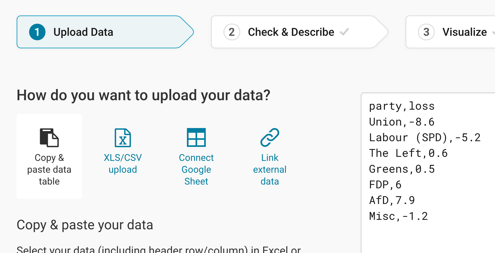
Click on Proceed in the bottom left to continue to step 2: Check & Describe.
Checking data and units
In step 2: Check & Describe, you can check what the table looks like after you've uploaded it. Make sure that the box First row as label is ticked so that Datawrapper correctly identifies your labels and values.
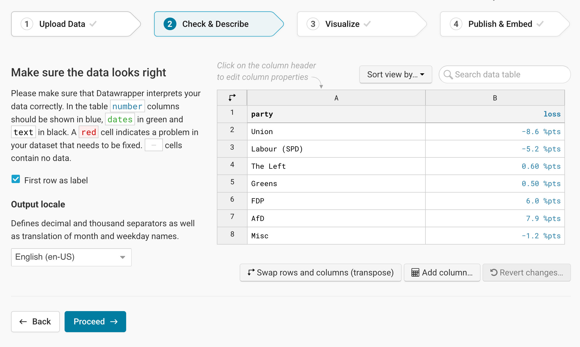
To add a unit (like km/h, kg, inch, $, etc.) to your numbers, click on a column header and then add the unit of your choice to the Prepend/append options on the left. You can learn more about adding units to numbers here.
Click on Proceed and Datawrapper will take you to the next step.
Choosing a column chart
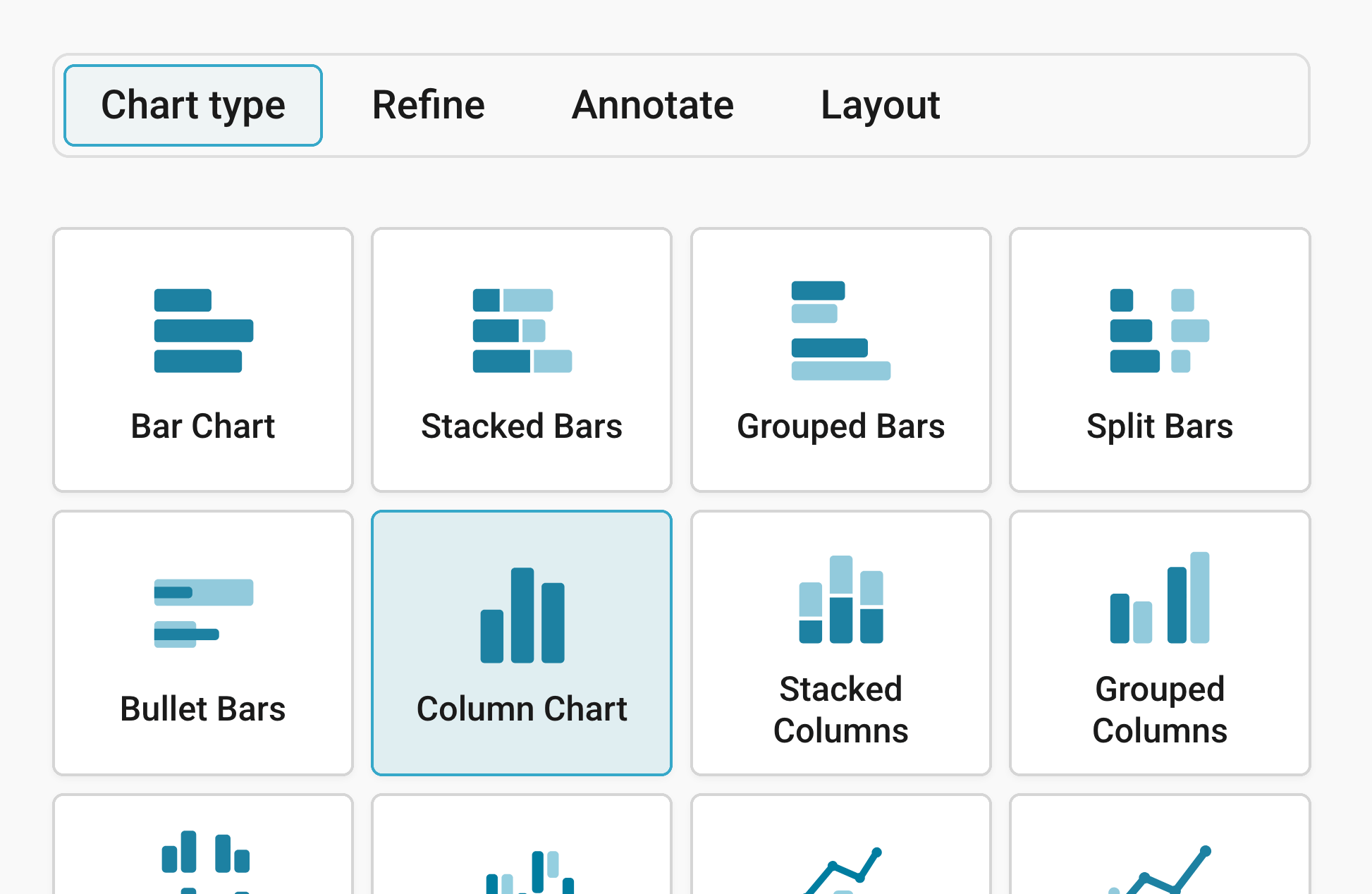
Once you're in step 3: Visualize, choose Column Chart and Datawrapper will create a first version of your chart. Besides Chart type, you'll notice three more tabs in this step: Refine, Annotate, and Layout.
Refining your chart
Resizing
In any tab of step 3: Visualize, you can click, hold, and drag the arrow in the lower right corner to scale the chart window or manually determine the dimension of the chart by entering values in the boxes below the chart (Size).
We recommend checking what the chart looks like on different screen sizes multiple times while designing it, by clicking on the little icons (mobile, tablet, and computer) below the chart.
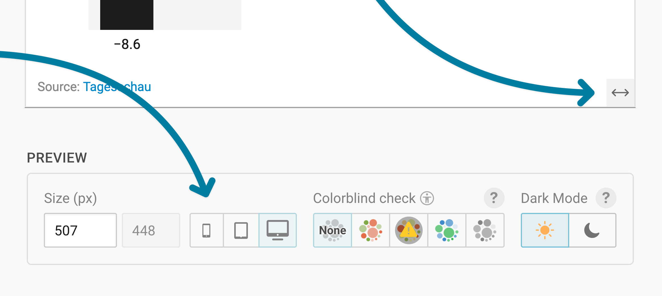
Learn more about changing the width and height of your chart in this article.
Let's continue with the Refine tab. Here, we see four panels: Vertical axis, Horizontal axis, Appearance, and Labels.
Changing the vertical axis
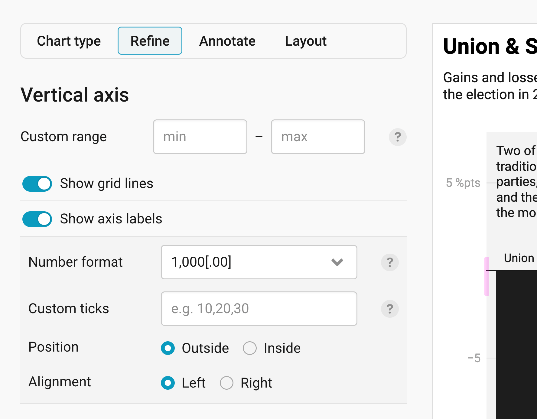
The Vertical axis panel lets you change the range of the axis on the left and how its grid lines and labels look.
- Custom range: Enter a minimum and a maximum here to extend the vertical axis beyond your data, for example to always show the range from 0 to 100%. Setting the minimum to a value greater than zero will be ignored, as column charts should always start at zero.
- Show grid lines: shows horizontal lines across the chart, which help readers see how big each column is. It's turned on by default.
- Show axis labels: shows the numbers next to the grid lines. If it's on (which is the default), you get these options:
- Number format: Decide how the numbers on the axis should look, for example "1,000" or "1k". Learn more about all available number formats here. The default is (automatic). We chose 1,000[.00], which only shows decimal places when a number has them.
- Custom ticks: Type in the values where you want grid lines and labels, separated by commas, like "-5, 0, 5". By default, the field is empty and Datawrapper chooses the ticks that work well for your chart.
- Position: Show the labels Outside of the chart (the default) or Inside of it, right on top of the grid lines.
- Alignment: Show the labels on the Left (the default) or the Right side of the chart. It makes sense to show the labels on the right side if your biggest columns are on that side.
Changing the horizontal axis

The Horizontal axis panel lets you decide in which order your columns appear and how the labels below them look.
- Show grid lines: shows a vertical line at each column. Under Line type, you can choose between Ticks, which are short marks at the axis, and Lines that go all the way up through the chart. Column charts normally don't need grid lines at all to be understandable, so that's the default.
- Automatically sort columns: sorts your columns by their values instead of showing them in the order of your dataset (the default).
- Reverse order: flips the order of your columns, so the last column in your dataset appears first.
- Rotate labels: If your column labels are long, Datawrapper can rotate them so they fit. With Auto (the default), labels only get rotated when there isn't enough space, for example on small screens. Always rotates them all the time, and Never keeps them horizontal and breaks them into multiple lines, although they might overlap anyway.
- Alignment: show the column labels At vertical baseline, right at the zero line, or Below chart, all at the bottom. That makes a difference if you have negative values, like in our chart: At the baseline, the labels of the negative columns are shown above them.
Changing colors and appearance
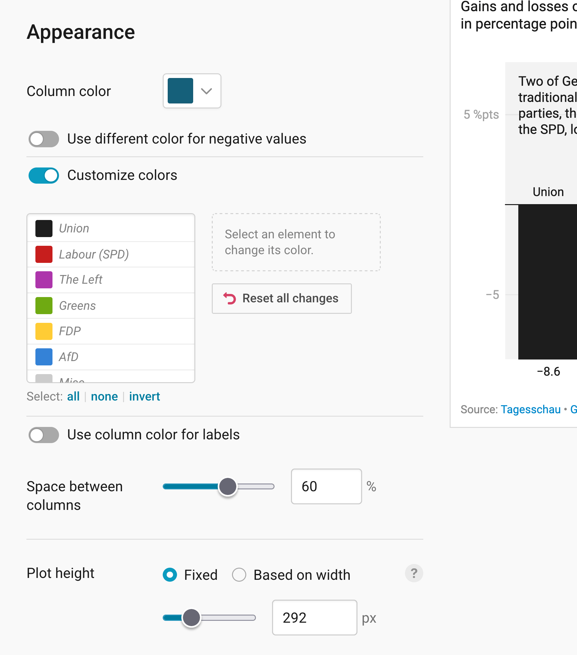
The Appearance panel lets you change the colors of your columns, the space between them, and the height of your chart.
- Column color: lets you pick one color for all your columns. Since we give every party its own color (see Customize colors below), this color doesn't show up in our chart.
- Use different color for negative values: lets you choose one color for all Positive and another one for all Negative values, like when you want to distinguish between gains and losses.
- Customize colors: lets you pick a color for each column. Click on a column in the list, then on the color box next to it to pick a new color. To change several columns at once, use Select: all, none, or invert, or hold down the Shift key or the Ctrl (Windows) or Command (Mac) key while clicking. Once you've picked a color, you can also tick Include in legend to show it in the color legend (after you've turned it on further down!). To undo your changes, click on Reset selection or Reset all changes.
- Use column color for labels: lets you show the value labels in the same color as their columns, like so:

- Space between columns: lets you make the gaps between your columns bigger or smaller. Play around with the slider a bit to see what degree of space looks best with your columns.
- Plot height: lets you choose a Fixed height in pixels, or a height Based on width, which makes your chart taller or shorter depending on how wide it is. Learn more about the difference in this Docs article.
Labeling
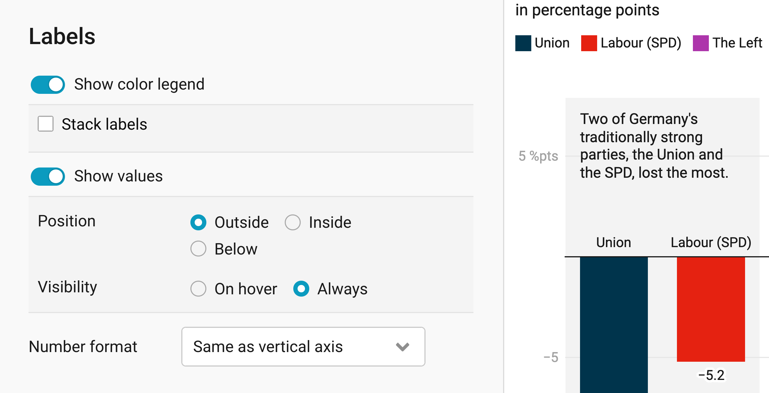
The Labels panel lets you decide whether there's a color legend and whether readers see the exact values of your columns.
Show color legend: This option appears only once you customize your colors. It shows a legend above your chart with all colors you've included in the legend. It's turned off by default because in most column charts, the column labels are sufficient.
Show values: This shows the value of each column. Under Position, choose whether the values appear Outside at the end of the columns, Inside of them, or Below. This video shows the difference:
- Under Visibility, you can decide whether readers see these values On hover (when they move their mouse over a column) or Always. By default, the values are shown outside and on hover.
- Number format: Decide how the values should look. The default is Same as vertical axis, which we keep.
Annotating your chart
Adding a title and source
In the Annotate tab, you're first asked to give your visualization a title, description, notes, source, byline, and an alternative description for screen readers. You can find a detailed explanation of all these Annotate options here.
Highlighting columns
In the 2nd panel in the Annotate tab, you can emphasize certain columns. To do so, select the element(s) you want to highlight. The rest of the columns will automatically tone down:
Adding text annotations
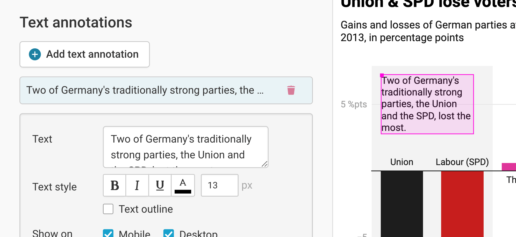
You can add annotations to your column chart by clicking on Add text annotation. You can then style and move the text, add an arrow and circle to it, and adjust how it will appear on mobile. Here's an in-depth explanation of all the options.
Highlighting ranges
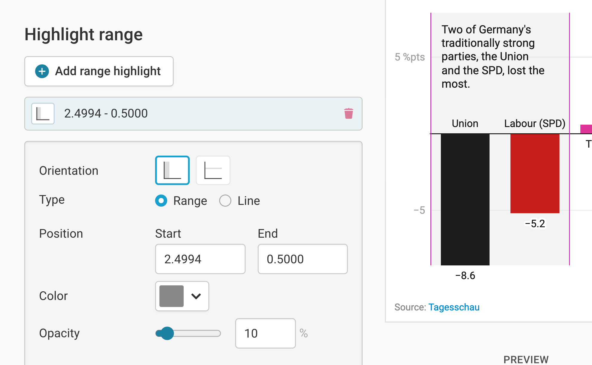
You can add range or line highlights to your chart by clicking on Add range highlight and then dragging on the chart where you want the highlight to be. You can then change its position, color, opacity, and line width and style, or delete it again. Here's an in-depth explanation of all the options.
Publishing your chart
In the Layout tab, you can select an output locale, change the design theme and footer options, and enable social sharing. Find a detailed explanation of all the Layout options here.
In step 4: Publish & Embed, you can first publish your chart and then decide how it gets to your readers. We recommend pasting the embed code into your website or CMS, but you can also share the chart's URL. Learn more about both options here. To use your chart somewhere else, download it as a PNG (on any plan) or as an SVG or PDF (on paid plans). See what each plan includes on our pricing page.
And that's it! You've successfully created and customized a column chart.