The best of last week’s big and small data visualizations
Lisa Charlotte Muth
Welcome back to the 60th edition of Data Vis Dispatch! (Usually) every week, we’ll be publishing a collection of the best small and large data visualizations we find, especially from news organizations — to celebrate data journalism, data visualization, simple charts, elaborate maps, and their creators.
Until the end of September, we’re taking a little late-summer break and publishing the Dispatch only every other Tuesday. You can expect the next Dispatch on September 20.
Without further ado, here's the best from last week (and a bit from the week before). Recurring topics include the floods in Pakistan, the droughts and heat in a lot of other parts of the planet, and the increasing energy costs.
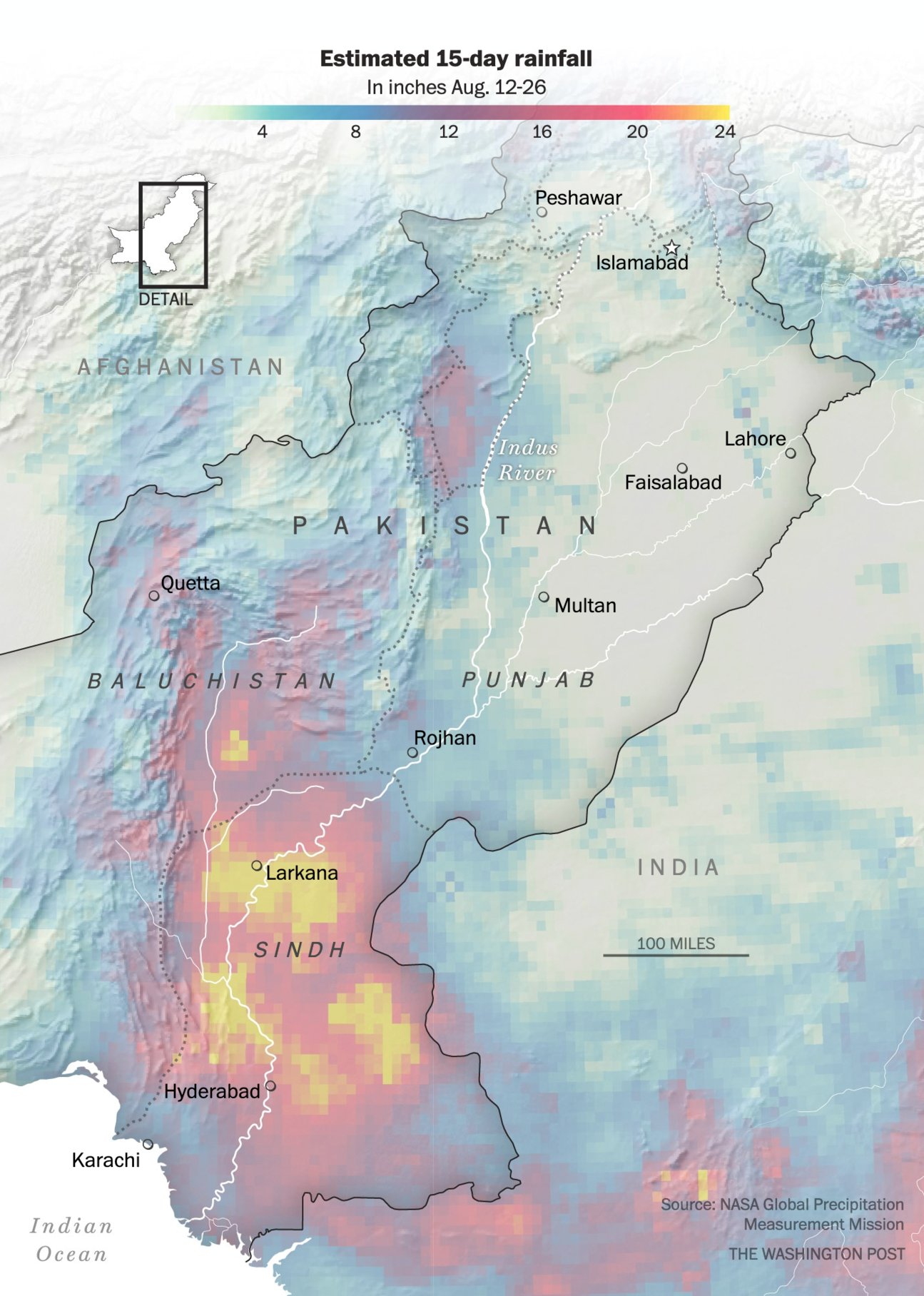
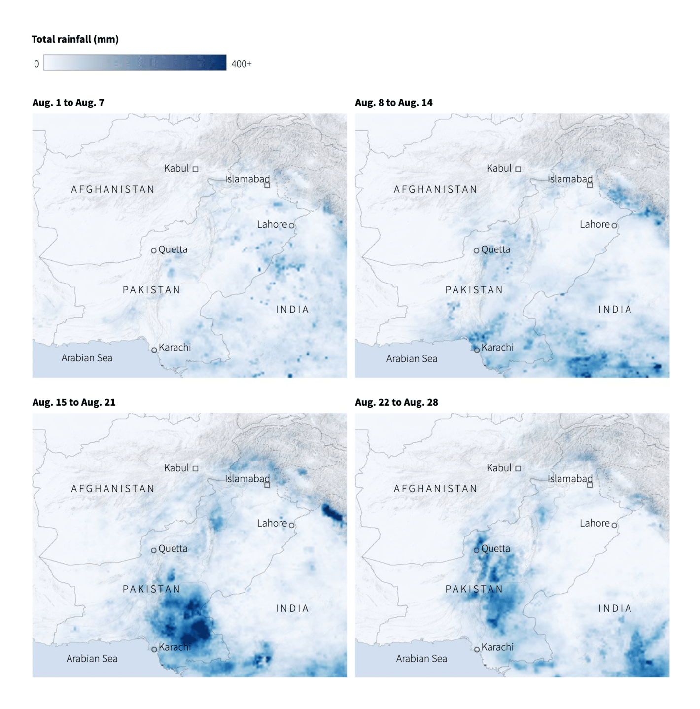
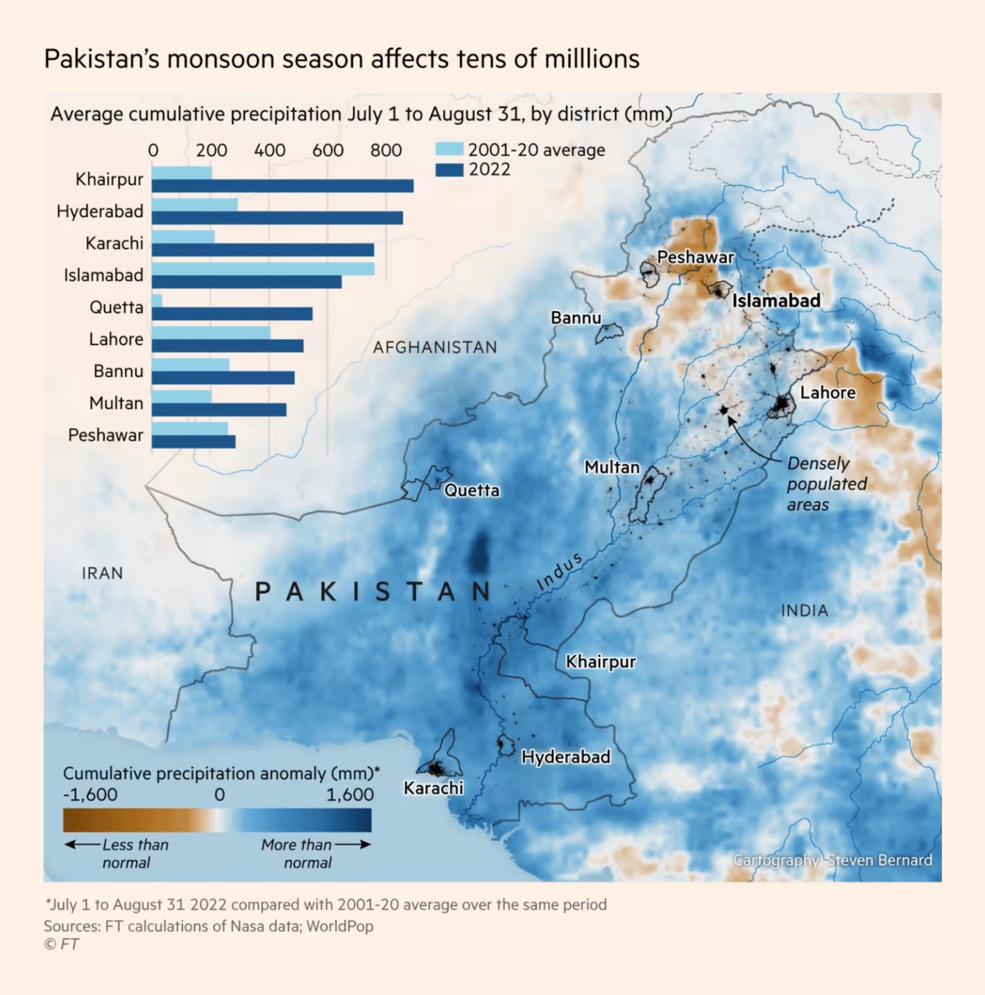
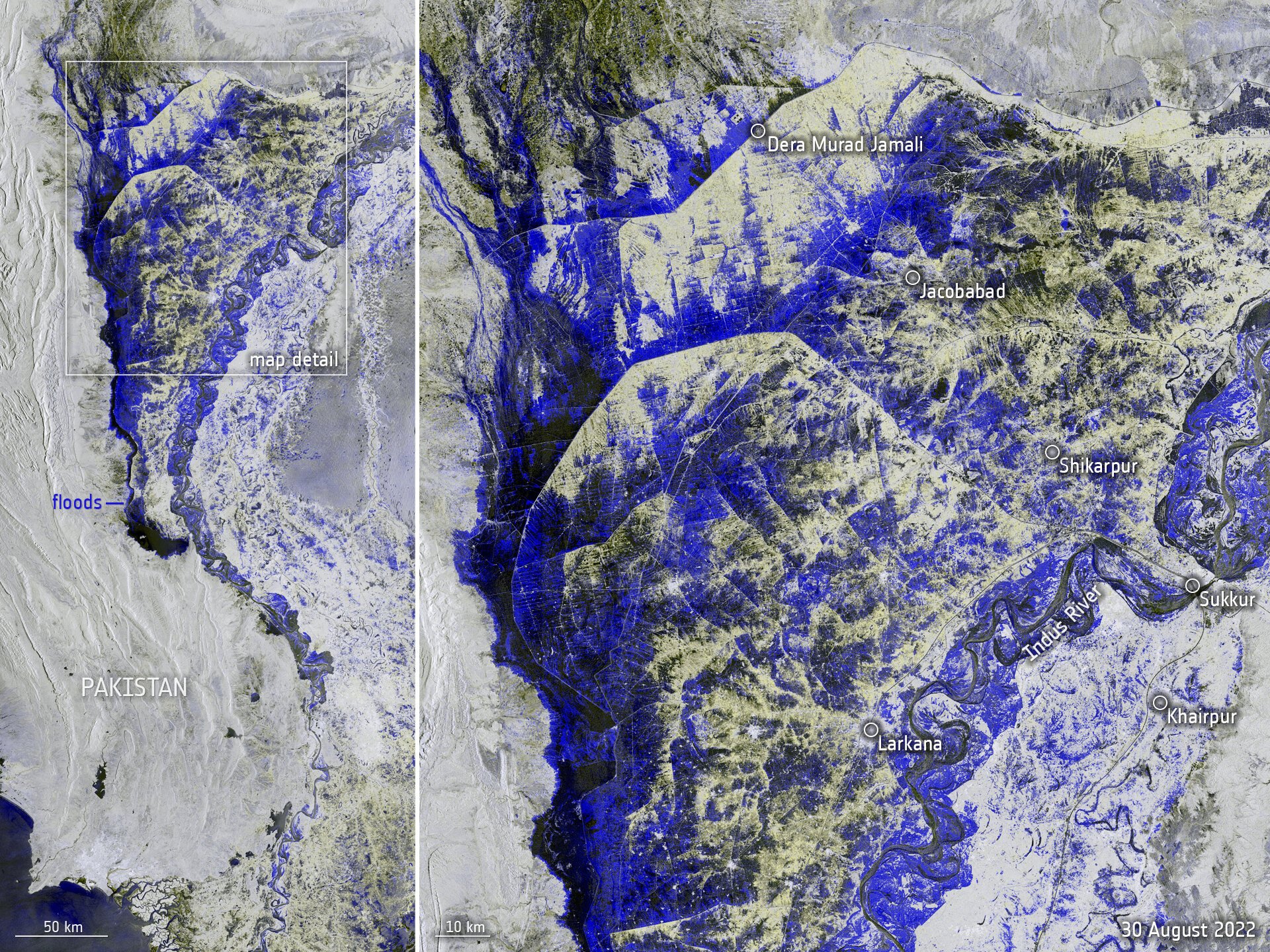
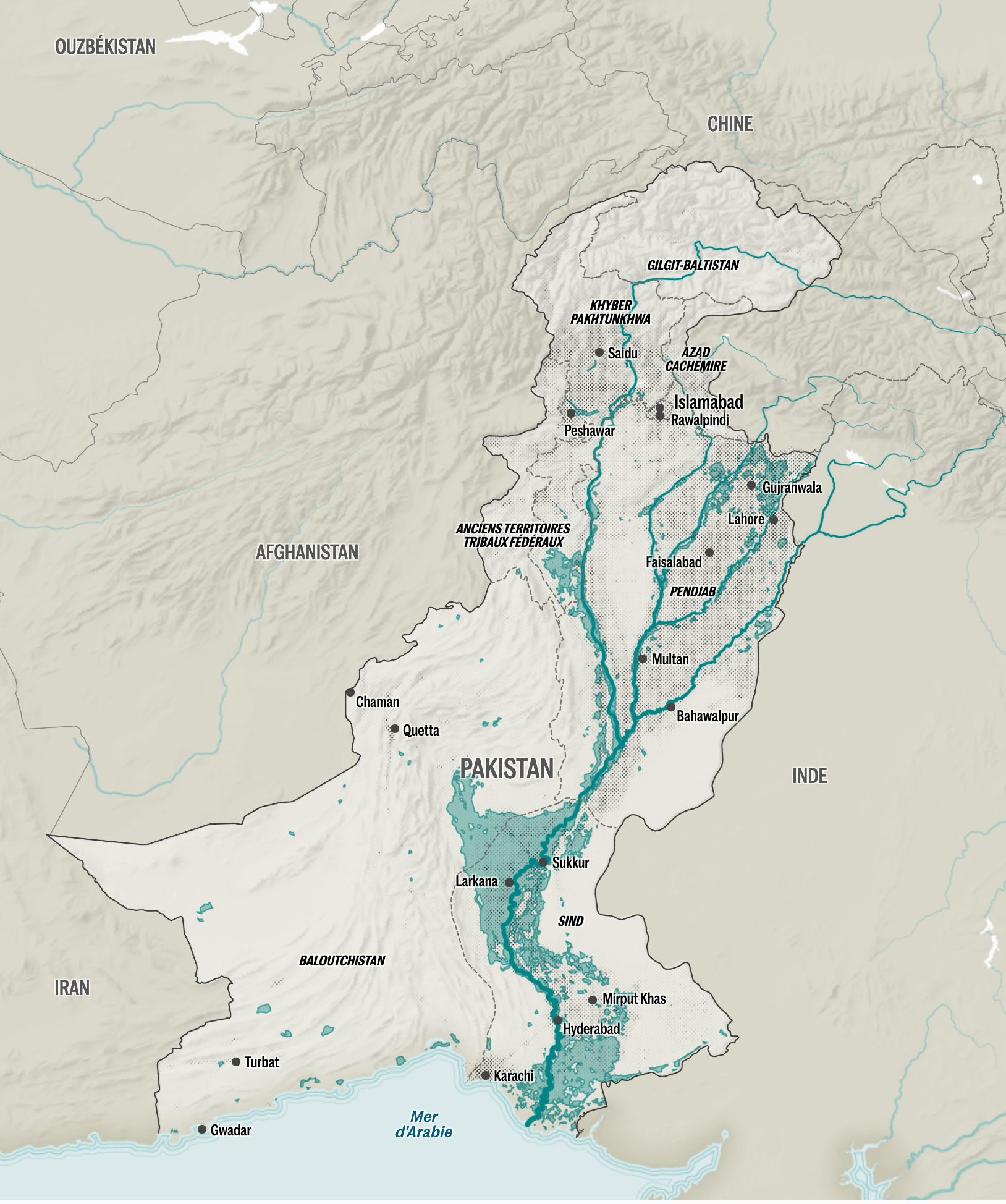
First, the devastating floods in Pakistan, caused by heavy monsoon rains in August:
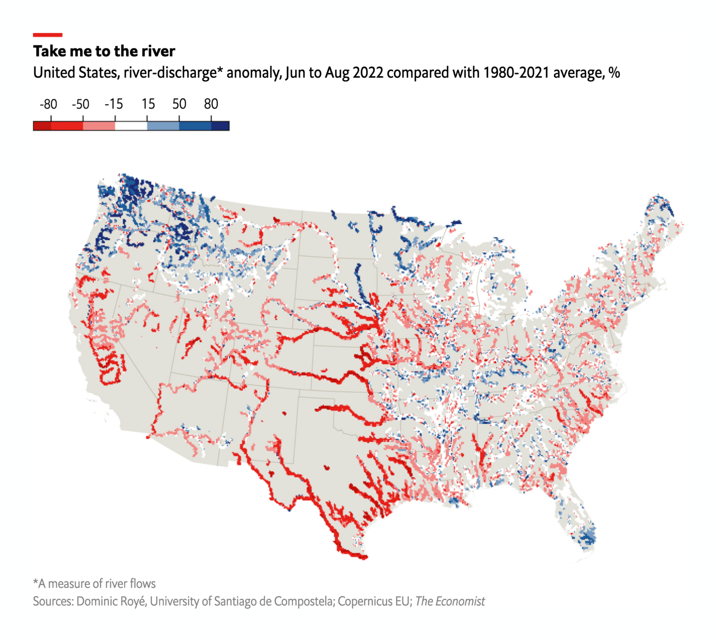
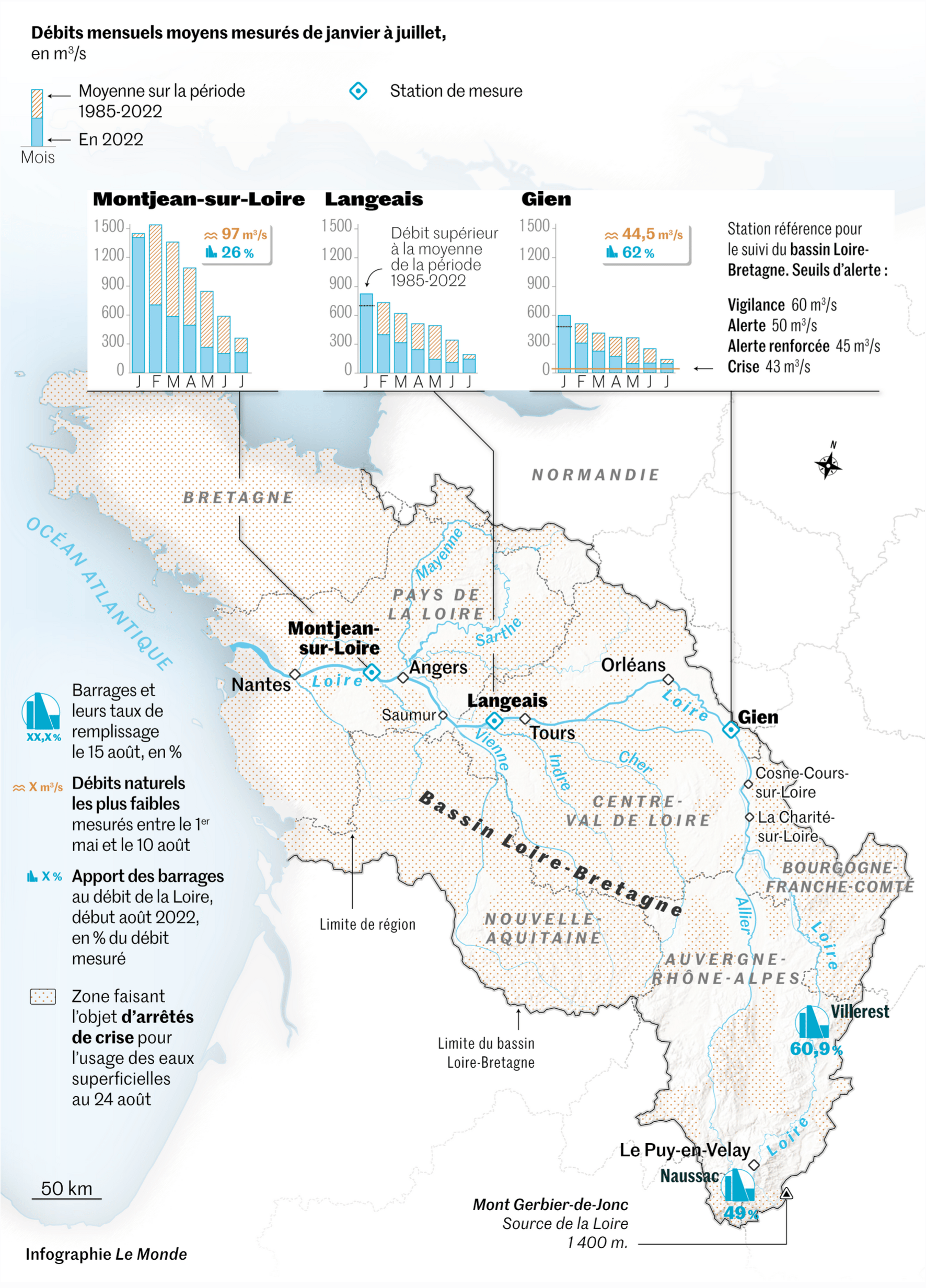
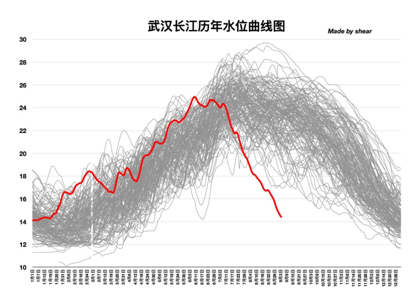
While Pakistan gets too much rain, the U.S., Europe, and parts of Asia get too little. Several news organizations reported on droughts and rivers with low water levels:
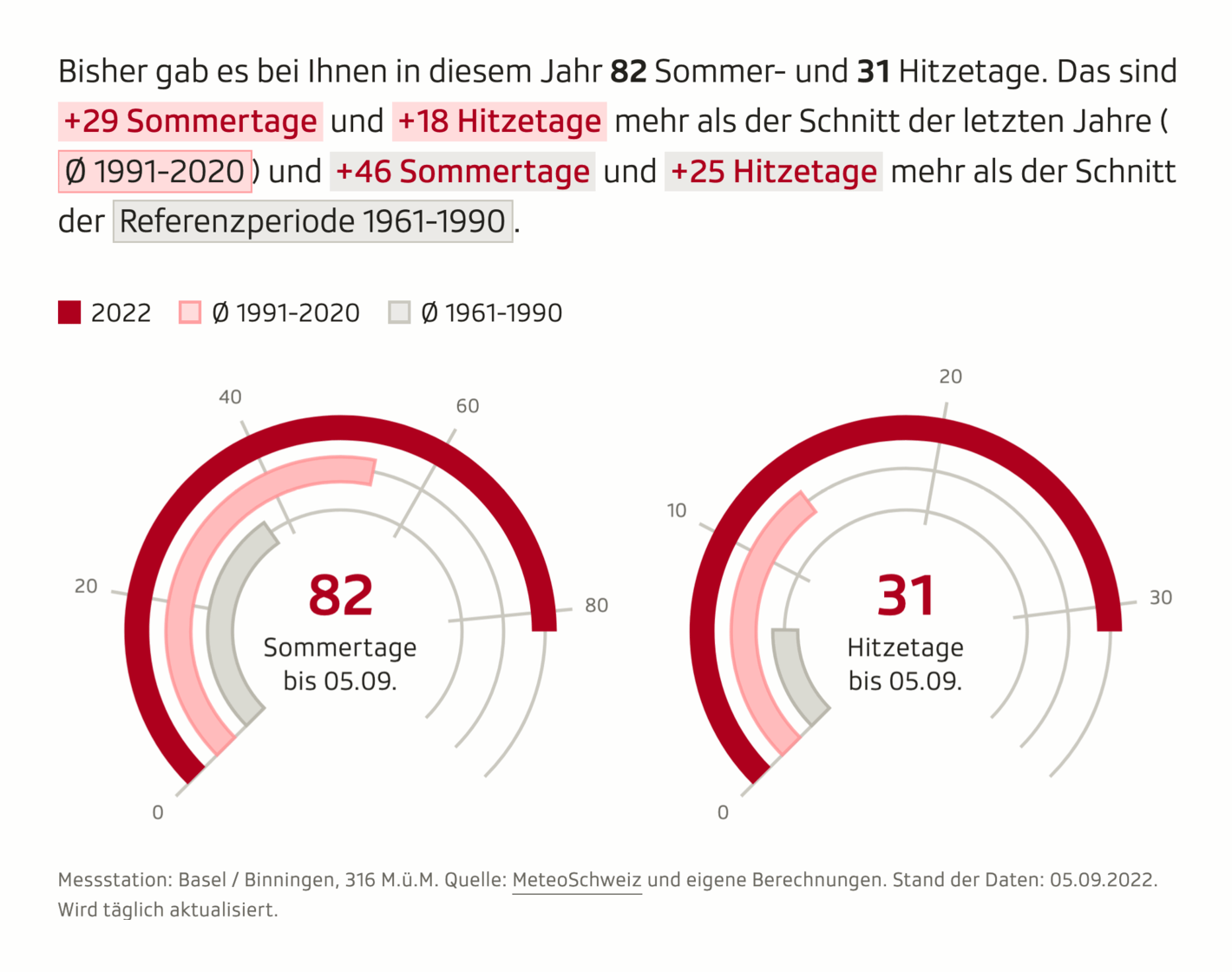
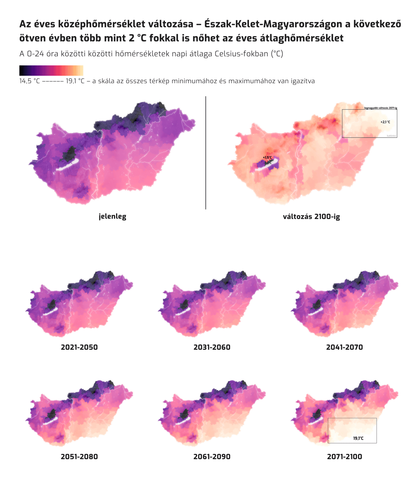
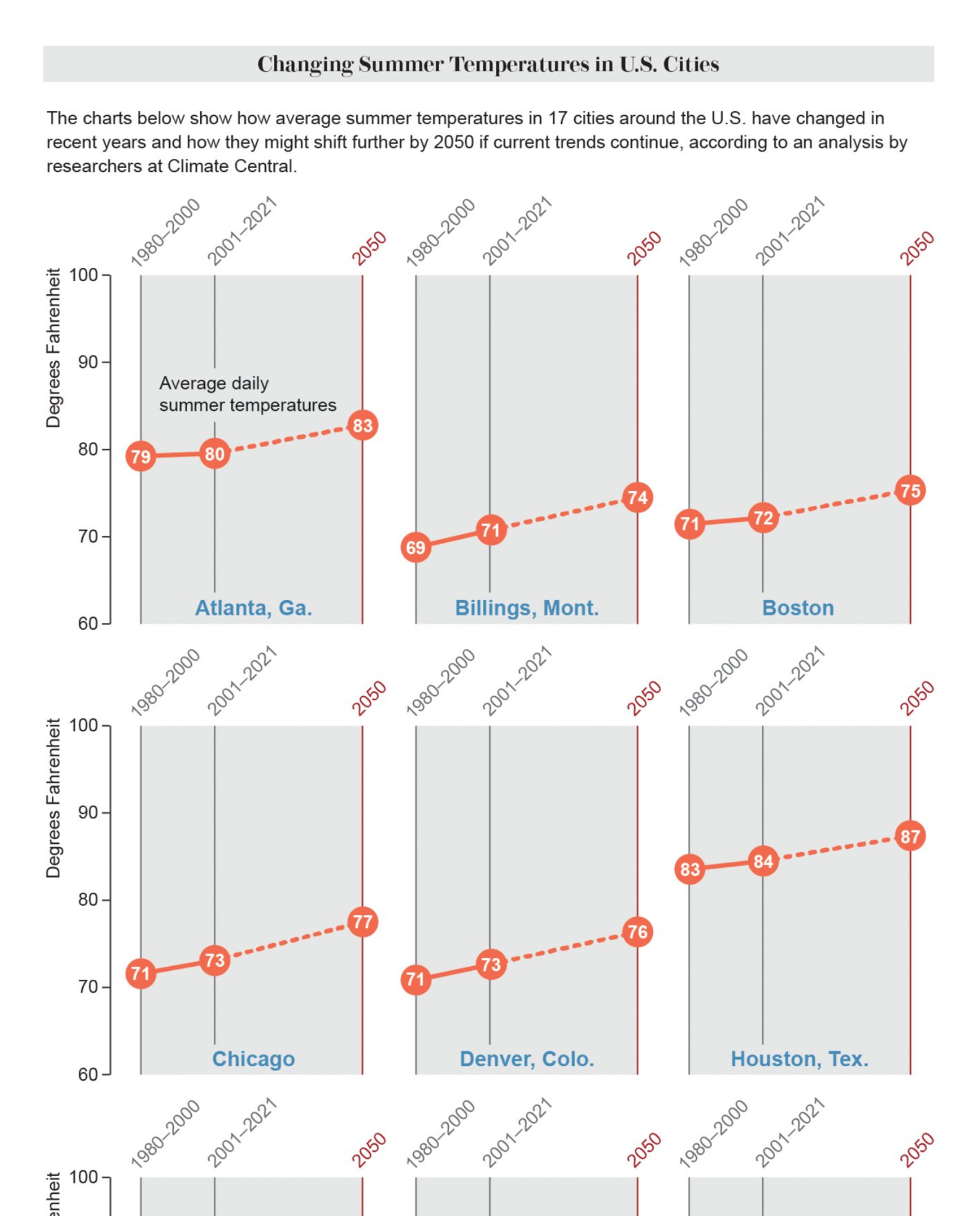
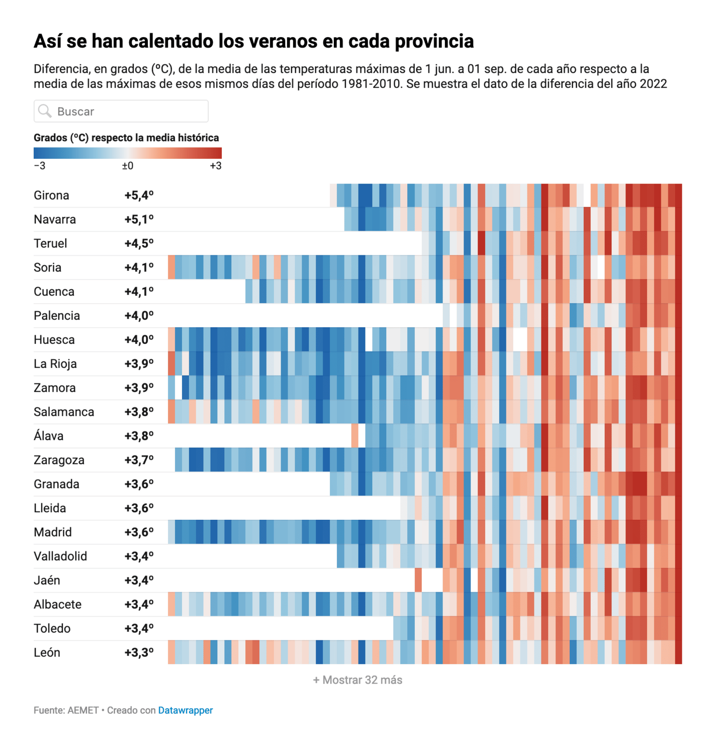
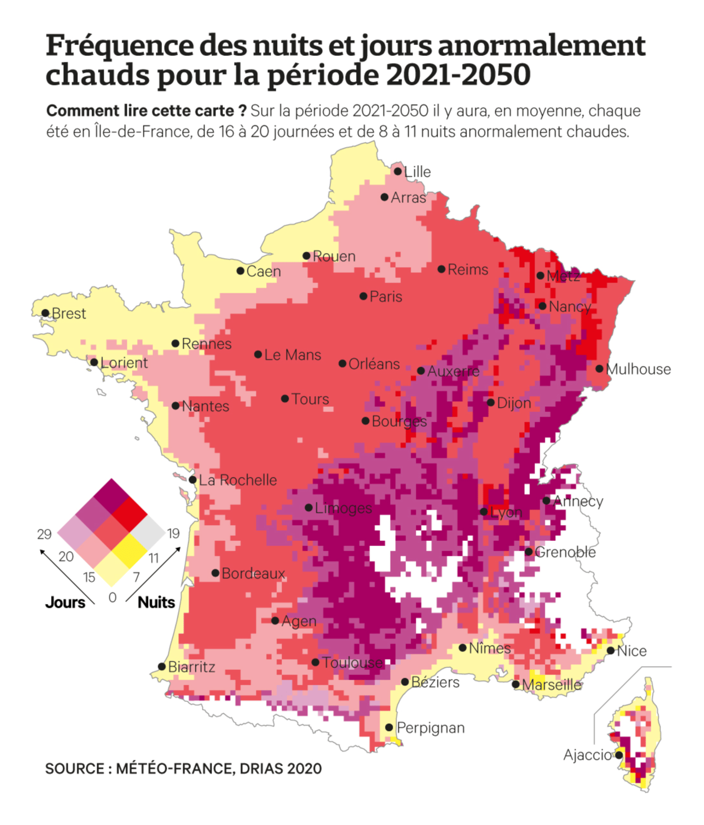
Like heavy rainfalls and droughts are, hot temperatures is another consequence of climate change that the northern hemisphere had to deal with this summer. The Swiss broadcasting company SRF launched a daily updating climate dashboard, while Hungarian visualization team Atlo shows how Hungary's weather might change until the end of the century:
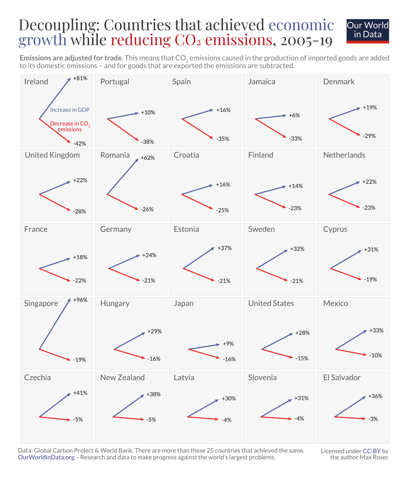
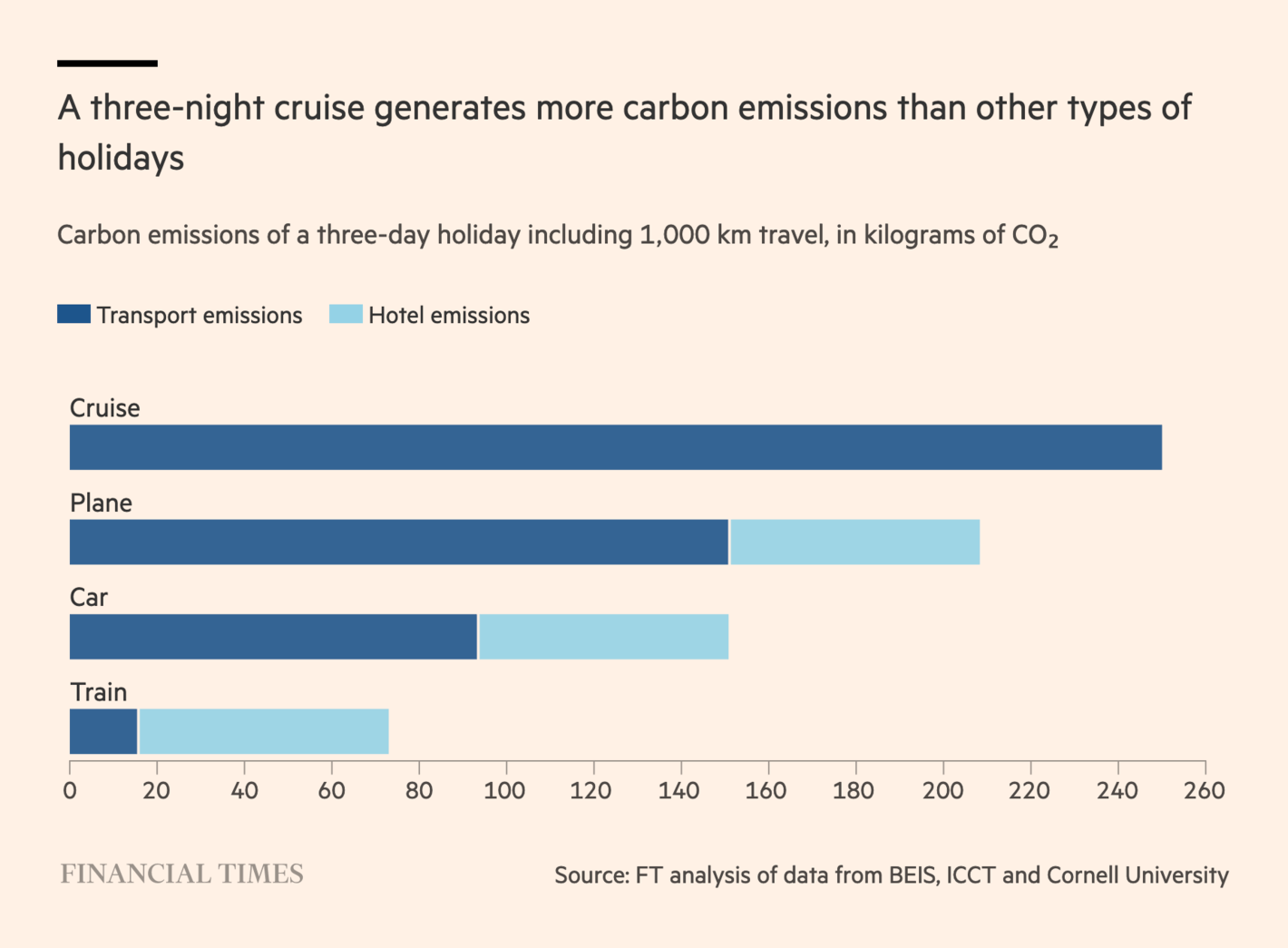
To reduce CO2 emissions, we don't need to lower ecomic growth, as many countries have demonstrated (but we should give up on cruises):
Max Roser: "More and more countries achieve to decouple economic growth from CO₂ emissions. Just made this new chart that shows the evidence for 25 countries. Growth is up, emissions down.", September 3 (Tweet)Financial Times: The cruise ship conflict: Europe’s port cities vs floating hotels, August 28
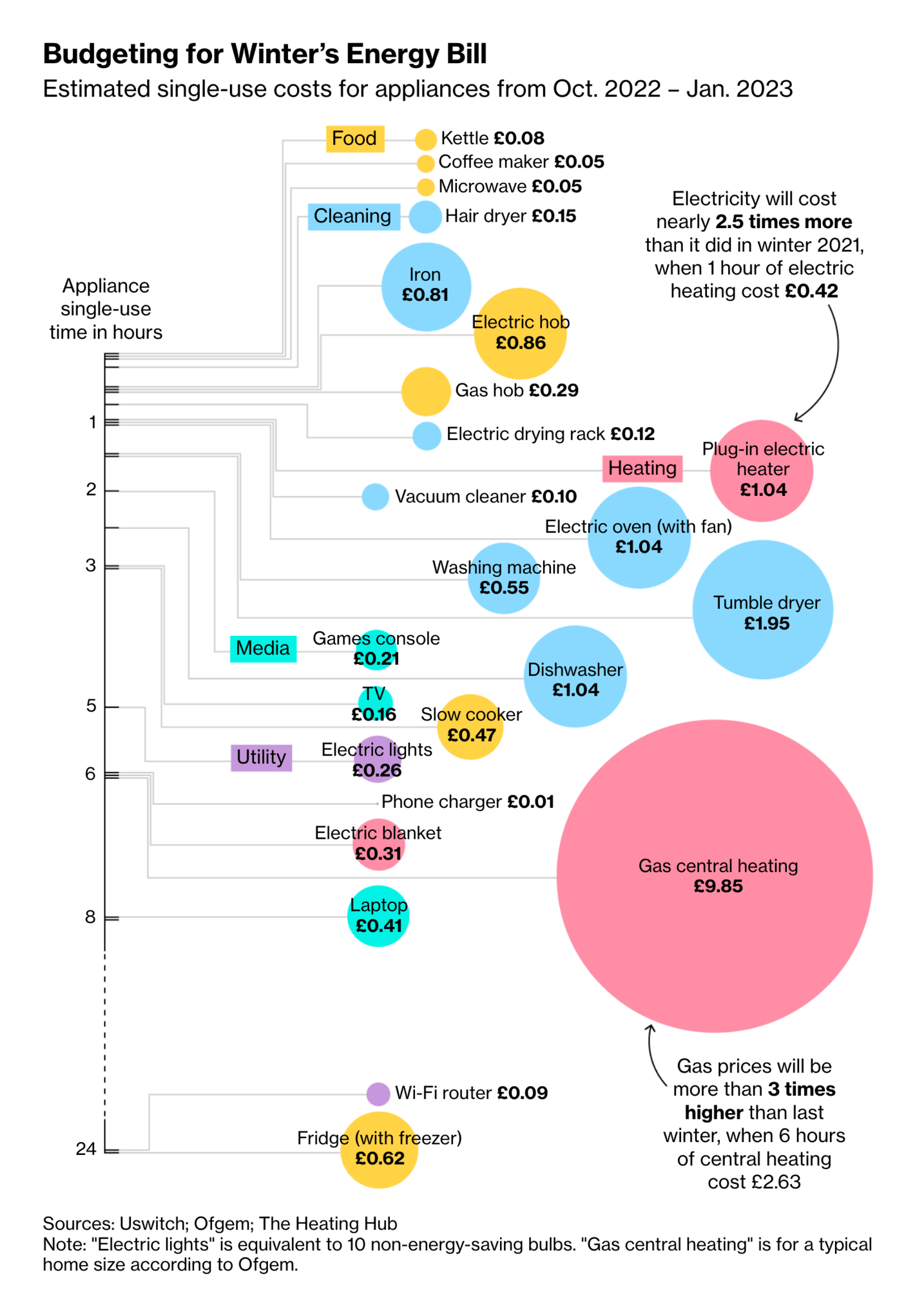
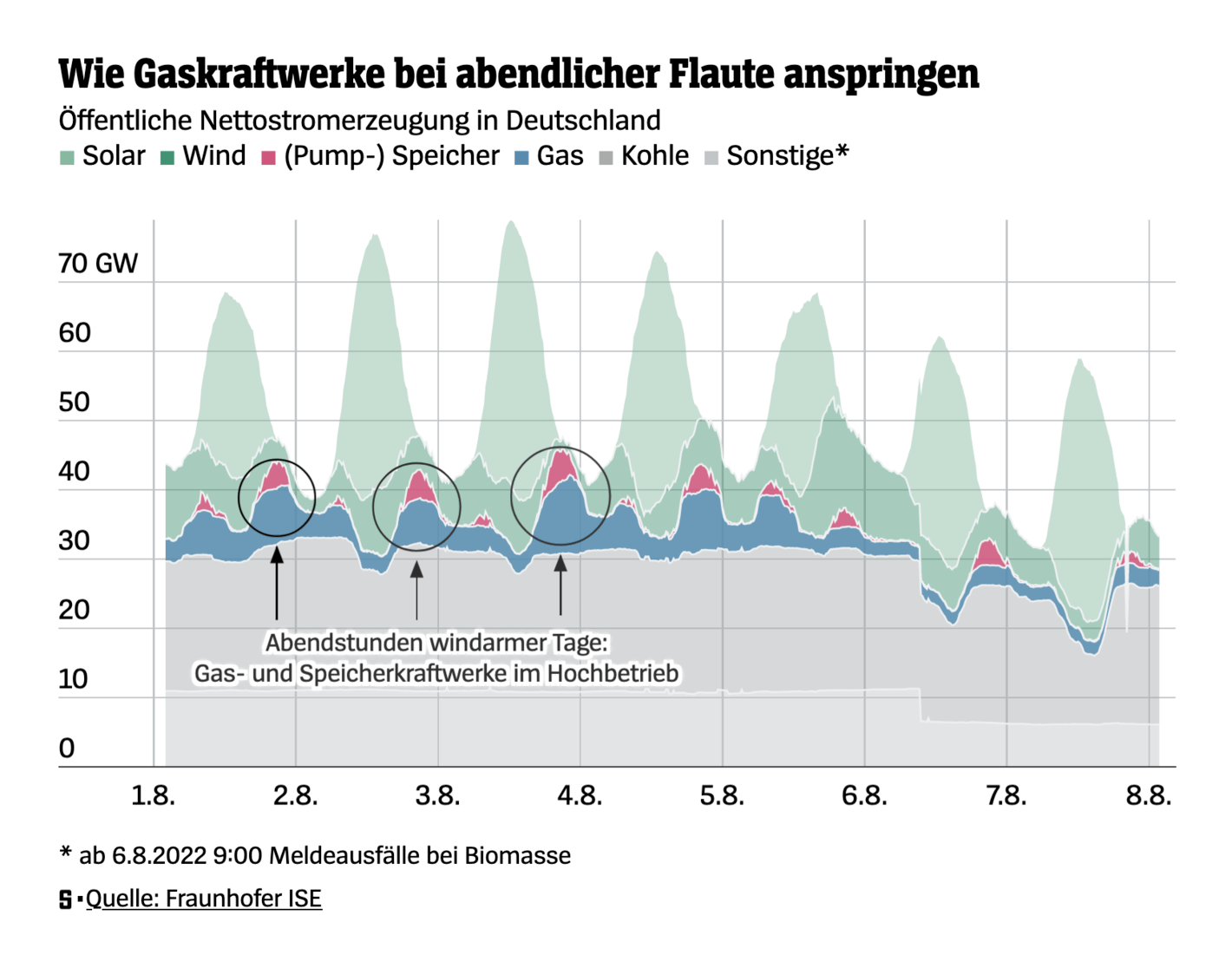
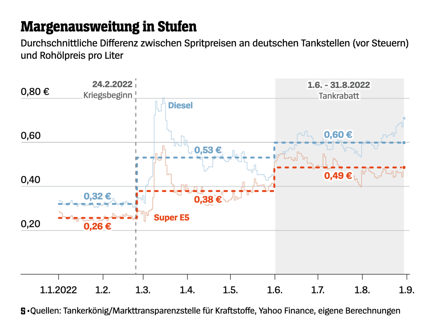
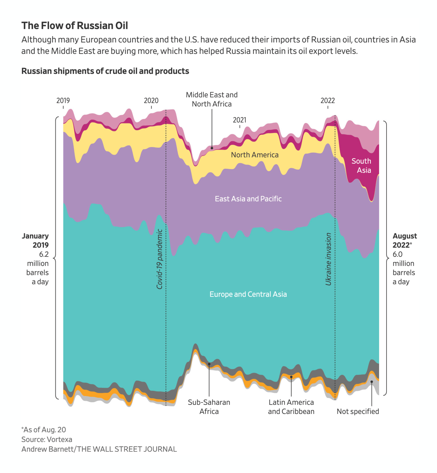
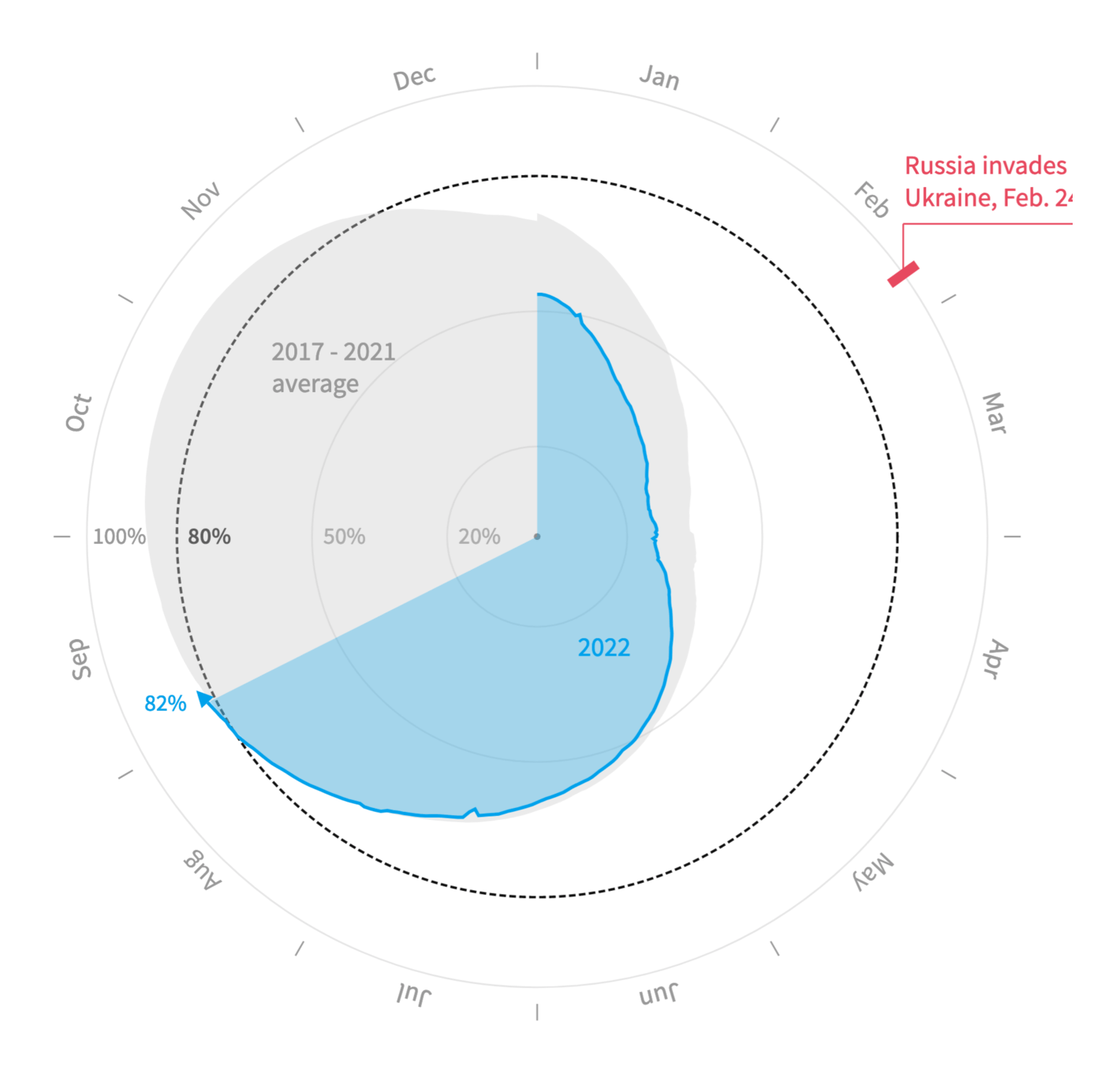
After summer comes winter – and energy becomes a more important topic. Consumers face high prices for gas and electricity, while EU countries try to fill their gas storages despite the Russia-Ukraine war:
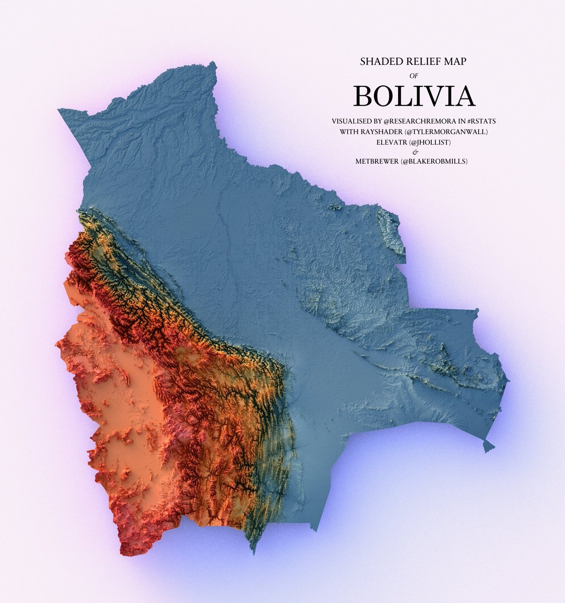
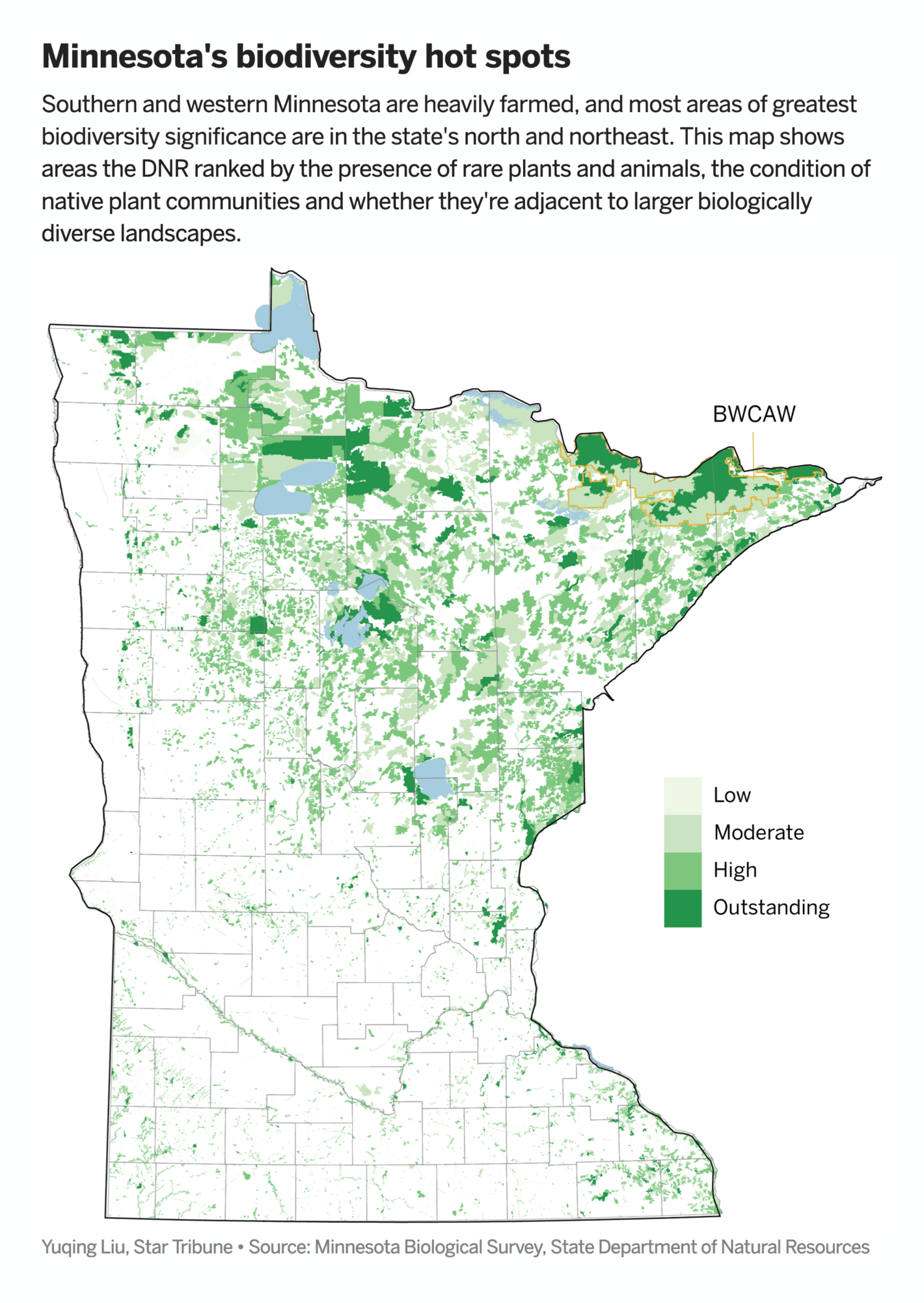
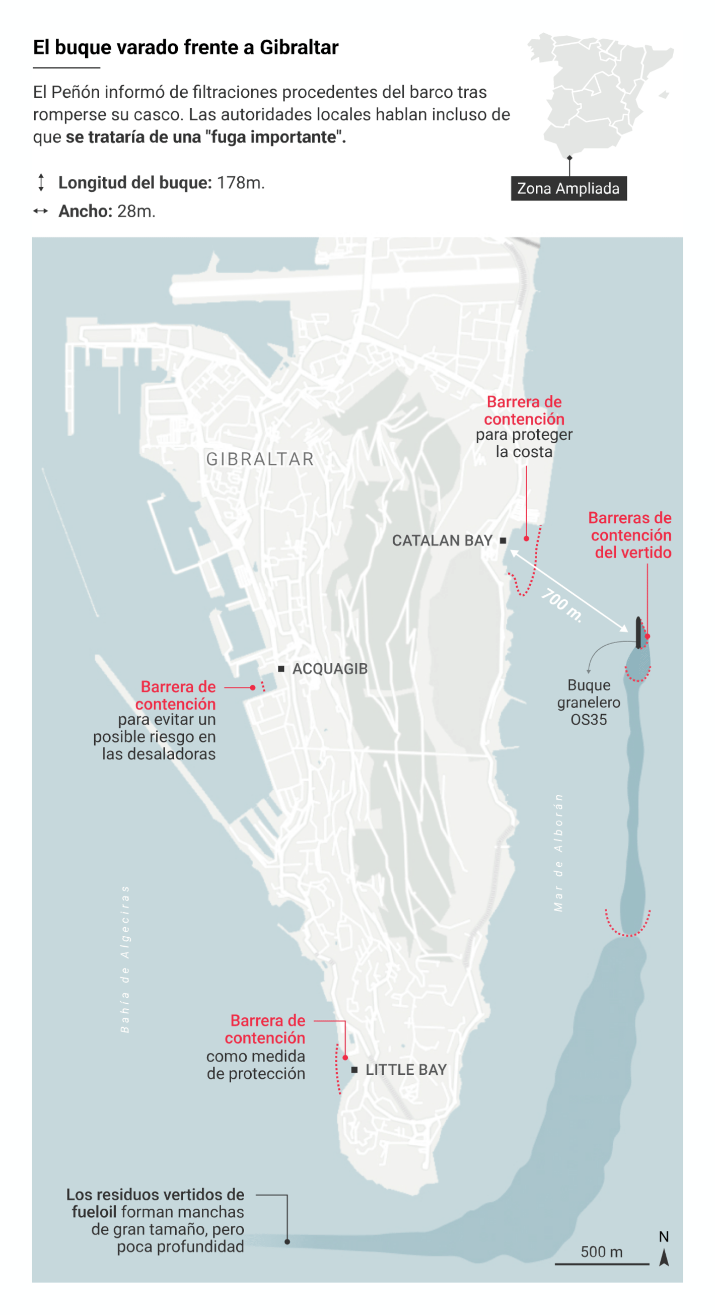
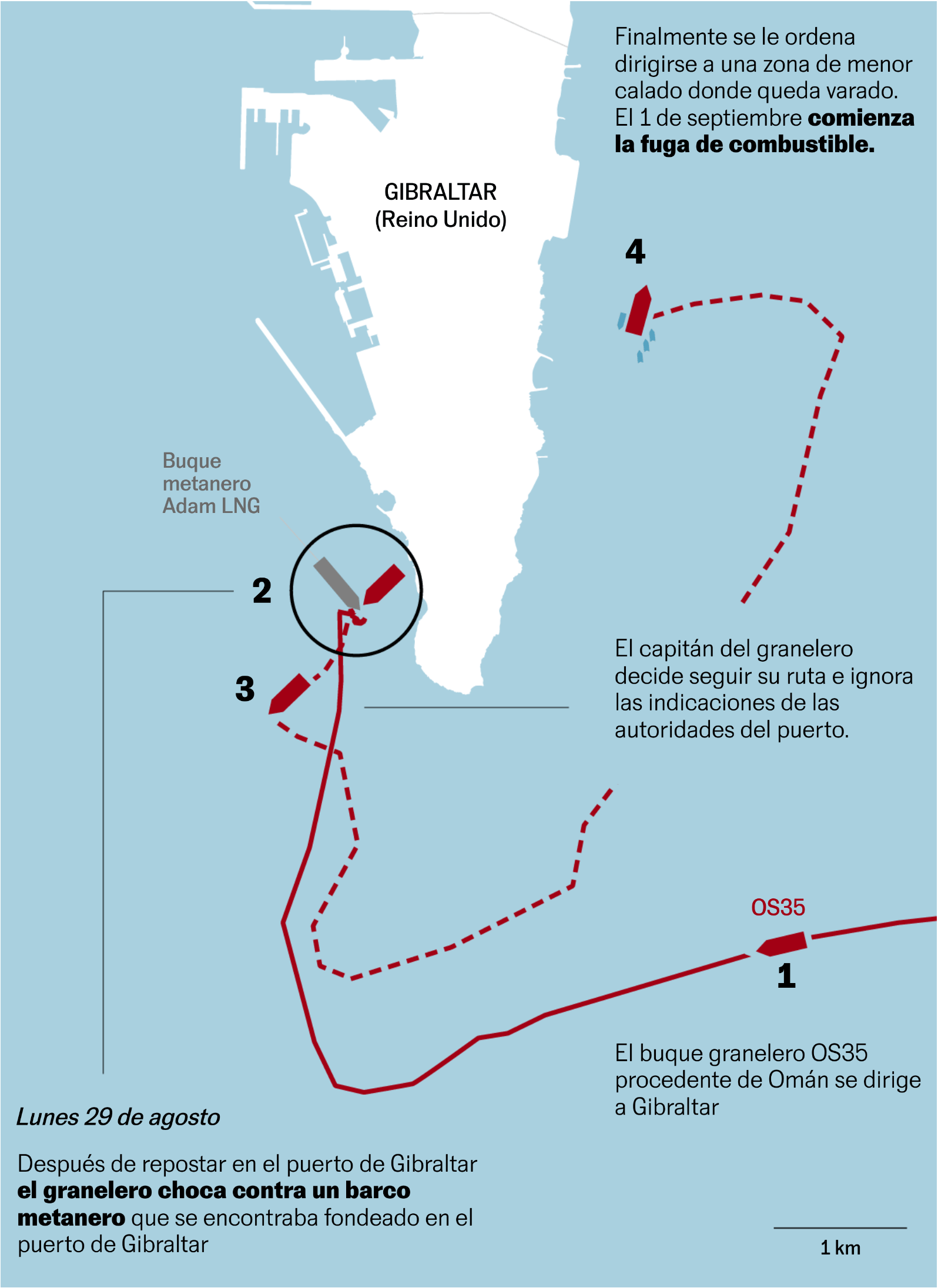
And we got more maps thanks to environmental issues, like Minnesota's declining biodiversity – and the leak of Diesel cargo by a semi-sunken ship off the coast of Gibraltar in Spain:
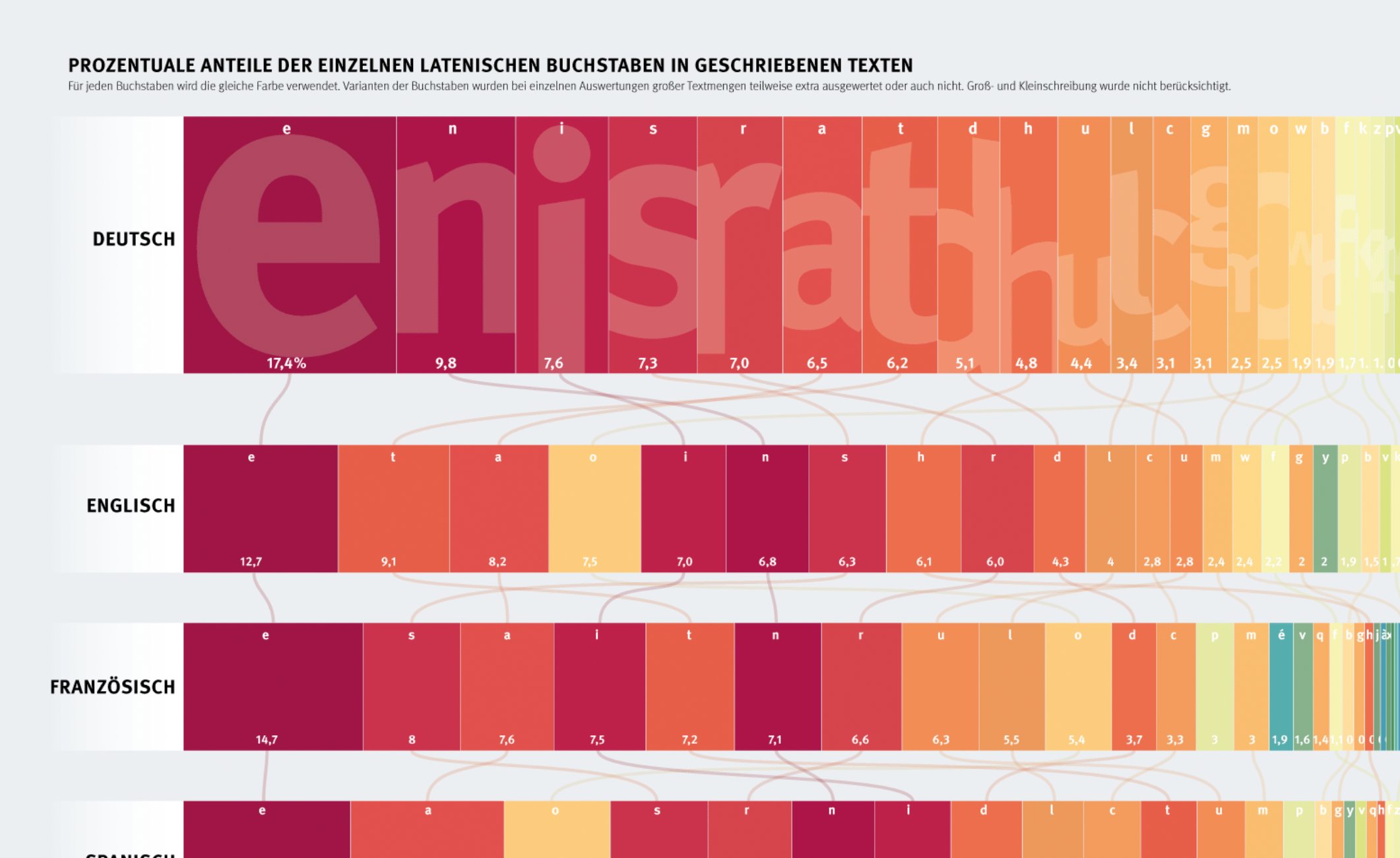
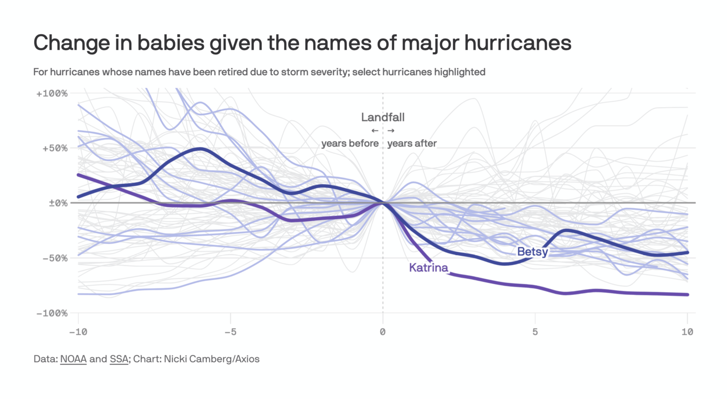
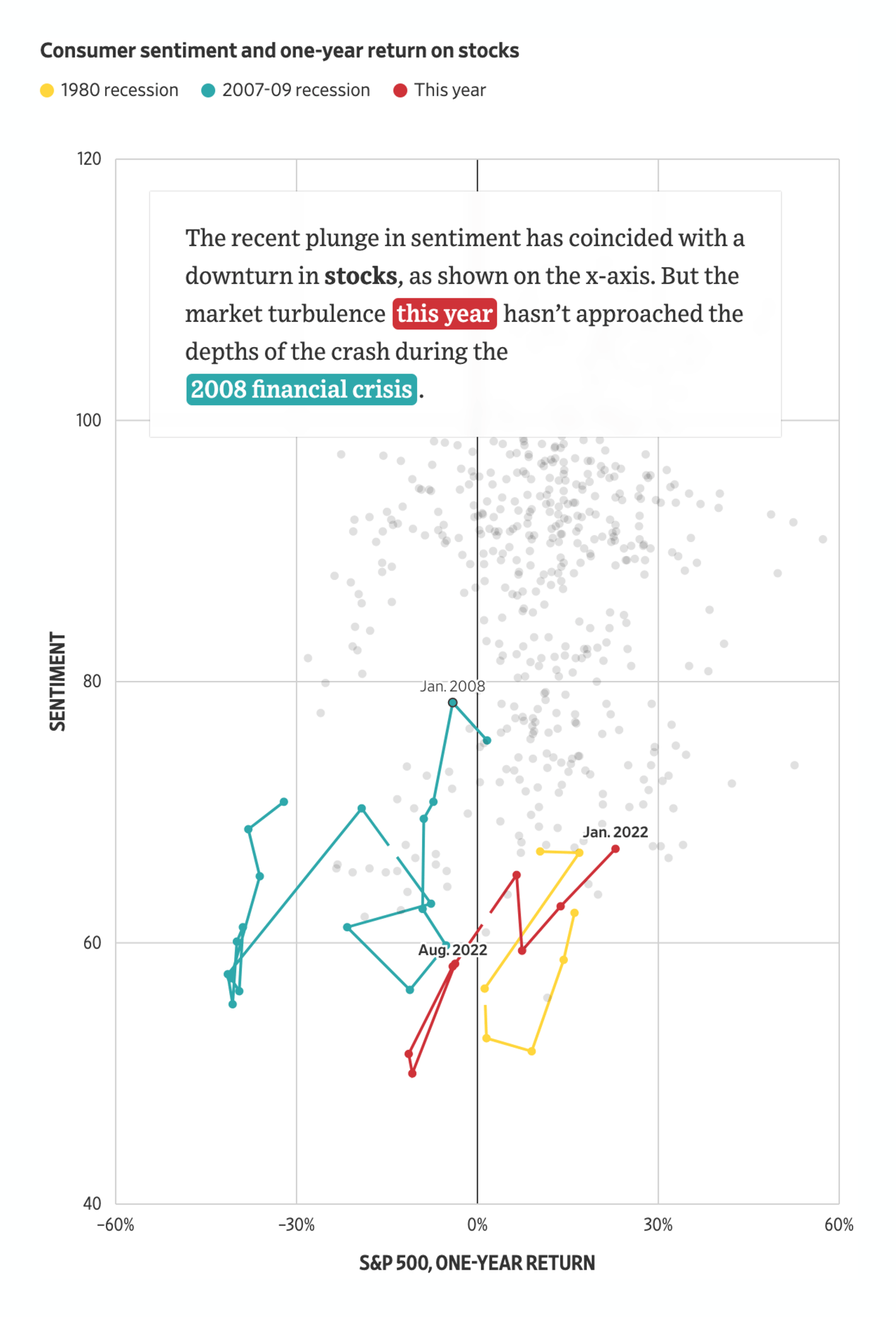
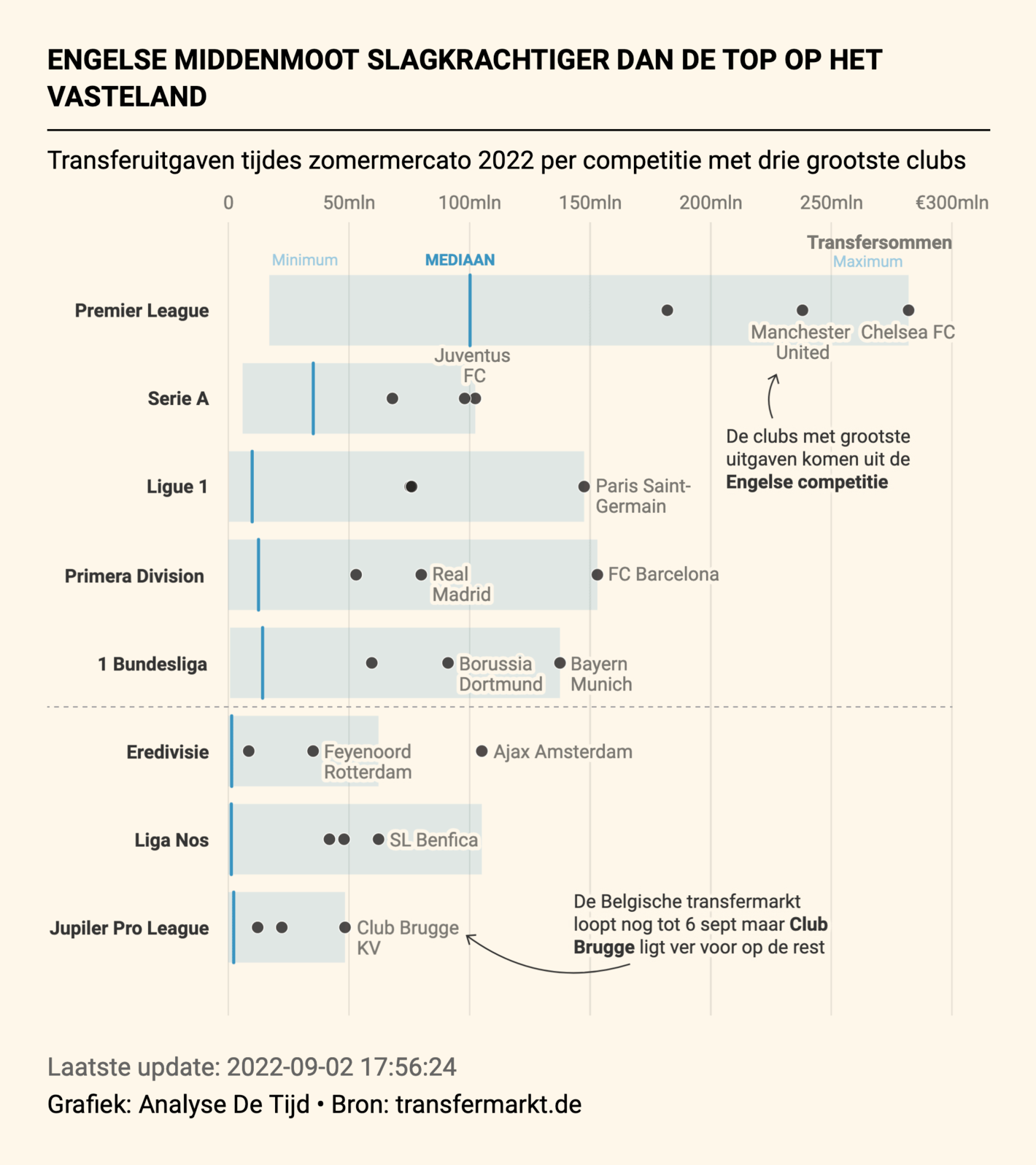
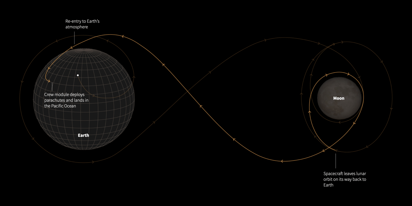
And in our miscellaneous section, we got some interesting visualization types for you: A rotated flow chart, a hyper-detailed network graph, a connected scatterplot, a Marimekko chart and much more:


![The Pudding: <strong><a href="https://pudding.cool/2022/08/censorship/">The Big [CENSORED] Theory</a></strong>, August 30](https://datawrapper.de/cdn-cgi/image/quality=85,width=1420,f=auto,fit=cover/https://kirby.datawrapper.de/media/pages/blog/data-vis-dispatch-september-6-2022/93ffd86bfe-1740123167/data-viz-dispatch-visualization109.png)