The best of last week’s big and small data visualizations
Lisa Charlotte Muth
Welcome back to the 15th edition of Data Vis Dispatch! Every week, we’ll be publishing a collection of the best small and large data visualizations we find, especially from news organizations — to celebrate data journalism, data visualization, simple charts, elaborate maps, and their creators.
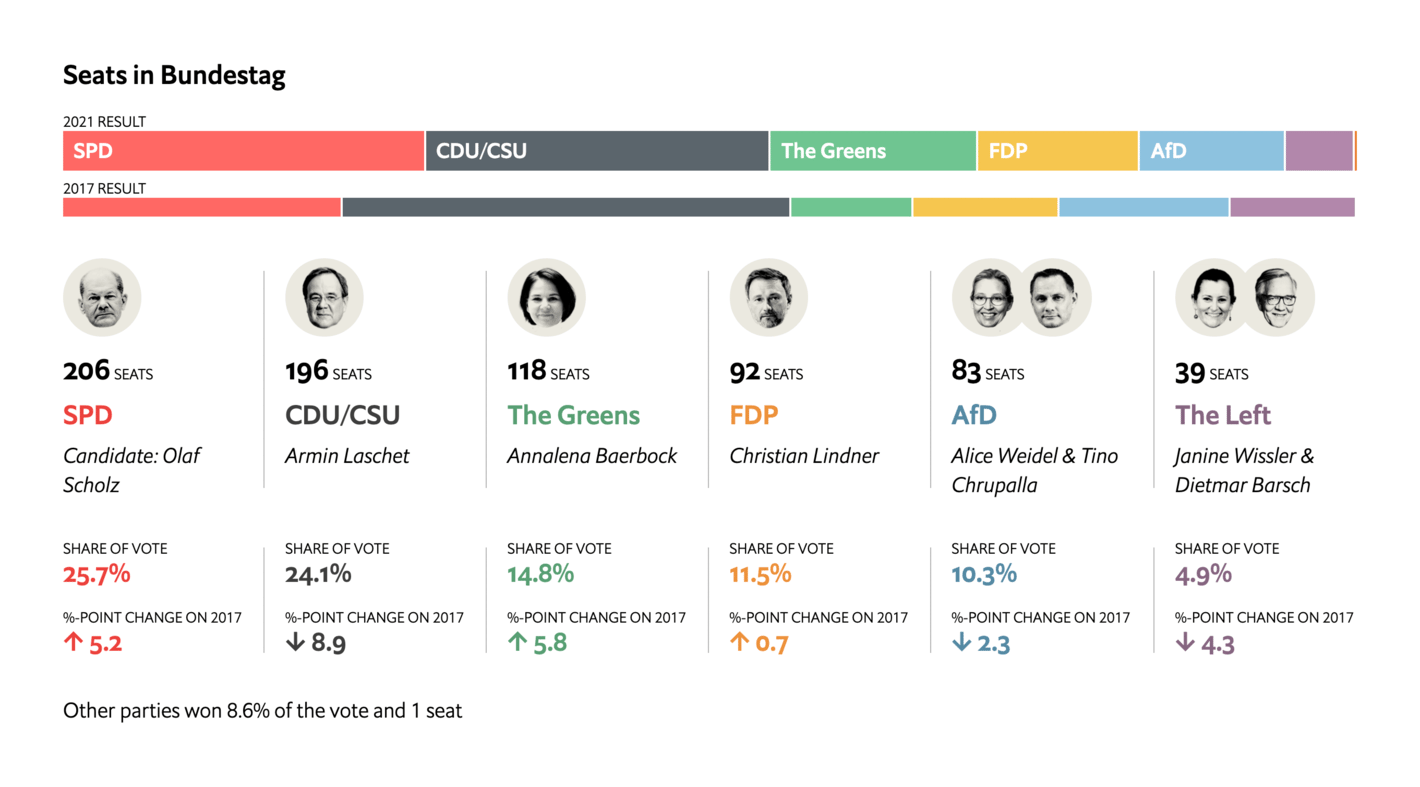
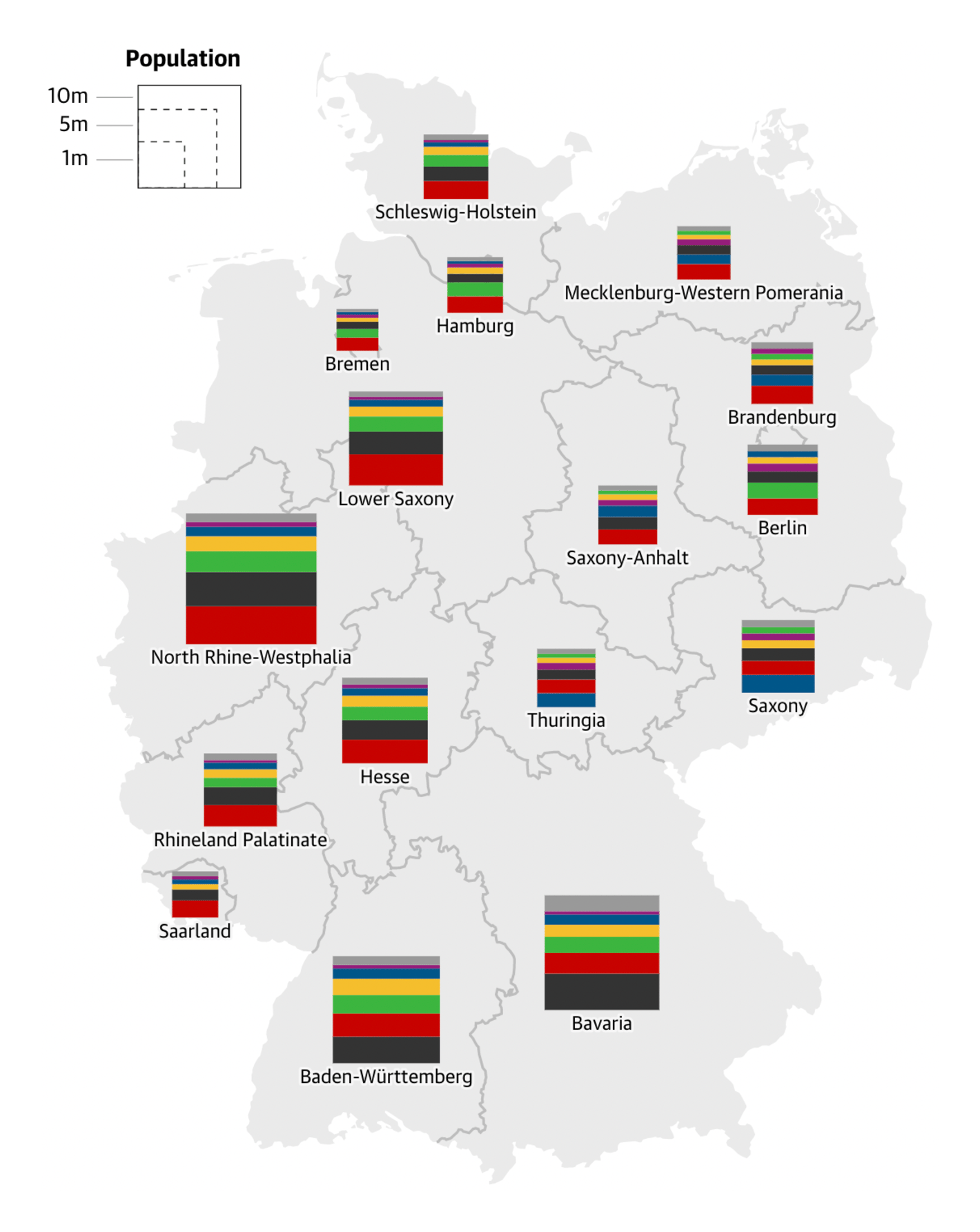
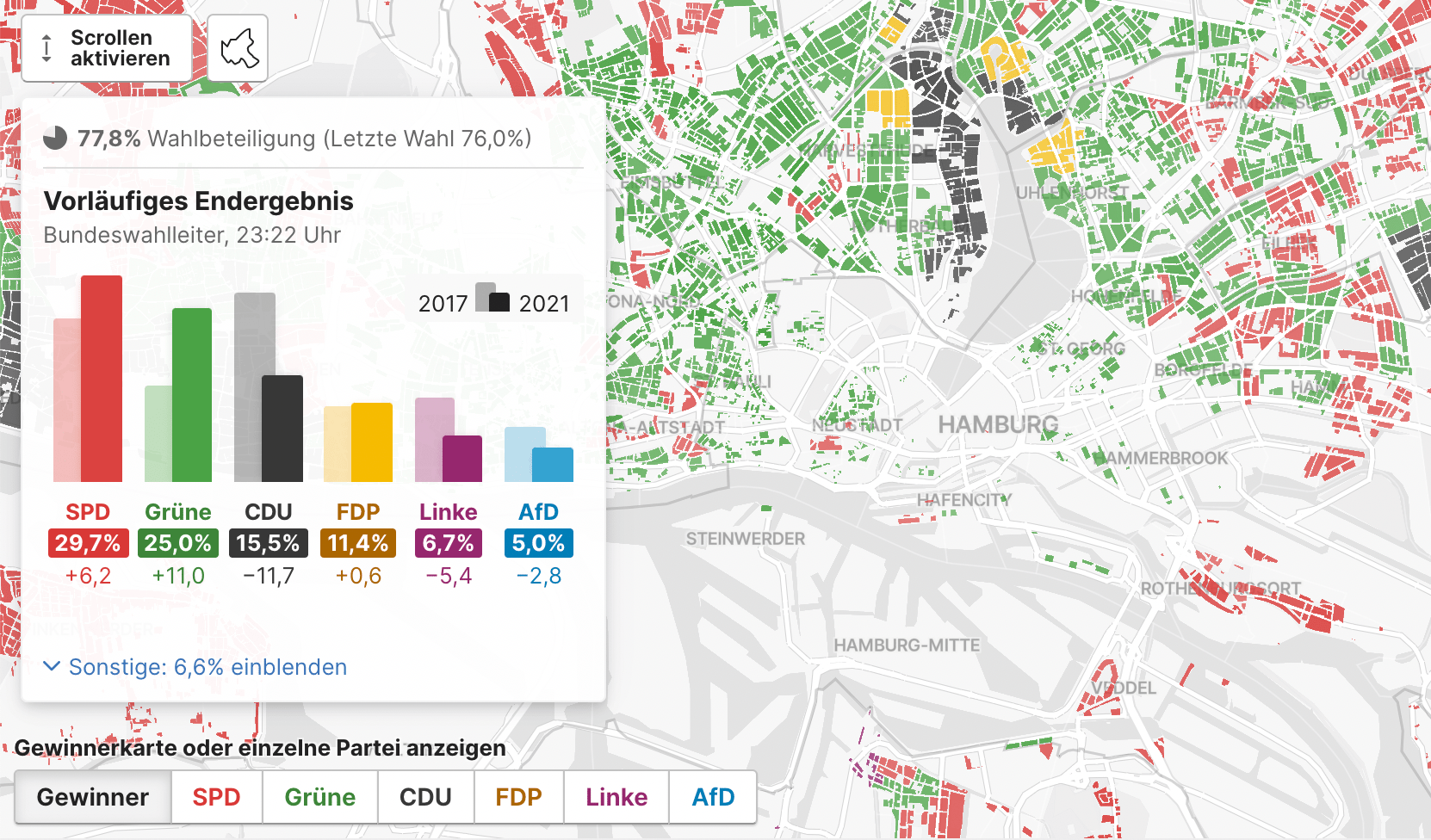
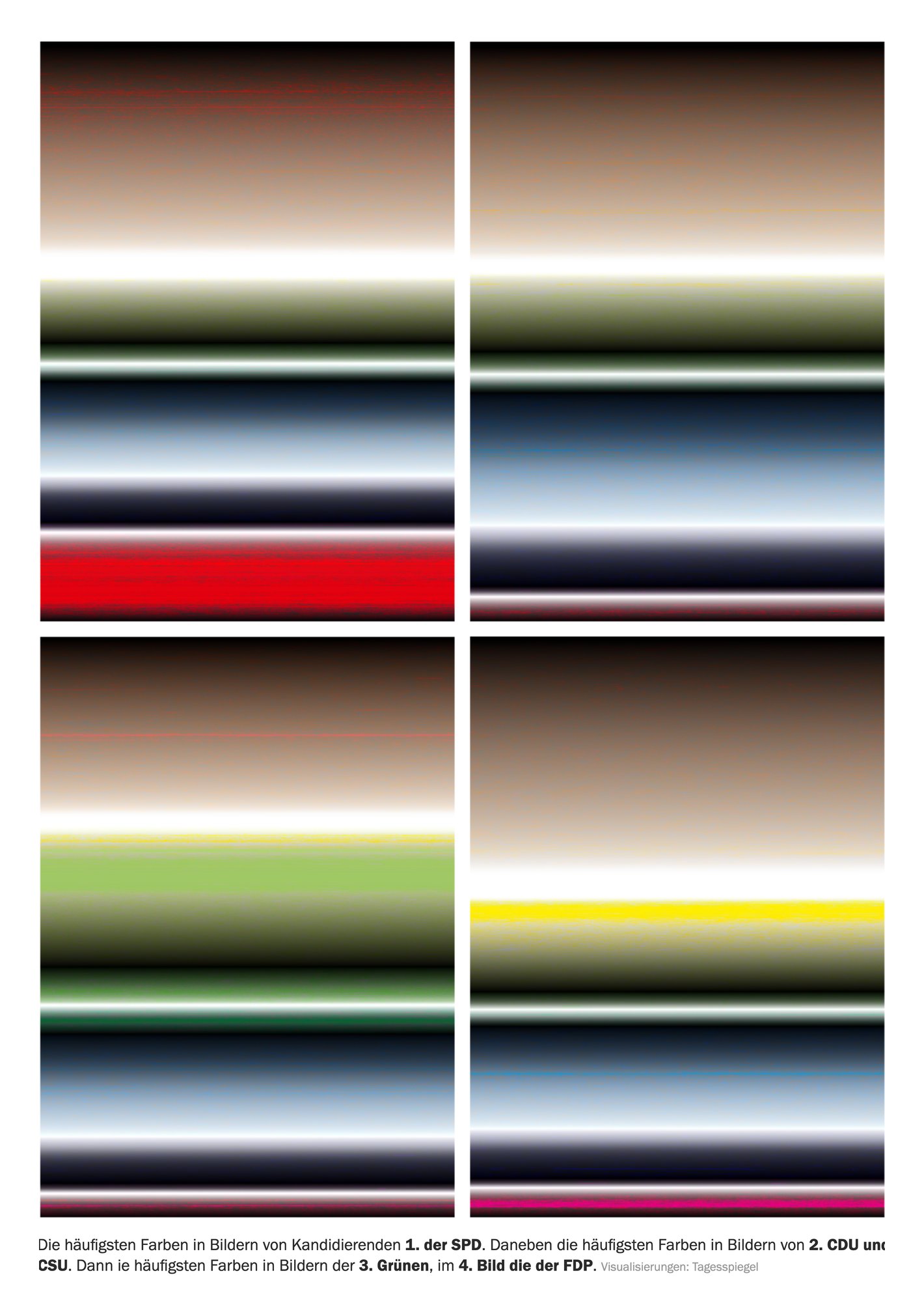
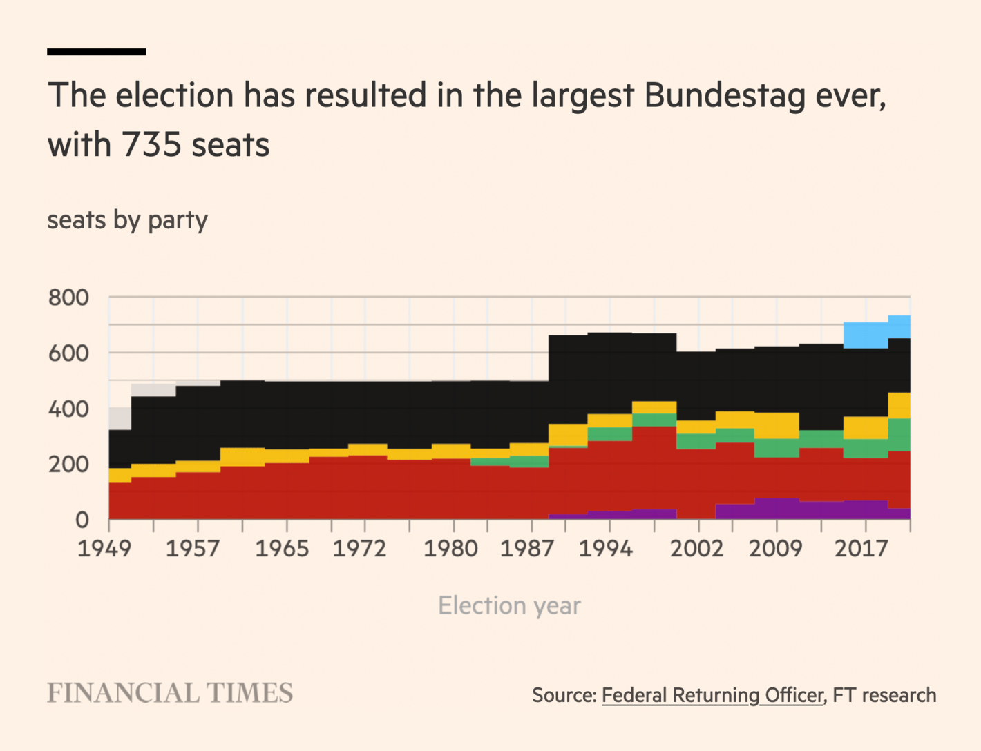
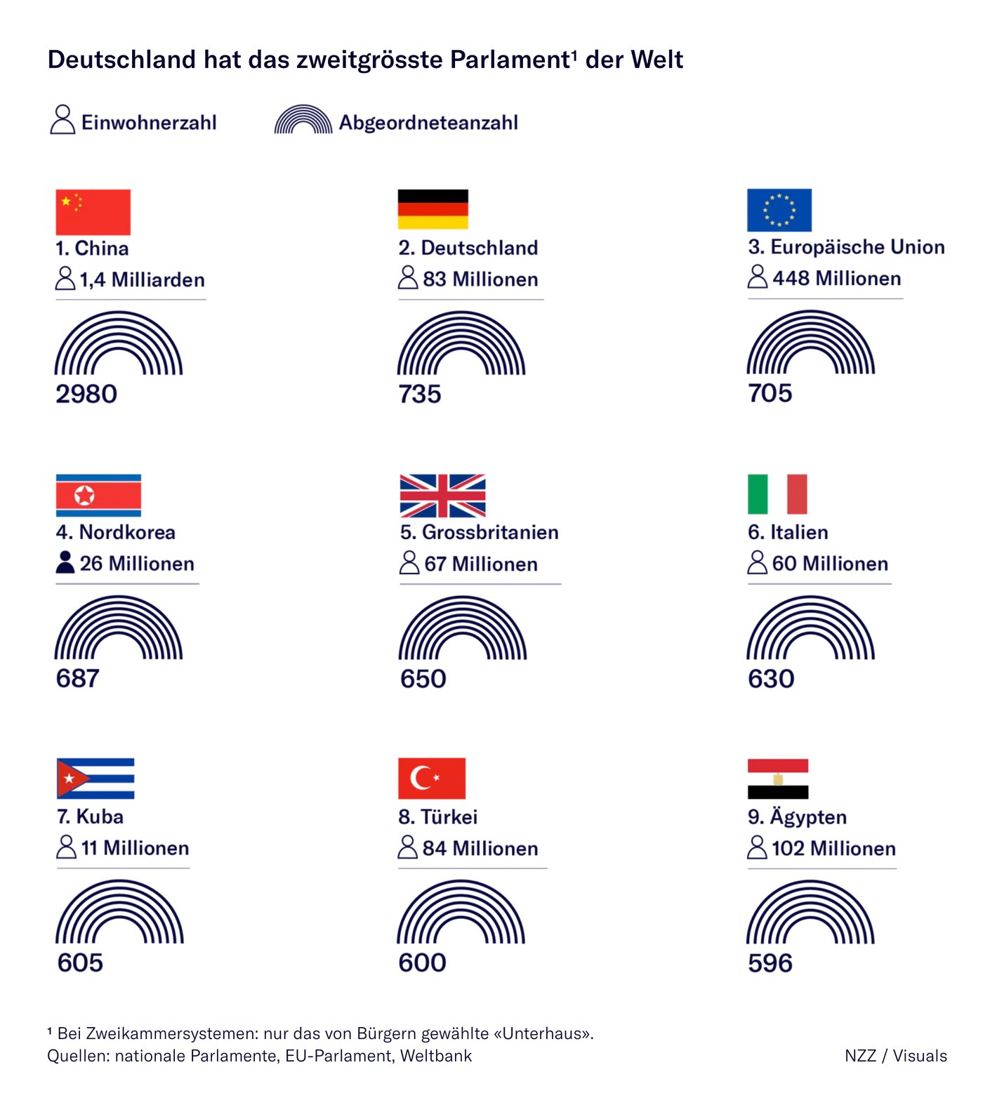
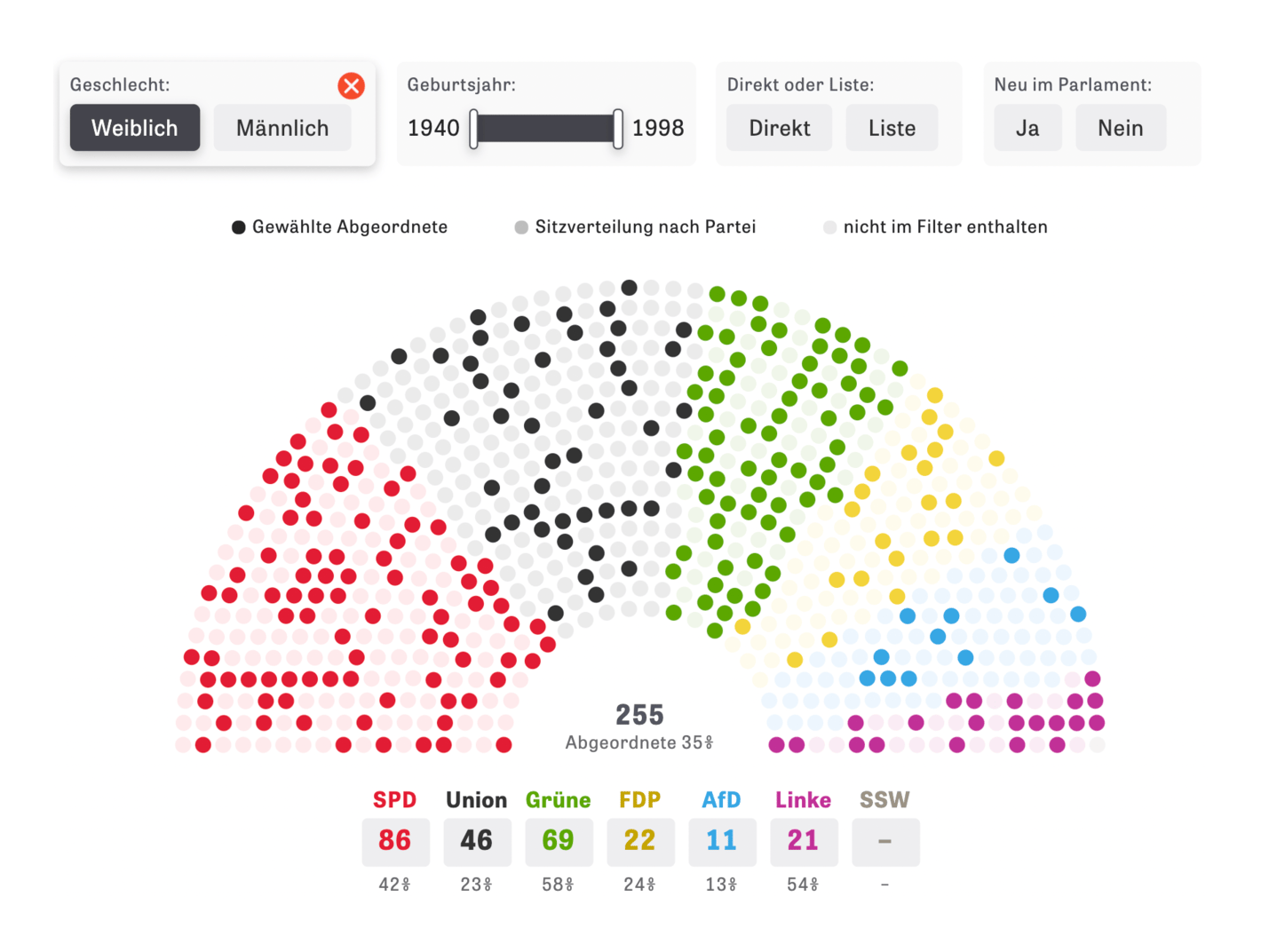
And wow, what a week! Dozens of people in Germany and worldwide visualized the results of the German federal election on Sunday. You all created some astonishing live-updating charts and maps (while barely getting any sleep). Thank you! This Dispatch is full with them.
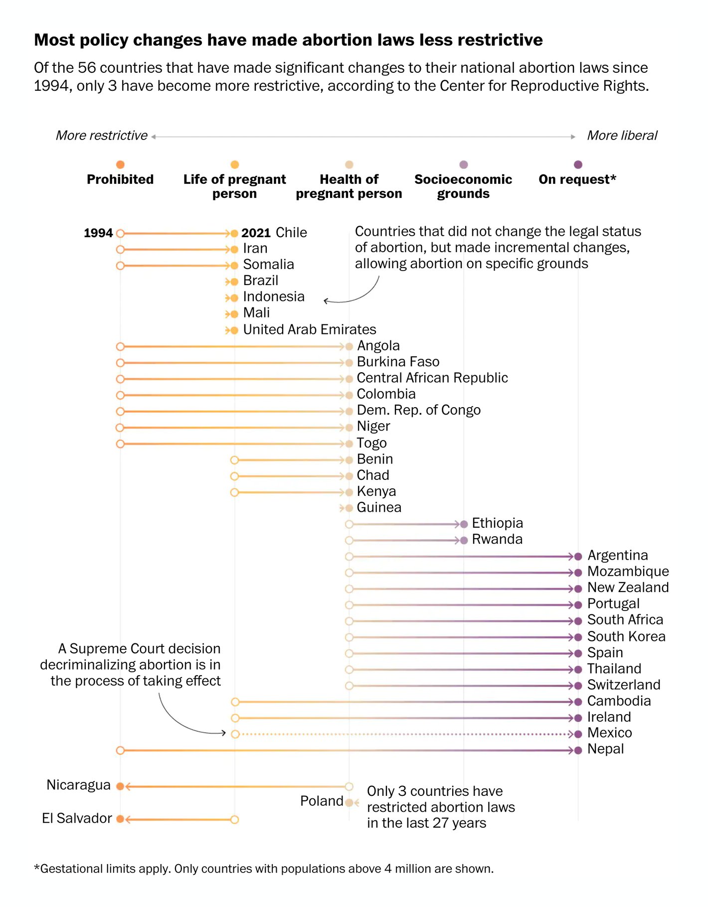
Other recurring topics include the climate, abortion laws, migration and covid-19.
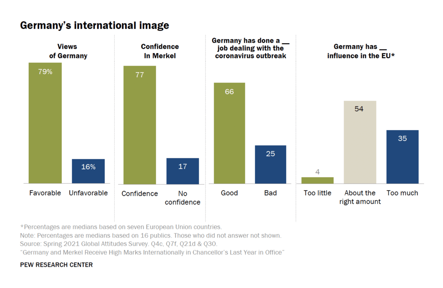
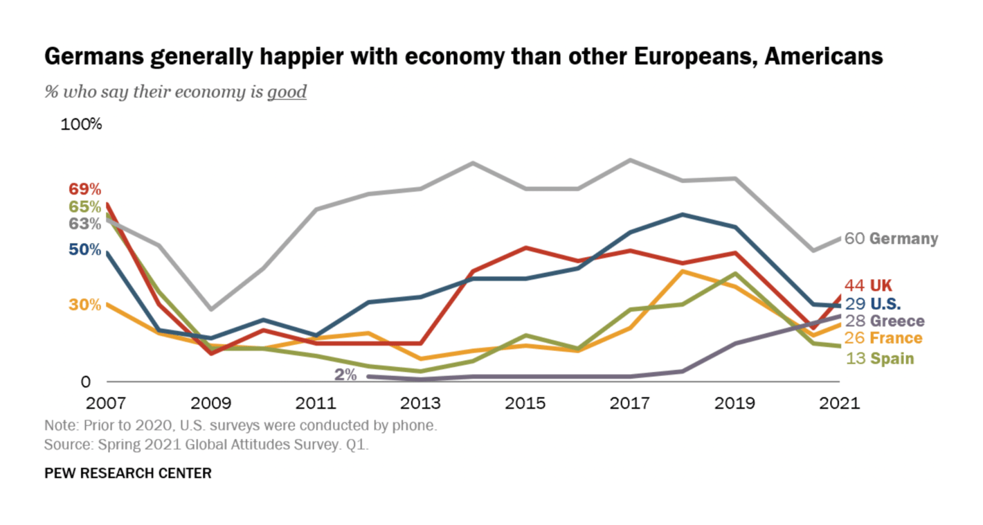
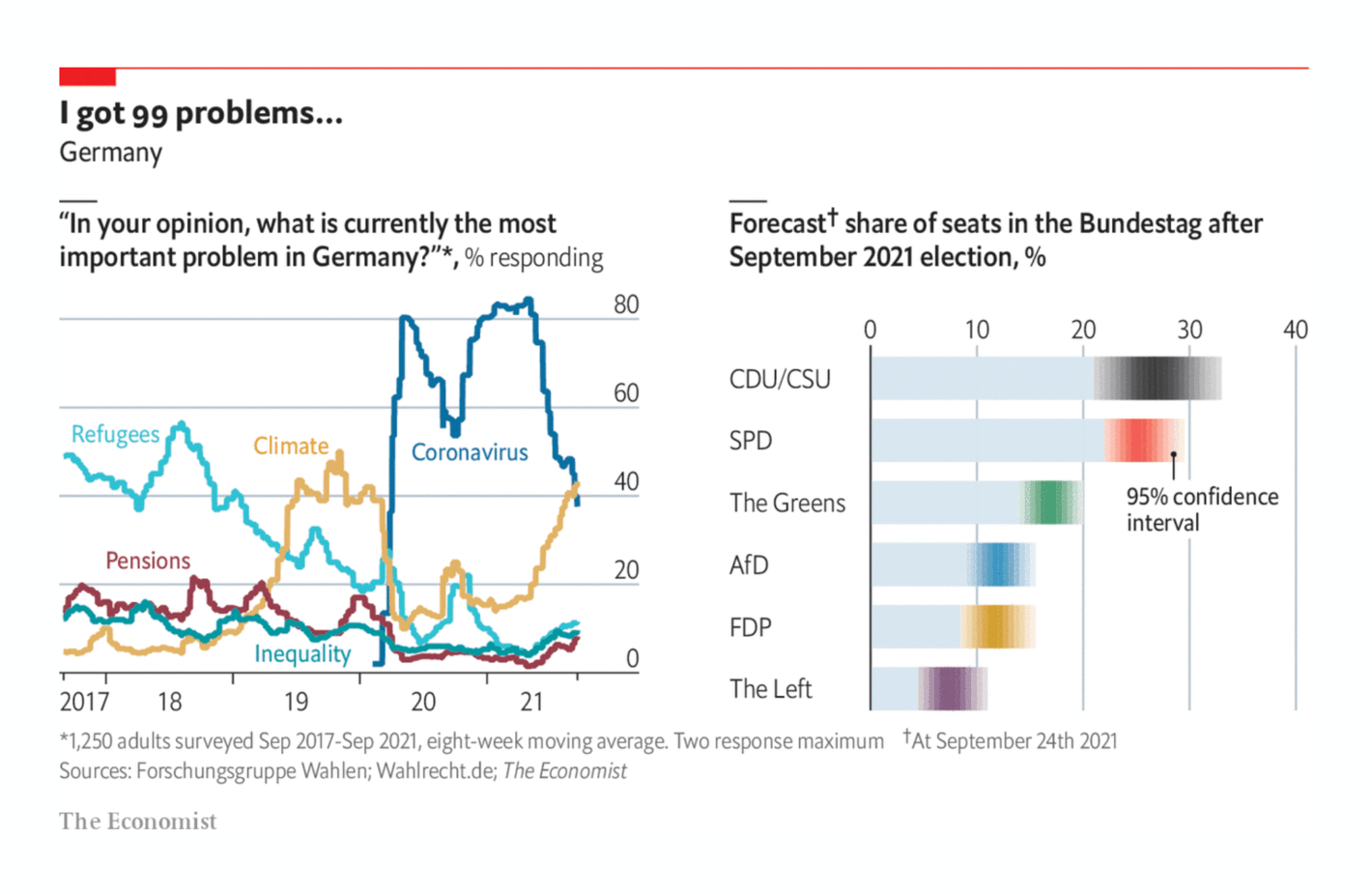
But even before the election, newsrooms were on fire. How does the German election work in general? How happy were Germans before the election? And how happy was the world with Germany? Lots of newsrooms already covered election-related questions before Sunday:
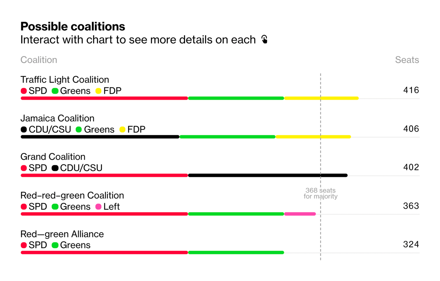
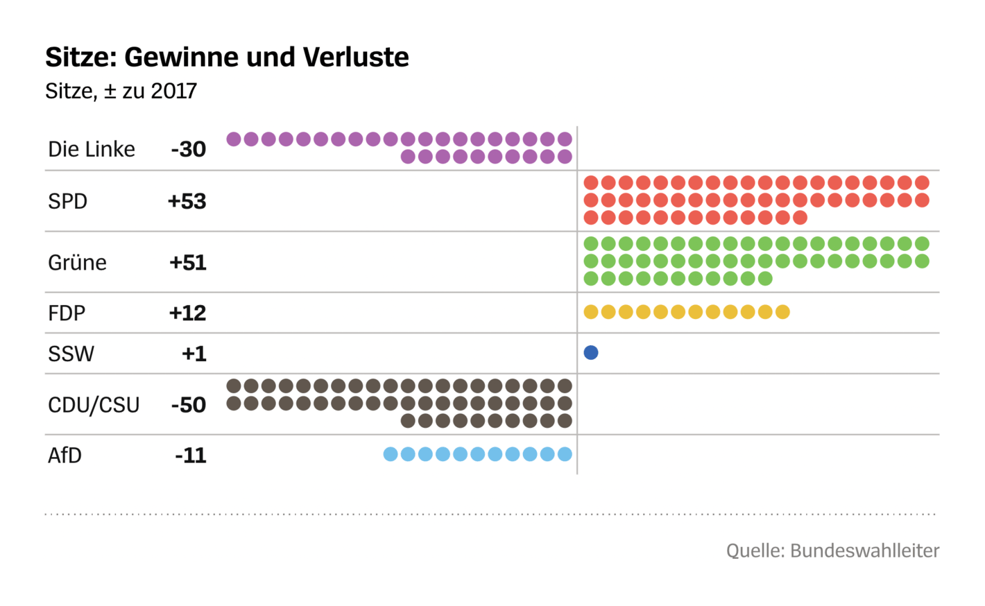
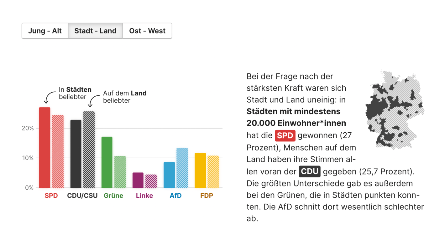
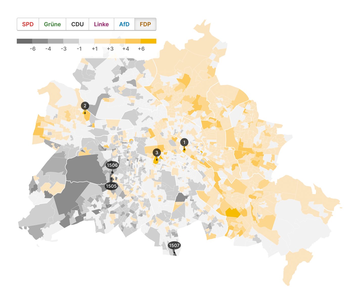
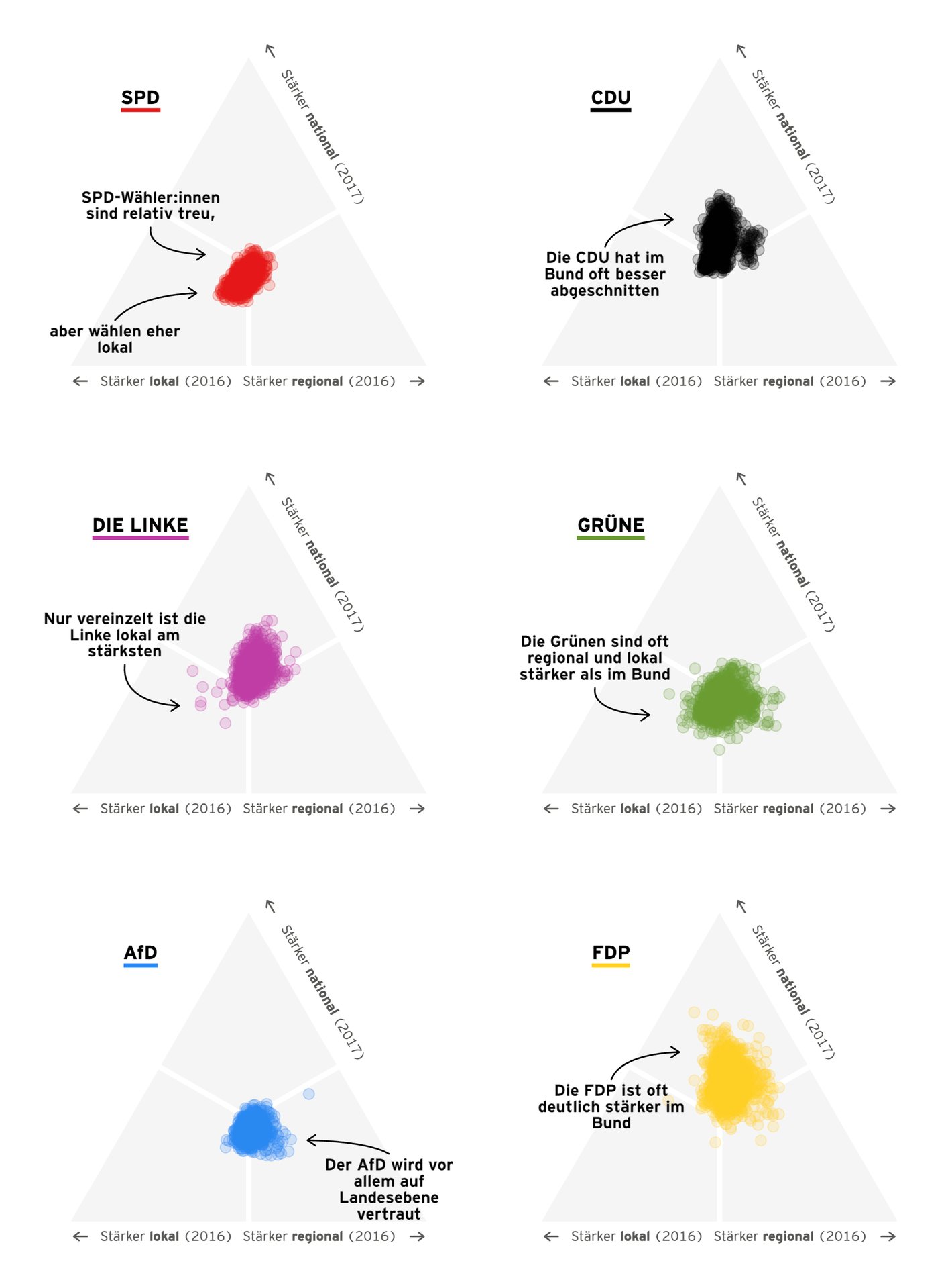
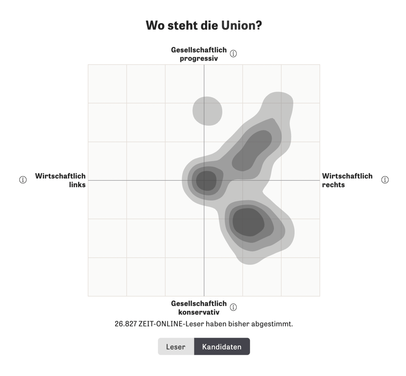
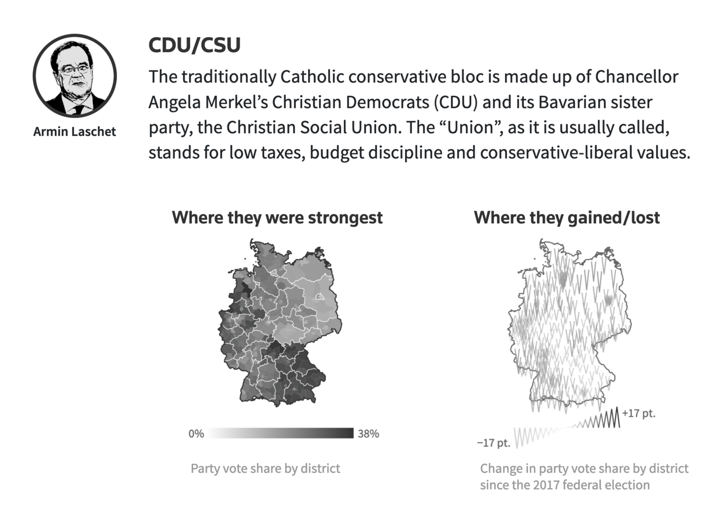
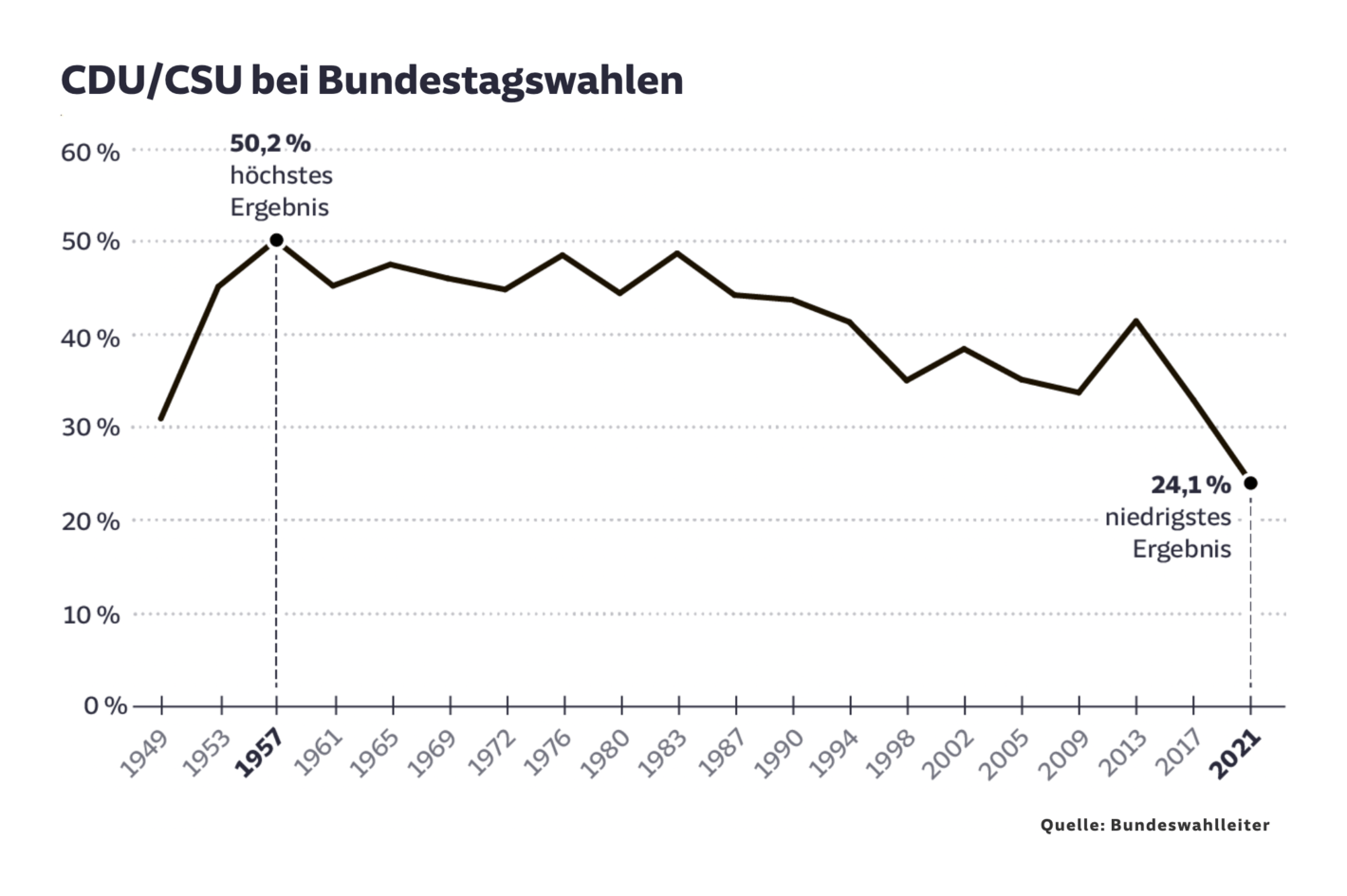
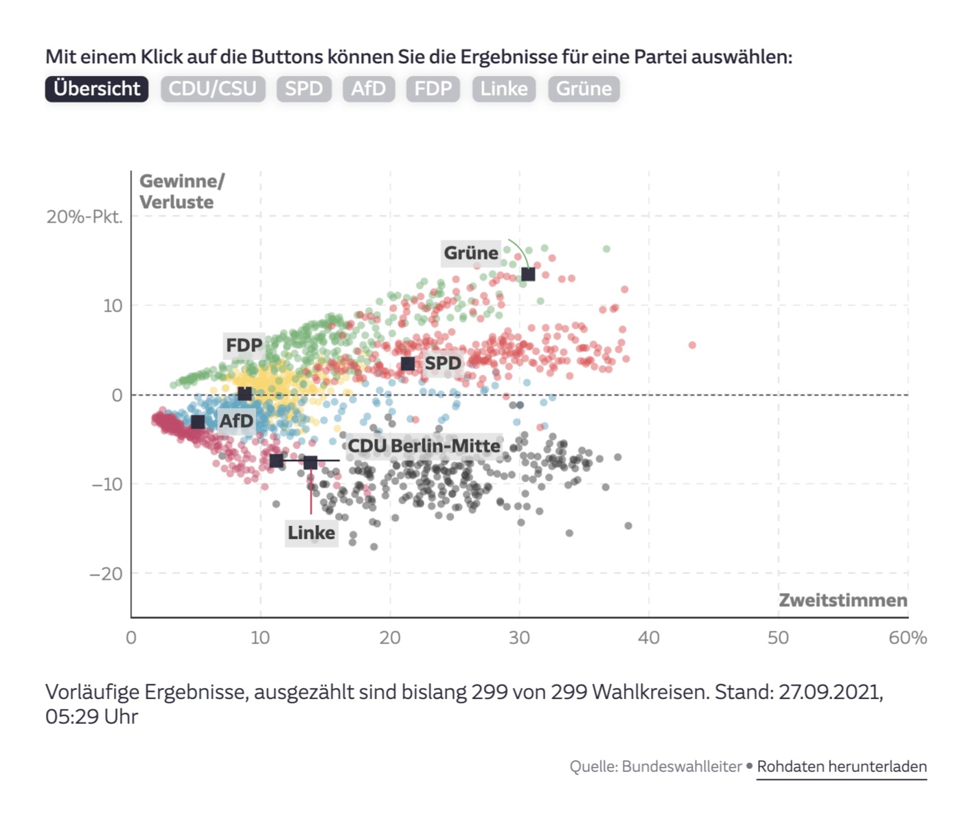
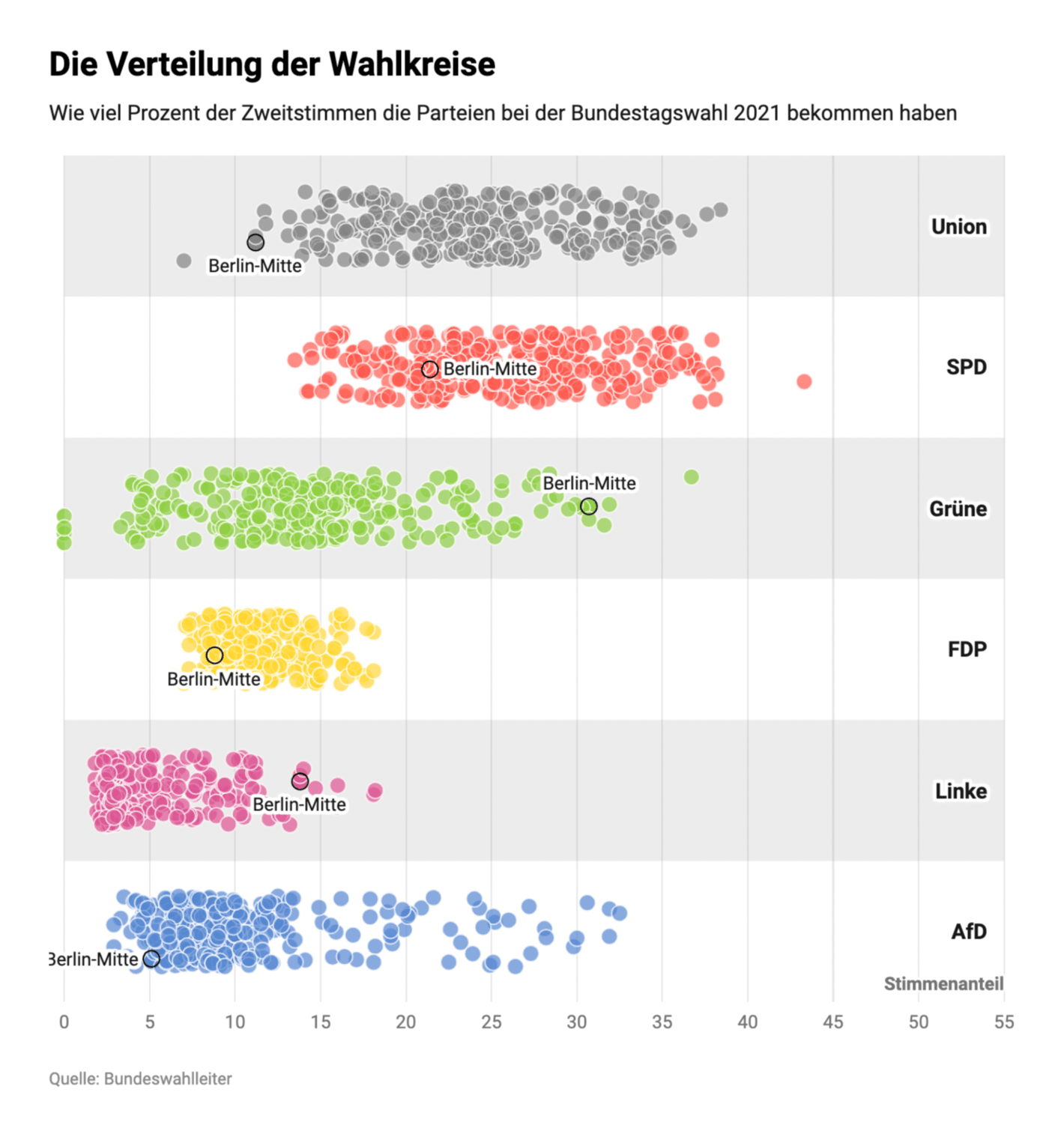
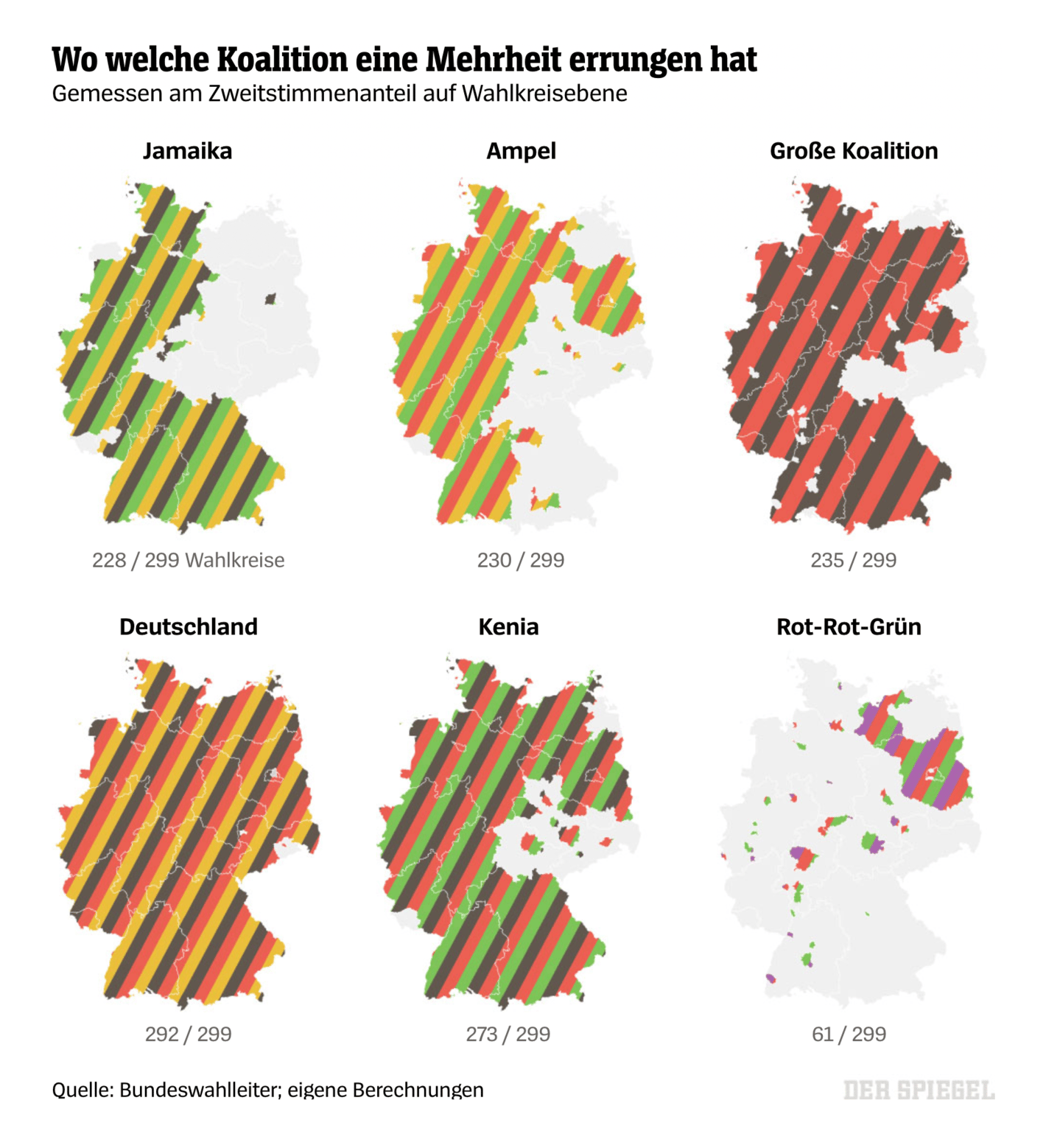
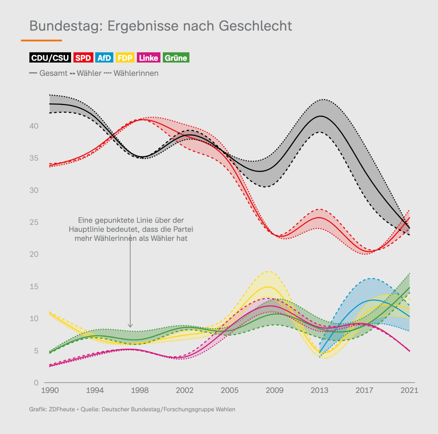
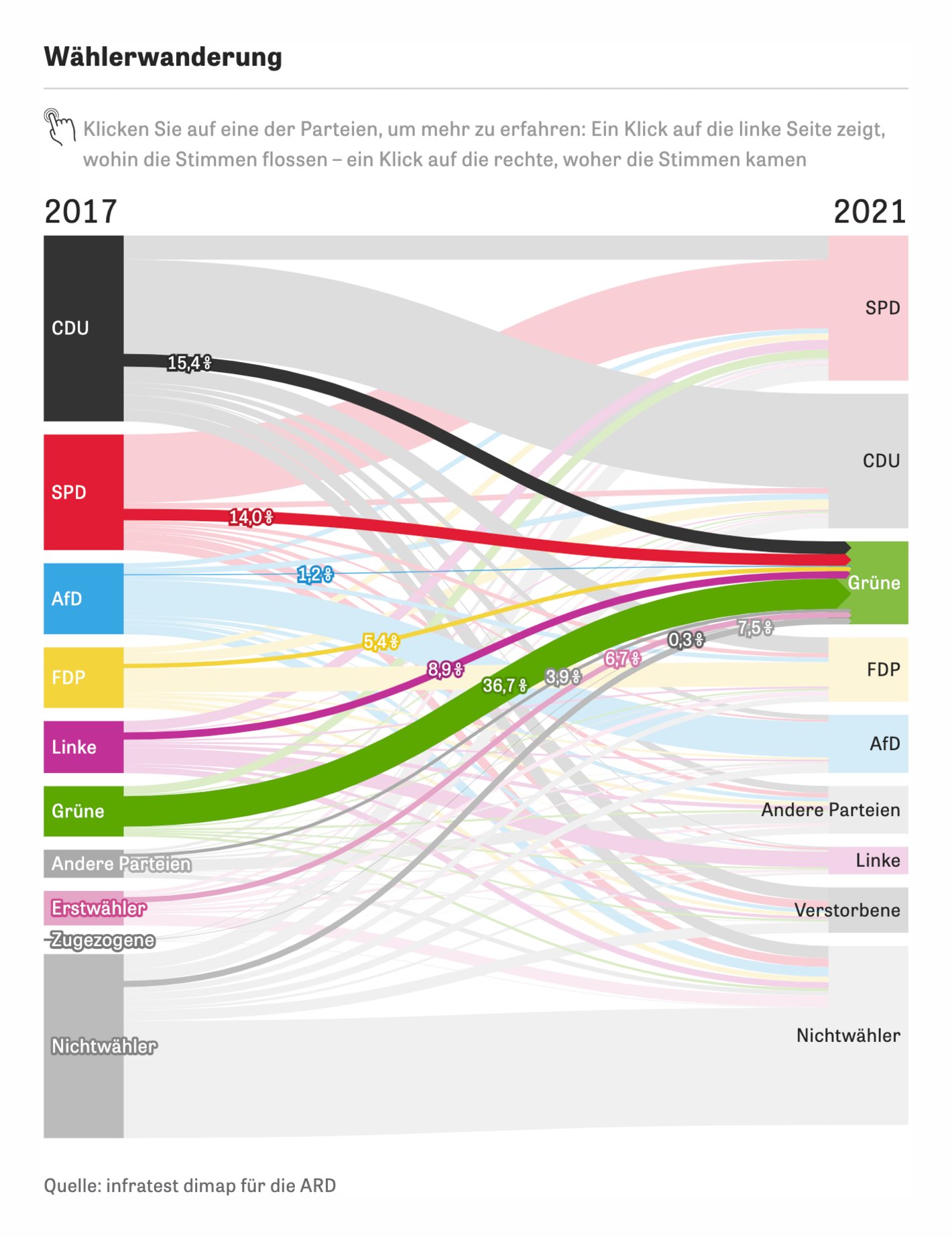
And of course, the classic election analysis followed a day later. Which coalitions got a majority of votes where? Which voters decided differently than in 2017?
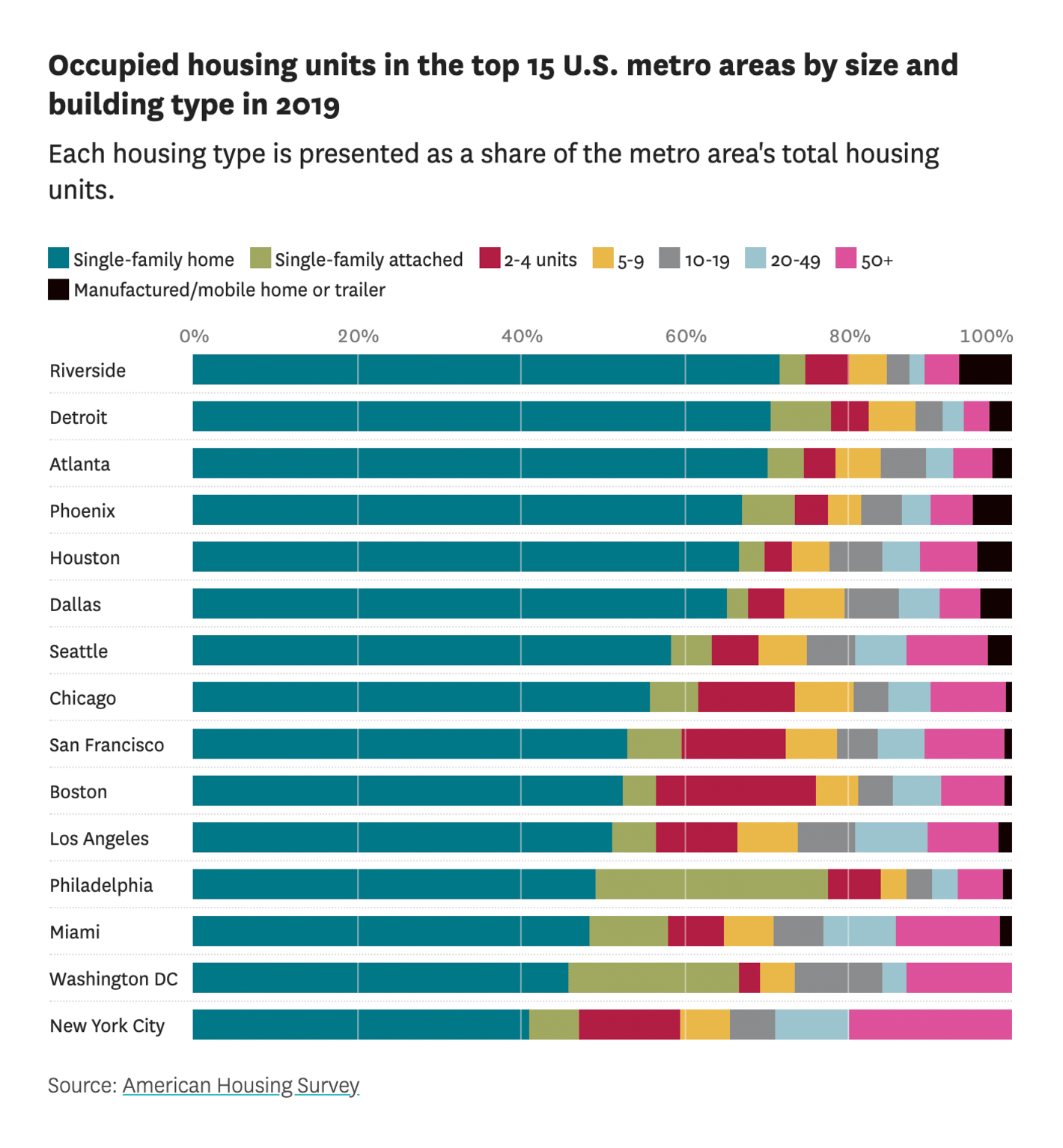
Datawrapper is based in Berlin, and here we also voted for or against a referendum that could transfer more than 200,000 Berlin apartments into public ownership. Housing is a big topic, not just in Germany:
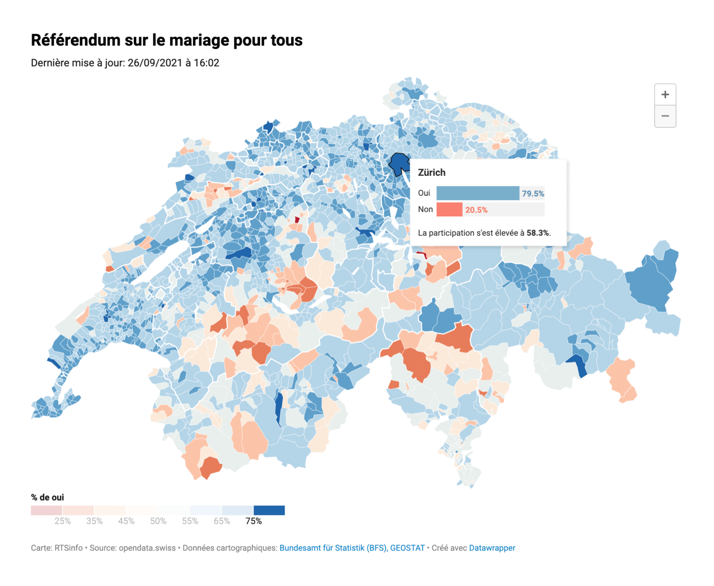
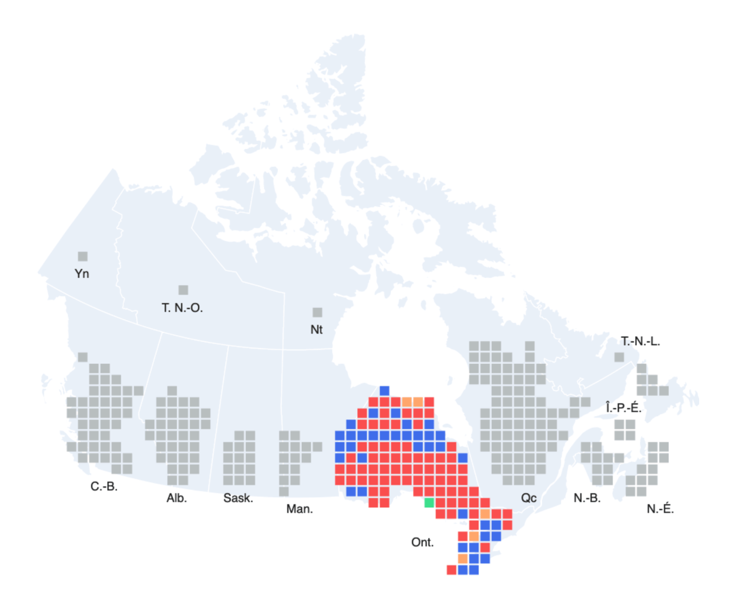
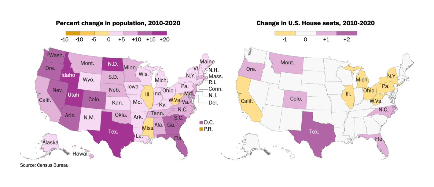
But politics also happened in other parts of the world. Swiss voters decided they want same-sex marriage to be legal. And U.S. parties are still trying to figure out how to redraw the borders of electoral districts to their advantage.
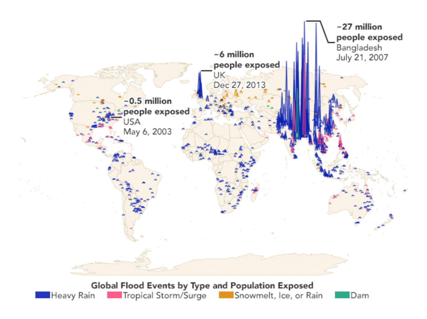
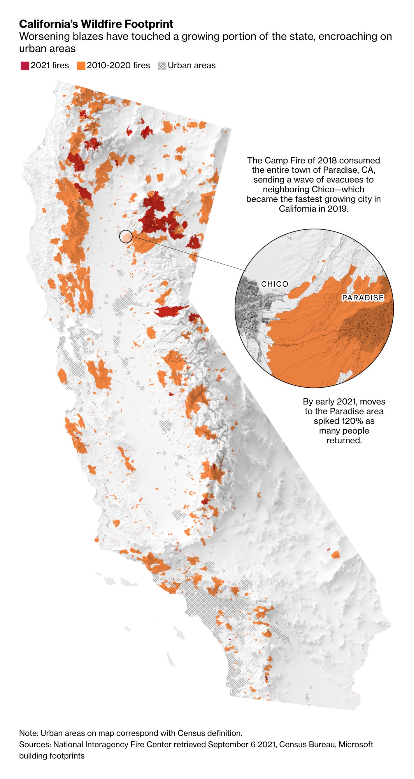
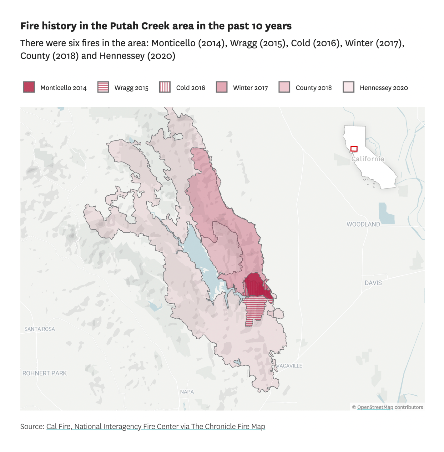
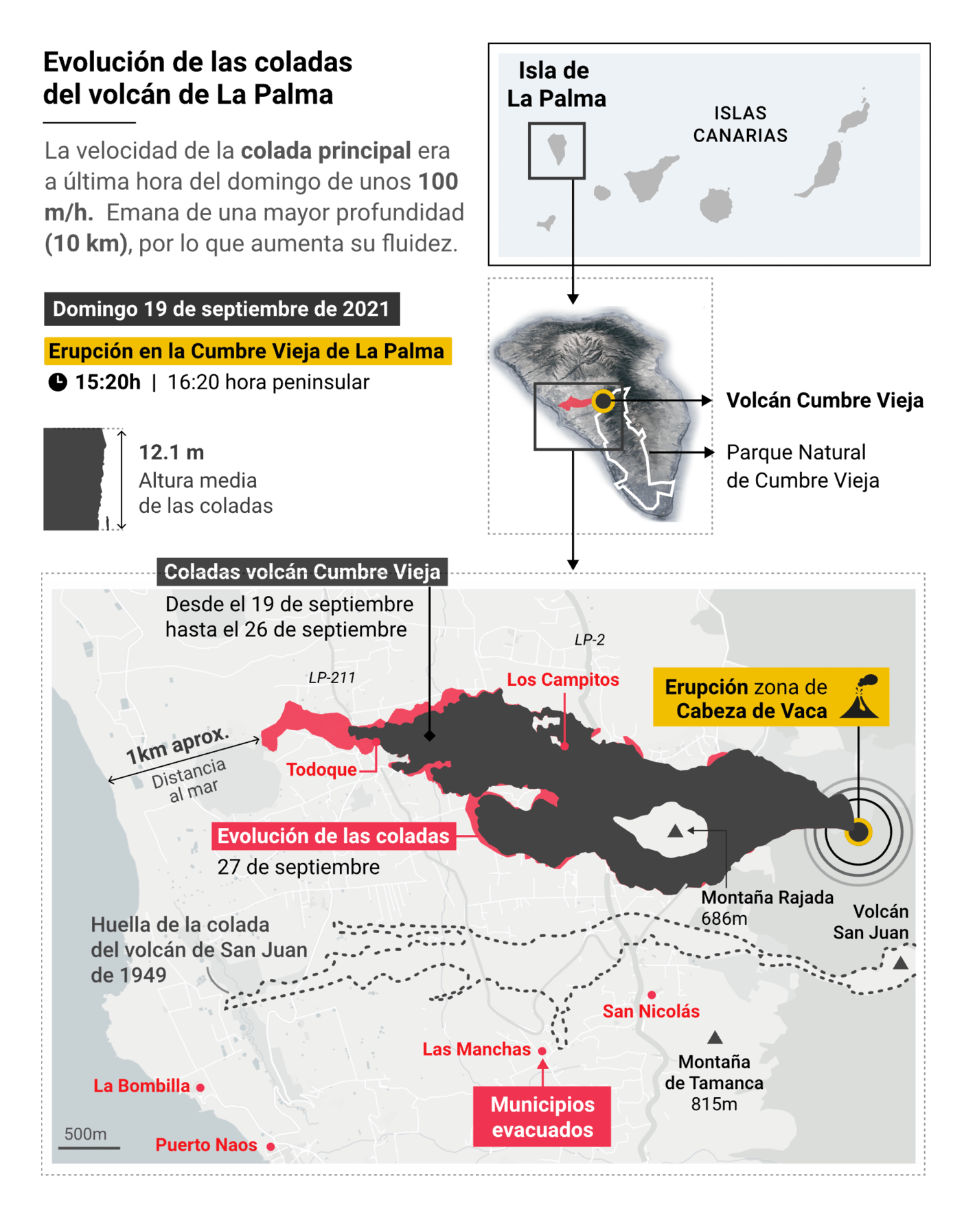
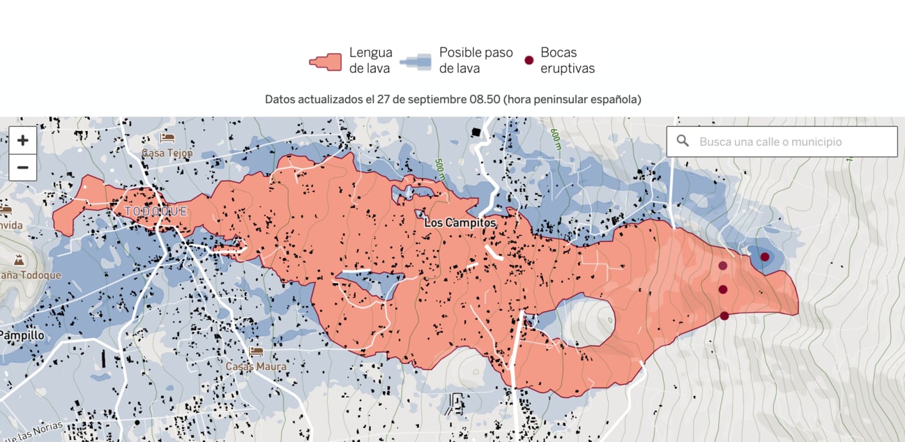
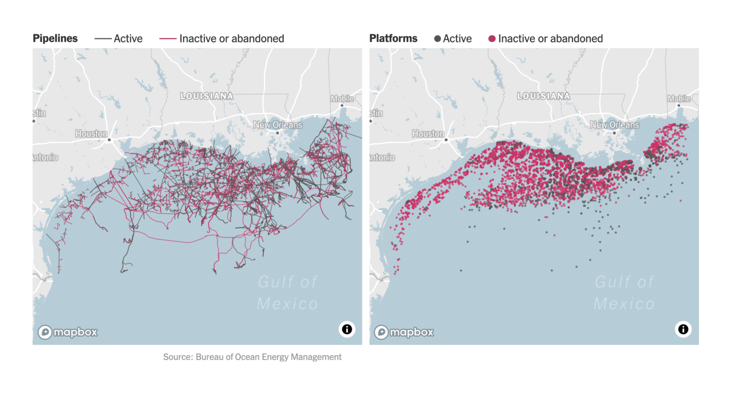
When it comes to the environment, we saw new maps and charts on old disasters: The fires on the U.S. west coast, the volcano eruption on La Palma (find more visualizations about that here), and oil spills in the Gulf of Mexico:
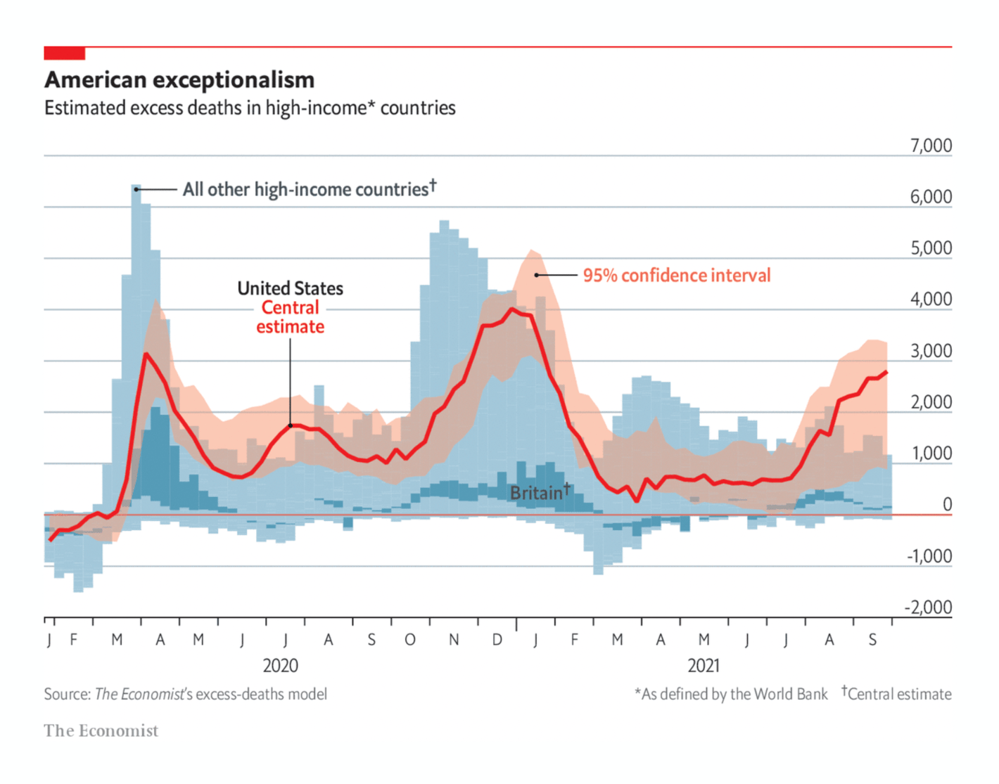
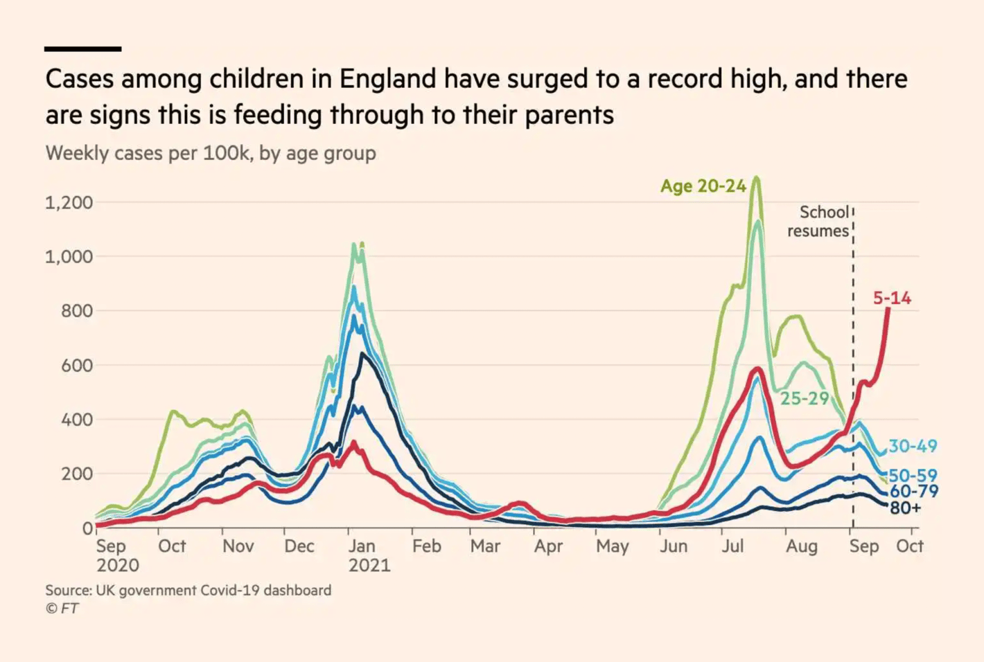
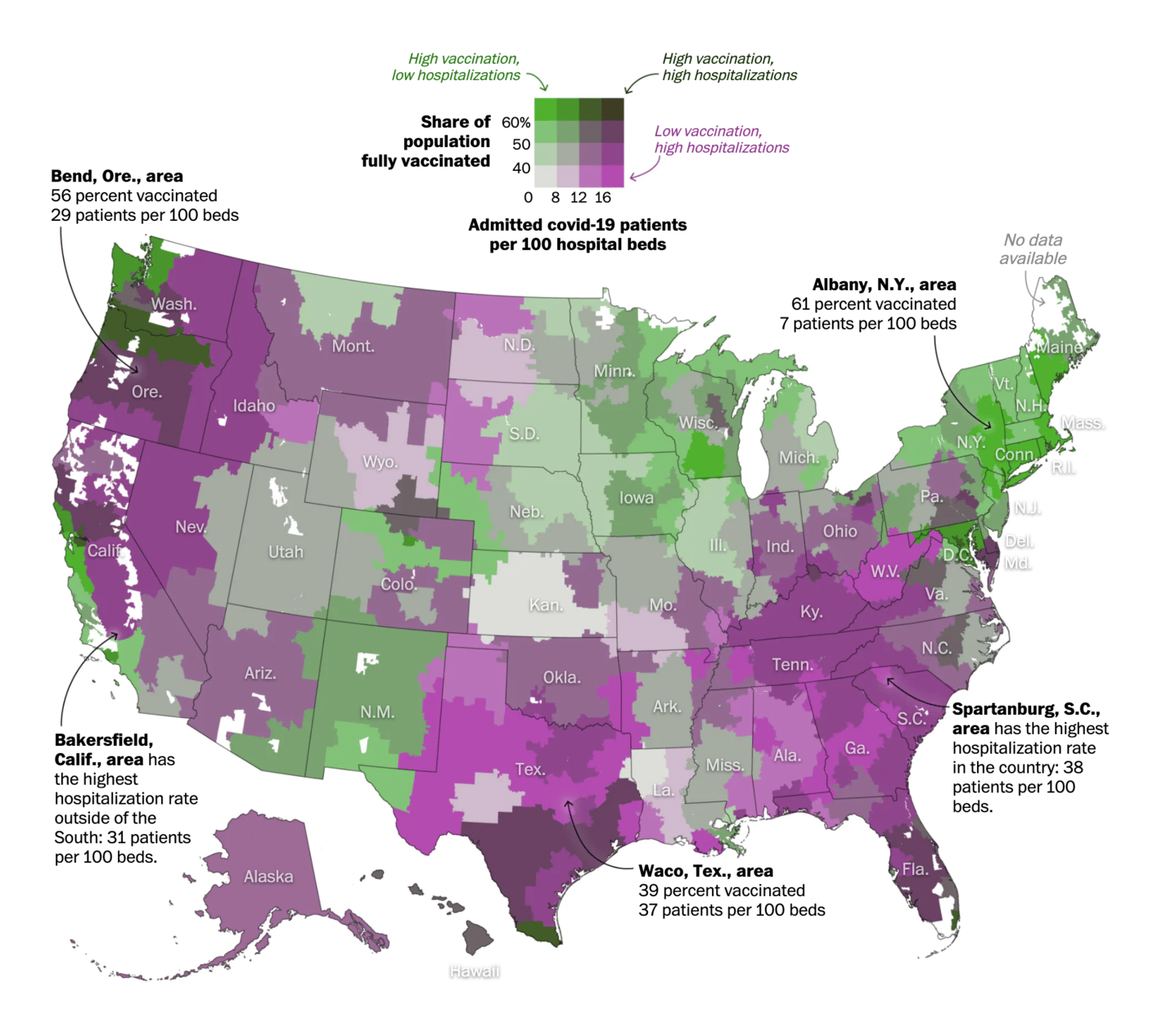
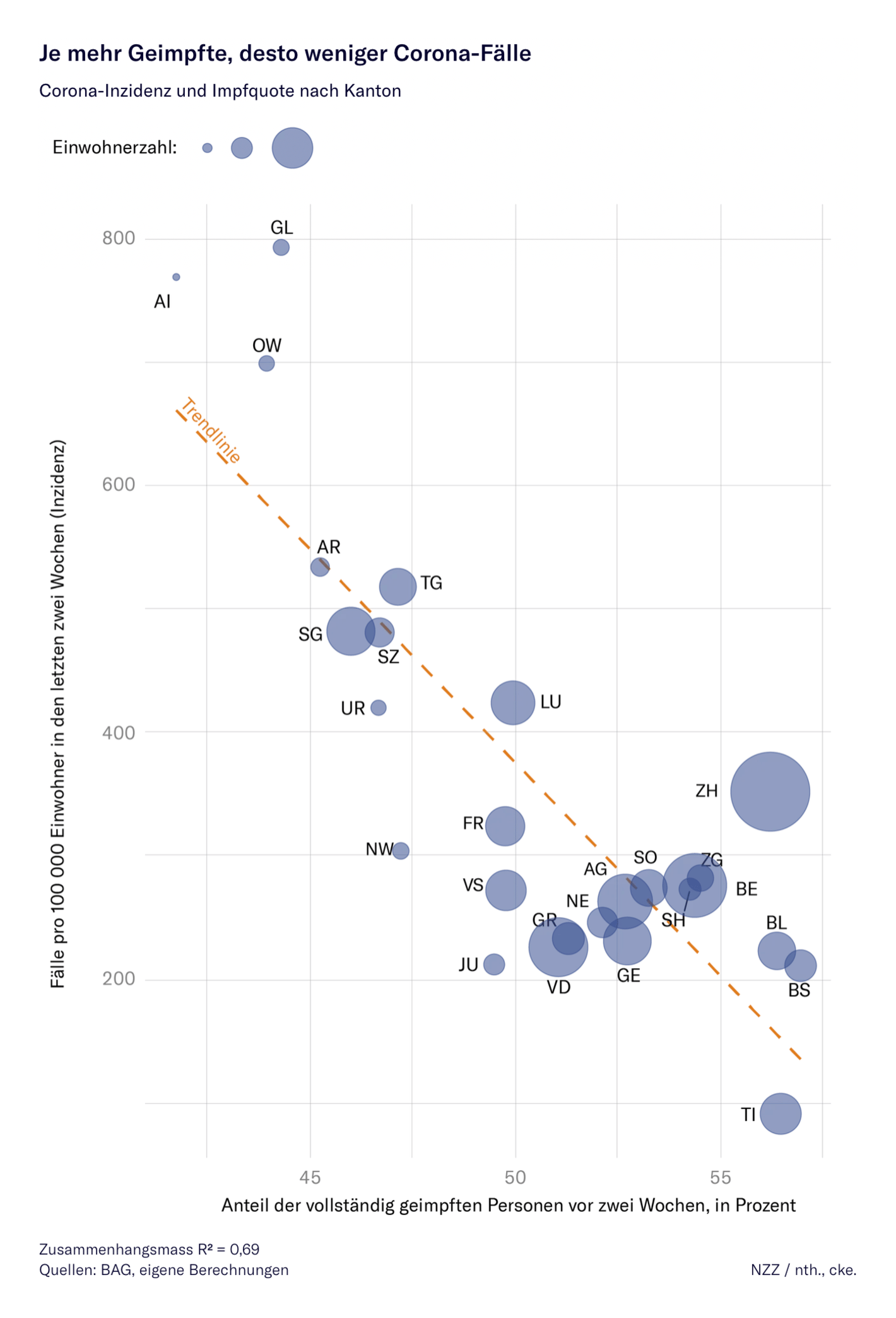
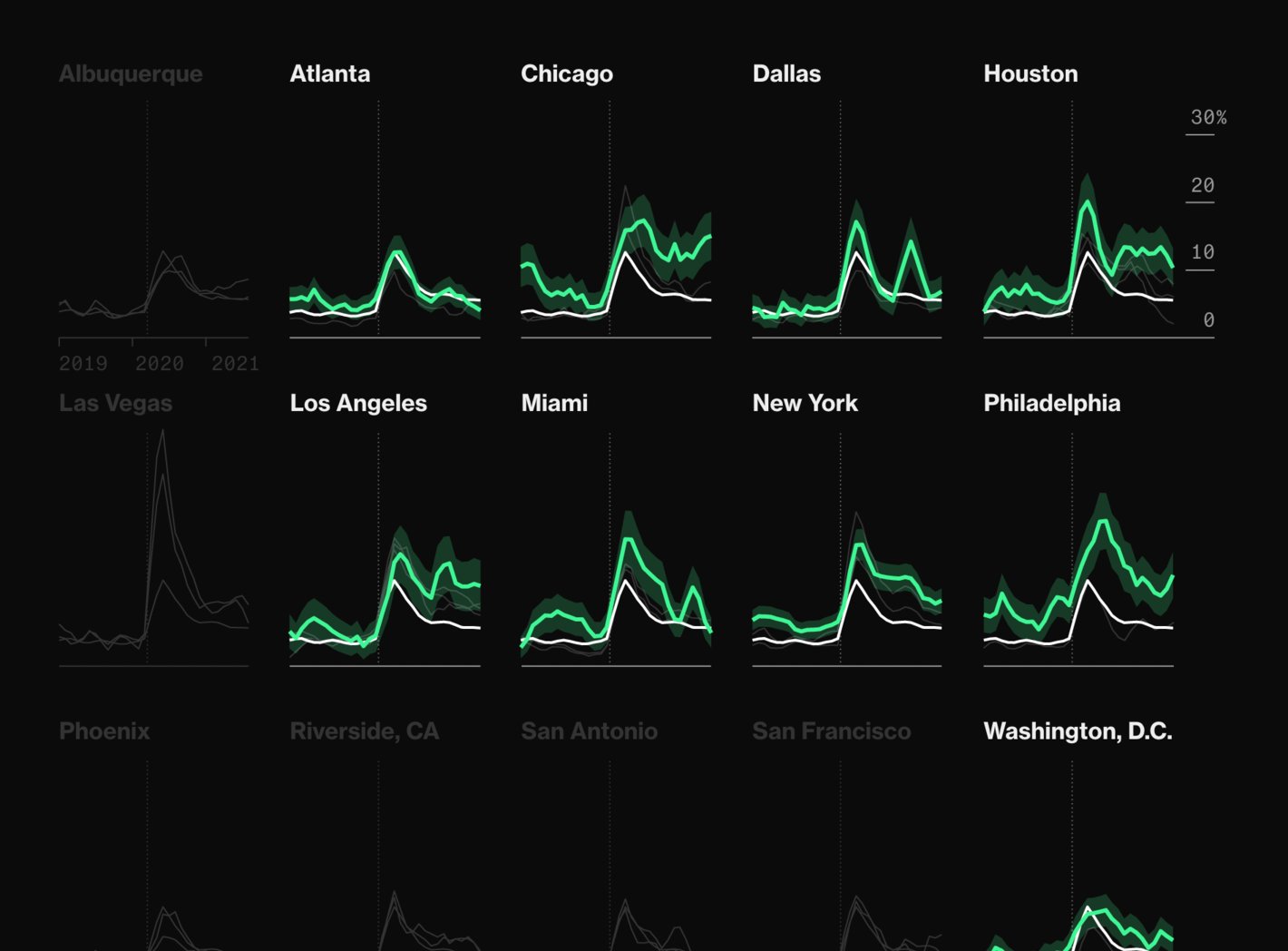
We'd love to tell you that covid-19 isn't visualization-worthy anymore – but while cases are decreasing in many countries (again), the pandemic isn't over yet:
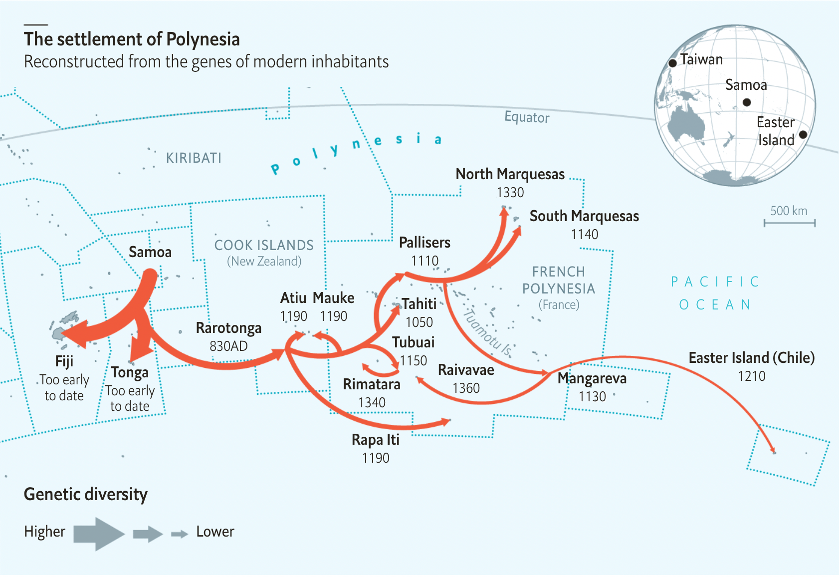
And we saw two good-looking visualizations about people moving this week – one by The Economist about migration that happened hundreds and thousands of years ago, and one by Reuters about migration in the past months:
Tyler Morgan-Wall: "New #dataviz! The Earth's submarine fiber optic cable network, visualized in #RStats with #rayrender" (Tweet), September 22South China Morning Post: Coming to the light. The Ghent Altarpiece restoration, September 21
Help us make this dispatch better! We'd love to hear which newsletters, blogs, or social media accounts we need to follow to learn about interesting projects, especially from less-covered parts of the world (Asia, South America, Africa). Write us at hello@datawrapper.de or leave a comment below.