Data Vis Dispatch, July 8: 200th edition — behind the scenes, Q&A, and new features

Welcome back to the 200th edition of Data Vis Dispatch! After four years of publishing our format celebrating data journalism, data visualization, simple charts, elaborate maps, and their creators, we're taking a pleased look back and commenting on its development, current state, and future.
How did the Data Vis Dispatch get started?

Lisa
When I first got interested in data visualization, I loved finding long lists of great charts and maps, like Tiago Veloso’s recurring collections on his Visualoop blog, and Andy Kirk’s monthly “Best of the visualisation web.” Tiago posted the last of his collections in spring 2017, and by 2021, we had to wait longer and longer for new editions from Andy. People like me were mostly dependent on skimming Twitter for the latest data vis, which wasn’t ideal — I felt like there was something missing in the community.
As the only person working on Datawrapper's communications at that time, I couldn’t pull this off myself. But when we hired Rose in May 2021, I knew I wanted her to be in charge of the project. When I presented the idea to her and the Datawrapper co-founders David and Gregor in mid-June, they were sold immediately, and wanted us to start as soon as possible. In the next days, Rose and I made all the decisions for the new series. She came up with the name “Data Vis Dispatch”, which had such a nice ring to it. David Wendler, our head of design, suggested a grey background to make the visualization stand out; our developer Ivan adjusted the existing blog layout to make this (and many smaller changes) happen. After only a week of preparation, on June 22, Rose and I published the first edition of the Dispatch.

Rose
One of my first projects after joining Datawrapper was to develop this idea for a “charts of the week” series (as we called it at the time). The core concept — a weekly update for the data vis community — was already in place, but what did that mean exactly and how should it look?
Most of the decisions we came to for that first edition are still the way we do things today. For example:
The Dispatch is strictly limited to new work published in the last seven days. The world of data vis is just too big to cover without this rule!
We actively strive for an international and multilingual scope.
Newspapers and data journalists are our main sources, but not our only ones — great visualizations from business, government, nonprofits, and individuals are also fair game.
The visualizations are grouped thematically, to give structure to the post and help readers orient to charts in languages they can’t easily understand. A few lines introduce each group and its significance in the news or in visualization.
We do subscribe to and screenshot publications with paywalls. After reaching out to many outlets to gauge their stance on this, it felt clear that this could benefit both them and our readers by offering a bird’s-eye view of where the best visualizations are published.
Where do the visualizations come from?
Rose
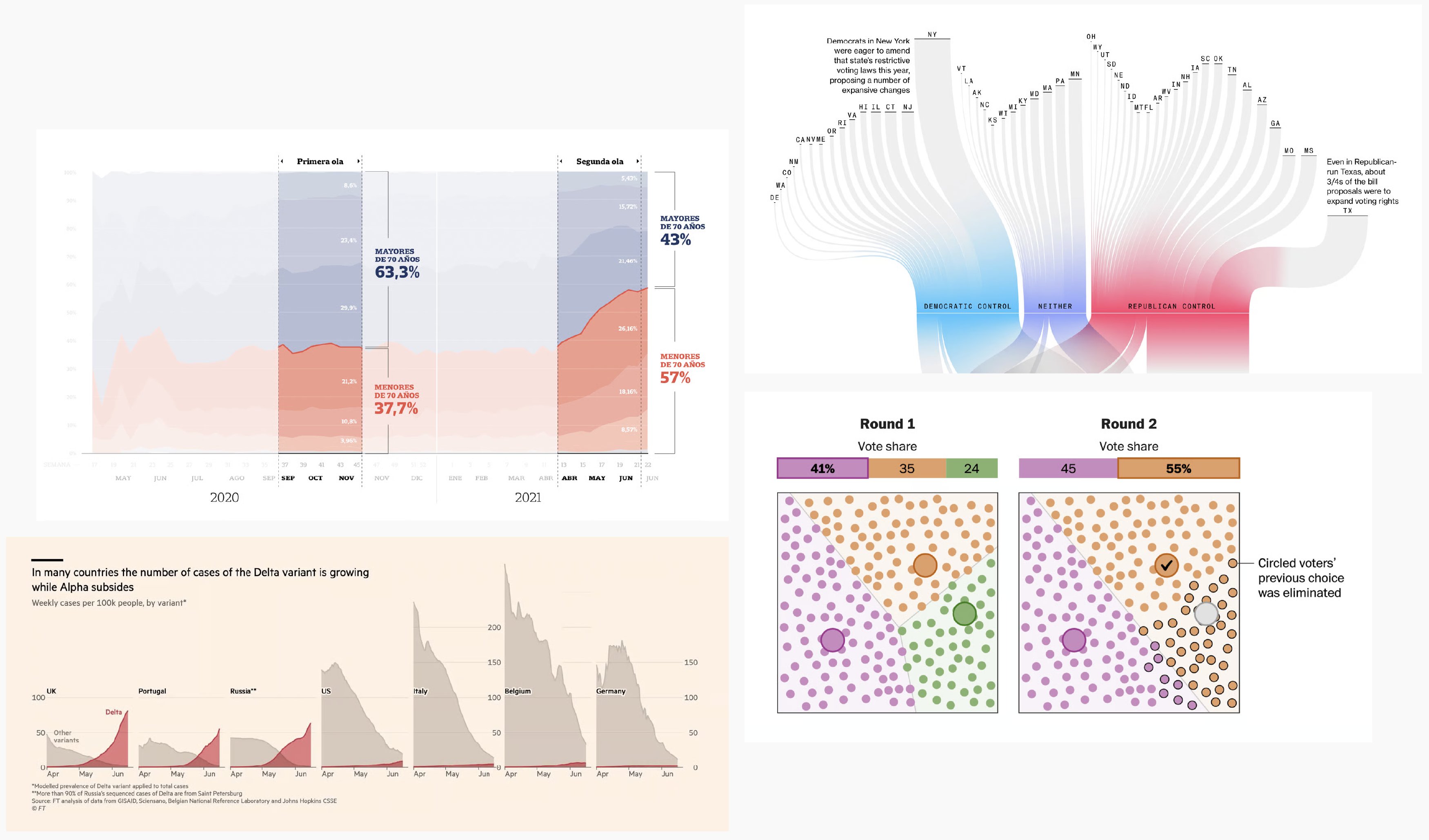
Our goal for the Dispatch was to create a centralized source for following new work in data visualization. Which means we had to be the ones to track it down in the first place! I spent most of my time in the first few months building up a Twitter list and RSS feed that formed the core of our sources — everything from official graphics desk pages, to individual journalists and practitioners who posted their own work, to bloggers who shared interesting stuff. A big part of that research was trying to tap into international networks of data vis professionals who weren’t already as connected to the English- and German-speaking circles we knew best.
And that project never ends! Keeping the Dispatch fresh means always looking for interesting new creators, subscribing to new small publications, and joining new social media platforms.
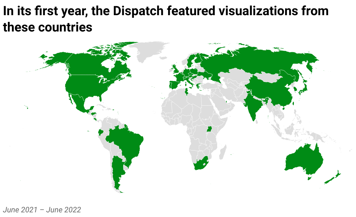
Our geographic coverage in the first year of publication.

Jonathan
Now, I'll usually start the morning by checking our large collection of bookmarked websites, which contains mostly newsrooms along with some lovely blogs and personal archives.

Since X died, Bluesky is now our main platform to collect from. We maintain a list with newsrooms and agencies, but it crucially includes individual journalists and designers too. This is a pretty dynamic space to catch up with topics in the community. With this and the bookmarks, I can usually gather a good amount of quality data vis already, and get an idea of how it could be structured.
Lastly, there are a few sources with smaller yield: The four X accounts (literally) who haven’t yet moved to Bluesky; some newsletters; and our internal channel for Datawrapper employees to share their discoveries.
How do you choose what to include?

Vivien
Collecting visualizations for the Dispatch is mainly about clicking hundreds of promising links — sometimes so interesting it’s hard to not get sidetracked — closing a fair amount of them again, and carefully selecting which ones to keep. Publishing the Dispatch has given me the habit of saving any intriguing charts I come across during the week, be it through Reddit, LinkedIn, or friends that send me links knowing I'm the one who’s always interested in data vis.
Choosing is the harder part. We don’t have a fixed set of criteria but rely on a multiple-eyes process. If I’m not 100% certain about a visualization, I always have the security of discussing it with Rose. We all agree on certain principles for what makes a good visualization, but we highly value new approaches and ideas. The perfect bar chart might be a technically better visualization than an unusual and risk-taking project that takes longer to understand, but both are equally valid here. After all, an integral part of this format is sparking ideas in other creators.
Jonathan
When collecting material, we of course value aspects like legibility, good use of color and typography, and chart choices for the given data. Not everything needs to be perfect though — sometimes, a bit of a novel design may make a few sacrifices to present information in a more inspiring way. Accessibility and interactivity are also easy bonus points.
Every now and then, we discover an obviously outstanding project that is already more than a week old. The chance of missing thoughtful, less news-focussed work is a downside of publishing a weekly format, but we do our annual holiday special to make up for it.
Rose
In my mind, there are three ways a visualization can fit into the Dispatch: being technically flawless, conceptually thought-provoking, or capturing the state of the field this week.
Charts in the Dispatch don't need to be flashy — I'll happily include a standard line chart on a mundane topic . But when we do show such a chart, it's because it gets everything right. Elegant colors, perfect label placement, thoughtful annotations — the kind of visualization that really shows how it's done.
On the flip side, we might show a chart with some rough edges if it takes an interesting and valuable conceptual approach. Does the chart type fit the data in a really elegant way, or use a powerful new visual metaphor to shake up an old topic? We can all learn from that!
Finally, the Dispatch aims to capture what happened in the data vis world each week. We want to help readers stay on top of current trends and also create an ongoing archive of the field in these years. That means showing a broad cross-section of coverage for major news events — for example, how the same natural disaster was covered in newspapers around the world — sometimes even including work we might have passed over otherwise.
The reader survey
Vivien
In the one and a half years I worked on the Dispatch, we gradually implemented little improvements, from title translations to 🌟the badge🌟. Still, there remained questions that we couldn’t answer without feedback. That's why we recently initiated a survey to understand what our readers are most interested in, what they wish for, and if they were unhappy with anything about the Dispatch. We love election charts and seeing all the small decisions different creators make, but do readers feel the same way?
Jonathan
It seems that most of our readers are very content with how we do things! Apart from all the kind words, which the team was happy to read, we identified two common concerns I would like to address:
Language: As part of our mission to show a diverse selection of visualizations, we always try to find charts and stories from an international perspective. Of course, this means every reader will encounter some charts in languages or even writing systems they can’t understand — ourselves included. But we believe that good visualization practices can still shine through. Taking on the huge task of translating every word ourselves would mean featuring a narrower group of sources.
Paywalls: We understand the frustration of wanting to see more of an outstanding visualization and its source, only to click the link and be faced with a paywall (it happens to us every week). But the alternative would be to not include paywalled work at all! We hope the Dispatch gives you a taste of what’s out there and maybe even encourages you to subscribe to your favorite sources.
We were happy to see that in the reader survey, not only were new sources suggested, but also technical ideas for the Dispatch itself. We sat down with our design and web development teams and are excited to release a few small new features in the coming weeks — stay tuned!
What else we found interesting
Applications are open for…
A data journalist at Correctiv
A design principal at Clever Franke
A graphics/multimedia editor at The New York Times
Help us make this dispatch better! We’d love to hear which newsletters, blogs, or social media accounts we need to follow to learn about interesting projects, especially from less-covered parts of the world (Asia, South America, Africa). Write us at hello@datawrapper.de or leave a comment below. Want the Dispatch in your inbox every Tuesday? Sign up for our Blog Update newsletter!


