Natali(n)e Portman: The chart that wasn’t

Hi, Elana here. At Datawrapper, I’m typically found on the other end of our support@datawrapper.de inbox, helping you with all your charting, mapping and data-wrangling questions.
Today however, I’m using Datawrapper in a way I wouldn’t typically ever find myself advising anyone, to recreate a photograph.
For those who missed it, this isn’t the first time I’ve misused Datawrapper for generative art. Previously I recreated Vermeer’s ‘Girl with a Pearl Earring’ as a scatterplot, and reincarnated Audrey Hepburn as a split bar chart.
Of course, Datawrapper is great for creating charts (and maps), but it certainly wasn’t designed as a tool for drawing pictures. Being forced to play by Datawrapper’s rules means coming up with increasingly unintuitive ways of transforming an image into a Datawrapper-friendly dataset.
Today’s victim: The Line Chart
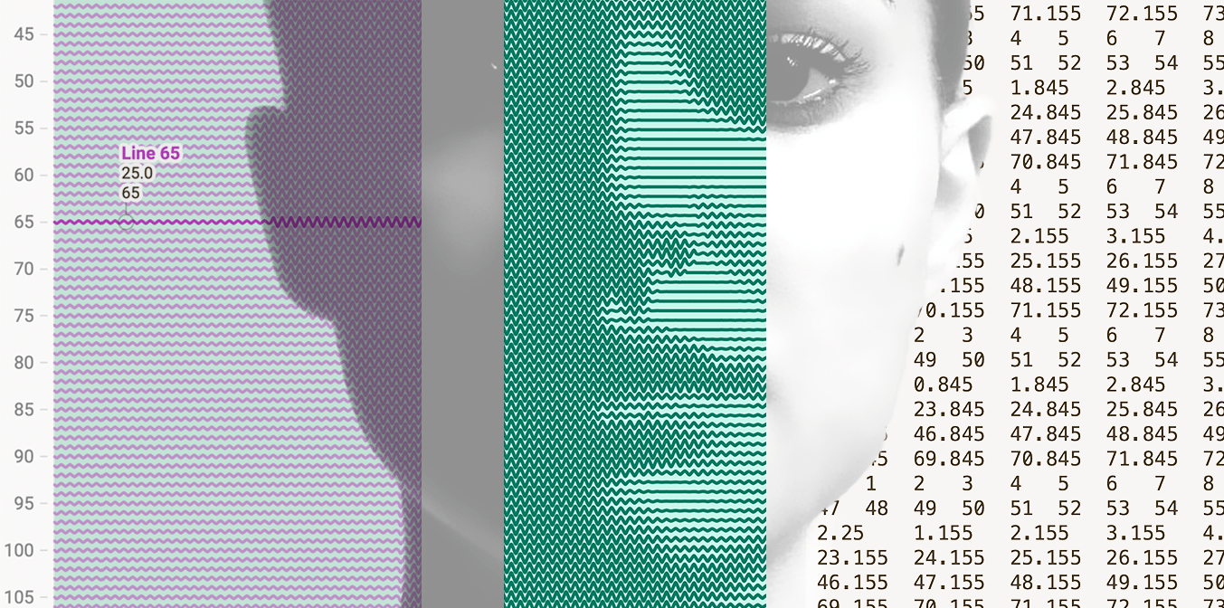
What’s going on here?
Each line represents a row of pixels in the original image. The lines are essentially ‘waves’, the size (amplitude) of which varies according to the brightness of the original image at that point.
The datapoints themselves are only at the peaks, troughs and ‘baseline’, Datawrapper does the work of drawing the lines between the points for me:
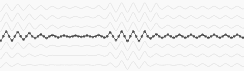
Bigger wave = more ‘ink’. And voila, the eye perceives a darker area.

Or if you prefer it in maths, each line is described by this equation (calculated only for 45 degree intervals):
y = y0 + amplitudeMax * (1 - brightness) * Math.sin(x*frequencyGenerating the dataset
For my previous chARTwork, generating the dataset was a lengthy process of:
1. Editing the image in Photoshop
2. Reducing the resolution

3. Using Processing to write a little script that loops over the image pixels, and extracts the brightness of each pixel and generate the required CSV.
When I was reached out to about how one would go about creating a chART dataset, I realised how clunky this process was, and decided to package the whole thing in a little web application, that uses HTML Canvas to manipulate the source image, and javascript to extract the image data and generate the CSV.
If you want to generate a dataset like this from your own image, you can do so here.
Making The chart
Once I had my dataset, I just pasted it into Datawrapper, and made a few small tweaks:
- I inverted the vertical axis using a custom range (so that it would go from low to high)
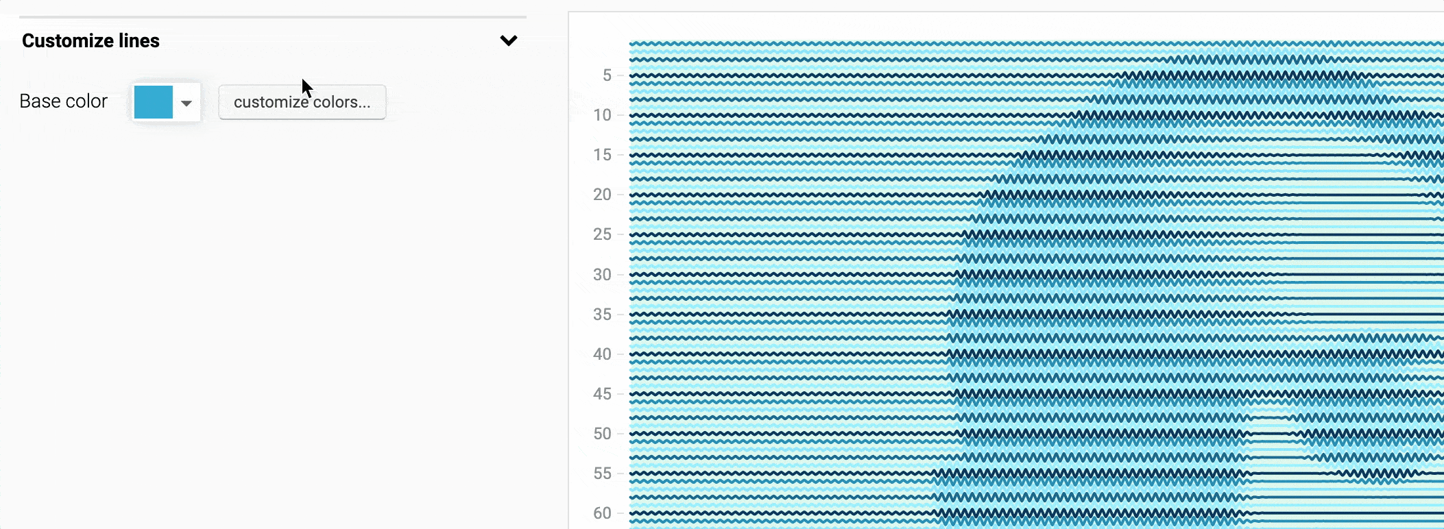
- I customized the lines, to give them all the same color:
- And finally, I added a range highlight, typically used to draw attention to an important bit of your data. In this case, just because I thought a background would look pretty.
And that’s it! If you want to check out the chart in Datawrapper for yourself, hover over the chart and click Edit this chart!
Hope you enjoyed, until next time!
p.s. Shoutout to John Preston, who inspired me to create that little tool for turning images into datasets!