How rating scales shape movie reviews

Hi, I’m Julian from the app team. 👋 Today we’re diving into something deceptively simple: rating scales. How much does the format of a rating scale actually influence the score someone gives a movie? As it turns out, quite a bit.
When a Facebook user once rated Fight Club a solid “5 out of 7,” the internet erupted. The scale is oddly specific, hard to interpret and just feels so wrong. But what is the right scale to rate something on?
Should we use a 1–10 scale? Give 1–5 stars? Are half-stars fair game, or is 2.5 just fence-sitting? As it turns out, designing a good rating scale isn’t as straightforward as it seems, and your choice has its implications.
Ideally, we would do a field study and ask a bunch of people to rate the same movies on different scales. Unfortunately, I don’t have the time nor the team of researchers, so we'll have to rely on existing data.
The usual suspects
Meet the movie rating platforms, IMDb and Letterboxd. On IMDb, you can rate movies on a scale from 1-10 points, where only whole numbers are allowed. On Letterboxd, you can rate movies on a scale from 0.5 to 5 stars at 0.5 increments.
But wait a second, doesn't that mean the two scales are identical? Sure, they are labelled differently, but they both offer the exact same range of 10 options, evenly spread out. We could even create our own corresponding scale with text labels or percentages.

Fortunately, both IMDb and Letterboxd let us see the full distribution of every single rating given by users. Here's an example of the above-mentioned Fight Club.
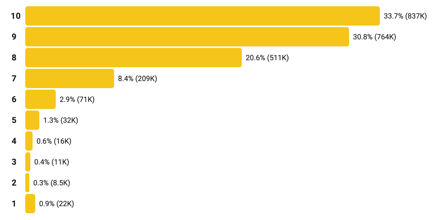
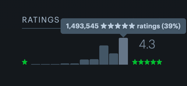
While we can see some differences, it could just be two communities having different opinions on this particular movie. To get any meaningful insights, we need way more data.
I gathered a dataset of nearly 4,000 movies1. The dataset contains a whopping 1,347,051,790 ratings from Letterboxd and 830,319,956 from IMDb. (It would take me ages to poll this many people!)
Let’s take a look at the distribution of the ratings and how they differ between the two platforms. If people rated movies the same way on both scales, we should be seeing two very similar charts — but we are not.

Similarities
First, let's look at the similarities.
The half-way option, or 5 out of 10 points and 2.5 out of 5 stars, gets 6% of ratings in both cases. (Would this look different if we used a word-based scale and rated the movie just a neutral okay?)
An 80% rating, that is 8 points or 4 stars, is the most common one on both platforms, making up around a quarter of all ratings. In fact, most ratings are concentrated in the upper half of the scale. This could be explained by two things: the central tendency bias and the ceiling effect.
Of course, other factors are likely at play here. People who expect to like a movie are more likely to watch it in the first place and rate it afterwards.
Differences
So much for the similarities, now let's focus on the differences.
Letterboxd reviewers are more likely to give low ratings. On IMDb, only 6.8% of ratings assign a score of 4/10 or less, but 10% of Letterboxd ratings are under 2/5. (Even though 1-star ratings are more common on IMDb, possibly due to review bombing which is more prevalent there2.)
A less prominent ceiling effect might be a result of the Letterboxd scale design: 2/5 just feels less harsh than 4/10, which results in more than double the amount of 2 star ratings on Letterboxd. My thesis: A narrower scale — even if it offers the same granularity — is less susceptible to the ceiling effect. This affects the actual results: The overall averages are 6.27 for Letterboxd and 6.4 for IMDb.
People on Letterboxd avoid half-star ratings, compared to the corresponding ratings on IMDb. The 7-point option on IMDb received 51% more votes than the 3.5-star option on Letterboxd, and the 9-point option 44% more. This phenomenon is known as the round number bias.
While it may seem that 0.5 increments open up room for more nuanced ratings, that doesn't necessarily mean this room will be used the same way as on an integer scale.
Caveats
As mentioned earlier, this isn't a scientific study, and while the findings strongly suggest that using different scales can have different results, there are a few caveats worth mentioning.
The list of nearly 4,000 movies collected was based on Letterboxd 100,000 Watched Club, i.e., movies that have been logged as watched by at least 100,000 people on the platform. This can introduce bias into the titles selected.
The two platforms likely have different audiences, each with their own tastes and preferences.
Different sample sizes. While we used the same list of movies for both platforms and the numbers are representative enough of the rating distributions, there are almost twice as many ratings from Letterboxd compared to IMDb.
So, which scale is better?
Letterboxd’s non-integer system discourages users from choosing half-star options. On the other hand, IMDb’s 10-point scale seems to suffer from a "ceiling-skewed central tendency bias" making the lower end of the scale mostly obsolete. In the end, both systems shape behavior in subtle ways. Personally, I prefer the Letterboxd system, but as a Letterboxd user that might be a result of the mere-exposure effect!
That’s it for this week's Weekly Chart! There’s plenty more to explore in this dataset, so stay tuned for a follow-up on this topic soon, and come back for something totally different next week.