What to consider when creating line charts

Line charts are great to show how your data developed over time. Since that’s something that’s often useful, line charts are a classic in the chart world. It’s hard to mess them up and your readers can quickly decipher them. Here you’ll learn how to improve your line charts:
When to use line charts
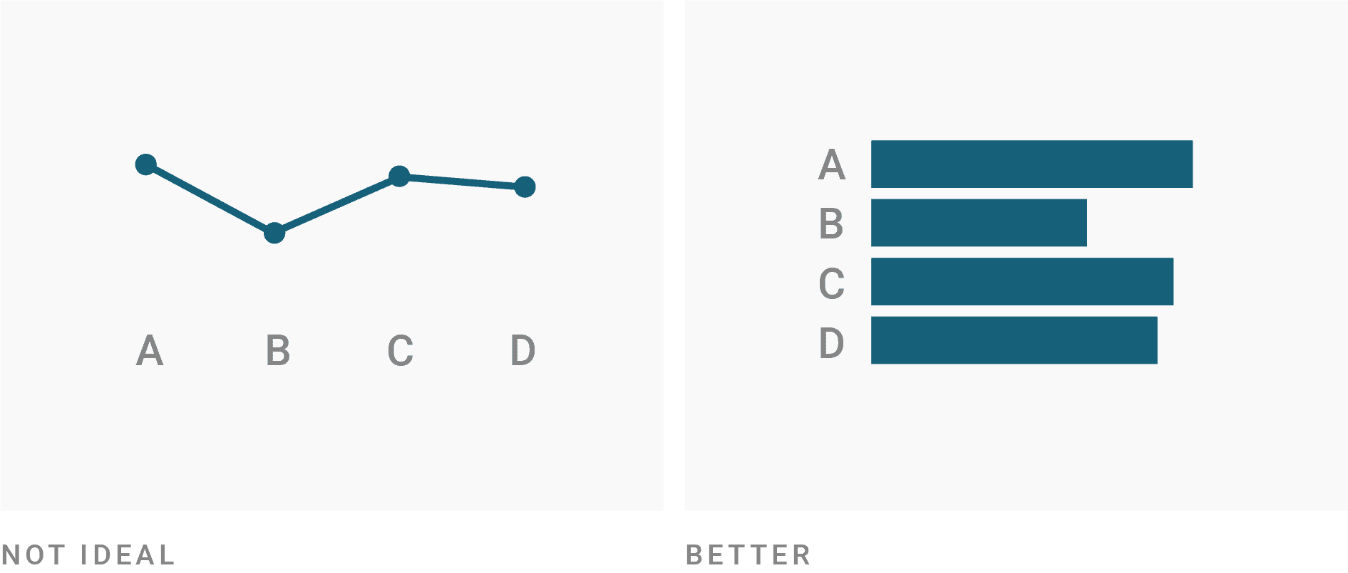
Use line charts only if you want to show how values develop over time. If you want to show how values differ in different categories, consider a (stacked) bar, column chart or split bars instead.
Line charts work to show how different categories stand to each other (e.g. to show that one category overtook another one). If the sum of your categories is as important as the categories itself, consider an area chart instead. Also, consider an area chart if your readers should quickly spot that the chart is about percentages that add up to 100%.

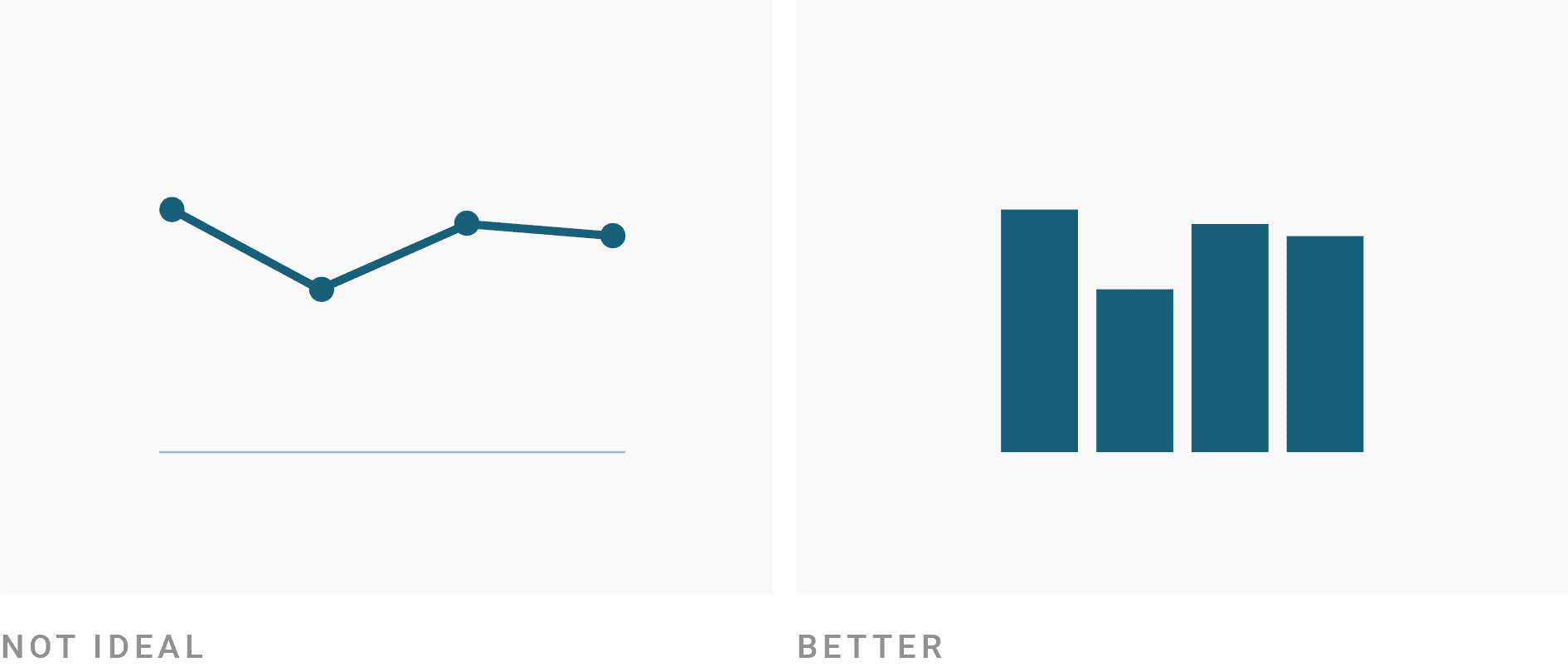
Line charts work really well for a high number of values or values with different time intervals. If you only have a few values of one category at the same time intervals, consider a column chart instead. It will be slightly easier for readers to compare the differences between values. In addition, a column chart communicates more intuitively that your values “fill up from zero every month” (or day, year, etc.), e.g. sales. A line chart is more intuitive for numbers that increase or decrease continuously, e.g. population or unemployment.
How to create better line charts
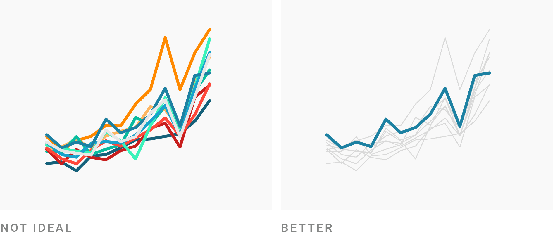
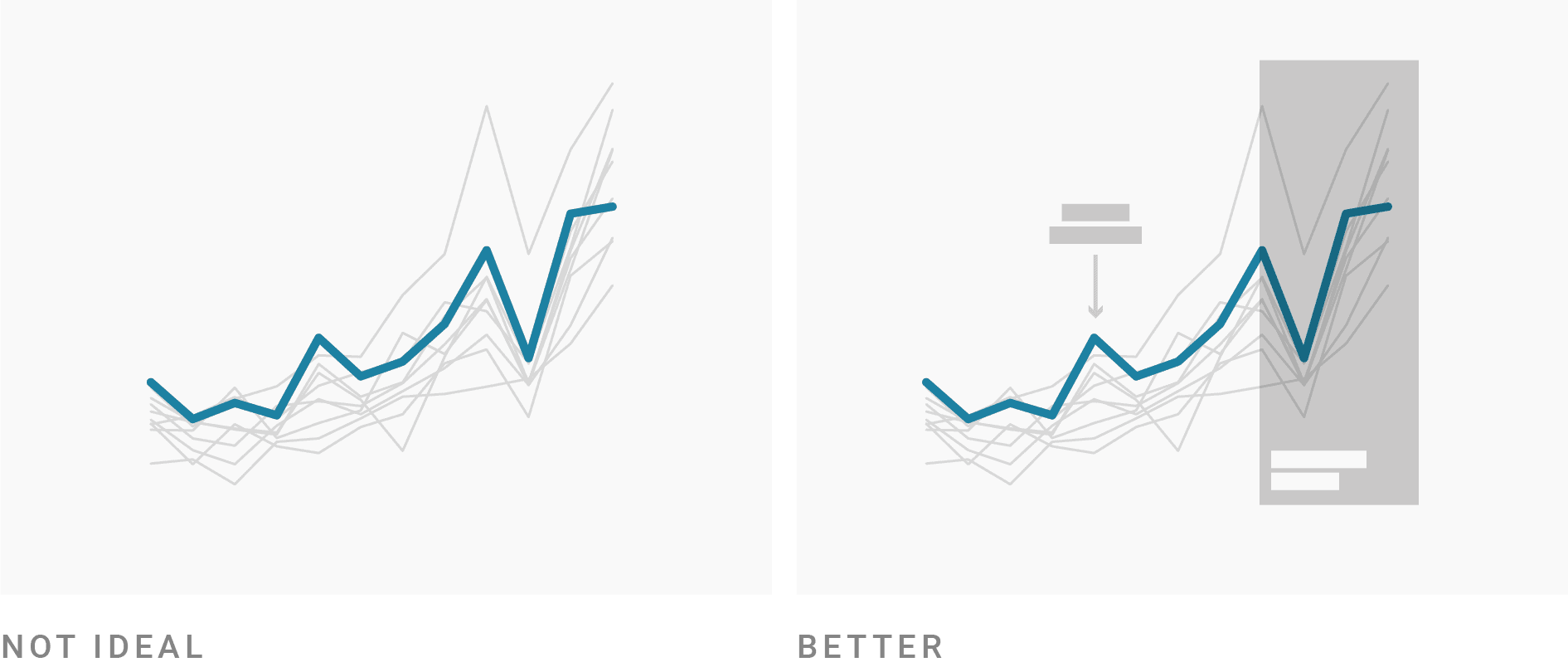
Consider adding comparison data to your line chart. Line charts can handle lots of data, so this chart type is perfect to give the reader some context. Consider adding averages, data from other countries, companies, time frames etc.

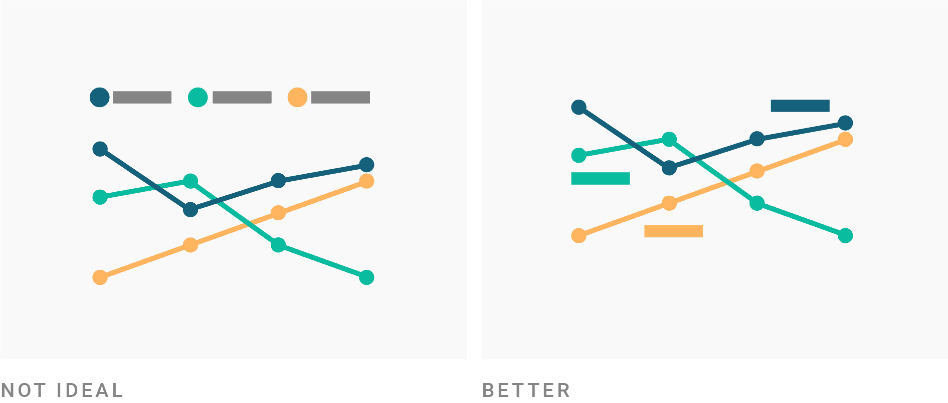
Use colors, line width and line dashes to make your most important values stick out. Grey is a great color to separate what’s important in your chart from what’s not important. That’s especially necessary when you add comparison data.
Consider using annotations and highlight ranges to add explanations to your charts. Line charts offer enough space for these annotations. They will make your chart more interesting to read and help readers to figure out what’s going on. Make sure to add a highlight range if your values switch to projections.
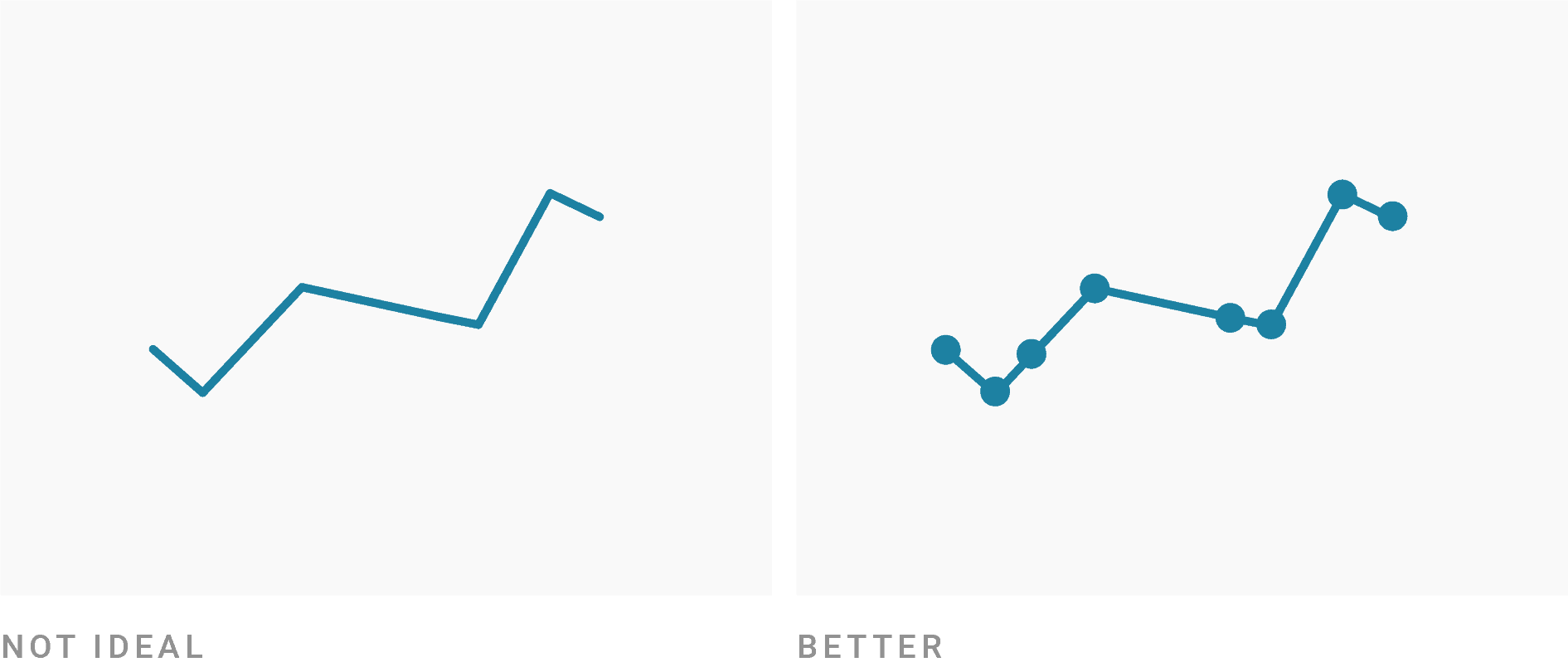
Consider adding line symbols to make clear which dates your data covers. In most cases, the interval between dates is consistent and there’s no need for line symbols. They can even be visually overwhelming if you have lots of lines or dates. However, line symbols are great if that’s not the case and you want your readers to quickly see the intervals between your dates.
Consider turning off automatic labeling and place the labels yourself. Your readers will be able to read the chart faster thanks to that. Try to use the same colors for the text that you use for the lines. Check if these self-placed labels still work in the mobile view, though. If you have too many lines to place labels directly, consider turning on automatic labeling (in Datawrapper, that’s “Annotate > Labeling > Line labels: right”). These automatic labels will turn into color key above the chart once the chart width is too narrow to show them next to the lines.
Consider extending your y-axis to zero. Line charts have the big advantage that they don’t need to start from zero. If your data comes close to zero, however, consider adding the zero baseline. Readers then will be able to compare not just the vertical distance between two values with each other, but also the distance between these values and the zero baseline. Also consider extending your y-axis to 100% if you want to show shares and your values come close to 100%.

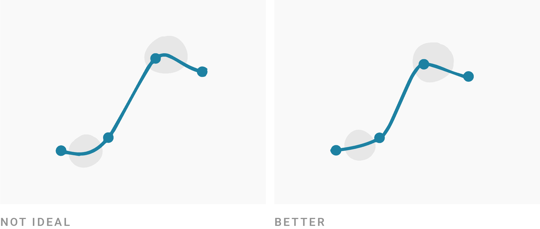
Pay attention when using smooth lines. Smoothing out your lines (“curved interpolation”) is a good way to take away the attention of individual points and to the overall trend. If your data changes continuously in the real world, this can make a lot of sense. However, curves can distort the visual impression of your data (see the first link at the end of the article to learn more). When using Datawrapper, use the Curved instead of the Curved (natural) or Curved (cardinal) interpolation for a still smooth but more honest line.
Example of a good line chart

Want to know more?
- Let’s Chart: stop those lying line charts by Noah Lorang. Focuses on explaining the problem with smoothed line charts and when column charts are a better choice than line charts.
- It’s OK not to start your y-axis at zero by David Yanofsky. Gives examples when truncating the y-axis conveys information better than with a zeroed y-axis.
- Line Charts: Where to Start? by Tim Brock. Design tricks for line charts that don’t start at zero.
- Doing the Line Charts Right by my co-worker Gregor Aisch. Explains general Do’s and Dont’s, e.g. about the aspect ratio of your chart (a point I didn’t touch in this article).
This article is also available in the Datawrapper Academy.