Just another hottest day ever in February

Hi, this is Gregor, CTO at Datawrapper, bringing you another climate-related episode for our Weekly Charts.
We don’t usually pay much attention to daily temperature records, but some days are different. Yesterday was February 24th, my wife’s birthday. We’ve been together for over 12 years now, and I remember how we spent most of these birthdays: indoors!
But with a maximum temperature of 19.7 degrees Celsius, yesterday was also the hottest February 24th since our nearest local weather station in Berlin began recording in 1963. So we had a nice family barbecue enjoying the sun, the birds, and playing some table tennis.
That’s why I decided to dedicate this episode to February 24th and made a chart of all the recorded temperatures:
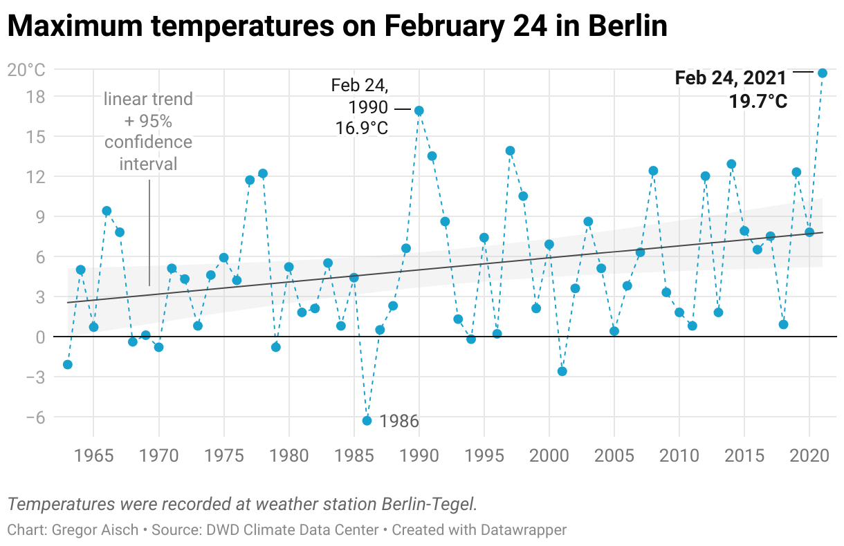
Plotting weather data from individual days is pretty noisy, so I also added the linear trend to show our old friend global warming1. But I was interested in how much of an “outlier” this temperature is.
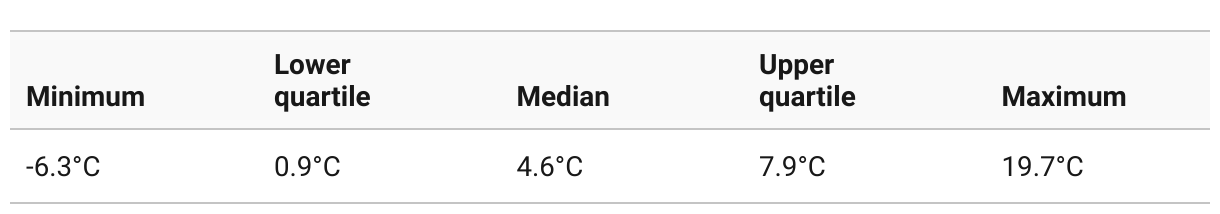
Another way to look into the data is through quantiles. The most common quantiles are the median and the lower and upper quartile. Of all the recorded temperatures, the median temperature was 4.6 degrees, meaning that half of the recorded years, the day’s peak temperature was below than 4.6 degrees, and for the other half it was warmer. The upper quartile tells us that in 75 percent of the years recorded, the peak temperature on February 24th was below than 7.9°C and so on.
The more quantiles we know, the more we understand a distribution. If only there were a way to show all of these quantiles at once! And that’s what a Quantile Plot is useful for!
Instead of sorting the temperatures chronologically, we’re sorting them from cold to hot. The horizontal axis is labeled with the corresponding percentile (the generic term for quantiles in 1% steps sometimes referred to as f-value).
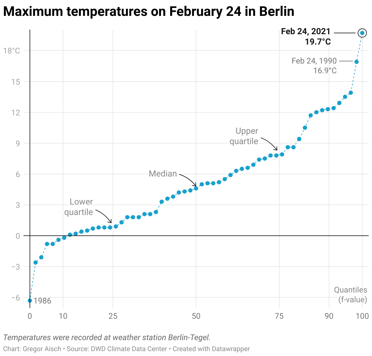
Besides telling us something about the distribution, a Quantile Plot is also useful for, well, reading quantiles :). Our median and lower and higher quartiles have fixed x locations in the plot. This is perfect if you want to compare different distributions. It’s also a lot easier to identify the outliers and their relative positions.
Another thing I like about quartile plots is that they’re a little bit more readable than histograms or density plots (in which outliers tend to be harder to see).
If you live in the middle of Europe like my family, I hope you’re enjoying the weather these days. We’ll see you next week!