Visualizing dissonance

Hey, I’m Luc, a visualization engineer here at Datawrapper. I have a newly found passion for music theory, and, as readers of this blog probably already know, there is a data visualization behind every new passion. So here it is!
At the beginning of this year, I started taking music classes where I learned notions like "minor third", "perfect fifth", or "octave". They correspond to intervals between two tones and are ubiquitous in music because they sound well when played together—in other words, they are consonant—whereas other intervals are less pleasant to the ear—they are dissonant.
An “octave”, for instance, is considered consonant:
Whereas a “minor second” is considered dissonant:
The tonal system relies on this opposition between consonance and dissonance, and underpins the twelve-tone scale used in most Western music. This system is so powerful that, until today, it is still used in most Western music as a composition technique.
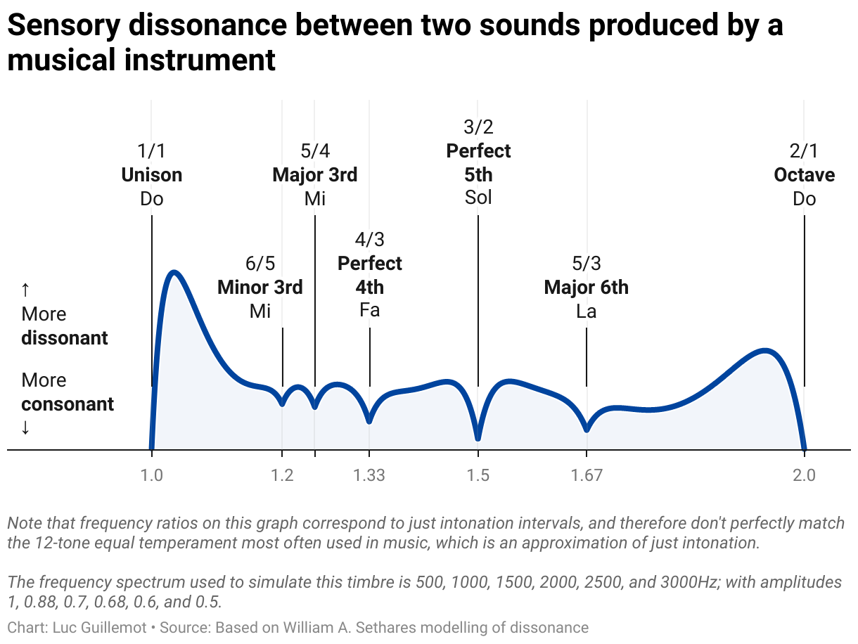
But in the end, music is just sine waves that our human ears can decipher, so there must be some physics behind this? Well, I’m not the first one to wonder about this. William A. Sethares wrote a whole book and an article on timbres and scales. For this Weekly Chart, I decided to try and understand what this meant by reproducing William A. Sethares’ dissonance curve.

This curve shows the sensory dissonance between two sounds based on experiments by Plomp & Levelt (1965). The horizontal axis represents the interval in frequency ratio between two sounds (for instance, the reference pitch A most orchestras tune to has a frequency of 440 Hz, a ratio of 1.5 above is an E with 660Hz), the y axis is an arbitrary unit of dissonance. When two sounds have the same frequency (the “unison” in musical terms), there is perfect consonance; the higher the curve, the more dissonant the two sounds are deemed to be when played together.
Dissonance between two sounds with near frequencies is due to frequency interference, which creates a sort of beating, a fluctuation in loudness, like in this example:
Alright, but so far, this curve doesn't really help us understand music theory since the famous intervals, like ”minor third” or ”perfect fifth”, don’t emerge from this visualization.
This is because the two sounds tested in the graph above are pure sine waves, easily produced on a computer. But the sound of a musical instrument, like a hammer striking the string of a piano, consists of a fundamental frequency, and a series of overtones (sometimes also called “harmonics” or “partials”) with different frequencies and amplitudes, that make the sound less pure, but give the instrument its color—or its “timbre”— which differentiates the sound of a piano from the sound of a guitar, or a violin.
When we add up the dissonance curves of all pairs of overtones approximating the timbre of a piano, the curve looks very different! Here, the typical intervals used in music show through: every dip (towards consonance) in the curve aligns with an interval on the 12-tone scale, commonly used in Western music.
I must confess I am not an expert in physics or acoustics, and I don’t fully understand everything entailed in the dissonance model implemented by William A. Sethares that I reproduced in this notebook—especially the psychoacoustic constants—but I find it fascinating that, be it from the perspective of physics or from the perspective of producing music, we can create different models that describe the same reality. Even if they are only approximations of reality, they allow us to create a raw understanding of sound waves, as well as emotion with music.
Note that the chart above shows intervals used in Western music since it is based on the simulation of a Western instrument, but the derived 12-tone scale is far from universal. In fact, the pentatonic scale is also widespread, for instance, in Indonesian Gamelan music, where the gongs and bells-like instruments produce overtones that make intervals of a 5-tone scale more natural for creating harmony. And, since computers can generate any timbre (any set of frequencies and amplitudes), there is nothing really preventing sound designers and musicians from using the dissonance function to create scales tailored to the instruments they synthesize. This is where mathematical simulation opens up entirely new territories for sound and music.
Endolith’s port to Python of the original algorithm developed by William Sethares helped me write my own implementation in JavaScript. Aatish Bhatia also visualized the ideas behind the physics of dissonance (with sound!).
Thanks for reading, and let me know if you spot any mistakes! See you next week with a chart from Guillermina.