Reveal patterns in your data with maps
Choropleth maps:
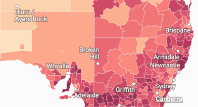
Color regions to show data on a map.
Edit visualization
Visualize your data anywhere on earth
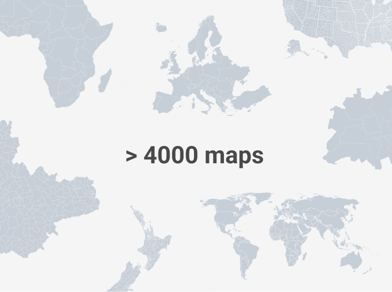
Upload your data to one of over 4,000 basemaps, including countries, municipalities, and election districts.
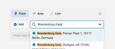
Add place markers by name or with a Google Maps link.
Switch between different map styles, or fine-tune all options as part of a custom plan.
Refine your markers with icons, tooltips, and callout lines.
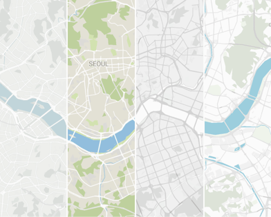
From world map to street level, Datawrapper offers maps for every region.
Upload your own basemaps. Learn more in the Academy
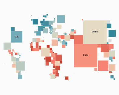
Choose from over 50 special cartograms and hexagon maps. Learn more in the Academy

Tilt your map to turn on 3D buildings.
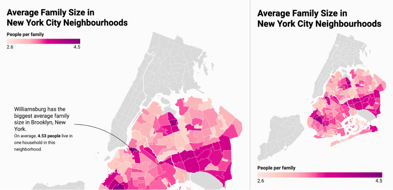
Customize your maps to reveal patterns
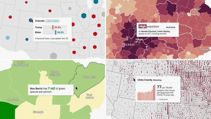
Customize tooltips to give extra information. Learn more in the Academy
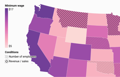
Use pattern overlays to set some regions apart. Learn more in the Academy
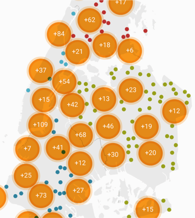
Group nearby symbols, then zoom in for more detail. Learn more in the Academy
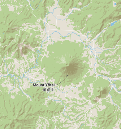
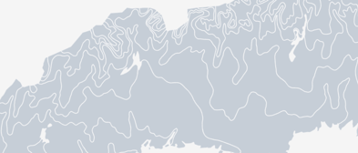
Add hillshading to make mountains and valleys more visible. Learn more in the Academy
Enable zoom.
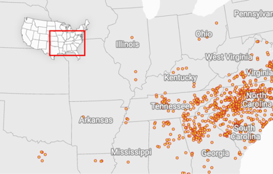
Orient your readers with an inset map. Learn more in the Academy
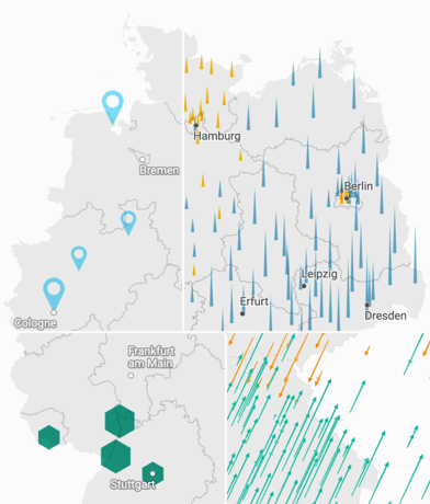
Customize symbol shapes and arrow angles.
Crop our basemap to your data. Learn more in the Academy
Annotate your map to tell your story
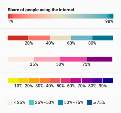
Customize your map’s colors and legend style.
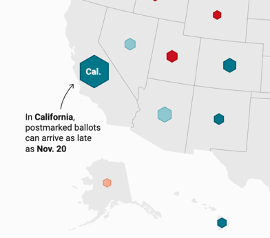
Add annotations and format them to your liking – on mobile, annotations move below the chart. Learn more in the Academy
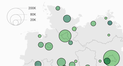
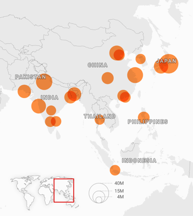
Add and customize a size legend.
Place the legends anywhere – on mobile, they move below or above the map.
Highlight regions when hovering over the legend.
Add place labels on top of your map.