Visualize your data with powerful charts
Line & area charts:
Show trends over time or categories.
Edit visualization
Customize your charts for faster, clearer insights
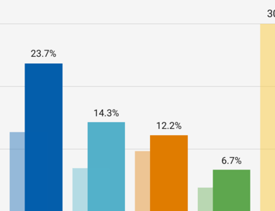
Customize the colors and style of your bars, lines, and areas.
Show tooltips on hover.
Add units to your axes, labels, and tooltips.
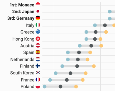
Replace country codes with flags. Learn more in the Academy
Show line chart symbols.
Easily translate chart text and localize number formats. Learn more in the Academy
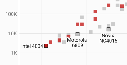
Plot your data on a log scale to better show growth.
Automatic labels that become a color legend on small screens.
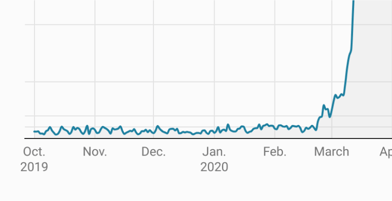
Uploaded dates will be understood as such – date axes are easy to decipher by default.
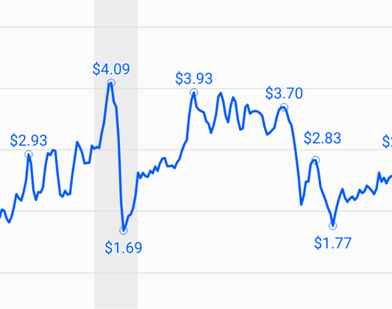
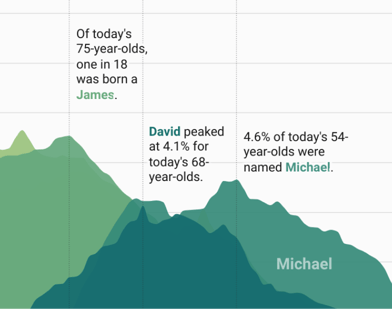
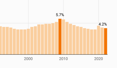
Highlight start, end, and peak values with labels that never overlap.
Tell your story with annotations
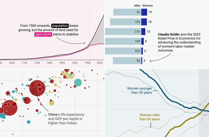
Add text annotations and format them to your liking – or let them move below the chart on mobile screens. Learn more in the Academy
Highlight and label selected data points.
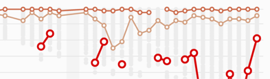
Highlight timespans and other intervals with shaded ranges.
Add context to your data
Add overlays with more context. Learn more in the Academy
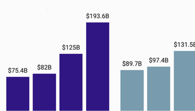
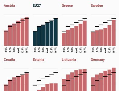
Add background columns for a point of comparison. Learn more in the Academy
Add confidence intervals to show uncertainty. Learn more in the Academy